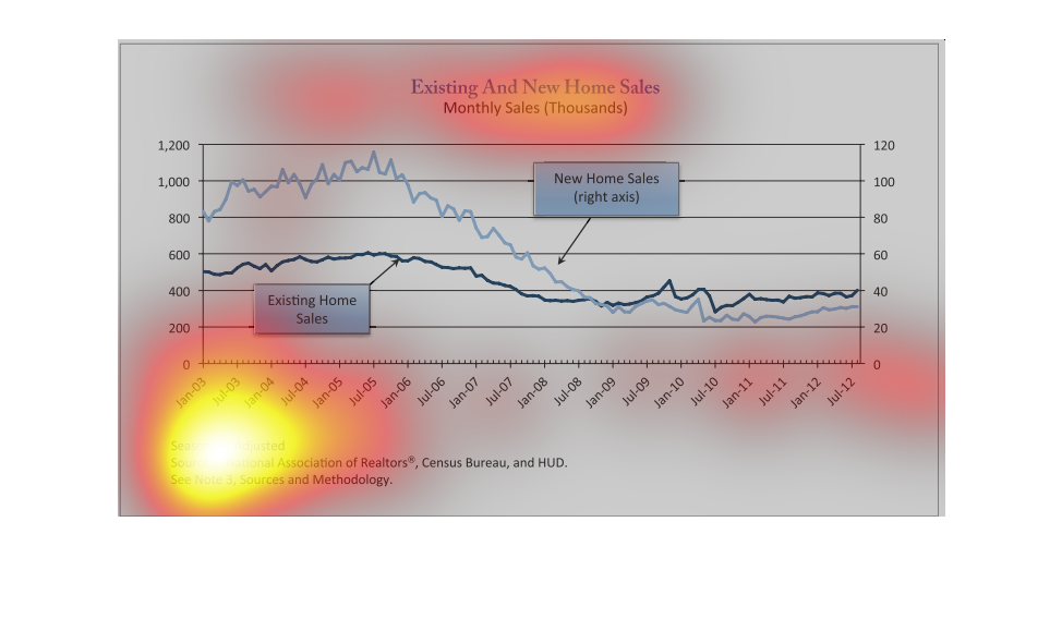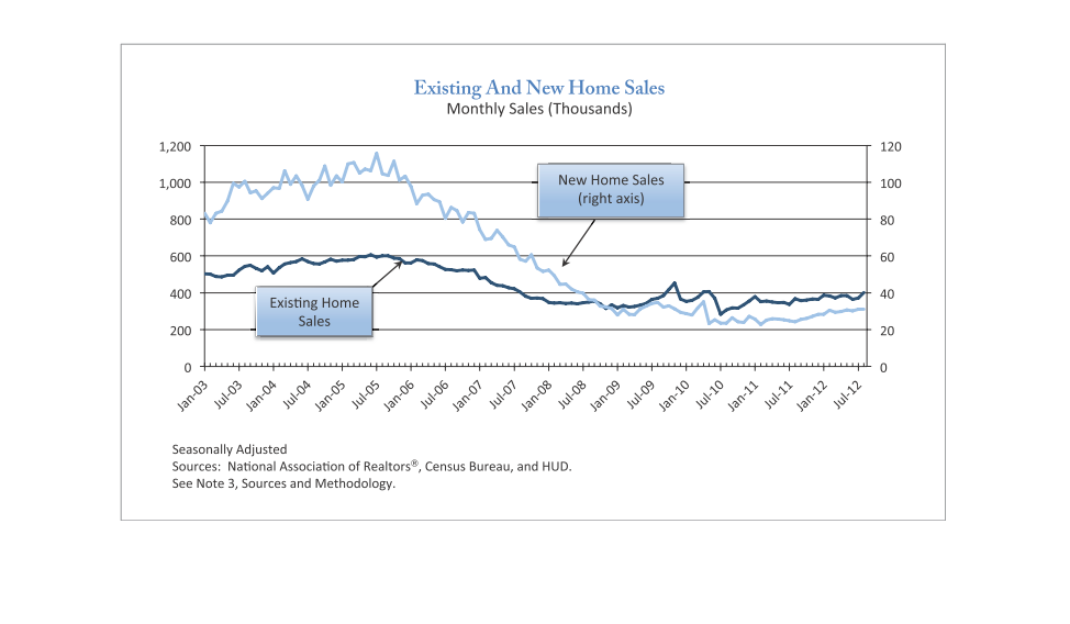
existing and new home sales monthly sales in thousands. January 20013 through July 2012. sales
drop to the same level in early 2009 level out and sales of existing home slightly top new
homes for the first time.
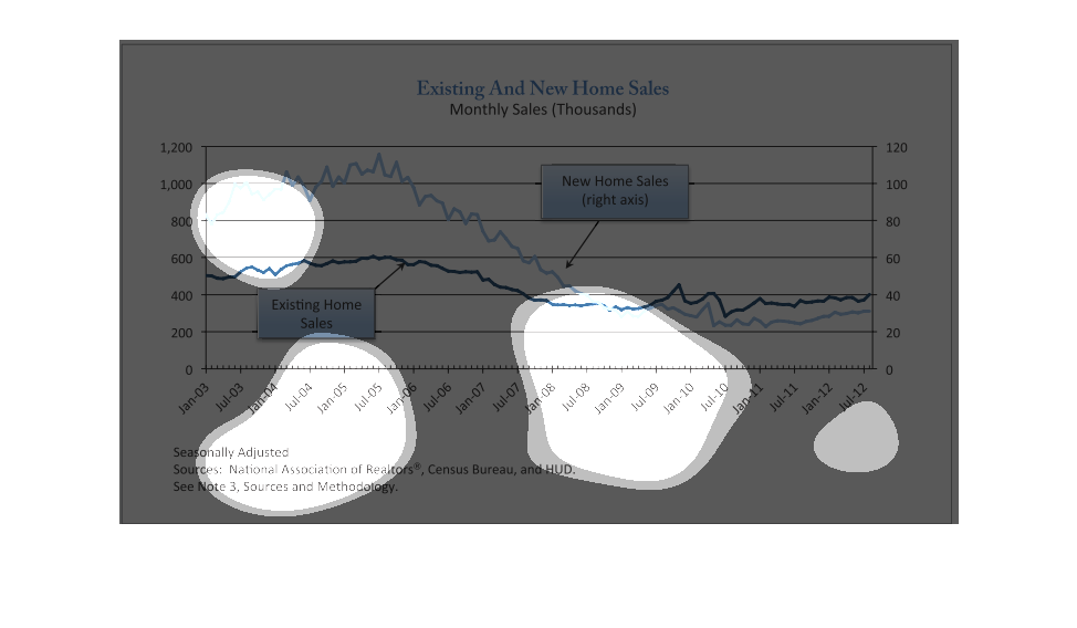
This image compares new home sales versus existing home sales monthly in units of one thousand.
zThe results seem to be close with new homes selling more. The year seems to have been 2005.
This is a chart showing monthly existing and new home sales from Jan of 2003 to July of 2012.
Existing went from 400 to 40 thousand, and new went from 800 to 30 or so.
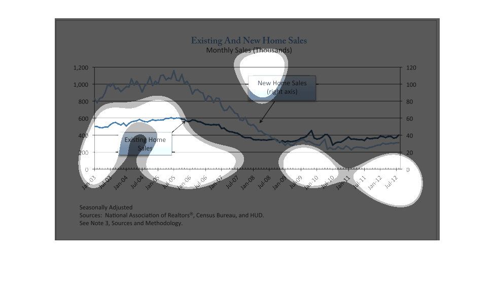
This graph illustrates existing and new home sales and how they have changed from the years
2003 to 2012.  The graph is seasonally adjusted and shows monthly sales in the thousands.
This is a chart depicting monthly new and existing home sales from January 2003 through July
2012. It shows we are in the midst of a broad decline but recovering from a bottom.
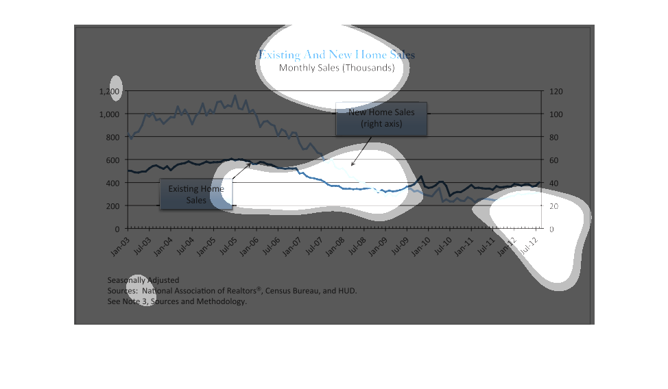
This graph describes existing and new home sales per month in thousands of dollars from 2003
to 2012. At the start, new homes sold for significantly more money than existing ones. Starting
around 2009 though, the trend reversed and now existing homes are selling for slightly more
than new homes. Overall the value of the homes have decreased.
This chart is about existing and new home sales. New home sales have gone down over the years
while existing home sales has started to slowly rise over the years.
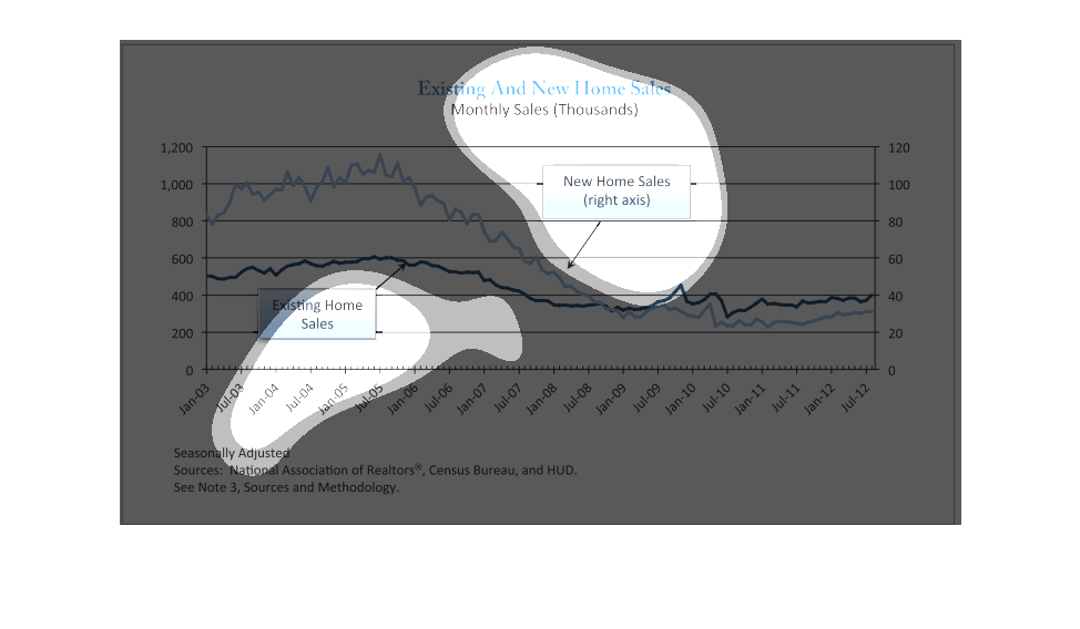
THIS PLOT SHOWS SEASONALLY ADJUSTED NEW AND EXISTING HOME SALES FROM 2003 THROUGH 2012 IN
THE UNITED STATES. THE DARK BLUE LINE IS EXISITING HOME SALES, AND THE LIGHT BLUE LINE IS
NEW HOME SALES.
This graph describes existing and new home sales in thousands of dollars (monthly) from jun
of 2003 to july of 2013. The y axis is time, and the x axis is homes sold.
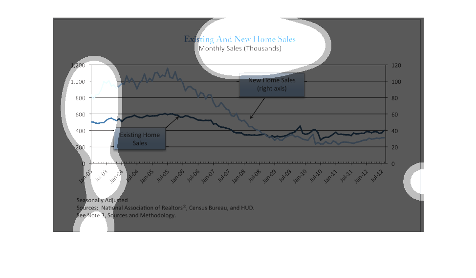
The following line chart depicts information of the amount of existing home sales and new
home sold within the united states of America all of the data was provided by HUD.
This chart tracks monthly existing versus new home sales. It shows that new homes sales were
greater than existing home sales from January 01 through January 09, when existing home sales
then outpaced new homes sales for the nest 3.5 years.
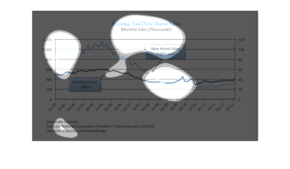
PLOTS SALES OF NEW AND EXISTING HOMES OVER TIME FROM APPROX 2003-2012.  THE DATA IS SEASONALLY
ADJUSTED.  THE GENERAL TREND IS DOWNWARD, SHOWING THAT FEWER PPL WERE BUYING HOMES.
This chart describes existing and new home sales. Specifically monthly sales in the thousands.
The chart covers the years 2003 through 2012. The chart is sourced by National Association
of Realtors.