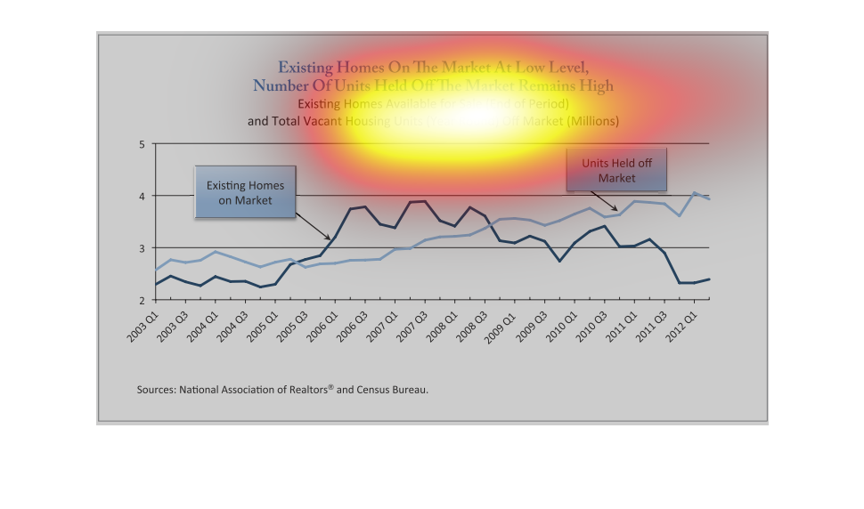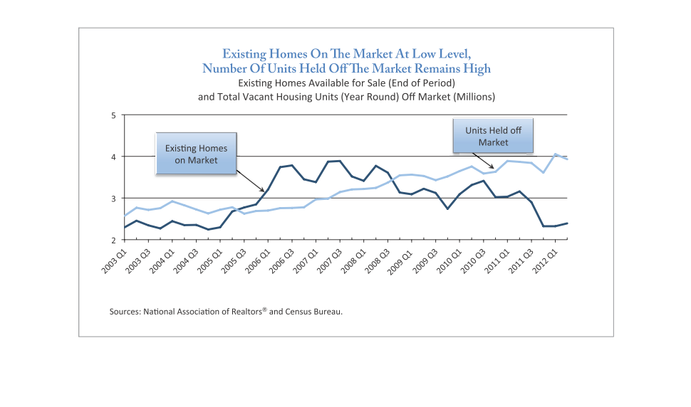
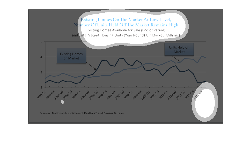
As of 2012 Q1 the following chart states that the number of houses on the market remains low
and the number of houses staying off the market remains at a high level.
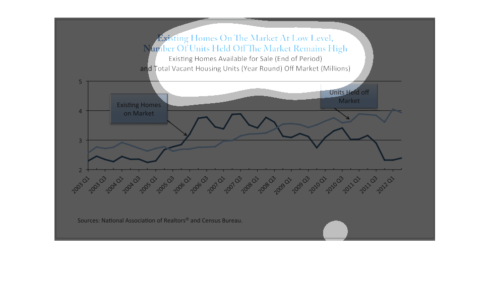
This image shows or depicts in statistical line bar graph format in regards to Existing Homes
on the market at low level, number of units held off the market the remains high.
This chart shows homes for sale and their wether they are currently on or off the Markertet.
The chart shows that the the amount of homes for sale is decreasing and the home off the market
is increay
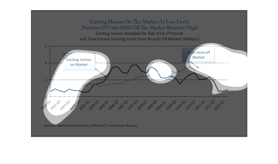
This graph illustrates the number of homes on the market at low level.  It shows existing
homes available for sale and number of units that are off the market.
The image depicts the number of existing homes on the market at low-level, as well as number
of unoccupied homes. Data spans from 2003-2012. The data suggests that a high level of houses
are still being held off market, even as home sales rebounded in prior years.
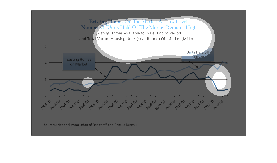
This graph compares the total number of existing homes on the market for sale and vacant homes
that are being held off the market from 2003 to 2012. From 2003 to 2005 there were more held
units, but then from 2005 to 2008 there were more homes on the market, then the number of
vacant homes increased again.
The graph illustrates here how the few houses available in the marketplace really are still
there because of a high level of the market remains exceptionally high.
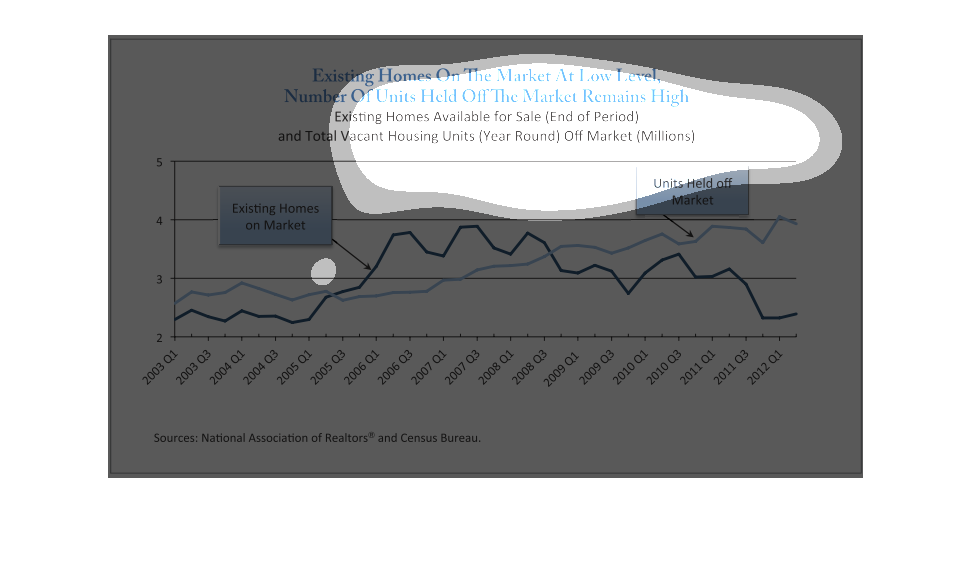
The data shows the number of homes on and off the market between 2003 and 2012. Between 2005
and 2008, the number of homes on the market was higher than the off-market homes, but before
2005 and after 2008, there are more off-market homes.
This looks at how there is a high amount of homes held off the market despite the overall
existing homes available. Now and during the early 2000s, this was the case, but in the times
in between, the trend was opposite this.
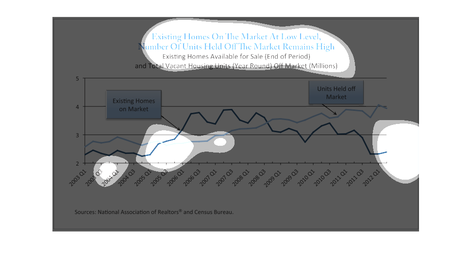
This chart depicts amounts of existing homes on the market being at a low level, and the amount
of units being held from the market are high. The chart along the bottom of the image shows
a line graph in quarterly segments between the years of 2003 and 2012. In Q2 of 2005 the existing
homes on the market rose dramatically but fell below the number of homes being held from the
market by Q3 of 2008.
This chart shows the relationship between numbers of existing homes offered on market and
of those held off the market.  The number of existing homes on the market has remained stable
or increased but the number of those held off the market has increased.
it looks like it is another graph. This time talking about the housing market. Showing price
fluctuations in the market and if its a good time to sell
This figure is titled Existing homes on the market at low level, number of units held off
the market remains high.  It represents the housing market and the number of units off the
market.
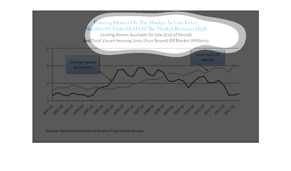
THIS PLOT SHOWS THE NUMBER OF HOUSING UNITS ON THE MARKET, AND THOSE CURRENTLY VACANT BUT
BEING HELD FROM THE MARKET. THE NUMBER OF UNITS ON MARKET IS LOW, AND THE NUMBER OF THOSE
HELD BACK HAS INCREASED.
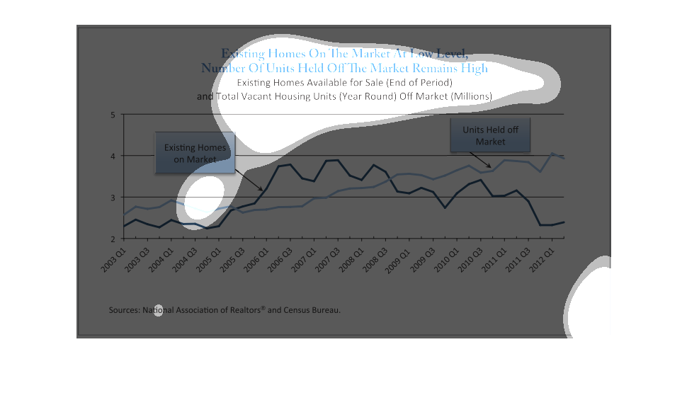
This chart describes existing homes on the market at low level, number of units held off the
market remains high. Specifically existing homes available for sale.