The graph shows the rates at which home interest rates have declined making houses more affordable
over the course of a mortgage. It shows the relationship between the length of the loan compared
to the affordability index.
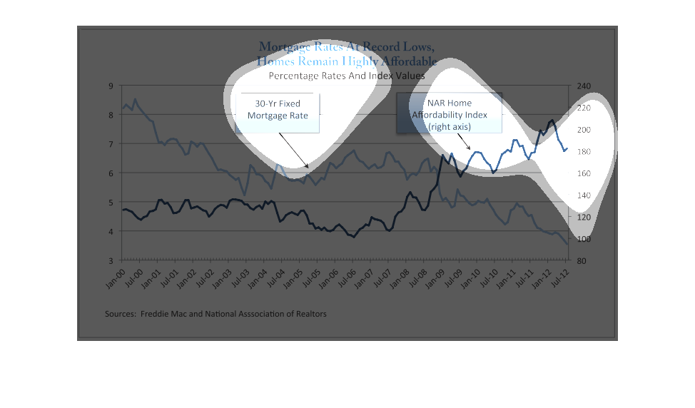
This graph illustrates mortgage rates at record lows yet homes remaining affordable.  It has
a line for 30 year fixed mortgage loans and a line for the NHA Home affordability Index.
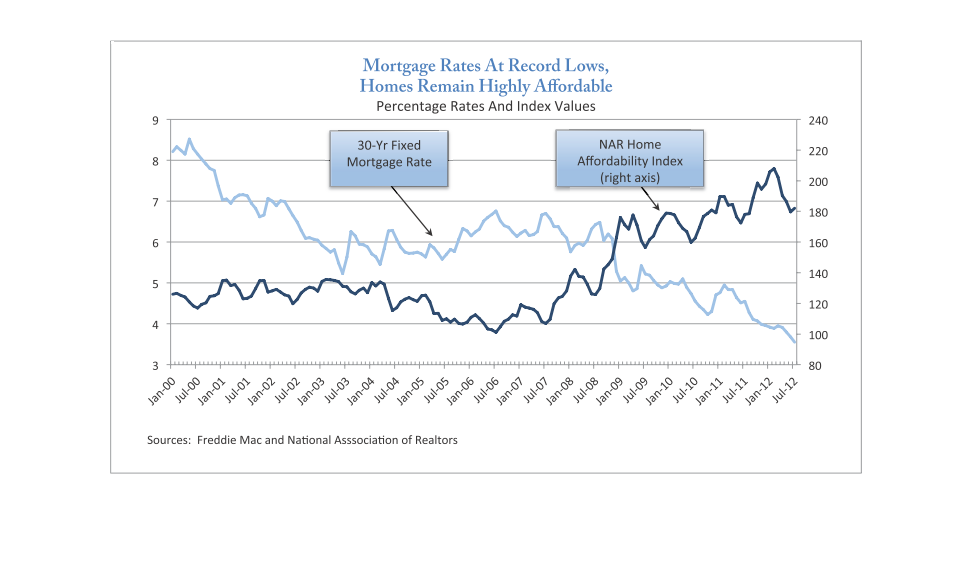
Mortage rates are at record lows and houses remain very affordable.  The graph shows, in my
opinion, that when houses are more affordable the average mortgage rates increase.
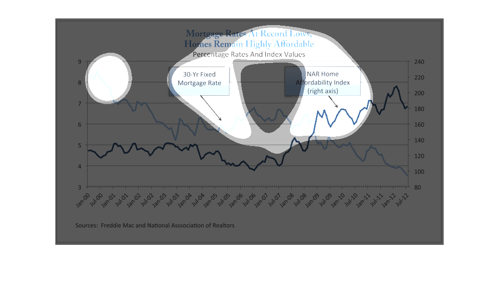
This graph displays the information concerning mortgage rates being at an all time low.  The
graph shows the rates in the months of January and July starting from the year 2000 to the
year 2012.  The 30 year fixed mortgage rate is compared alongside the NAR Home Affordability
Index.
The graph is titled, "Mortgage Rates at record lows, homes remain highly affordable". It shows
two lines one representing the 30-year fixed mortgage rate and the other displaying the affordability
index over 12 years. The graph is displaying that mortgage rates have decreased recently and
that the affordability of a home has increased. Thus, a 30-year fixed rate is lower now that
12 years ago but the price of a home has increased dramatically.
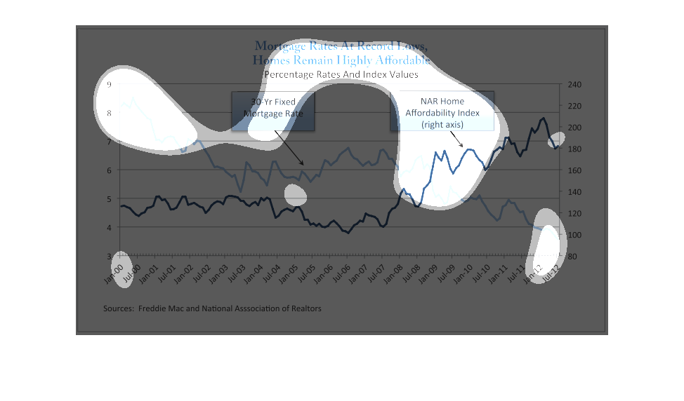
Gives the percentage rates and index values for home mortgage rates for each six month period
from Jan 2000 to July 2012 from Freddie Mac and the National Assn of Realtors.
mortgage rates at record lows, home remains highy affordable. 30 year fixed rate slowly declines.,
NAR home affordability index is slowly rising, jan 200 to july 2012
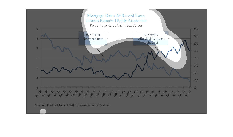
This chart shows the relationship between 30 year Fixed Mortgage Rate and NAR Home Affordability
Index. 30 year Fixed Mortgage Rate has been decreasing as NAR Home Affordability Index has
been increasing over the years since 07.
This graph shows that mortgage rates are at its lowest in the 21st century, having spiked
in the summer of '06 and then decreased again. The present time was depicted as summer '12
where the home affordability index is at its maximum and still seems to be on the rise.

This graph shows the historical trend of home mortgage rates. It is a straightforward graph
with time on the horizontal axis and the rates on the vertical axis.
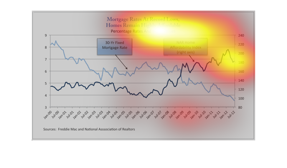
This chart describes that mortgage rates are at record lows, and homes remain highly affordable.
The chart covers the the years 2000 through to the year 2012.
This chart shows the Mortgage rates at record lows, Homes remained highly affordable, it is
for the percentage rates, and index values. This chart was interesting.
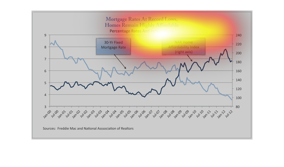

The following chart lists interest rate average on 30 year mortgage from the years 2000 to
the year 2012. It also lists the NAR index for housing affordability.
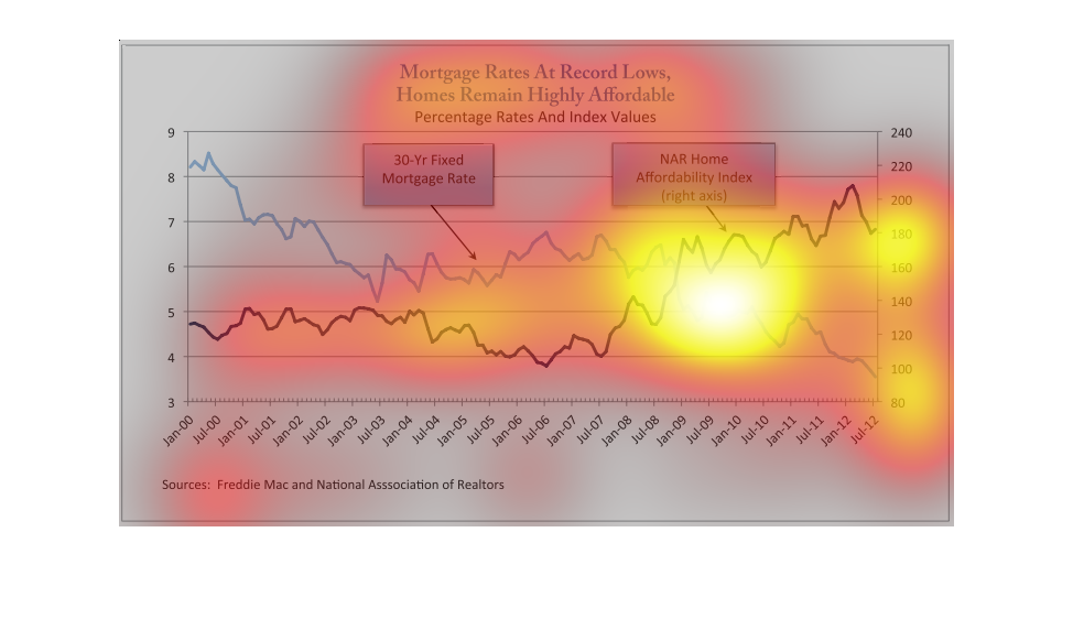
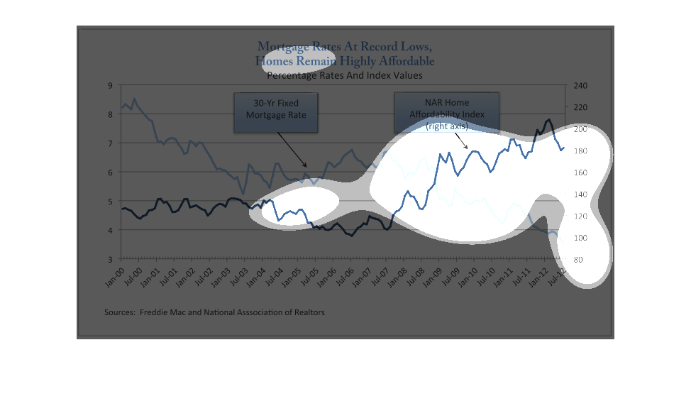
Mortgage rates are at record lows and homes remain highly affordable is the headline of this
graphic.  It then shows a line graph of how the 30 year fixed mortgage rate has been declining
over the years and the NAR home affordability index has been increasing.  There is an inverse
relationship between these two trends.