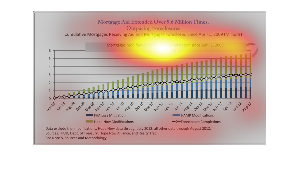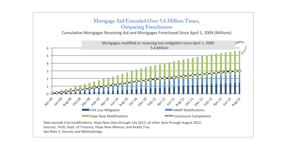
This graph is showing the breakdown of mortgages assistance from the financial crisis in April
2009 through August 2012.  It showing that foreclosures and assistance with loans has increased
dramatically since this three year gap.  The main theme of this graph is that mortgage aid
as been extended 5.6 million times over this period of time.
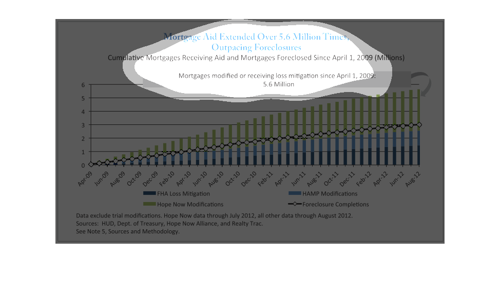
THIS CHART SHOWS BOTH MORTGAGE AID AND THE NUMBER OF MORTGAGE FORECLOSURES FROM 2009 TO 2012.
THIS CHART SHOWS THAT BOTH HAVE BEEN INCREASING WITH AID NOW OUTPACING FORECLOSURES.
This shows mortgage foreclosures, as well as mortgage mitigation proceedings since 2009. Mitigation
has recently outpaced foreclosure by almost two to one.
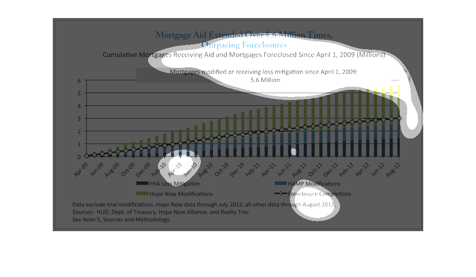
This graph illustrates mortgage aid estimated outpacing foreclosures.  It reflects mortgages
that are modified or receiving loss mitigation since April 2009.
This image shows mortgage aids extended over 5.6 million times, outpacing foreclosures, from
April 2009 to August 2012. FHA Loss mitigations, Hope Now Modifications, HAMP modifications,
and foreclosure completions continue to rise.
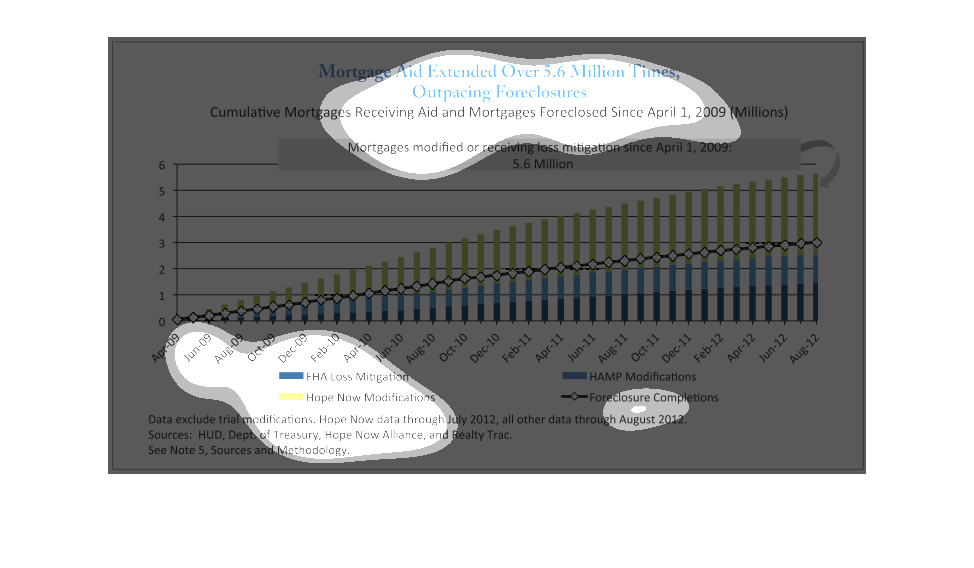
This image is about the number of mortgages receiving mortgage aid and the number of mortgages
foreclosed since April of 2009.  Data is shown in a bar graph and color coded to show the
number of mortgages receiving help from FHA, the number receiving help from Hope Now Modifications,
as well as those receiving help from Hamp Modifications.  It also shows the number of completed
foreclosures.  Amounts are shown for each quarter from April of 2009 to August of 2012.
This chart describes mortgage aid extended over 5.6 million times outpacing foreclosures.
Cumulative mortgages receiving aid and mortgages foreclosed since April 2009.
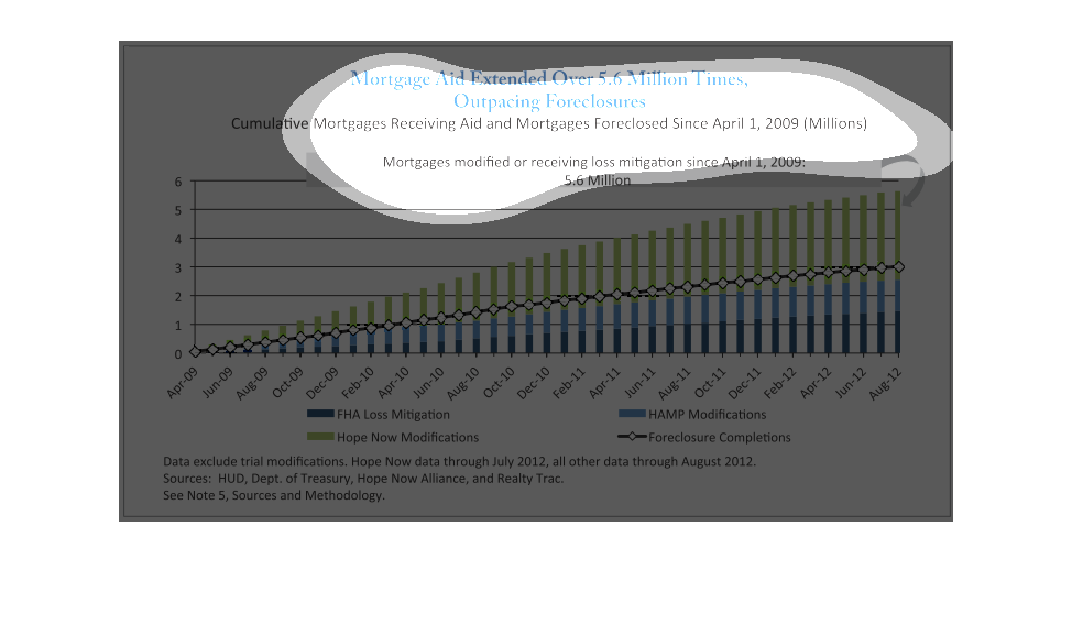
The following chart shows the number of people who received financial mortgage aid and the
number of people who foreclosed on homes. The chart shows that people receiving aid outpaced
those in foreclosure.
This image is a simple graph that shows the number of mortgages and forecloses have risen
since April of 2009. The number of house that have received some sort of assistance has increased
faster then the number of homes foreclosed on.
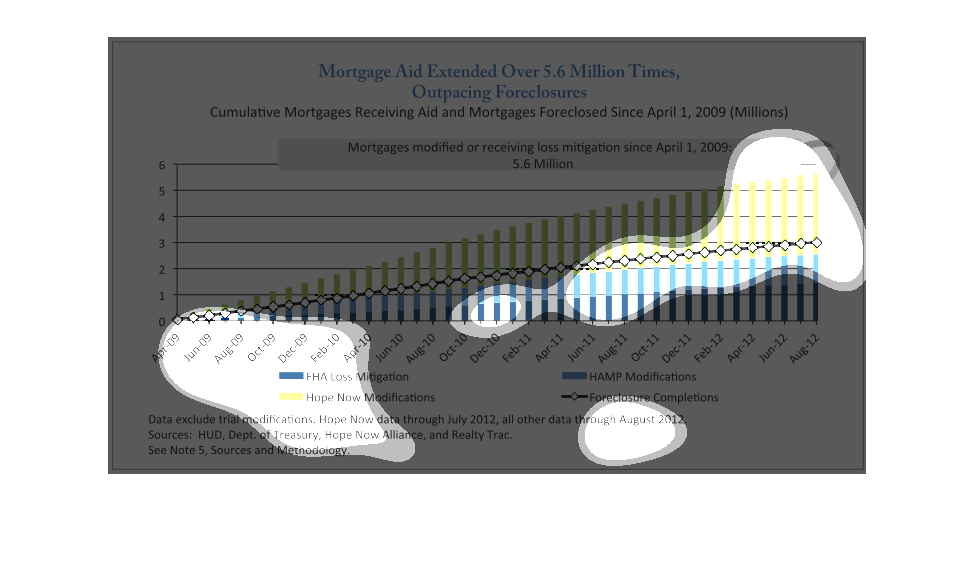
This graph compares hud mitigation vs hope now help . It appears that as midigation increased
so don't did the amount of hope now help in those situations per the chart
This graph depicts the cumulative mortgage receiving aid and mortgages foreclosed since April
1, 2009 until August 2012. The graph shows a gradual upward trend over time.
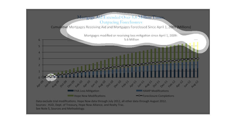
This is a chart depicting how the mortgage aid extended over 5.6 million times is outpacing
foreclosures. It shows the number of mortgages receiving aid and the number of foreclosures.
The threat of an anemic housing market has not yet left us, but the fact is government has
had to continue to extend aid to some in order for this to march along like they should.

This chart shows the: Cumulative mortgages receiving Aid, and Mortgages foreclosed since April
1, 2009 (Millions). The times covered are April 2009- Aug 2012.
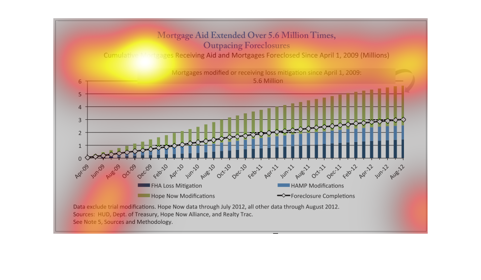
This chart is showing the Mortgage Aid Extended Over outpacing foreclosures 5.6 Million Times,
Cumulative Mortgages receiving aid and mortgages foreclosed since April 1 2009 were in the
millions. Mortgages modified or receiving loss mitigation since April 2009. Hope now modifications
ended up with 5.6 million in August 2012.