This chart is measured the amount of forclosuse starts vs the amount of forclosuse ending.
It shows that there are more starting than closing in the current housing market
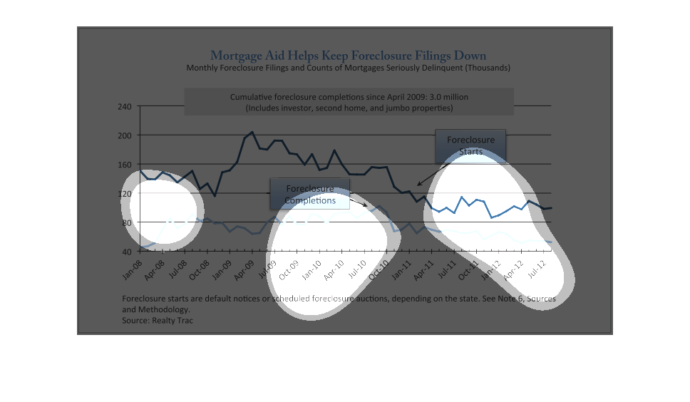
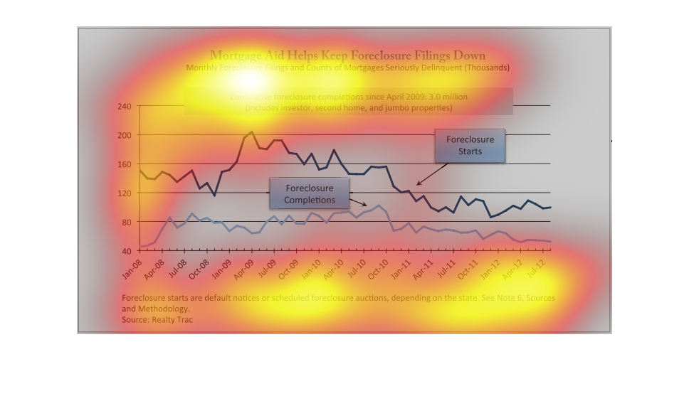
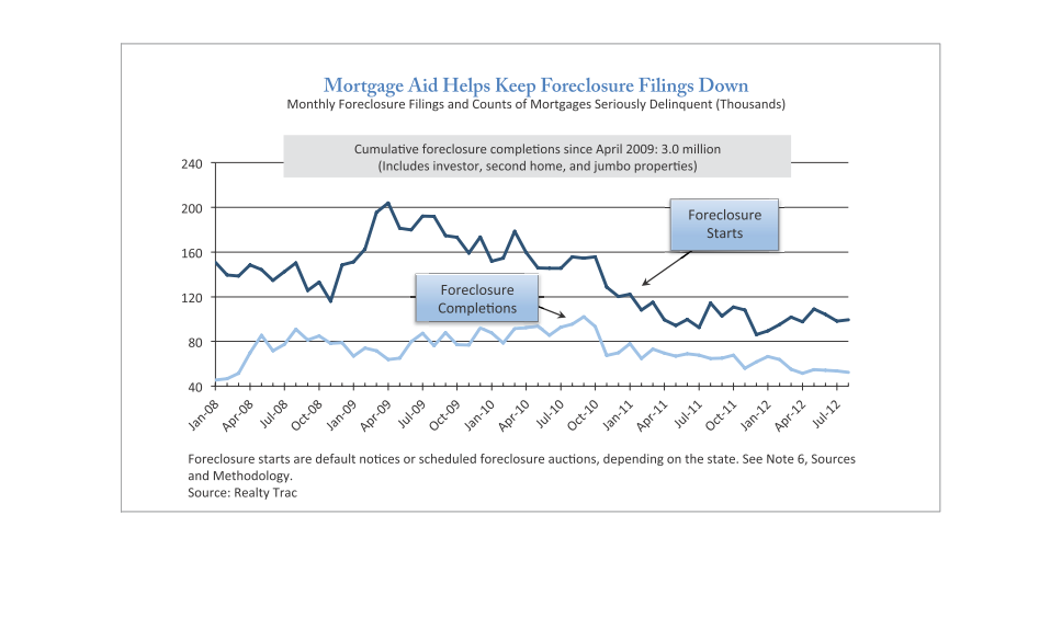
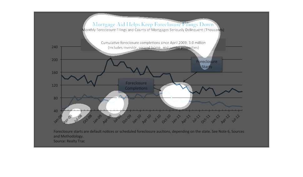
This graph shows the number of monthly foreclosure filings and counts of mortgages seriously
delinquent from 2008 to 2012. The graph depicts how mortgage aid helps keep filings down.
This figure is titled Mortgage Aid Helps Keep Foreclosure Filings Down.  The figure is a representation
of multiple years of statistics for Mortgage Aid and Foreclosure comparisons.
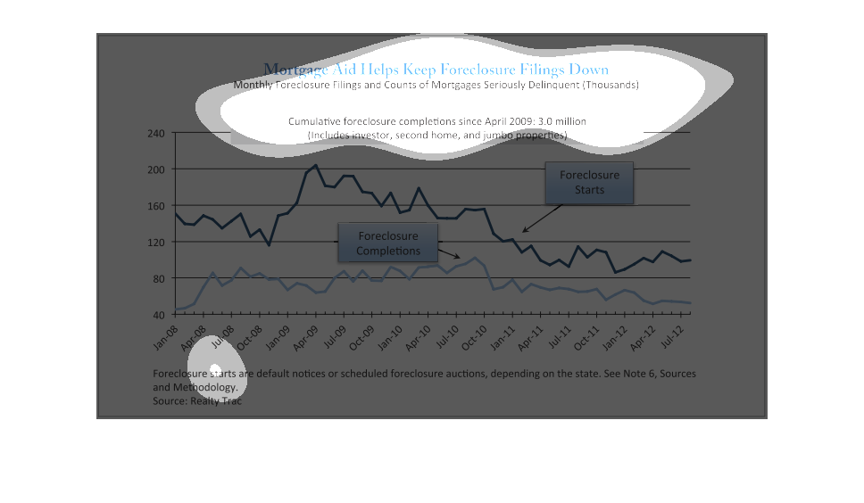
The following chart depicts how financial aid programs help keep foreclosures down. The number
of houses that are in pre foreclosure and the total of hoses in Foreclosure all went down.
When the government released the emergency funds into the hands of people, they were able
to apply this relief of pressure and renegotiate the terms of their mortgage, saving a lot
of people from having to foreclose on their homes
A chart comparing mortgage aid to people to people who file for foreclosure. The information
shows that the more people receive aid, the less foreclosure filings exist.
This is a graph showing how Mortgage aid has helped homeowners keep foreclosures down over
the years. It shows that with an increase in Mortgage aid, foreclosures has lessened.
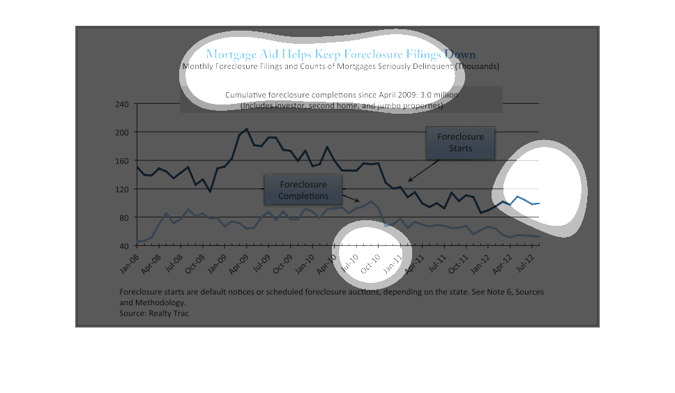
This shows the rate of mortgage foreclosure starts and completions from January 2005 through
July 2012. There was a big increase in starts in 2009, persisting through 2010 before returning
to a rate at or below 2005. The completion rate followed the same general pattern, but with
a much less pronounced peak -- indicating that many of the excess foreclosure-starts during
the Great Recession were slow to be completed.
The caption for this graph is, "Mortgage aid helps keep foreclosure filings down".  The data
for the graph ranges from January 2008- July 2012.  This line graph displays the peaks and
valleys in millions of two lines.  One seems to be of the data for foreclosure filings, the
other for foreclosures that were completed.
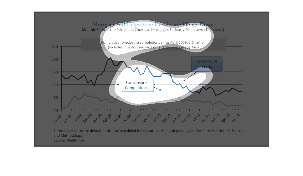
This chart describes that mortgage aid helps keep foreclosure filings down. Specifically monthly
foreclosure filings and counts of mortgages seriously delinquent.

Mortgage aid helps keep foreclosure rates down from the years 2008-2012. Foreclosures were
hitting a record high in 2009 as opposed to when they were far less in 2012.
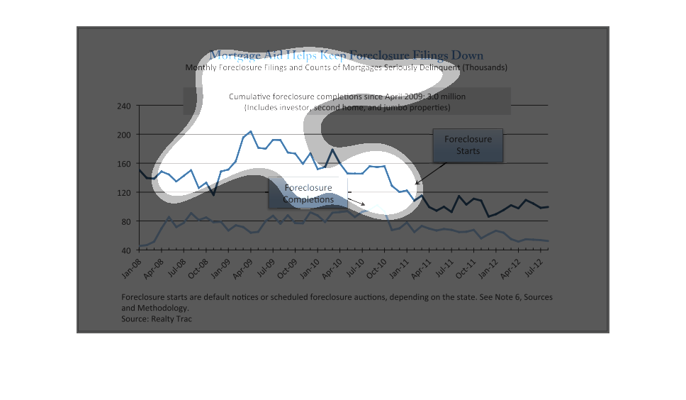
The graph is a line graph. On the horizontal axis is the time, on which dates in a monthly
span are labeled. On the vertical axis is the amount of foreclosure. The goal of the graph
is to show that foreclosure fillings are kept down by the mortgage aid. In the middle of the
graph we have also explanation given in rectangle boxes about the foreclosure start and completion.
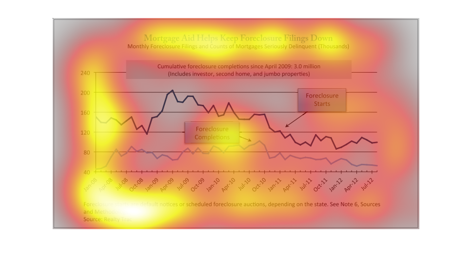
In this graph in discusses how many foreclosures happened between 2008 and 2012. It shows
how many mortgages were filed for foreclosure and how many people were delinquent on their
mortgage. During 2008 there was a higher number of foreclosures and reached an all-time high
before the number began to go back down as the housing market stabilized.