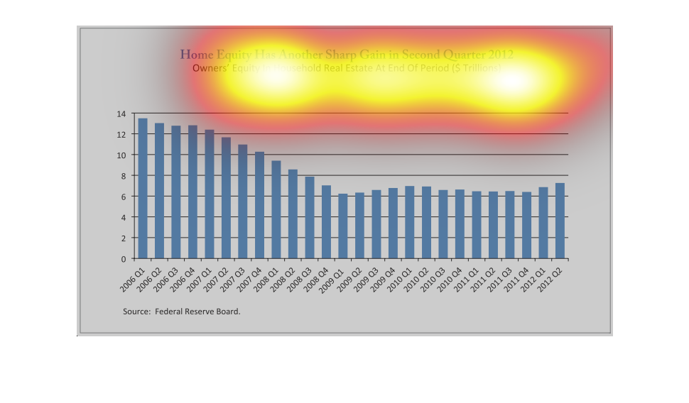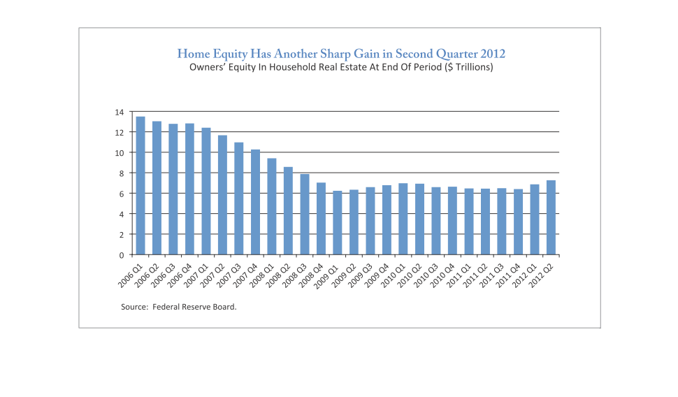
home equity has another sharp gain in second quarter. owner equity in households at end of
period in trillions. 2006 through 2012 medium decline and leveling off by quarter 4 of 2008
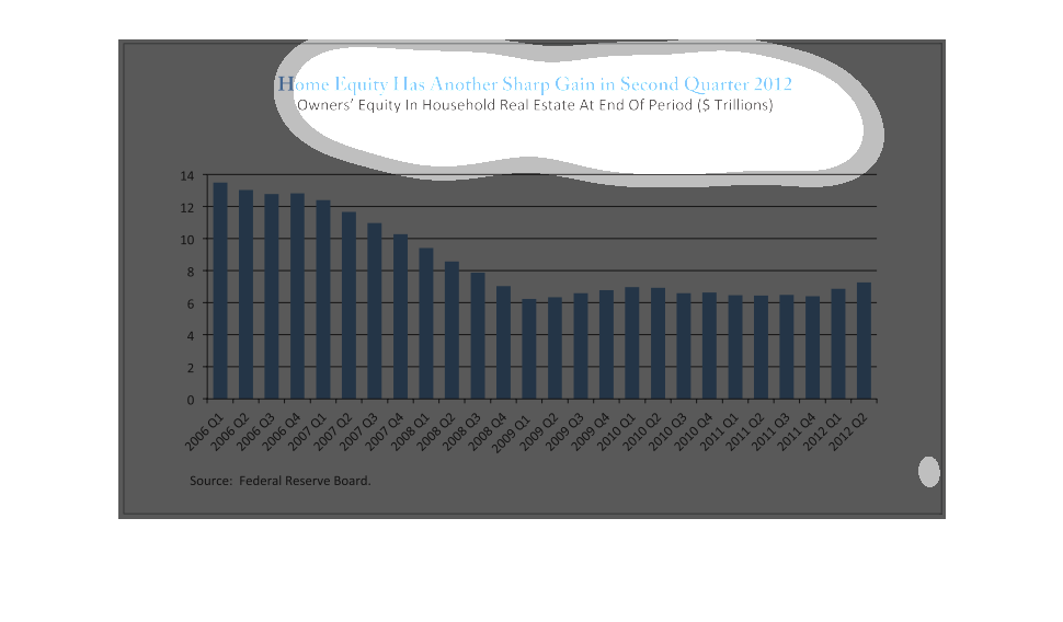
This figure is titled Home equity has another sharp gain in second quarter 2012.  The data
represents the different home equity values for previous years.
This is a chart that shows home equity values over the course of six years. The graph breaks
down the amount of home equity based on each quarter of the year.   The main purpose of the
graph is to show how home equity is increasing since the second quarter of 2012.
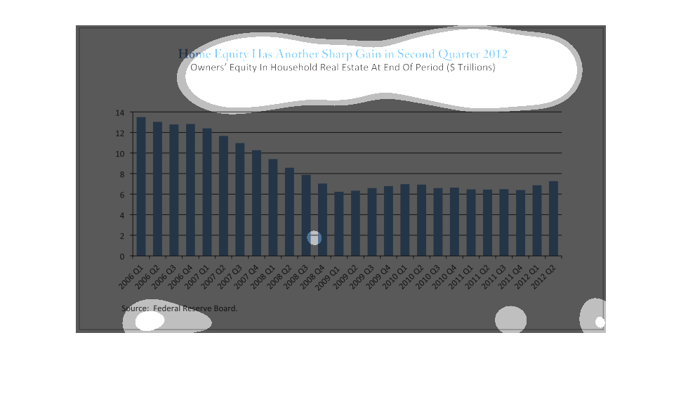
This graph shows Owner's Equity in household real estate in 2012 and speaks about gains in
Real Estate and equity in 2012 in trillions. The graph appears to display a decrease as the
years increase in owner's equity.
Home equity number numbers have another sharp gain in the second quarter of 2012.  Home equity
loannumbers decreased from the 1st quarter of 2006 until the 4th quarter of 2009, but are
showing a gradual increase from the 4th quarter of 2009 through the 2nd quarter of 2012.
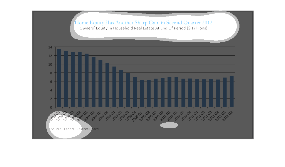
This graph shows average home equity from 2006 to 2012. After falling fairly consistently
from 2006 to 2009, home equity began rising again beginning in early 2012.
This graph illustrates sharp gain in home equity.  It shows the years from 2006 to 2012 and
the amount of homeowners equity in real estate during that period.
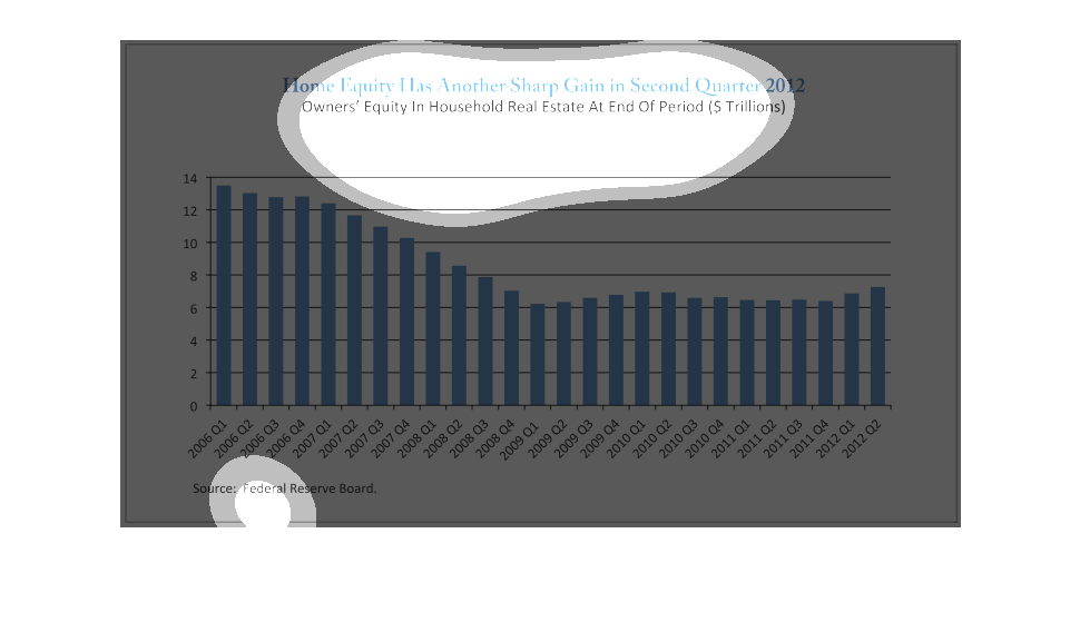
This graph shows home equity values from 2006-2012 and claims that the end of the second quarter
in 2012 showed a sharp increase in home equity values. The general trend of the graph is that
home equity values have declined over time, but it is correct that there is a slight increase
in the second quarter of 2012.
Bar graph shows the the gains of Homeowner's Equity in Household Real Estate in ($ Trillions)
during the Second Quarter of 2012. It was over $13 trillion in 2006 Q1 and now over $7 trillion
in gains.
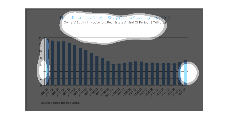
The following chart shows that home prices have gained in value which means that home equity
has continued to increase since the bottom in quarter 1 2009.
This chart represents information for quarterly year information from 2006 to 2012. It is
from the federal reserve board about home equity. Overall home equity has decreased from 2006
to 2012.
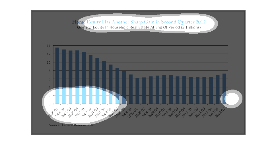
This chart describes that home equity has another sharp gain second owner's equity in household
real estate at the end of period in trillions of dollars.
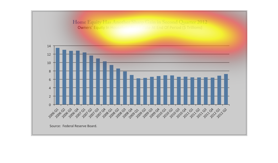
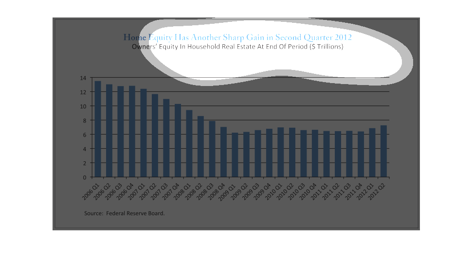
This is a graph of data from the end of the second quarter of 2012. It displays homeowner
equity, which had a slight downward trend but seems to be stabilizing.
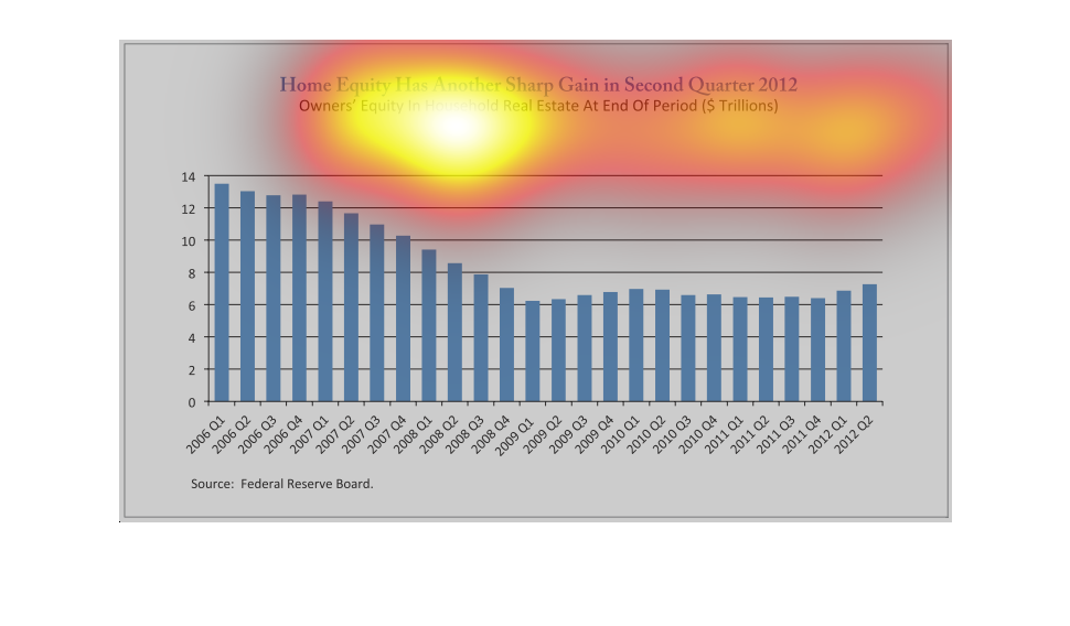
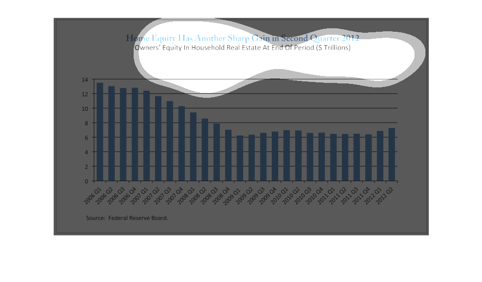
This is a graph chart showing how home equity has made a sharp gain in the second quarter
of 2012. The dates start in 2006 and end in 2012 showing four quarters for each year.
This is a graph depicting how home equity had another sharp gain in the second quarter of
2012 and shows owners equity in household real estate at the end of this period.