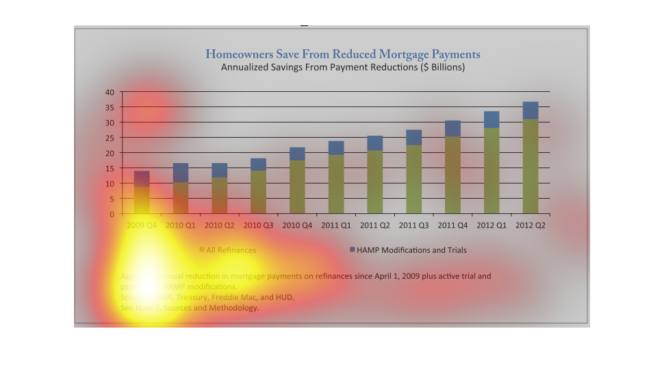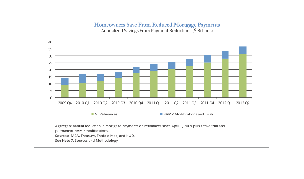
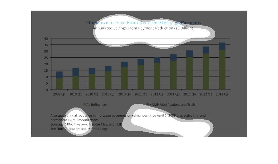
This graph illustrates the amount homeowners save from reduced mortgage payments.  It shows
the payment reductions in billions of dollars for the years 2001 to 2012.
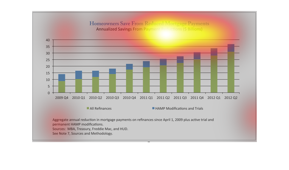
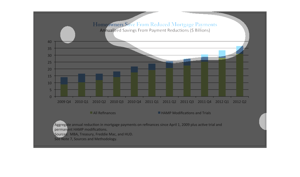
The title is "Homeowners Save from Reduced Mortgage Payments".  The bars are broken into green
and blue segments.  The blue segments represent HAMP Modifications and the green represents
all other refinances. Figures are based on refinances since April 1, 2009.
From 2009 to 2012, mortgage remediation and reductive modifications rose steadily. By 2012,
more than 35 billion in payments per year were being subtracted from homeowner mortgage payments.
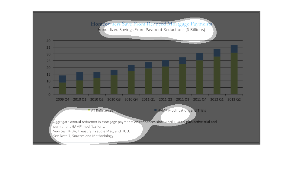
This chart describes homeowners save from reduced mortgage payments. Specifically, annualized
savings from payment reductions in the billions of dollars.
This graph shows how much homeowners saved by reduced mortgage payments annually by refinancing
or doing a HAMP modification in the billions of dollars. Based on MBA, Treasury, Freddie Mac
and HUD
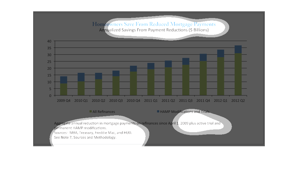
This chart shows the relationship between savings from refinancing and the year.  It highlights
how home owners have had to pay less from reduced mortgage payments.  The savings have increased
overall from 2009 to 2012.
The following is a line graph that depicts the total amount of Dollars saved by consumers
due to lowered interests rates they received from Refinancing or receiving financial aid under
HARP.
The recession hit everybody hard. People lost houses they'd lived in their entire adult lives,
families were wretched and displaced. Because of the government intervention during the crisis,
fewer people had to experience that misfortune.
This graph shows how homeowners save money with lower mortgage payments. It shows that from
2009 to 2012 people increasingly saved money by refinancing their home mortgages. This graph
is specifically looking at how much people spent on mortgage payments in one year.
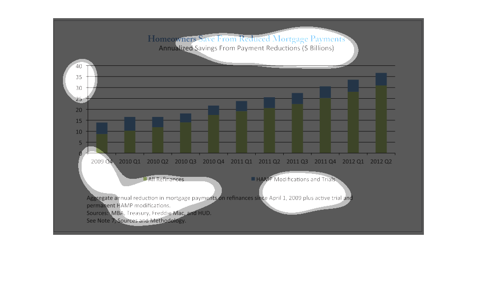
This chart is titled: Homeowners save from reduced Mortgage payments. It displays the amount
of saving in Billions. The years displayed are 2009-2012.
This chart explains how much homeowners save from reduced mortgage payments.  HAMP modifications
and trials make up more of a savings versus a traditional refinance.
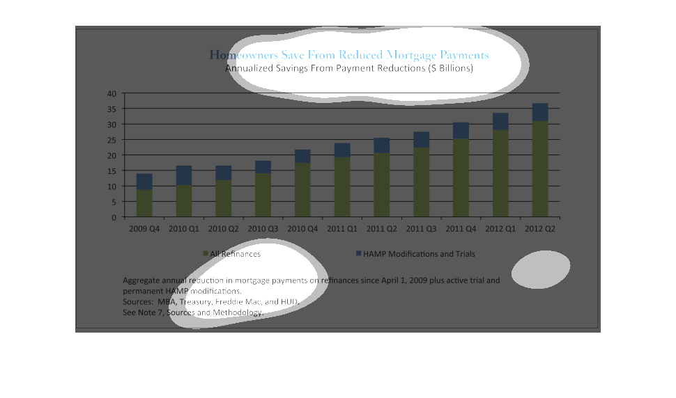
Homeowners saving money from reduced mortgage payment is represented on graph that displays
their savings in billions of dollars of each quarter per year. Graph begins at the fourth
quarter of 2009, and ends at the second quarter of 2012. People seem to have been saving at
under 15 B in Q4 of 2009, but over 35 B by Q2 of 2012.
This shows the amount of refinancing that happened broken down by year it seem that the amount
of refinancing has increased over the past few years due to low interest rates