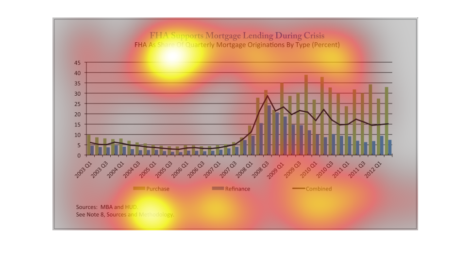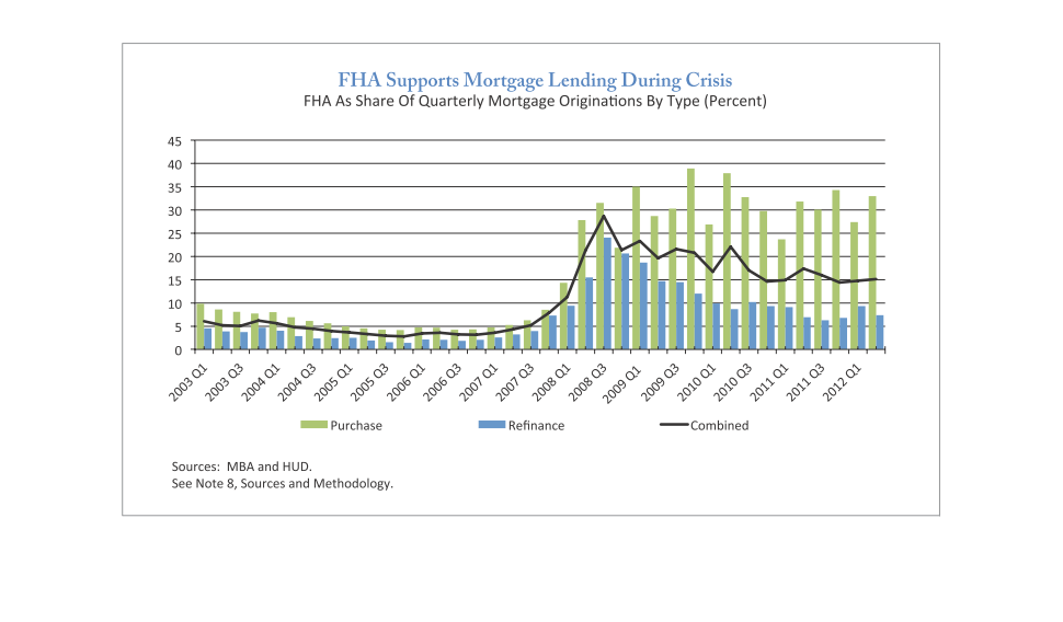
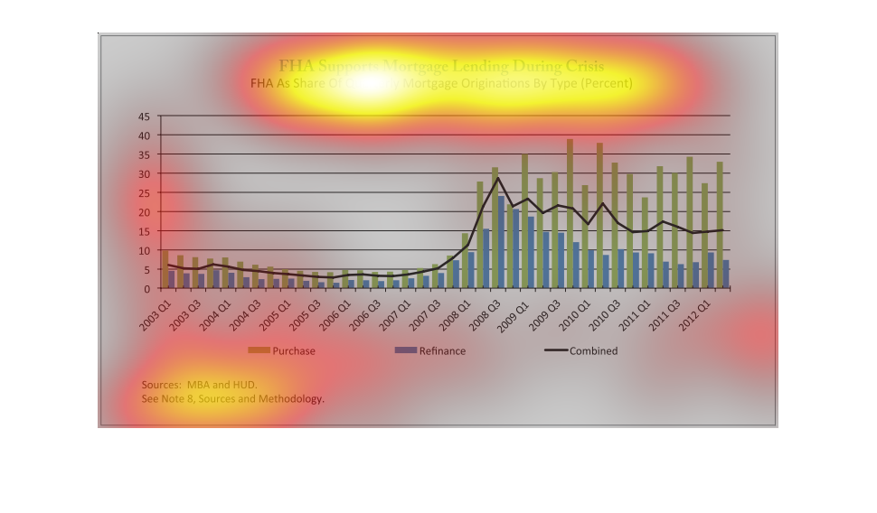
This is a bar and line graph combination entitled FHA Supports Mortgage Lending During Crisis.
 It reflects the percentage of FHA quarterly mortgage originations from the first quarter
of 2003 to the first quarter of 2012.  The blue bars represent FHA mortgage refinancing, the
green bars represent FHA mortgage purchases, and the black line shows the combined percentage.
 In the first quarter of 2003, that combined percentage was around 6%.  There was a peak of
around 28% in 2008, ending around 15% in the first quarter of 2012.

The chart shows FHA Mortgage Lending Data during the crisis years. The chart displays a histogram
of the data collected in percentages. The data was collected from the first quarter of 2003
to the first quarter of 2012. The sources used were MBA and HUD.
The following chart shows how the Federal Housing Association FHA supported the housing market
during the extreme housing slow down.  It gives information showing a huge increase in FHA
home lone origination during the crisis.
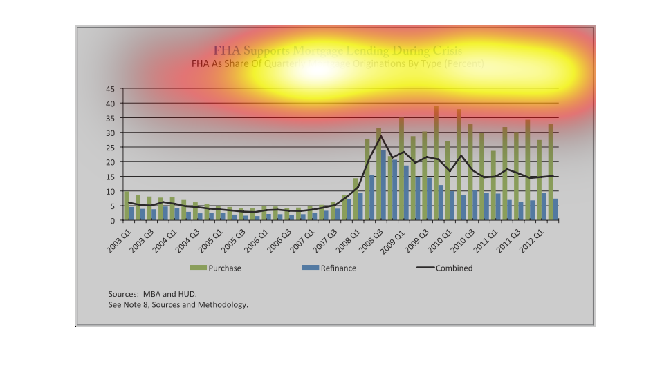
This is a bar graph that shows how FHA Supports Mortgage Lending During Crisis.  This has
been compared from 2001 Q1 to 2012 Q1.  The bars represent purchases, refinances, and the
two combined.
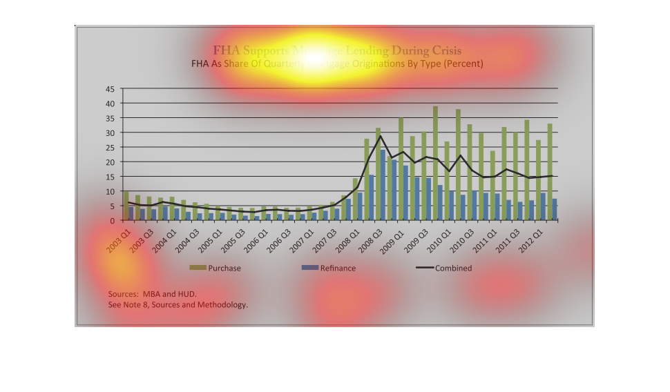
The image on the left hand side is depicting the FHA's support of the mortgage crisis during
the recession.  From this graph it helps to show that the FHA came in and helped get this
country back on its feet by having people refinance their house therefore giving them more
money to put towards the consumption aspect of GDP.
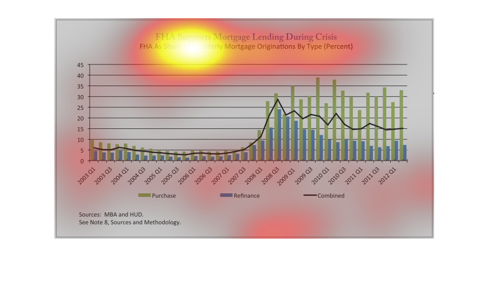
This graph shows FHA supports mortgage lending during crisis, specifically as a share of quarterly
mortgage originations by type. It shows 2003 through 2012. In 2008 it began to increase.
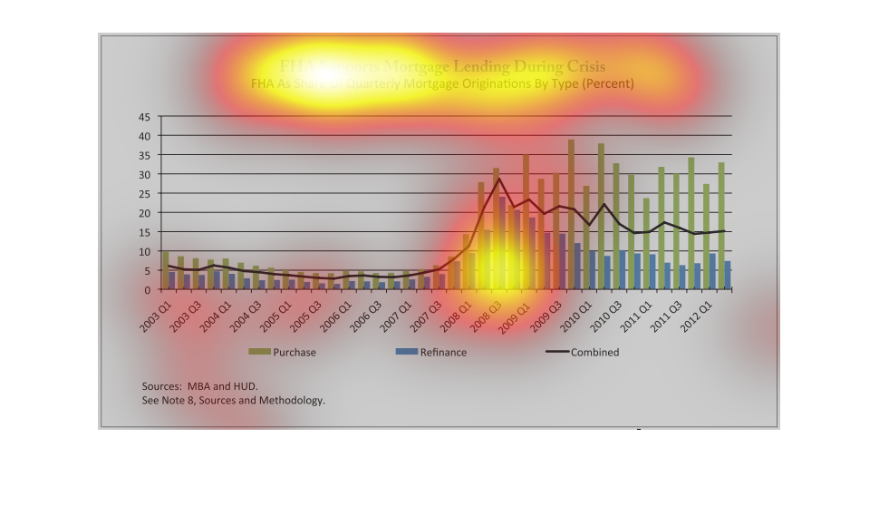
This chart describes FHA supports mortgage lending during the crisis. Specifically FHA as
a share of quarterly mortgage originators by type percent for the years 2003 through 2012.
This chart is a representation of FHA supports Mortgage lending during crisis.  It shows the
FHA as a share of quarterly mortgage originations by type.
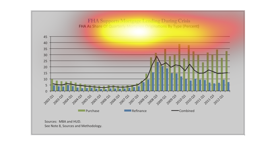
This image depicts how the FHA supports mortgage lending during a crisis by plotting the FHA
as a share of mortgage origination by type. This percentage is tracked from the first quarter
of 2003 to the first quarter of 2012, for both purchases (green) and refinances (blue). A
linear regression is depicted for the combined results. The source of this information is
MBA and HUD.
The image depicts a graph of the FHA (Federal Housing Administration) and it's support of
mortgage lending during the housing crisis, with the FHA as a share of quarterly mortgage
origination by type (percentage). As the crisis deepened, the FHA took on more of a role supporting
mortgage lending, and then somewhat reduces it's role as the housing market began a tepid
recovery.
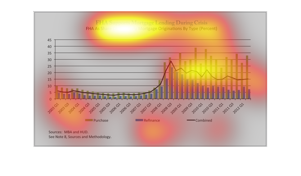
This graph is an argument for FHA's mortgage lending during the crisis. They demonstrate their
percentage of lending for purchase, refinance, and combined types of lending in each quarter
from 2003 to 2012. Lending of all kinds decreased in 2006 and then increased rapidly starting
in 2008, especially for purchases. After 2009, purchases increased and decreased erratically
while refinances were more stable overall.
This shows FHA mortgage lending during the crisis. It shows the type (purchase, refinance,
 or both) and percent from quarters beginning in 2001.Refinance was most popular from 2005-11,
but since then purchase has taken over.
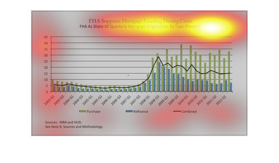
This graph shows the increase in FHA home purchases and refinances from the years prior to
and during the 2008 housing market collapse, while also showing the combined average of the
two.
This graph illustrates how the FHA supports mortgage loans during the economic crisis.  It
illustrates the years 2001 to 2012.  It is reflected as a share of quarterly mortgage originations
by type.
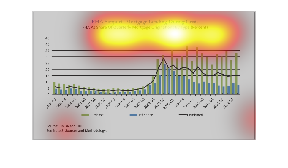
The economic rescue has created a boom in the mortgage industry, it seems everybody is trying
to get a piece of the action. In this graph it shows how application for aid has multiplied.