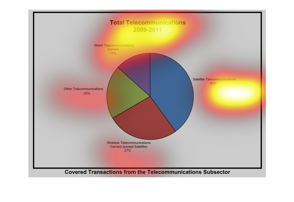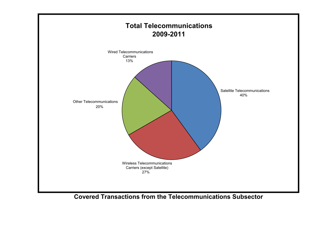
This graph shows the total telecommunications for 2009-2011 in a pie chart with categories
such as wireless camera and satellite telecommunications and other.
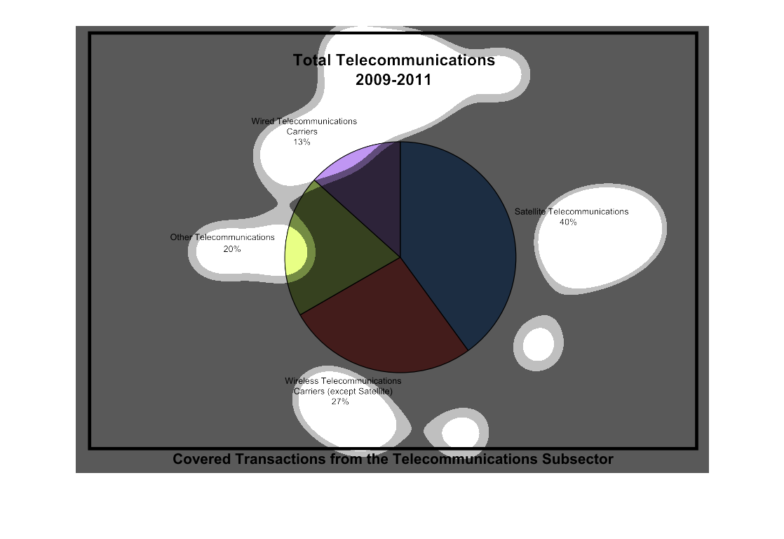
the graph is a pie chart that talks about global telecommunications from 2009 - 2011.  From
looking at the graph you see that almost half of global telecommunications are from Satellite
telecommunications, followed by wireless telecommunications carriers (except satellites),
other telecommunications, and wired telecommunications carriers.
total telecommunications, weird telecommunications 13%, satalite telecommunications 40%,
other telecommunications 20% , wireless telecommunications 27%
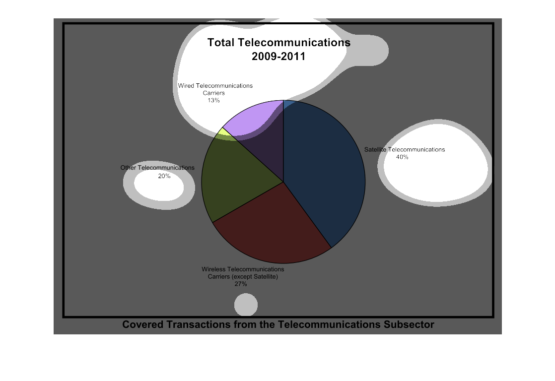
The image shown is a pie chart. The pie chart shows the types of different telecommunications
allotted by designated percentages over time and such.
This pie chart shows the total telecommunications from 2009 to 2011. Satellite telecommunications
takes the largest amount at 40% while wired telecommunications carriers take the least at
13%.
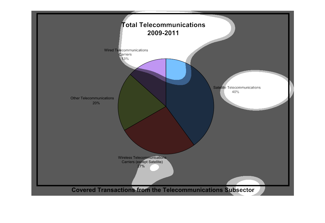
This is a pie chart of the total telecommunications from 2009-2011. The 4 sections are Satellite,
Wired, Other, and Wireless. Satellite is by far the largest portion of telecommunications
over these 2 years. The data comes from all communications cover by the telecommunications
sector
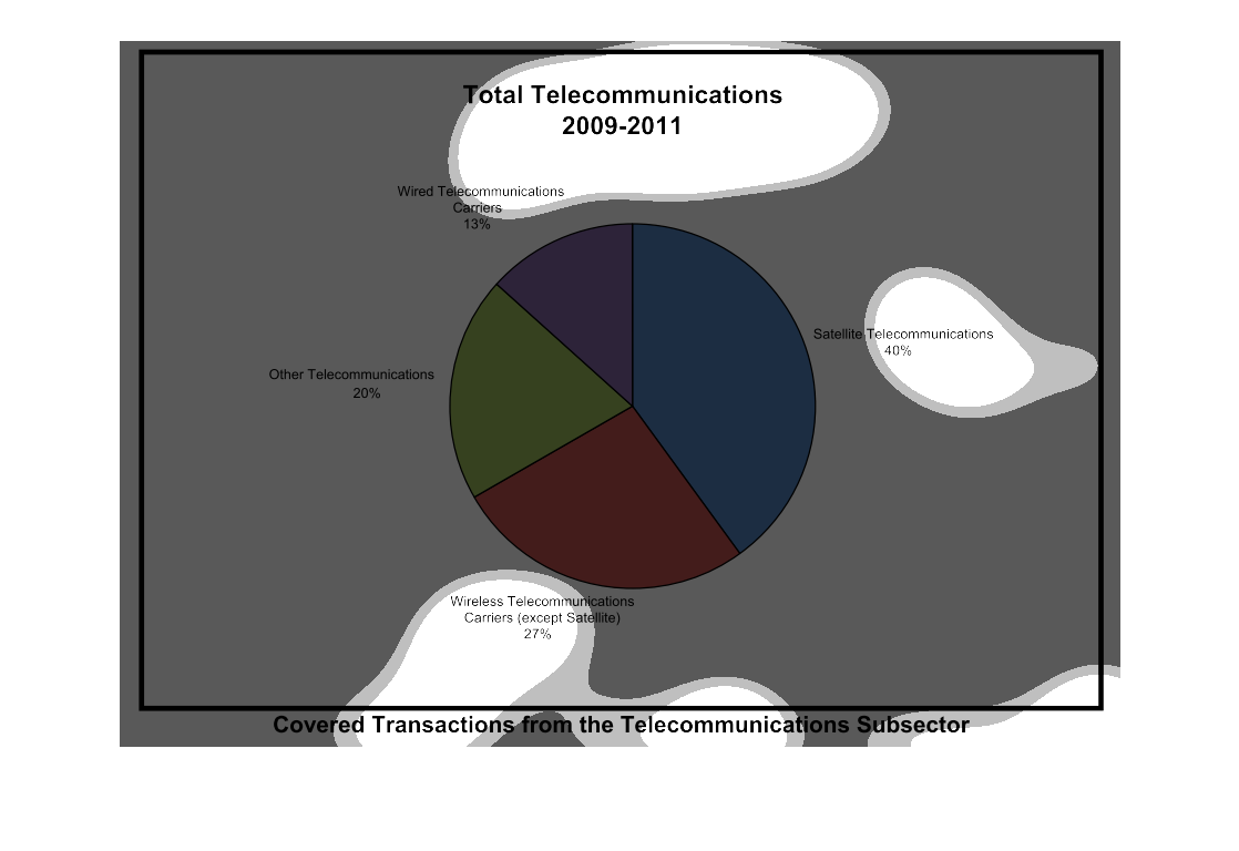
This is a pie chart showing telecommunications from 2009 to 2011. The largest part of the
pie is satellite telecommunications with 40%, while wireless takes up 27% and various other
methods at 20%.
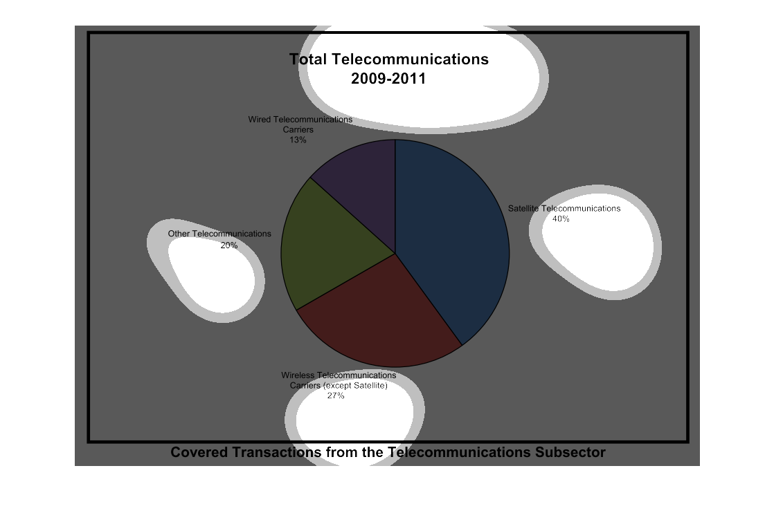
Shows difference type of Total Telecommunications from 2009 - 2011. Wired, Satellite, Wireless,
and Other Telecommunications. Satellite is now on the rise and is at the top with 40%
This chart shows the difference in the type of telecommunications broken down in a pie chart.
Currently satellite has the most amount of telecommunications
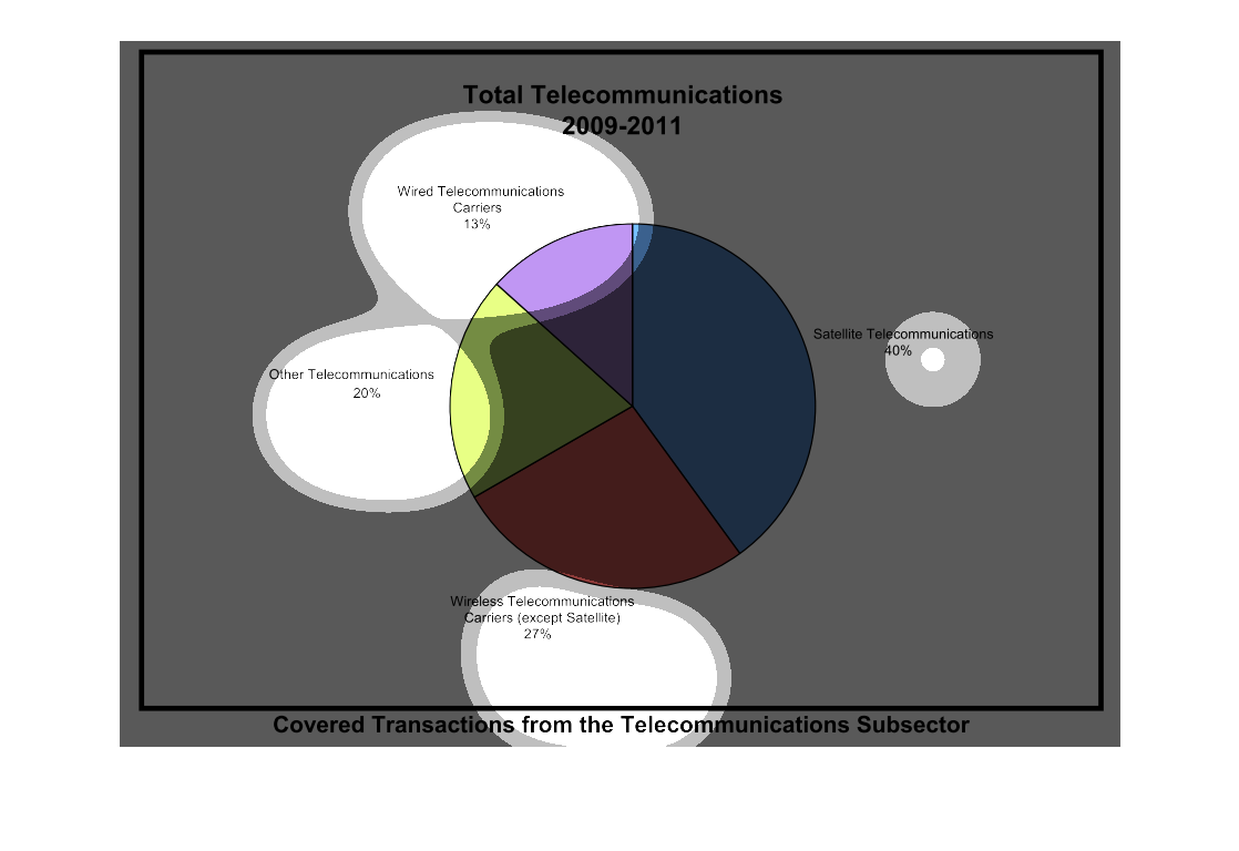
The image shows a pie chart that depicts telecommunications during the years of 2009 to 2011.The
groups involved are satellite telecommunications,wired/wireless telecommunications carriers,
and others
This chart describes total telecommunications from the years 2009 through 2011. Categories
on the chart include wired telecommunications carriers and satellite telecommunications.
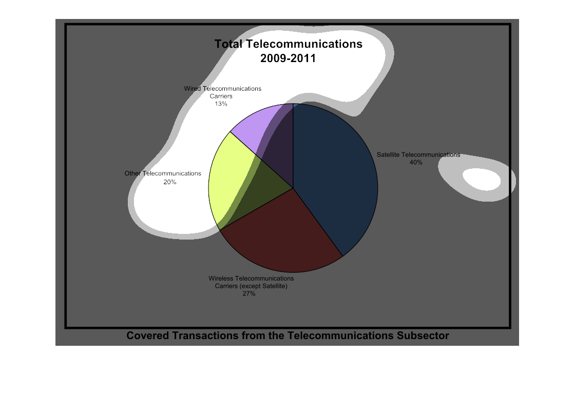
This circle graph shows the Total telecommunications for ht years of 2009-11. The percentage
for Wired Telecommunications Carriers is 13 percent. This chart was interesting.
this pie chart shows total telecommunications between 2009 and 2011. it lists wired, satellite,
wireless communicators and other types of communication with satellite communication being
the largest majority
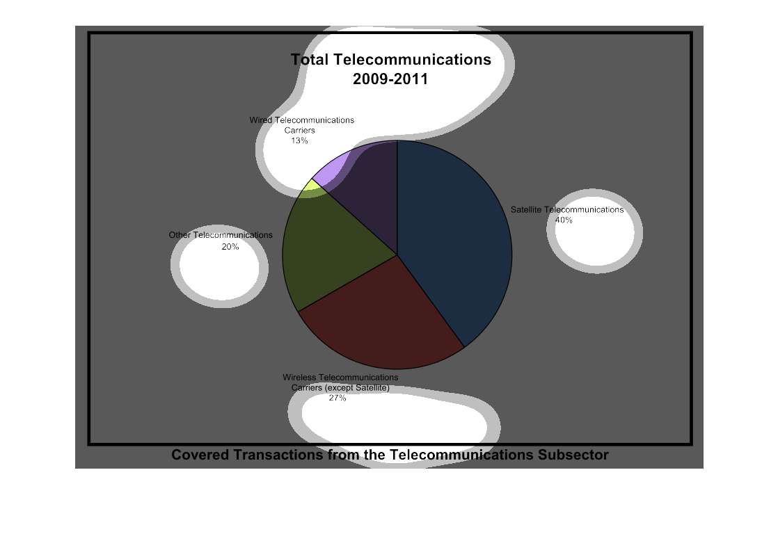
The graph on the left hand side is depicting a pie chart detailing the different types of
telecommunications during the years 2009-2011 and giving a percentage of the four types.
From this graph it is easy to show that Satellite telecommunications is the most popular with
an outstanding 40% of the entire telecommunications business.