Warning: Image is too big to fit on screen; displaying at 50%
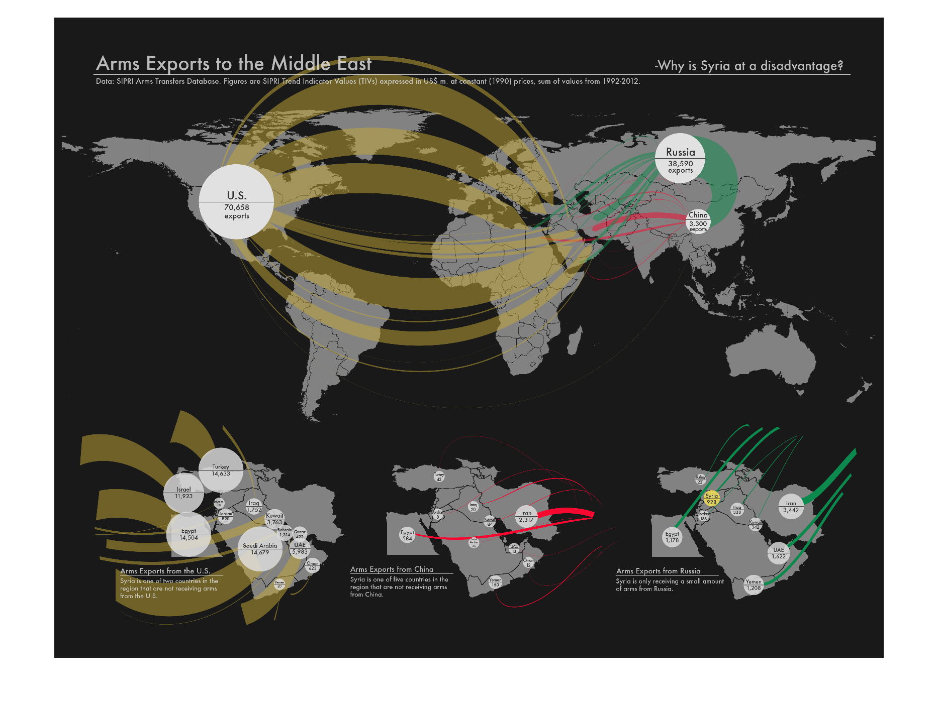
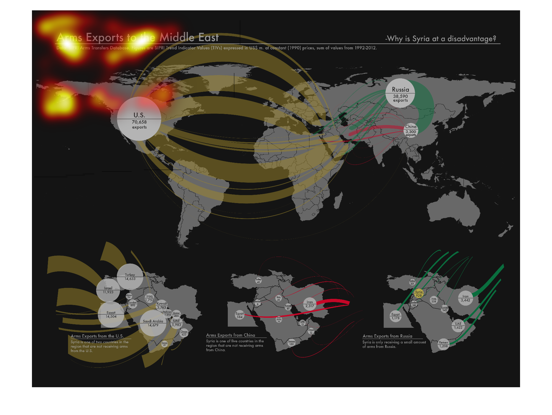
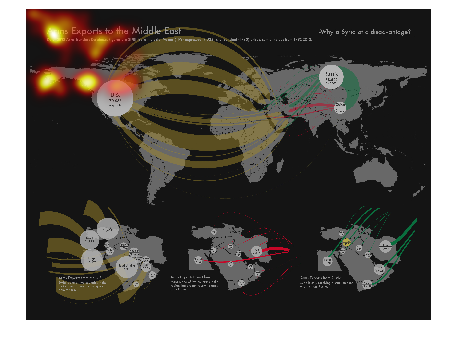
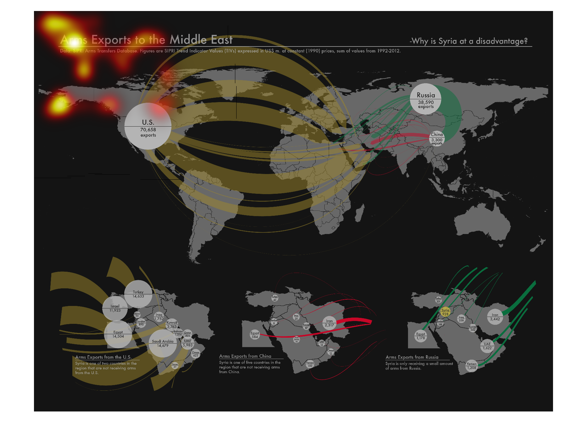
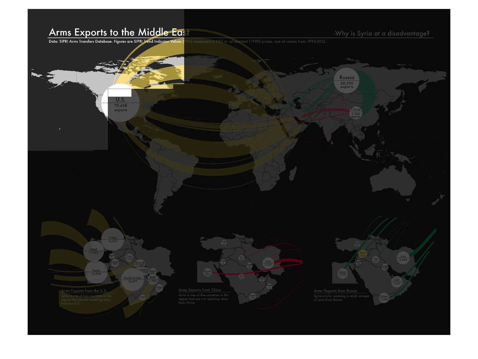
This image is entitled Arms Exports to the Middle East and poses the question "Why is Syria
at a disadvantage?"  It is a graphic with a black background, with white maps of countries
splayed across it.  There are swooping arcs of green, gold and red leading to small white
circles with fine black print inside of each of them, placed upon the countries on the maps.
 Unfortunately, the overall graphic and its text are so tiny that even when blown up to 400%,
they remain illegible.  I can make out the words U.S. and China, and what I believe is exports,
but that is all.
Warning: Image is too big to fit on screen; displaying at 50%
Warning: Image is too big to fit on screen; displaying at 50%
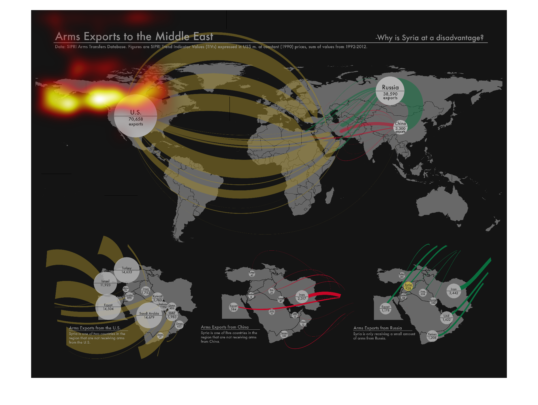
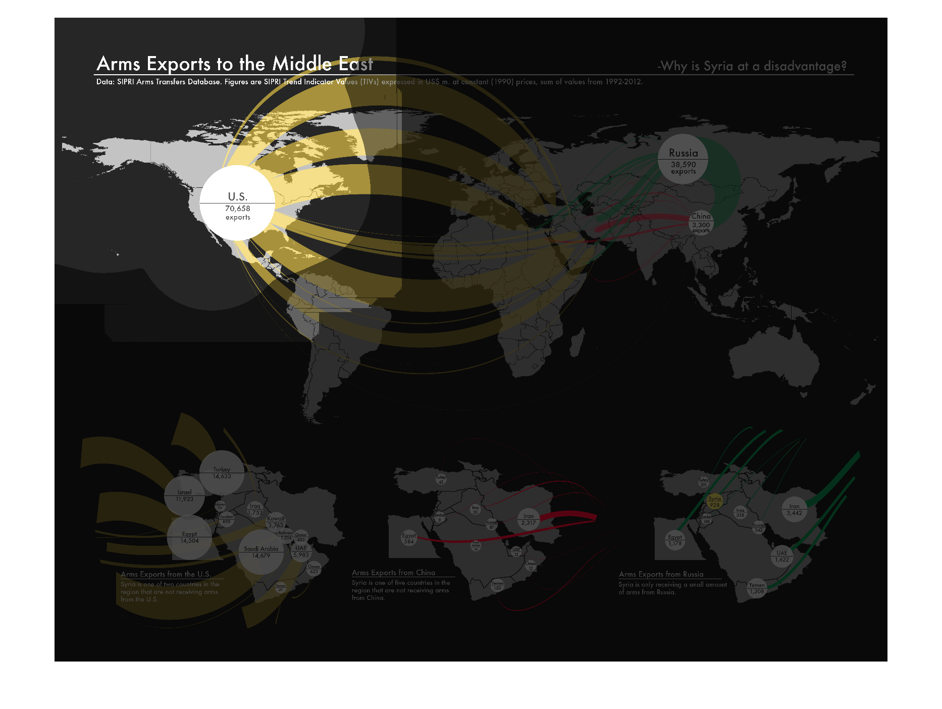
The graph shows how much Arms are Exported into the Middle East. A Picture Graph setup of
the world displayed the number of arms supplied to the Middle East from the United Sates,
Russia, China, and South America. The United States being the biggest suppliers of arms with
more than 70,000, followed by Russia with more than 30,000. China and South America follow.

Warning: Image is too big to fit on screen; displaying at 50%
Warning: Image is too big to fit on screen; displaying at 50%

The following shows the Arms imports from different countries into the middle east. The united
states and Russia had huge imports of Arms into these countries.
Warning: Image is too big to fit on screen; displaying at 50%
Warning: Image is too big to fit on screen; displaying at 50%
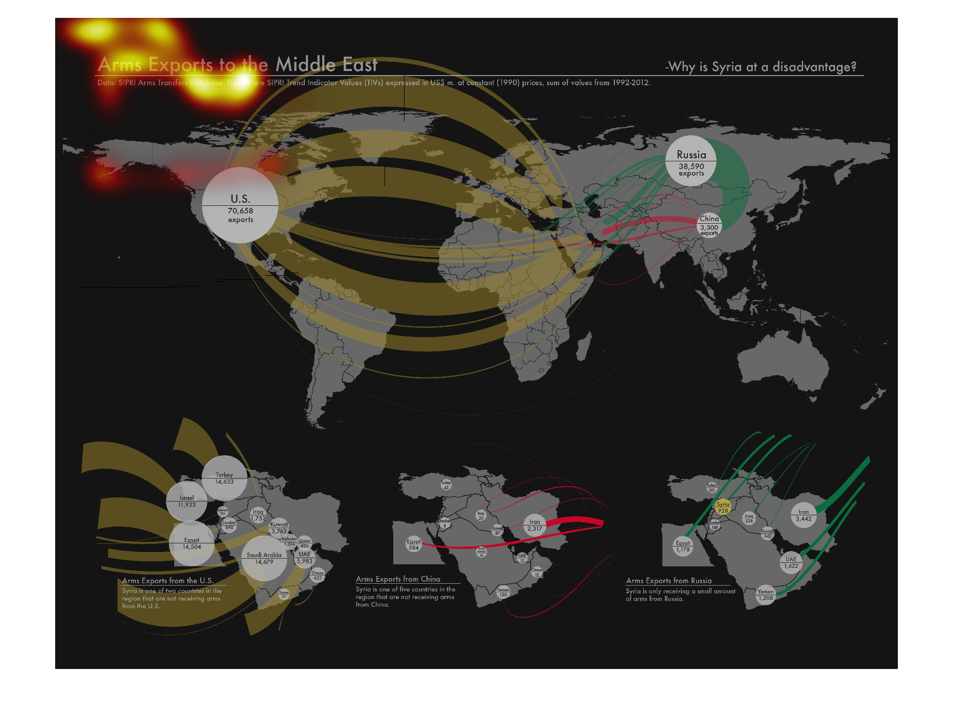
This is a graph of the world that shows Arm Exports to the Middle East.  There are numbers
reported for the United States, Russia and several countries within the Middle Eat.
Warning: Image is too big to fit on screen; displaying at 50%
Warning: Image is too big to fit on screen; displaying at 50%

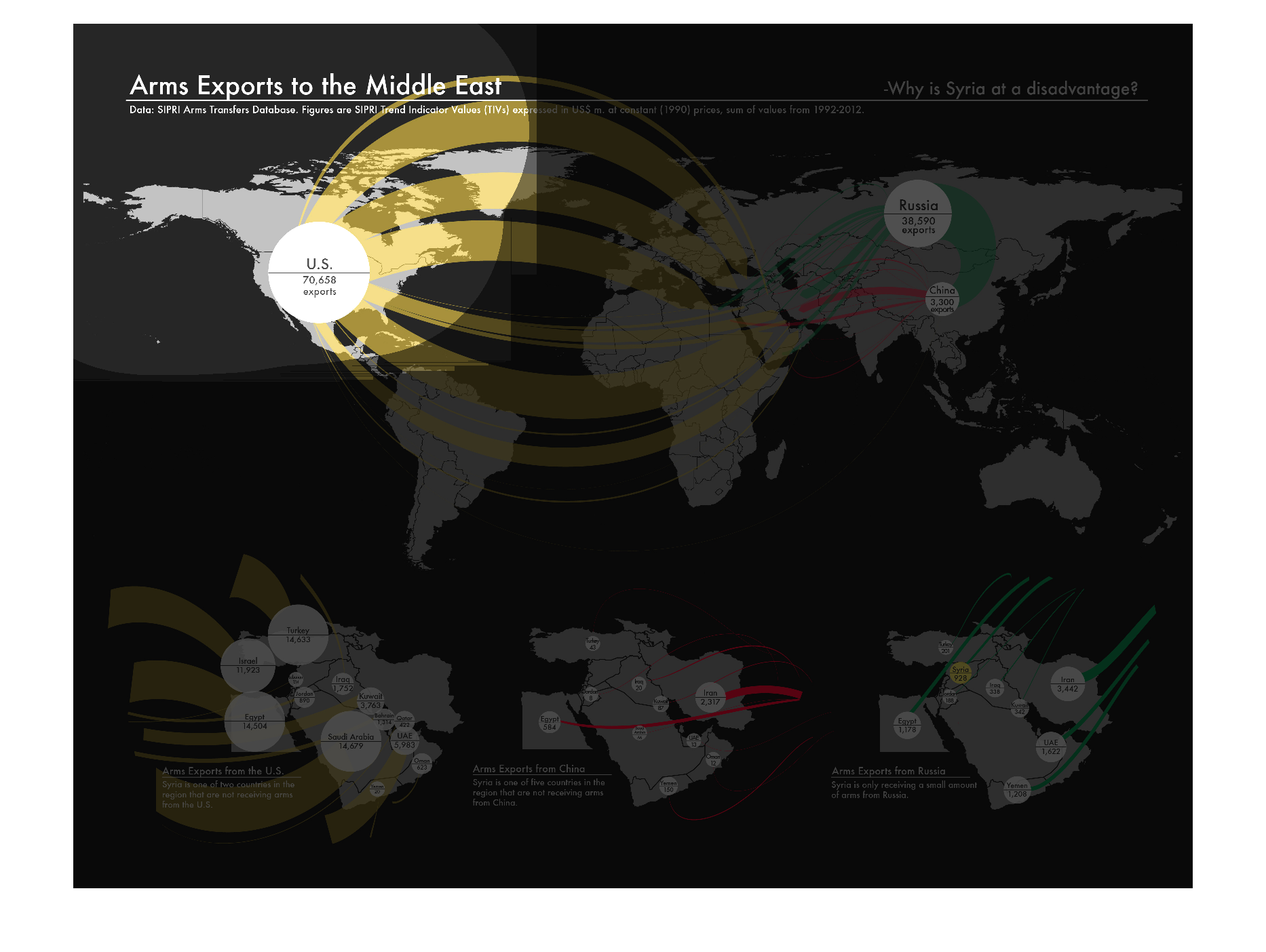
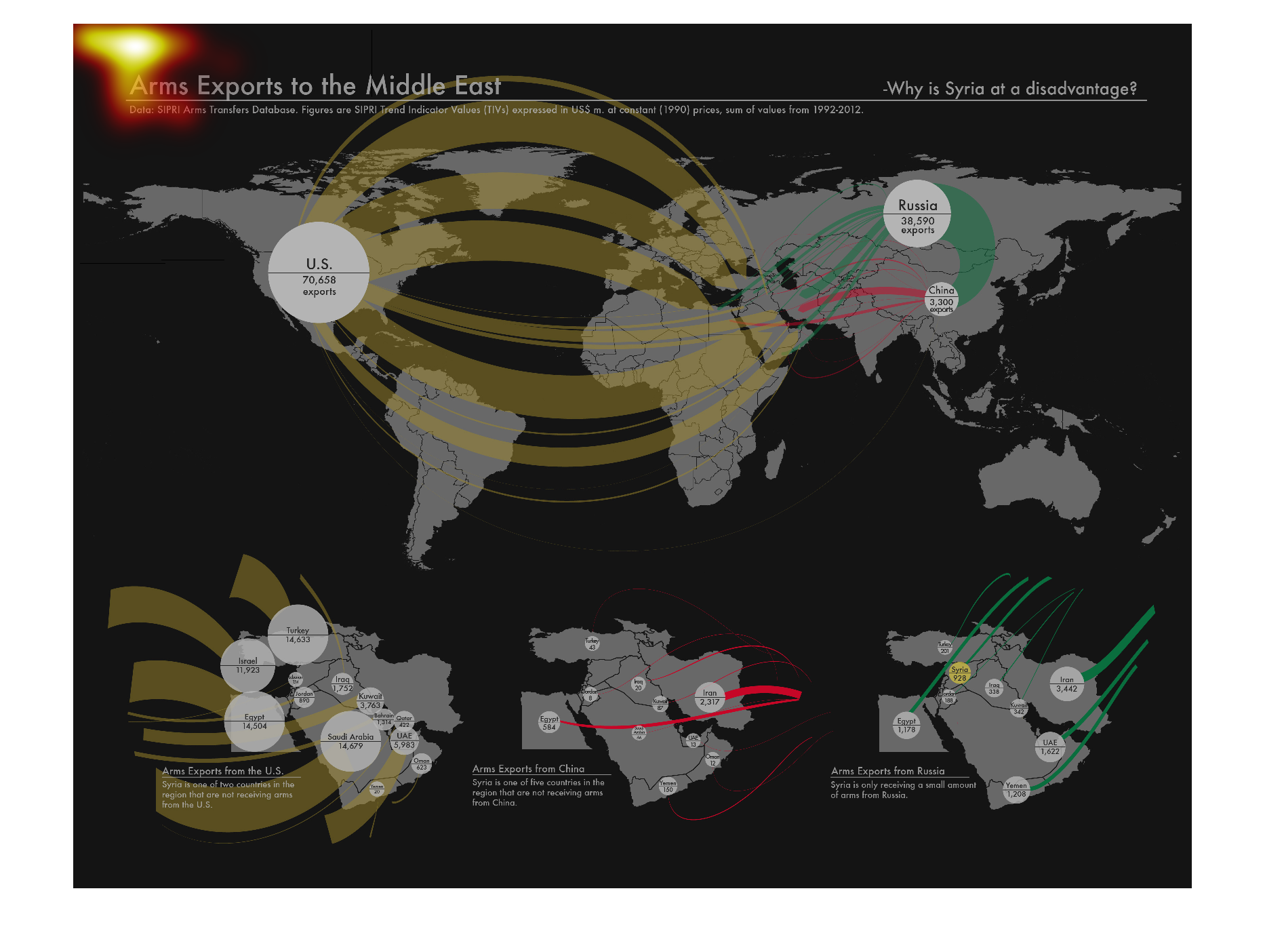
The image on the left hand side depicts each countries exports to the middle east.  Specifically
it give three zommed in locations of the middle east to make it absolutely clear where the
exports are delivered.  The United States a big export to the Middle East sees a fare chunk
of their exports land in Saudi Arabia.
Warning: Image is too big to fit on screen; displaying at 50%
Warning: Image is too big to fit on screen; displaying at 50%
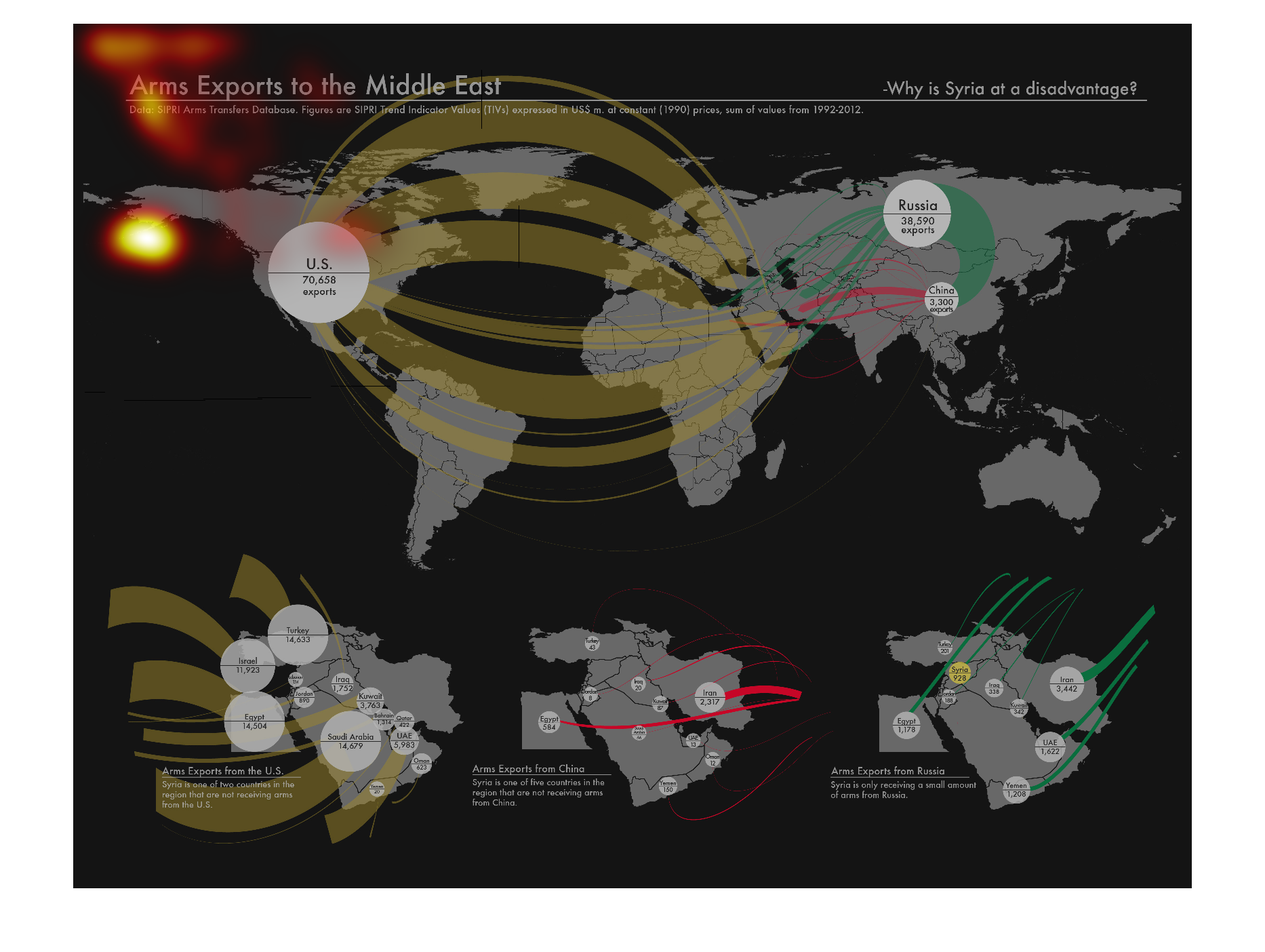
This depicts arms exports to the middle east. The United states, Russia and China seem to
be the countries with the most exports. Syria is at a disadvantage.
Warning: Image is too big to fit on screen; displaying at 50%
Warning: Image is too big to fit on screen; displaying at 50%
This chart describes arms exports to the Middle East. Categories on the chart include the
United States, Russia, and a number of other countries all over the world.
Warning: Image is too big to fit on screen; displaying at 50%
Warning: Image is too big to fit on screen; displaying at 50%

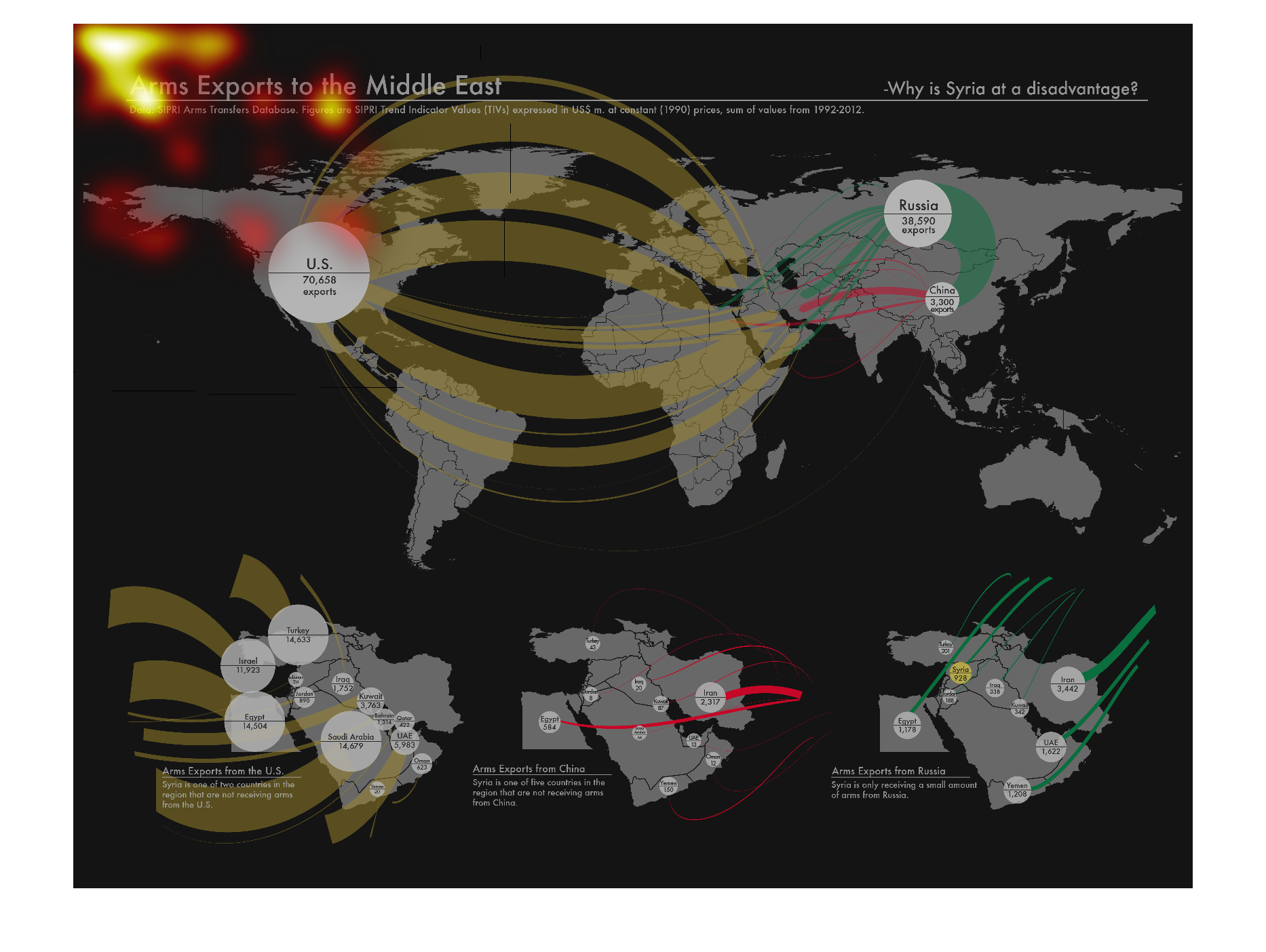
This chart is a representation of arms exports to the Middle East.  A map of the world is
displayed and different countries are highlighted to show the amount of arms they have given.
Warning: Image is too big to fit on screen; displaying at 50%
Warning: Image is too big to fit on screen; displaying at 50%
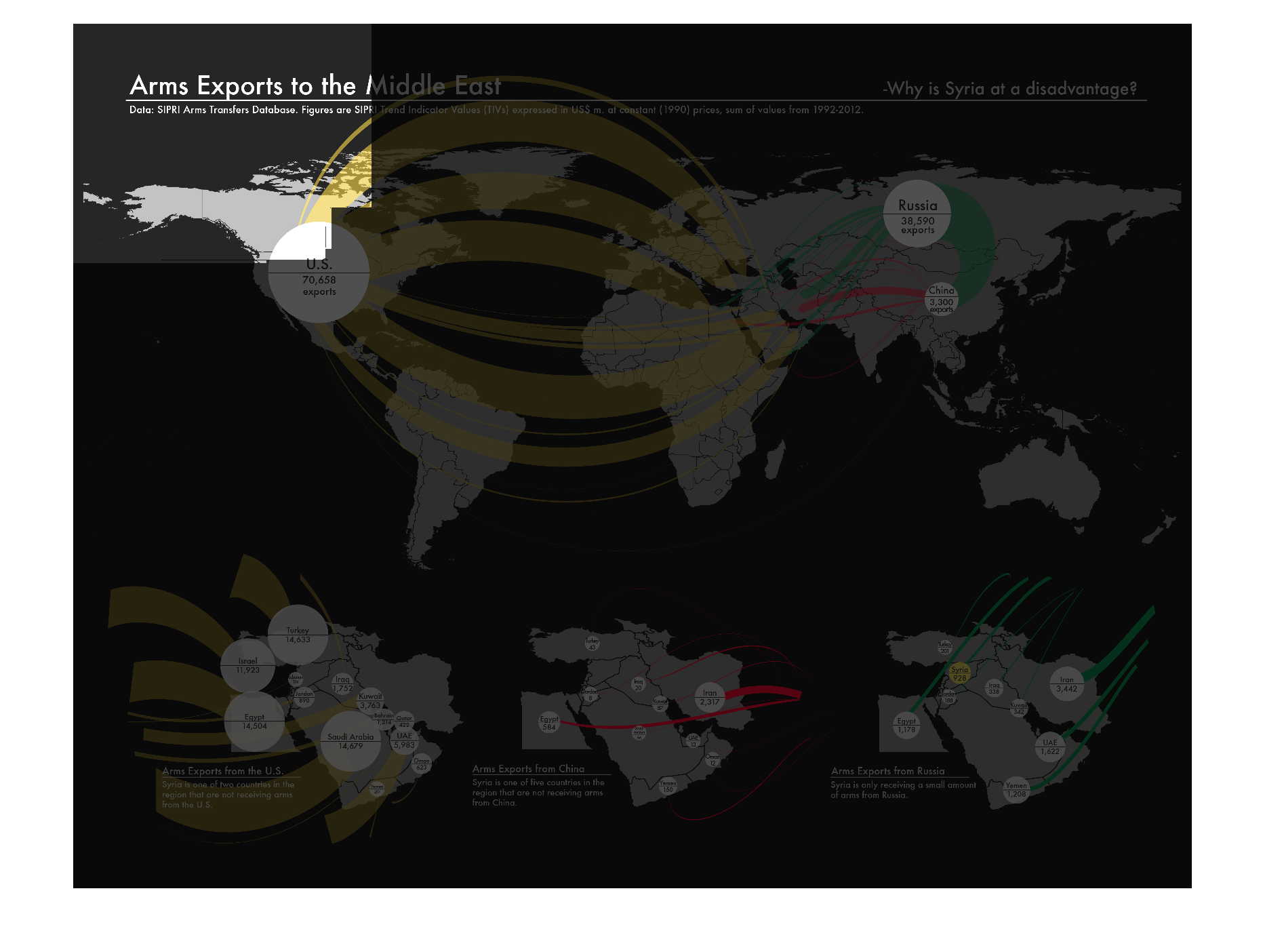
This image describes arms exports to the middle east and attempts to explain why Syria is
at a disadvantage. Tan or yellow indicates arms moving from North and South America and the
thickness of the band indicates quantity.
Warning: Image is too big to fit on screen; displaying at 50%
Warning: Image is too big to fit on screen; displaying at 50%

The image depicts arms exports to the middle east, showing a map of the world and individual
countries contribution to arms exports. The US and Russia appear to have high export numbers,
with other countries trailing behind.
Warning: Image is too big to fit on screen; displaying at 50%
Warning: Image is too big to fit on screen; displaying at 50%
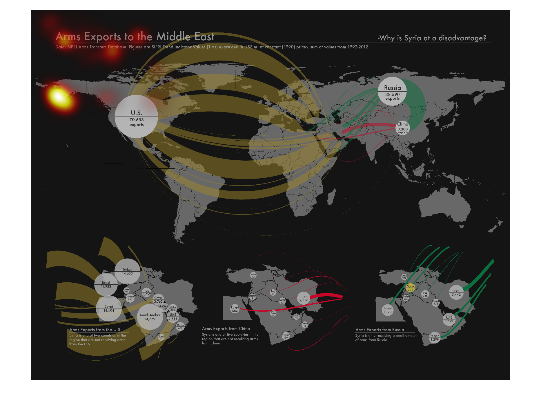
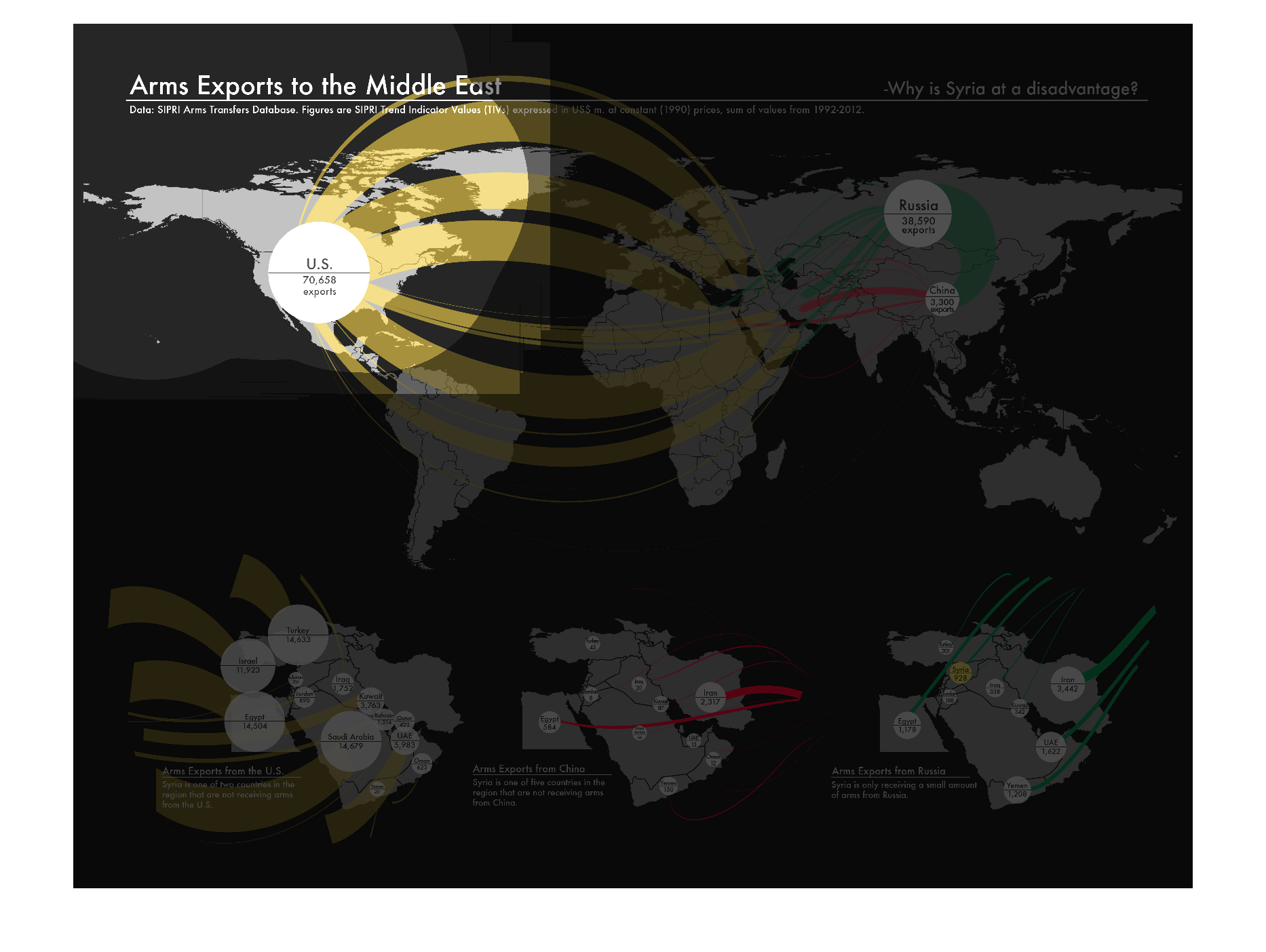
This graph shows arms export to the Middle East from Asia, the U.S., and Russia, Europe. .
It aims to answer the question, "Why is Syria at a disadvantage?" Of these large areas, China
has contributed the least, and the U.S. has contributed the most. Various countries in Europe
have contributed thousands of arms.
Warning: Image is too big to fit on screen; displaying at 50%
Warning: Image is too big to fit on screen; displaying at 50%
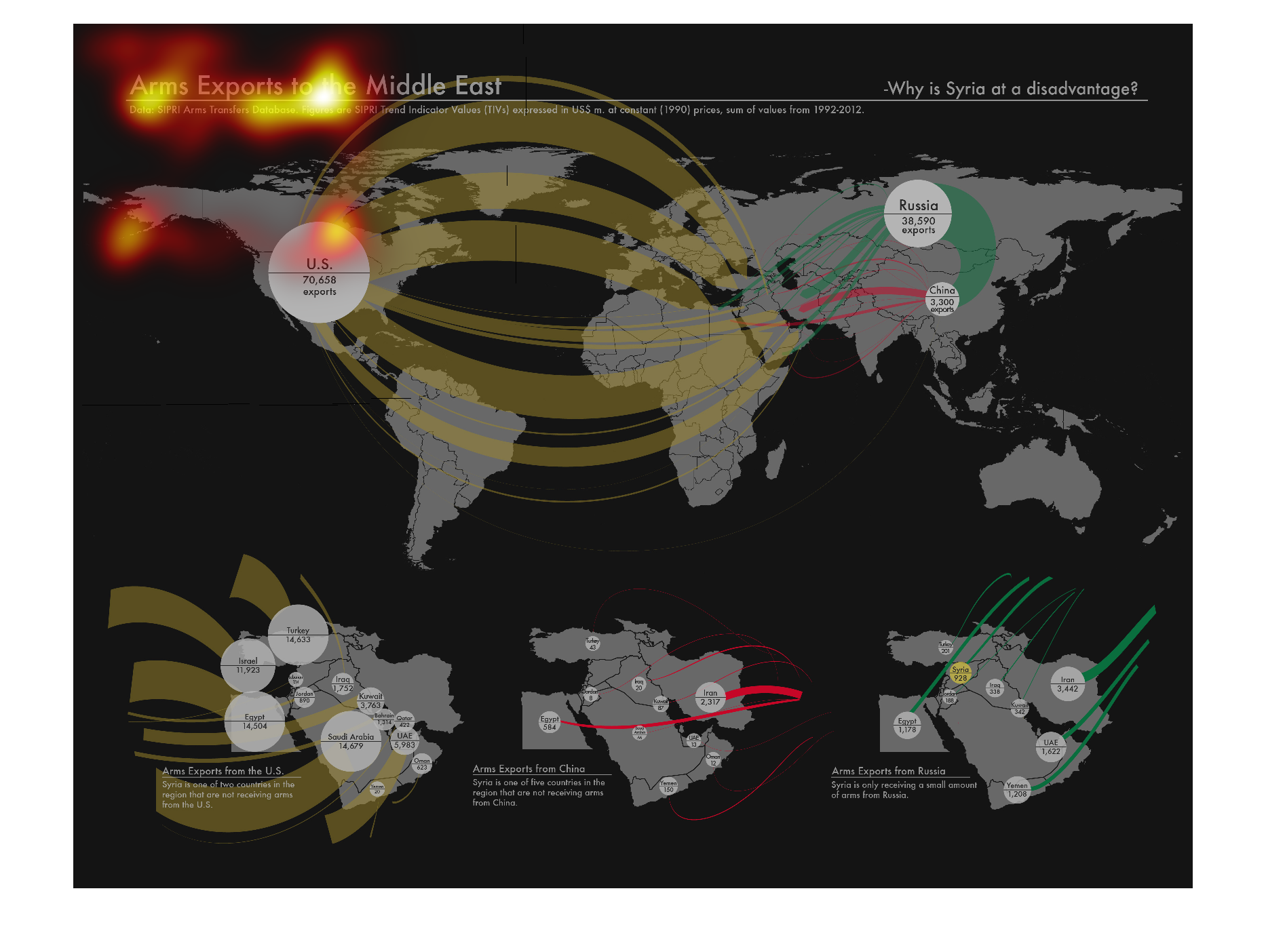
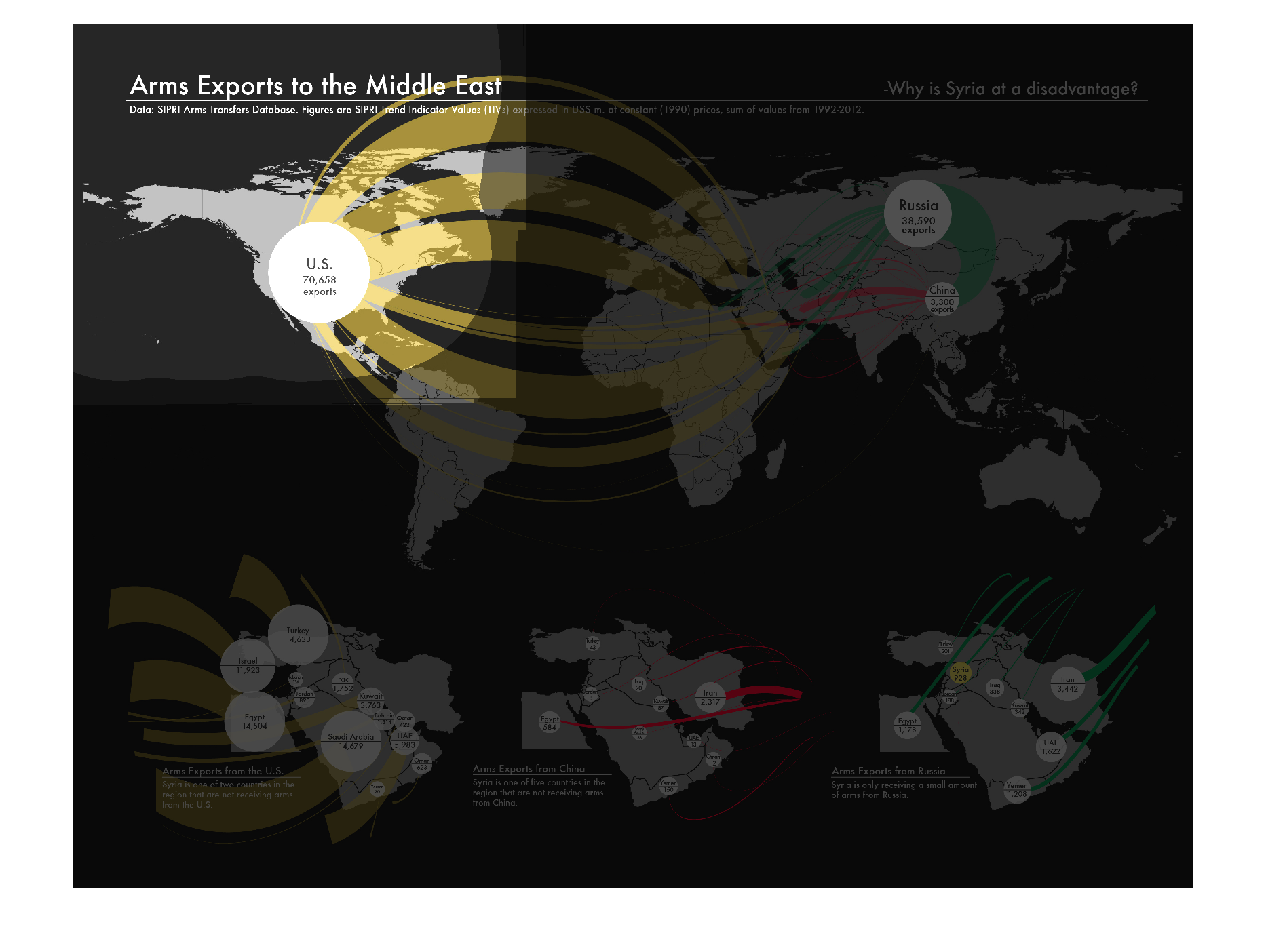
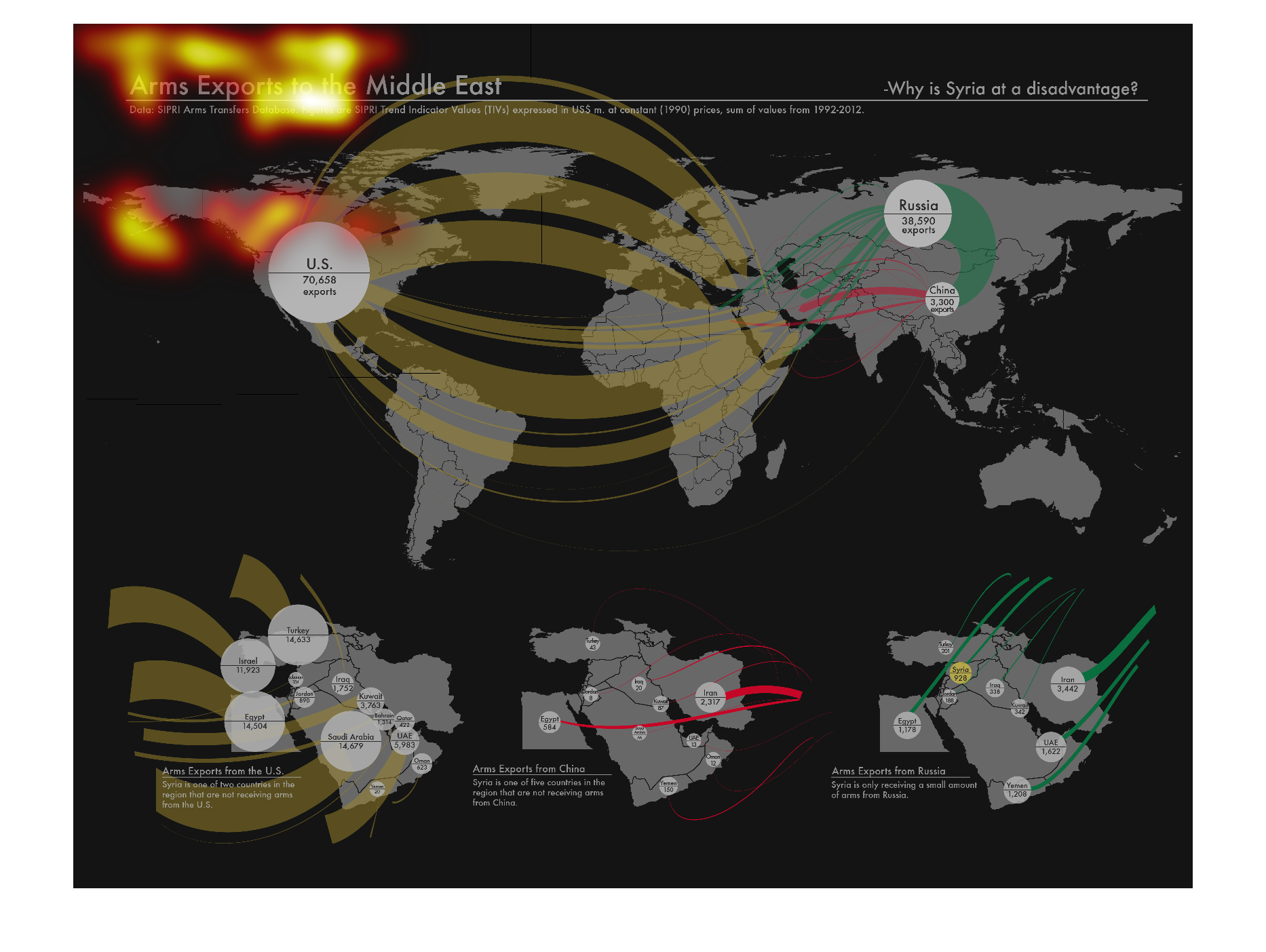
This shows where exports of weapons to the Middle East originate from. The more they supply,
the thicker the line. While most areas do not supply, the vast majority comes from the US.
Warning: Image is too big to fit on screen; displaying at 50%
Warning: Image is too big to fit on screen; displaying at 50%
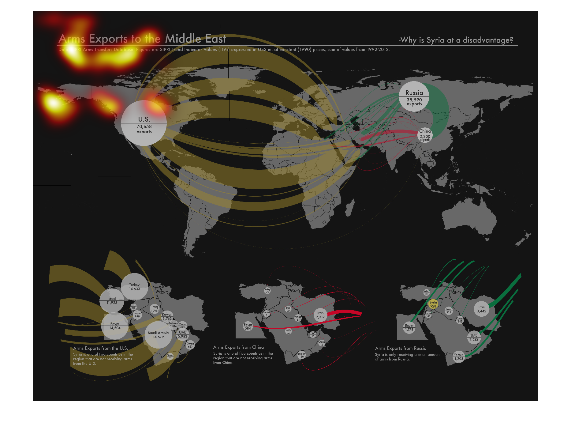
This map shows the origination points and recipient points for arms exports to the Middle
East. It uses different colors, though it is unclear why those different colors are used.
Warning: Image is too big to fit on screen; displaying at 50%
Warning: Image is too big to fit on screen; displaying at 50%

This is a world map indicating arms exports to the Middle Eastern countries.  It indicates
the number of arms being exported from what countries and their trajectory to the Middle East.
Warning: Image is too big to fit on screen; displaying at 50%
Warning: Image is too big to fit on screen; displaying at 50%
War, what is it good for? Absolutely nothing! This illustration showcases America creating
its own problems by selling the majority of the world's guns, which then are used against
us during armed military conflicts, particularly in the middle east campaigns.
Warning: Image is too big to fit on screen; displaying at 50%
Warning: Image is too big to fit on screen; displaying at 50%