Warning: Image is too big to fit on screen; displaying at 67%
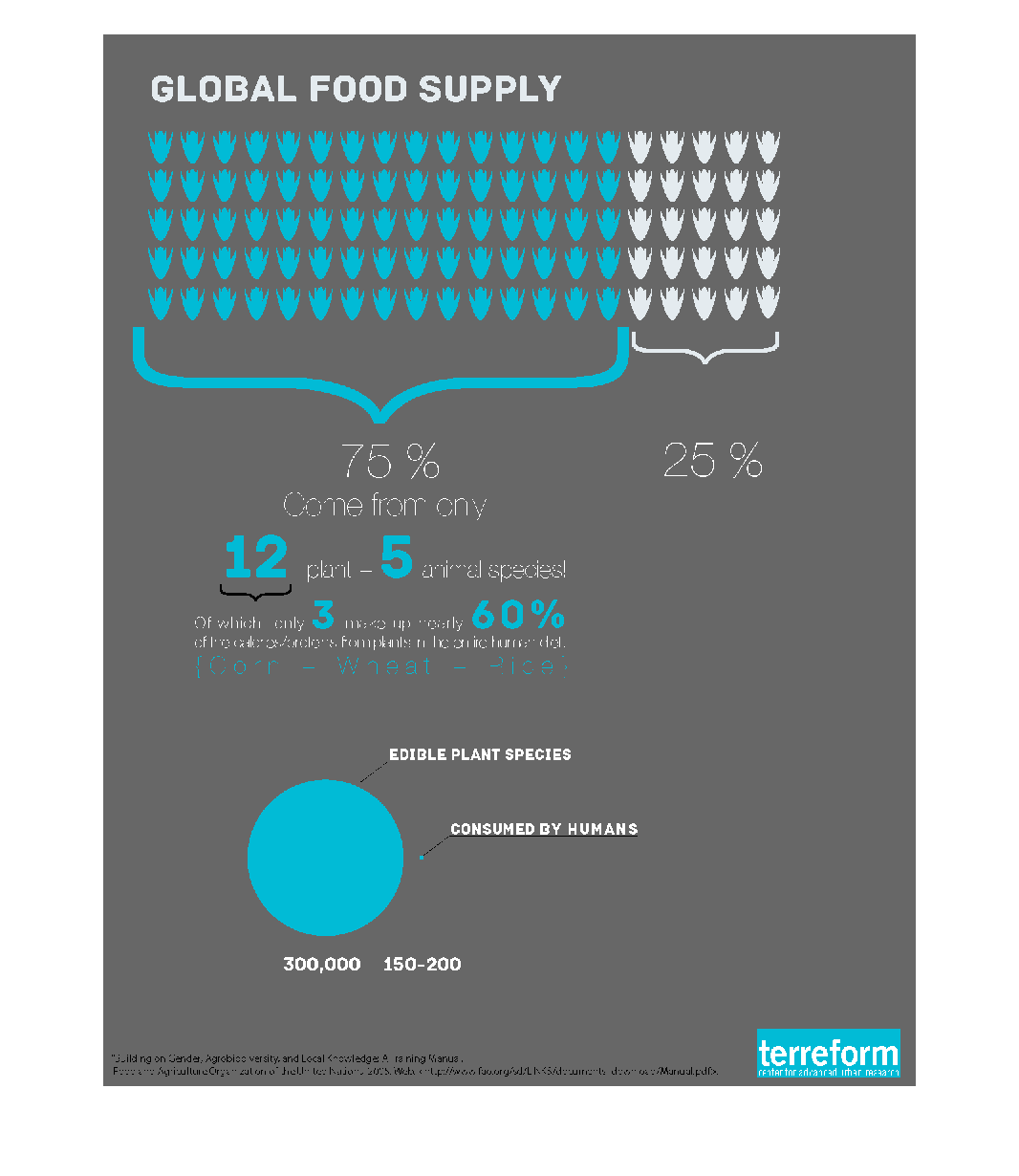
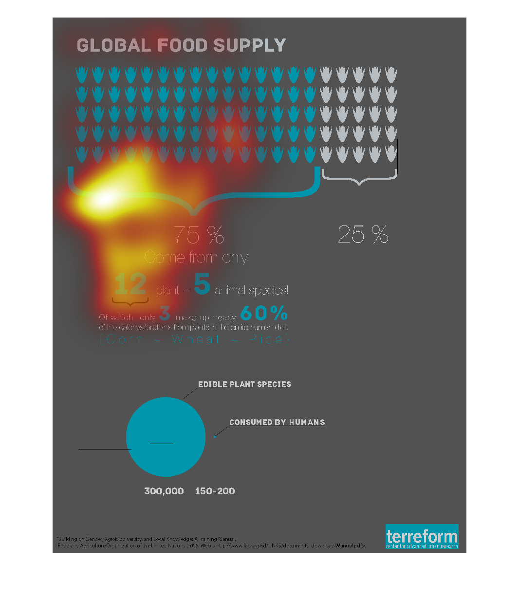
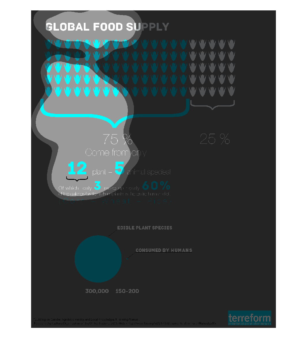
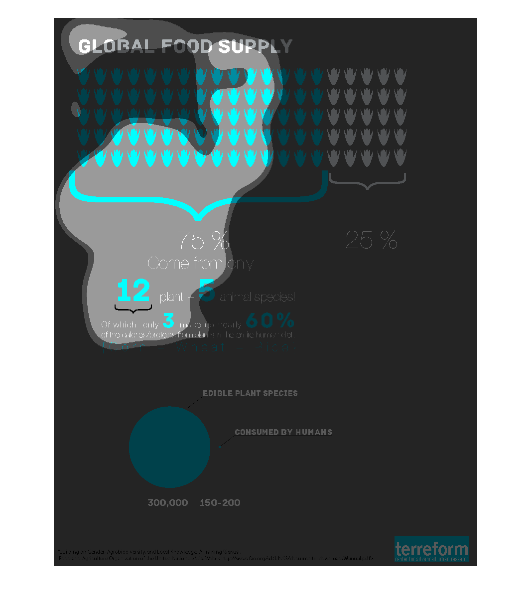
This graphic shows that roughly 75% of the global food supply comes from only 12 plant species
and 5 animal species. There are about 300,000 plant species that are edible, but humans only
consume 150-200.
Warning: Image is too big to fit on screen; displaying at 67%
Warning: Image is too big to fit on screen; displaying at 67%
The name of this graph is called the global food supply and it shows how much food is around
the world and who has what and need what the circle graph shows what was cinsumed by humans.
Warning: Image is too big to fit on screen; displaying at 67%
Warning: Image is too big to fit on screen; displaying at 67%
This is a graphic about global food production. 75% of the food humans eat comes primarily
from corn, wheat or rice. All in all, we eat primarily only 12 plant species and 5 animal
species.
Warning: Image is too big to fit on screen; displaying at 67%
Warning: Image is too big to fit on screen; displaying at 67%
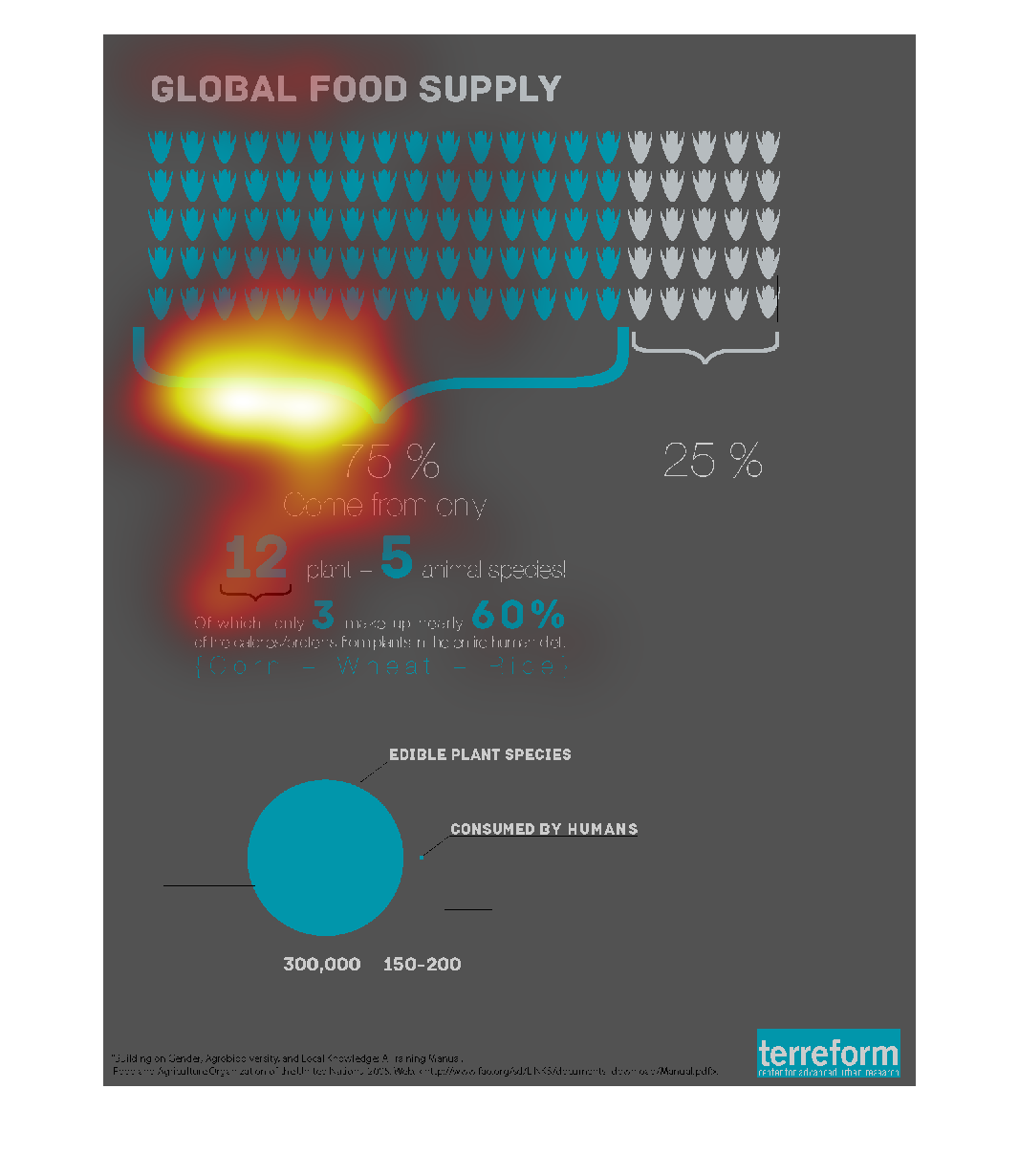
This chart appears to measure certain food to show the calery count each item . It is hard
to tell what type of food the are measuring without a key for reference
Warning: Image is too big to fit on screen; displaying at 67%
Warning: Image is too big to fit on screen; displaying at 67%
The graph to the left is describing that 75 percent of the world consumption is made up of
12 plants and 5 animal species.  For example a cow and pig under the animal species as an
example.  The other 25 percent of the world consumption comes from other types of plants and
animals.
Warning: Image is too big to fit on screen; displaying at 67%
Warning: Image is too big to fit on screen; displaying at 67%
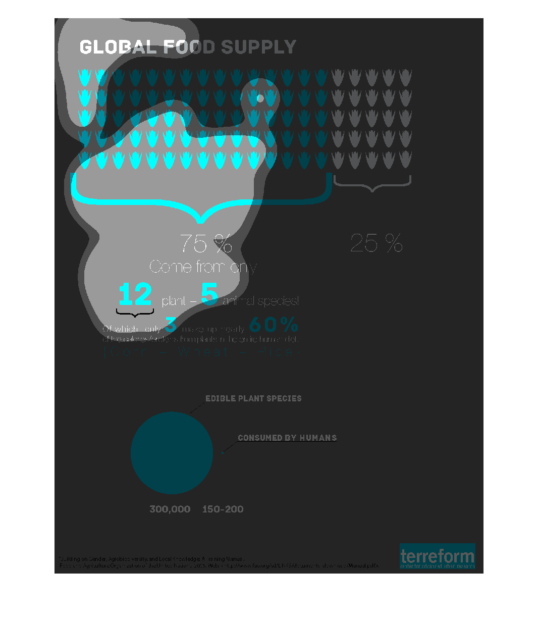
The chart is about Global Food Supply. 75 percent come from 5 animal species and 12 plant
species of which only 3 make up 60 percent. It talks about the edible plant species that humans
consume. 25 percent arent used for consumption. This study was done by terreform.
Warning: Image is too big to fit on screen; displaying at 67%
Warning: Image is too big to fit on screen; displaying at 67%
This infographic shows information regarding the global food supply and where most citizens
of the world derive their food from (what types of food they consume, for example: animals,
grains, etc.) as well as the amount of these types of foods that are consumed by human beings
on the planet Earth.
Warning: Image is too big to fit on screen; displaying at 67%
Warning: Image is too big to fit on screen; displaying at 67%
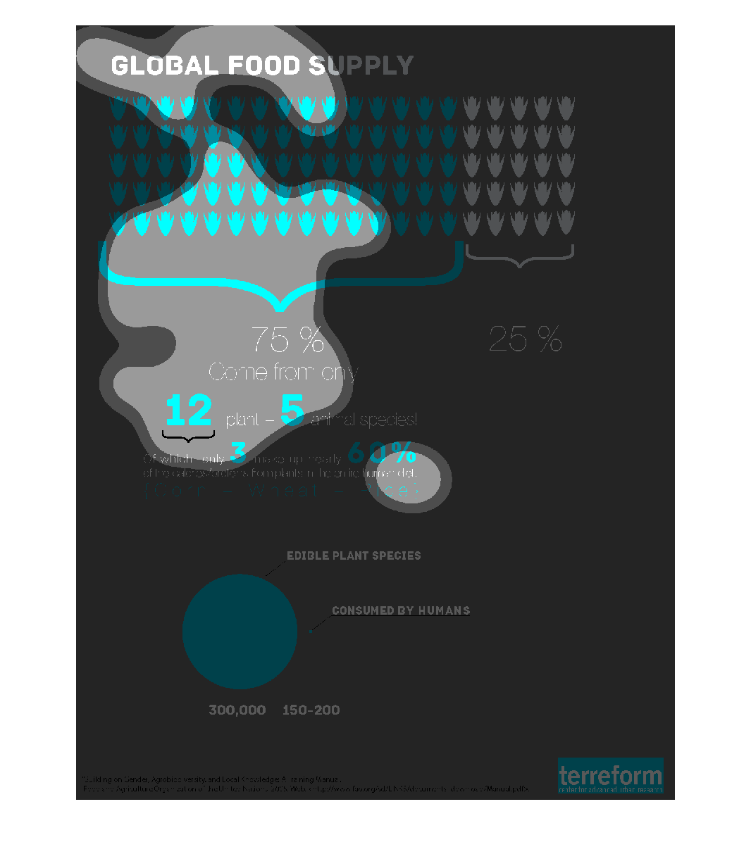
Information diagram about the global food supply.  The illustration points out that 75% of
the global food supply comes from just 12 plant and 5 animal species. Of the plants, only
3 make up nearly 60% of human calorie/protein intake (corn, wheat, rice). There is a 300,000
to 150-200 ratio between edible plant species and plants that are consumed by humans.
Warning: Image is too big to fit on screen; displaying at 67%
Warning: Image is too big to fit on screen; displaying at 67%
The genetic engineering of food products like corn has been going on for decades and only
recently has the public started to ask questions about the repercussions of such actions.
This chart illustrates the point perfectly.
Warning: Image is too big to fit on screen; displaying at 67%
Warning: Image is too big to fit on screen; displaying at 67%
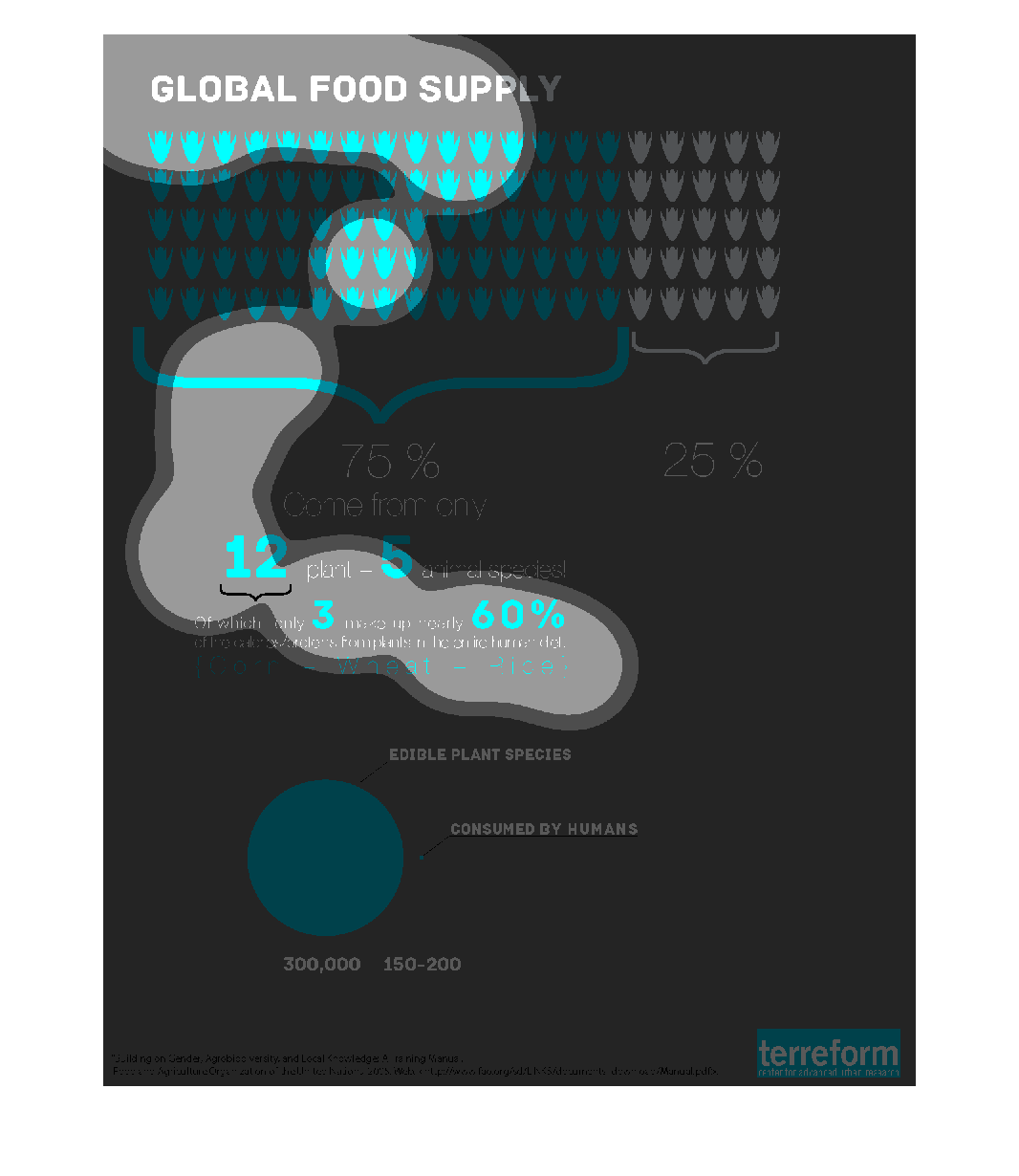
The following chart gives information on the global food supply with Human consumption being
by and far the largest consumer of all the worlds food supply.
Warning: Image is too big to fit on screen; displaying at 67%
Warning: Image is too big to fit on screen; displaying at 67%
This chart describes the global food supply. With seventy-five percent of that food supply
coming from plant and animal species to food the world's population.
Warning: Image is too big to fit on screen; displaying at 67%
Warning: Image is too big to fit on screen; displaying at 67%
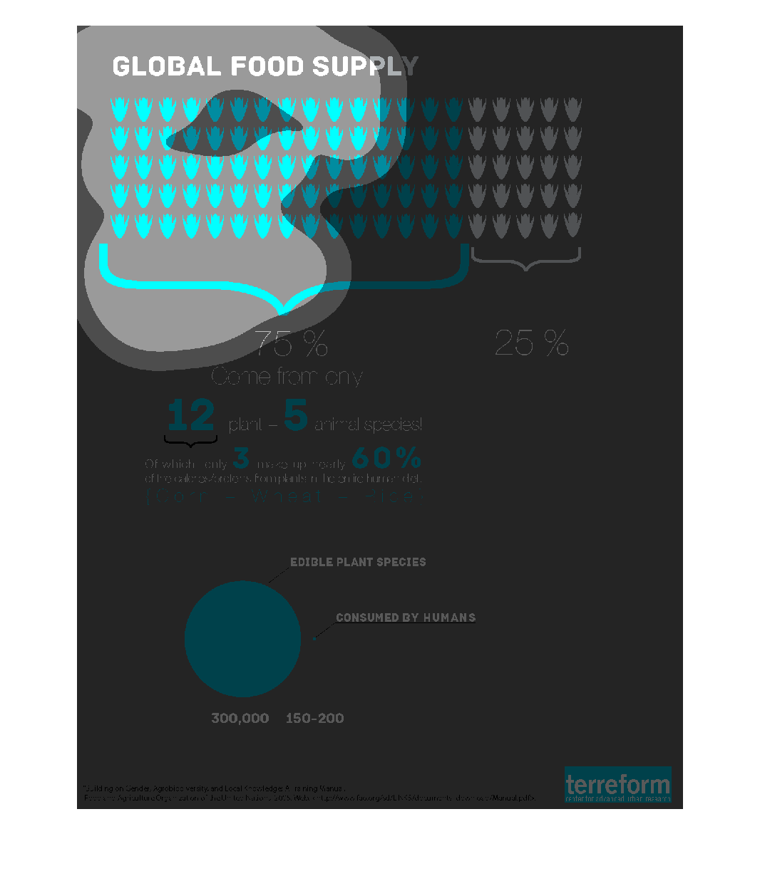
This graph illustrates the sources of the global food supply, where they come from, and what
percentages are edible compares to what is actually consumed by humans.
Warning: Image is too big to fit on screen; displaying at 67%
Warning: Image is too big to fit on screen; displaying at 67%
The image depicts the global food supply, citing specific plant species eaten by man versus
edible plant species not eaten by man. Focuses on corn, wheat and rice as primary consumed
foods across the planet.
Warning: Image is too big to fit on screen; displaying at 67%
Warning: Image is too big to fit on screen; displaying at 67%
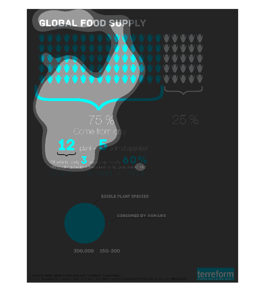
This chart is showing data for the global food supply. It shows that corn, wheat and rice
make up 60% of the humans diet. On this planted there are 300,000 edible plant species and
in comparison the human population would only consume 150-200 of that.
Warning: Image is too big to fit on screen; displaying at 67%
Warning: Image is too big to fit on screen; displaying at 67%
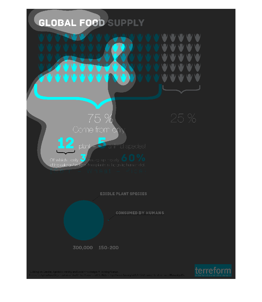
The top portion of the chart breaks down the food supply into two components.  On the left,
in blue, 75% comes from only 12 plants and 5 animal species (the remaining 25% is represented
by white. Of which, only 3% make up 60% of the proteins needed by the human diet.  The bottom
chart shows that there are 300k plant species; 150-200 are consumed by humans.
Warning: Image is too big to fit on screen; displaying at 67%
Warning: Image is too big to fit on screen; displaying at 67%