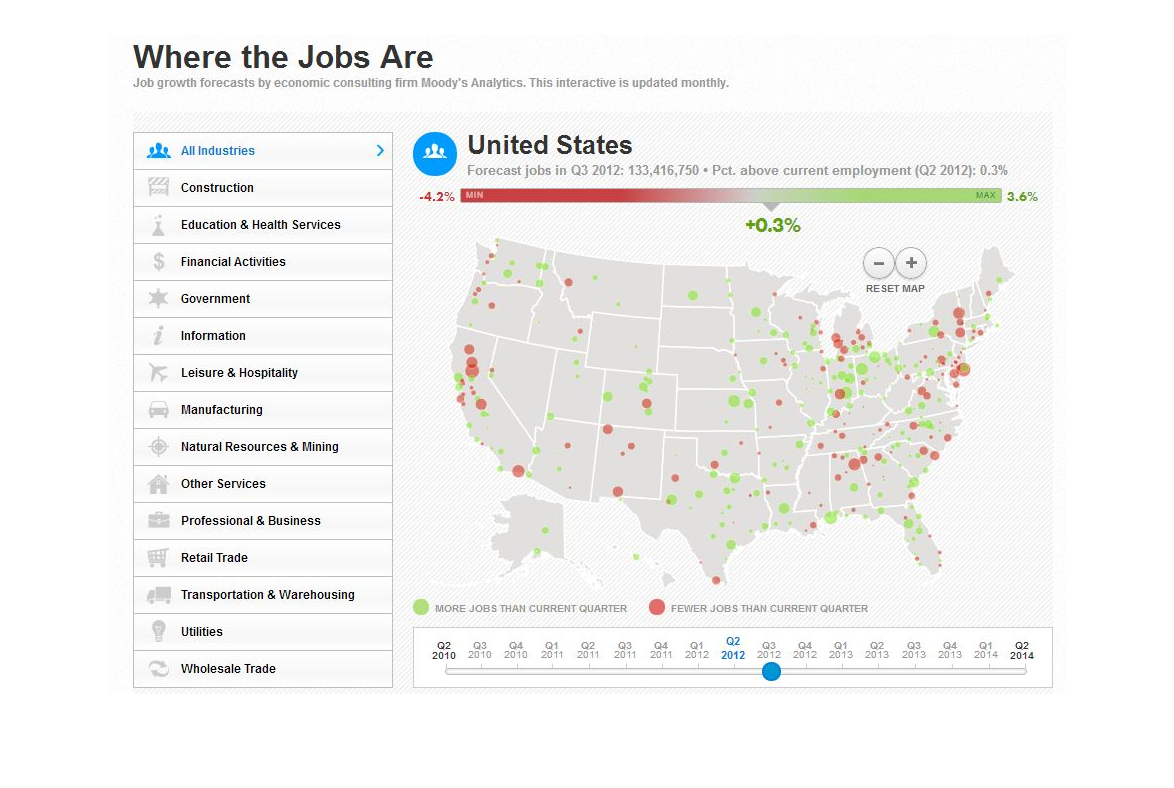
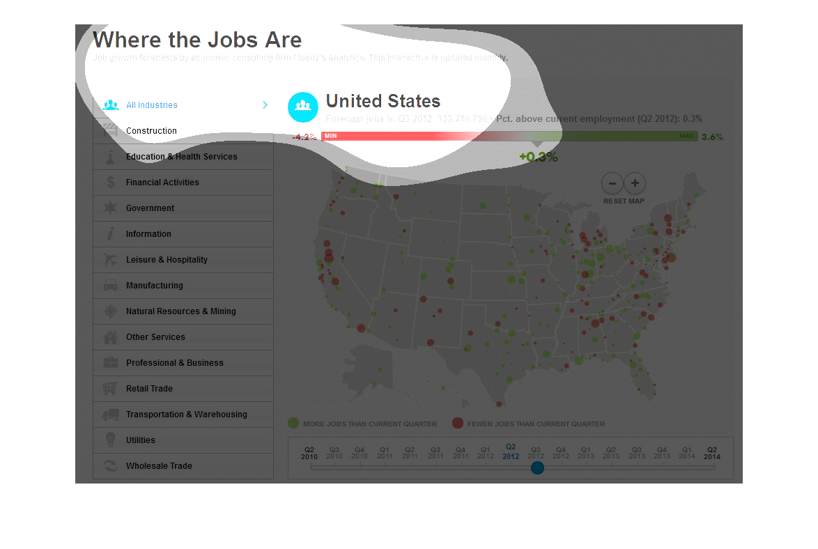
This is a graph illustrating where the jobs are and shows a map of the Unites States.  It
has graphics that display the different sectors of jobs that exist and where they are available
in the US.
This image gives us the forecast for job growth and decline in the United States for many
different industries. It breaks up the data in quarters in the year 2012.
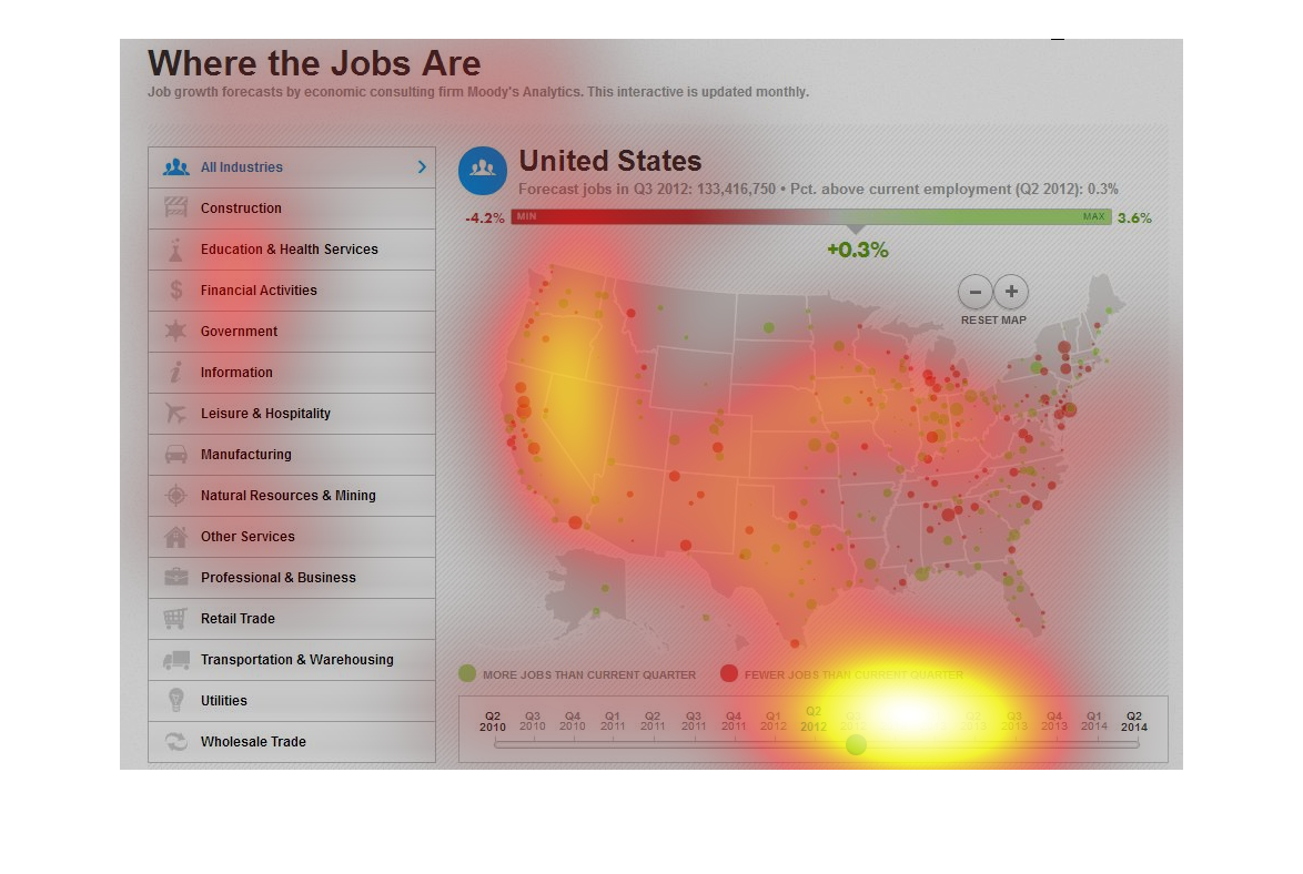
where the jobs are untied states map infographic, most jobs are in new england, the northern
mid west and the southern west coast. Other jobs are scattered throughout the united states.
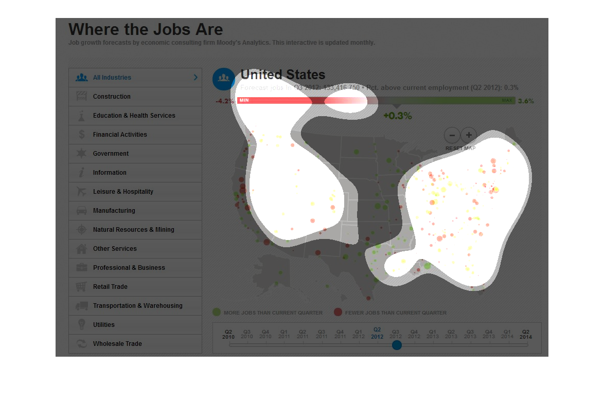
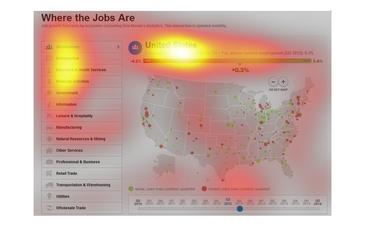
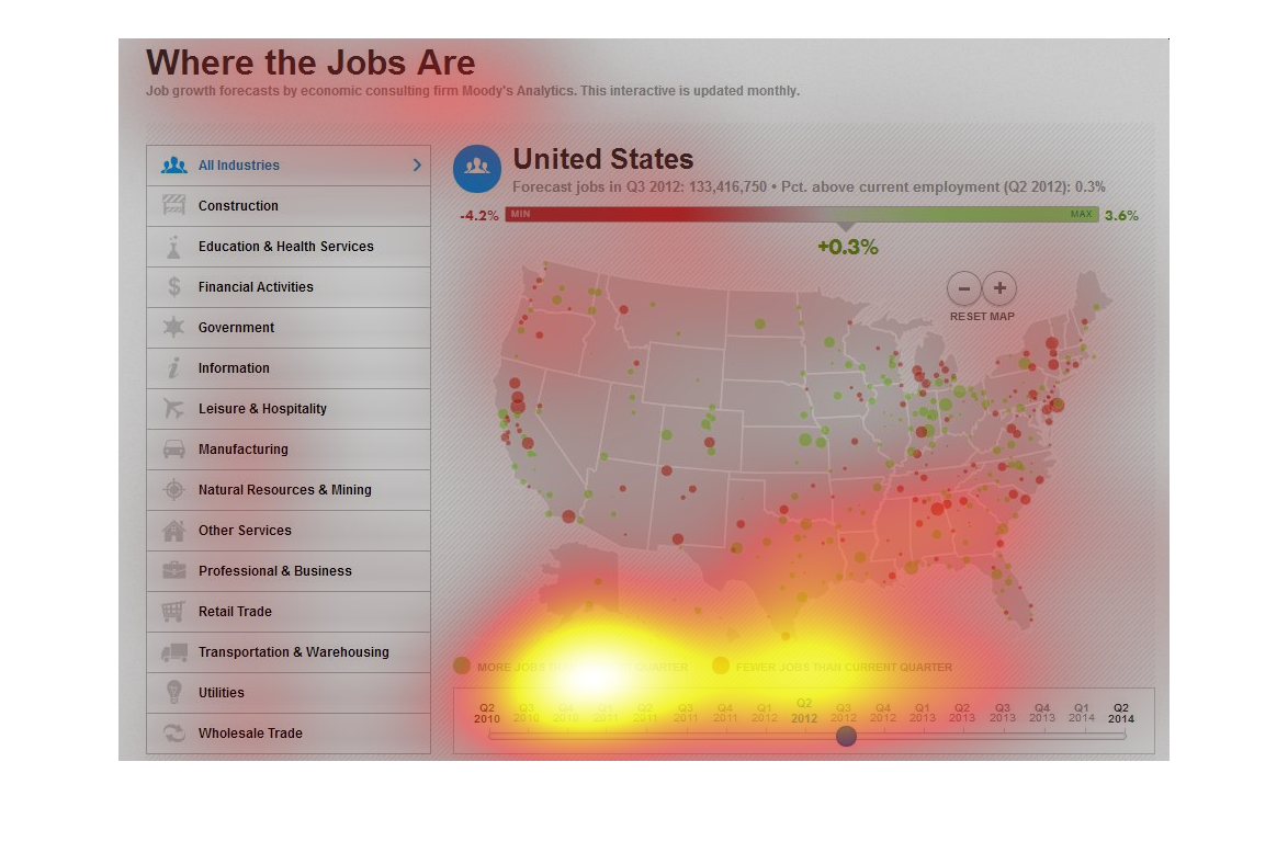
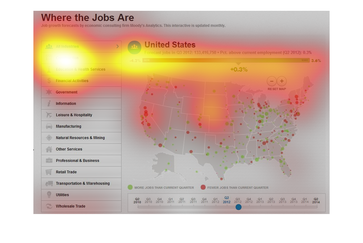
The image depicts job availability forecasts in the US for Q3 2012, according to economic
consultants at Moody's. Jobs ranging from Construction, Education and Health Services, Government,
Information, Manufacturing, and many more are included. Forecasts detail future job growth
occurring in densely populated areas of the US, and are hovering around +0.3+.
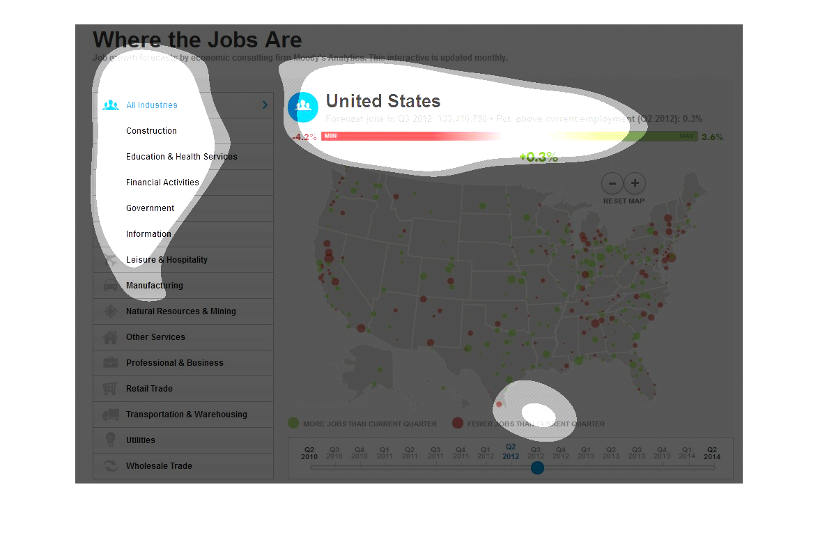
This is a map of the United States and it shows the analytics about where all the jobs are.
The forecast for jobs in the first quarter of 2012 is supposed to 133,416,750 jobs which is
4.2% less jobs then what there was in the previous quarter. There are also 3.6% more jobs
as well. Overall it seems that the Eastern side of the United States has way more job loss
but also job gain. The Western side of the United States does not have as much loss and gain.
However, California has quite a bit of job loss without much gain.
This image is a map of the United states that shows where jobs are thriving. The map shows
many different categories of jobs across the country and shows high and low numbers.
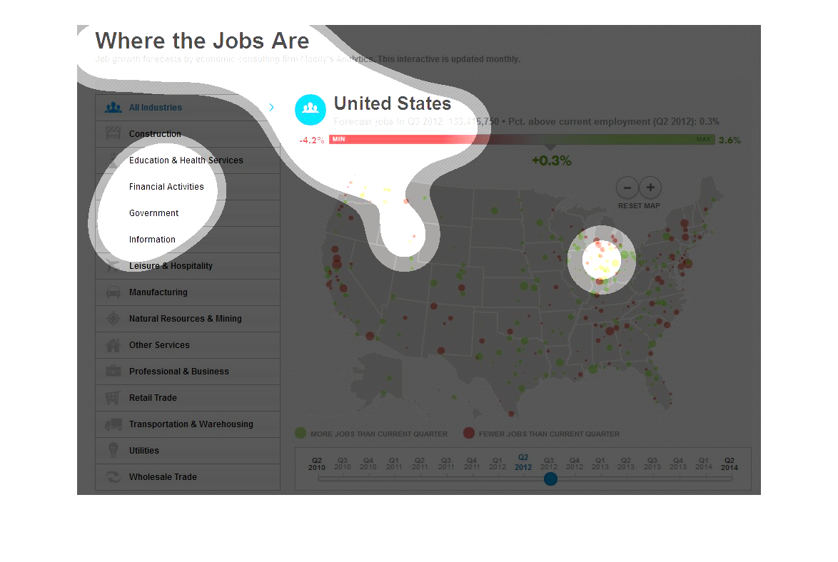
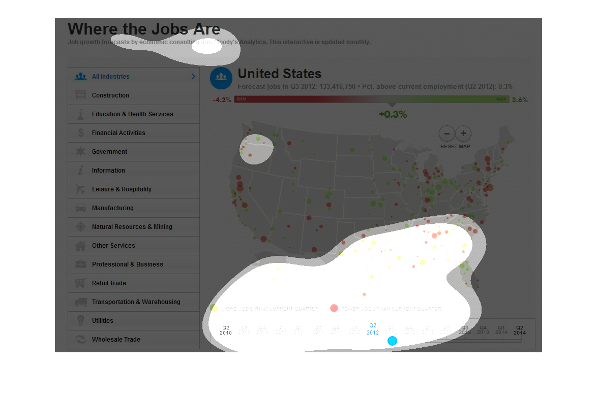
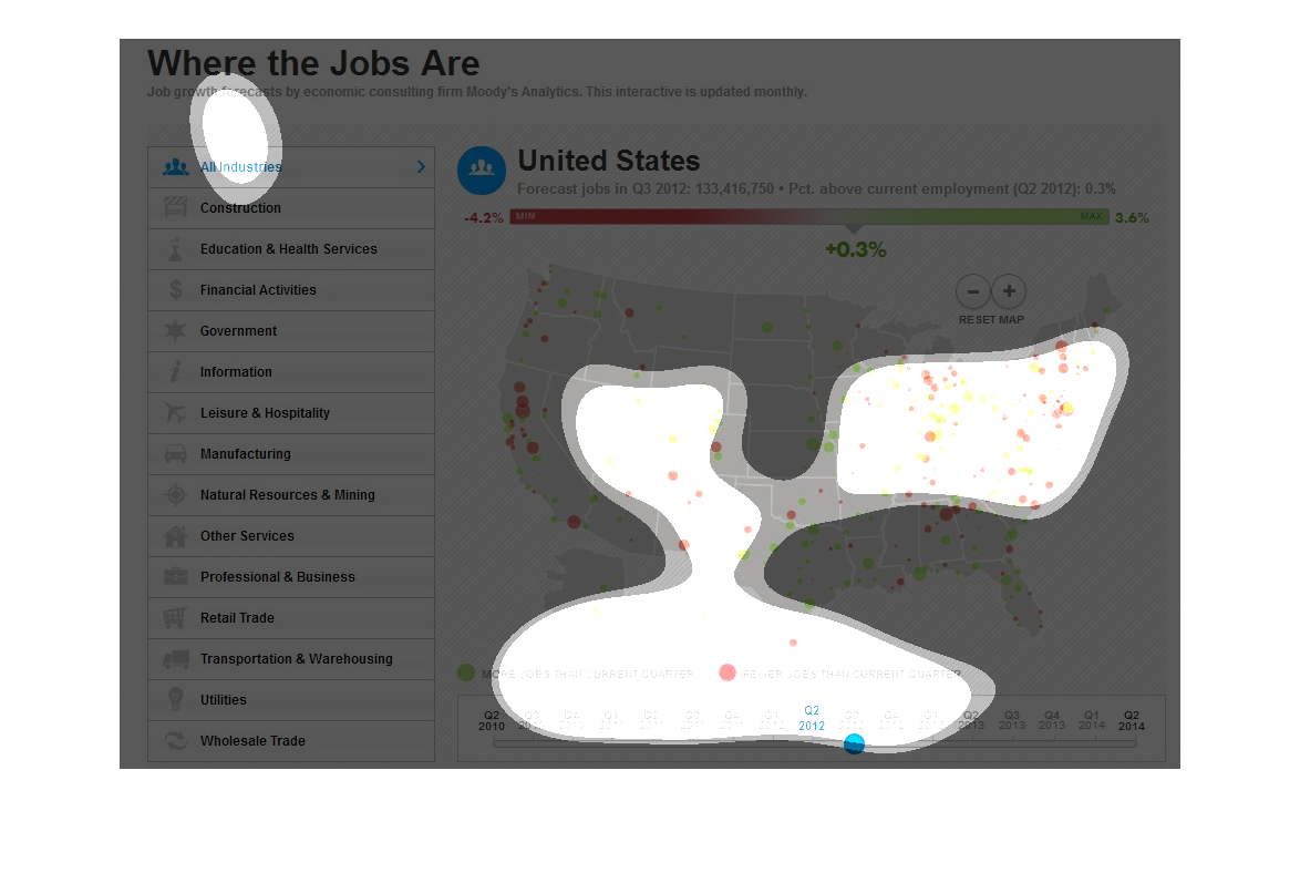
There's a political map of the United States including Alaska and Hawaii.  In the upper left-hand
corner of this map is a caption that reads, "Where the jobs are".  In the left hand column
of the page is a descending list of various jobs.  Scattered about the map are different sized
and colored dots representing the charted information.  The color green represents more jobs
than current quarter.  The color red representing fewer jobs than current quarter.
This chart describes where the jobs are. Area in the chart include construction, education
and health, government, information, manufacturing, and other services.
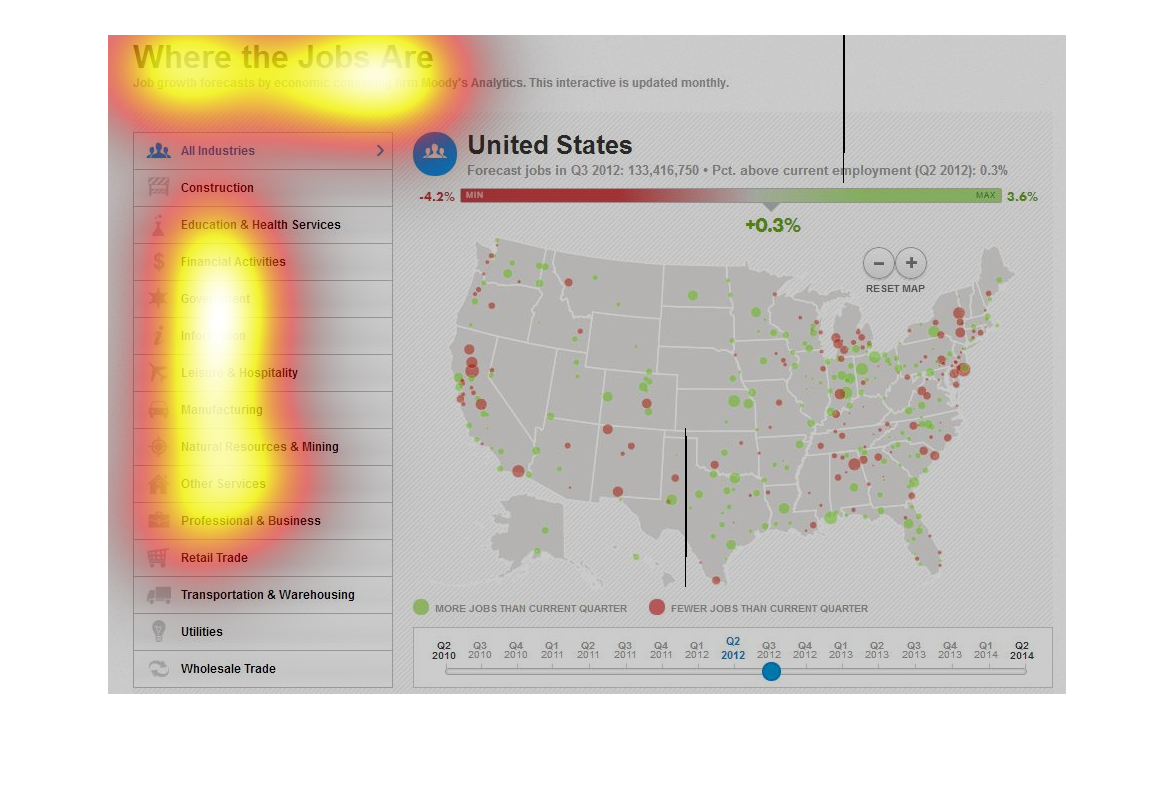
This chart is titled Where The Jobs Are and it's a job growth forecast done by economic consulting
from Moody Analytics. This interactive is updated monthly.
This is a chart in map form showing a distribution of where jobs can be found. This chart
also breaks the jobs down into categories. This chart is color coded.
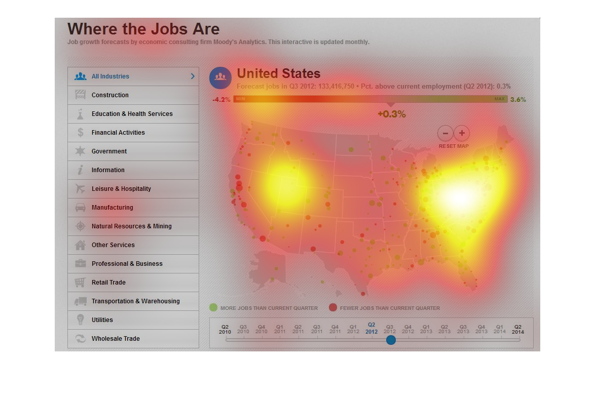
This graphic depicts the current status of where available jobs are in the United States across
all industries of employment. Green circles denote an area where there is job growth whereas
red circles denote that this area has will have less jobs than the current quarter. It seems
that there is a good amount of growth in the central states while the coasts have less growth,
seen by the larger amount of red circles.
This is a map of the United States showing “Where The Jobs Areâ€. The information is broken
down by type of jobs available. it shows that there are not too many jobs in the central United
States.
This graph shows the location of job sectors scattered throughout the United States, and how
they relate to migration of workers from one place to the other.
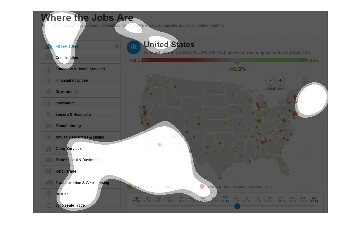
This info graphic is listing where the jobs are within the United States. It gives a list
of types of jobs such as construction, government, information, leisure and home, manufacturing,
natural resources, and others. It then color codes where there are more job and less jobs
when compared to the current business quarter.