Warning: Image is too big to fit on screen; displaying at 50%
Construction dust is on the rise! as least this is what the chart leads us to believe. The
facts are pretty convincing, as in the New York Metropolitan area has seen an exponential
rise in construction of high income housing after the recession.
Warning: Image is too big to fit on screen; displaying at 50%
Warning: Image is too big to fit on screen; displaying at 50%

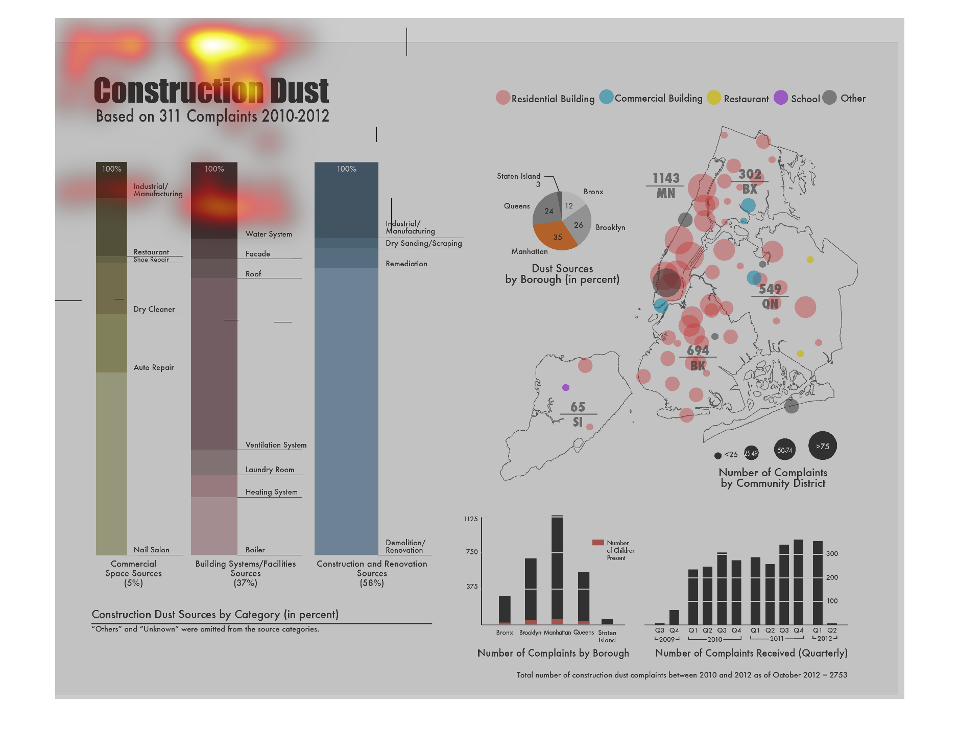
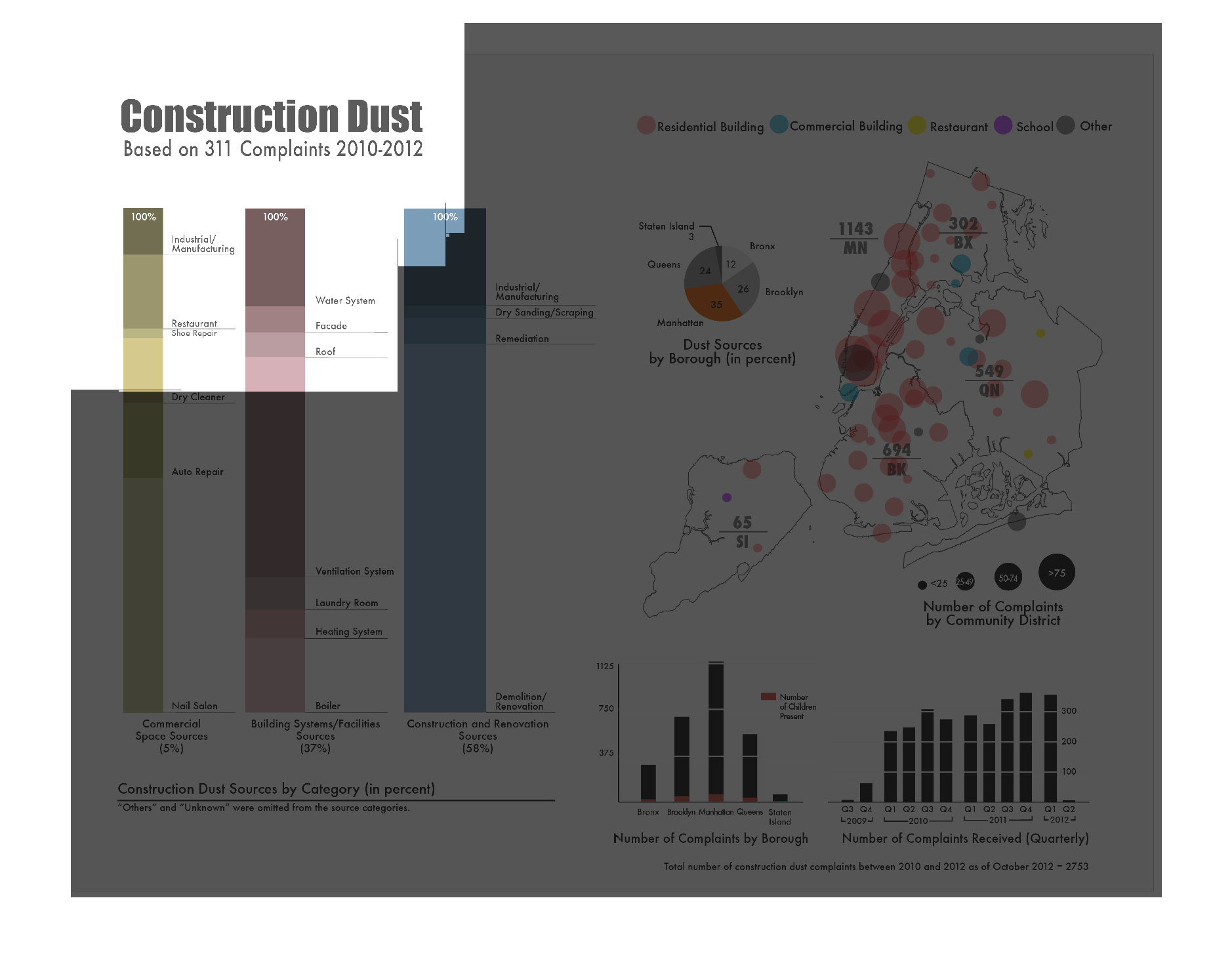
This series of graphs are about construction dust based on the number of complaints from 2010-2012.
These complaints are broken down by type of construction, source of dust, which borough the
complaints come from, and when the complaints were made. The largest number of complaints
were in 2012 and Manhattan had the most complaints out of the five boroughs.
Warning: Image is too big to fit on screen; displaying at 50%
Warning: Image is too big to fit on screen; displaying at 50%
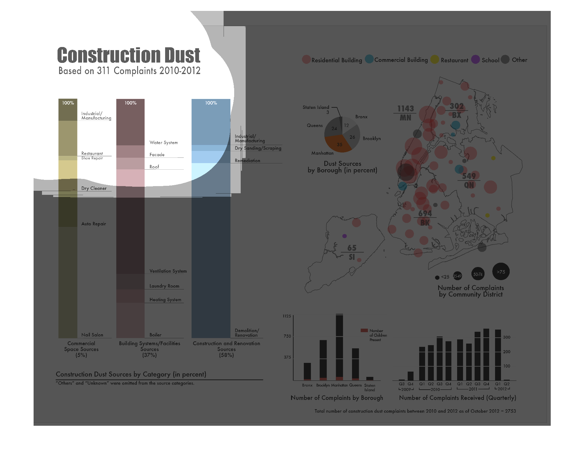
This chart describes and depicts the construction dust  which is based on three hundred and
eleven complaints from the year two thousand and ten to the year two thousand and twelve.
Warning: Image is too big to fit on screen; displaying at 50%
Warning: Image is too big to fit on screen; displaying at 50%
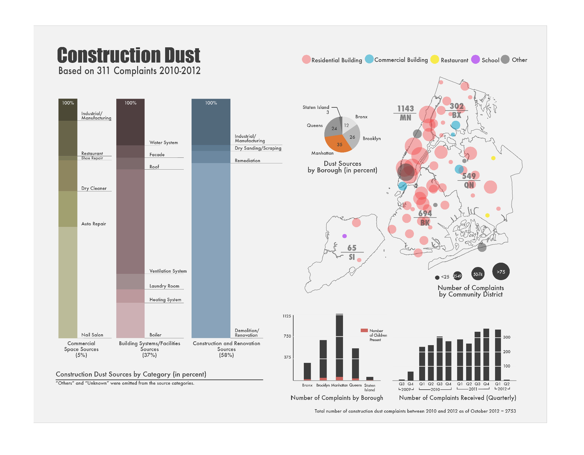
The following chart illustrates the Construction dusts complaints from the years 2010-2012.
This information was based on 311 different complaints. They were from the following areas
of construction. Residential Construction, Commercial, Restaurant, School and another listed
as other.
Warning: Image is too big to fit on screen; displaying at 50%
Warning: Image is too big to fit on screen; displaying at 50%
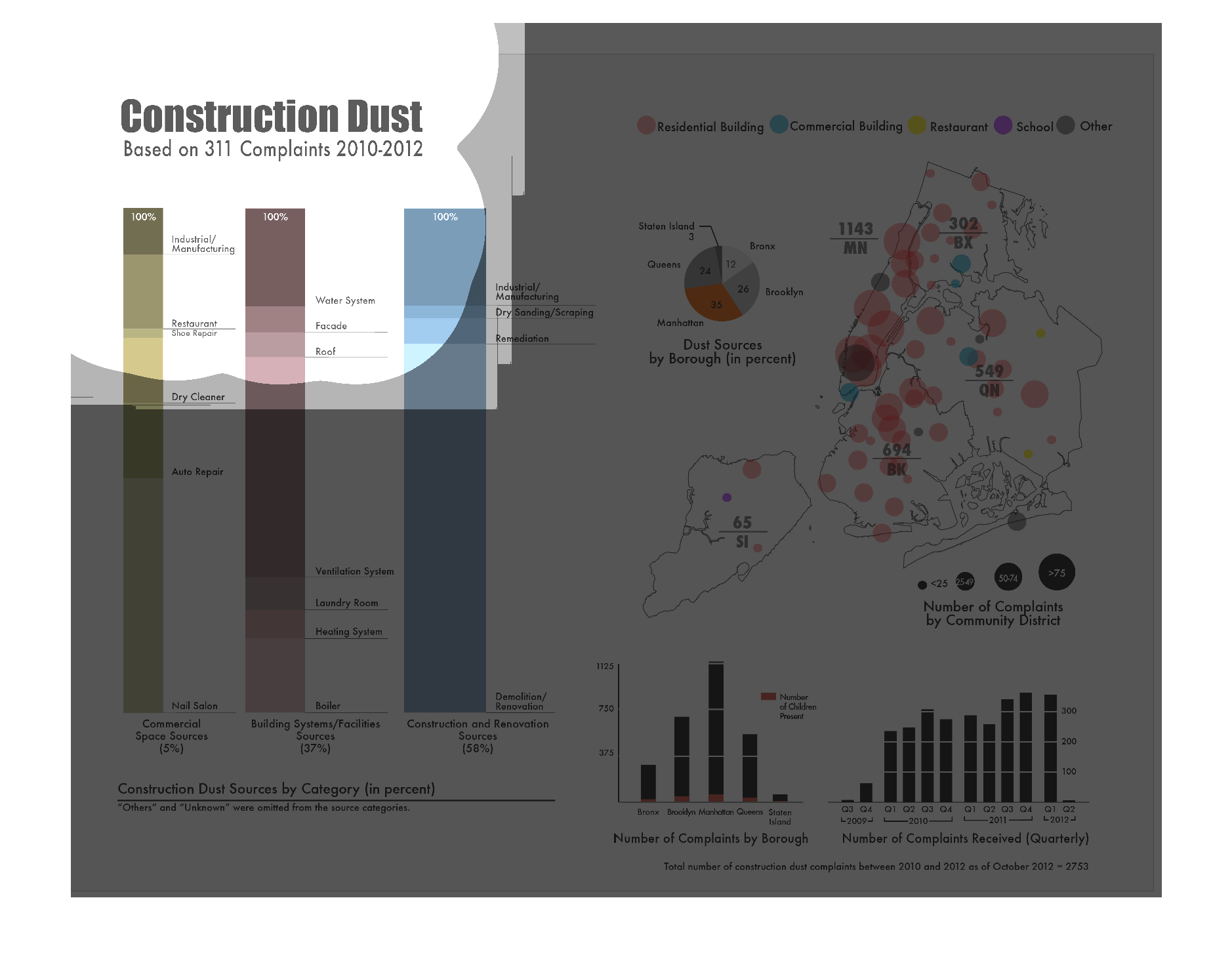
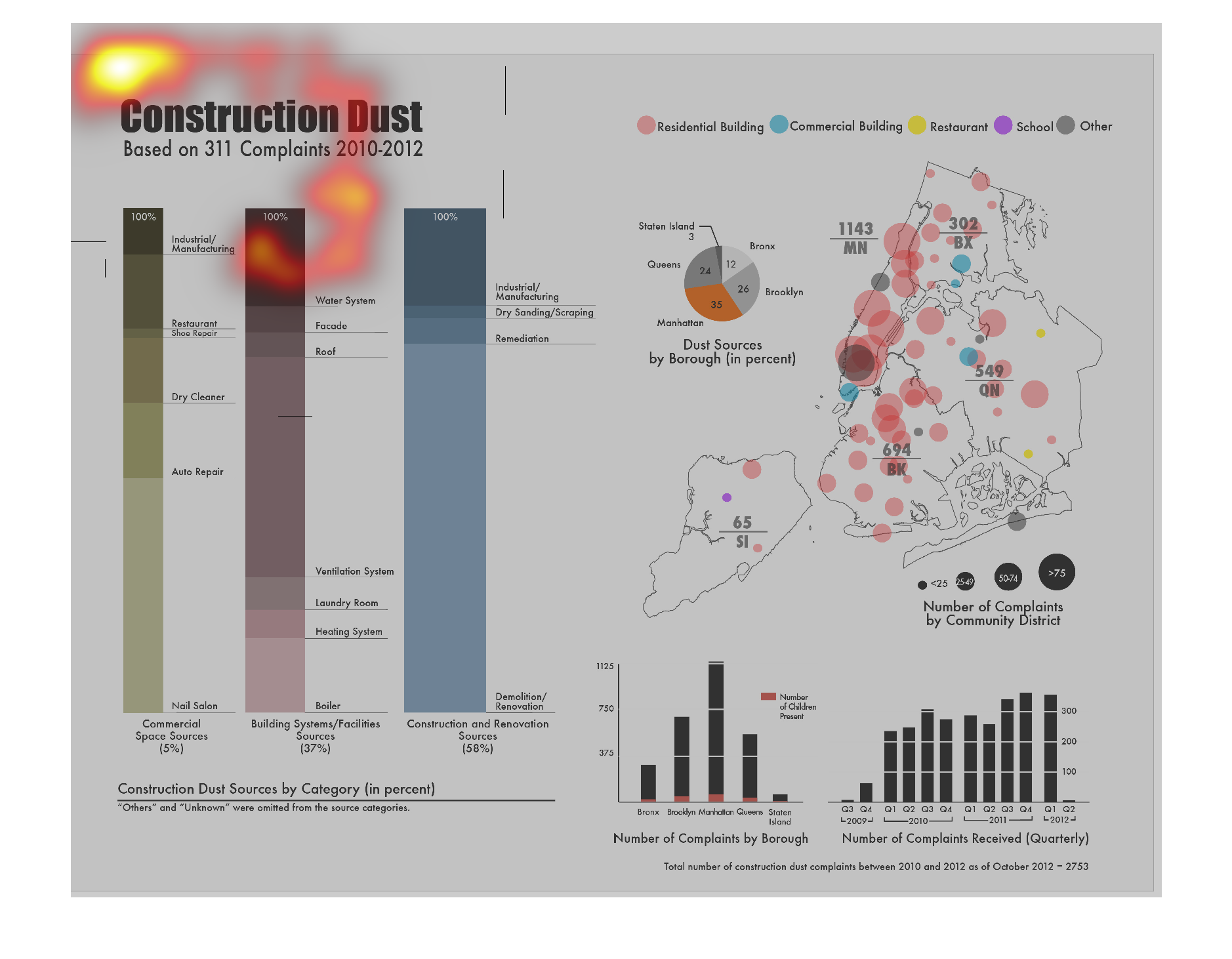
This graphic shows construction dust based on 311 complaints between 2010 and 2012. Categories
include Residential buildings, commercial buildings,Restaurants, Schools, and other. A pie
chart showing dust sources by borough, in percents, is also included.
Warning: Image is too big to fit on screen; displaying at 50%
Warning: Image is too big to fit on screen; displaying at 50%
This chart is titled: Construction dust, and is based on 311 complaints for 2010-2012. I had
a hard time being able to see the specific details, and numbers clearly.
Warning: Image is too big to fit on screen; displaying at 50%
Warning: Image is too big to fit on screen; displaying at 50%
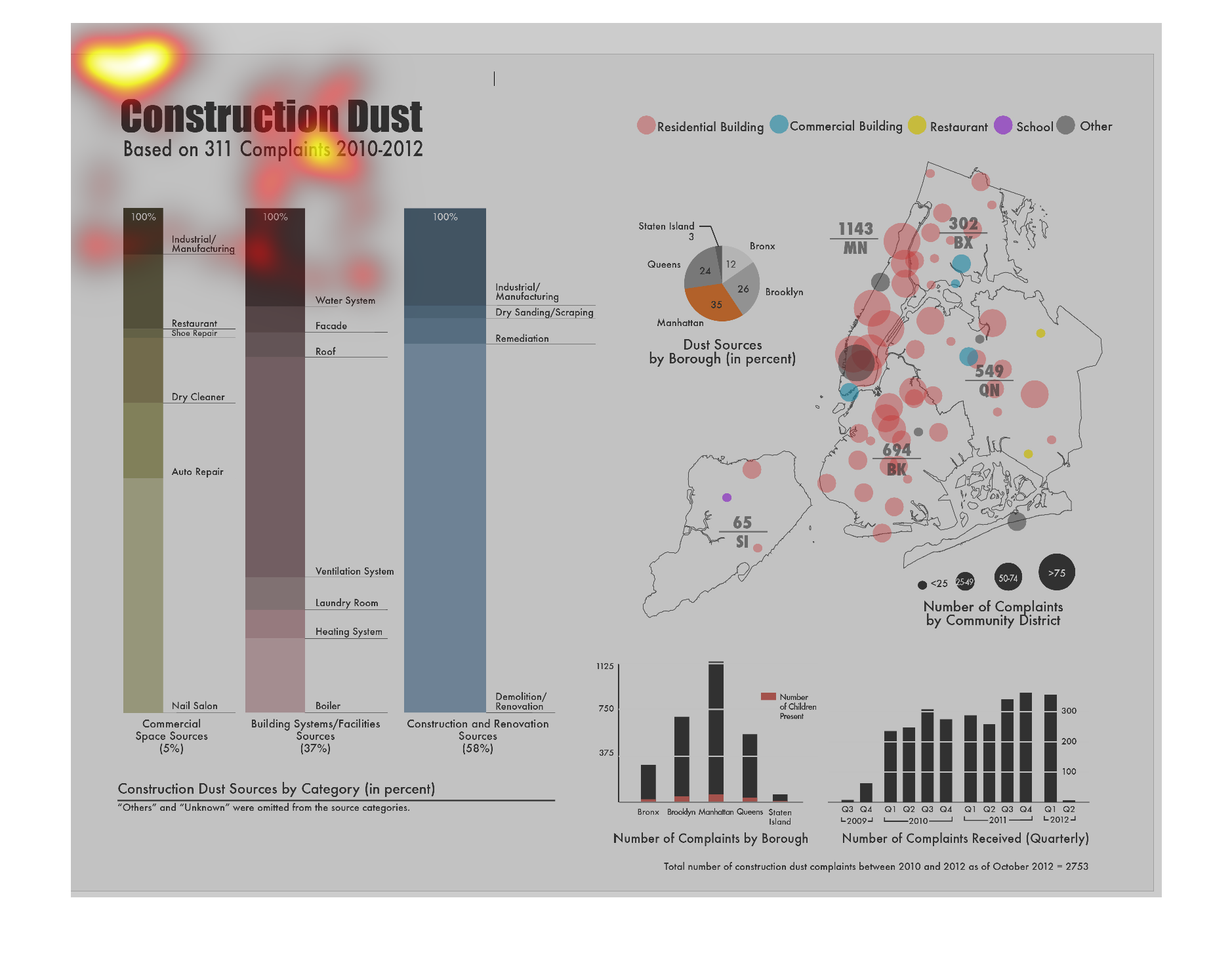
This chart depicts complaints about construction dust from 2010 through 2012, based on 311
complaints.The complaints are separated into community districts and boroughs. The chart is
further broken down by quater.
Warning: Image is too big to fit on screen; displaying at 50%
Warning: Image is too big to fit on screen; displaying at 50%
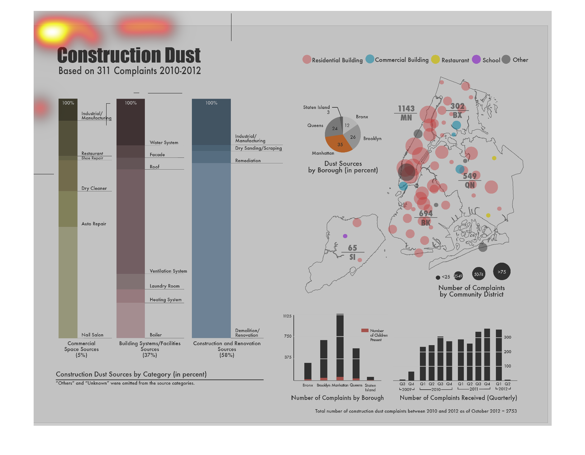
This graph illustrates construction dust based on 311 complaints in 2011.  It has categories
for residential buildings, commercial buildings, businesses and schools.
Warning: Image is too big to fit on screen; displaying at 50%
Warning: Image is too big to fit on screen; displaying at 50%
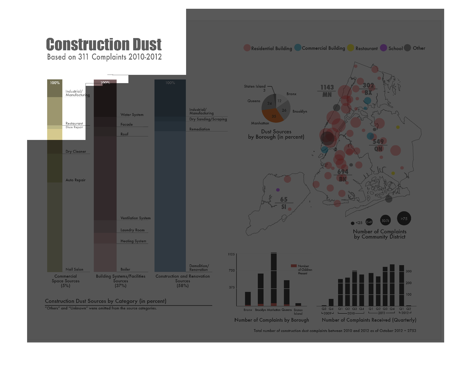
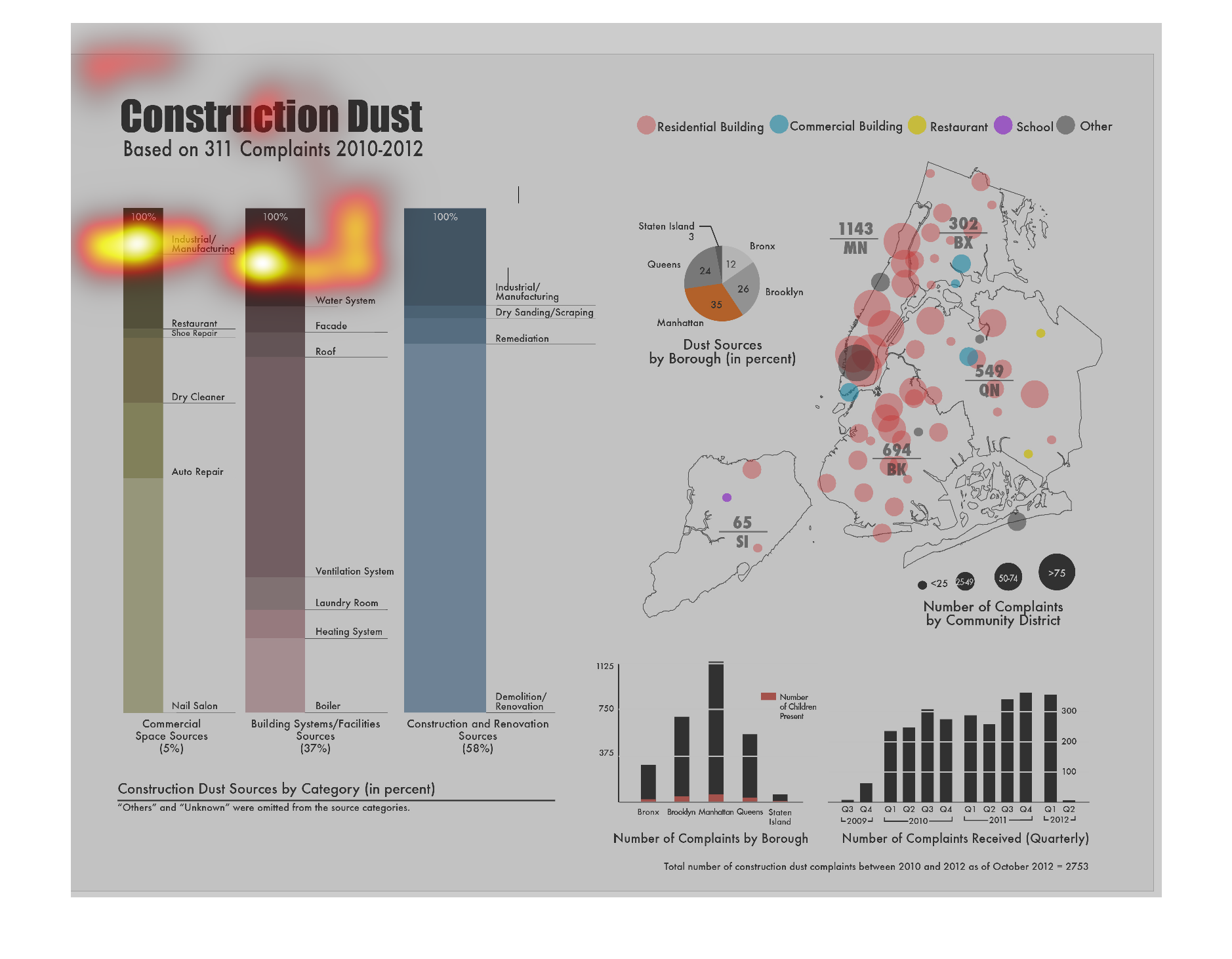
The image is describing construction dust complaints by percentage, based on 311 complaints
from the years of 2010 to 2012. It cites complaints from schools, residential buildings, commercial
buildings, restaurants, and other locations. There's a pie chart depicting dust sources as
well. There are also percentages from number of complaints by community districts, boroughs,
and number of complaints received quarterly.
Warning: Image is too big to fit on screen; displaying at 50%
Warning: Image is too big to fit on screen; displaying at 50%
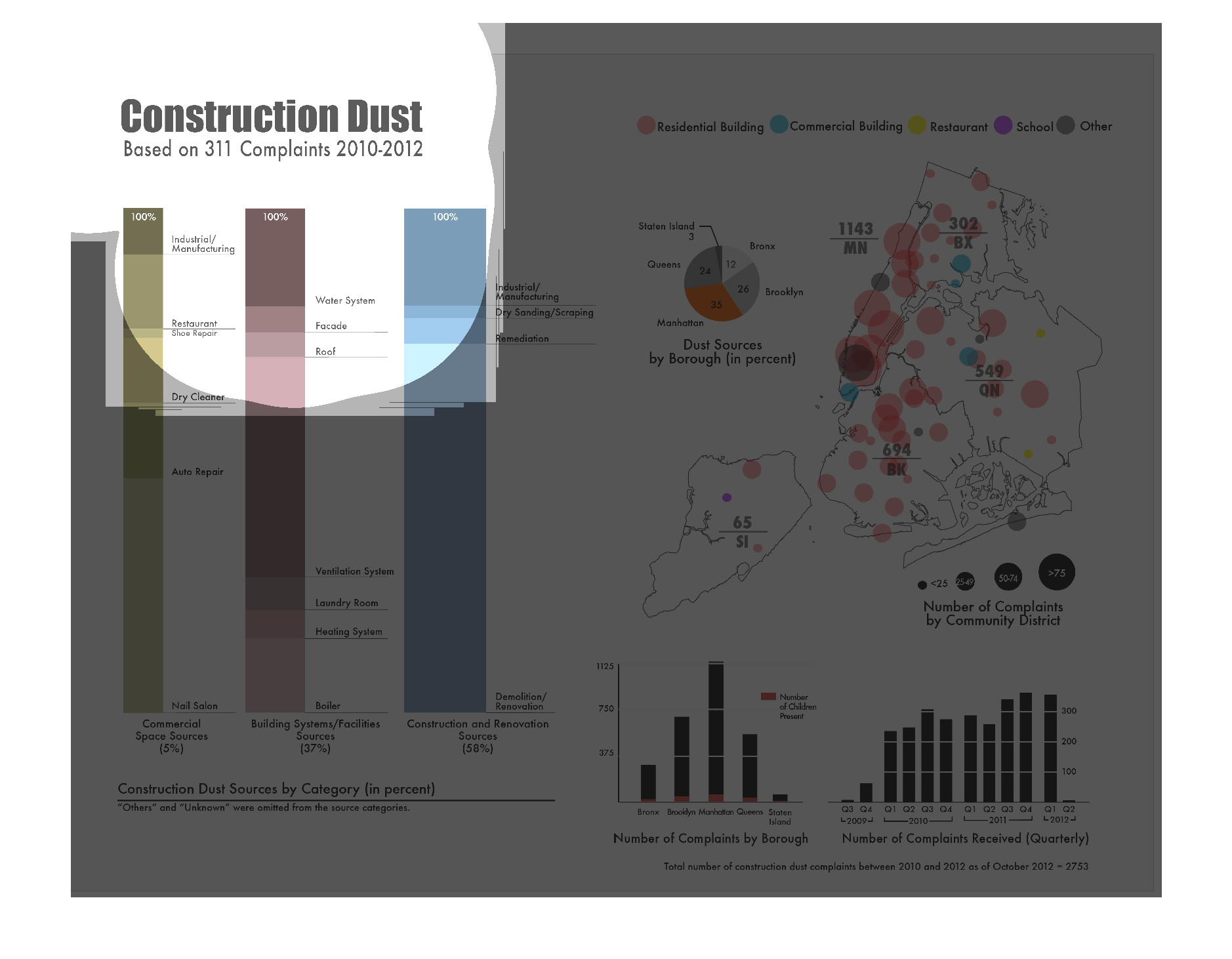
This graphic shows the distribution of complaints about dust and the sources of the complaint.
The data comes from 311 complaints. The majority of the complaints come from construction
and renovation sources.
Warning: Image is too big to fit on screen; displaying at 50%
Warning: Image is too big to fit on screen; displaying at 50%
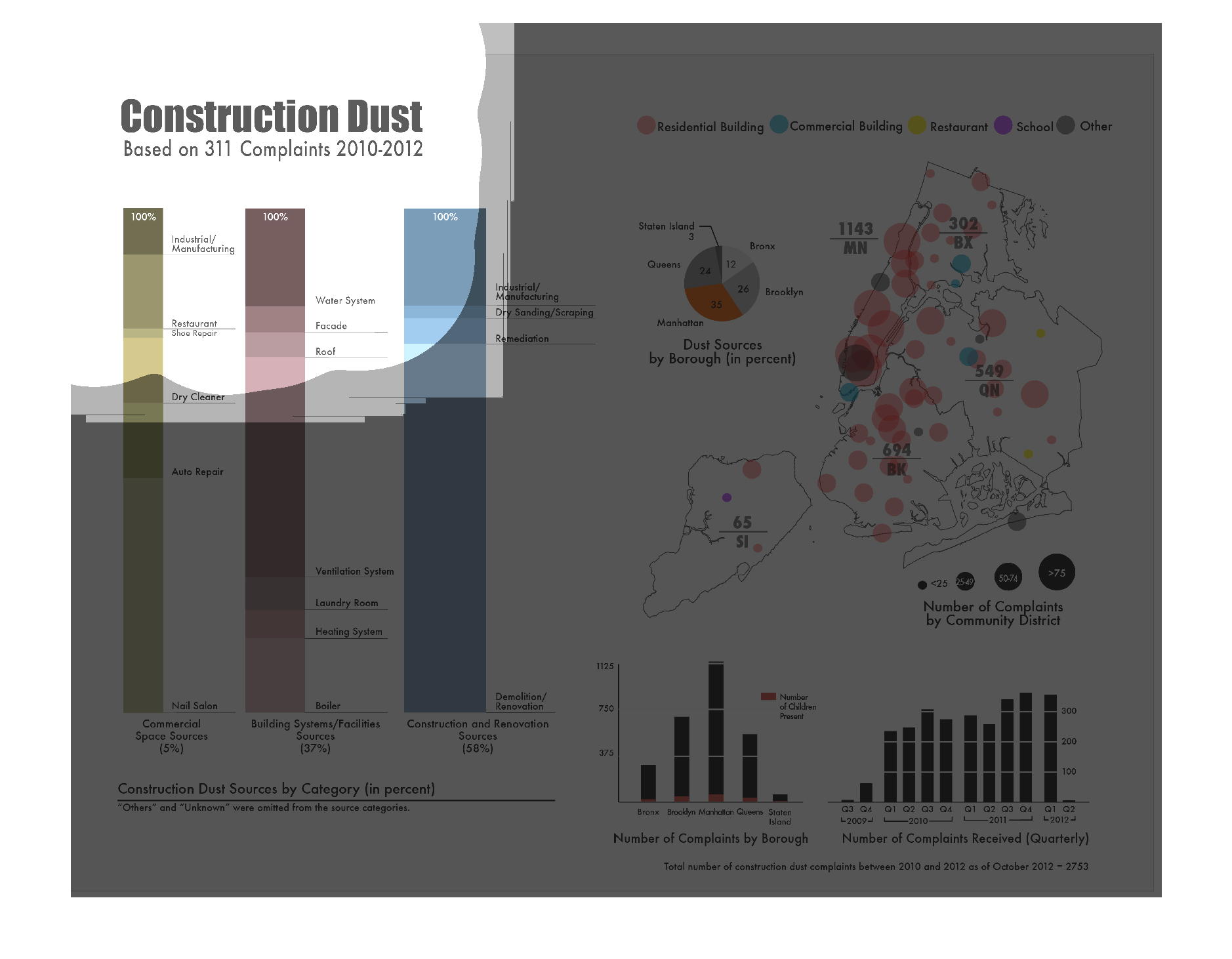
This chart is titled "Construction Dust" It is based on 311 Complaints 2010-2012 Different
graphs include dust sources by borough, Number of complaints by community district, Number
of complaints by borough, Number of complaints received quarterly and construction dust sources
by category.
Warning: Image is too big to fit on screen; displaying at 50%
Warning: Image is too big to fit on screen; displaying at 50%
Using complaints over three years, this looks at construction dust in different types of buildings,
and the number of complaints. Sadly, the small font makes this really hard to read and I can't
tell what anything is.
Warning: Image is too big to fit on screen; displaying at 50%
Warning: Image is too big to fit on screen; displaying at 50%
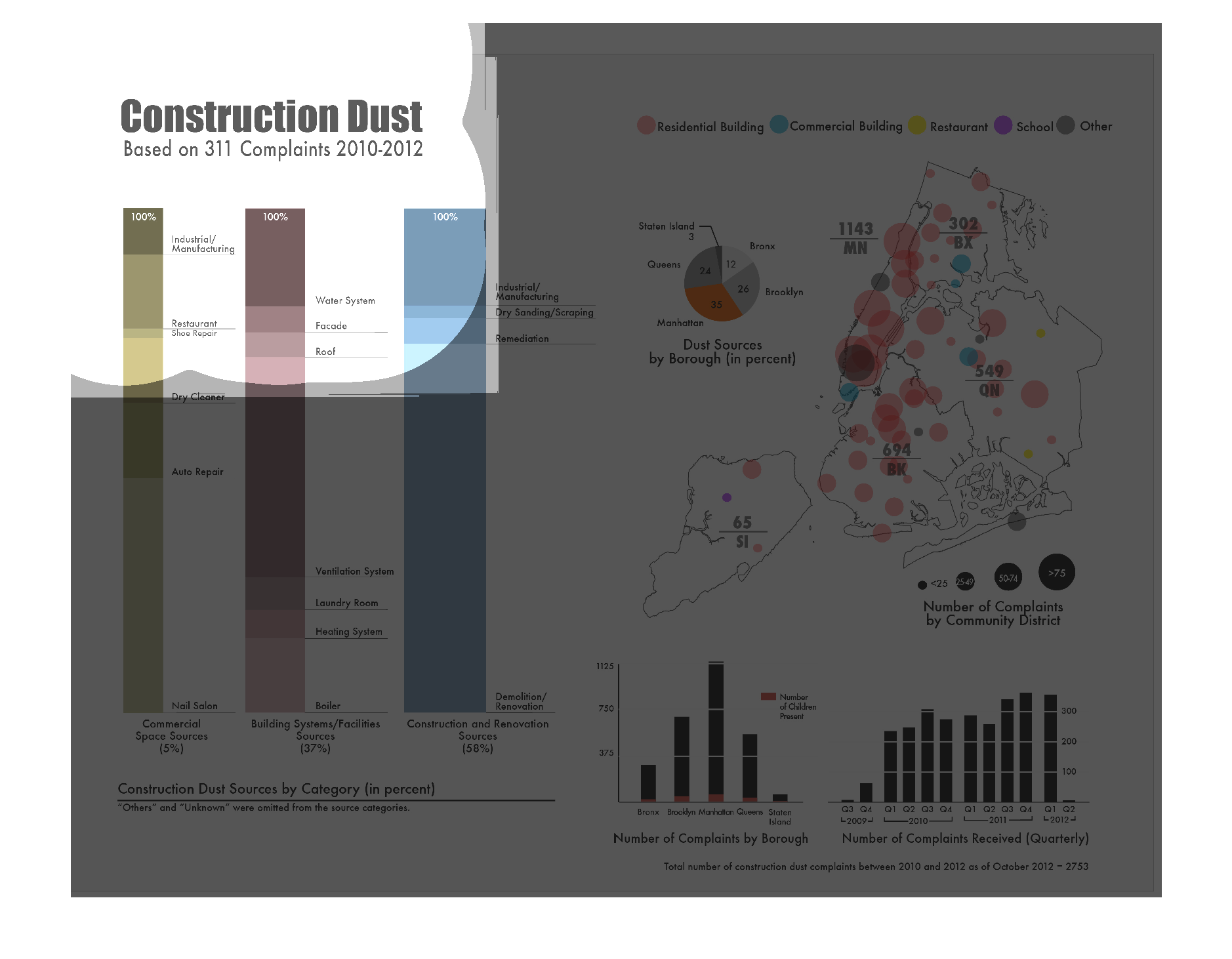
This chart describes construction dust based on 311 complaints from the years 2010 through
2012. Categories on the chart include residential building.
Warning: Image is too big to fit on screen; displaying at 50%
Warning: Image is too big to fit on screen; displaying at 50%
This is a graphic showing the types and frequency of construction dust complaints, sorted
by New York Borough.  The frequency of complaints were consistent across dust generated by
commercial construction versus governmental (such as roads).
Warning: Image is too big to fit on screen; displaying at 50%
Warning: Image is too big to fit on screen; displaying at 50%

The graph charts construction dust based on 311 complaints from 2010-2012. It singles out
residential buildings, restaurants, schools and commercial buildings.  There is also a bar
graph that plots the number of complaints per boro.
Warning: Image is too big to fit on screen; displaying at 50%
Warning: Image is too big to fit on screen; displaying at 50%