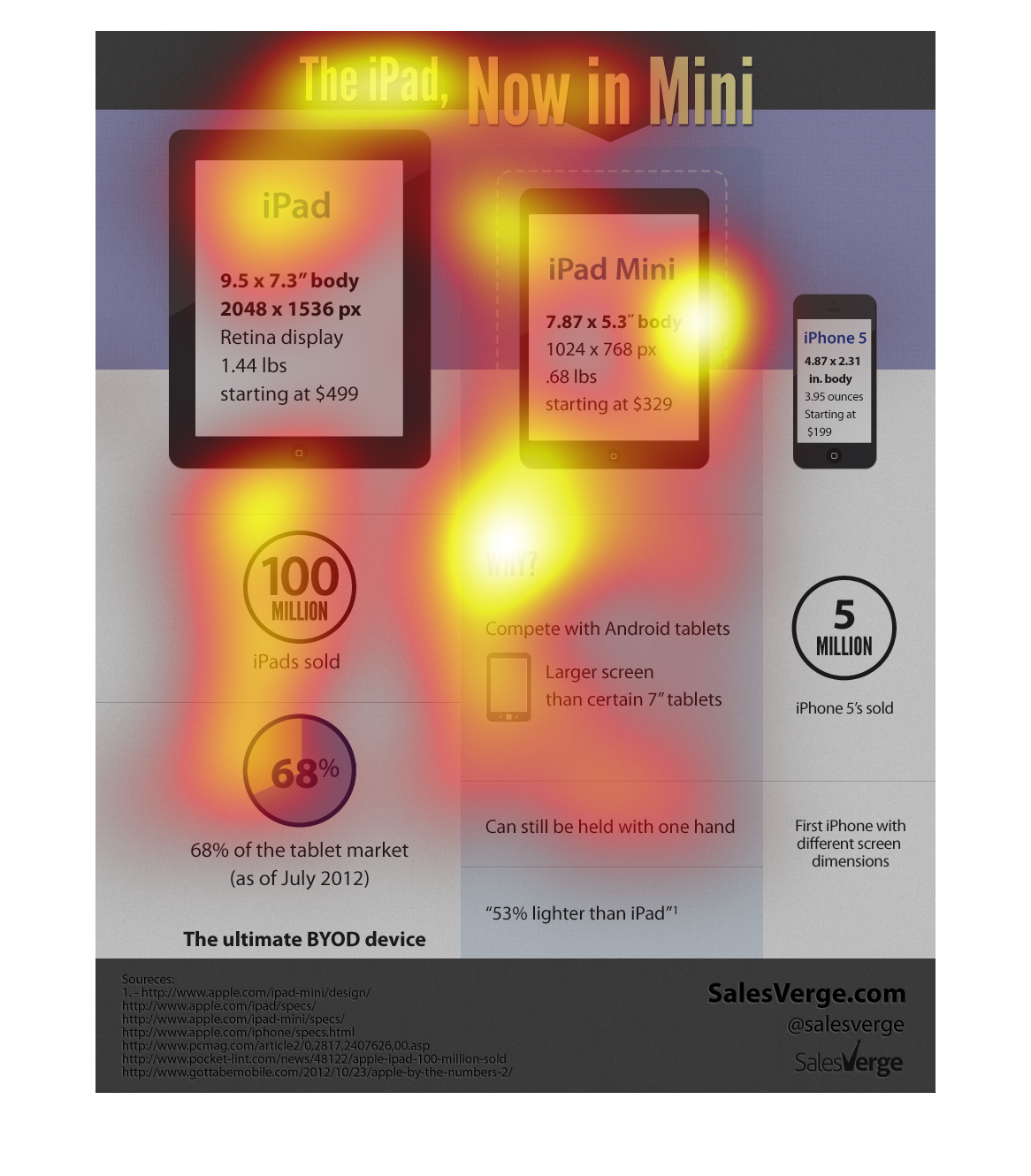
This graph shows the iPad and Mimi, then and now.  There have been over 100 million iPads
sold and they represent a whopping 68% of the tablet market overall.
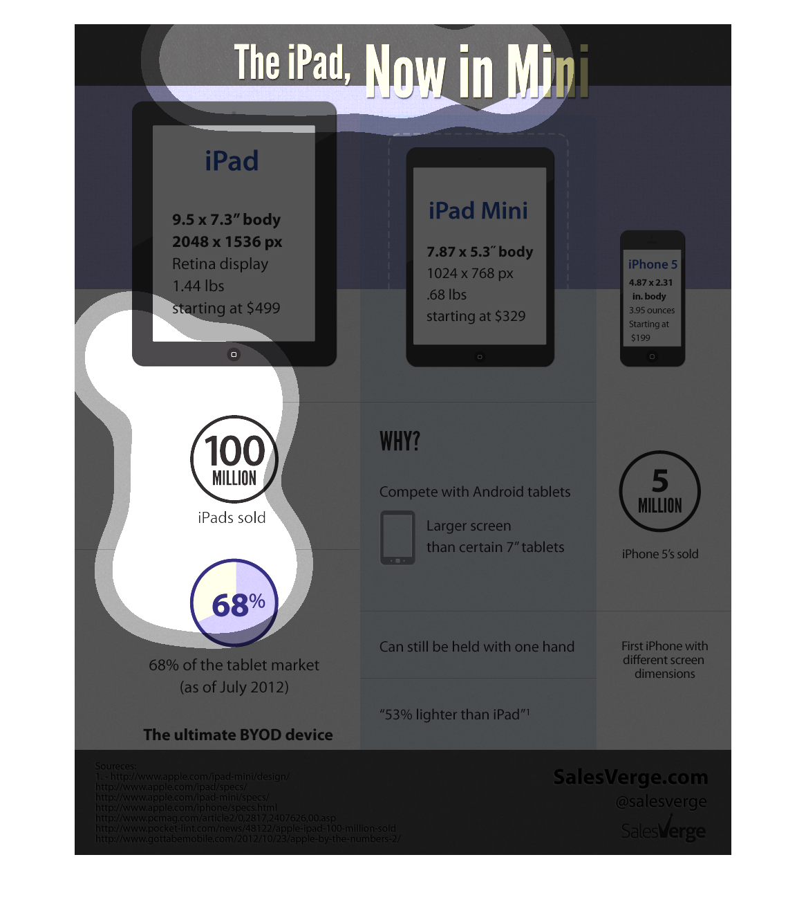
This infographic compares the iPad to the iPad mini. It also gives statistics on how many
iPads have been sold as well as why it is possible that the iPad mini was created.
A comparison of the iPad, the iPad mini and the iPhone 5. The iPad has had 100 million sold
with having 68% of the market as of July 2012. The iPad mini offers competition with the Android
and is larger than most 7" tablets and is 53% lighter than the iPad. The iPhone 5 is described
has having 5 million sold and first iPhone with different screen dimensions.
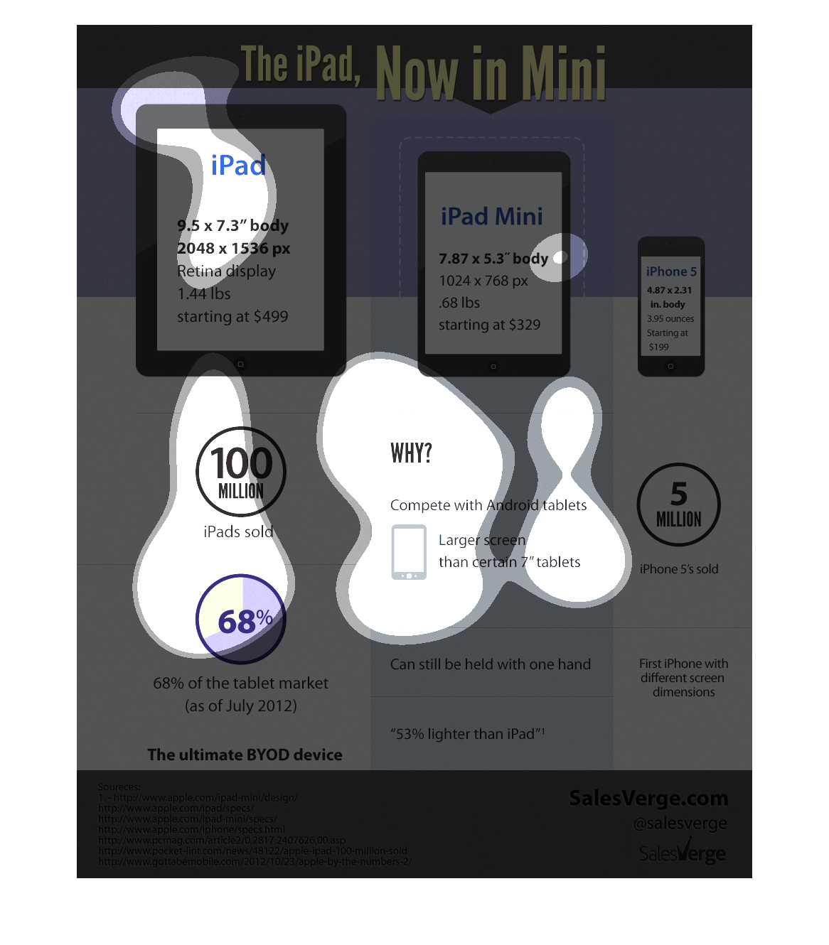
The image introduces the ipad mini and compares its features to the ipad and the iphone..
 It compares the sizes and weight.  It shows some of the reasons that it was introduced, like
being lighter, competitive with android tablets.  It also shows the number of iphones and
original ipads sold.
The image/graph on the left hand side depicted the differences between the iPad and the iPad
mini.  They are promoting the iPad mini basically giving variety to the extremely popular
original iPad.
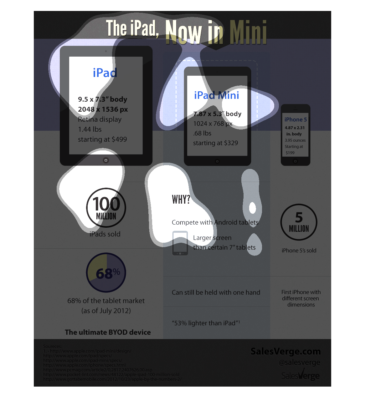
Image is related to the iPad mini.  Provides information similar related Apple products of
larger and smaller sizes.  Info covers why it is better.  Focusing on weight, size and screen
real estate. Info graphic provides sources at the bottom.
This chart is showing the size difference between the ipad, ipad mini, and iphone 5. The prices
of each are included. 68 percent of the tablet market is held by the ipad, which has sold
over 100 million. The ipad mini is lighter and can be hold in one hand. Over 5 million iphone
5s have been sold. It appears that these apple products are making great process in each market.
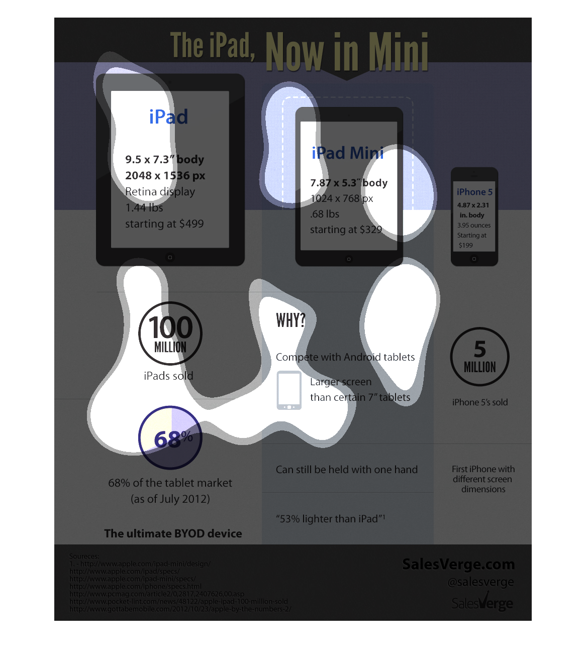
The following chart gives information about tablet computers. Specifically its comparing Apple's
IPAD to the Android Tablets. At this time in 2012 APPLE controlled 68% of the total tablet
market.
this is a promotional campaign for the Ipad mini compared with the Ipad and the Iphone.  Each
chart shows the speccifications of the Ipad, the Ipad Mini, and the Iphone.
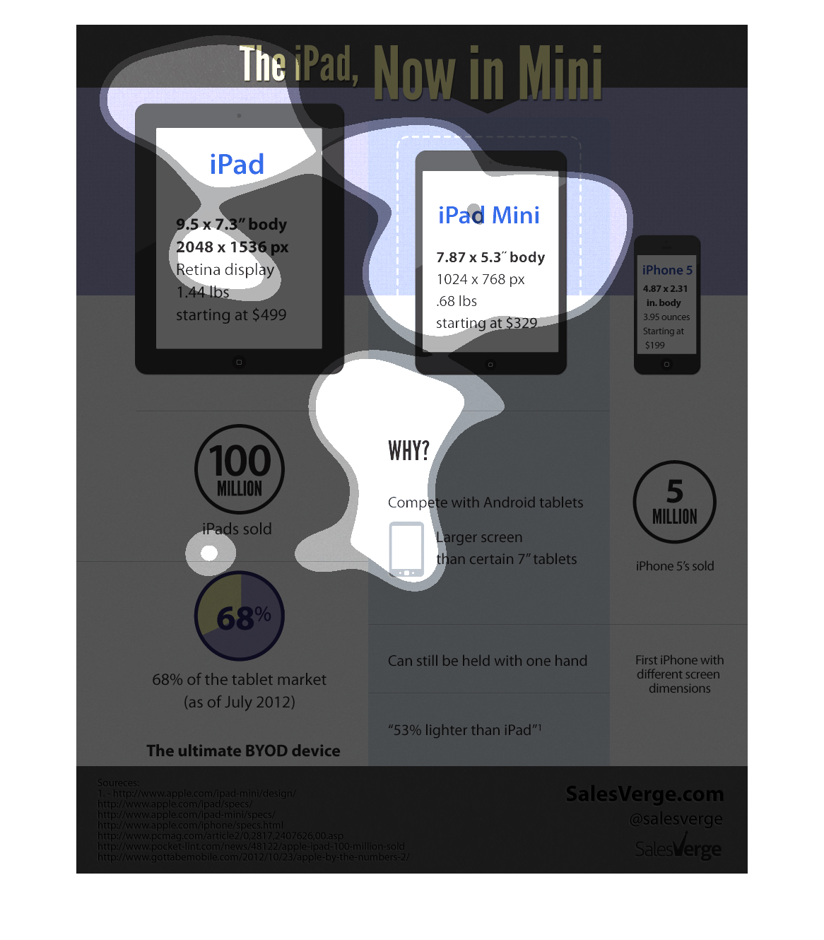
This pictures is titles The iPad now In mini. It shows a picture of an iPad, iPad mini and
an iPhone 5 and how they compare in size. It gives detail measurements for each.
This is an advertisement for the iPad Mini.  On the left it shows a depiction and specifications
for the standard iPad, and on the right it shoes similar specifications for the iPad Mini.
 Next to both of those, it shows an iPhone, as a point of reference so that the viewer can
see how the iPad Mini fits in between the iPhone and iPad.  Below all of that is sales statistics
for the iPad and iPhone.
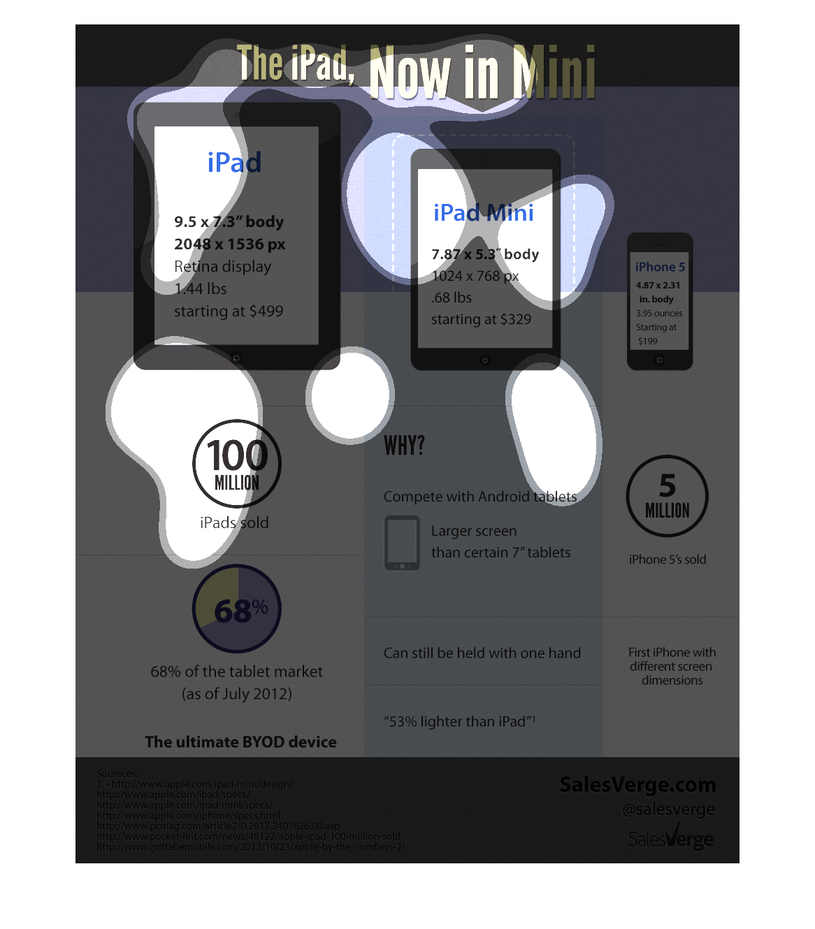
This image explains the iPad Mini.  It shows the difference in size between the iPad, the
iPad Mini, and the iPhone 5.  It also gives the dimensions and other attributes of each device.
 Also in the image are comparative information on usage between devices.
This chart describes the iPad now in mini. The chart describes the dimensions of the iPad,
ipad Mini, and the iPhone. The chart states that one hundred million iPads were sold.
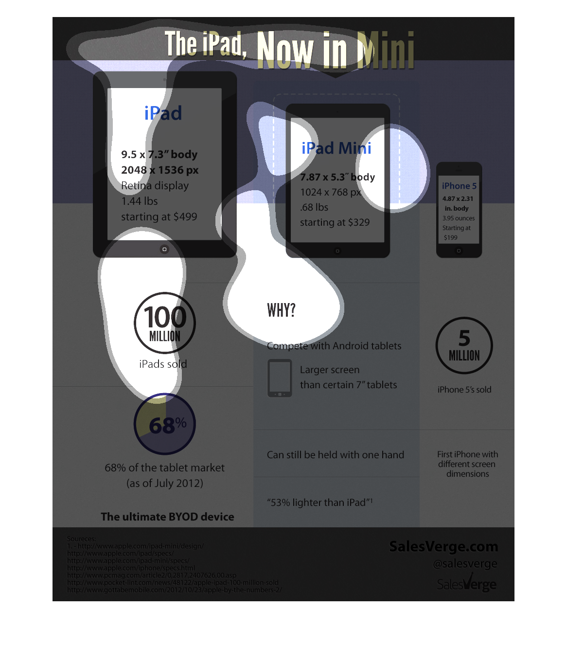
The iPad now in mini. 100 million iPads sold. ipad 68% of the tablet market. larger than 7"
android tablets. can still be found with one hand. 5 million iphones sold. first iphone with
different screen dimensions.
Hovering above three decreasing size images of iPads is a caption, "The iPad, Now in Mini".
 On the face of the three iPad graphics are some basic specifications of the models that they
represent.