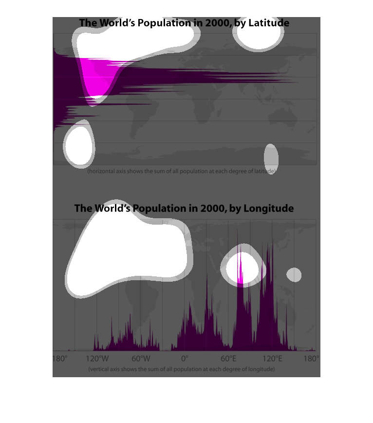
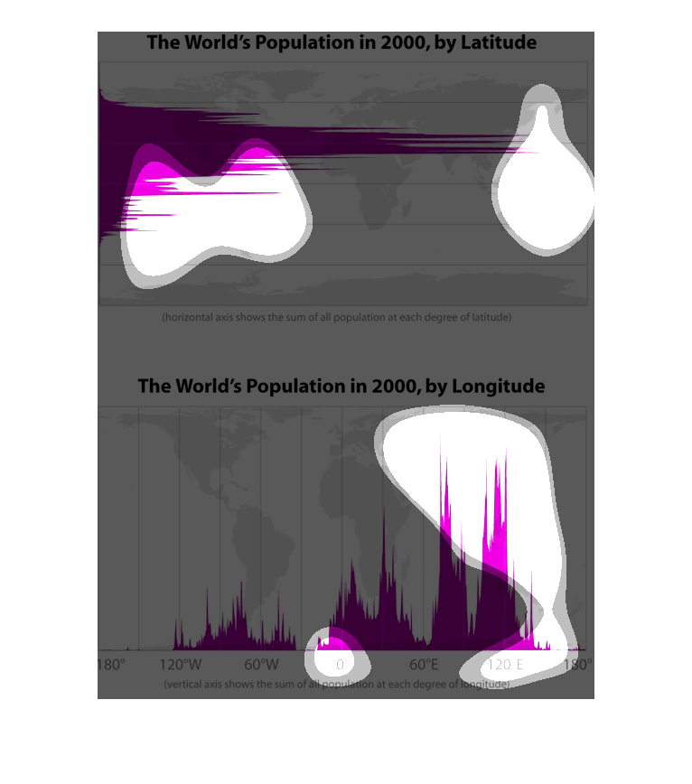
The top chart describes the world's population of women by latitude, an overwhelming majority
existing near the equator. The bottom chart describes the world's population of women by longitude,
with two major centers, 80 degrees east and 110 degrees east (around the countries of India
and the Philippines, respectively). Chart data was collected in the year 2000.
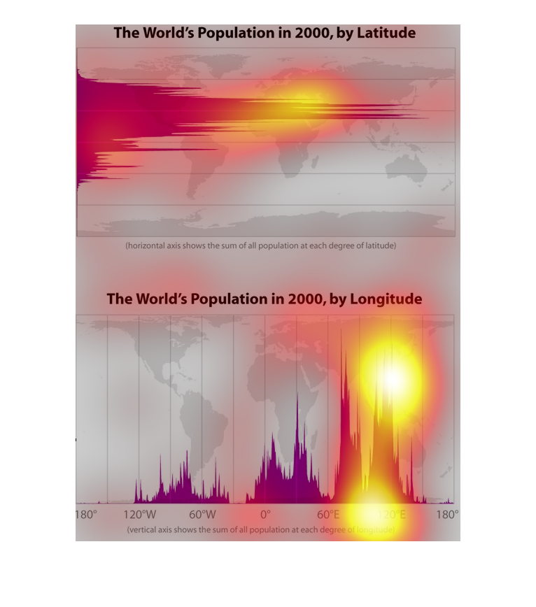
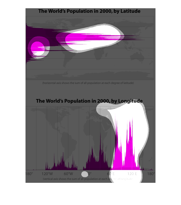
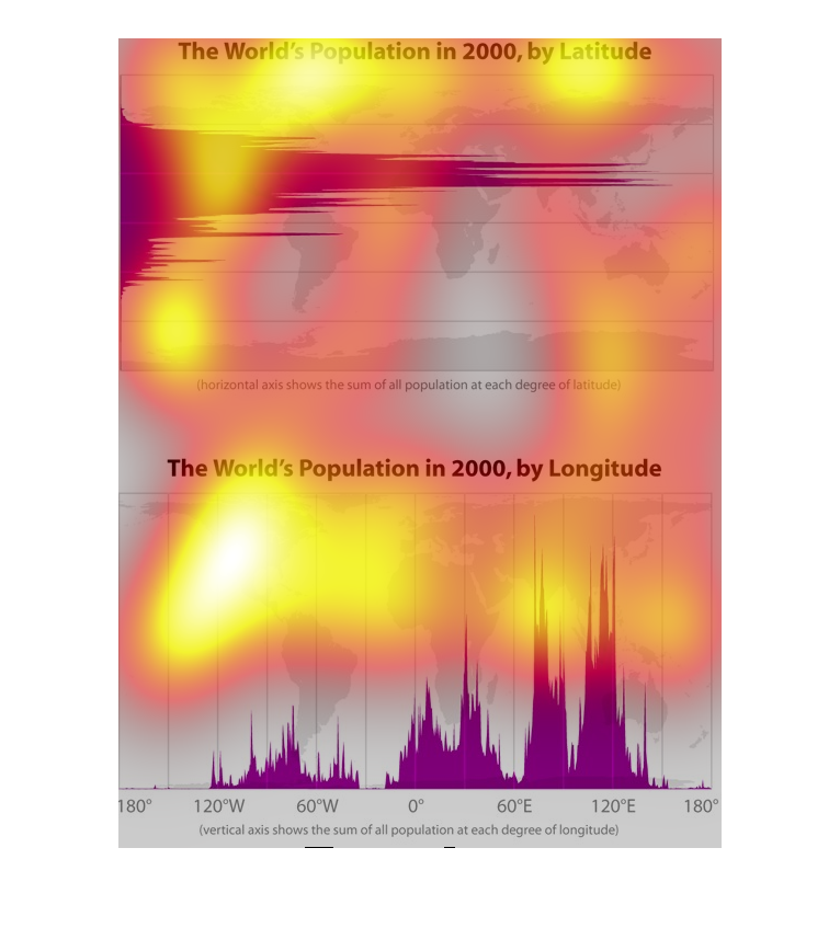
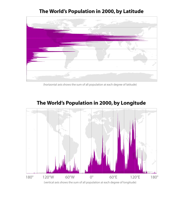
This chart describes the world's population in 2000, by latitude and the world's population
by longitude for the same year. Chart levels are represented by the color purple.
This graphic talks about the worlds populations in the 2000's by latitude and longitude. Showing
that by latitude the higher amount of the world population in on the North America, and by
longitude is more concentrated in South Asia.
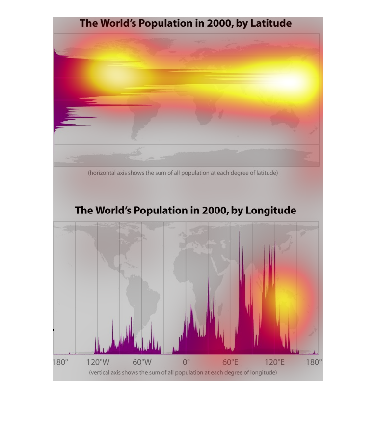
These graphs show world population density by latitude and longitude. The world's population
is most dense in the Northern hemisphere, in a zone passing through Southern North America,
Northern Africa, India and Southern China. As far as longitude, the world's population congregates
in several peaks in Eastern China, India and Africa.
These graphs both have a particular aim- a very important one- to showcase the population
density by region, both longitude and latitude across the world.
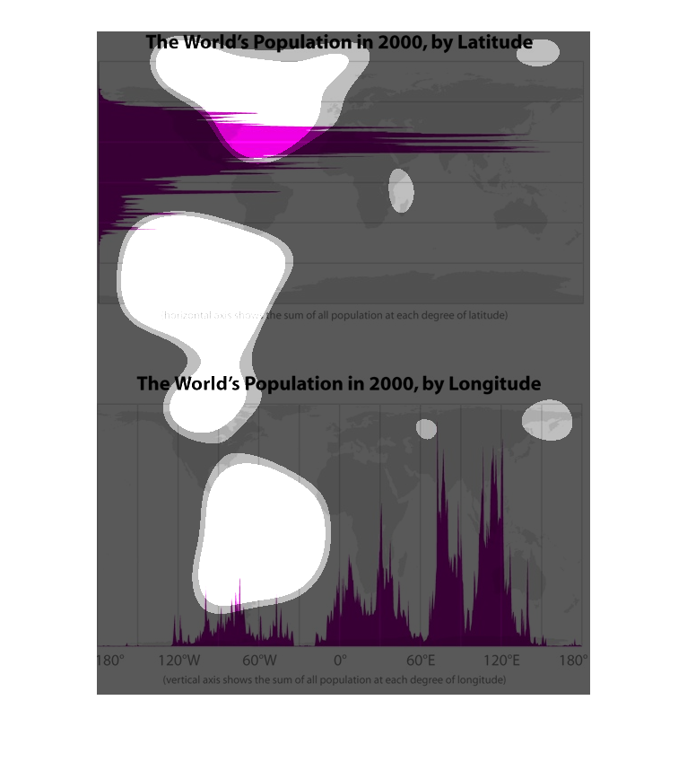
These are two charts that show the world's population in 2000. The top chart shows it in terms
of latitude and the bottom chart in terms of longitude. The chart is colored with the deeper
color showing the more populous areas.
This image shows or depicts in statistical bar graph format in regards the World's Population
in 2000, by latitude. Also, the second graph shows the World's population in 2000 by longitude.
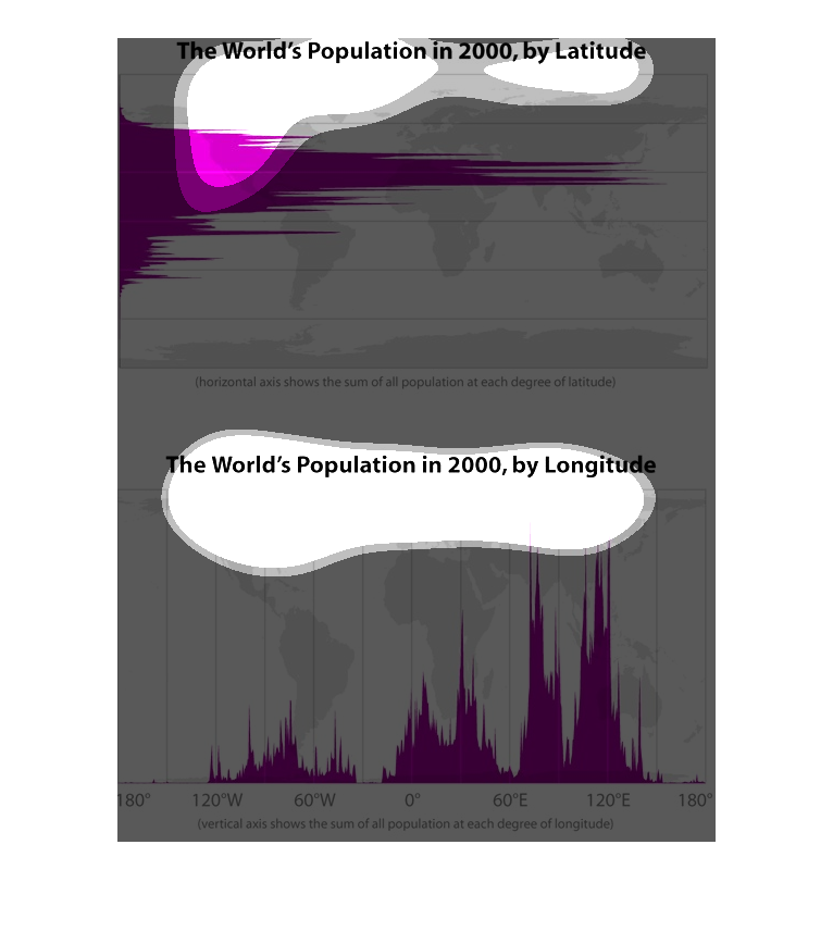
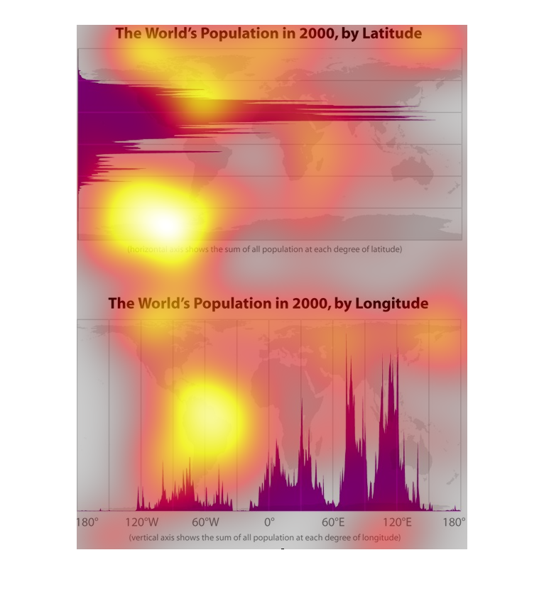
This graph shows the population of the world by latitude and by longitude. Most people live
around the equator and to the east of Africa, with smaller populations scattered about.
The following chart breaks down the total population of the world according to longitude and
latitude. It shows the most people living in or around the equator and with the most people
living in Asia.
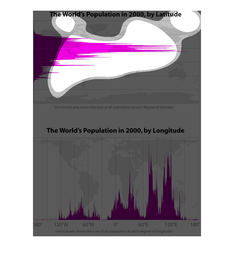
The upper chart shows the world's population in the year 200 by latitude.  The lower chart
shows the world's population in the year 2000 by longitude. In the upper chart, the horizontal
axis is population and in the lower chart the vertical axis represents population.
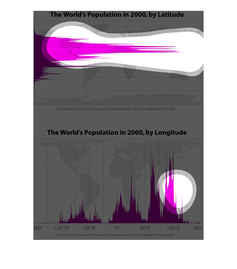
There are 2 graphics. The first shows world population by latitude in the year 2000. The second
shows world population by longitude in the year 2000. There is no reference for latitude numbers
however the graph shows a large spike in the northern hemisphere. The second graph shows a
large spike between 60 and 120 degrees east.
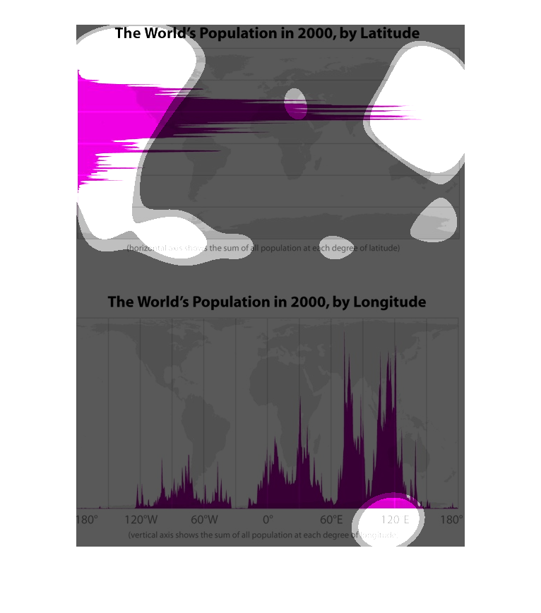
The world's population in the year 2000, (two thousand A.D.) by latitude.  Also shows in the
other graph down at the bottom, the world's population by longitude.