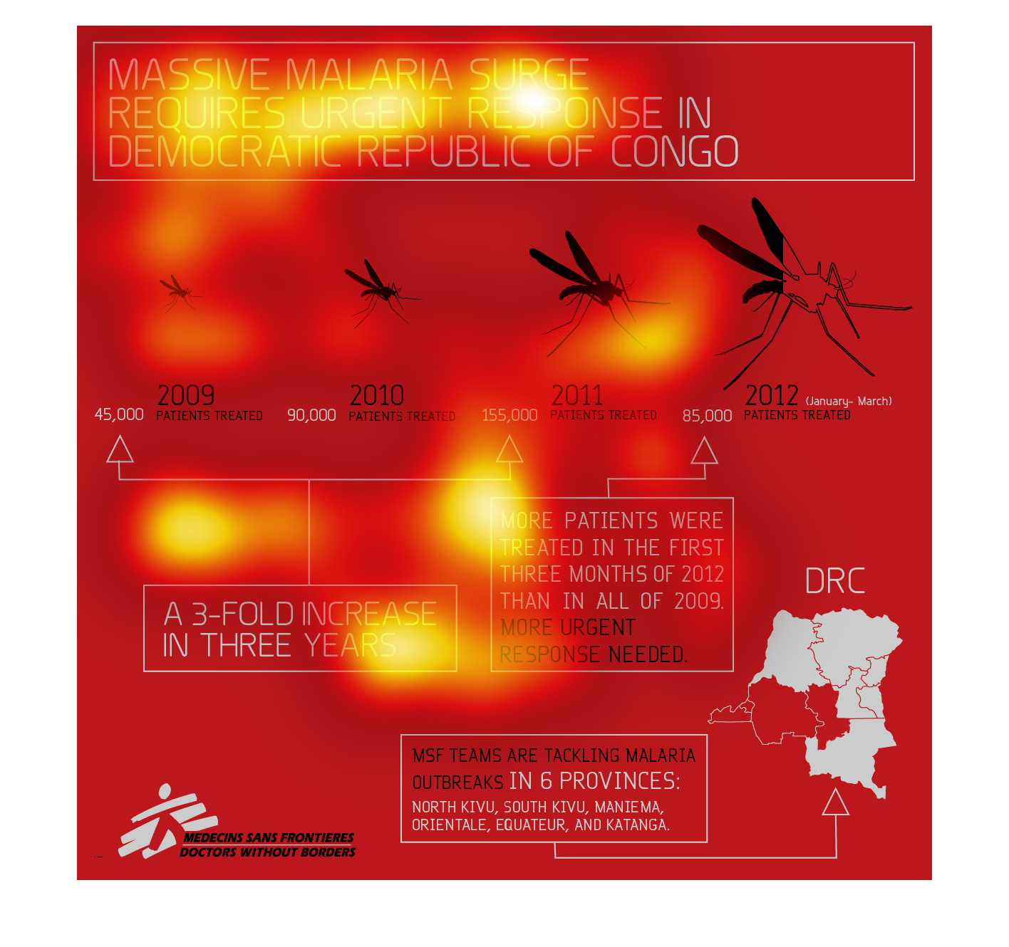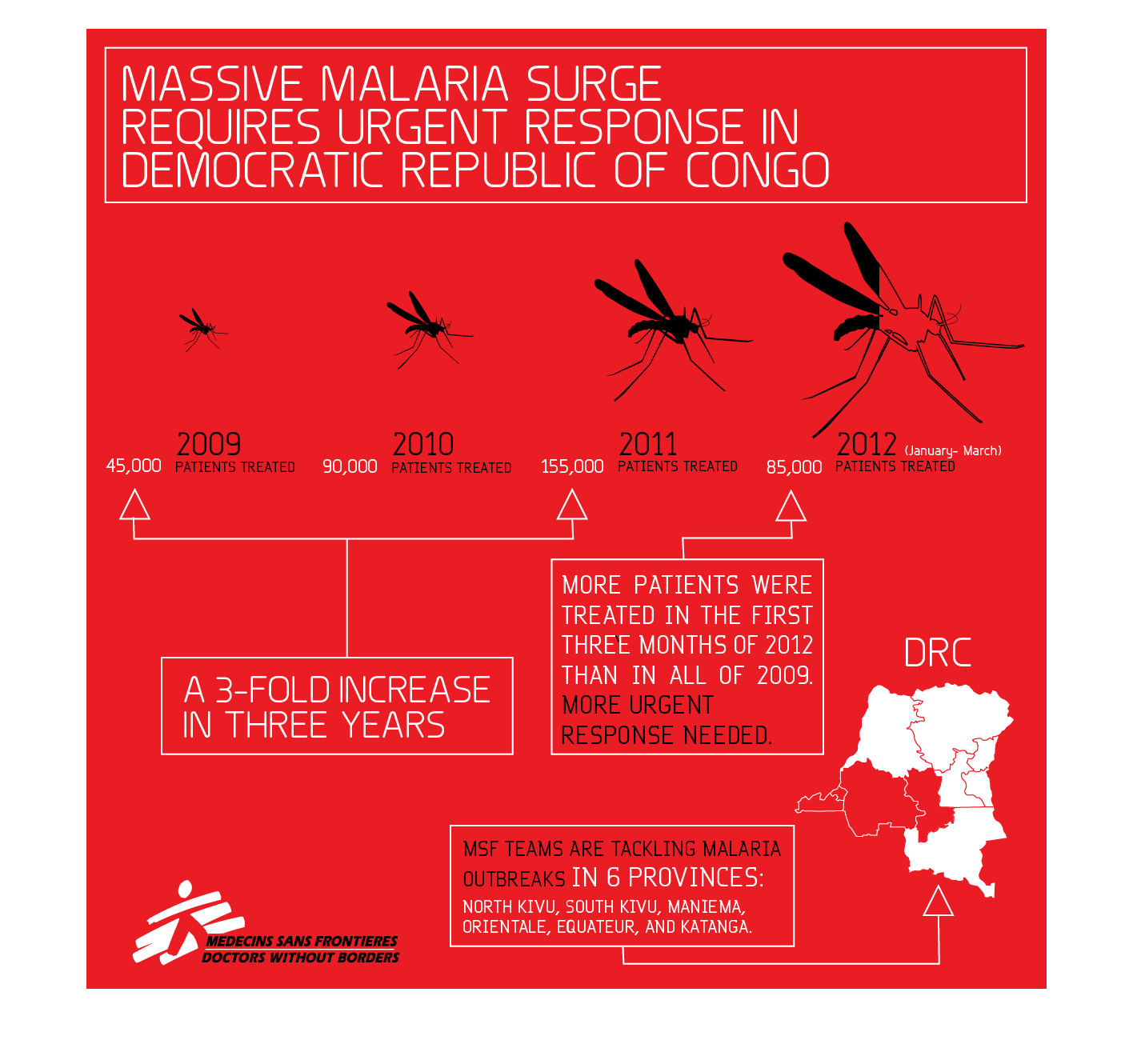
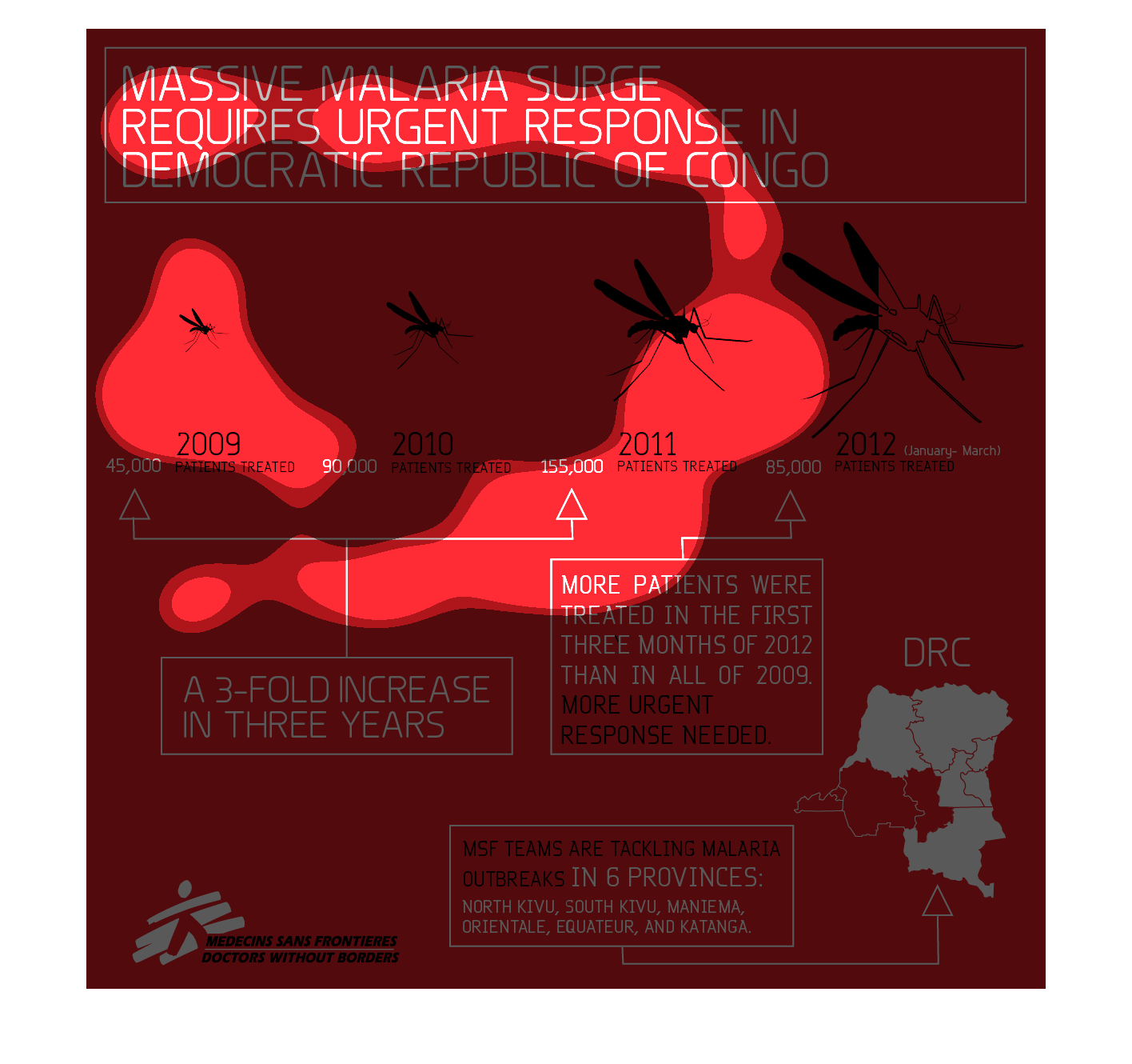
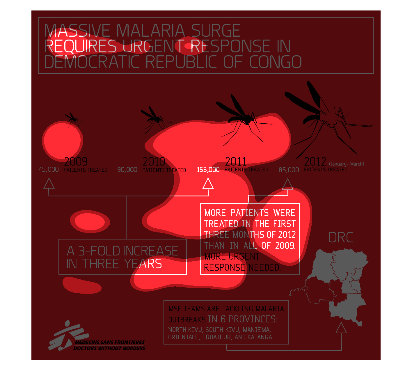
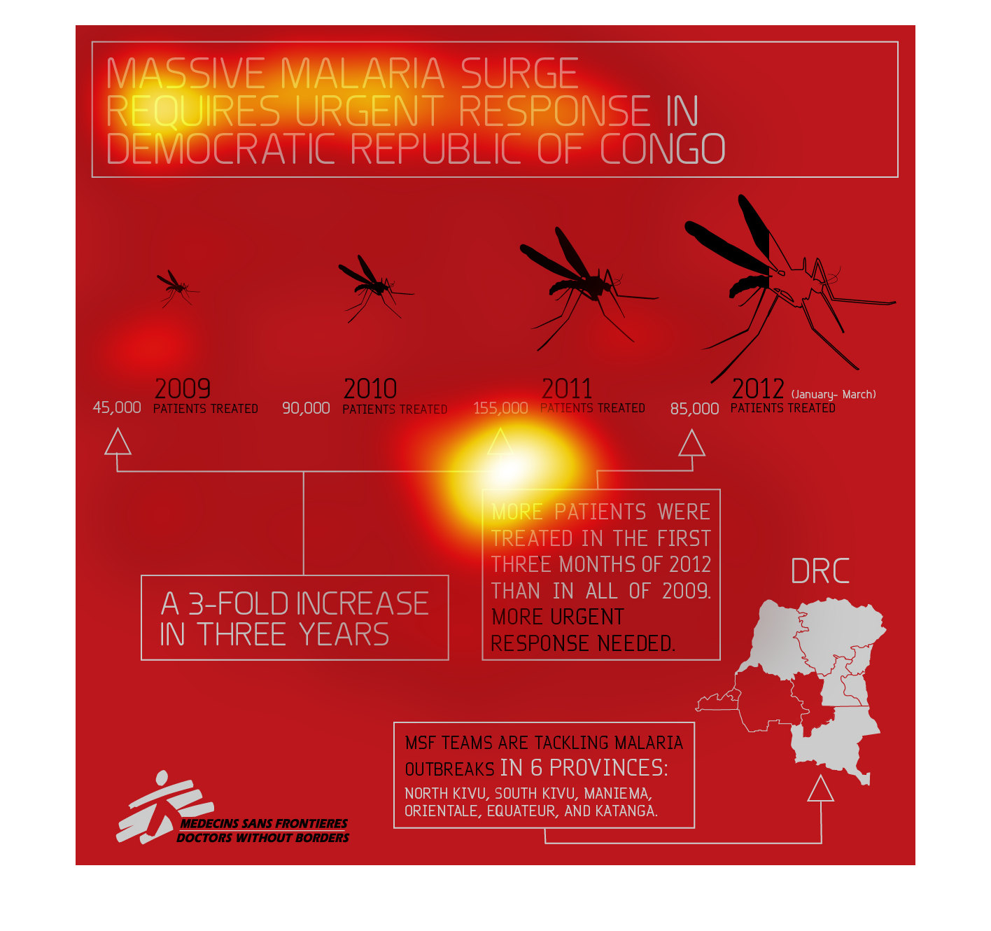
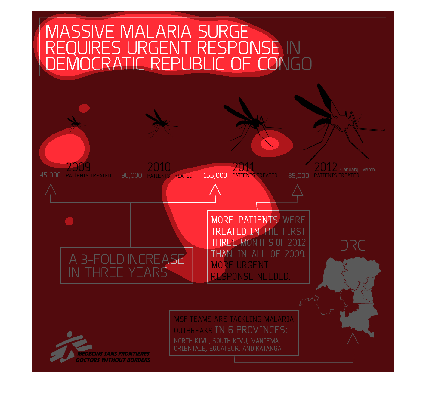
This graphic shows the development of malaria in the Democratic Republic of Congo. There have
been more patients of malaria in the last few years, with 45,000 in 2009 to 85,000 in 2012.
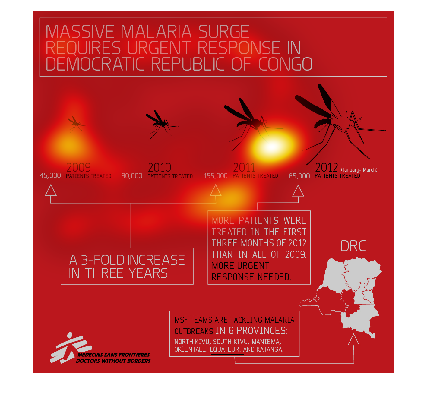
This graph is all red and the name of this graph is called massive malaria are the world it's
shows that in 2012 more response was need now then back in 2009 they need people to respond
quicker.
This poster illustrates a massive malaria surge in the Congo. The infection rate is 3 fold
higher in 2012 compared to 2009, although 2012 saw a slight reduction in new infections compared
to 2011.
This looks like a picture showing the number of West Nile virus increases by year. It shows
that the number of cases has almost tripled and the size of the mosquitos has increased
In the graph on the left hand side it is describing the dramatic rise in malaria cases that
have affected the democratic republic of Congo within Africa.  This virus/disease is transmitted
most frequently through mosquitoes.  These mosquitoes grow bigger as each year passes within
the chart to show the dramatic rise in cases.
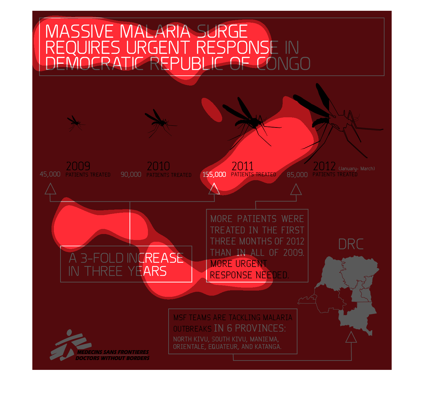
Massive Malaria surge in the Congo. They went from 4500 people treat in 2009 to 85000 people
being treated in 2012. More patients were treated in the first 3 months of 2012 then all of
2009. This was presented by Doctors without borders.
This image is a poster describing the response to malaria in the Democratic Republic of Congo
and the progression of the disease as well as treatment, how the disease is progressing, and
how many people have been affected by the disease; as well as provinces where outbreaks have
occurred.
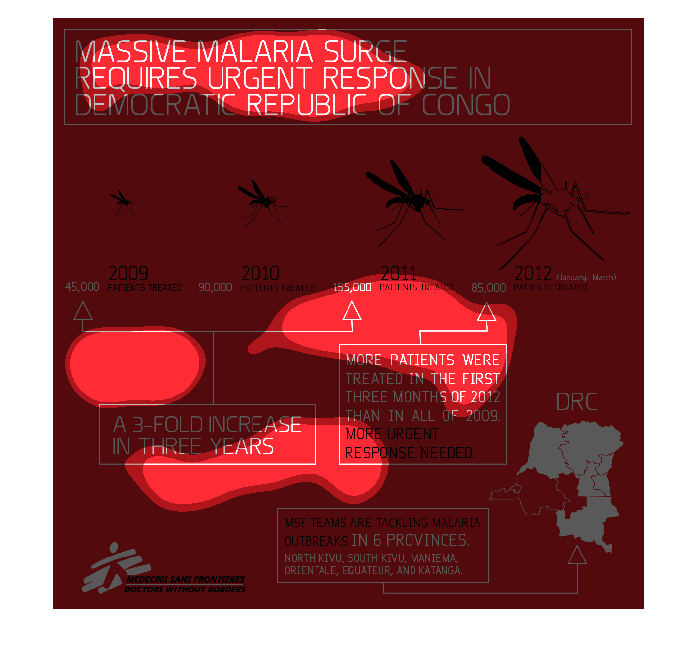
Diagram of massive Malaria surge in the Democratic Republic of Congo. From 45,000 patients
treated in 2009 to 85,000 patients treated in 2012. A 3-fold increase in 3 years. Illustration
expressing the dramatic increase of Malaria.
An epidemic swept the Democratic Republic of Congo called Malaria. This vile disease that
caused many deaths and irreplaceable damage to the countries physic

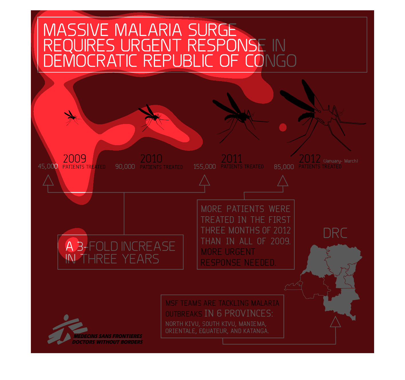
Massive malaria surge requires urgent response in Congo.  The following chart shows that from
2009 to 2011 a huge increase in the number of Malaria Patients was reported in Congo.
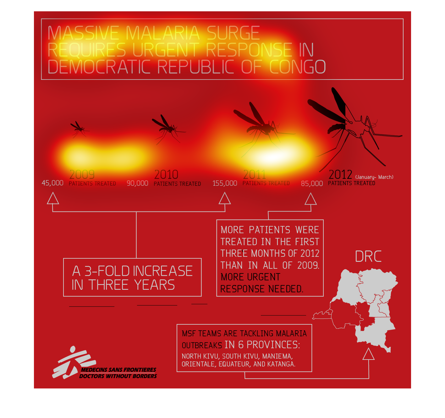
This chart describes massive malaria surge requires urgent response in Democratic Republic
of Congo. The chart features a number of illustrations of mosquitoes.
This graph claims that a massive malaria surge in the Democratic Republic of Congo demands
our attention.  It demonstrates the increase from 2009 to 2012 in outbreaks.
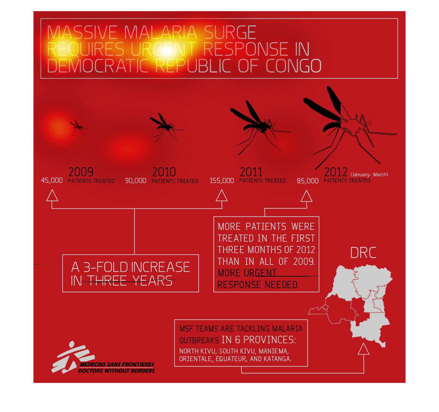
The image depicts the increase in treatment of malaria over the span of multiple years from
2009-2012 in different provinces of the Democratic Republic of Congo. Treatment has increased
over the years.
This chart show the data for a massive malaria surge that required an urgent response in democratic
republic of Congo. Between the years 2009 and 2011 there was a three fold increase of malaria
from 45,000 people treated in 2009 to 155,000 people treated in 2011. However the most patients
were treated in the first three months 2012 than in the whole year of 2009.
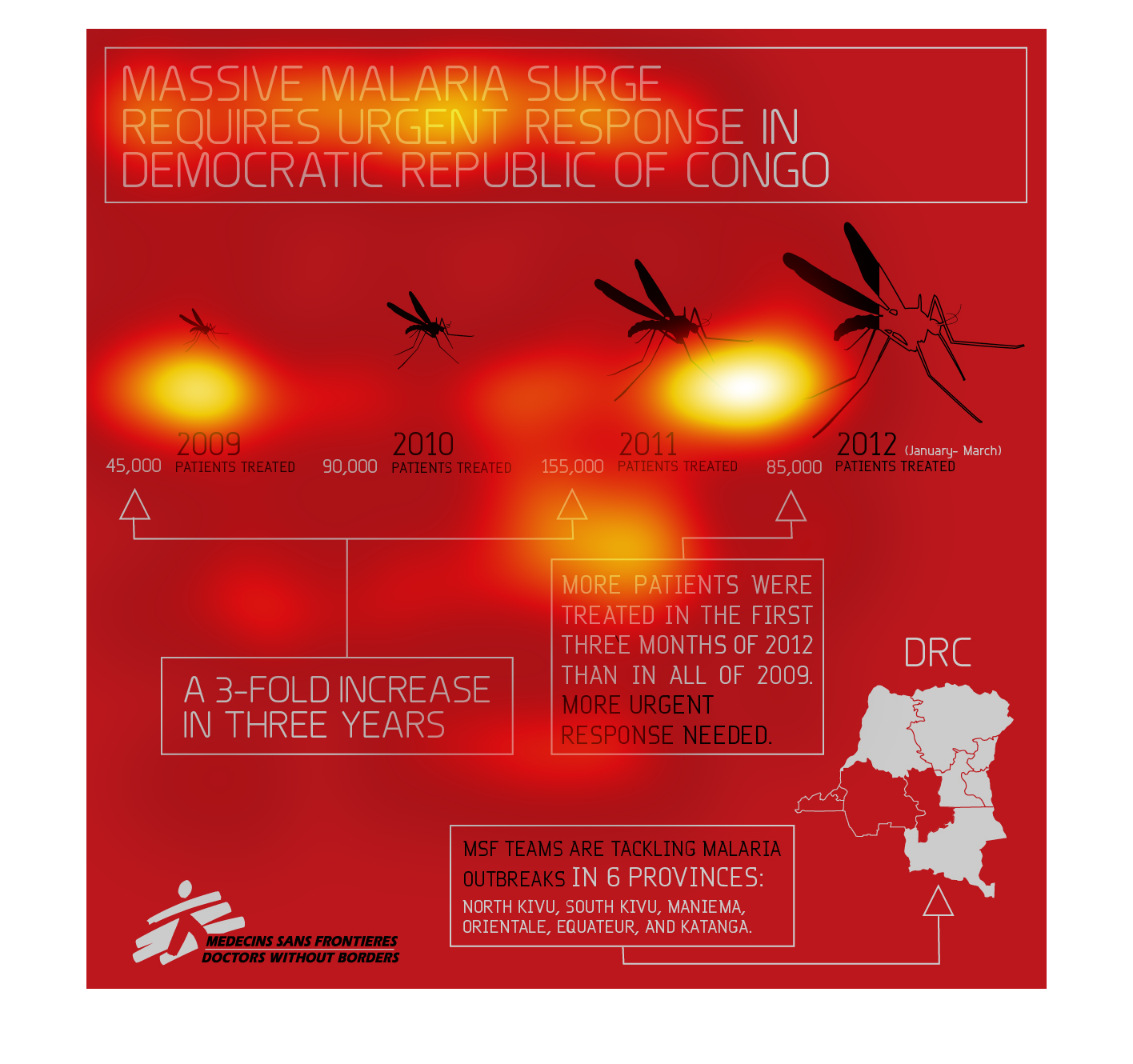
This chart details that a malaria outbreak requires a response in this DRC.  From 2009 to
2012, the amount of patients treated increased each year (a three-fold increase). The problem
is being tackled in 6 provinces in the DRC.