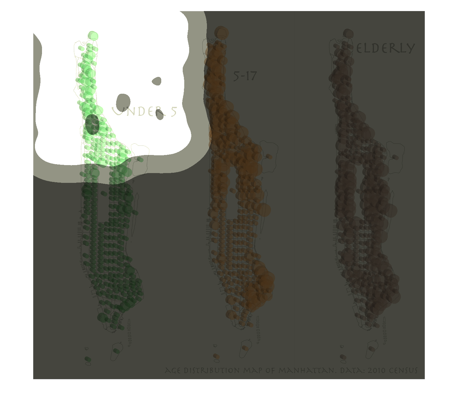
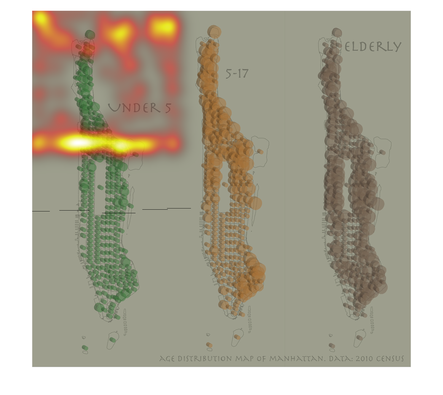
Warning: Image is too big to fit on screen; displaying at 50%
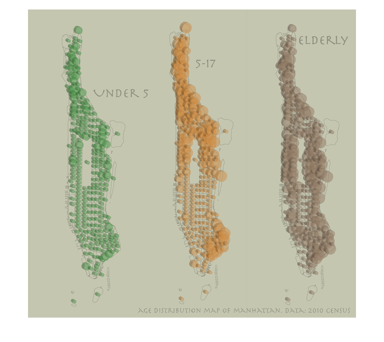
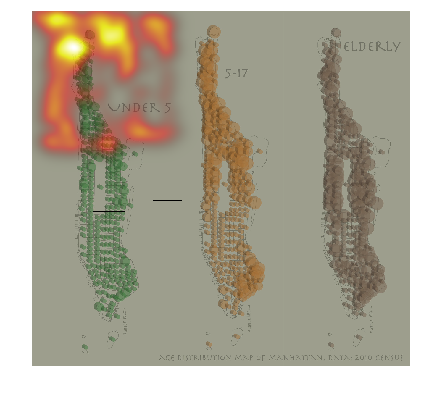
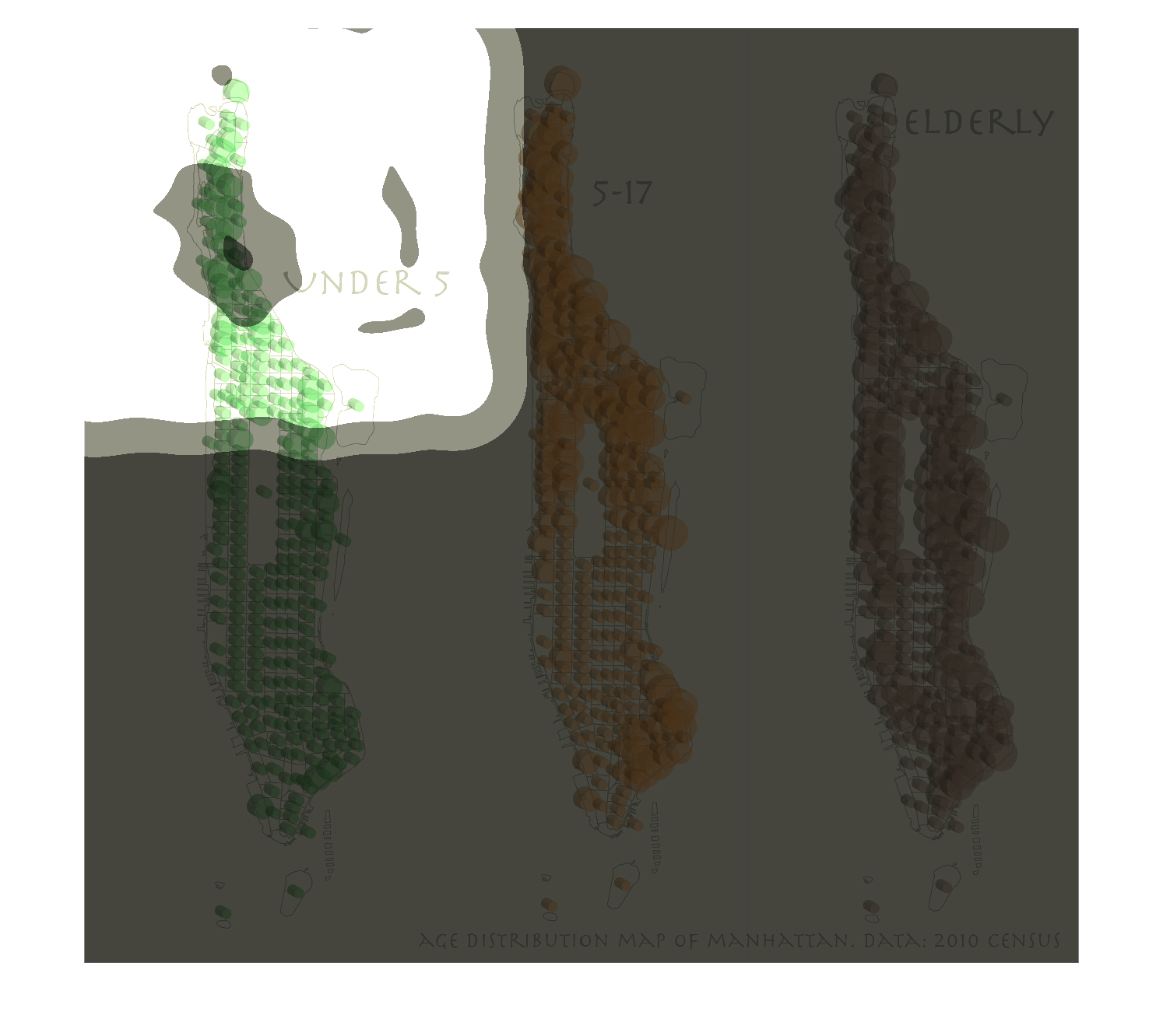
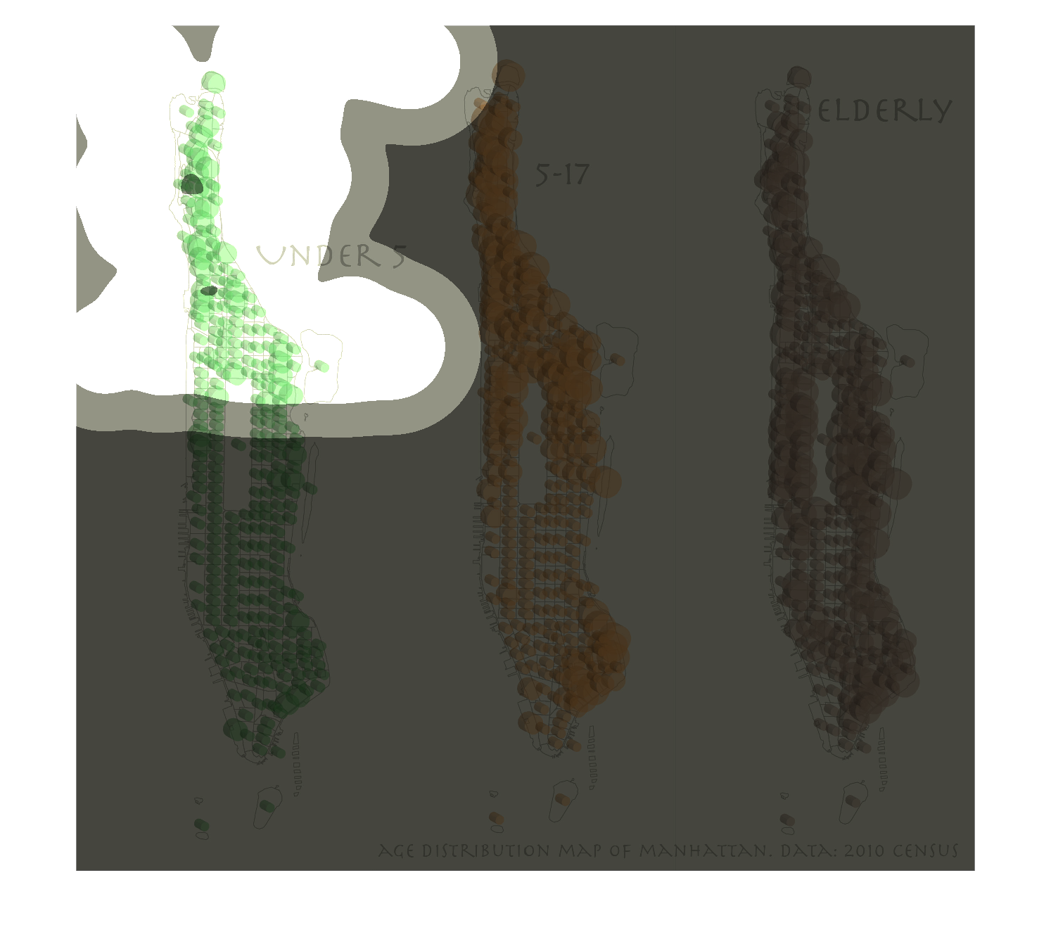
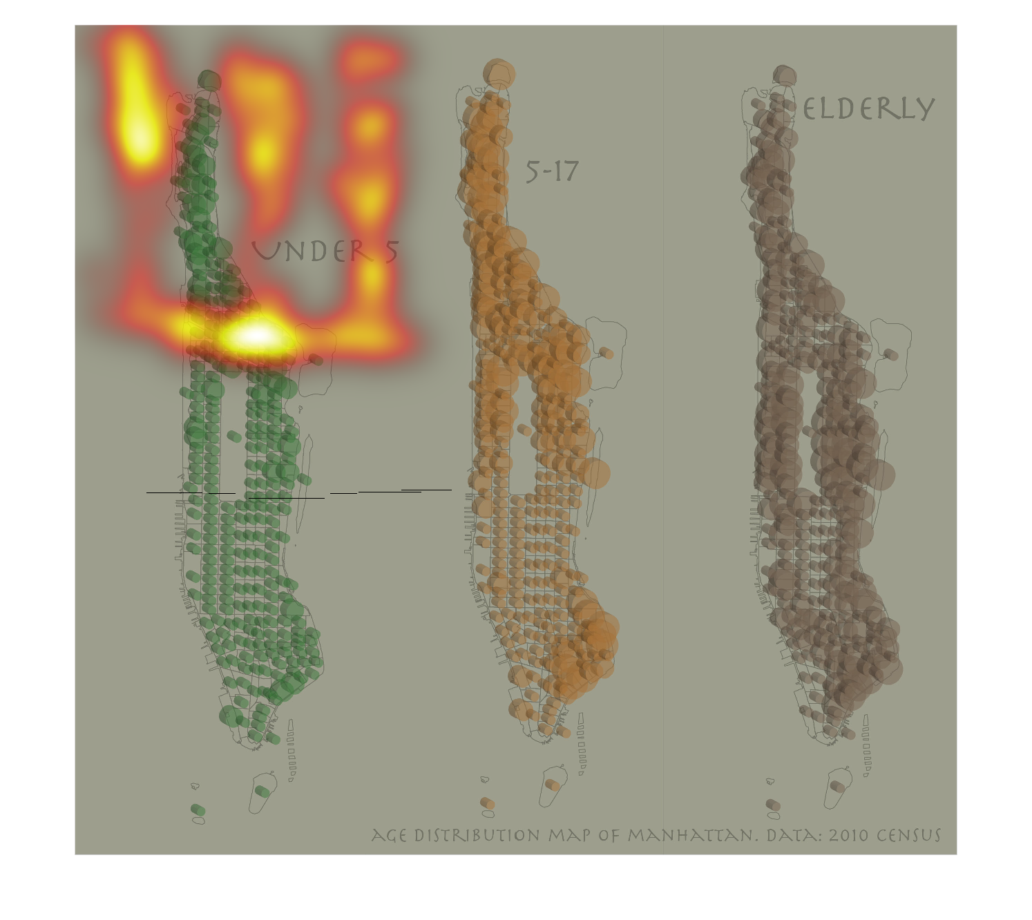
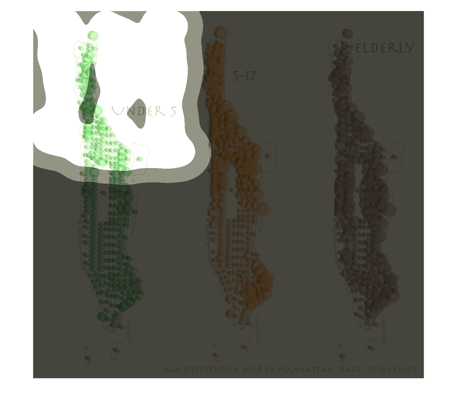
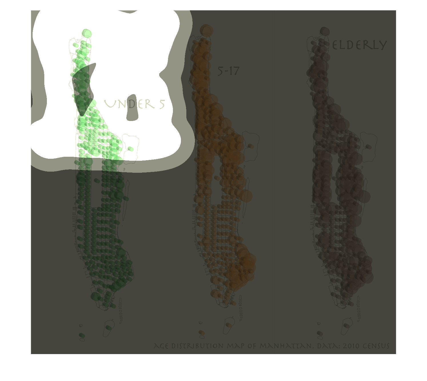
This chart describes about age distribution of people at Manhattan for the year of 2010. Green
color shows child of under age 5. Orange shows for childrens under 5-17. Brown color shows
about about elderly people.
Warning: Image is too big to fit on screen; displaying at 50%
Warning: Image is too big to fit on screen; displaying at 50%
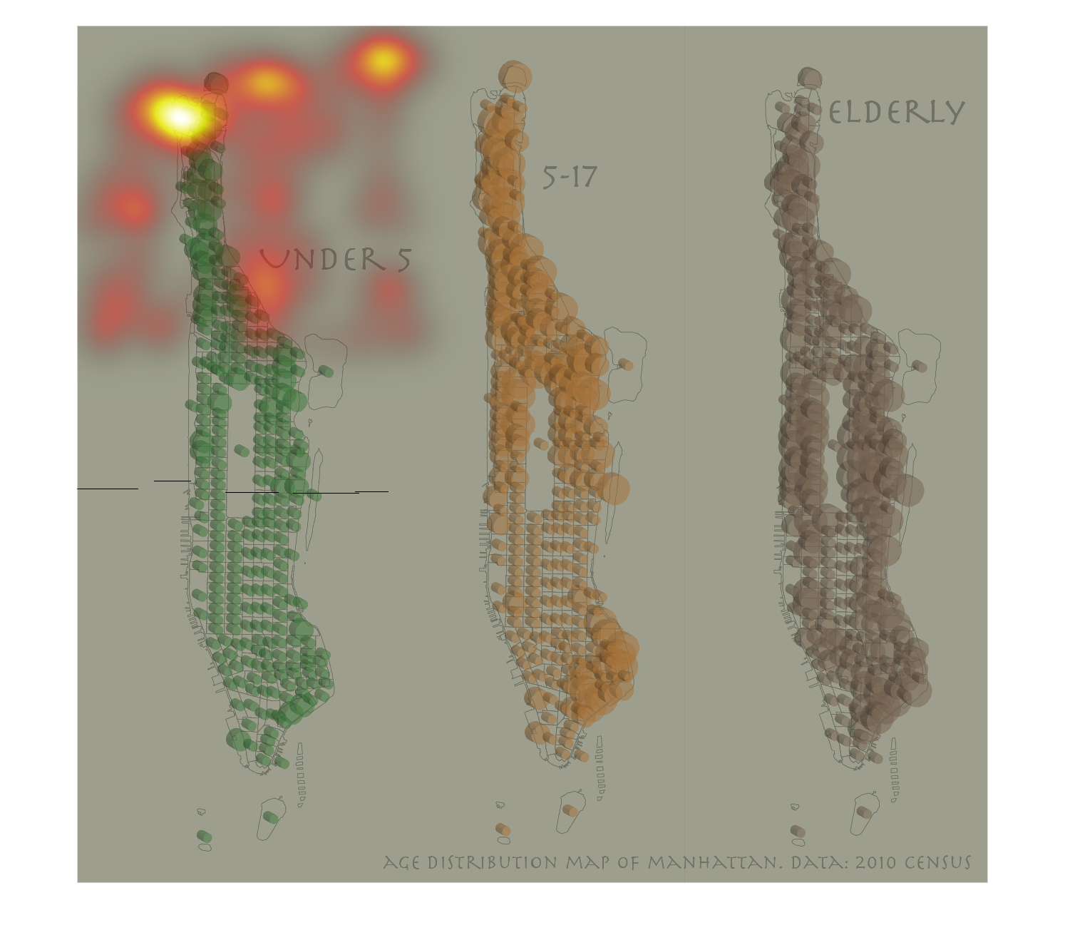
The following chart is an age distribution chart of the city of Manhattan it depicts a rather
balanced distribution of age group around the city with different ages pretty spread evenly.
Warning: Image is too big to fit on screen; displaying at 50%
Warning: Image is too big to fit on screen; displaying at 50%
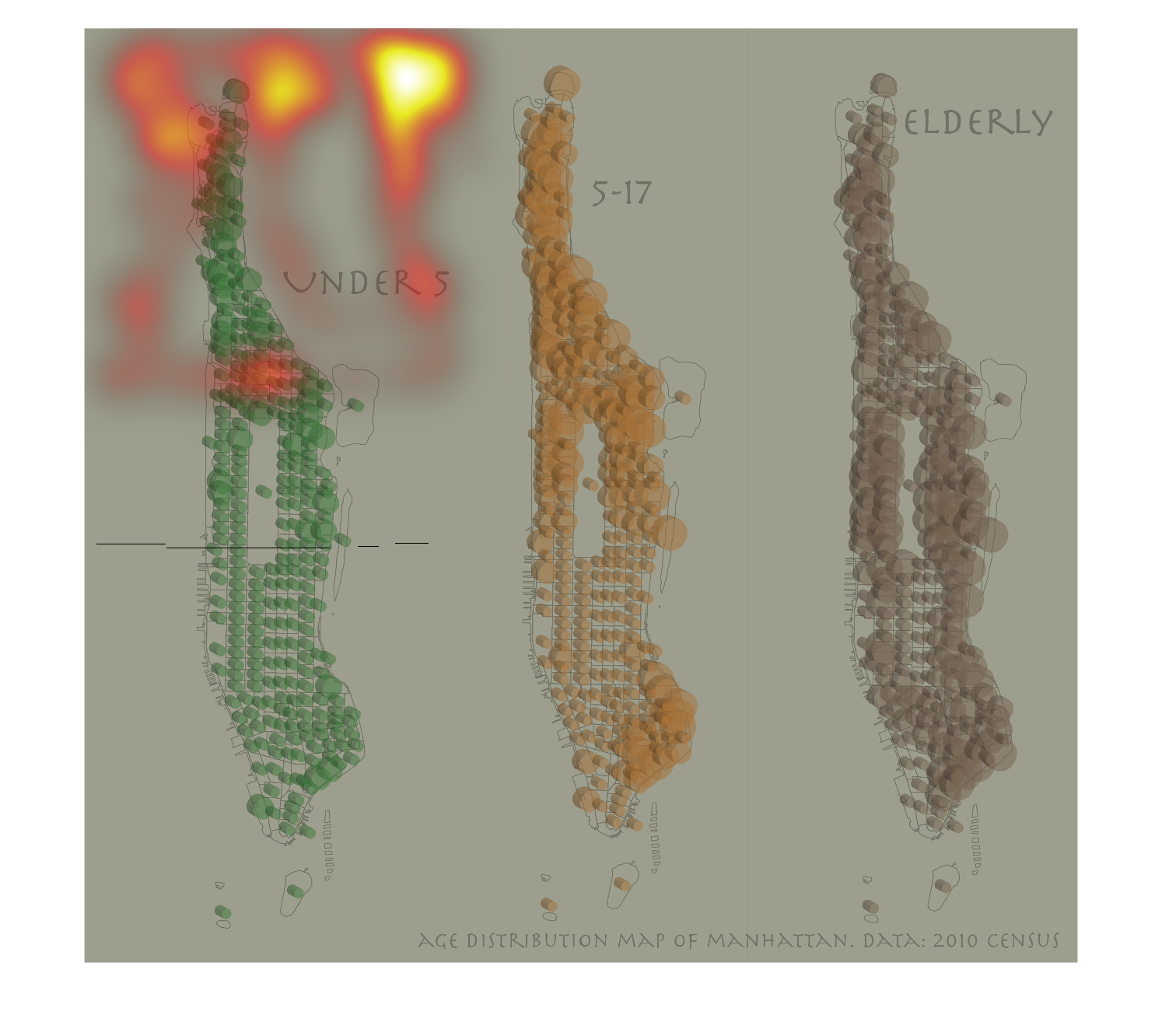
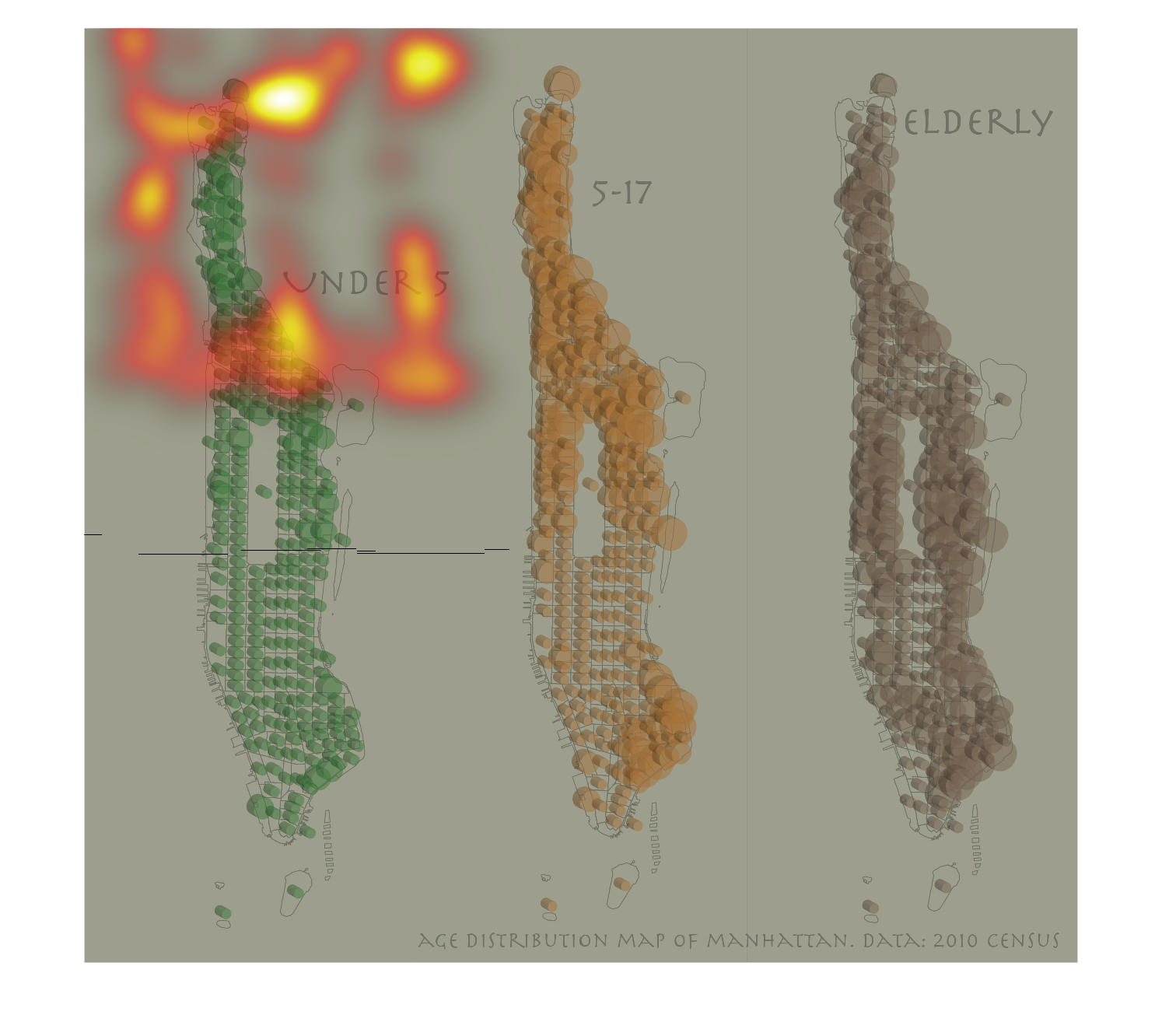
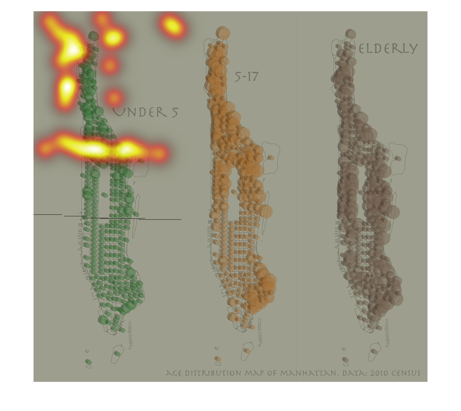
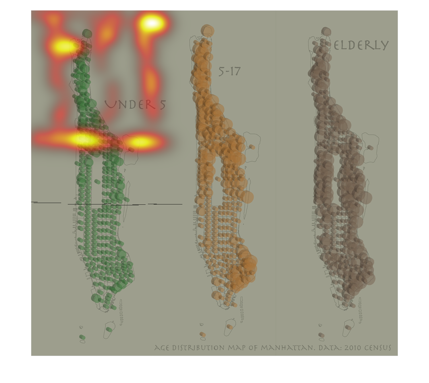
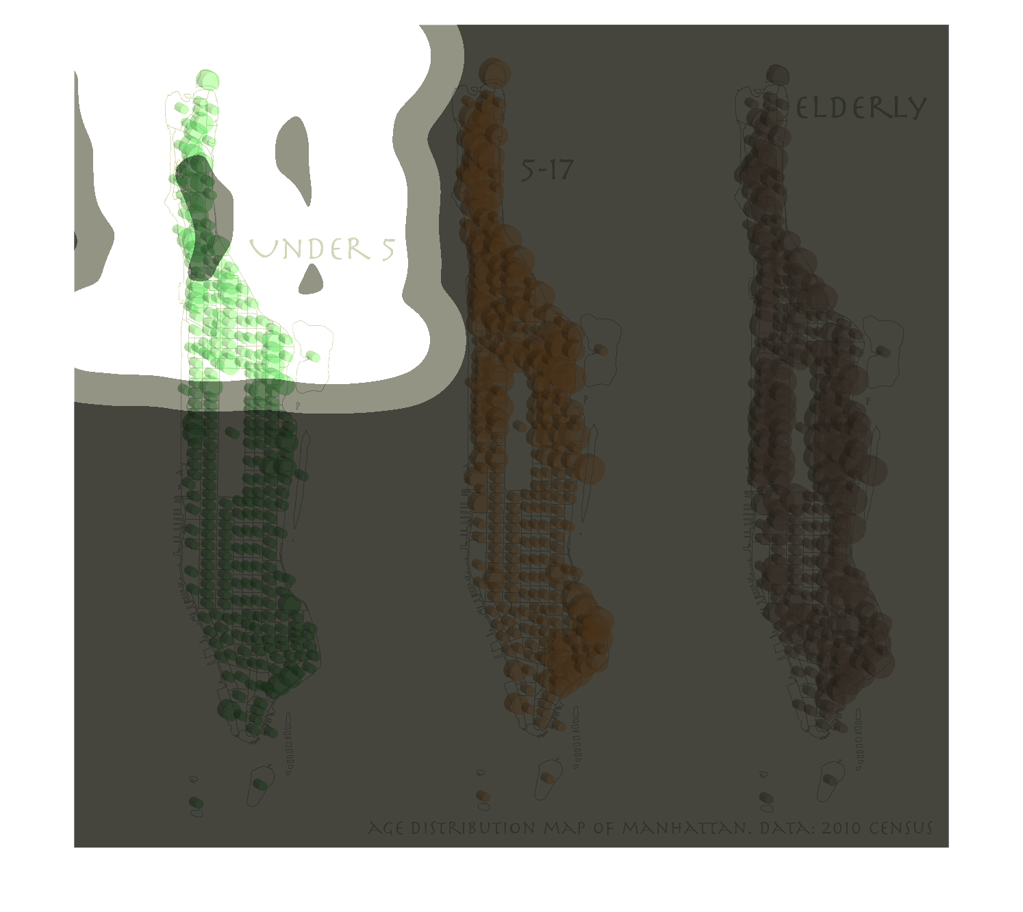
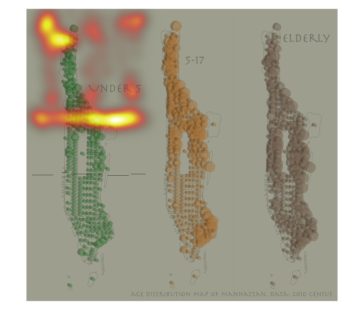
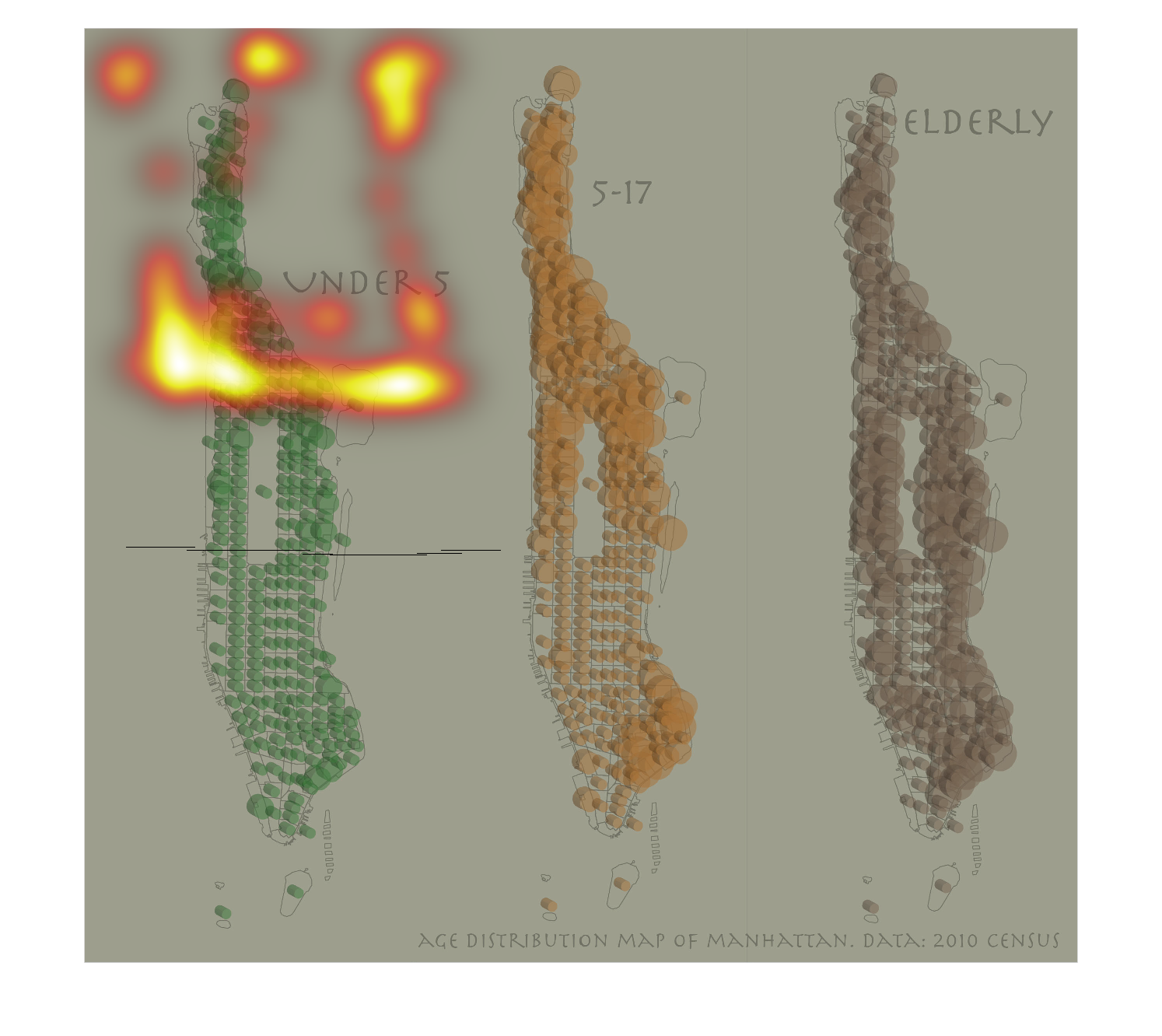
This shows the population distributed throughout the island of Manhattan between the young
and the elderly. It does not provide a year, but the data indicates that they live in exactly
the same places.
Warning: Image is too big to fit on screen; displaying at 50%
Warning: Image is too big to fit on screen; displaying at 50%
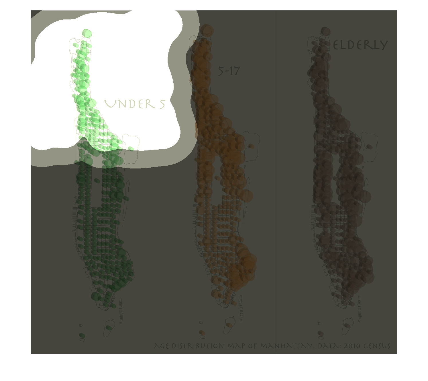
This image displays data from the 2010 census, showing  age distribution of Manhattan. The
three age demographics represented by this graph show those under 5 years with the color green,
ages 5-17 with the color orange, and "elderly" with a brownish-purple color.
Warning: Image is too big to fit on screen; displaying at 50%
Warning: Image is too big to fit on screen; displaying at 50%
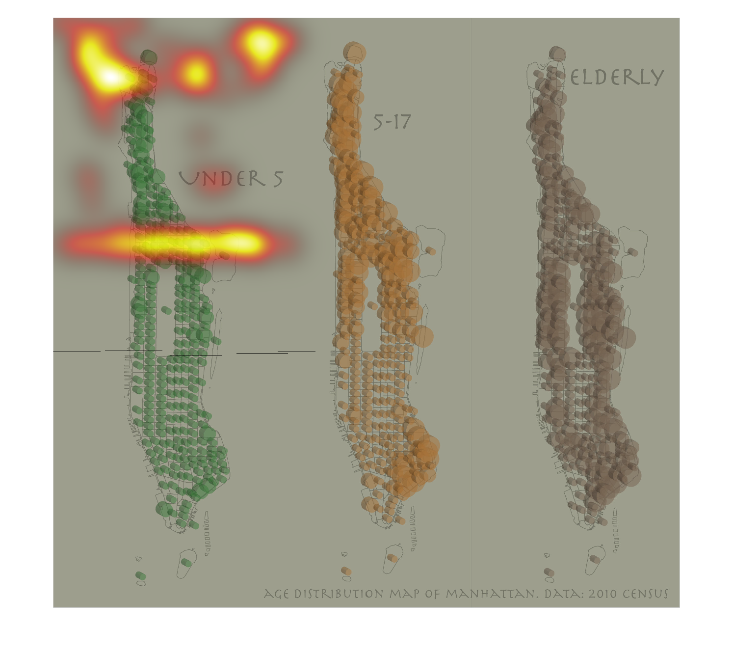
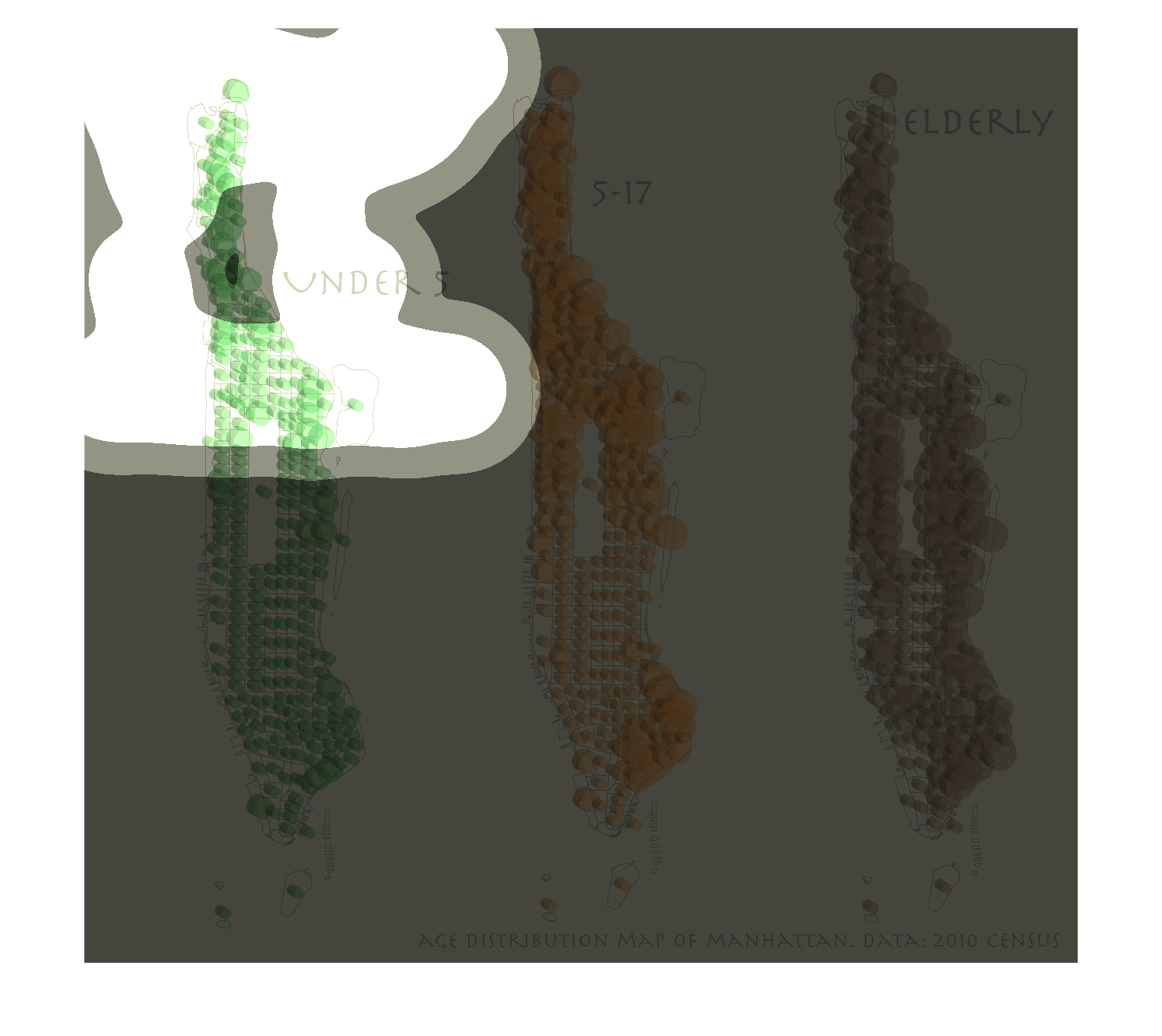
This chart describes and depicts the age distribution   map of the city of Manhattan from
under five, age five   to seven-teen,as well as the elderly.
Warning: Image is too big to fit on screen; displaying at 50%
Warning: Image is too big to fit on screen; displaying at 50%
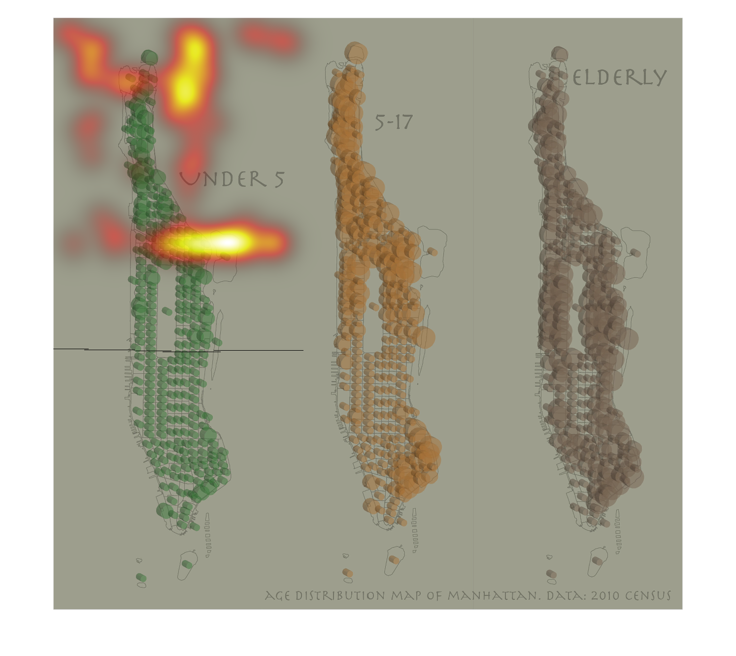
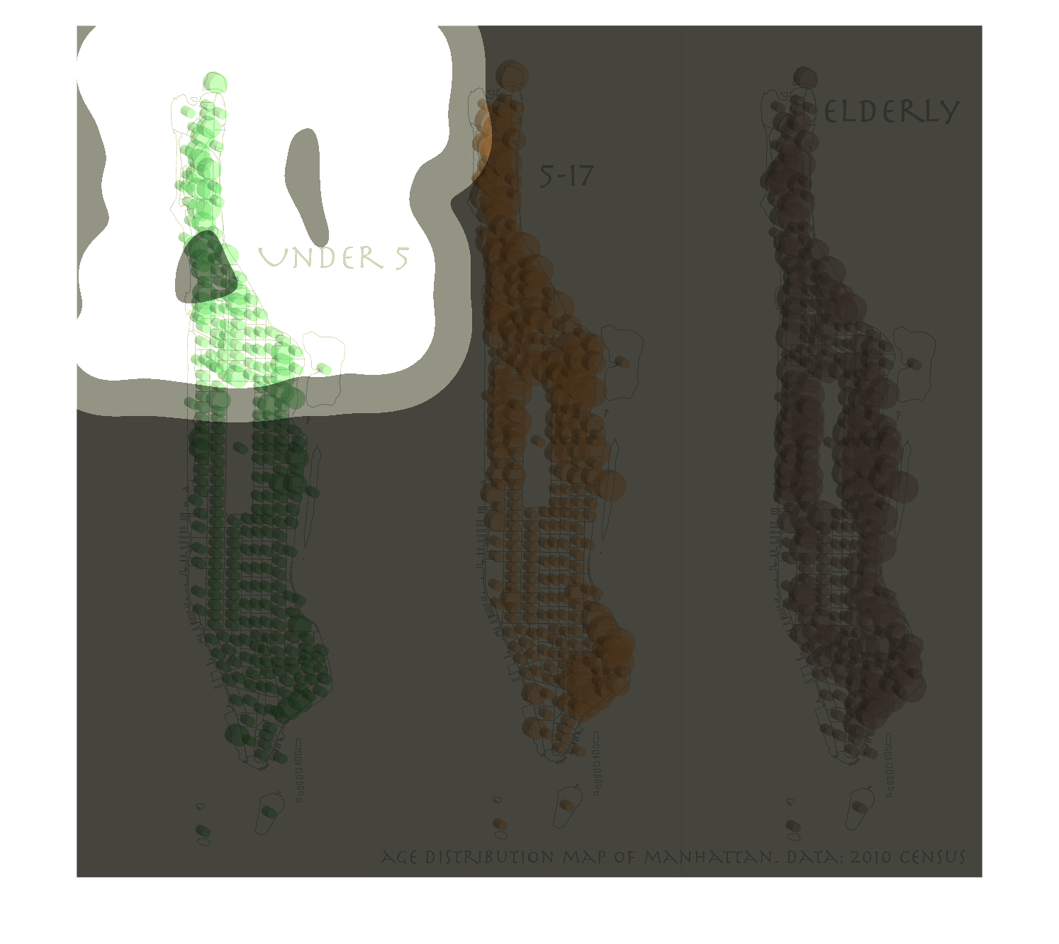
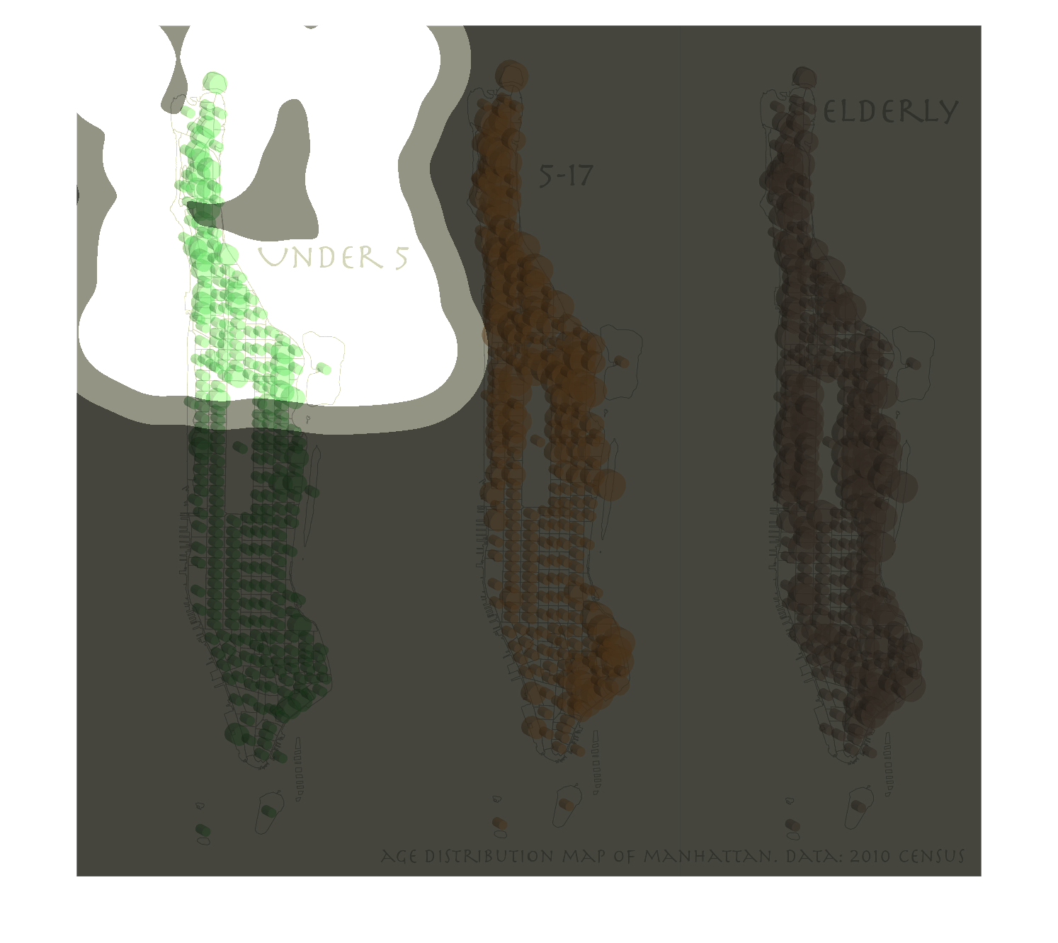
This image is showing the age distribution map of Manhattan data gathered from the 2010 census.
According to the data the elderly people account for the most amount of people and children
five years old and younger account for the least amount.
Warning: Image is too big to fit on screen; displaying at 50%
Warning: Image is too big to fit on screen; displaying at 50%
The image on the left hand side has three textures one being green depicting under 5, the
one in the middle is colored orange depicting 5-17 and the image on the right hand side is
maroon and is depicted as elderly.  From first glance these look like blood tissues just as
a guess.
Warning: Image is too big to fit on screen; displaying at 50%
Warning: Image is too big to fit on screen; displaying at 50%
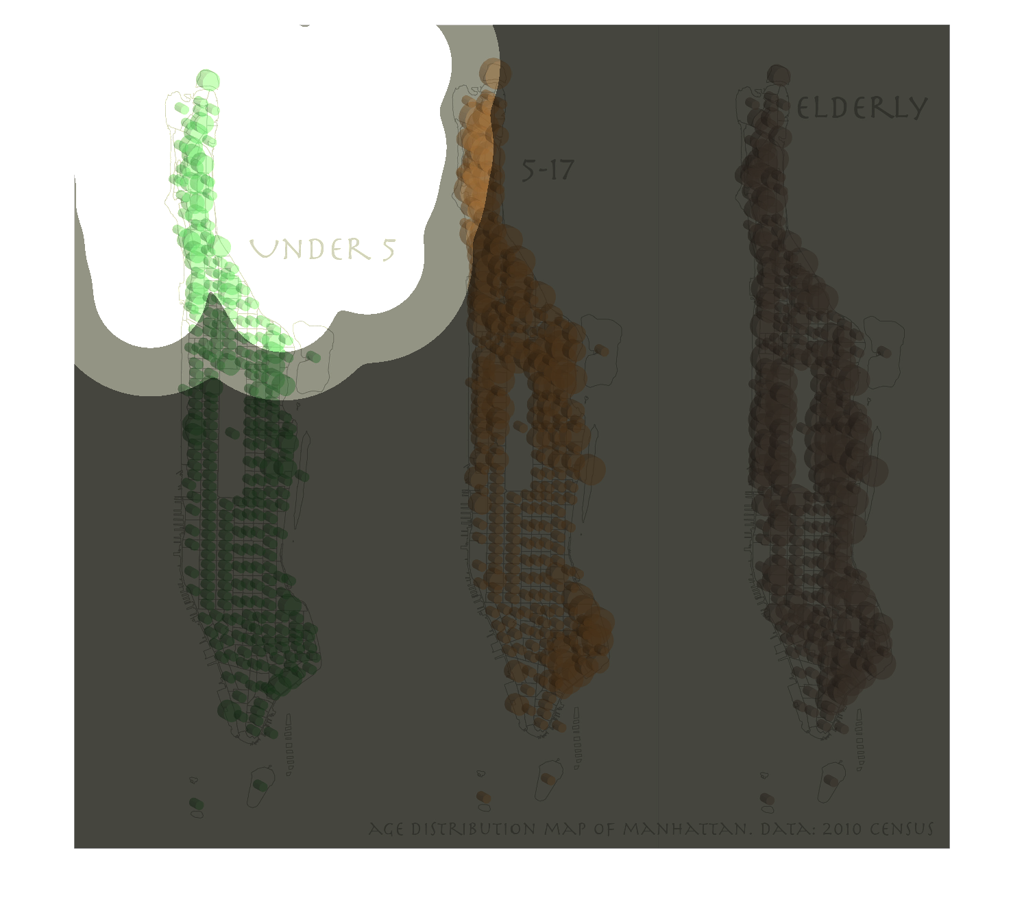
Under 5 5-17 Elderly  Age distribution map of Manhattan 2010 census. What is there to say?
They seem to be relatively evenly distributed, how strange.
Warning: Image is too big to fit on screen; displaying at 50%
Warning: Image is too big to fit on screen; displaying at 50%
This graph shows under 5 years on the right, 5-17 years in the middle, and elderly on the
right and displays the population of each in the island of Manhattan.
Warning: Image is too big to fit on screen; displaying at 50%
Warning: Image is too big to fit on screen; displaying at 50%
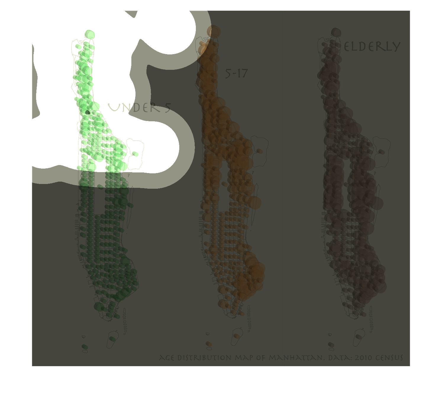
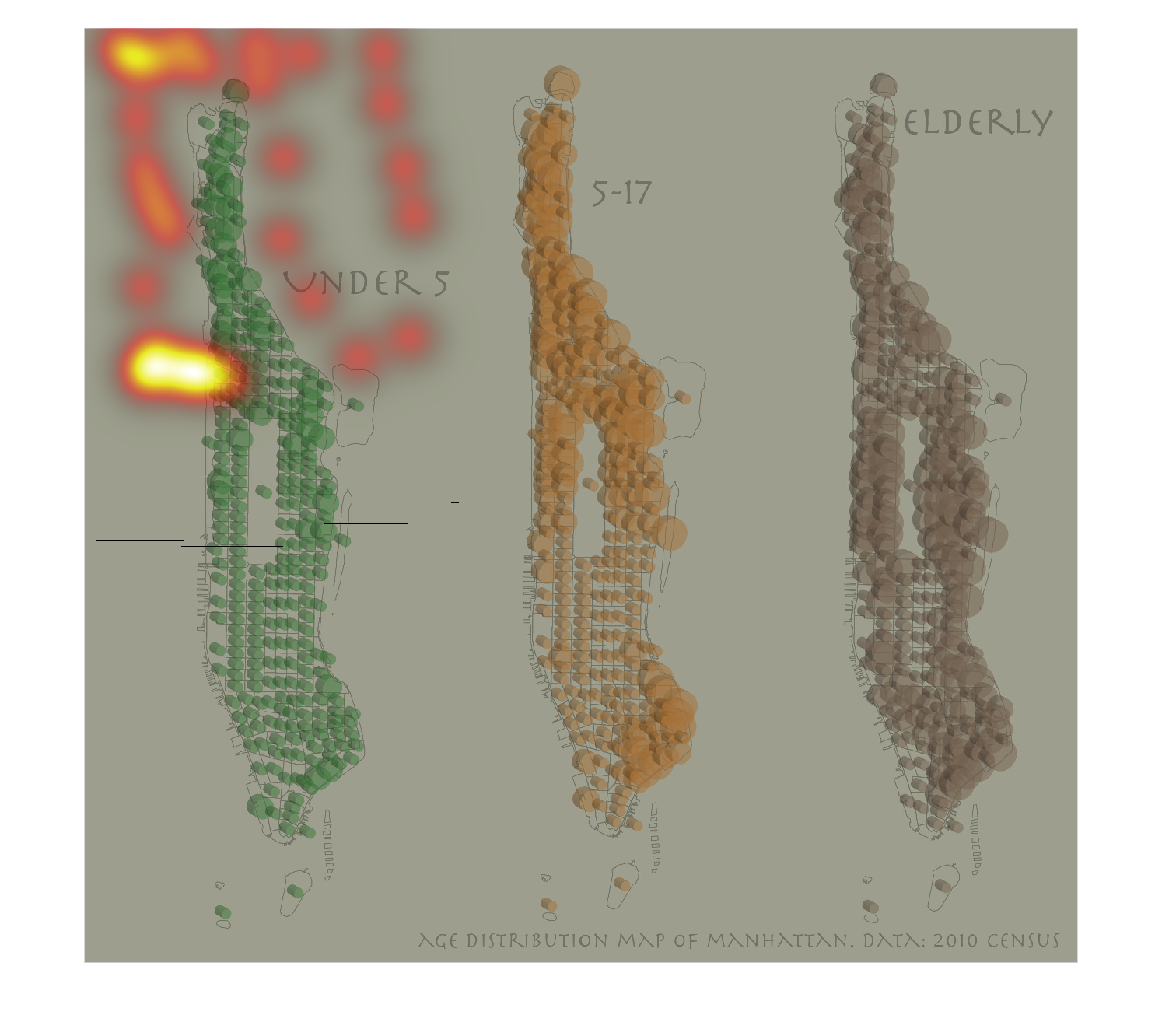
The image shows a data set for Manhattan, based upon the Census from 2010. This image displays
a graphic for individuals under 5 years of age, 5-17 years of age, and the Elderly.
Warning: Image is too big to fit on screen; displaying at 50%
Warning: Image is too big to fit on screen; displaying at 50%
The image shows the age distribution of Manhattan. The image displays three small maps of
Manhattan labeled as: Under 5, 5-17, and Elderly. Each map shows the areas where people within
the designated range live on the map of the city.
Warning: Image is too big to fit on screen; displaying at 50%
Warning: Image is too big to fit on screen; displaying at 50%
This chart displays the age distribution map of Manhattan data from the 2010 census. The elderly
were shown in the color brown. The other categories were not listed.
Warning: Image is too big to fit on screen; displaying at 50%
Warning: Image is too big to fit on screen; displaying at 50%
This was not a graph nor a chart. This was three landscape architecture diagrams of trees
in different colors. The first one is green, the second is orange, and the third one is purple.
Warning: Image is too big to fit on screen; displaying at 50%
Warning: Image is too big to fit on screen; displaying at 50%
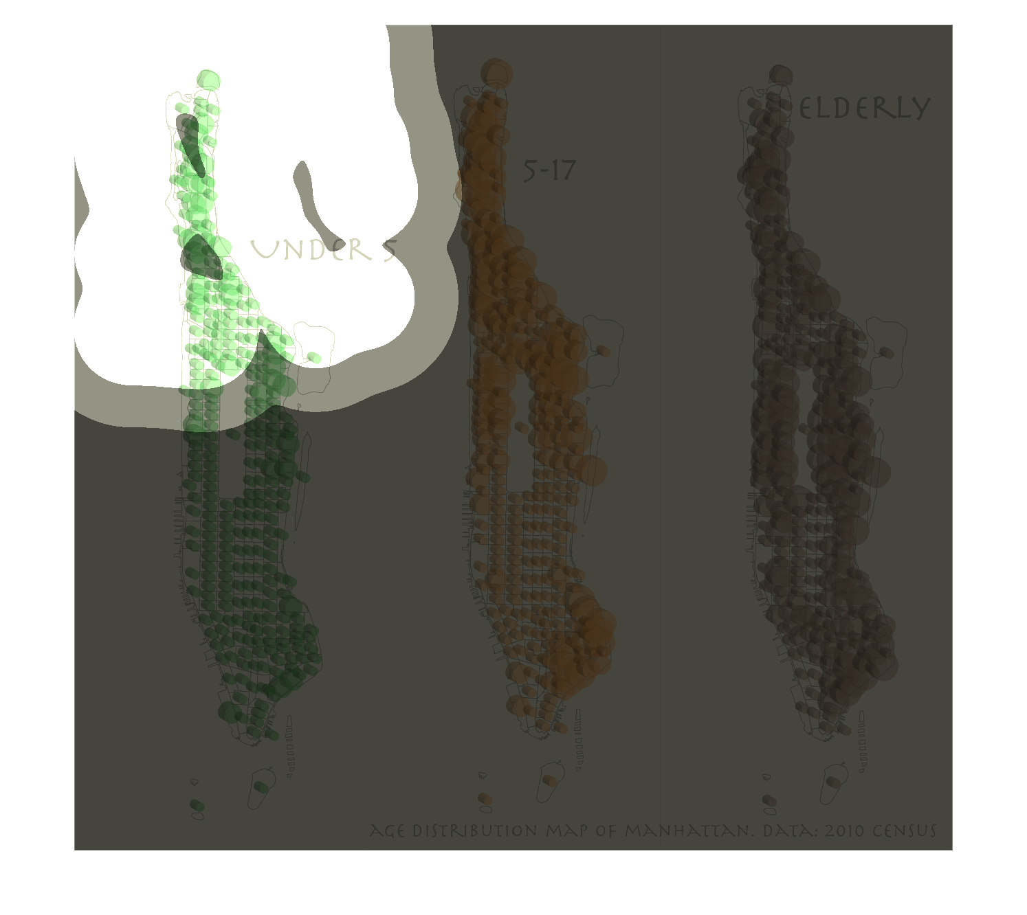
This image shows or depicts in 3 different forms of anatomy among the different ages of humans
from young ages to those of adults and then the elderly.
Warning: Image is too big to fit on screen; displaying at 50%
Warning: Image is too big to fit on screen; displaying at 50%
This is some kind of a medical chart that shows differences between the organisms at birth,
 between 5-17 and elderly The chart is color coded for the different ages
Warning: Image is too big to fit on screen; displaying at 50%
Warning: Image is too big to fit on screen; displaying at 50%