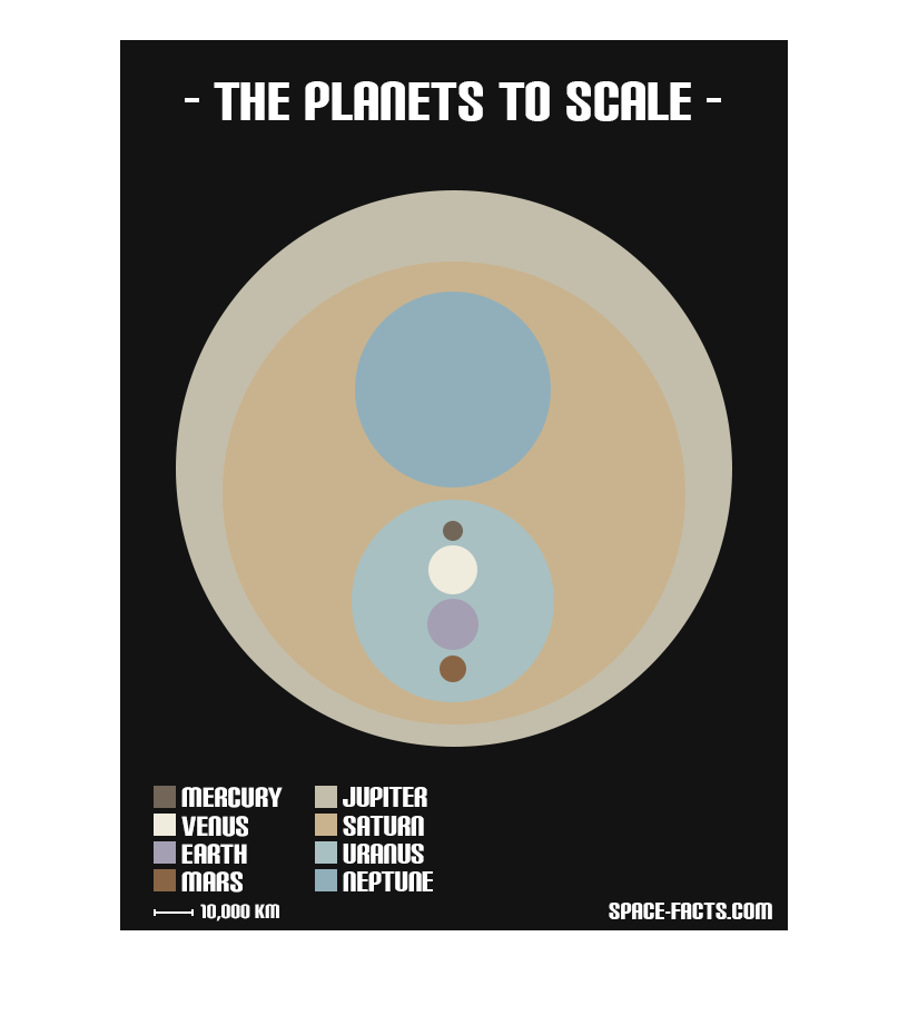
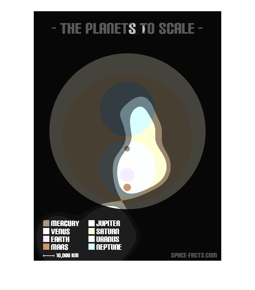
This is a graphic that shows all the planet sizes to scale. it shows ll the planets next to
each other so that people can see the size of each of the planets.
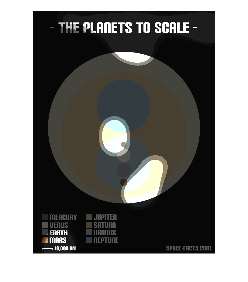
this image shows the scale of the different planets in the solar system compared to jupiter
 it also has a ruler showing 10,000 kilometers to show how large some actually are
The caption for this image is, "The planets to scale".  In the bottom right hand corner is
a key.  The key is color coordinated to the planets in our solar system.  Then there are spheres
of different colors and sizes corresponding to the displayed planets, centerrd in the graphic.
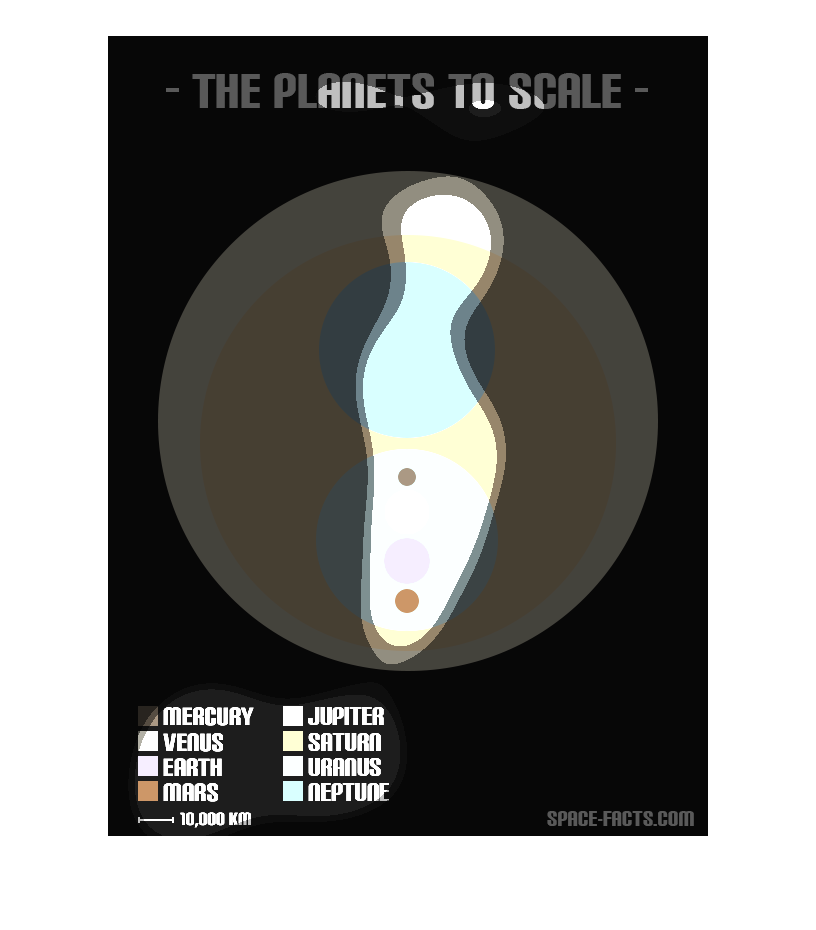
This chart shows the planets to scale and has the size of each planet in the solar system
reflected in a different color in relation to all the other planets in the solar system.
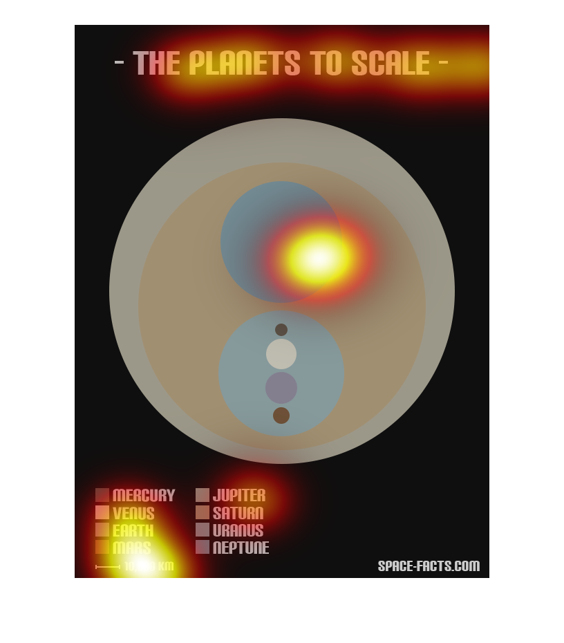
This graphic shows the planets to scale, against Jupiter as a background. Saturn is almost
as big as Jupiter in diameter, with Uranus and Neptune each about 1/4 the diameter of Jupiter.
The inner planets, including earth, are more ping pong ball sized compared to Jupiter's basketball
sized diameter.
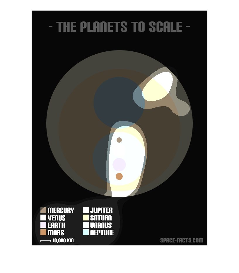
This chart shows the planet to scale. The chart lists, Earth, Venus, Mars and Mercury, Jupiter,
Saturn, Uranus and Neptune. It has a color associated with each planet, each planet is placed
in order of size starting with the largest planet and working towards the smallest planet
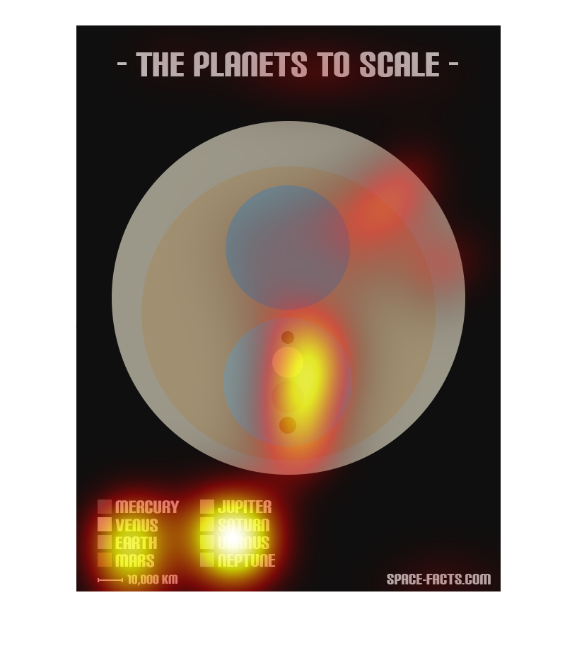
This chart shows the size of the planets by showing a chart that demonstrates the  conference
of each . Saturn is the largest planet on the chart followed by earth
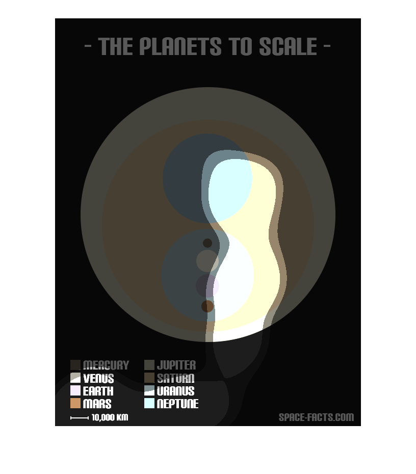
This image shows all of the planets in our solar system, to scale. Jupiter and Saturn are
the largest planets, by a long shot. The others vary in size, with Mercury as the smallest,
than Mars. Venus and Earth are similar in size, and Neptune and Uranus are also similar in
size.

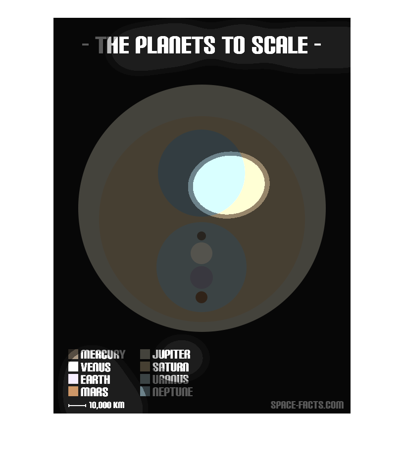
This chart describes and depicts the planets' sizes scaled and in comparison to each other.
This was done by placing the smaller planets inside the larger planets.

The graph to the left is describing how the planets are in order and size in comparison to
the sun.  At the bottom of the graph you will see that the planets are in order from nearest
to the sun to furthest as you move up the graph.  From this graph one can point out that the
Sun is massive in comparison to all of the other planets.
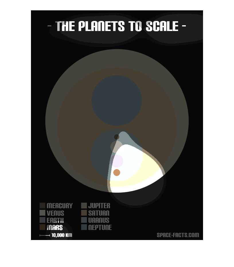
This image depicts the scale of the 8 planets in this solar system. The planets are differentiated
by color and  the scale for this chart is 10,000 Kilometers.
This image shows or depicts information about the planets to scale. Planets listed are Mercury,
Venus, Earth, Mars, Jupiter, Saturn, Uranus and Neptune.
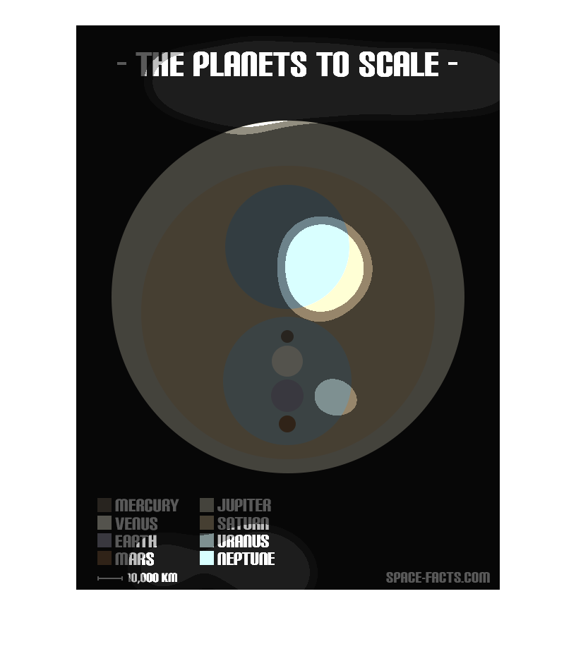
This chart describes the planets to scale. The chart includes, Mercury,Venus, Earth, Mars,
Jupiter, Saturn, Uranus, and Neptune. Pluto was not on the chart.
It showing the planets on a scale. I guess when in orbit the planets even with each other
at some time.. This is showing what planet lines up and when.