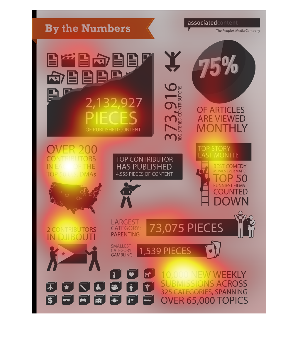
These are figures regarding the Direct Marketing Association or DMA and the number of pieces
and content that are distributed.  It has all kinds of statistics on articles.

The infographic is telling the reader about pieces of published content and their various
percentages and data numbers. It gives data on the largest category, where the articles originated
from in the USA,  top story, etc.

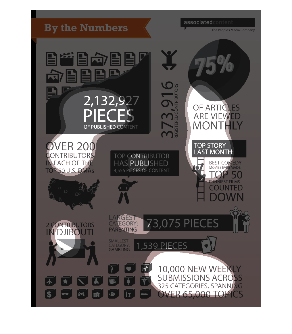
by the numbers 2,132,927, a bunch of numbers and symbols that i don't understand and really
small worlds. This chart is so extremely confusing, i don't understand what's going on
The image depicts the statistics of the Associated Content online publishing platform using
raw numbers and percentages. Everything from the number of contributors, to numbers of articles
written, number of articled read, unique publishers from far-out countries like Djibouti,
and pieces of content published.
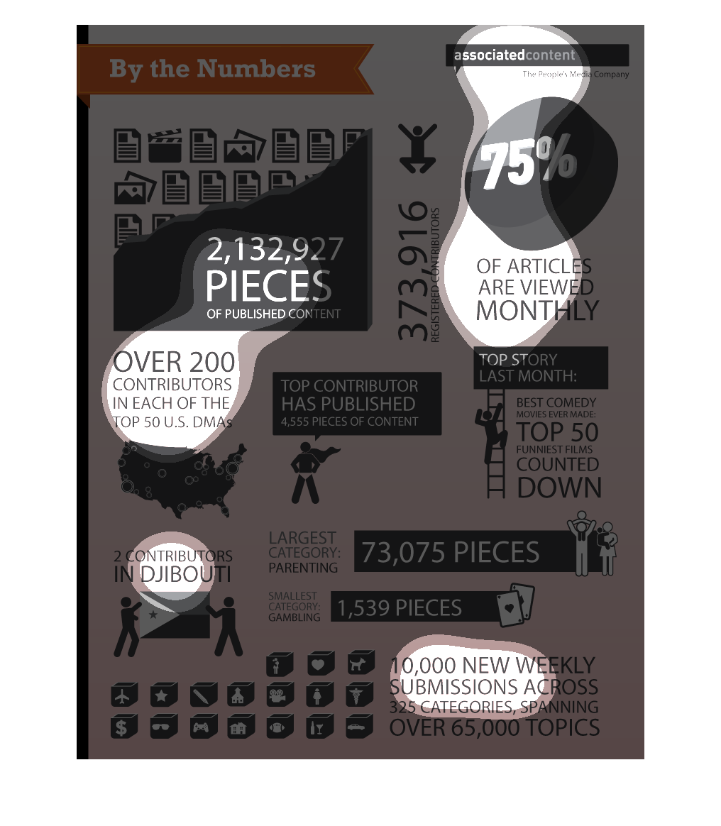
This image looks like its an article page going over numbers from the People's Media Company.
They have published 2,132,927 pieces of content. The most content they have published is under
the category parenting with 73,075 pieces published. The least amount of content is under
the category gambling with  only 1,539 pieces published.
This image provides information about a wide variety of topics. The information is presented
by category and uses images to illustrate the numbers that are shown.
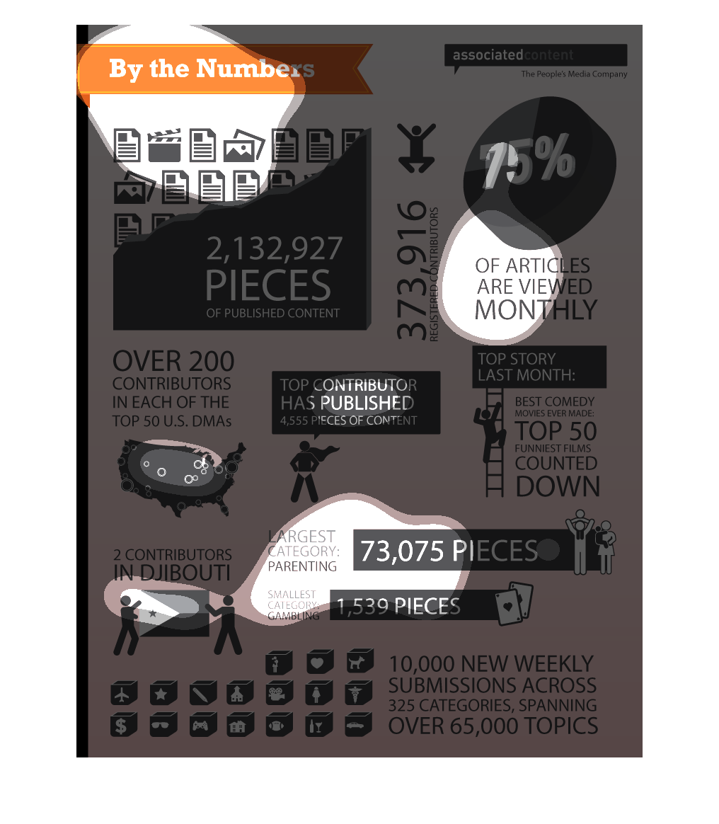
The caption for this image is, "By the numbers".  There are about a dozen different icons
with bits of information regarding different types of media, the numbers of that media that
were published, separated by different subject matter categories.
This chart is titled by the numbers. The chart states that there are over 200 contributors
in each of the top fifty U.S. DMAs. With the largest category being parenting.
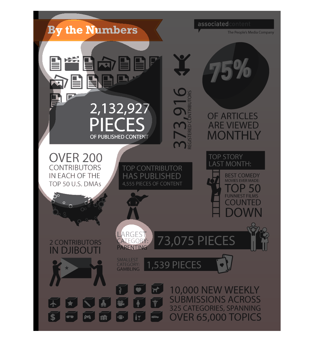
This is a chart titled By The Numbers. The chart seems to be displaying stats about associated
content and has a number of different graphs and statistical information on it.
This is a chart describing who writes content, where they are and who their content is consumed
by in location and other relevant demographic data. This chart also includes other submission
forms.

This graphic depicts various statistics regarding some sort of periodical or media source.
The graphics detail certain facts such as how many contributors the source, the percentage
of articles viewed monthly, and the amount of weekly submissions over broad categories. Altogether,
the graphic gives details on how prolific and widespread this certain forum is.

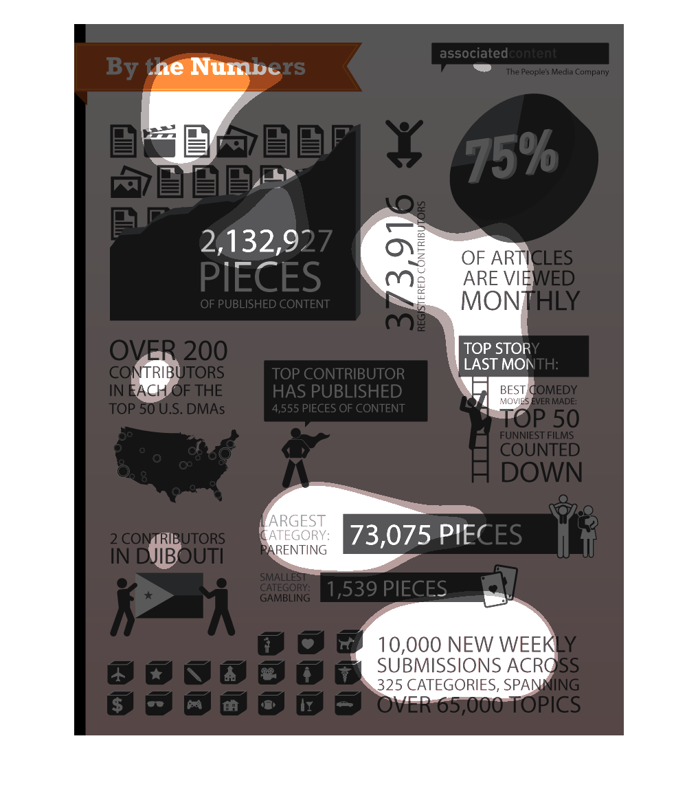
This is a poor depiction of the number of content contributors and the of articles they have
published. Happily it shows that only 75% of those are viewed monthly.

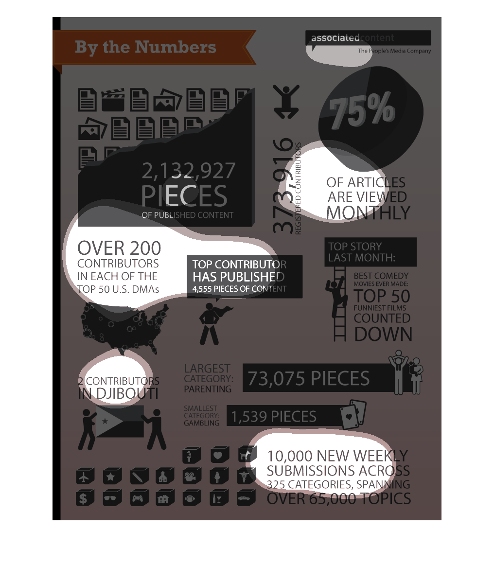
This is a series of statistics, graphs and diagrams displayed graphically showing the numbers
across a varying number of metrics for the growth of a website.

This is an illustration of a varied sort of content distributed over the internet, and the
high volume of consumers said content has in the millions all over the world.
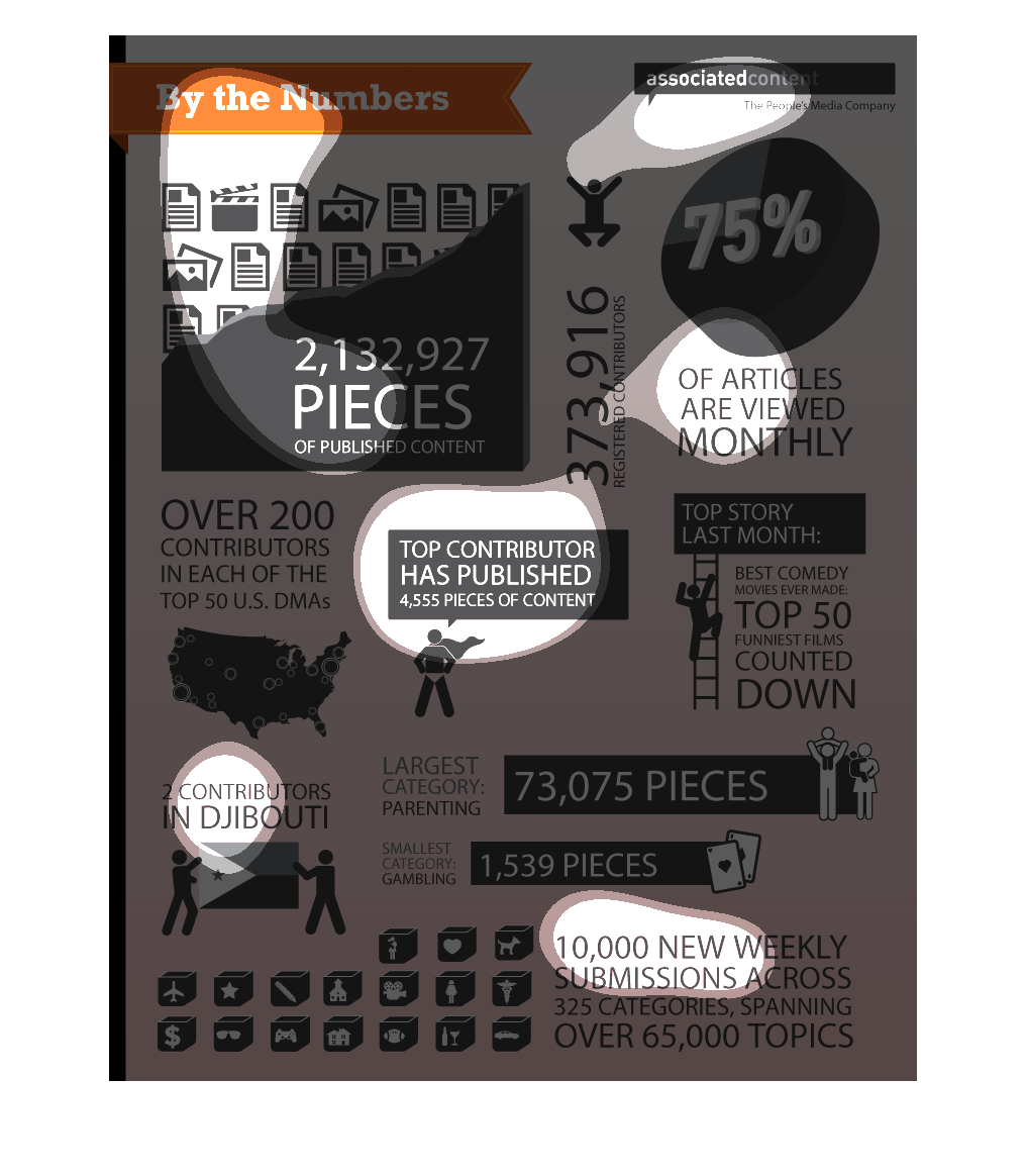
This is a by the number graphic depicting the number of pieces (which totals 2,132, 927) of
published content. 75 percent of articles are viewed monthly. The top story of last month
was the best comedy movies ever made. The largest category of content was about parenting
(73,075), smallest category of content was about gambling (1,539). There are over 200 contributors
in each of the top 50 US DMAs and 2 contributors in Djibouti. 10000 new weekly submissions.