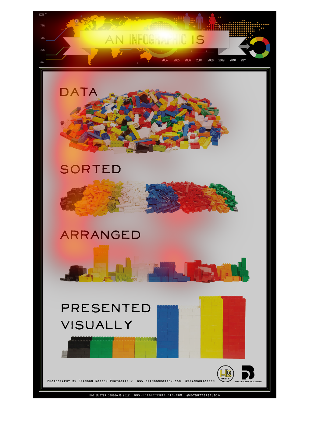
The image is of legos describing the meanings of the phrases "sorted", "arranged", and "presented
visually" in regards to data presentation. Sorting is simply separation of objects, arrangement
is legos built into little city-like groups, and visual presentation is even, aesthetically
pleasing groups of the legos.
The image depicts and explains by using words and pictures as to what an infographic is, and
how one goes about creating an infographic. Simple words and pictures are used, with a step
by step instruction of: Data, sorted, arraigned, and presented visually.


This infographic provides to be an example for infographics. It outlines that an infographic
should contain data that is sorted, arranged, then presented in an eye catching manner. The
infographic uses building blocks to provide examples of sorting and presenting.
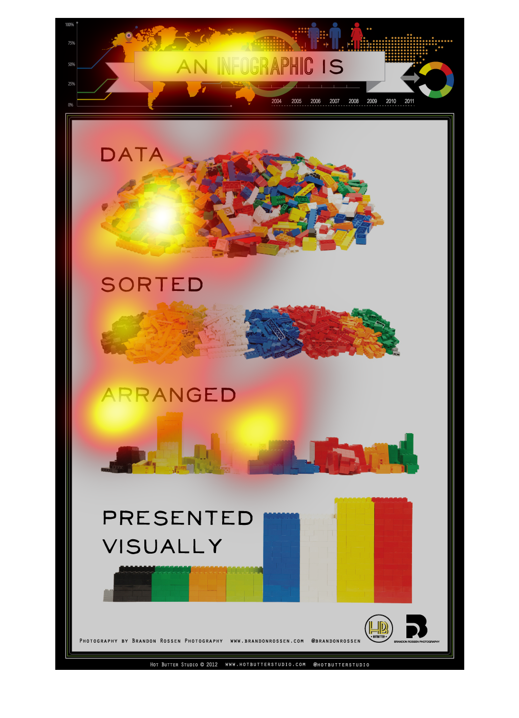
This is a diagram of what is contained in an infographic.  It says an infographic is assorted
data arranged and presented in a visually appealing manner.
This chart explains what the exact qualifications are needed for something to be classified
as an infographic. It has all of the necessities for something to be an infographic.
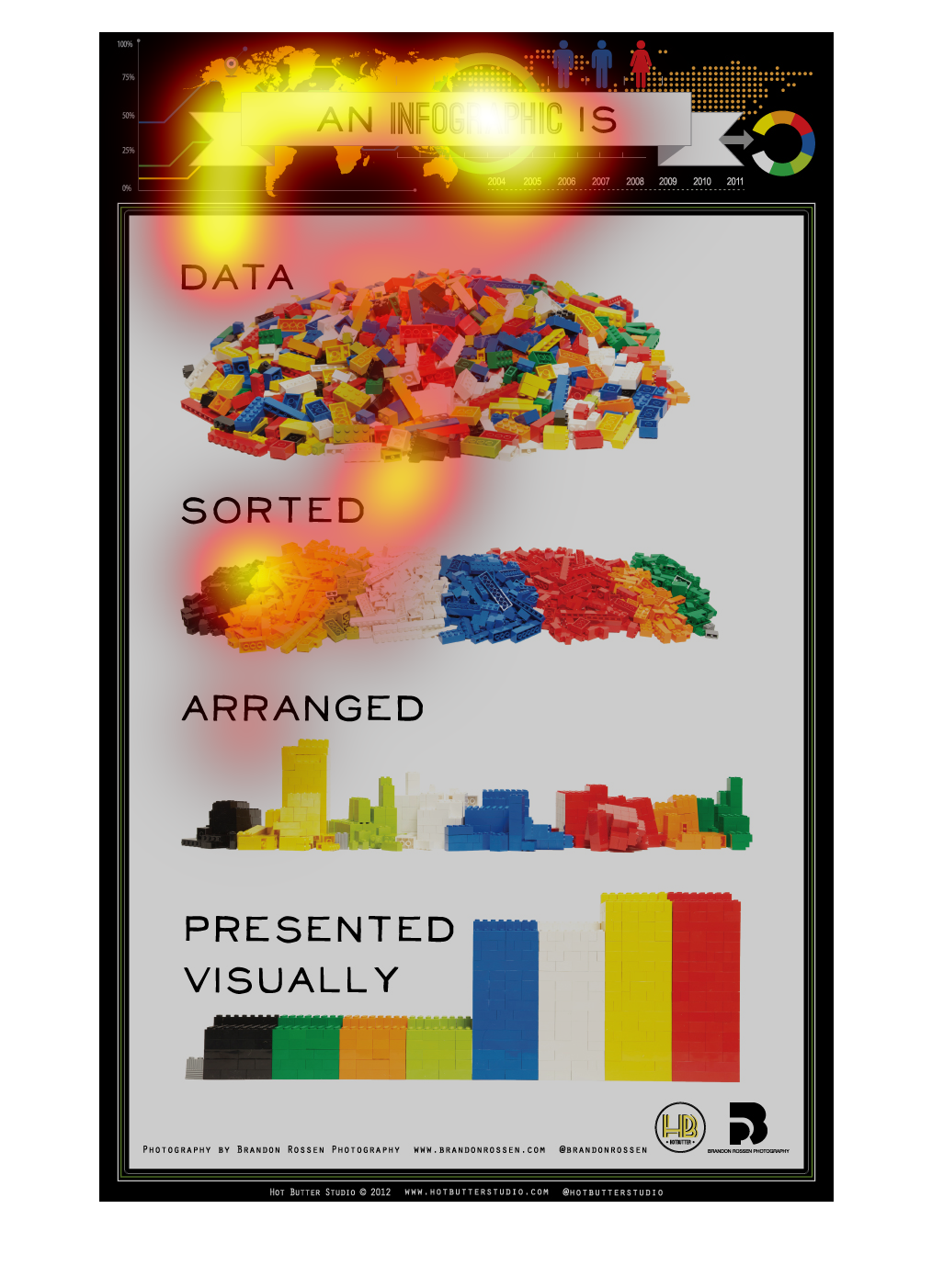
This image shows what appears to be Lego blocks with different headings, like; Data, Sorted,
Presented and Arranged. Visually. It gives examples to visual learners of what the company
is tiring to convey in its message.
This chart describes different kinds of data. Kinds of data on the chart include sorted, arranged,
and presented visually. The chart has a variety of colors.
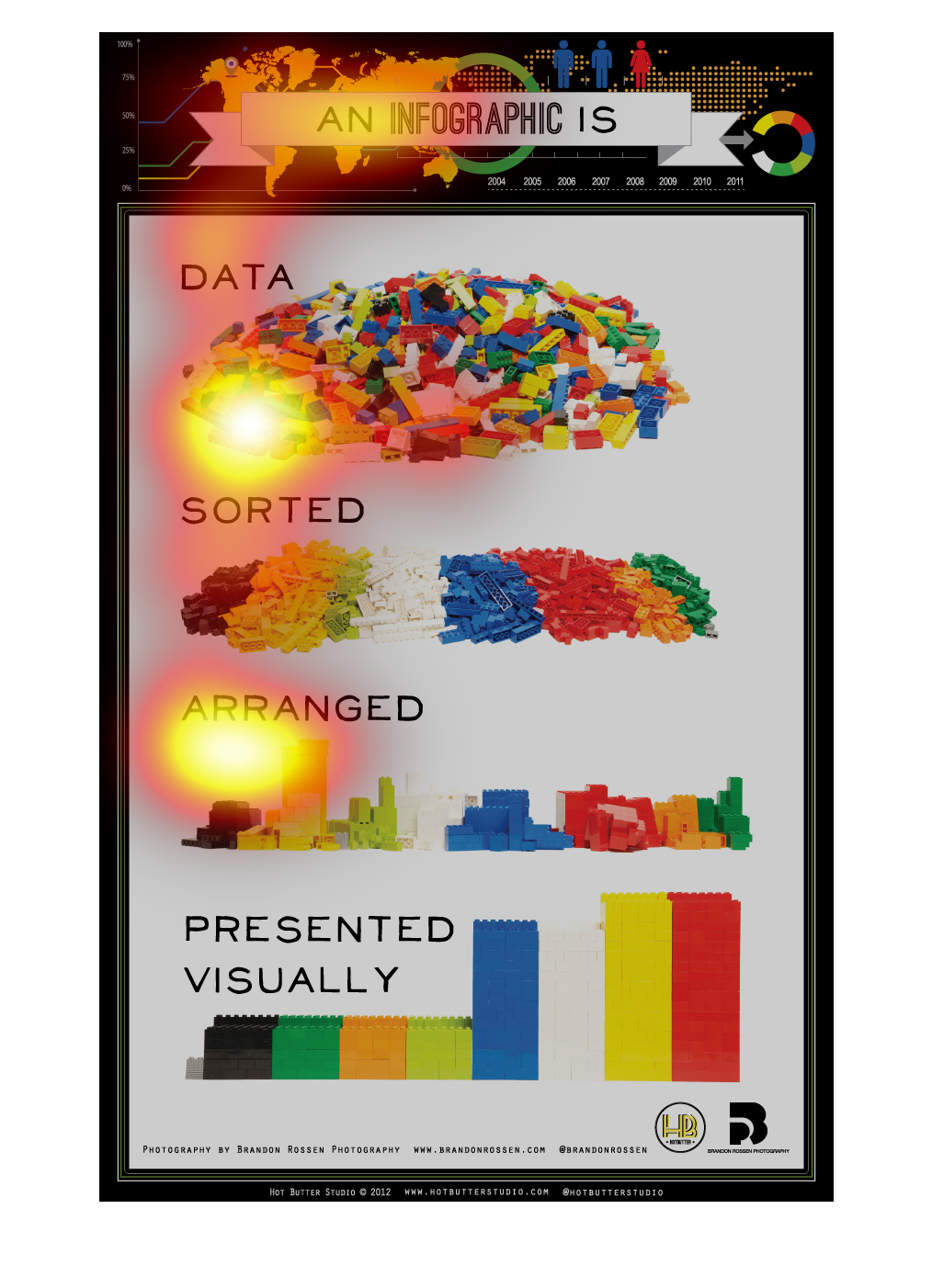
This chart is titled: An infographic is. The different sections are: Data, Sorted, Arranged,
and Presented Visually. The pictures appear to be of colorful lego blocks.
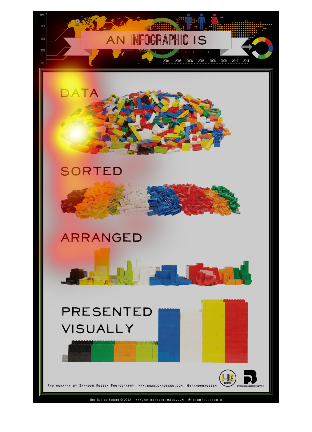
The name is called an inforgraphic I s  sorted and arranged are the Legos on the graph this
graph is to help us with the world and its in order from color
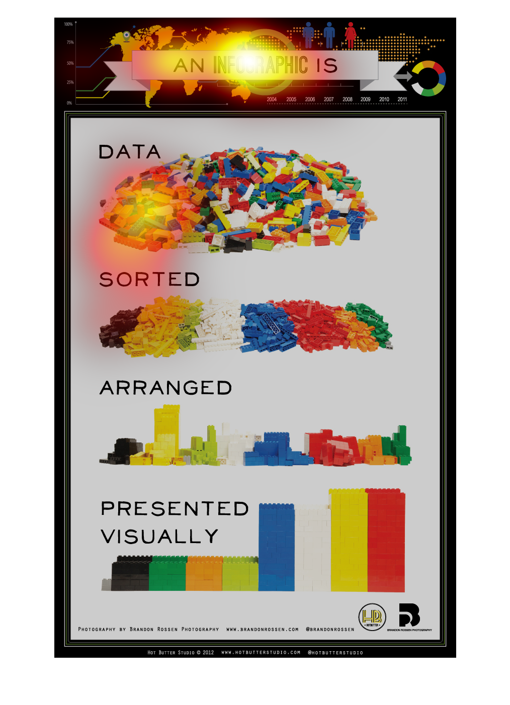
The following chart shows how information is presented as in the form of an infographics from
sorted data arranged data and data that is presented visually.
This picture is trying to show the different definitions for IT terms in a really easy and
fun way with blocks of legos. Looking at it in seconds you understand what they are tying
to convey.
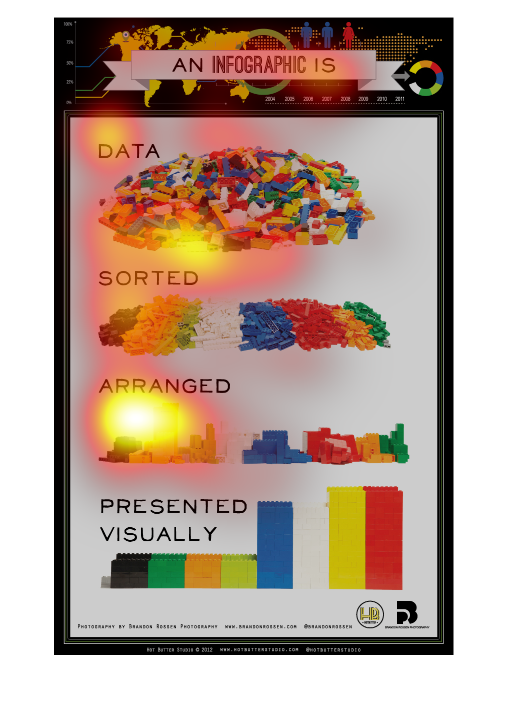
It's a graph that breaks down the amount of data that is sorted, arranged and presented visually.
There are different colors for different kinds of data.