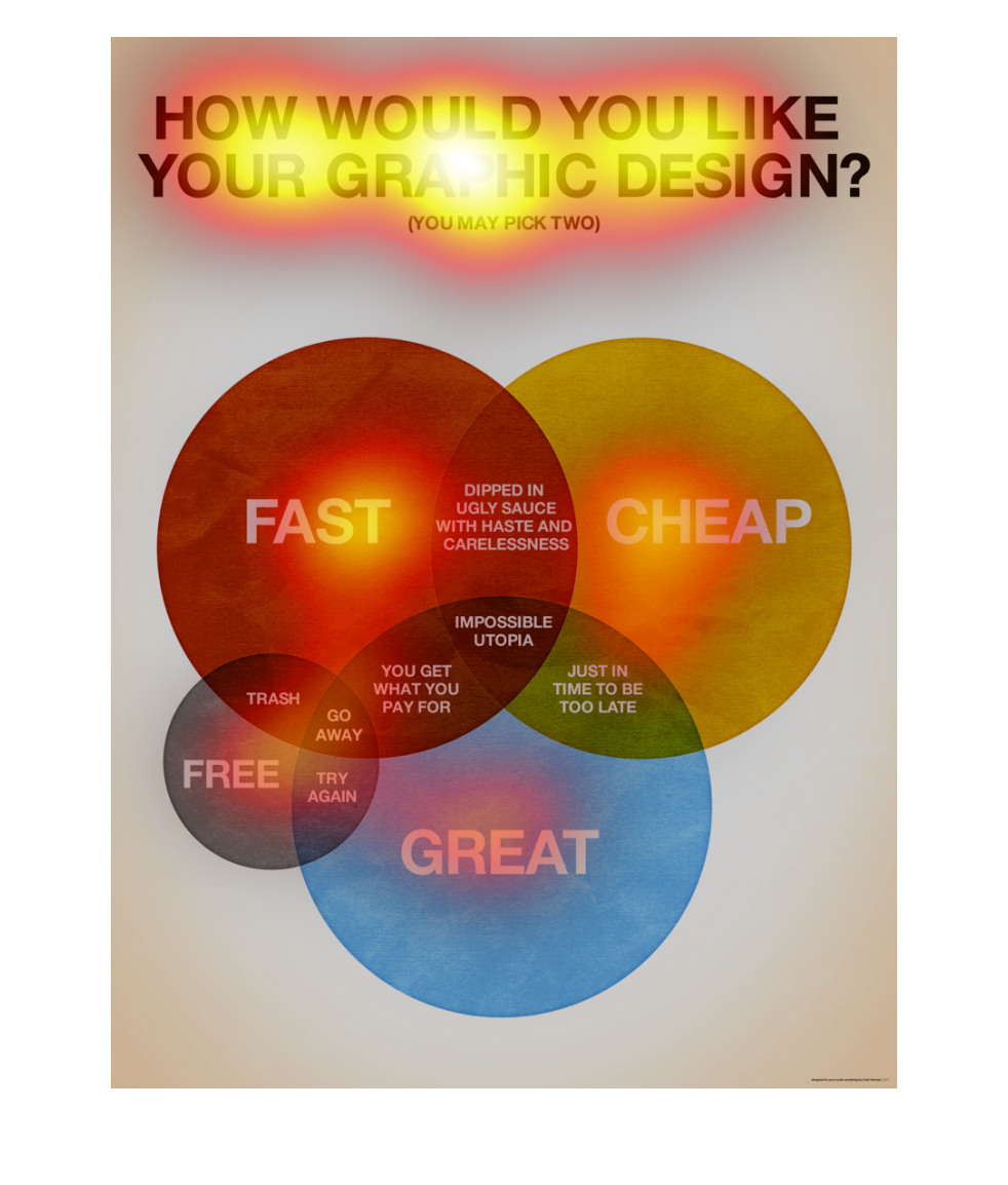
This image asks how one would like their graphic design: cheap, fast, great, or free. There
are overlapping parts of the chart that represent overlapping options and their results. For
example: Fast and cheap produces the option, "dipped in ugly sauce with haste and carelessness."

How would you like your graphic design? This chart looks at fast, cheap, free, and great,
and how those intersect in a venn diagram. The intersection of fast and cheap is "dipped in
ugly sauce with haste and carelessness." The cheap and great intersection is "just in time
to be too late." Fast and great is "you get what you pay for" and free and great is "try again."
Fast, cheap, and great intersect at "impossible utopia."
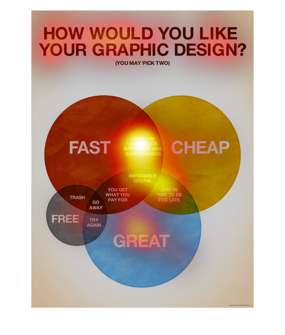
This is a Venn diagram about how people would like to have their graphs designed.  Variables
are speed, cheap, great, and free and shows their intersections.
This survey describes "how would you like your graphic design".  Most people want it fast,
cheap and great wit a few wanting it free.   There is some overlap with negative feedback
such as trash, you get what you pay for as well as some overlap with positive.  The happy
spot seems to be cheap, fast and great!
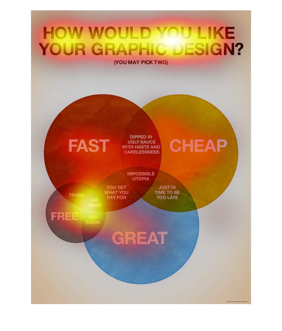
The image depicts a venn diagram asking how an individual would like to have his or her graphic
designed. Popular responses are provided, and an overall picture is presented.
This chart describes how would you like your graphic design. Different categories on the chart
are represented by different colors. Categories include fast and cheap.
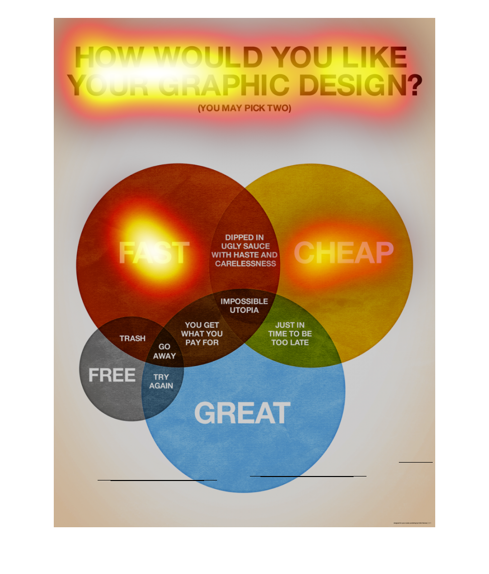
The graph to the left is more of an ad. for a website design.  It is showing the in a circle
chart the different types of website designs one can have.  One can focus on being cheap,
great or fast.  Then they have overlying circles describing how you can work together to create
an even better design.  The creators of this ad believe that it is impossible to create a
design that encompasses being cheap, great and fast all in one.
This chart shows how there is a definite sweet spot between quality, affordability, and speed
of production with any service or goods that may be sold to consumers.
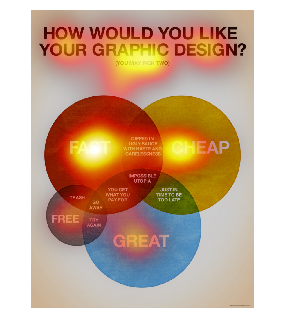
This shows the decisions people make and depending on how the decision is made shows the outcome
and what you can expect based on the decision that are made
This is a humorous chart with a Venn diagram about "How You Would Like Your Graphic Design?"
You cannot have your impossible Utopia of Fast, Cheap and Great, so you should settle for
paying a lot or waiting a while. And forget about "Free."
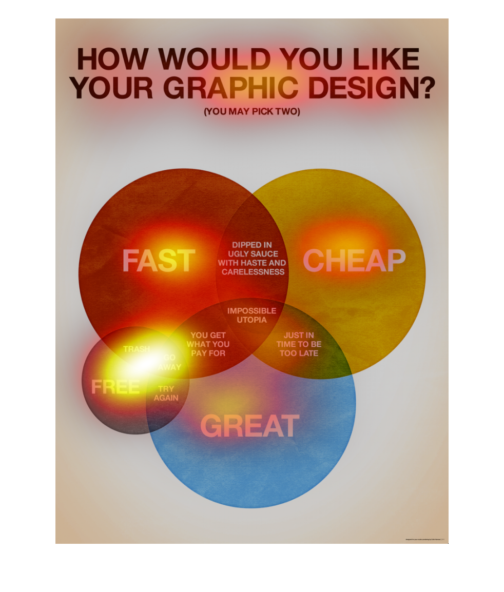
The caption above this image is, "How would you like your graphic design?"  There are four
interlocking spheres of different colors.  Each one of the spheres has a bold font.  At the
intersections of each of the spheres are funny anecdotes.
This image explains what you would get if you chose this team for graphic design. It lists
3 main catagories, fast, cheap, great. Its how each overlap and relate to each other.
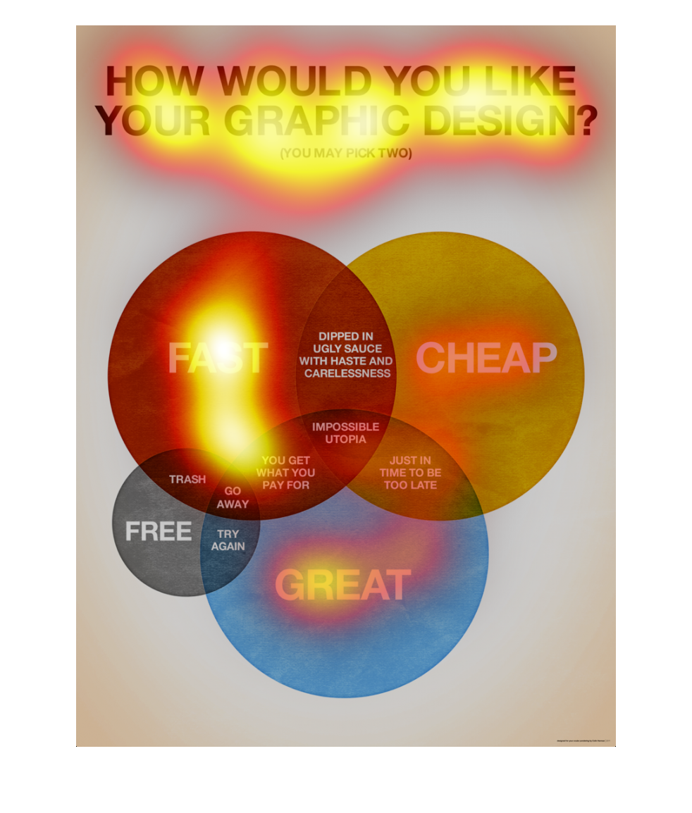
This is a venn diagram of the traits of graphic design. You can pick any two traits for your
graphic design out of this list: fast, cheap, or great. This is true for most things in life.
This image shows or depicts in colored circle chart format asking the question how would you
like your graphic design. Choices are fast, cheap, great and free.