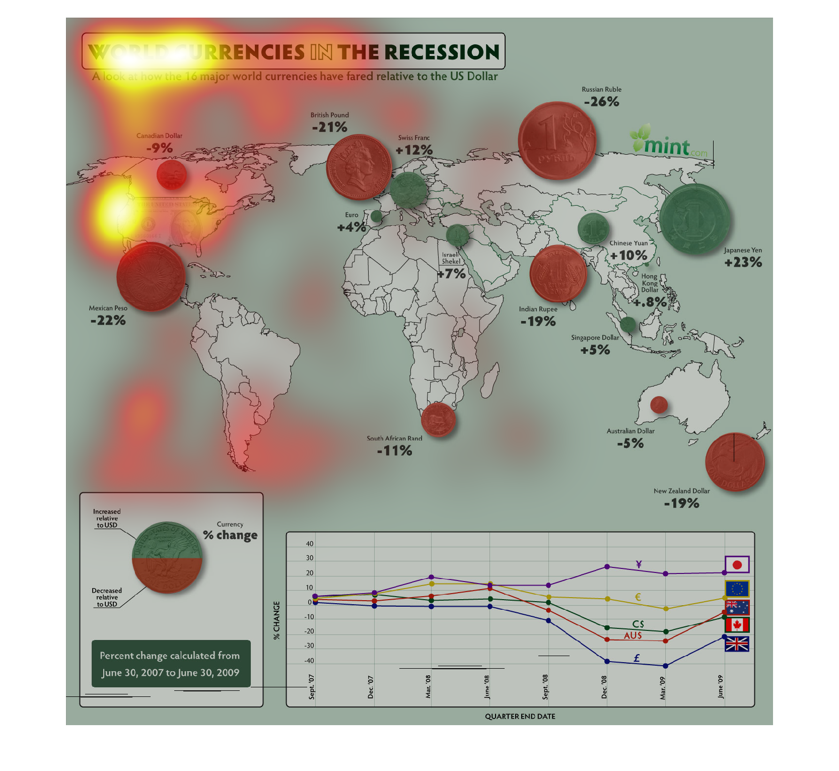
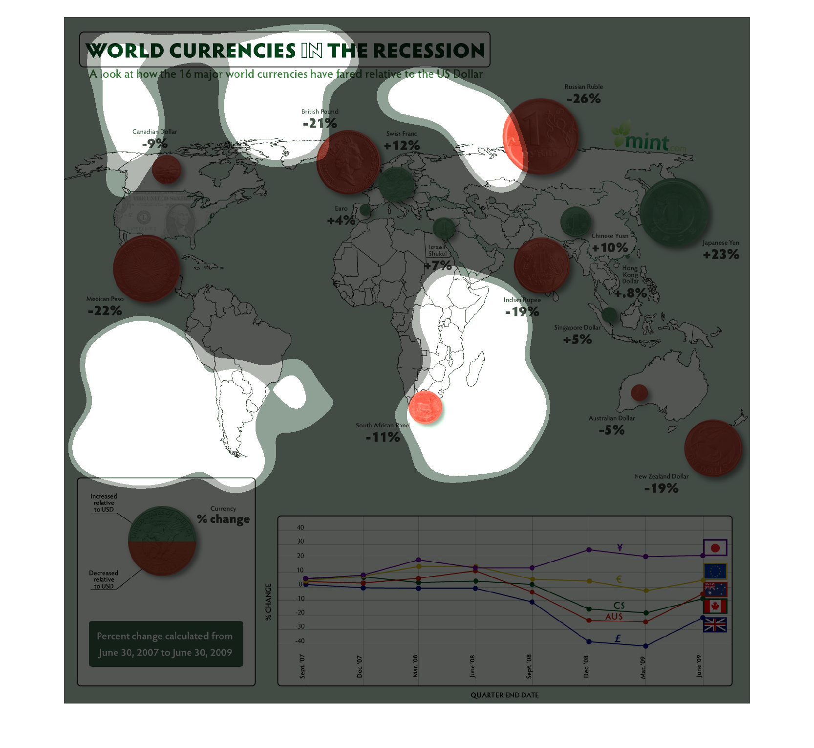
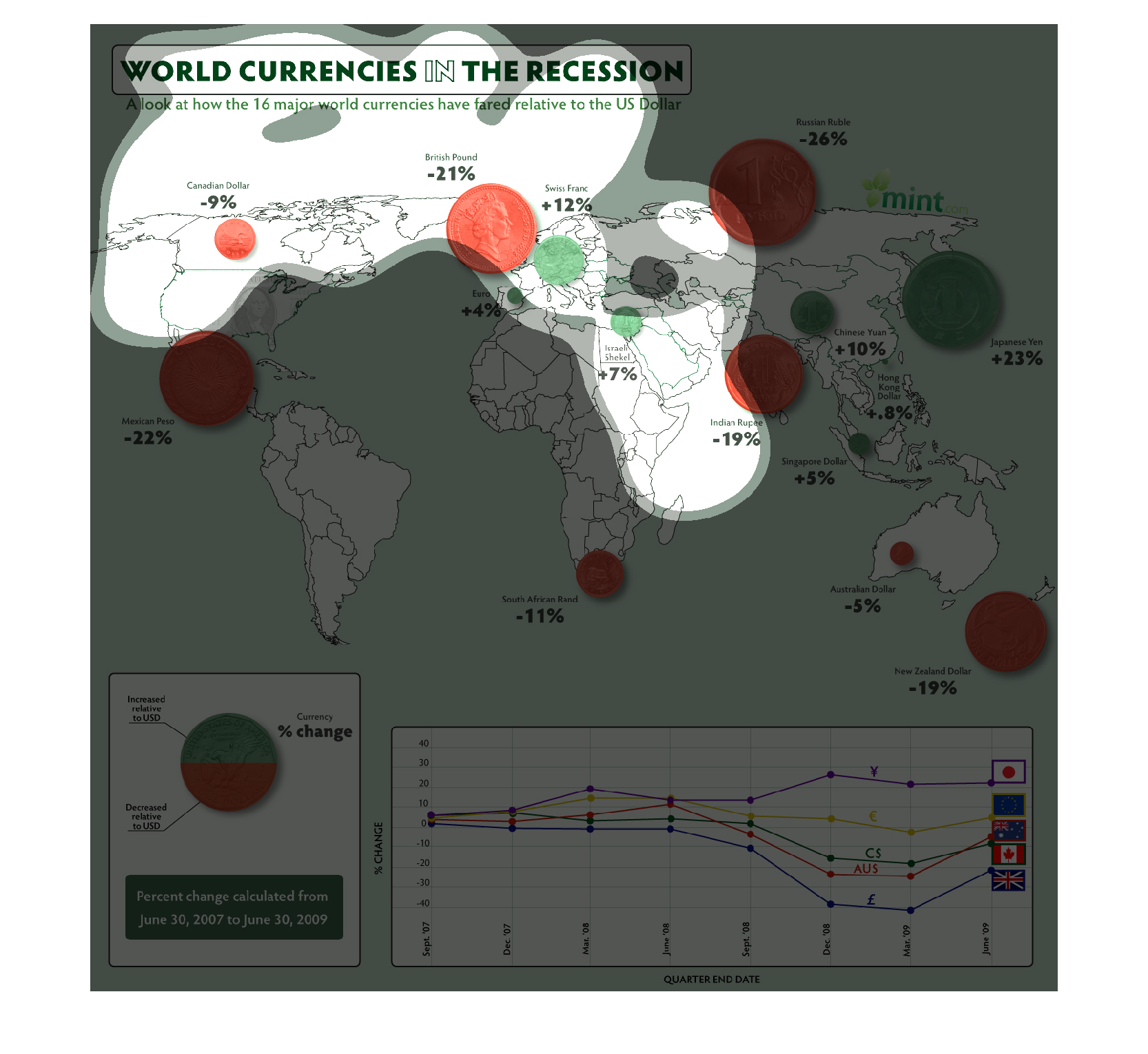
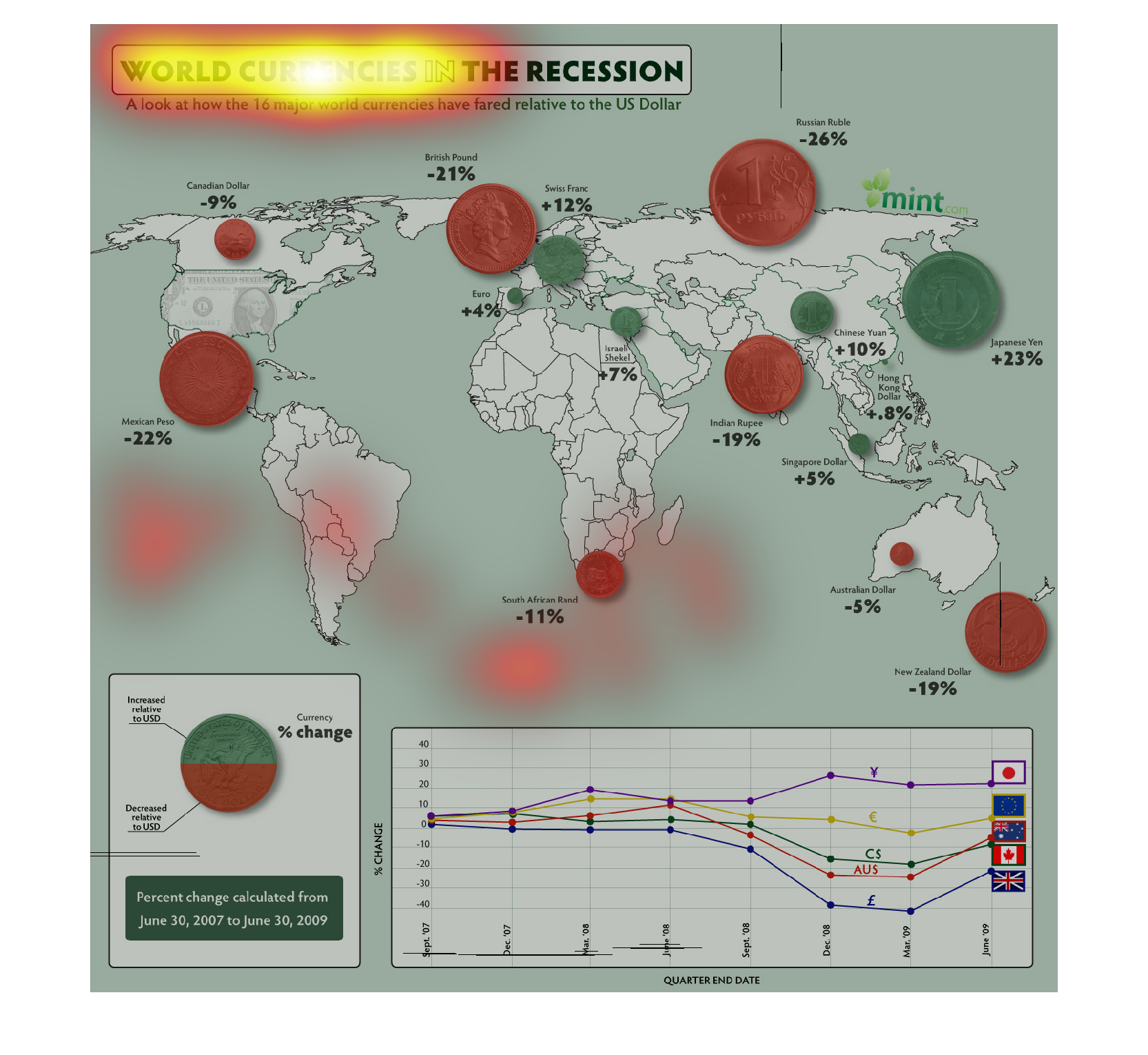
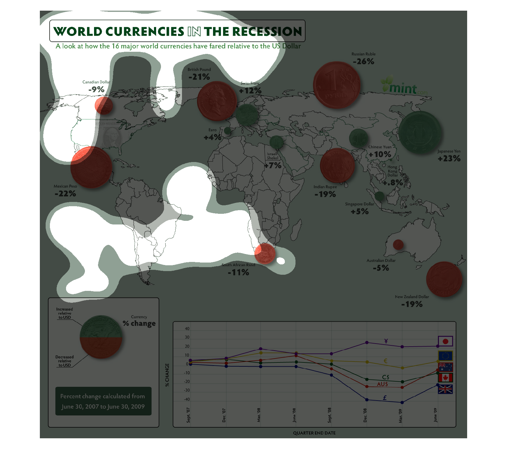
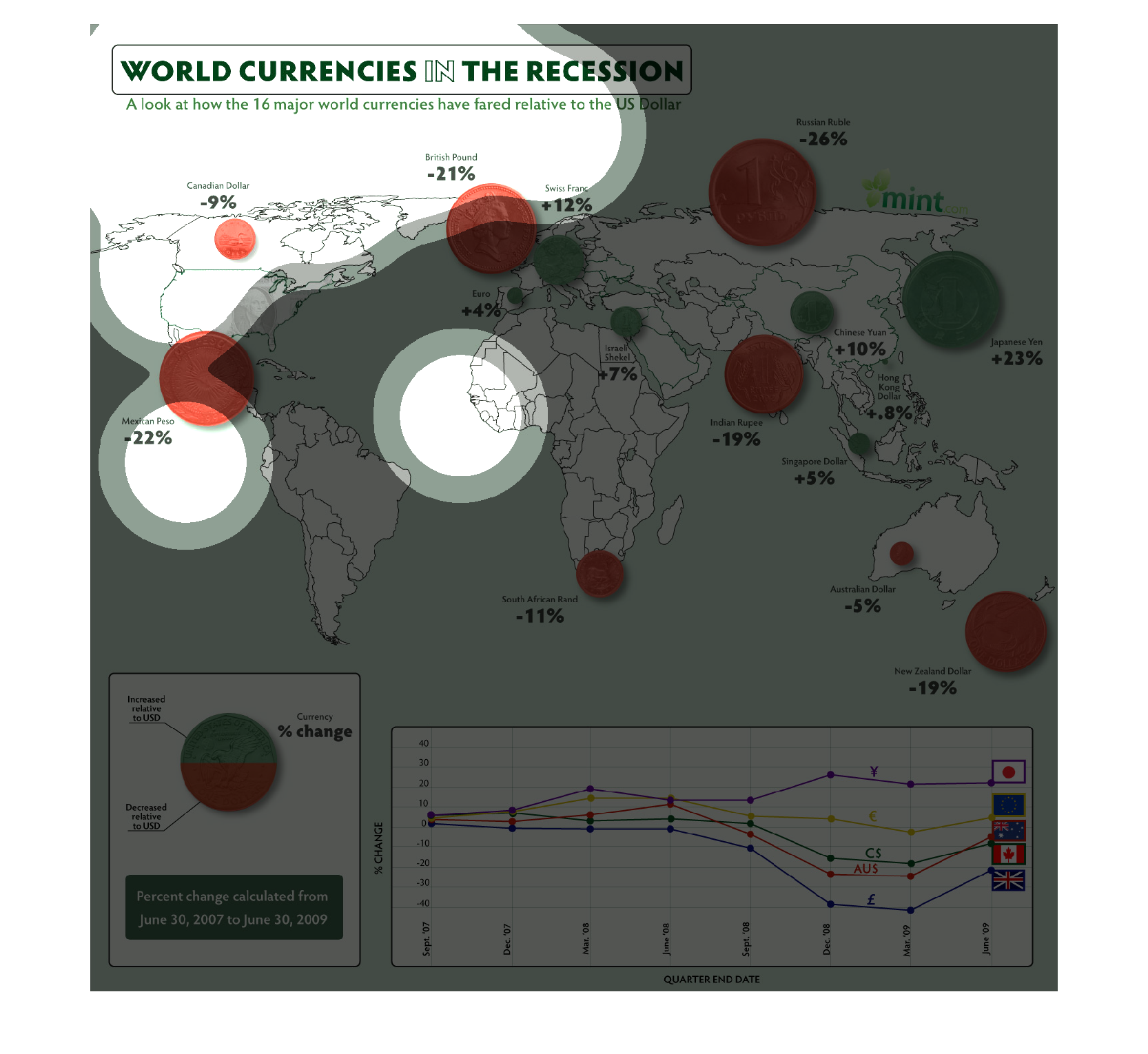
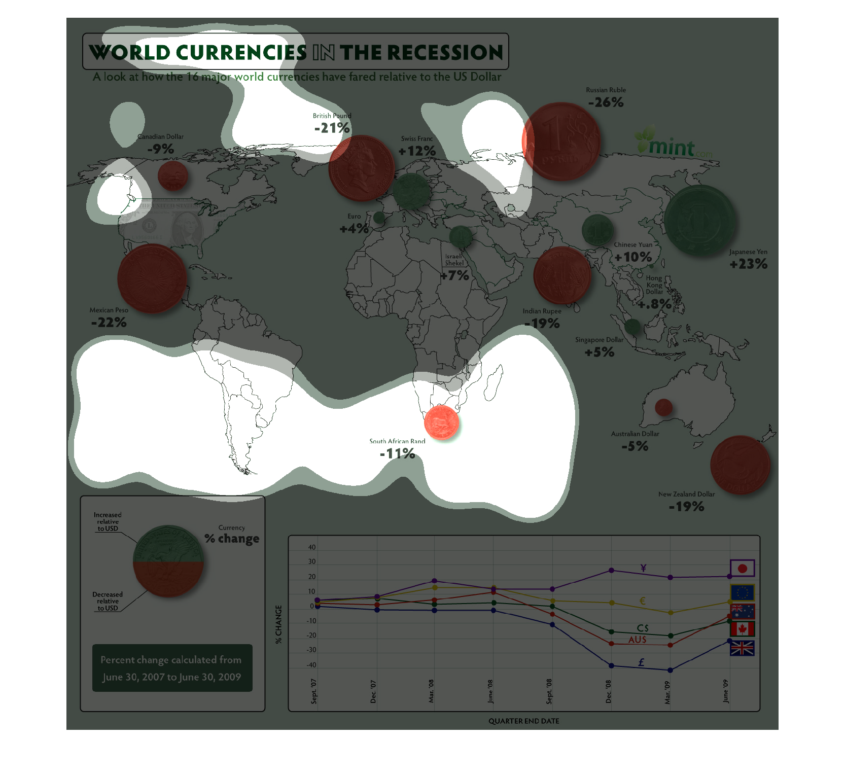
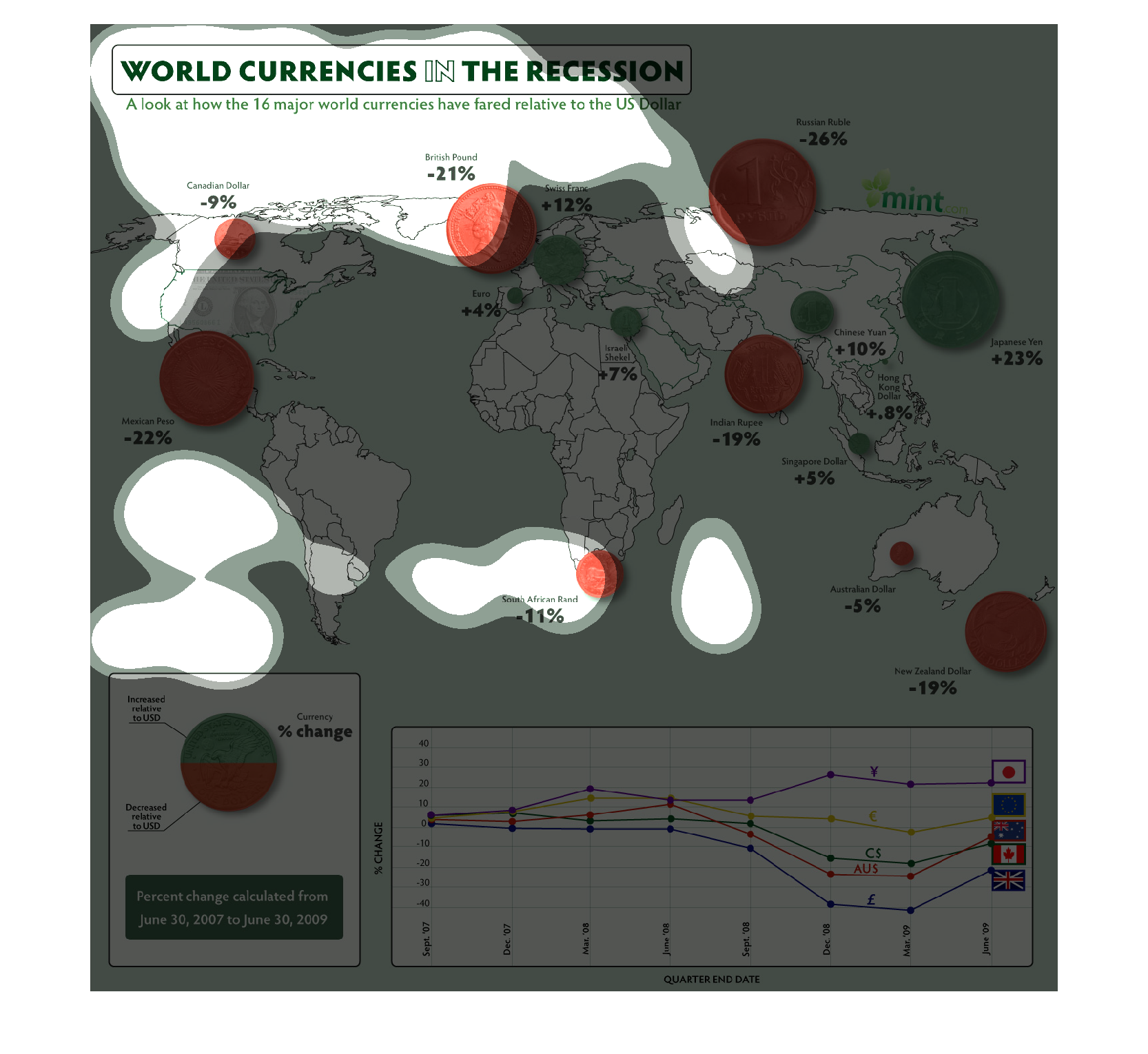
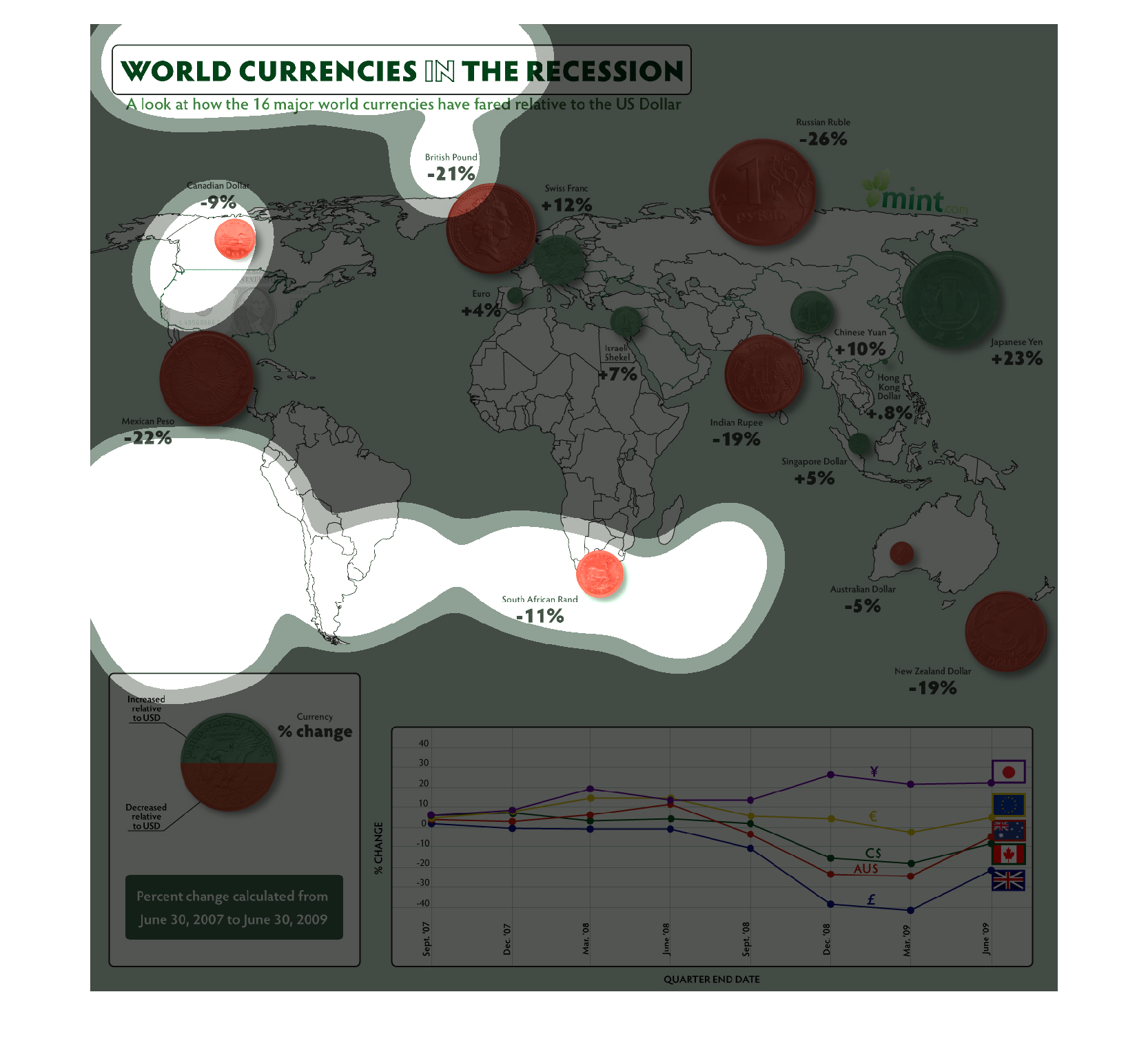
This is a chart entitled "World Currencies in the Recession."  It compares how well 16 major
world currencies held up to the US dollar. This information is shown by colored coins superimposed
over the top of countries on a world map, with the coins colored red to reflect losses and
green to reflect gains.  It shows that the Canadian dollar only dropped about 9%, and the
New Zealand dollar dropped 19%, while the value of the British pound and the Russian ruble
both dropped more than 20%.  Meanwhile, there was a rise in the value of the Euro - 4%, the
Swiss Franc -12%, and the Japanese Yen - an astounding 23%. There are many other changes noted,
though not as significant. The lower left corner of the graphic shows a pie chart which reflects
a 50-50 overall international change - half improved and half declined - between 2007 and
2009.  The bottom right corner of the graphic includes a line graph which tracks the performance
of each type of currency over time, quarter by quarter.  The countries of each currency type
are identified by their flags, connected to a unique colored line, with the symbol of that
currency right above the line.
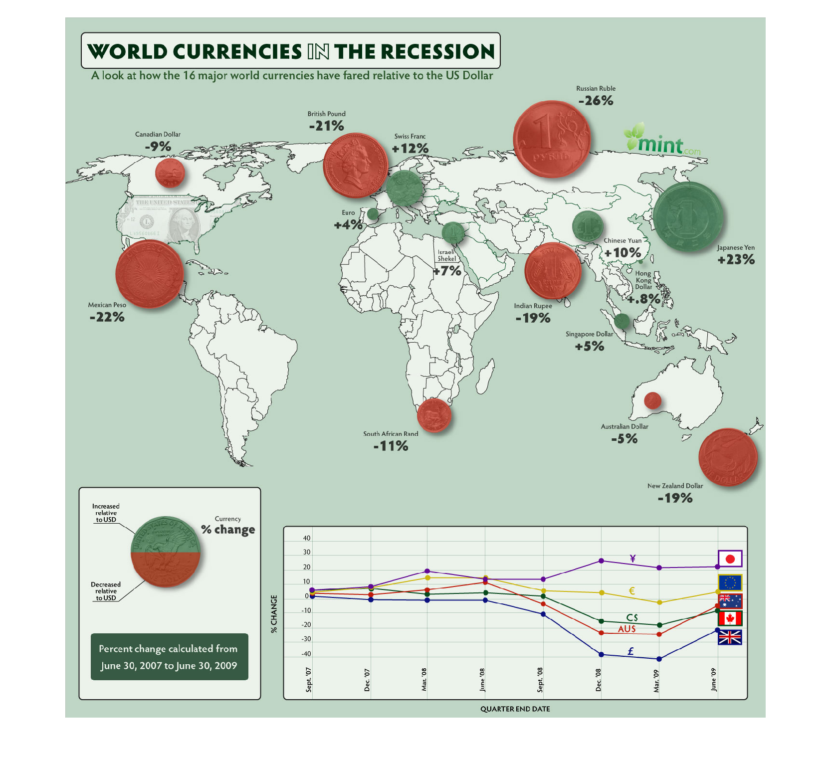
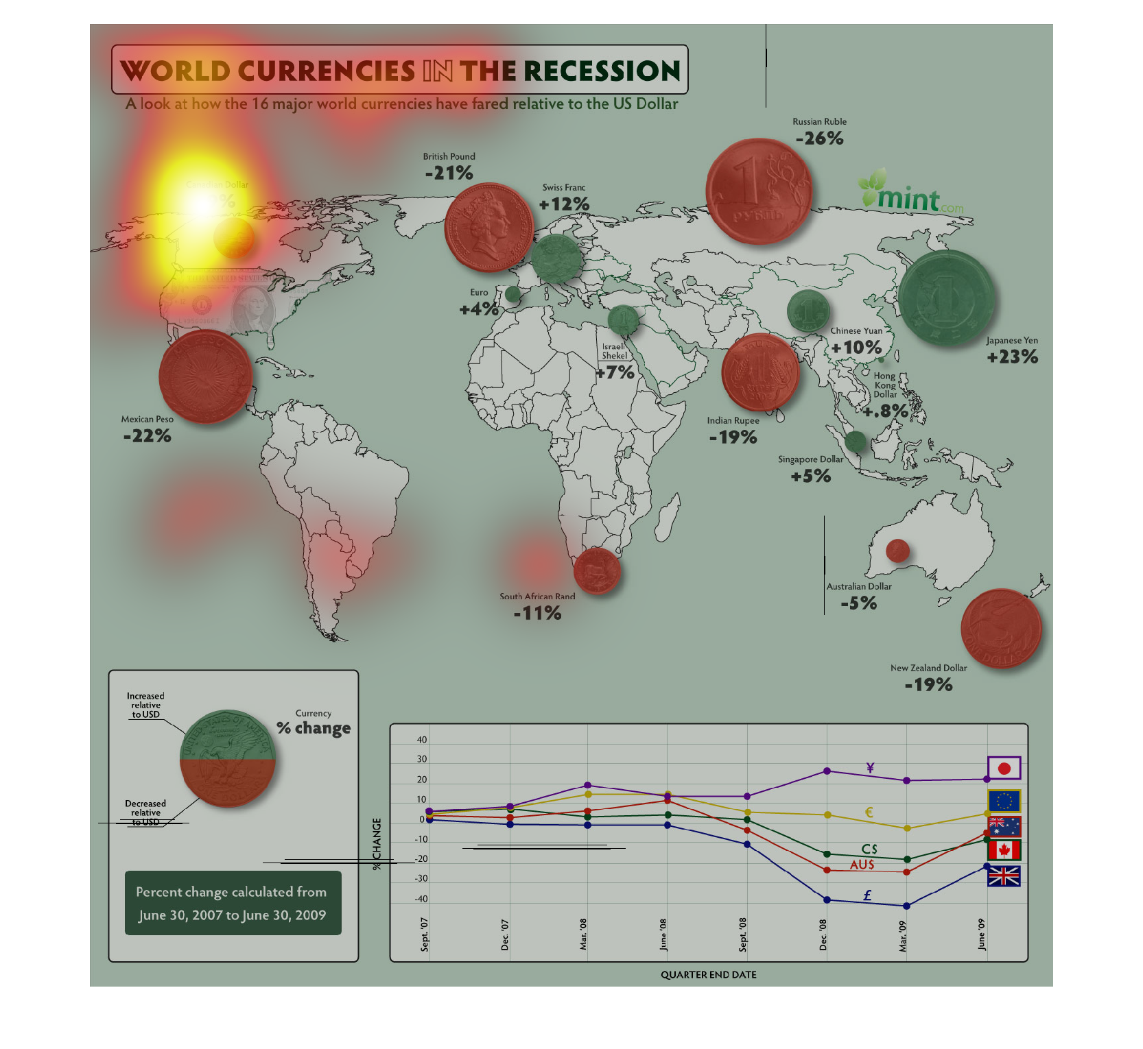
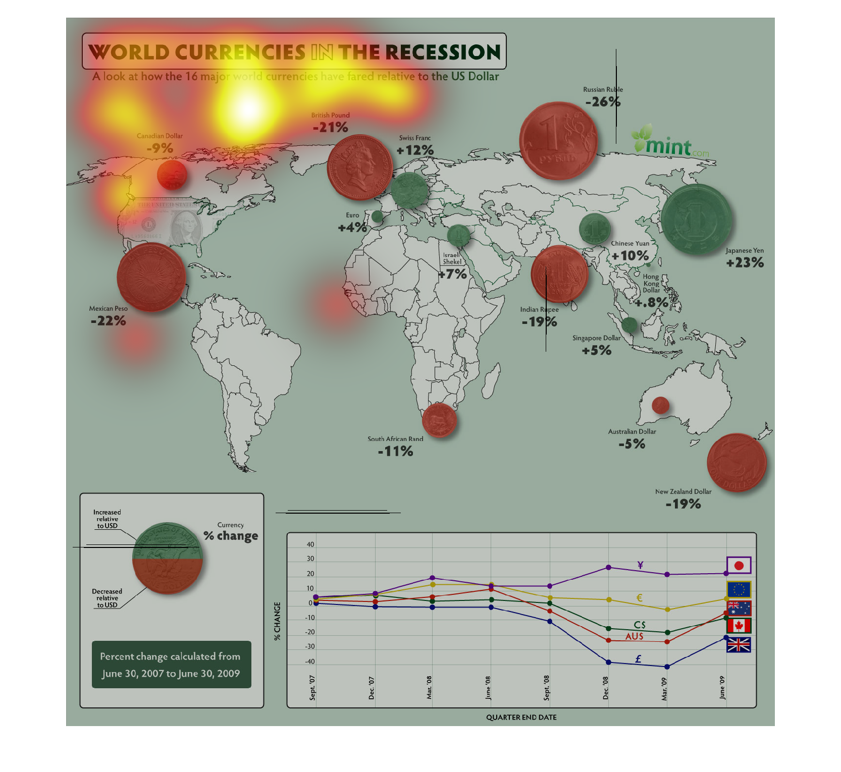
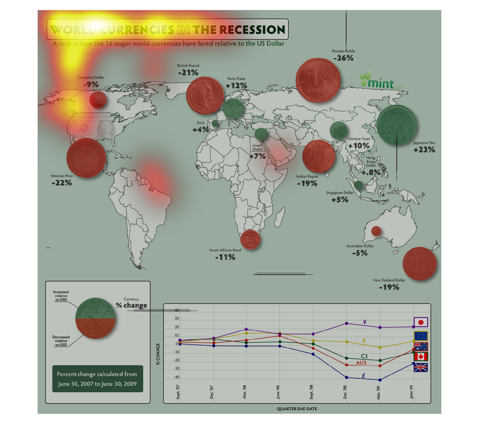
The graph displays how the World Currencies Fared during the Recession. Sixteen countries
were studied to uncover how well there currencies performed. China was the country that benefited
the most with a 23 percent gain. Russia was the lease with negative 26 percent. The data was
collected from June 30, 2007 to June 30, 2009. It includes a line chart to visually show the
data.
The following graph shows the appreciation and depreciation of different world currencies
during the economic melt down of 2008-2009. It showed that the Yen increased in price dramatically.
While Russia and Mexico, Italy's currency the Euro took a huge crash.
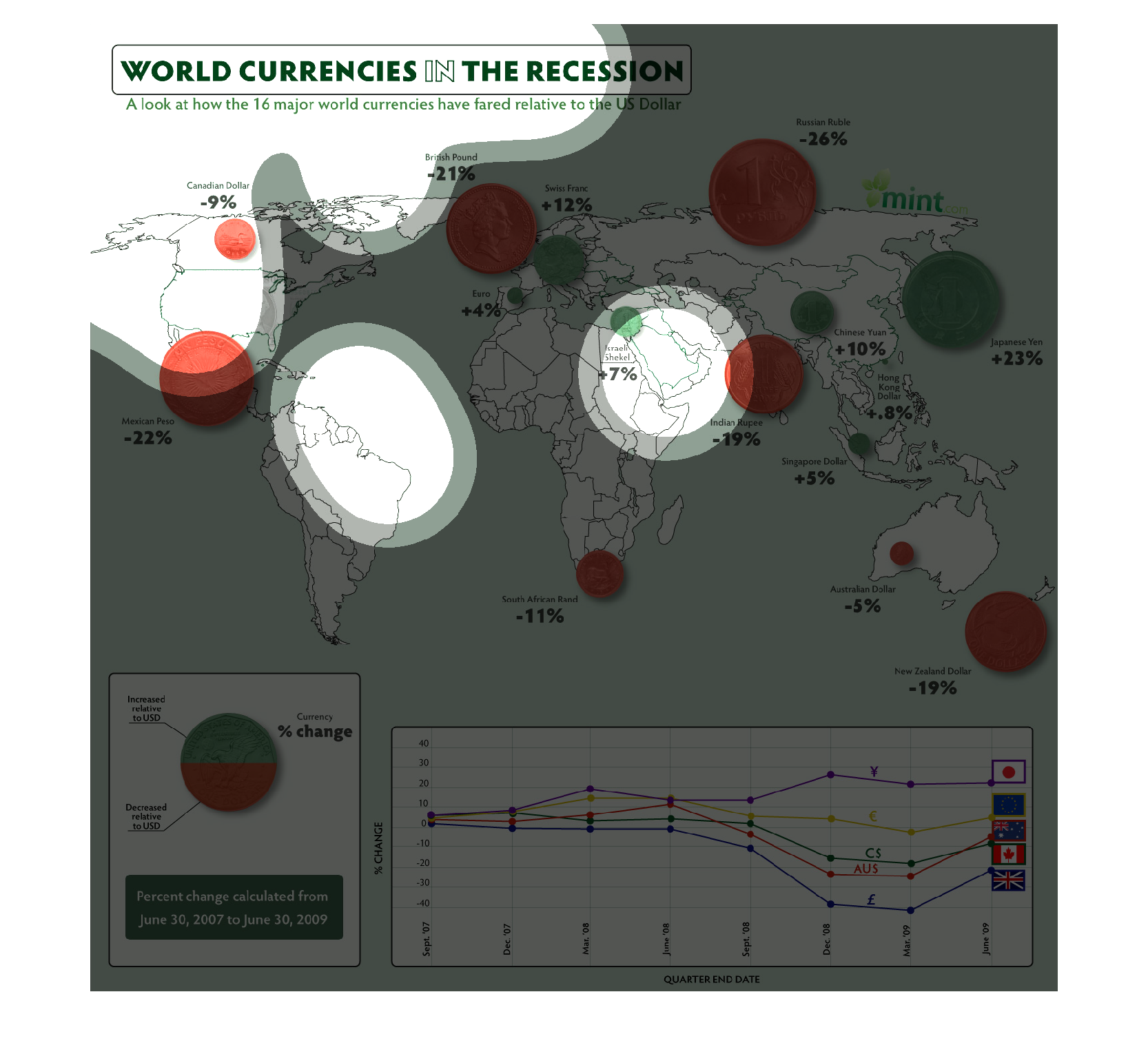
This is a map of the world that describes the World Currencies in the Recession.  It compares
how 16 major world currencies fared to the US Dollar  There is also a line graph at the bottom
of this that shows the quarter end dates.
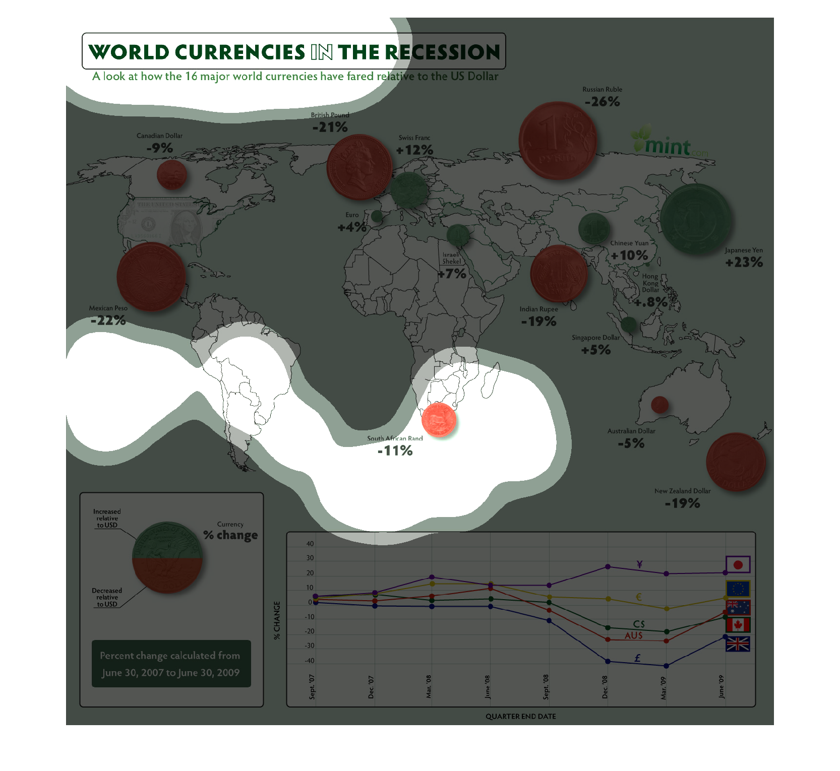
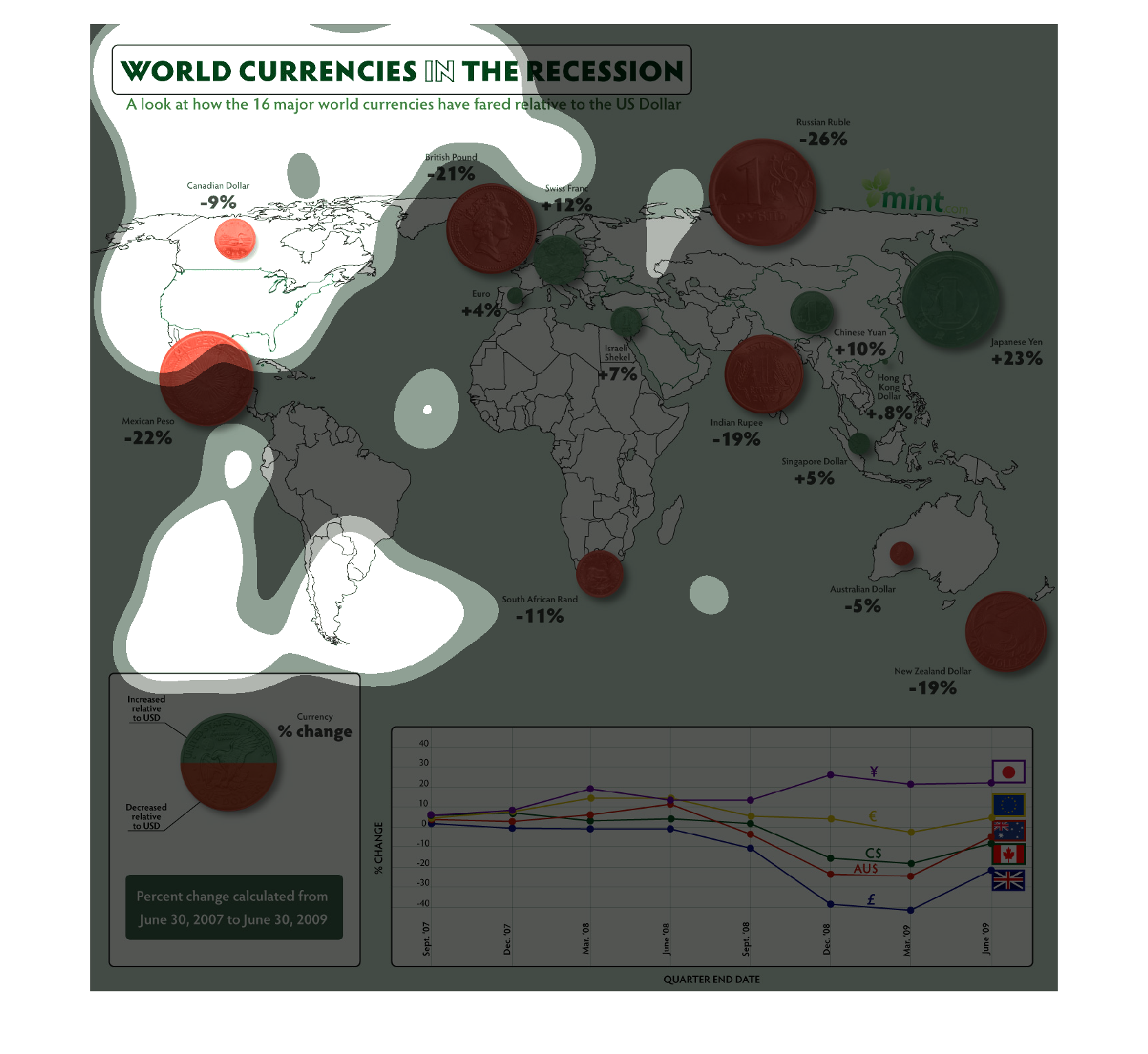
The image on the left hand side is a showing the world and each of the countries in their
represented continents.  This image is highlighting the drop in each countries currency during
the financial crisis which happened nearly eight years ago in respect to the US dollar.  From
this image it appears that the Russian Ruble took the biggest drop going down 26% against
the dollar.
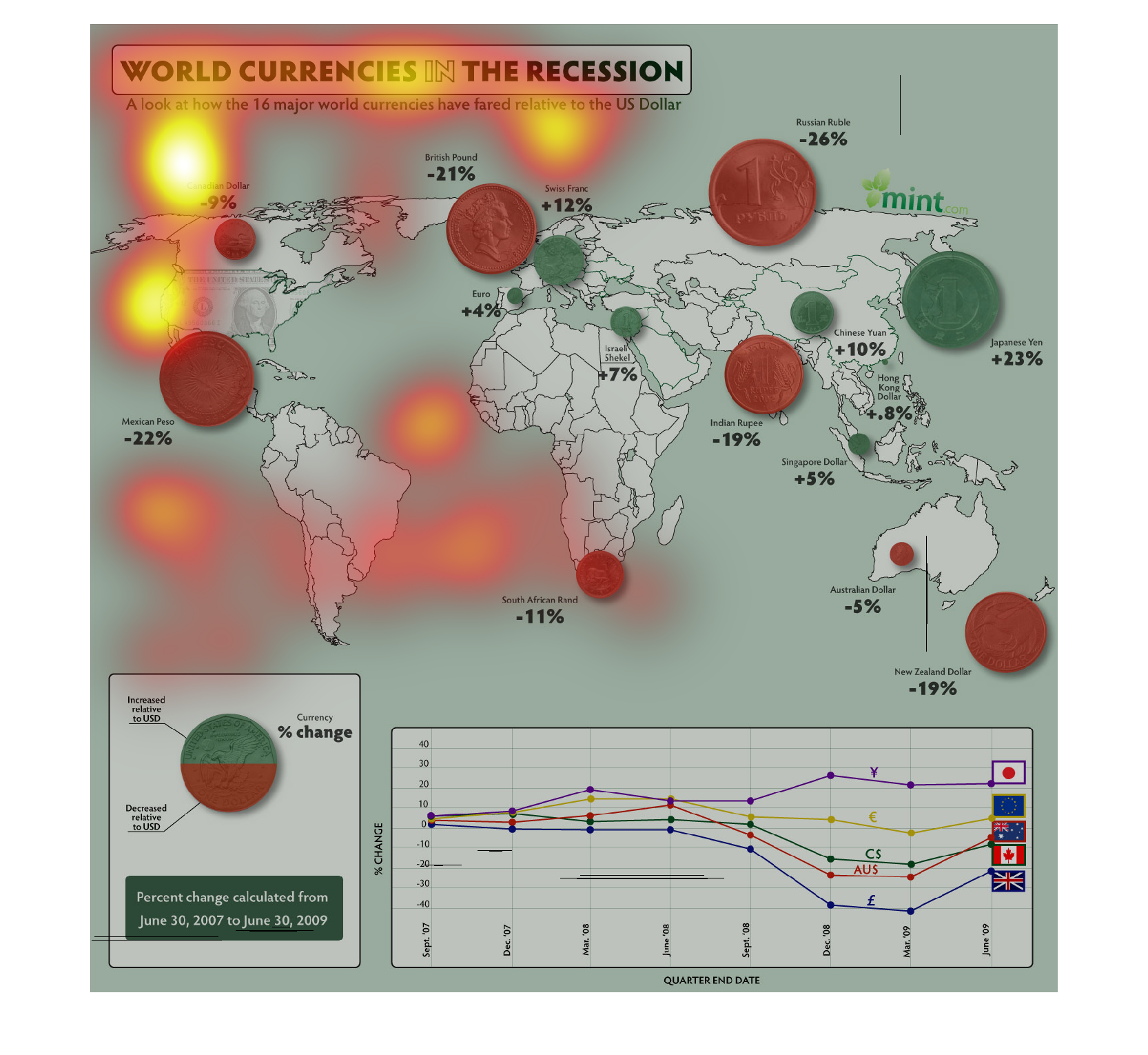
This depicts World currencies in the recession, a look at how the major world currencies have
fared relative to the US dollar. North American was down by 9%.
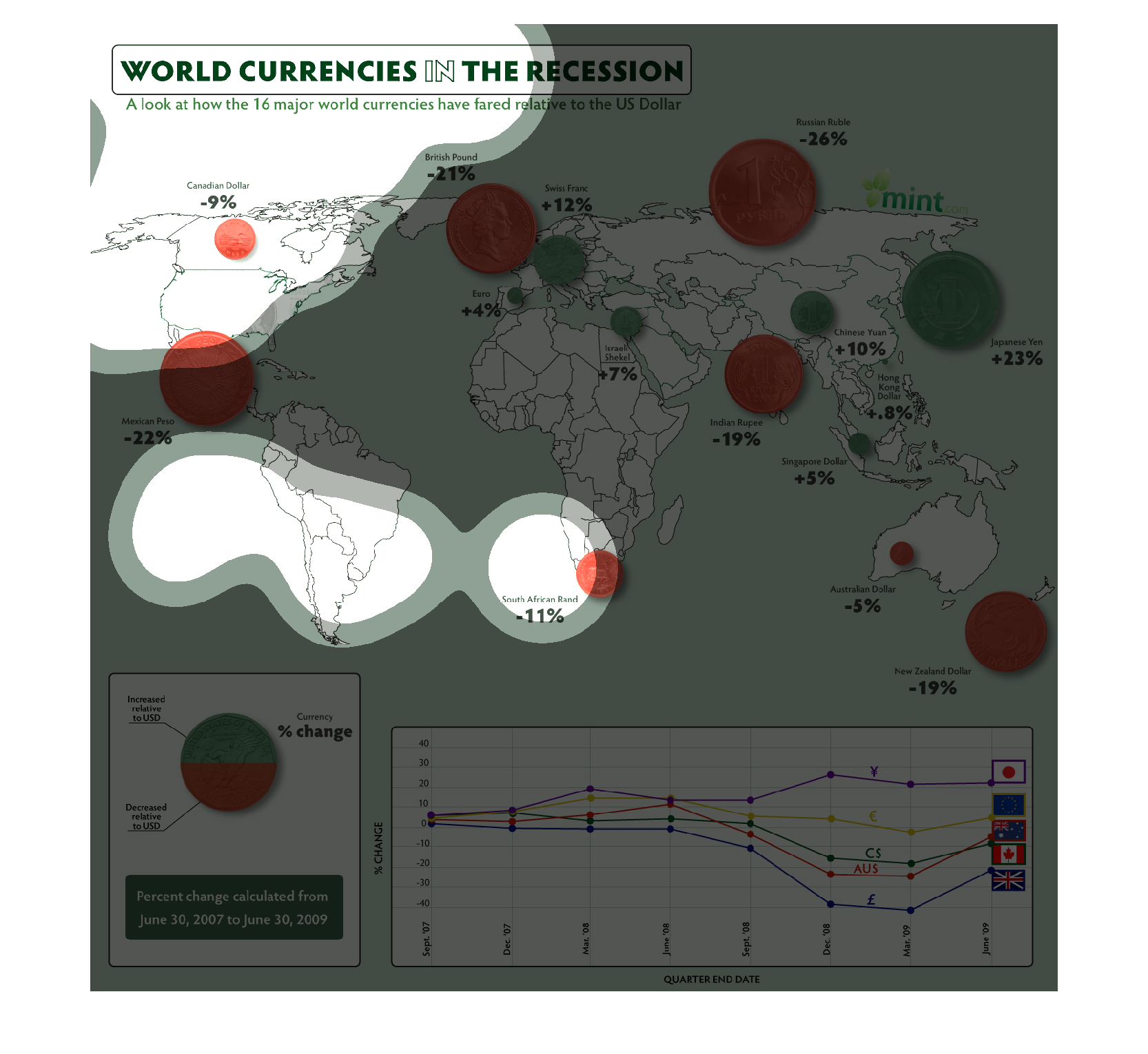
This chart describes world currencies in the recession. different currencies on the chart
are presented by a coin for each of the different countries and regions.
This chart is a representation of world currencies during the recession.  It is a map of the
world with different types of currency labeled for different nations.
This chart describes world currencies in the recession, specifically how 16 major currencies
have fared against the US Dollar. The size of the circle represents the percent change in
value from June 30, 2007 to June 30, 2009. A line graph is included at the bottom of the screen
depicting the change in value of currencies for five countries by quarter over the same period
of time. For these countries, Japan saw the greatest positive percentage change and Great
Britain saw the greatest negative percentage change.
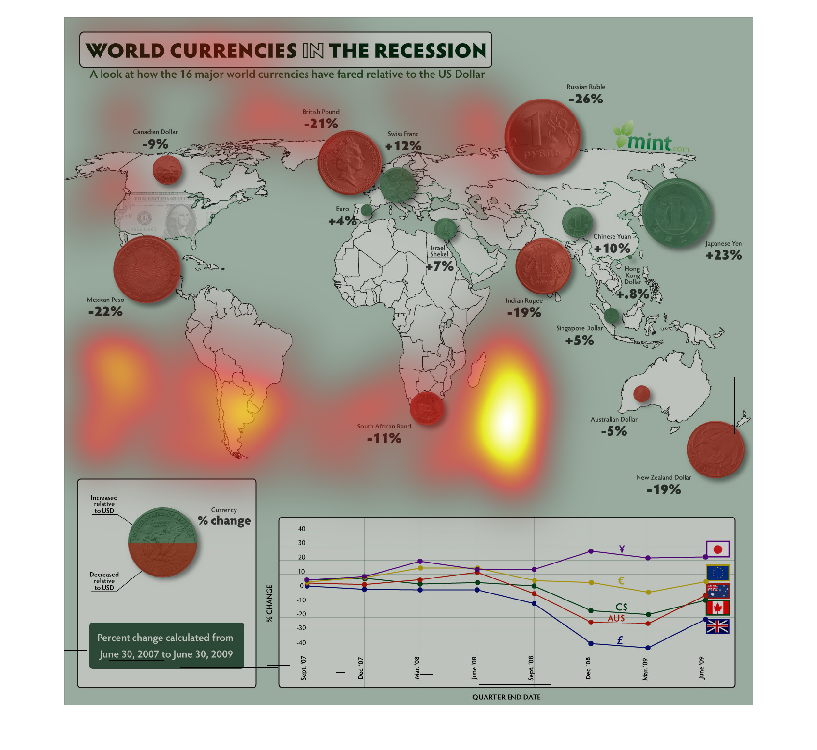
The image depicts the world currencies and their worth during the recent global recession.
The data indicates that many world currency reduced in worth during the recession, with a
small few managing to increase in worth. Most advanced economies had their currencies lower
in value, as opposed to emerging economies such as China which actually saw growth. Calculations
are from June 30, 2007 - June 30th, 2009.
This graph shows how 16 major world currencies fared compared to the U.S. dollar during the
recession. The Japanese yen and the Swiss Franc fared the best while the Russian Ruble, Mexican
Peso, and British pound fared the worst.
This looks at world currencies and their values during the recession, relative to the USD.
Red dots and sizes show losses, while Green is gains. The biggest losers were Mexico at -22%
and Russia at -26%. Gaining was China at 23%
This image shows how different world currencies fared against the dollar during the recession.
Those regions marked with green found their currencies performing well against the dollar,
while those with red did not.
This is a world map showing world currencies in the recession and the percent change that
has been calculated in the years 2008 and 2009 by selected countries.
The world was devastated with the recession, and in this world economy we live in-where everything
is intertwined- the illustration demonstrate how each individual country was affected.