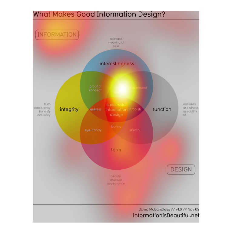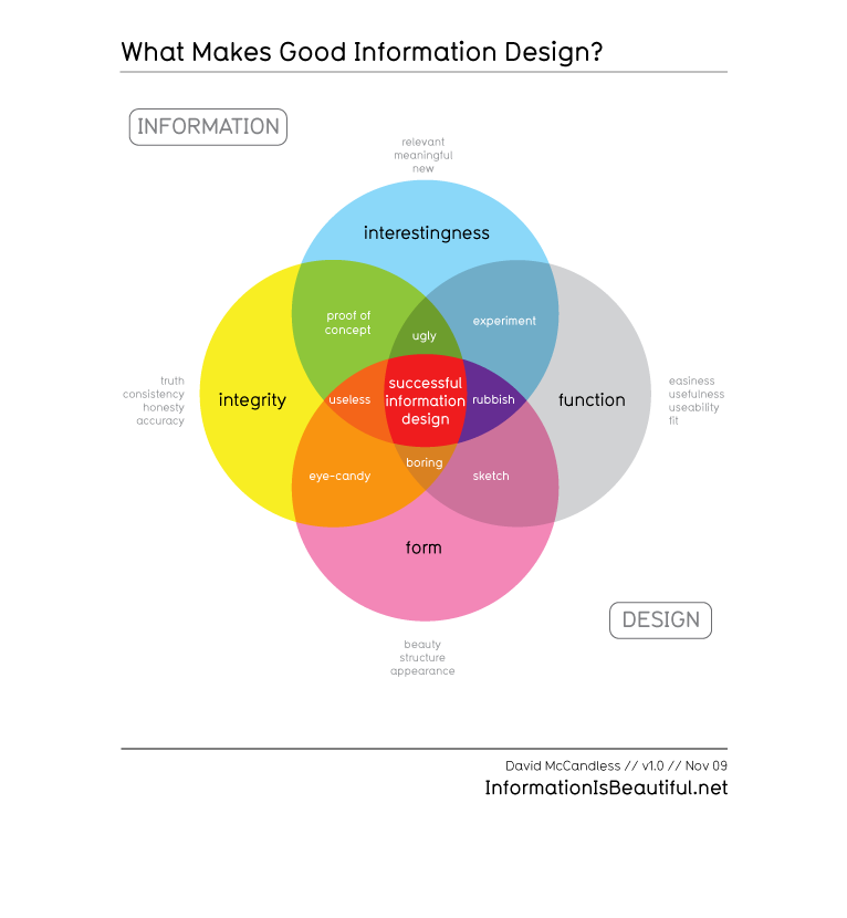
The image depicts a venn diagram describing what makes good information design. Things like
integrity, form, function, experiment, proof of concept are all included.
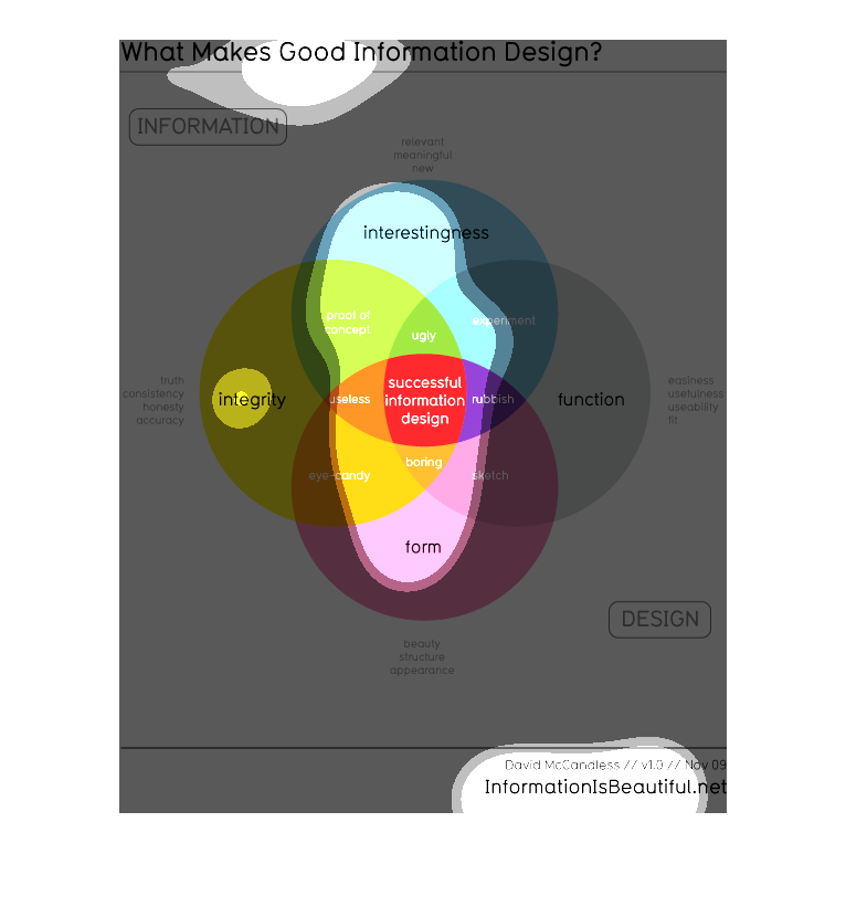
this graph visually shows how information can be displayed so that it is both  interesting
to the viewer, that is has the appropriate form function and integrity
This infographic tells you how to create meaningful, powerful infographics.  There are 4 key
tenets to it: interestingness, function, form and integrity. If these 4 things are met, then
you will have a well designed infographic.
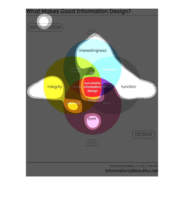
This is a colorful Venn diagram explaining what makes good information design. The different
large circles represent different elements of information design including integrity, form,
interestingness, and function. Many different overlapping circles describe what information
design that incorporates some but not all of these elements would be described as. For example,
information design that has only integrity and form is called "eye candy," where one that
has only function and interestingness is called "experiment".
This image explains different aspects of how to design an inforgraphic well. It mentions that
it should be interesting, have a function and form, and have accurate information.
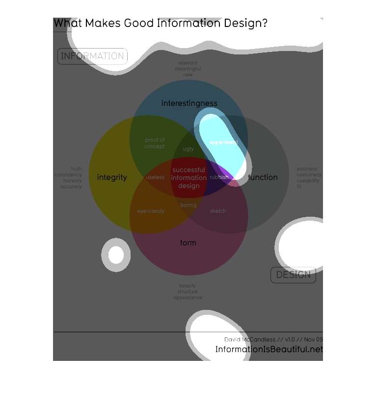
This is a Venn diagram that illustrates what makes good information design.  The four pillars
of intersection are form, integrity, interestingness, and function.
The image concerns, " successful information design" and how to rate it good from bad using
various descriptions moving outward from the central topic.
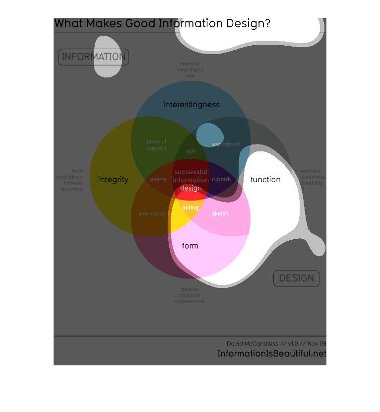
This image provides a series of for colored circular images that give an example of elements
that contribute to concept of "Good Information Design." This information appears to be compiled
by David McCandless who provided version 10 of this study within November of 2009.  The information
from this image comes from the URL listed below. As of this writing the "Information Is Beautiful"
website is still active:   http://www.informationisbeautiful.net/
The following chart uses different pie graphs to show what makes a good informational presentation.
It uses integrity, form, function and interestingness as its pillars.
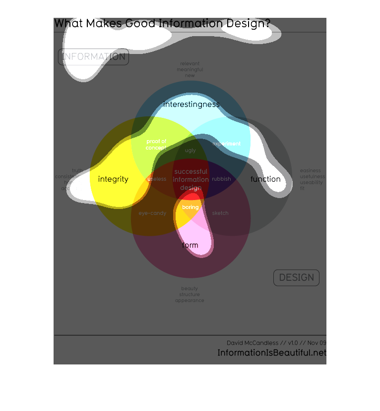
This is a venn diagram of Informational design. It includes, interesting, function, form.
The 4 of them equate. They all center around successful information design.
This chart describes what makes good information design. Different categories are represented
by different colors, including proof of concept and integrity.
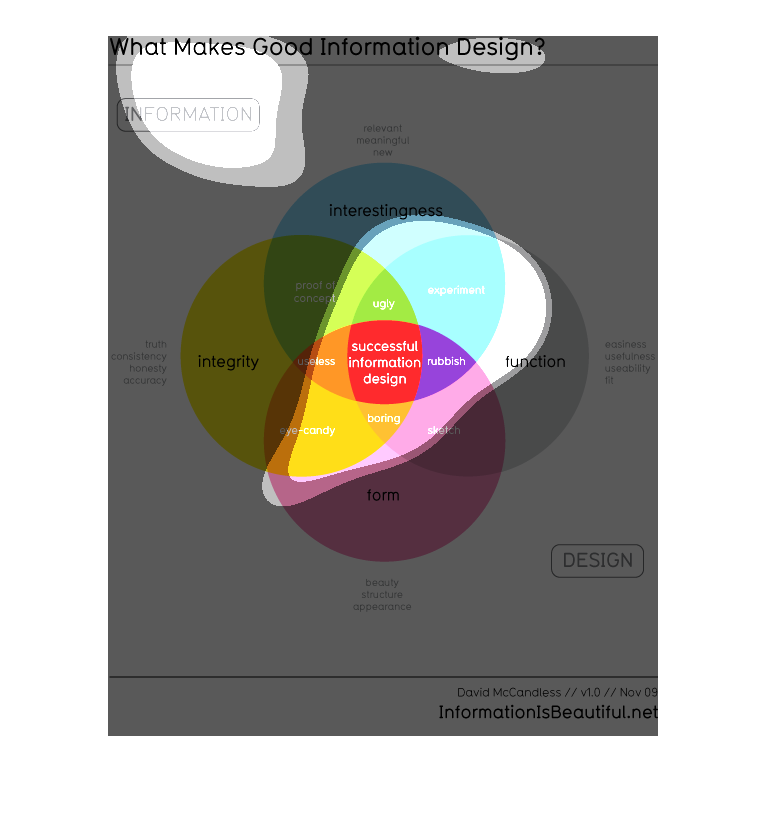
The image is a chart regarding the question, What Makes Good Information Design? There are
several colors separating the different design concepts such as "eye-candy", "uselessness",
or even "interestingness".
This illustration goes straight to the heart of the many facets of the information technologies
theorem which dictates that everything must come together in harmony to work efficiently.