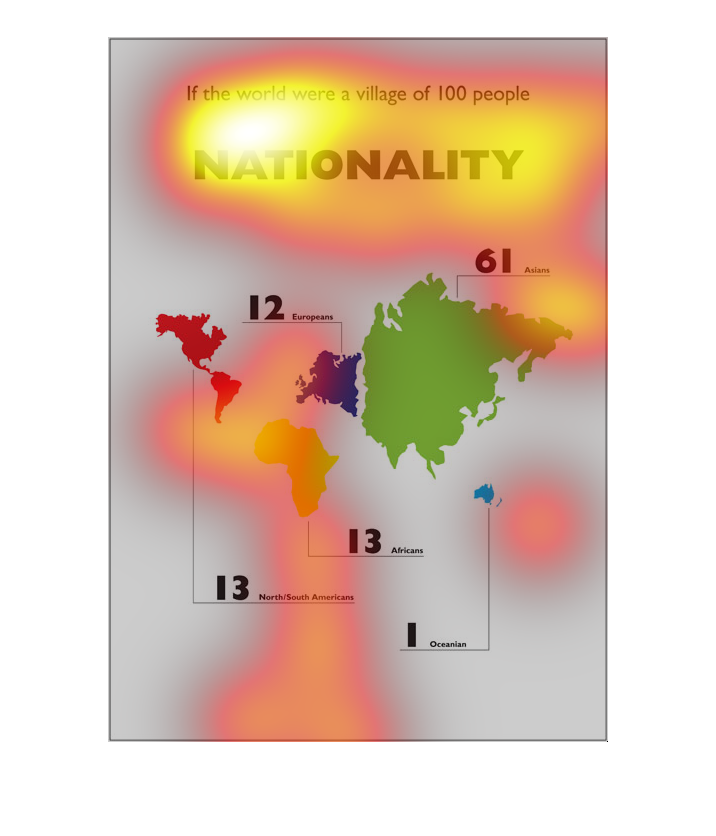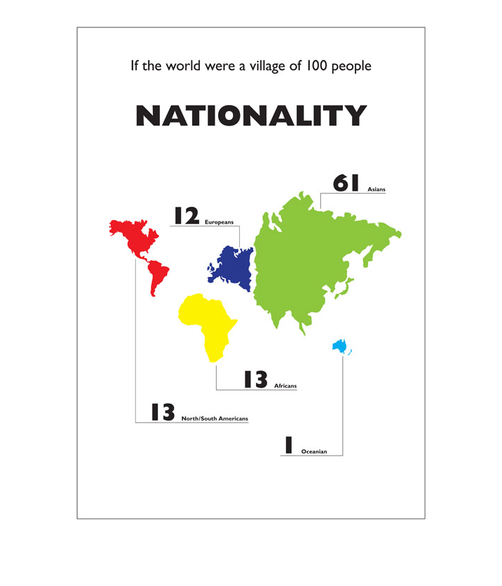
This chart describes if the world were a village of one hundred people. Different regions
and countries on the map are represented by several different colors.
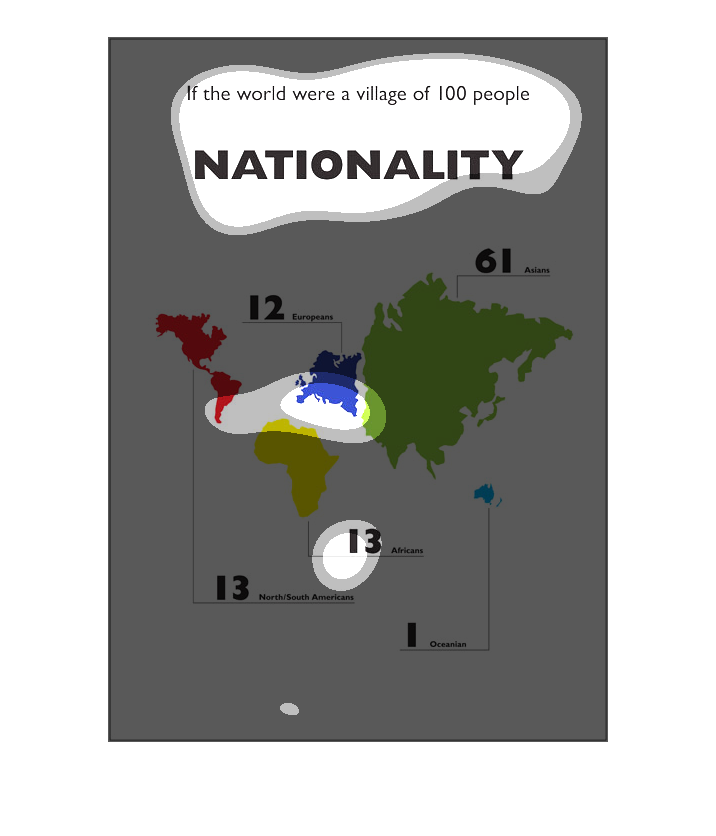
This chart is titled: Nationality, with a world map below. The map displays the amount of
nationalities. This is a very interesting chart that I learned quite a bit from.
It is an image of all of the continents throughout the world and there is also a key of them.
It is a way to show the percentage of the world population by representing them as a 100 people
in a village.
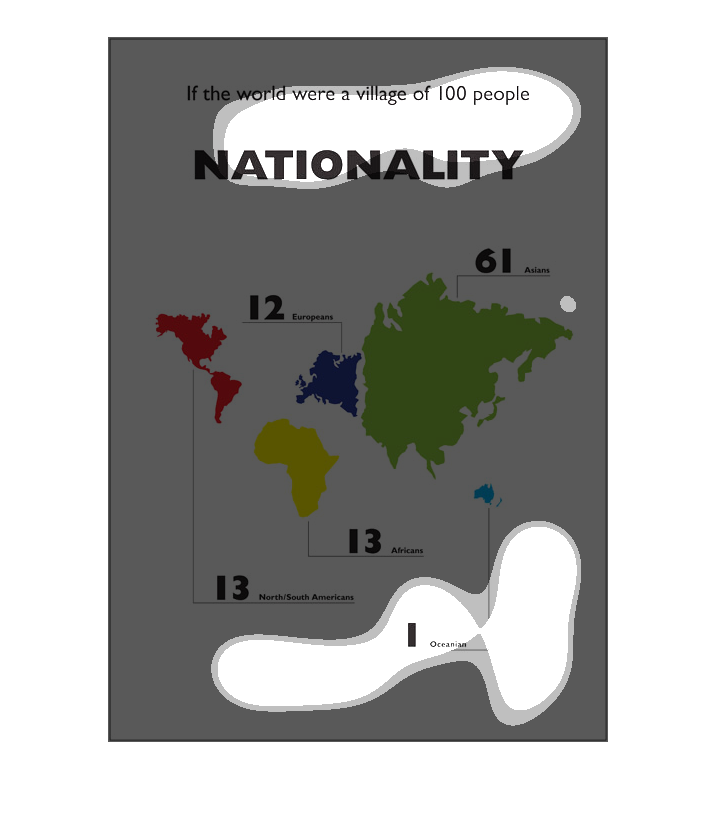
This is an image showing how the world's population is distributed by recalculating data to
show how many people would be from various countries if the world had only 100 people. The
largest section is Asia, with 61 people.
The chart is a visual of the proportion of each ethnicity on earth. The population is scaled
down to 100 people, with 12 Europeans, 61 Asians, 1 Oceanian, 13 North/South Americans, and
13 Africans.
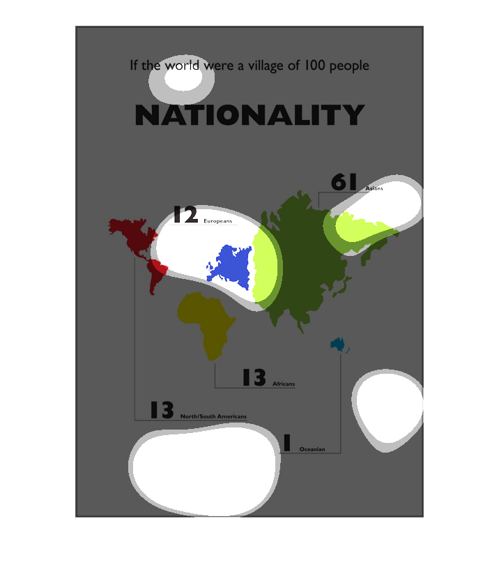
This is a colorful image of a map of the world that shows how many people would be present
from each continent if the world population was reduced proportionally to 100 people. The
information explains that Europe, North & South America, and Africa would each represent about
12-13 people, Oceania would only represent 1 person, and Asians would make up 61 people.
This graph shows if the world were a village of 100 people.  It shows the number of people
that would be in each nationality by continent if there were only 100 people.
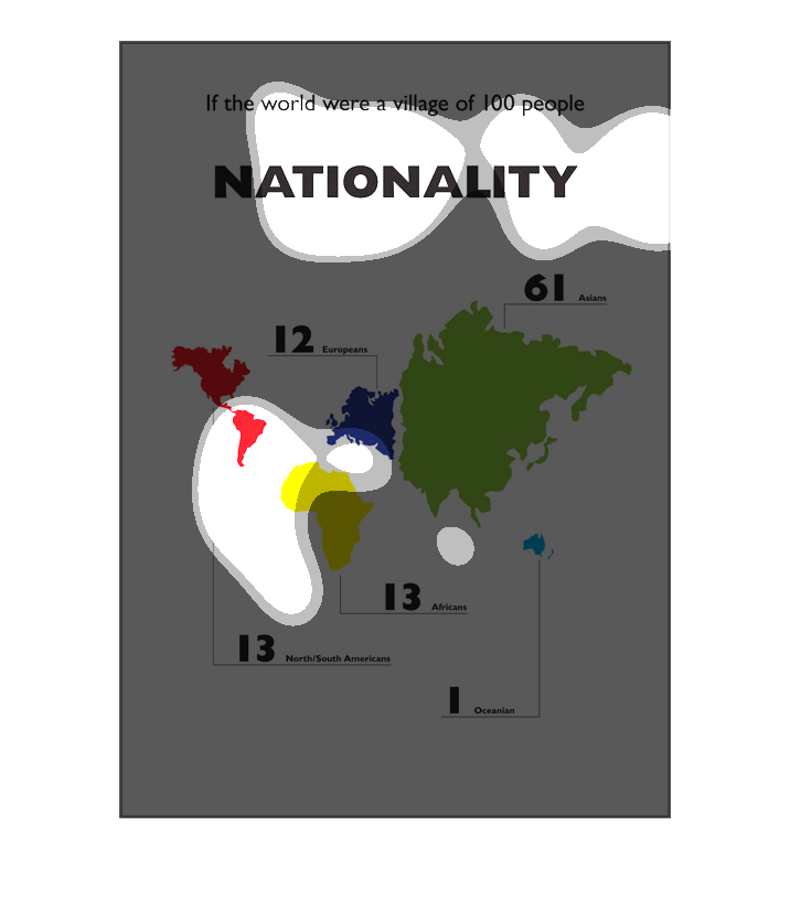
The image shows a map of the world and depicts the nationality numbers if it was a village
of 100 people. Asia far outnumbers any other nationality with 61. North America, South America,
and Africa tie with 13. Europe is right behind with 12. Oceania represents a single 1.
This graph shows the world density if the world was a village of 100 people.  We see that
61 people would have belonged to Asia, and rest would be other continents.
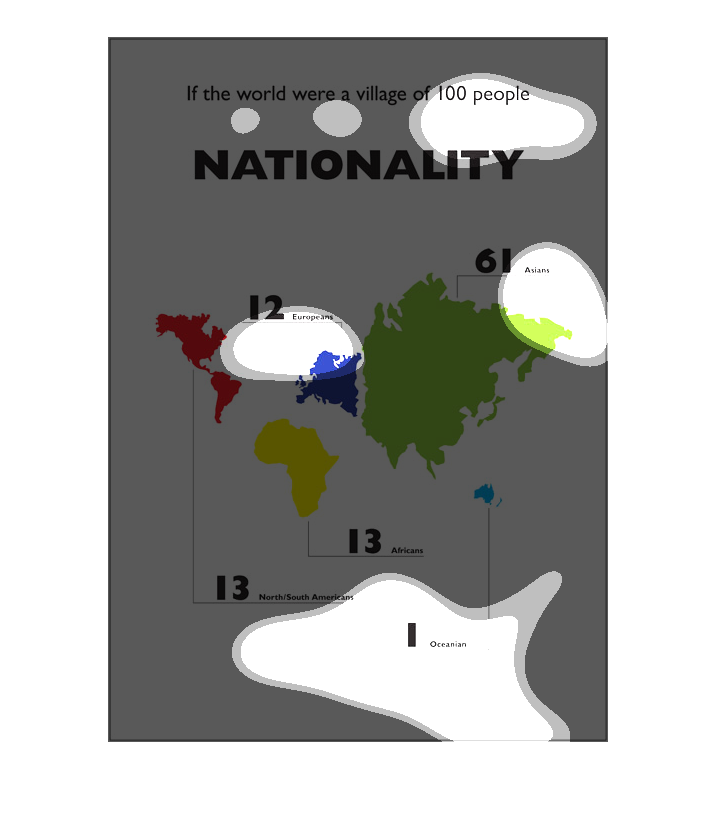
This picture shows if the world were a village of 100 people what the nationalities would
be. Asians would represent 61. Europeans would be 12. There would be 13 in north and south
America. Also there would be 13 Africans. There would be only 1 for Oceanian.
This pictures is trying to show with as little words as possible- via little vocabulary and
small numbers- the population dispersion across the globe.
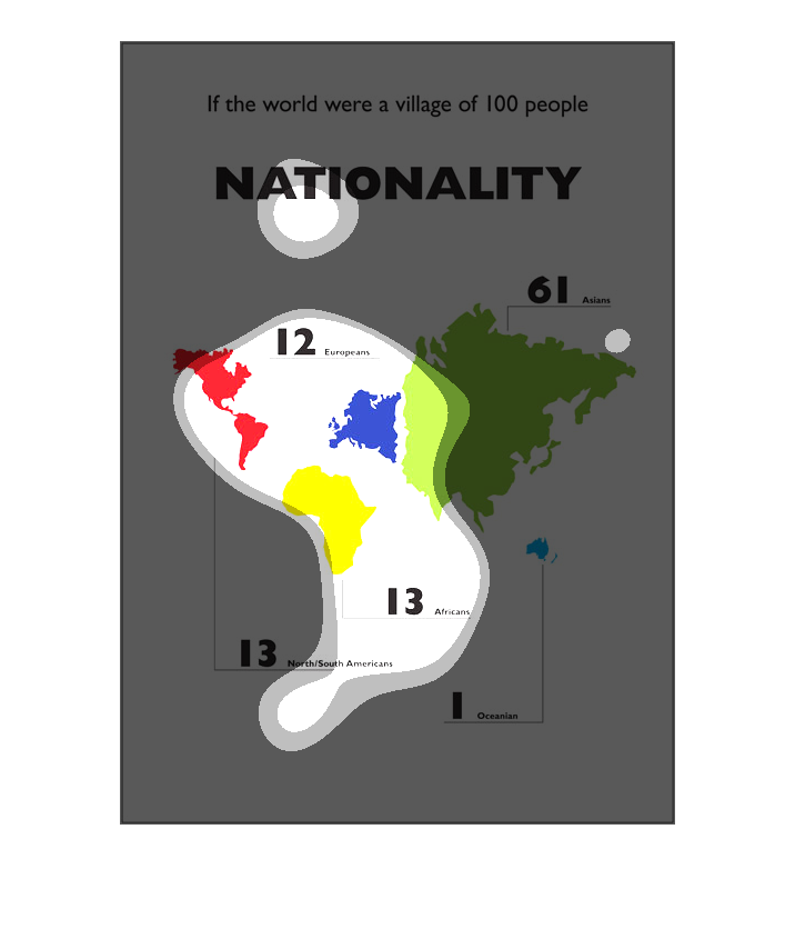
This infographic imagines the world as 100 people, explaining how many would be from each
continent with numerical details. Each continent appears in a different color as well. The
majority (66 of 100) are from Asia.
The graph to the left is showing the breakdown percentage wise of the world population by
country if there were only one hundred people designed in the new world.  In the new world
a large percentage would be from Asia which would account for 61 individuals.