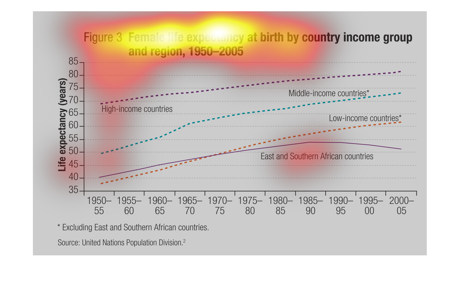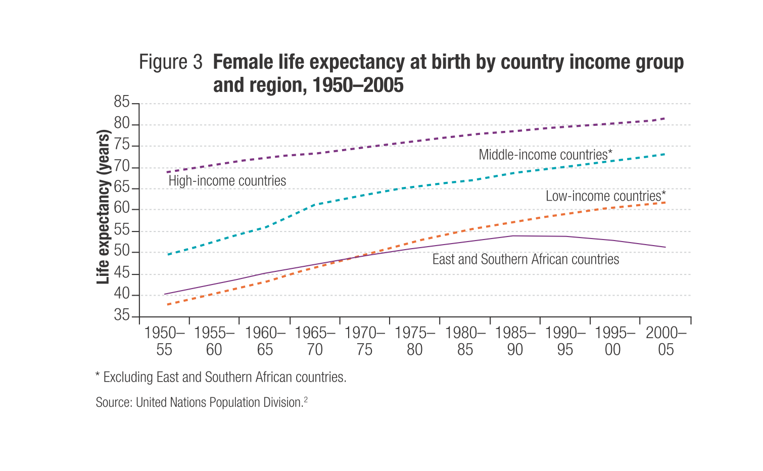
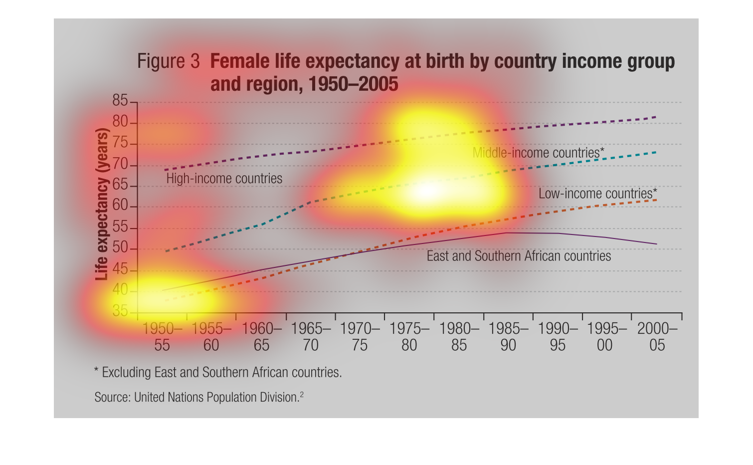
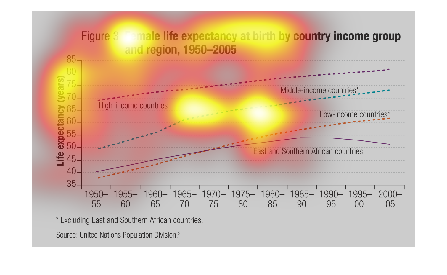
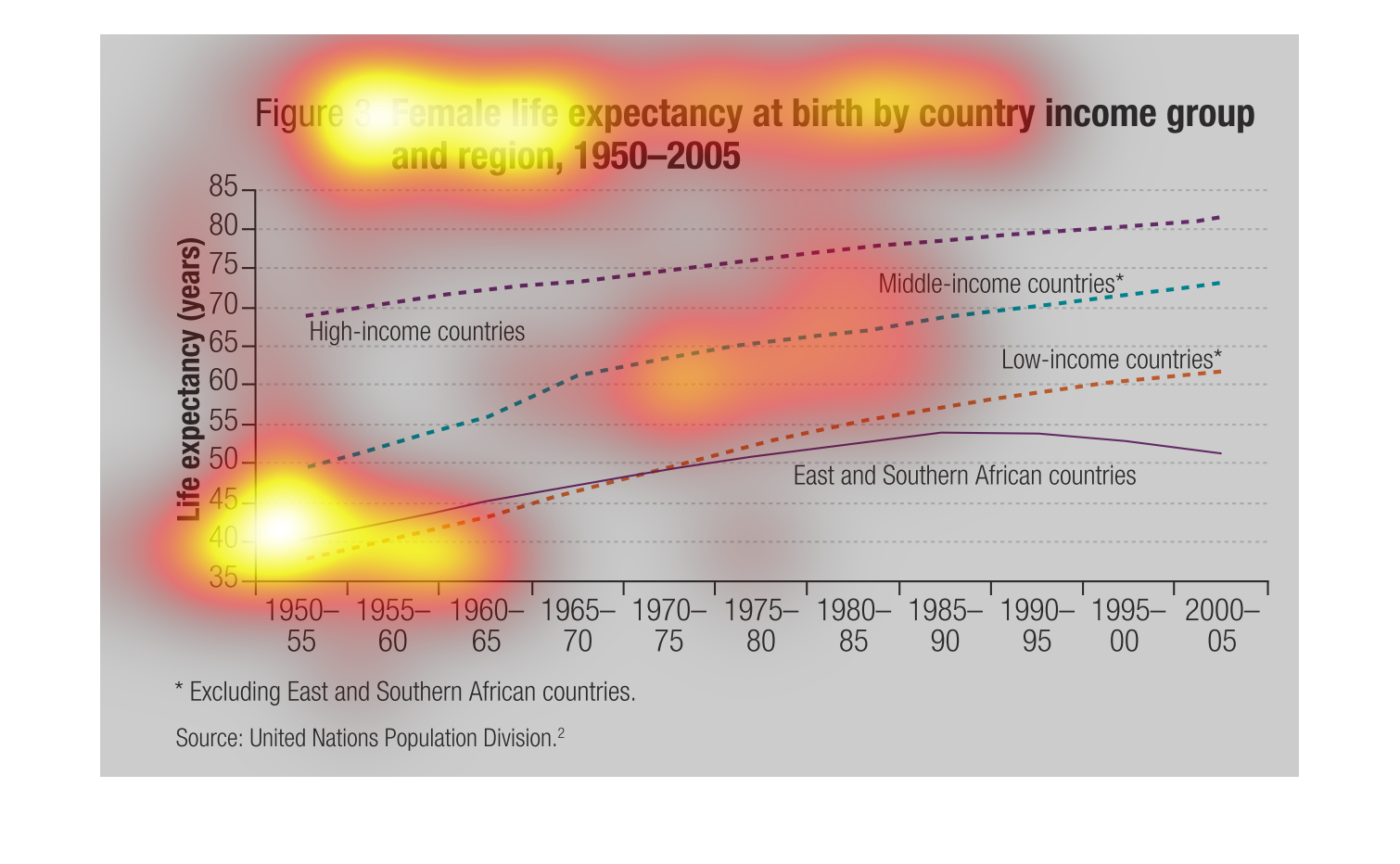
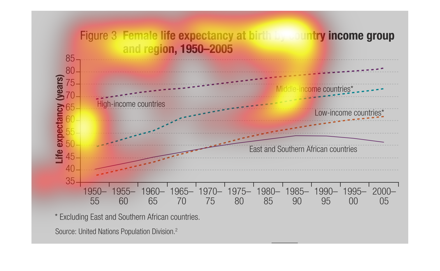
This line chart compares female life expectancy at birth by country income group and region
from 1950 to 2005.  Note that African countries in the east and south have been excluded.
 Generally life expectancy and income are directly related and both have increased over time.
 Life expectancy has also been increasing fairly consistently between the years of 1950 and
2005.

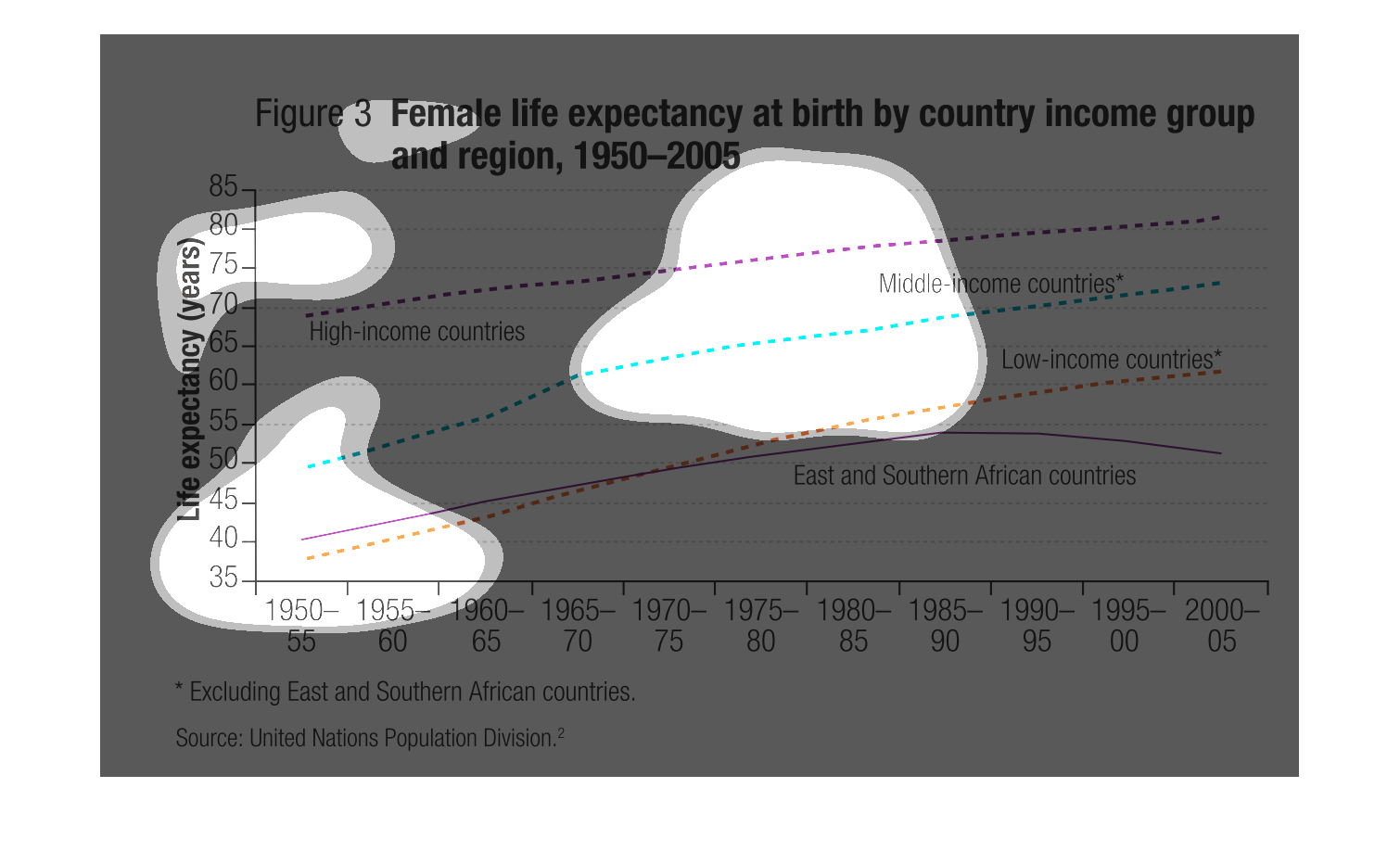
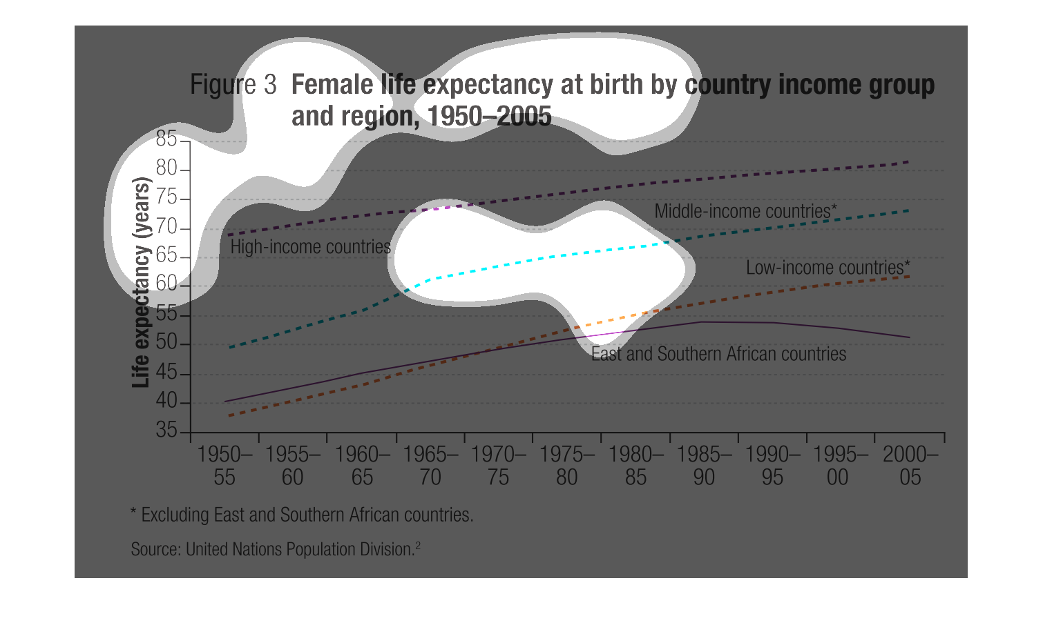
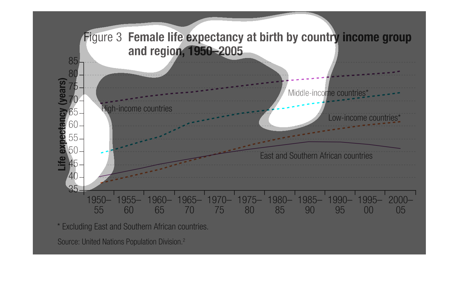
The image depicts a chart of female life expectancy at birth by country income group and region,
1950-2005. The graph excludes East and Southern African countries. Conclusion from chart indicates
that higher-income groups have higher life expectancy for women, while lower-income groups
have lower life expectancy for women. But the overall trend for a majority of these groups
throughout the years, is that life expectancy is increasing for most of them. Source is the
United Nations Population Division.
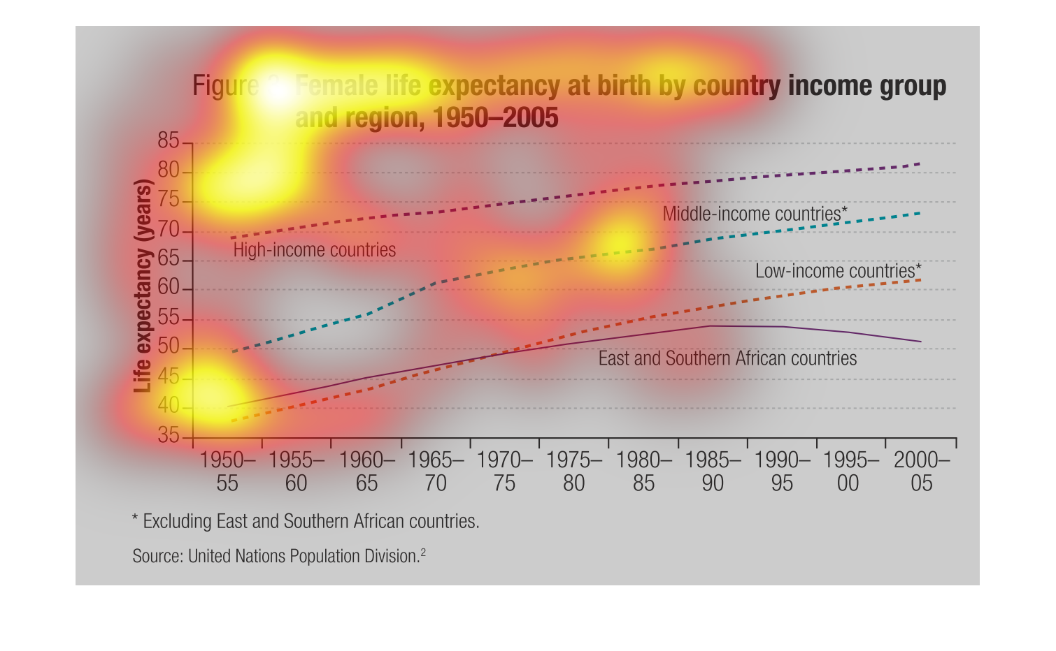
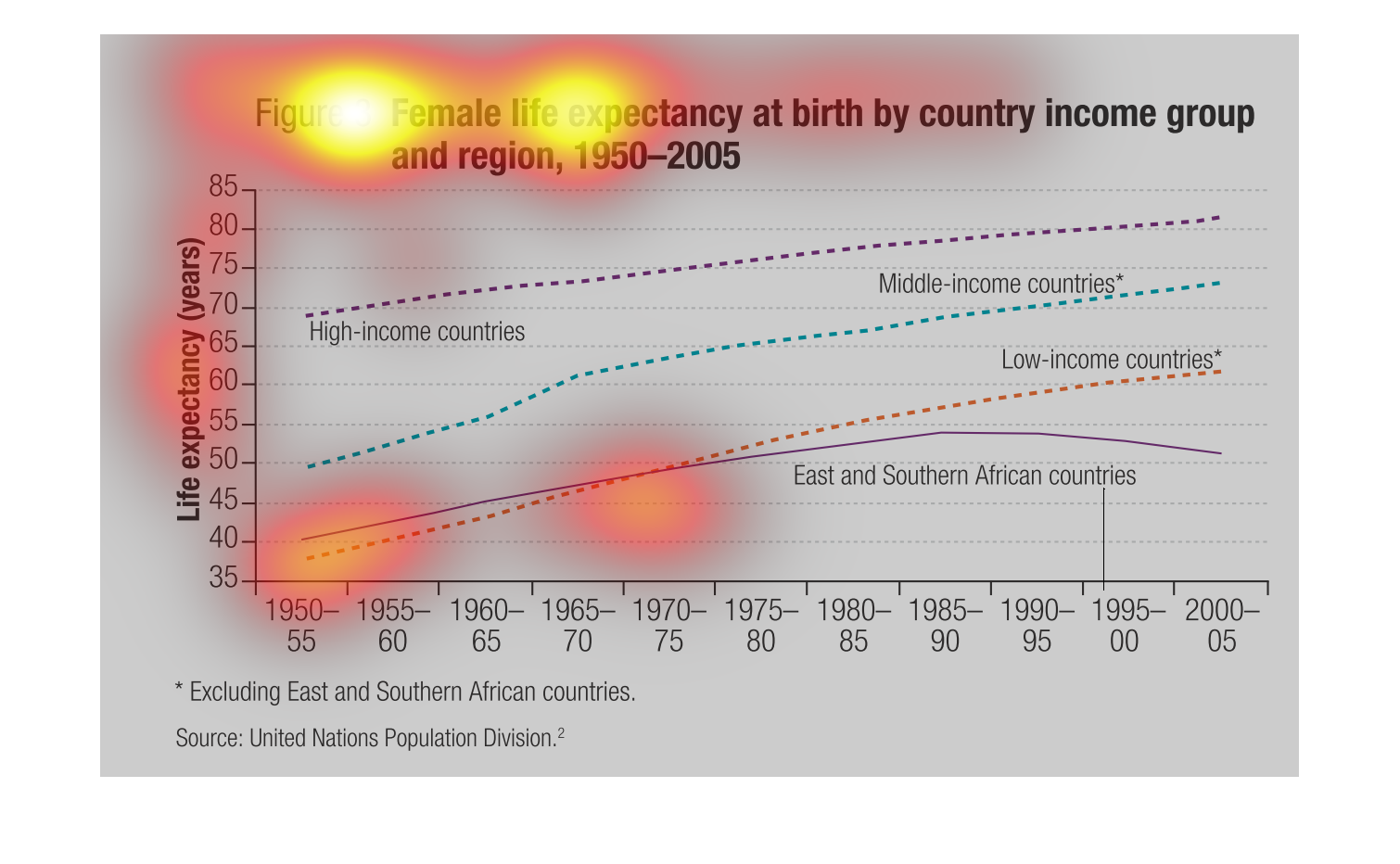
This graph charts female life expectancy at birth by country income group and region from
1950 - 2005.  The graph indicates that women from higher income groups have a longer life
expectancy.
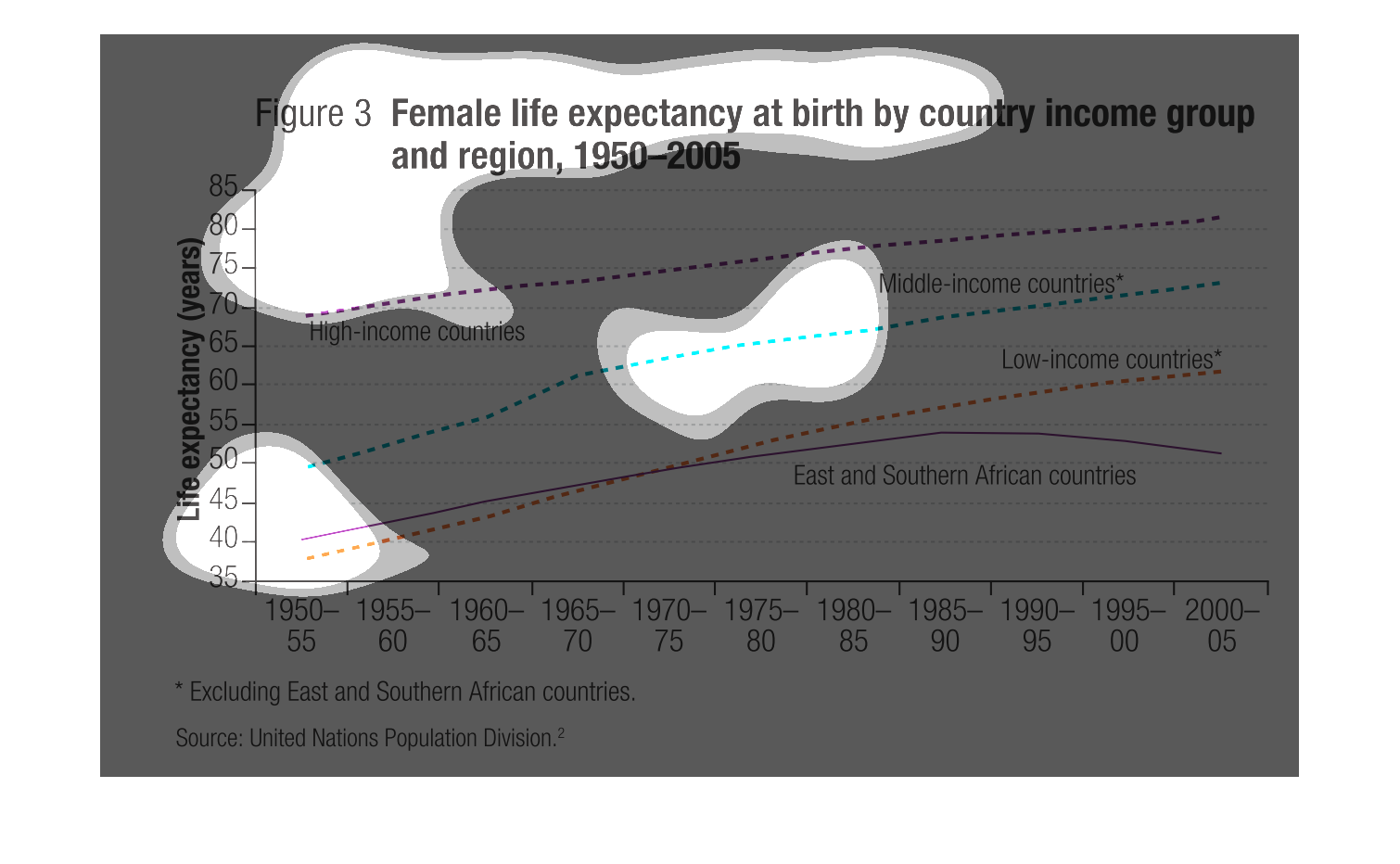
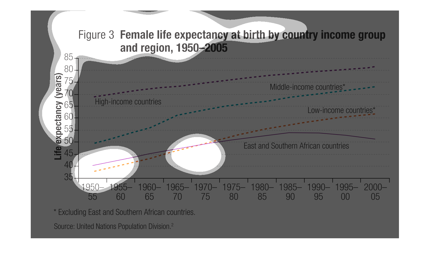
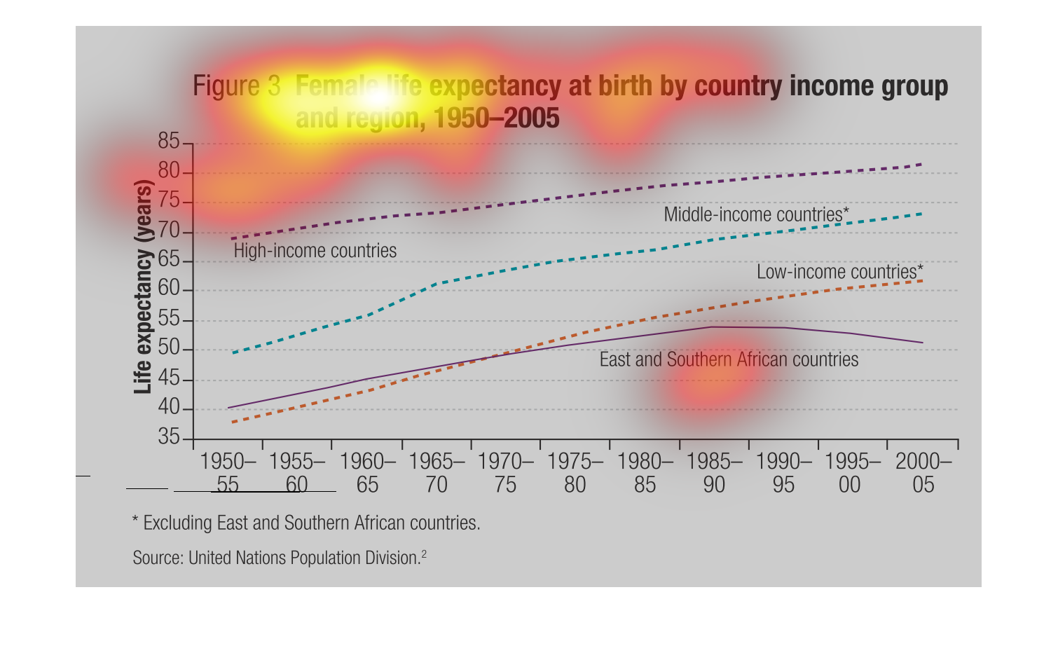
The graph shows female life expectancy at birth by country income group and region. Overall
every region has increased their life expectancy except for East and Southern Africa which
increased until 1995 then has began to decrease.
This figure is titled Female life expectancy at birth by country income group and region,
1950 - 2005.  It shows the life expectancy by region of the span of 55 years.
This chart shows the female life expectancy at birth based on country income groups and regions.
It maps out life expectancy between the years of 1950 through 2000. All east and southern
African countries are excluded. The higher the income group, the high the life expectancy
is related to that group.
This graph depicts female life expectancy increases as a function of the year of birth, and
compares the outcome for low, middle, and upper income countries.
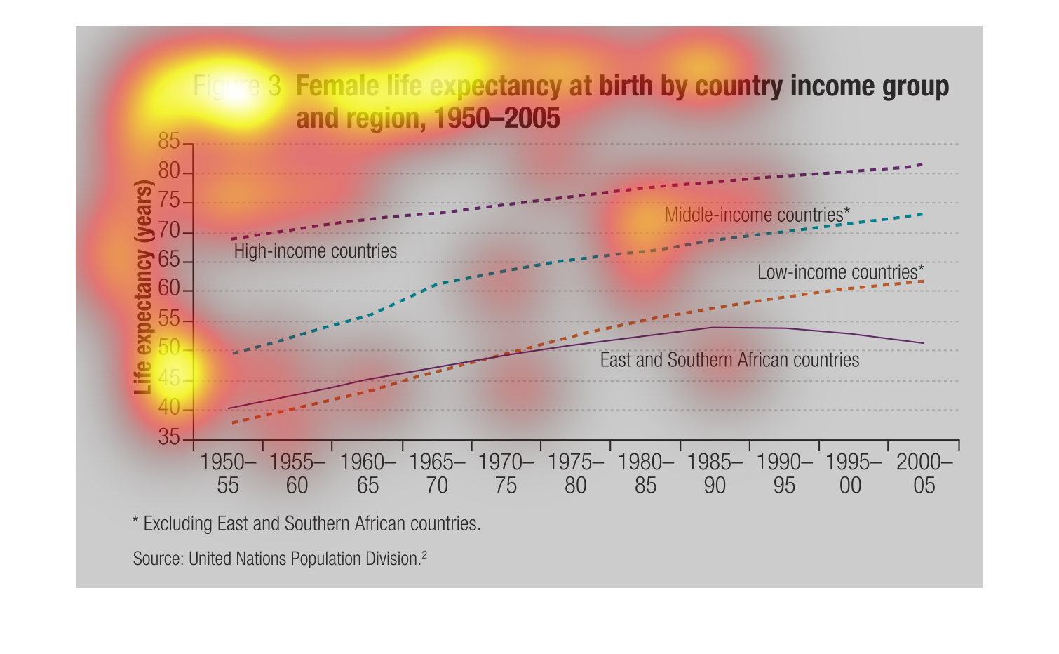
This graph shows the life expectancy of females by region and income. All have risen significantly
in the last 50 years, but the poorer countries are still around their fifties, while the high
income groups are in their 80's.
This graph represents female life expectations at birth by income group and region from 1950
to 2005.  High income countries have the highest life expectations.
This chart shows the female life expectancy organized by country, income group, and region.
The information was gathered from 1950 to the year 2005. High income countries have a increasing
income have the highest life expectancy for females, with middle income countries following
behind. However Low income and East and Southern African Countries are towards the bottom
of the spectrum.
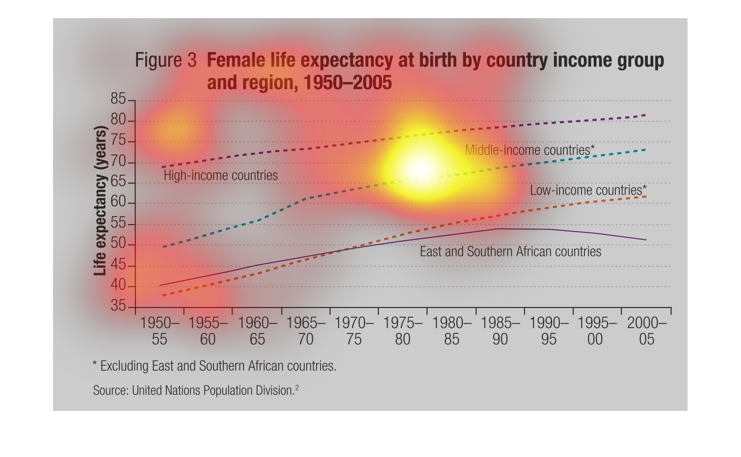
The following chart list the life expectancy of women and in their income by a particular
region and or country. The data was from the years 1950 to 2005.
This chart describes female life expectancy at birth by country income group and region for
the years 1950 through 2005. Regions on the chart include high income countries.
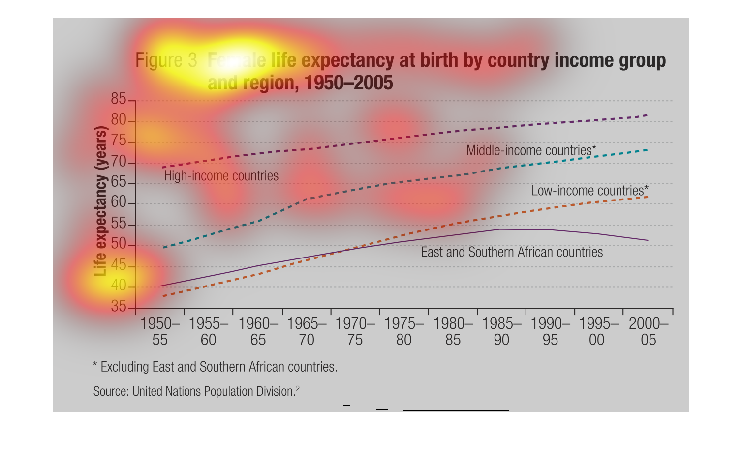
The 1950s were such a simpler time, where you didn't have to worry about from where your chicken
came from, but these days not so much. The graph shows the incremental lifespan of women from
that point till present day.
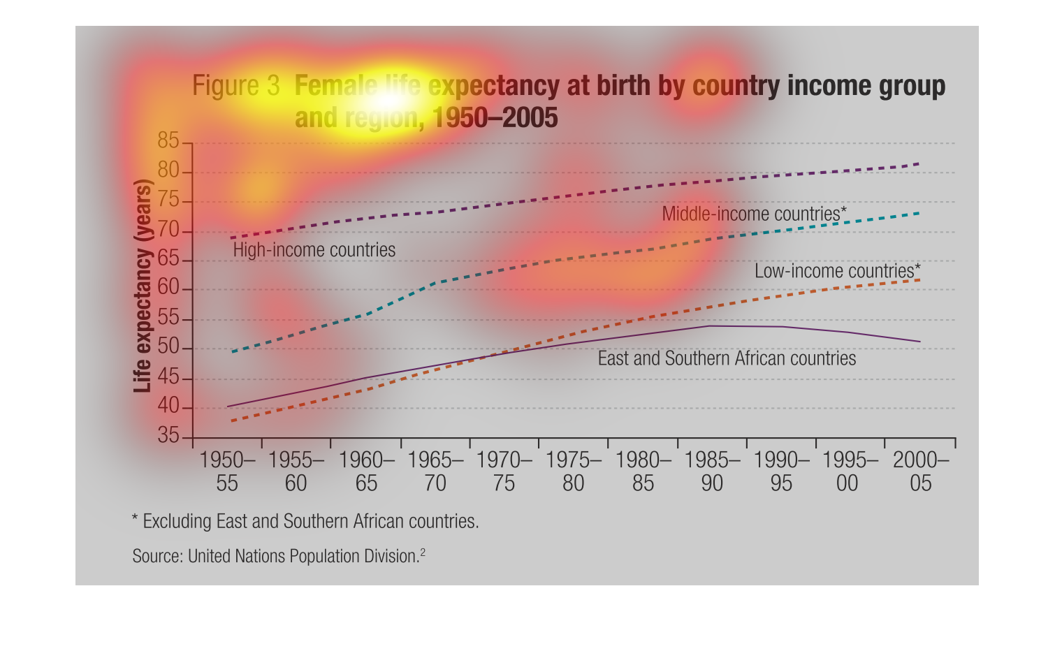
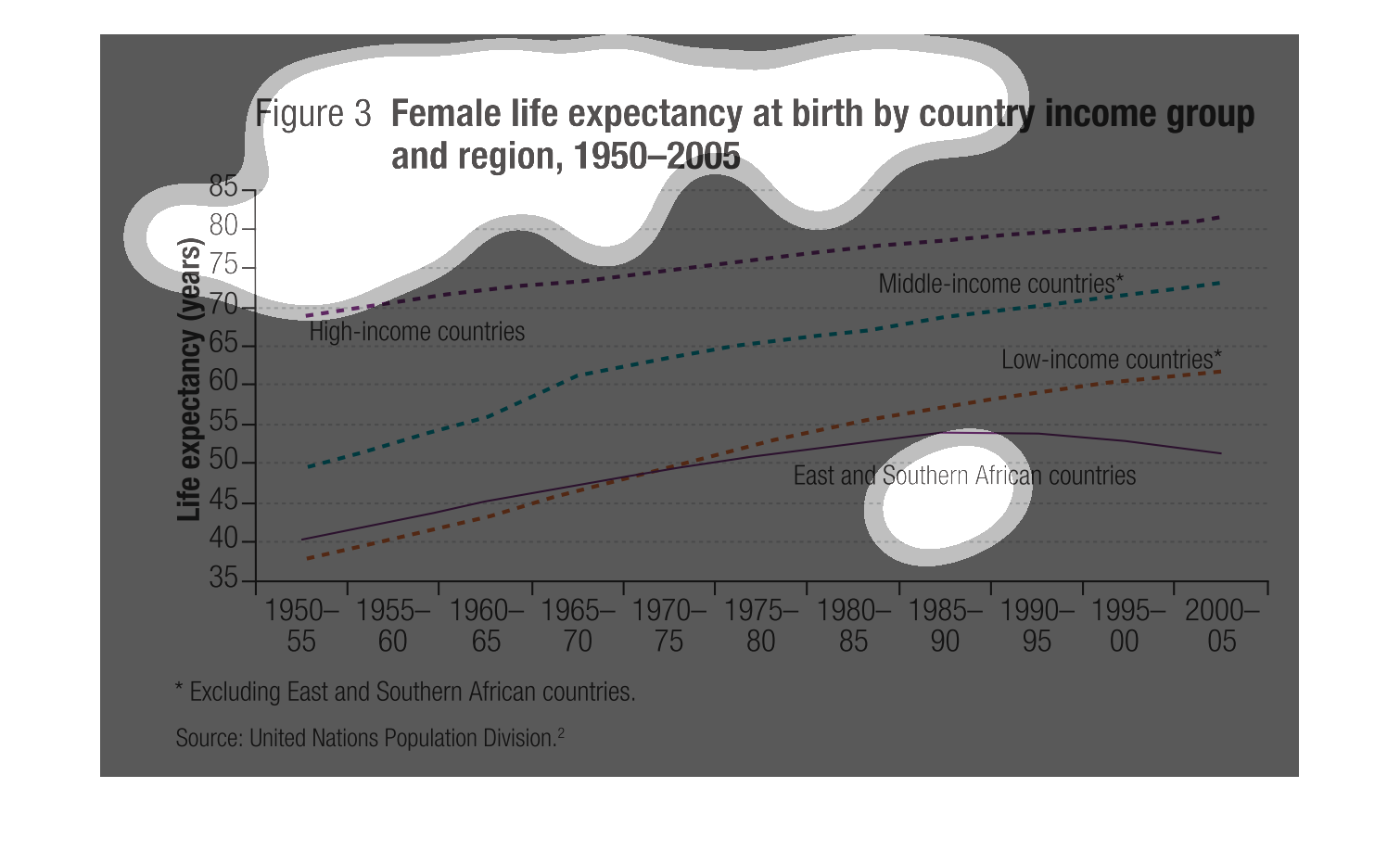
This shows the life expectancy of females by income and location from 1950-2005. Low-income
countries ranged from 37-60; high income from 70-80, and middle-income from 50-75. Overall
the poorer the area, the more dramatic increase.
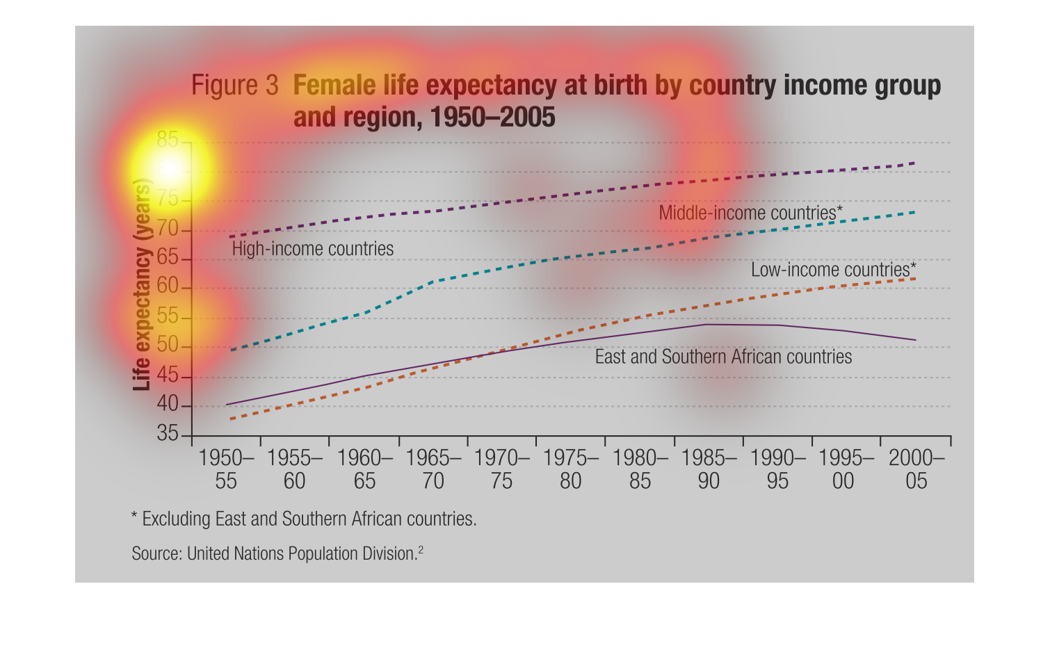
This chart is for the Female life expectancy at birth by country  income group, and region
for the years of 1950 to 2009. The life expectancy rates have went up tremendously over the
years.