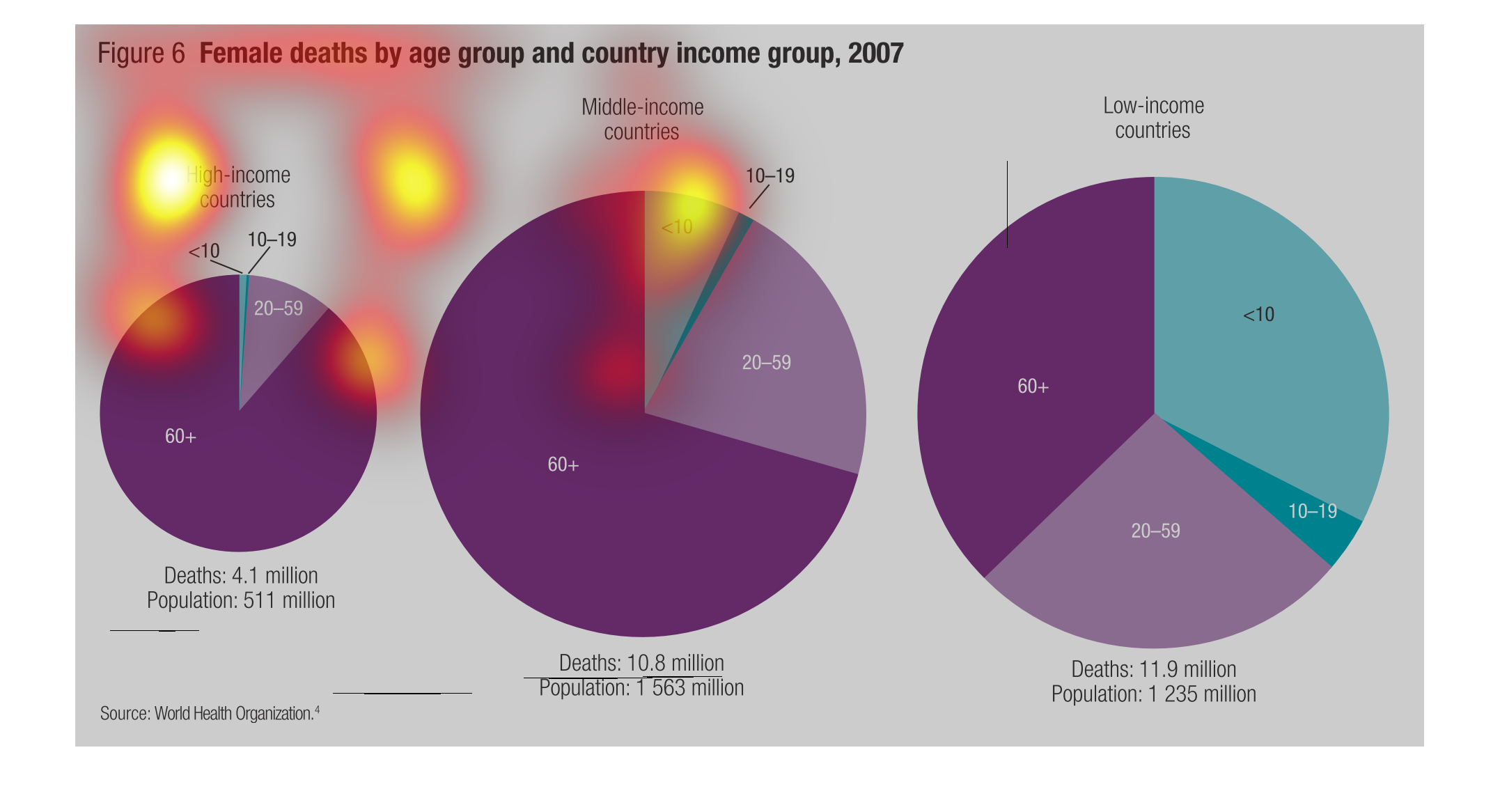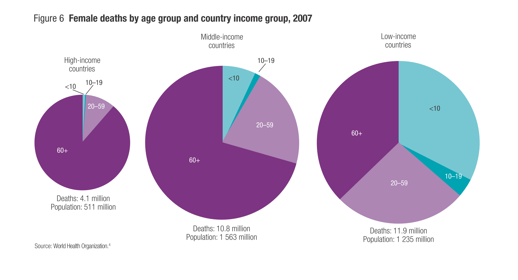
These circle graphs depict female deaths by age and country income group in 2007.  The country
income is divided into three categories: high, medium and low.  The high income countries
had 4.1 million deaths out of a population of 511 million.  The medium income countries had
10.8 million deaths out of a population of 1563 million.  The high income countries had 11.9
million deaths out of a population of 1235 million. This shows that the higher the income,
the fewer the deaths.
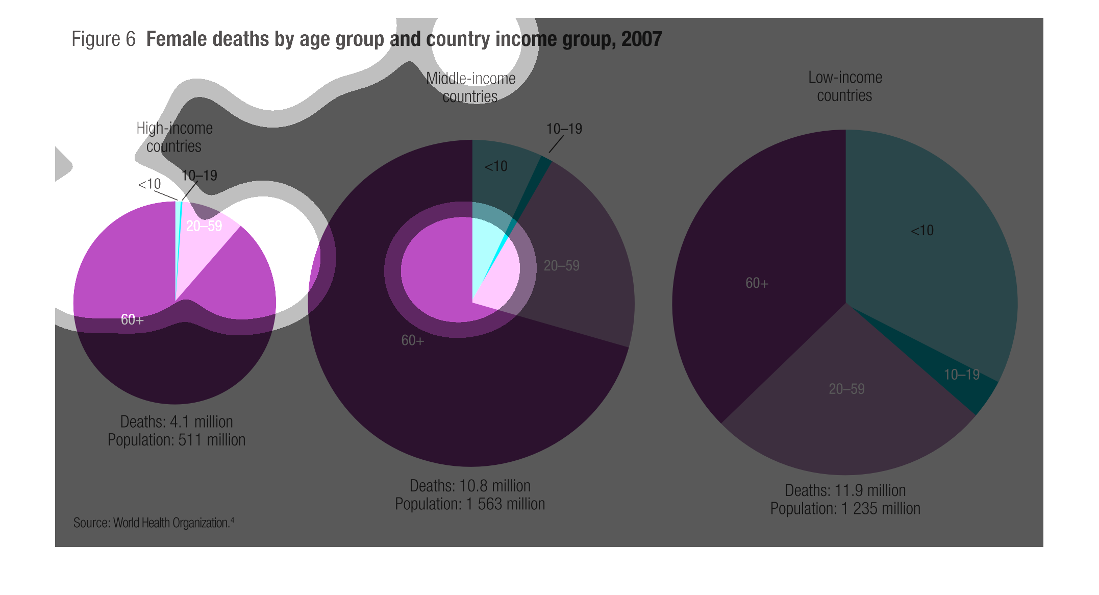
The graphs compare female mortality based on age in differing wealth brackets of countries.
 The data supports that the lower the income of the country the lower the average age of mortality
for females.
The following chart lists the female death rate by different age group in the year 2007. They
are broken down by low income countries, middle income countries and high income countries
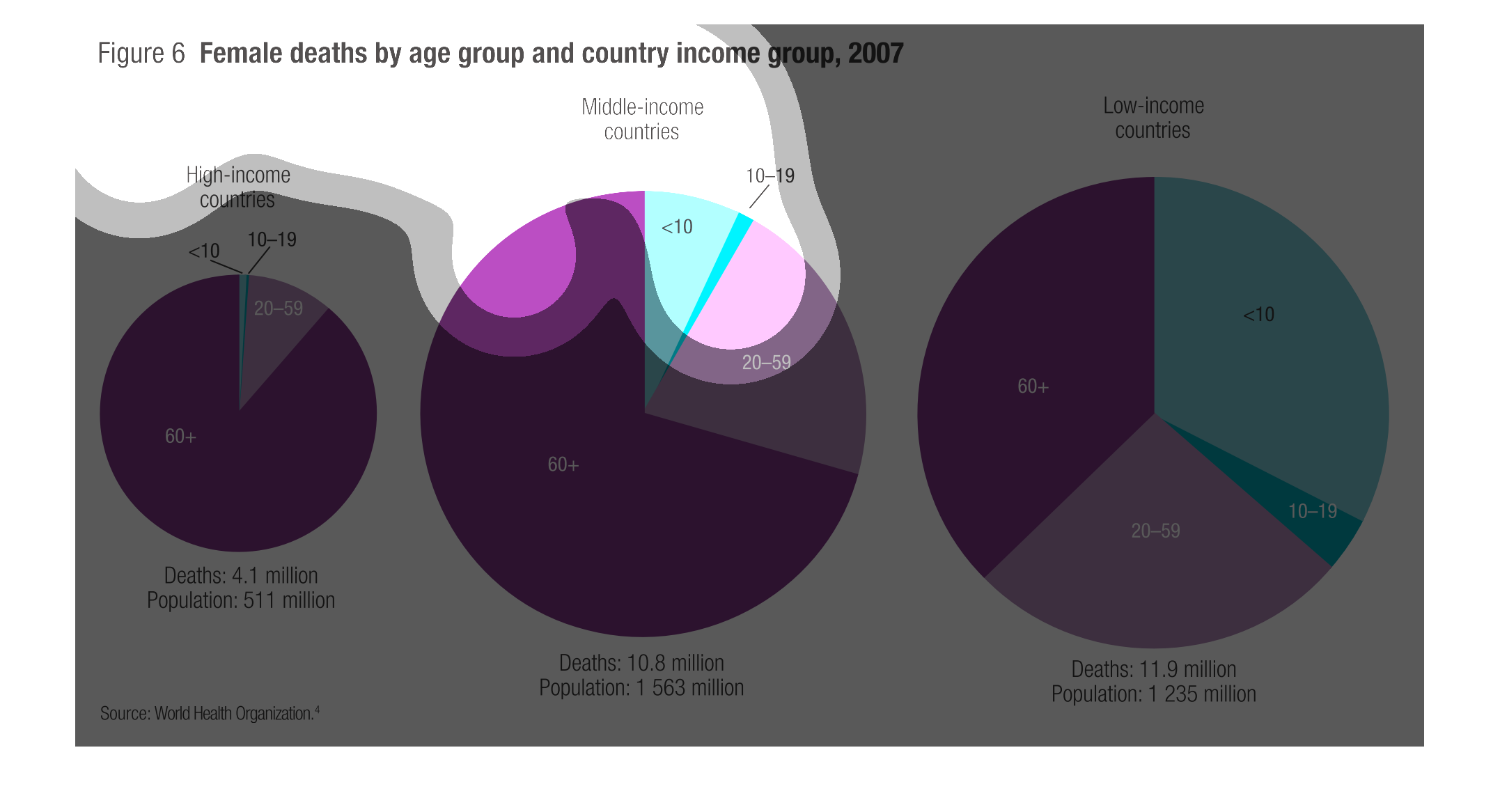
This circle graph shows the Female deaths by age group  and country income group for the year
of 2007. The three circle graphs are for: High income countries, Middle income countries,
and Low-income countries.
These three pie charts show female deaths by age group and country income in 2007. In high
income countries the majority of deaths are of women 60+. In middle income countries, the
majority of deaths is still 60+ but the amount of women aged 20-59 dying has increased. Lastly,
the lower income countries are almost equal deaths per age group. The lower income countries
see a large increase in deaths of females under the age of 10. This last thing to note is
the size of the population as you go down the income ladder increases.
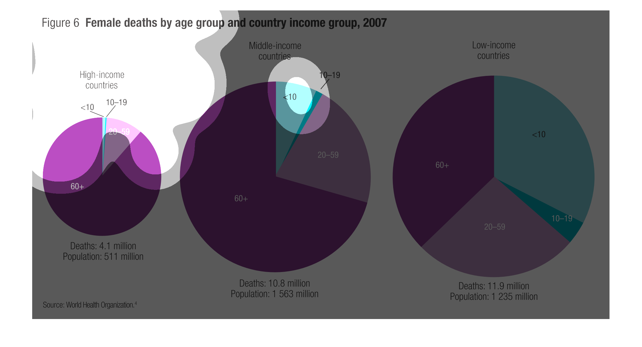
This chart describes and depicts the approximate number of female deaths in the year two thousand
and seven by age group as well as country income group.
These pies are trying to demonstrate female life expectancy between a variety of economic
groups, which have been labeled high income, middle of the road, and low income. It shows
that higher income females live longer.
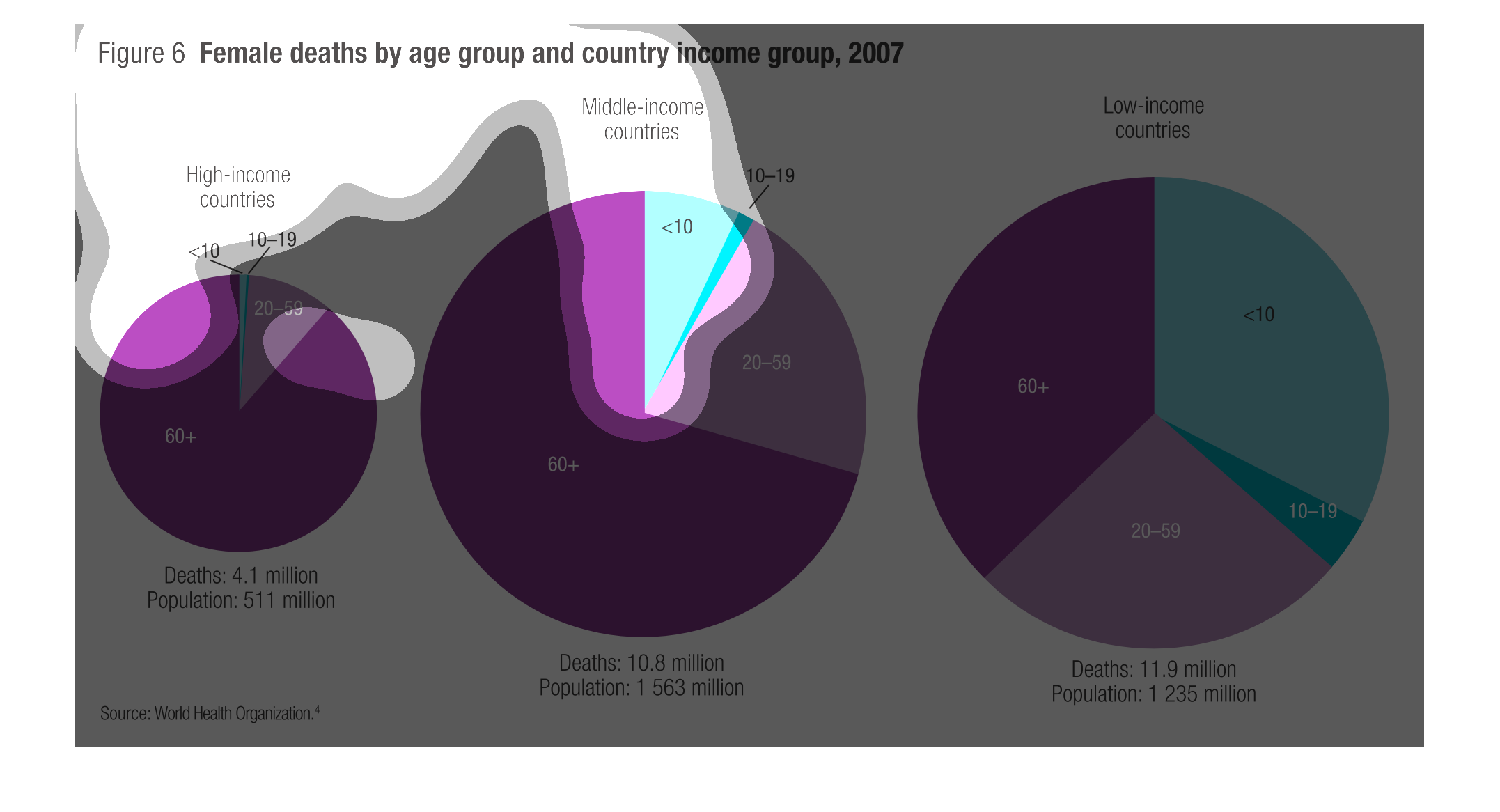
This chart shows the deaths of females in different age groups among three different groups
of countries-low,middle,and high income countries. The graphs show information collected during
the year of 2007 and shows the discrepancy caused by income.
These are pie graphs that show the percentage of women who passed away in specific age groups
depending on their countries income. More women are living 60 plus years in higher income
countries than in middle, and lower-income countries.
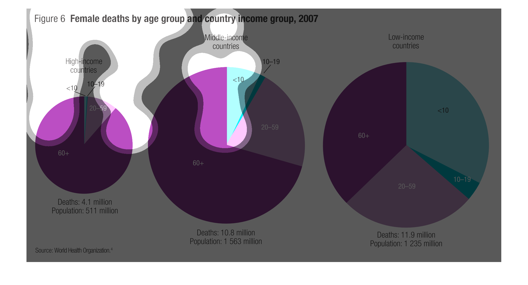
Three pie charts are shown with female death rates by age group and country group from 2007.
In high income countries, the majority of deaths come from women older than 60. In middle
income countries, the majority of deaths still come from women older than 60, but more come
from younger groups. In low income countries about a third come from women under 10 years
of age.
This image provides through pie charts displaying various percentages of Female deaths by
age group, country and income group. The information in this image is based upon a study performed
in 2007.
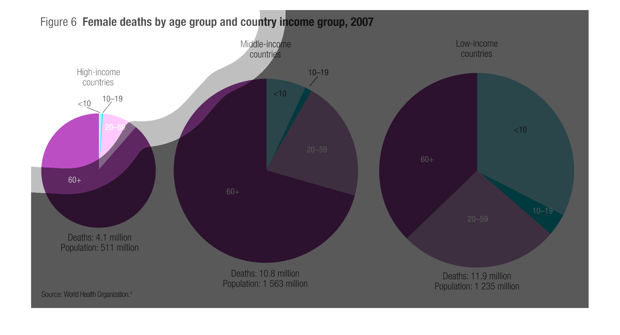
This is a pie graph on a study done in 2007 about female deaths and country income. The graphs
show that in high income county's most deaths are of women 60+ and 1/6th of deaths at younger
ages while in middle and low income country's the deaths for younger women grow to a 1/3rd
in mid and nearly 2/3rds in low income country's.