Warning: Image is too big to fit on screen; displaying at 67%
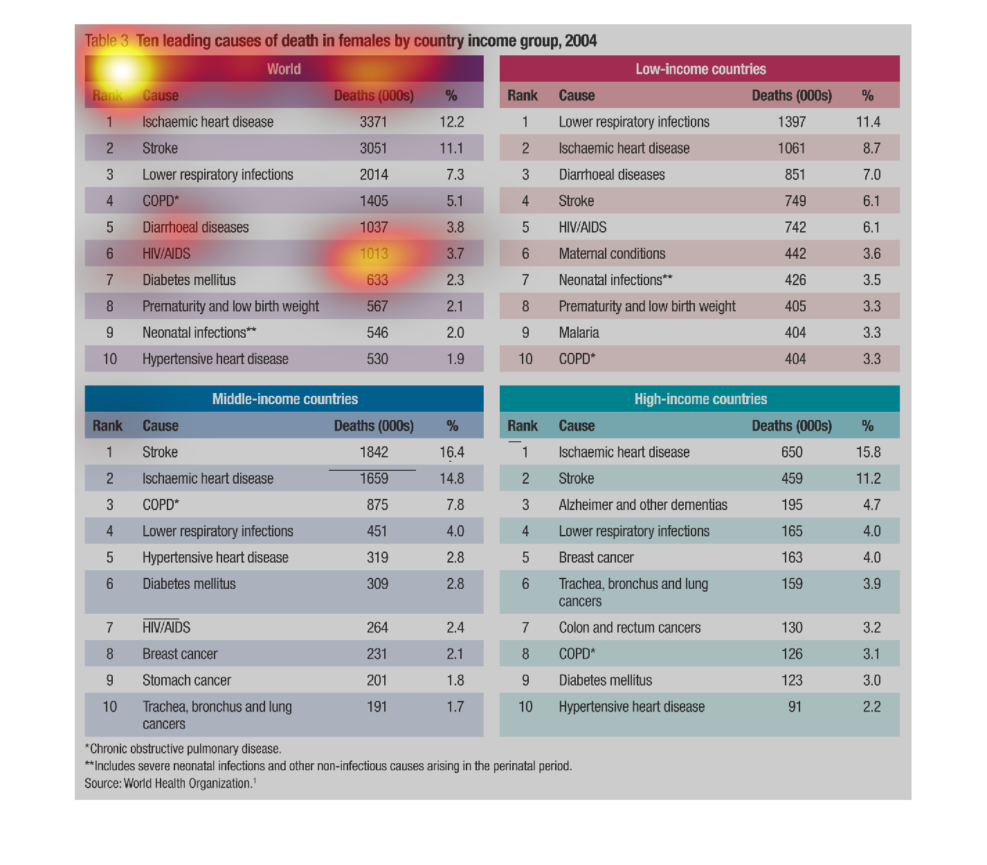
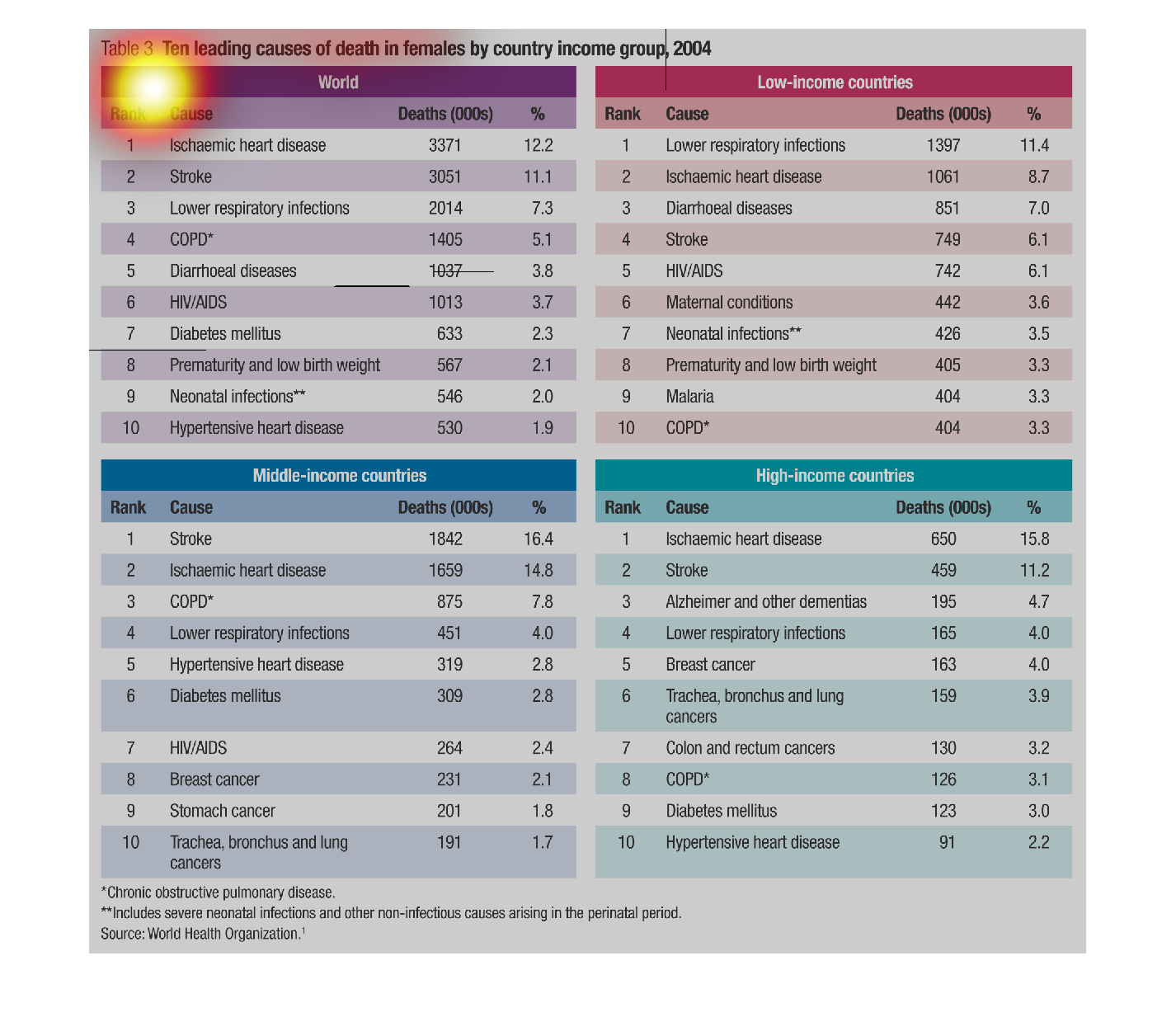
This series of graphs displays the ten leading causes of death in females by country for the
world on top left, low income countries on top right, middle income countries on bottom left,
and high income countries on bottom right.
Warning: Image is too big to fit on screen; displaying at 67%
Warning: Image is too big to fit on screen; displaying at 67%
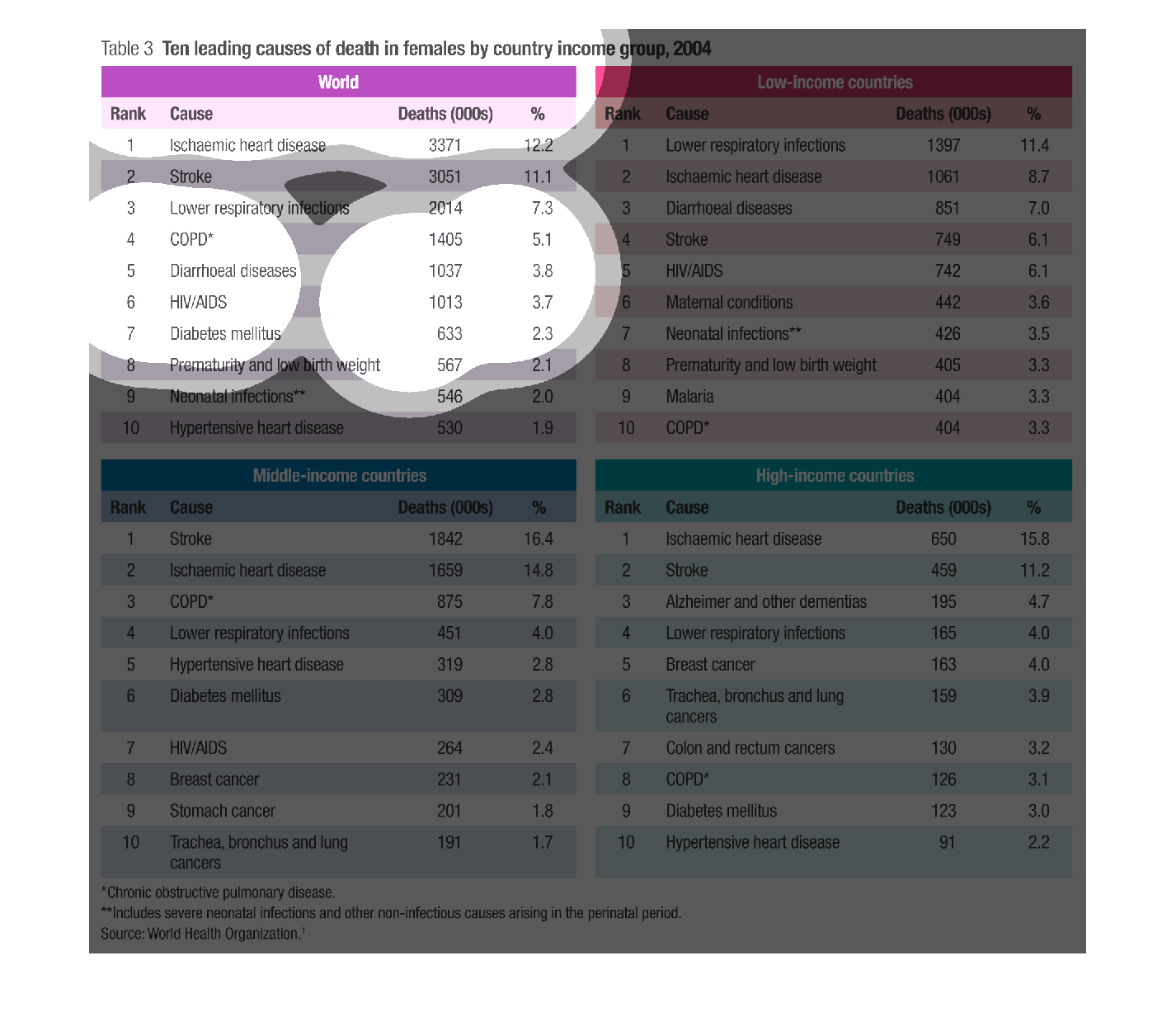
The following chart gives the ten leading causes of deaths of females. The chart divides them
into Low Income Countries, Middle Income Countries and high income countries.
Warning: Image is too big to fit on screen; displaying at 67%
Warning: Image is too big to fit on screen; displaying at 67%
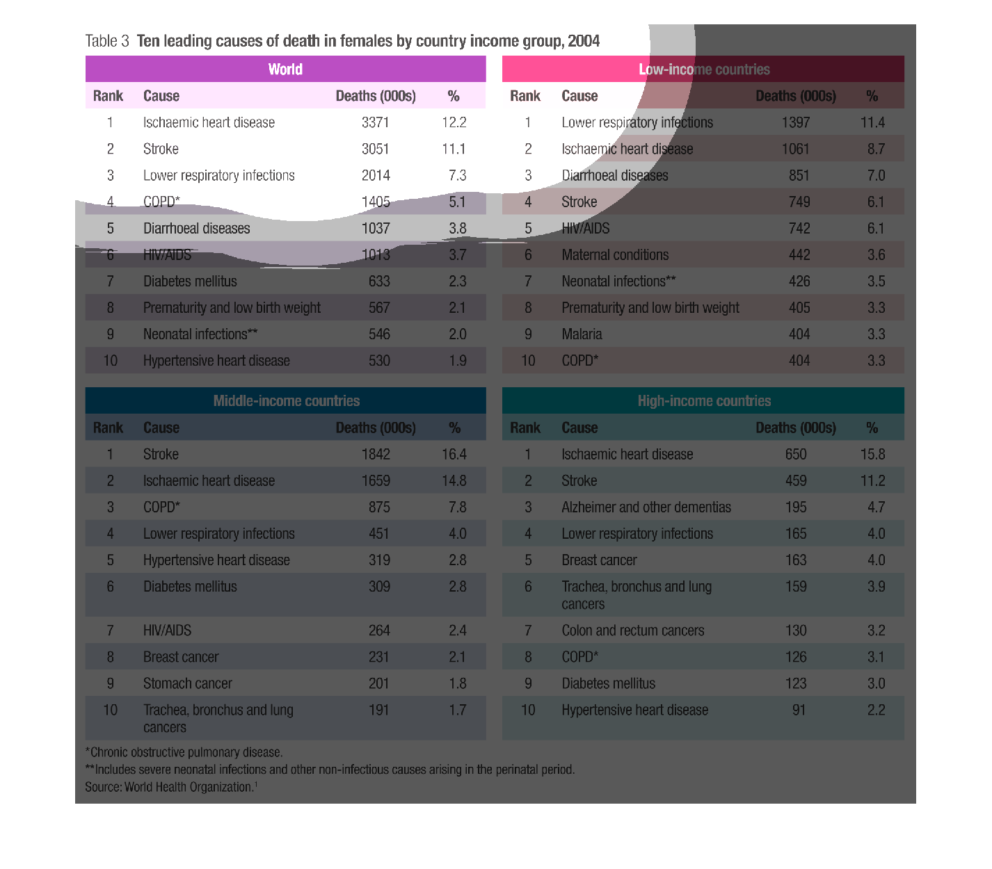
This graph shows the top ten leading causes of death in females by country income group in
2004. Globally, the leading cause of death is heart disease, but in low-income countries,
it is lower respiratory infections.
Warning: Image is too big to fit on screen; displaying at 67%
Warning: Image is too big to fit on screen; displaying at 67%
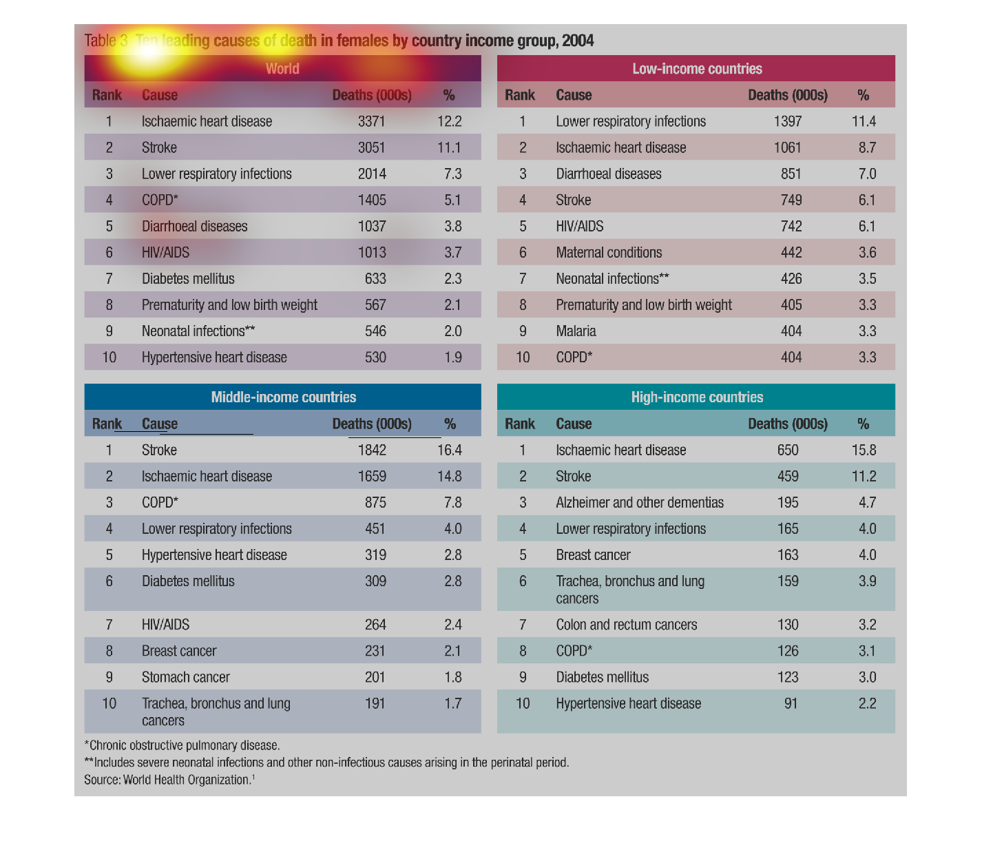
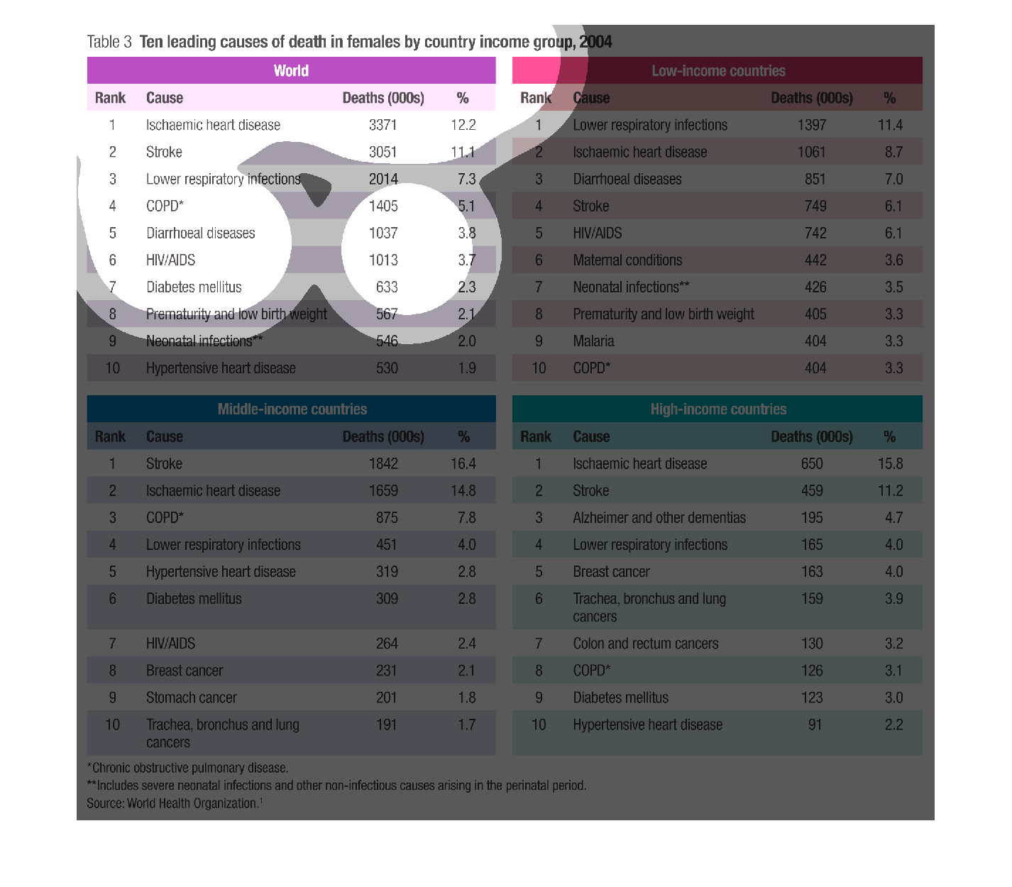
This image shows or depicts in 4 statistical categories the leading causes of death of females
by country income group for the year 2004. Categories are World, Low Income, Middle income
and high income countries.
Warning: Image is too big to fit on screen; displaying at 67%
Warning: Image is too big to fit on screen; displaying at 67%
This is a chart about common causes of death among females by country income group. Each chart
is defined by income bracket and contains columns for rank, cause of death, number of deaths
and percentage.
Warning: Image is too big to fit on screen; displaying at 67%
Warning: Image is too big to fit on screen; displaying at 67%
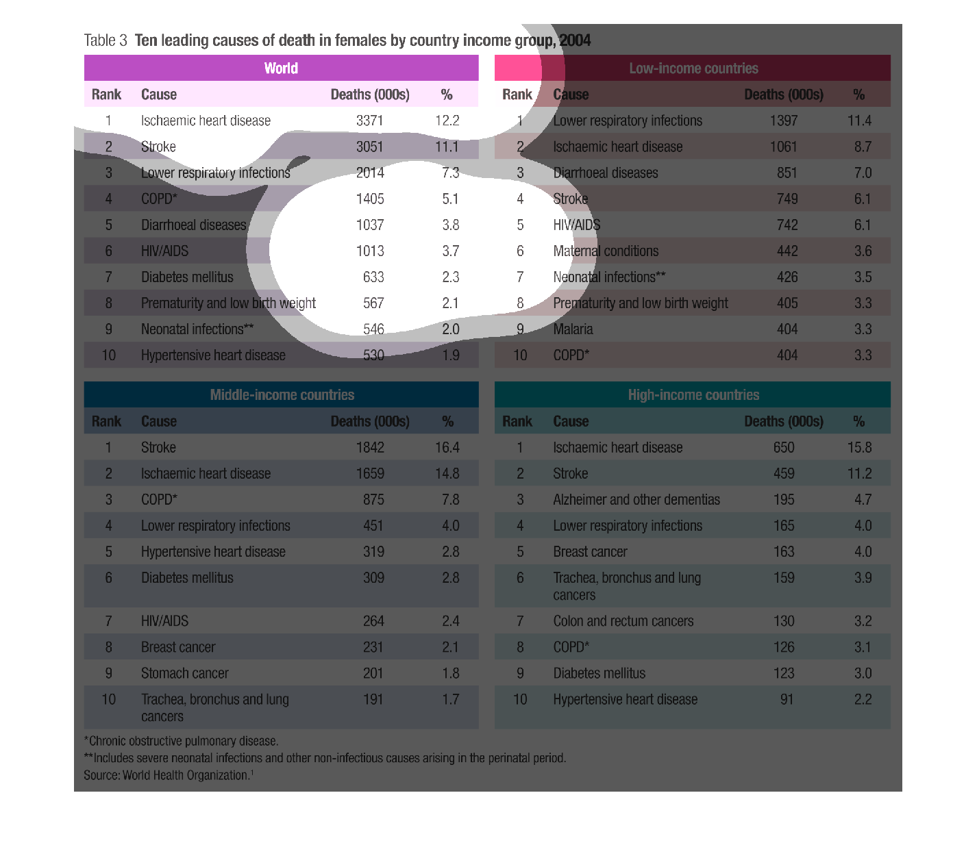
The image on the left hand side describes the top ten deaths in the world on females for any
age rage.  It then goes into more of an analysis of the deaths by classifying them by income
group from low, middle and high classes in society.
Warning: Image is too big to fit on screen; displaying at 67%
Warning: Image is too big to fit on screen; displaying at 67%
The image depicts the leading causes of death in females based on country income group. The
three groups are low, middle, and high income. Heart disease, stroke, and lower respiratory
infections are the top three overall, accounting for a total of 30.6%. Two of the above causes
are in the top three of each income level, so everyone is pretty equally affected. Low income
countries have a high rate of diarrhea disease. Middle income countries have a high rate of
COPD. And High income countries have a high rate of Alzheimer's and other dementia.
Warning: Image is too big to fit on screen; displaying at 67%
Warning: Image is too big to fit on screen; displaying at 67%
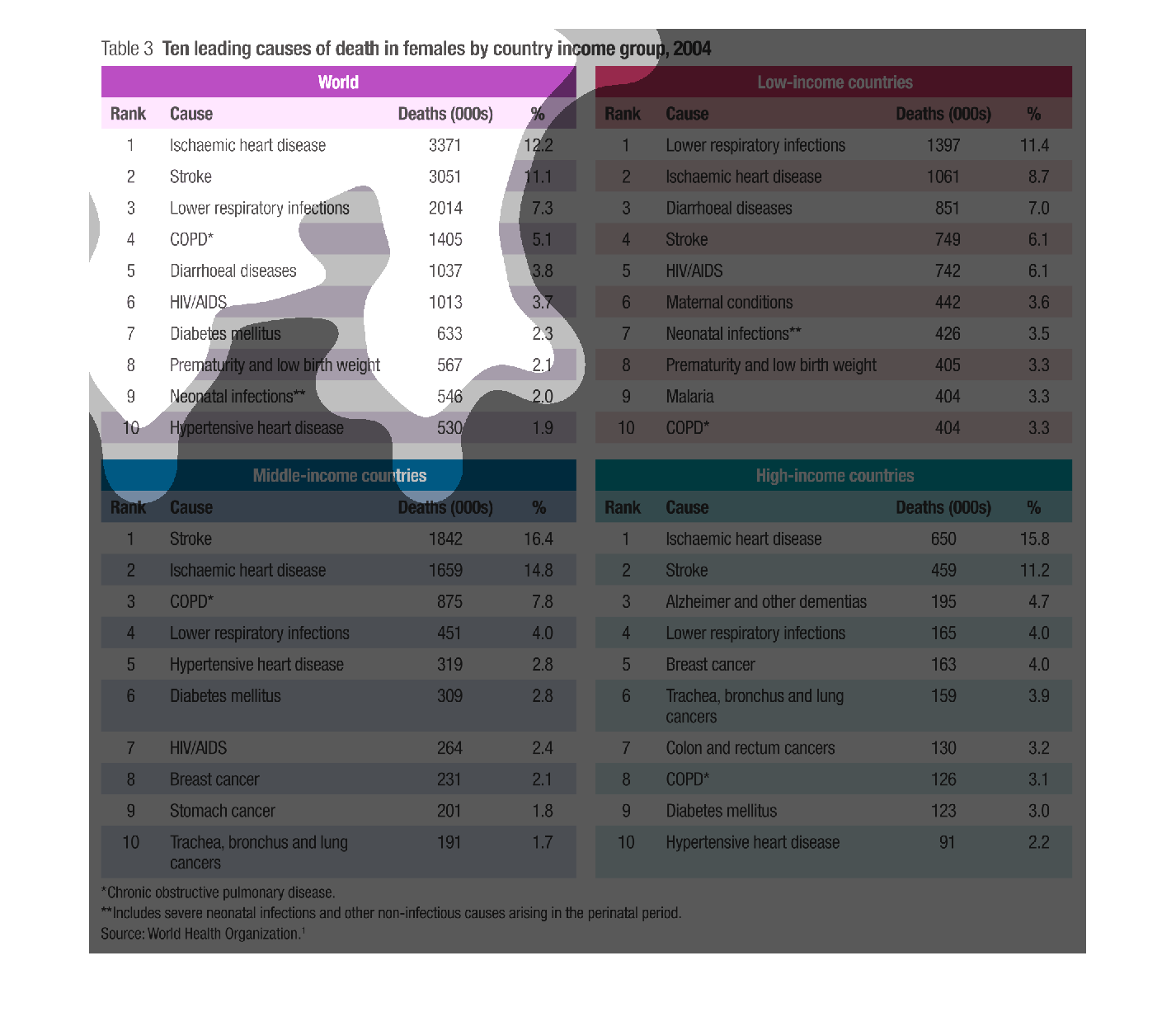
Table identifies the 10 leading causes of death in women in the world, and in three different
income groups.  Heart disease and stroke are the leading causes world-wide, and in middle-
and high-income countries.  Lower respiratory infections are the leading cause of death in
low-income countries.
Warning: Image is too big to fit on screen; displaying at 67%
Warning: Image is too big to fit on screen; displaying at 67%
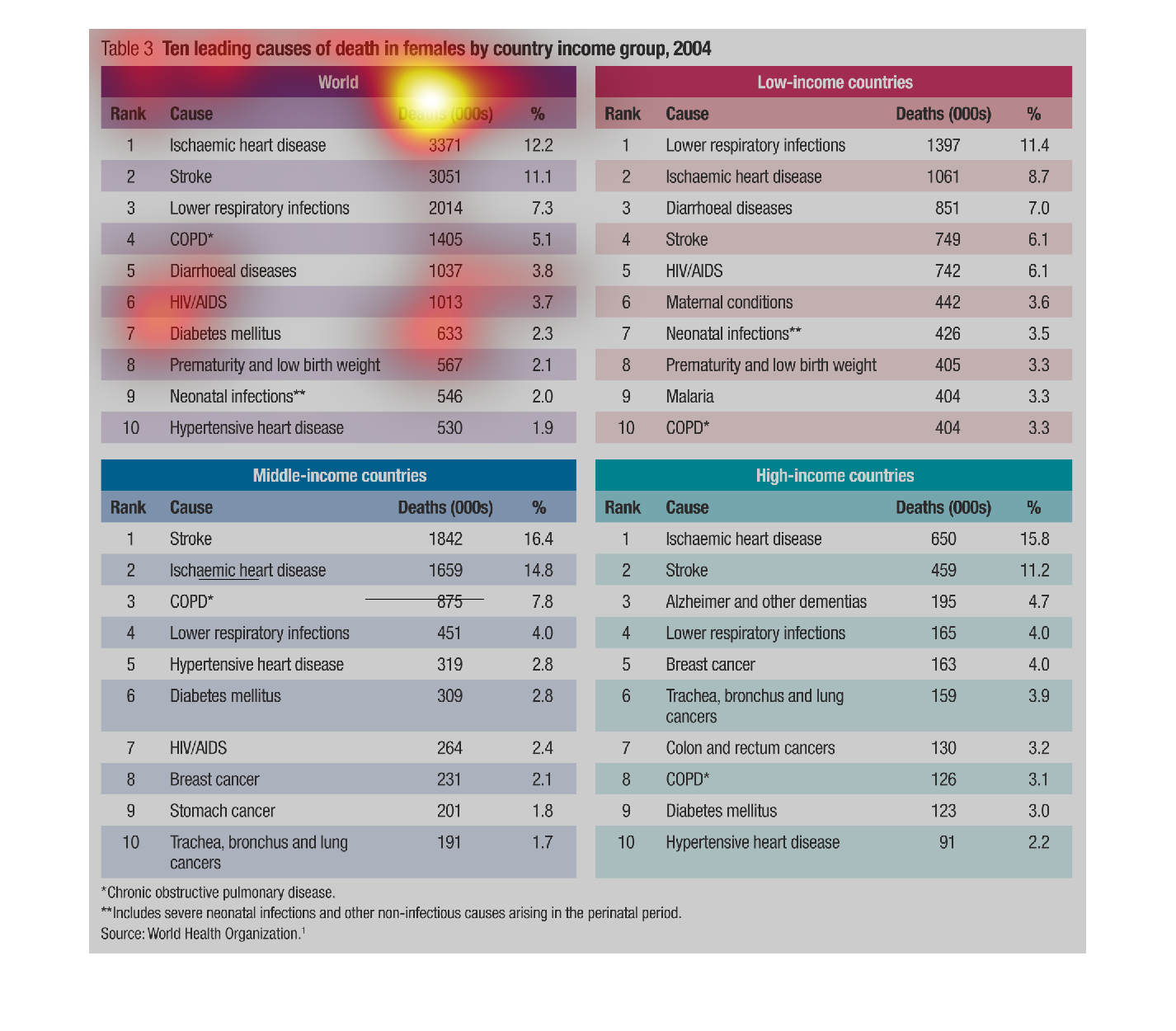
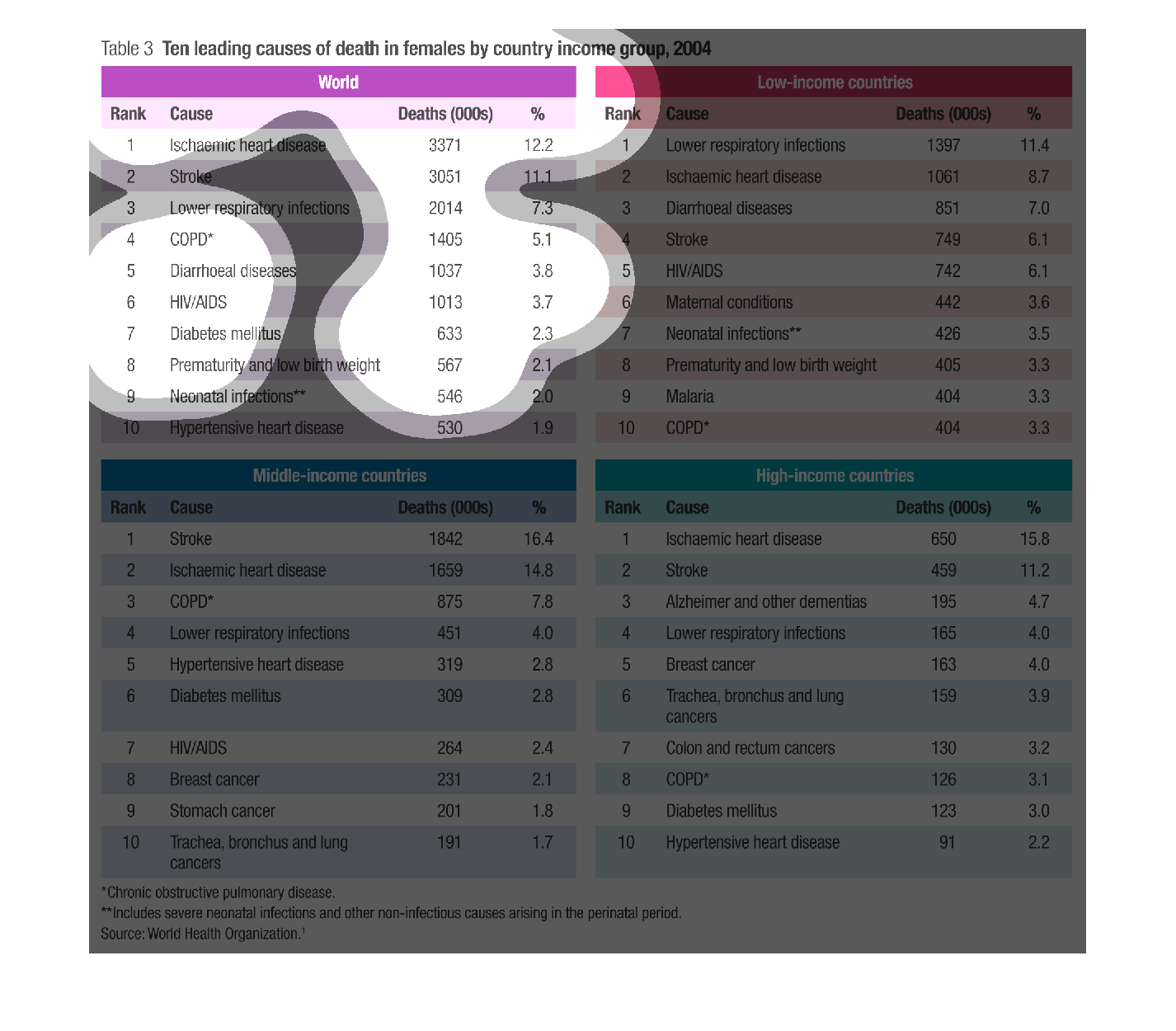
Table 3, consisting of four lists of the same diseases, shows the leading cause of death of
women, throughout the world of varying incomes and the relationship between countries of low,
middle to high income.
Warning: Image is too big to fit on screen; displaying at 67%
Warning: Image is too big to fit on screen; displaying at 67%
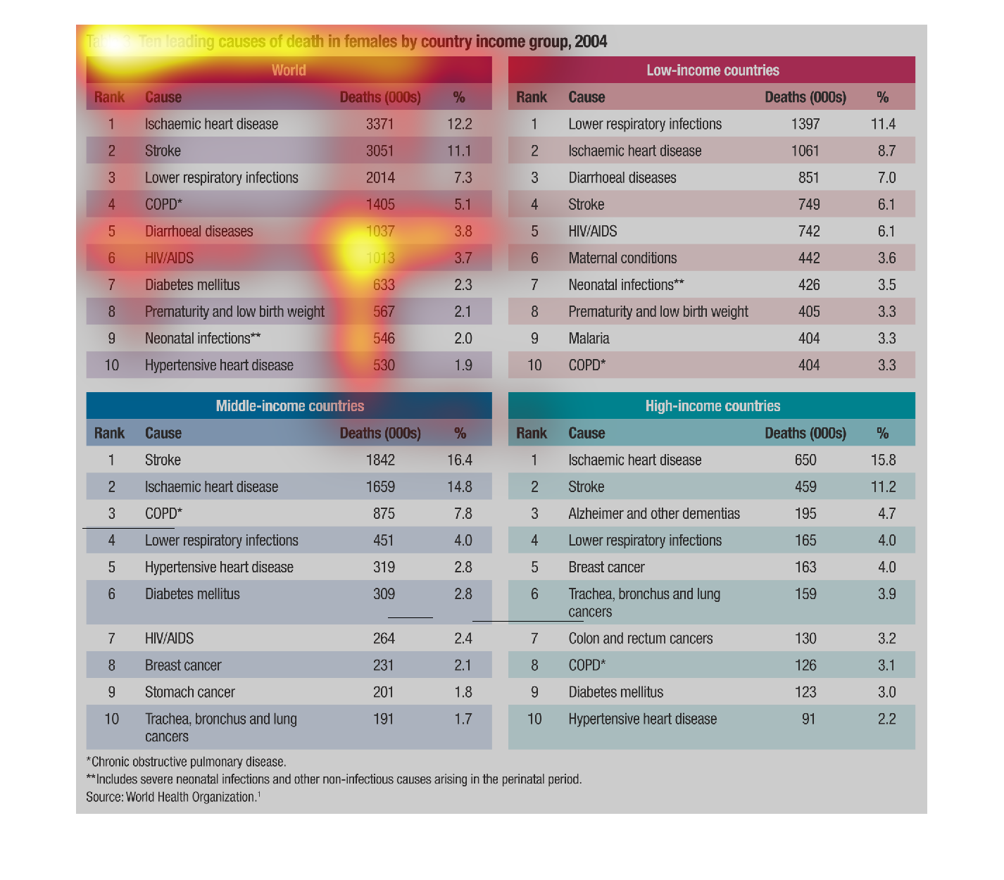
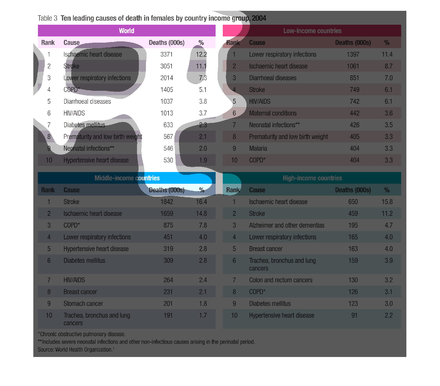
This chart shows the leading causes of death for females by country income group. For the
world, heart disease and stroke lead. In low-income countries, lower respiratory infections
and heart disease lead. In middle-income countries, stroke and heart disease lead. In high-income
countries, heart disease and stroke lead.
Warning: Image is too big to fit on screen; displaying at 67%
Warning: Image is too big to fit on screen; displaying at 67%
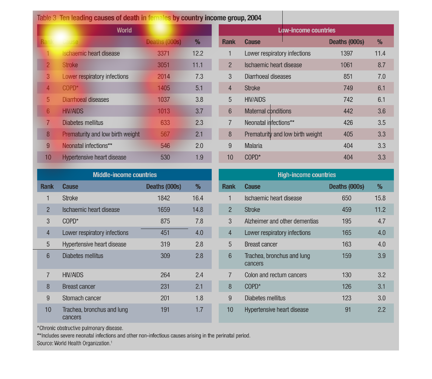
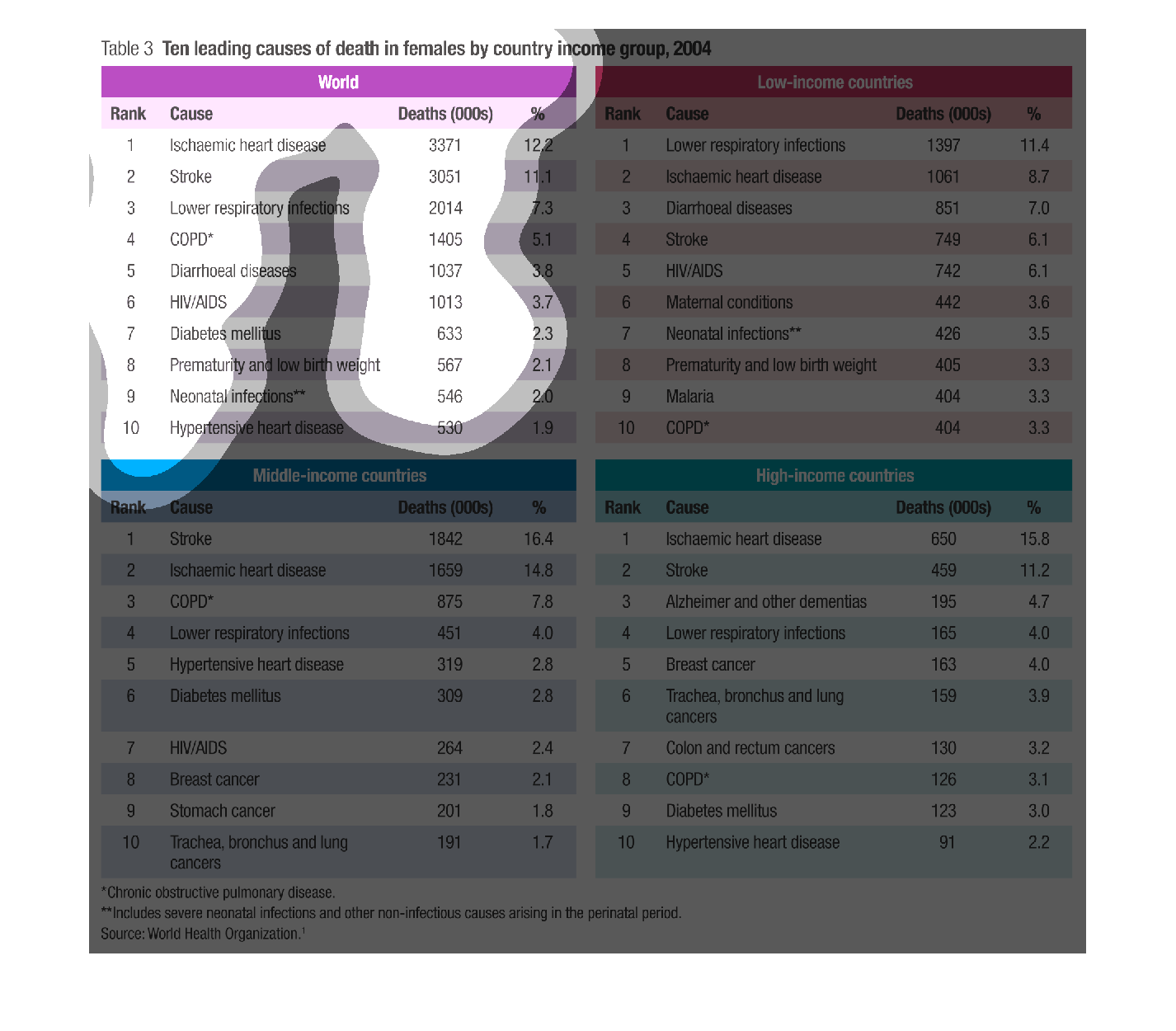
This chart describes ten leading causes of death in females by country income group for the
year 2004. Causes of death include stroke and heart disease.
Warning: Image is too big to fit on screen; displaying at 67%
Warning: Image is too big to fit on screen; displaying at 67%
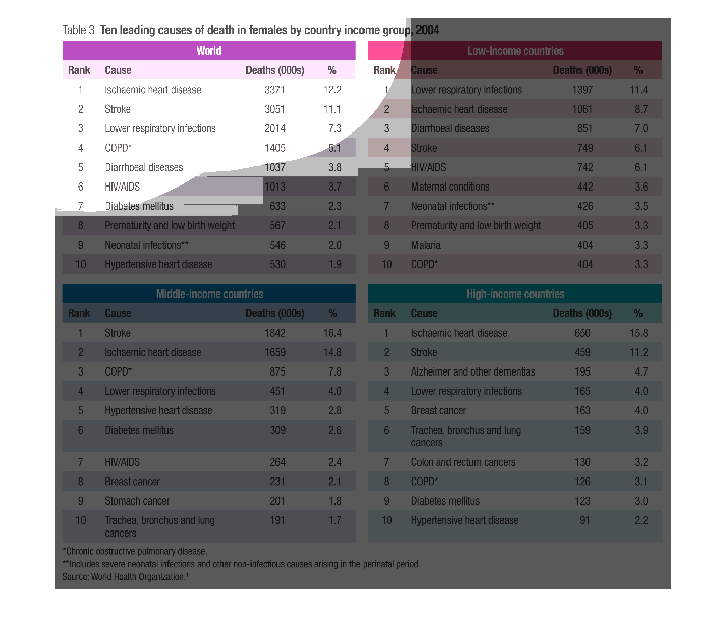
This chart is comparing Heath issue between high income nations and low incom nations . It
shows that low income nations have a higher amount of health problems
Warning: Image is too big to fit on screen; displaying at 67%
Warning: Image is too big to fit on screen; displaying at 67%

Paying rent is a big pain in the neck, especially if you don't have any money to pay it as
this illustration perfectly demonstrates. The divide between the haves and havenots is quite
apparent here.
Warning: Image is too big to fit on screen; displaying at 67%
Warning: Image is too big to fit on screen; displaying at 67%
This graph shows the leading causes of deaths in females in 2004. Heart disease and stroke
are among the top causes of deaths shown here. There are different causes in the developing
countries.
Warning: Image is too big to fit on screen; displaying at 67%
Warning: Image is too big to fit on screen; displaying at 67%
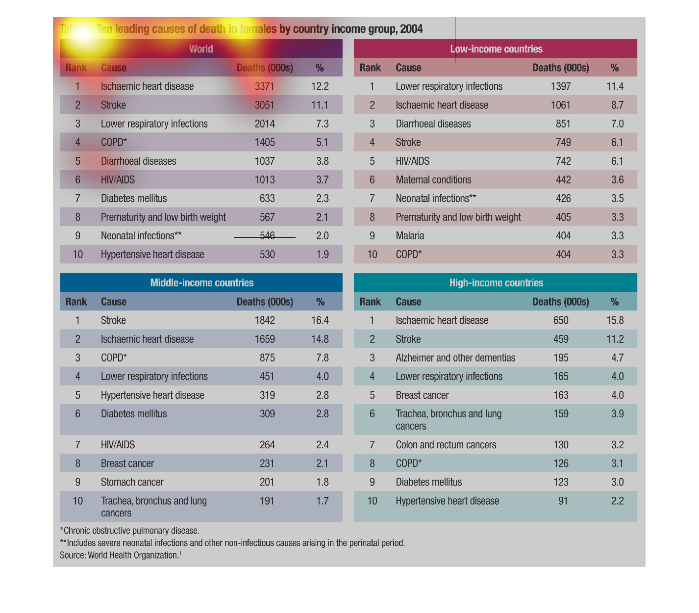
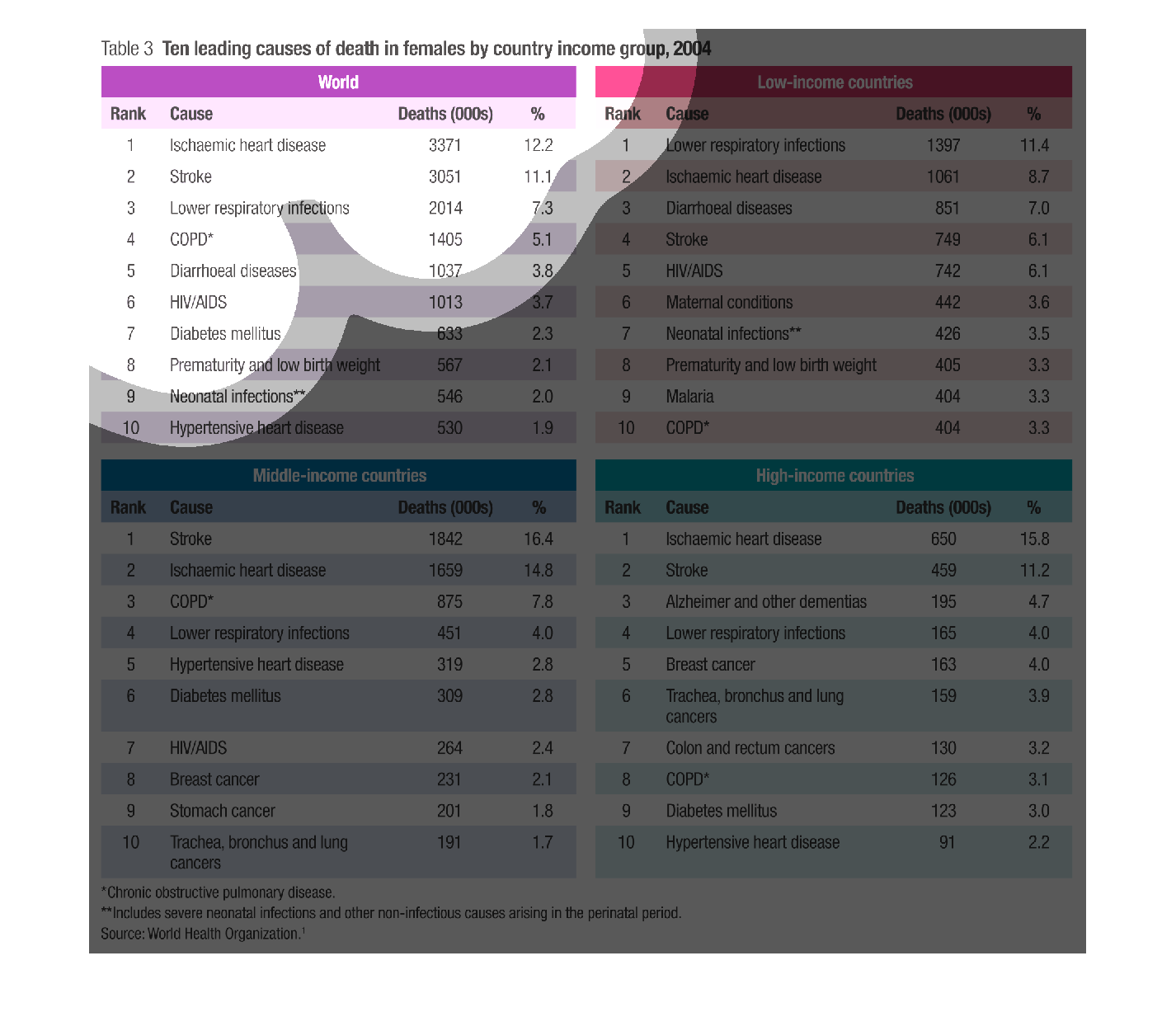
The image depicts the ten leading causes of death in females by country income group in 2004.
The image compares the following categories: World, Low-income countries, Middle-income countries,
and High-income countries. The image shows Rank, Cause, and actual deaths by numbers per category.
World category shows heart disease as leading cause, Low-income countries category shows lower
respiratory infections as leading cause, Middle-income category shows stroke as leading cause,
and High-income category shows heart disease as leading cause.
Warning: Image is too big to fit on screen; displaying at 67%
Warning: Image is too big to fit on screen; displaying at 67%