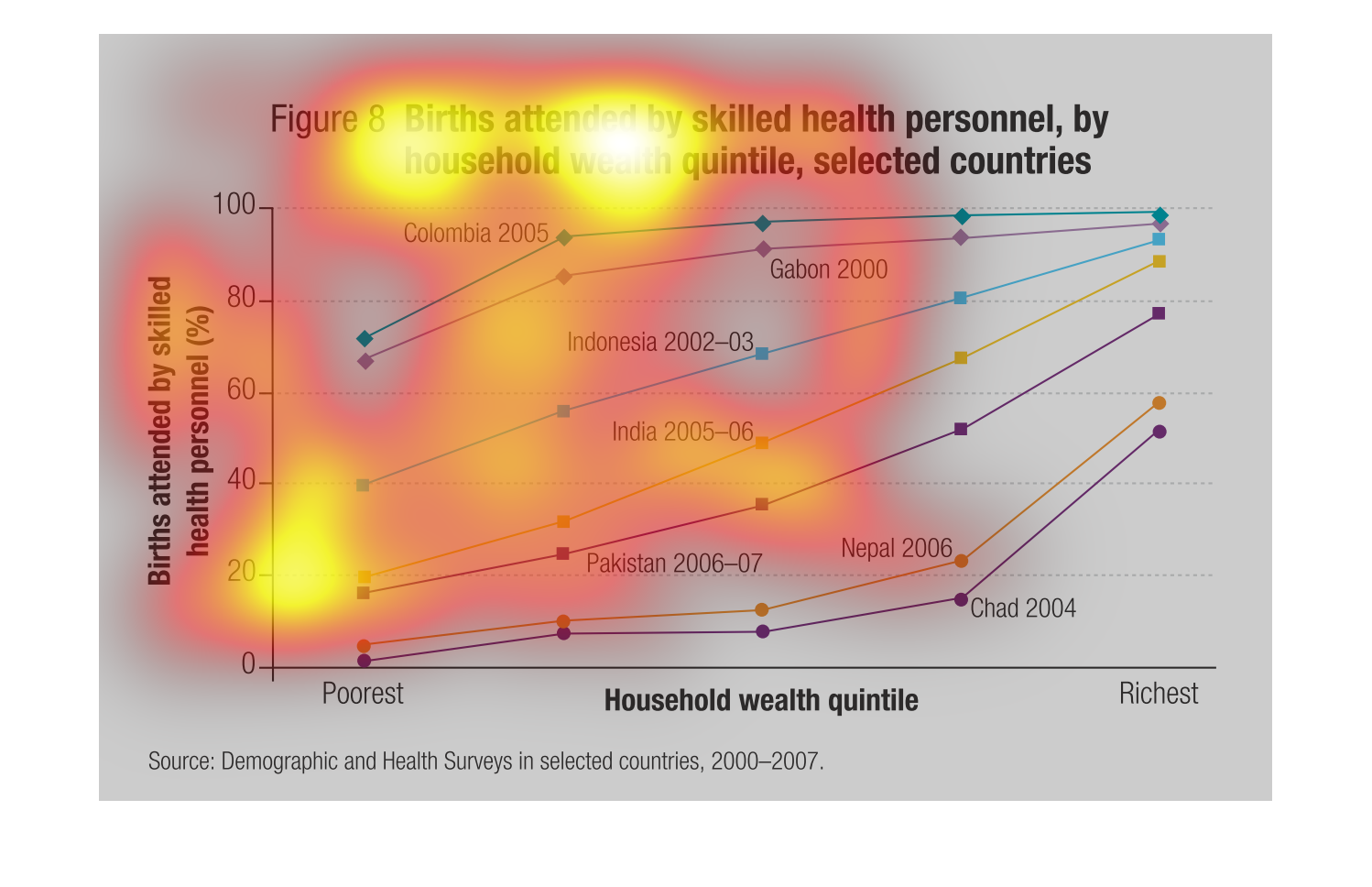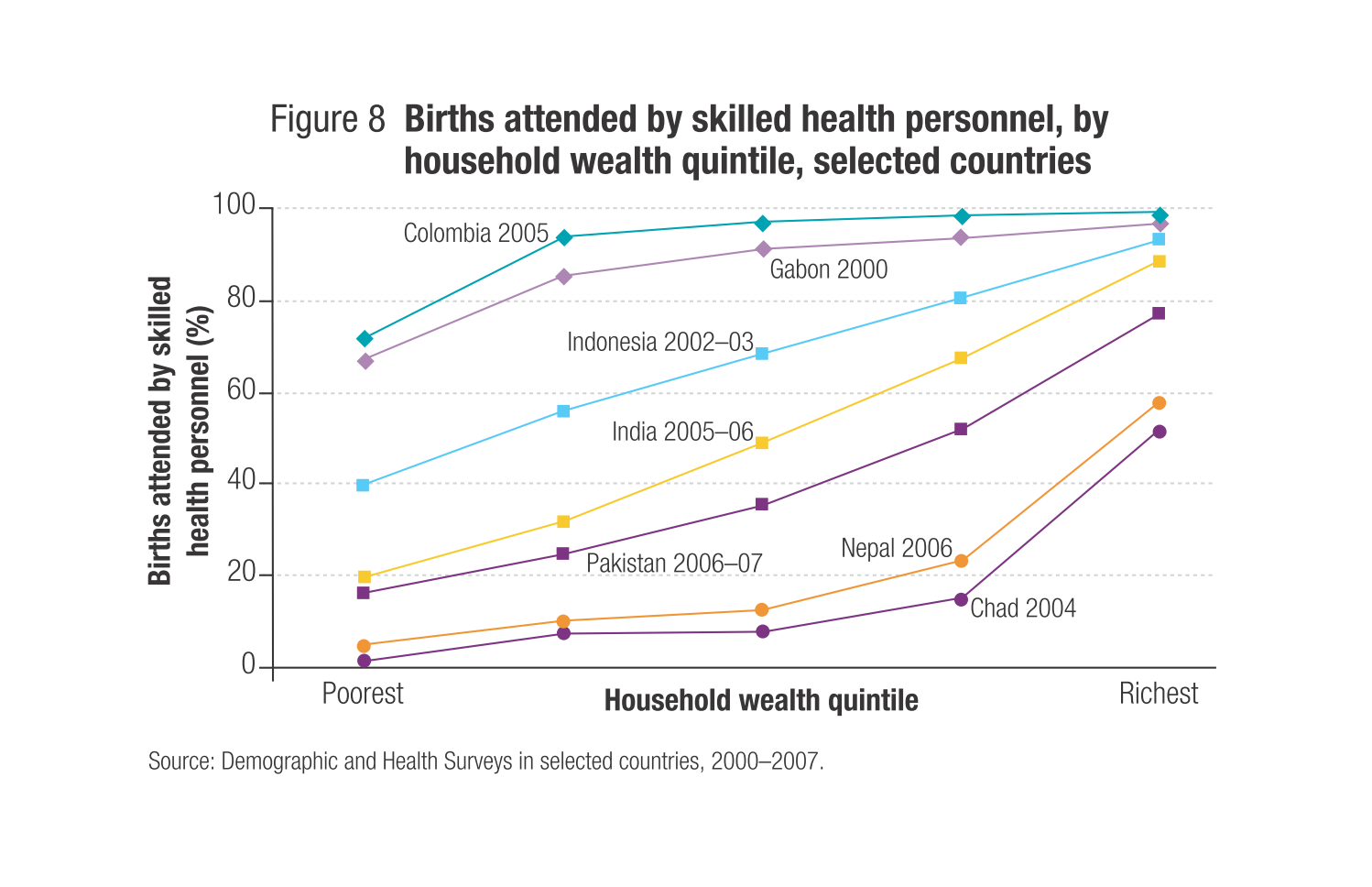
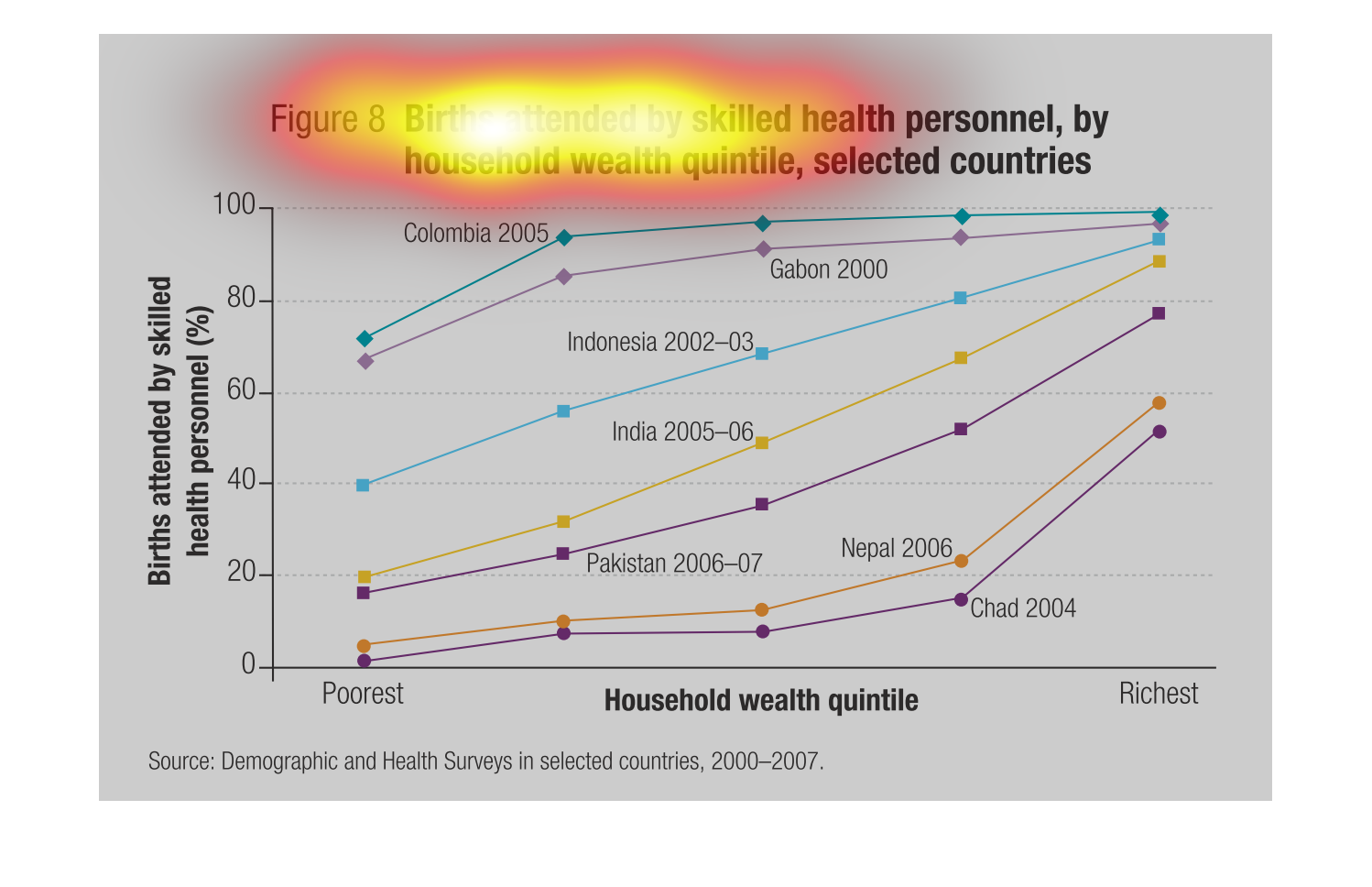
THIS CHART SHOWS THE NUMBER OF LIVE BIRTHS ATTENDED BY QUALIFIED HEALTH PERSONNEL BY COUNTRY
(EACH COUNTRY IS ONE LINE) AND BY WEALTH (BY PERCENTILE, WITH HIGHER WEALTH ON THE RIGHT).

This charts show the births attended by skilled health personnel, by household death quintile,
selected countries. This was an interesting chart that I really enjoyed looking at.


This chart describes births attended by skilled health personnel, by household wealth quin-tile
in selected countries. Countries on the chart include Gabon.
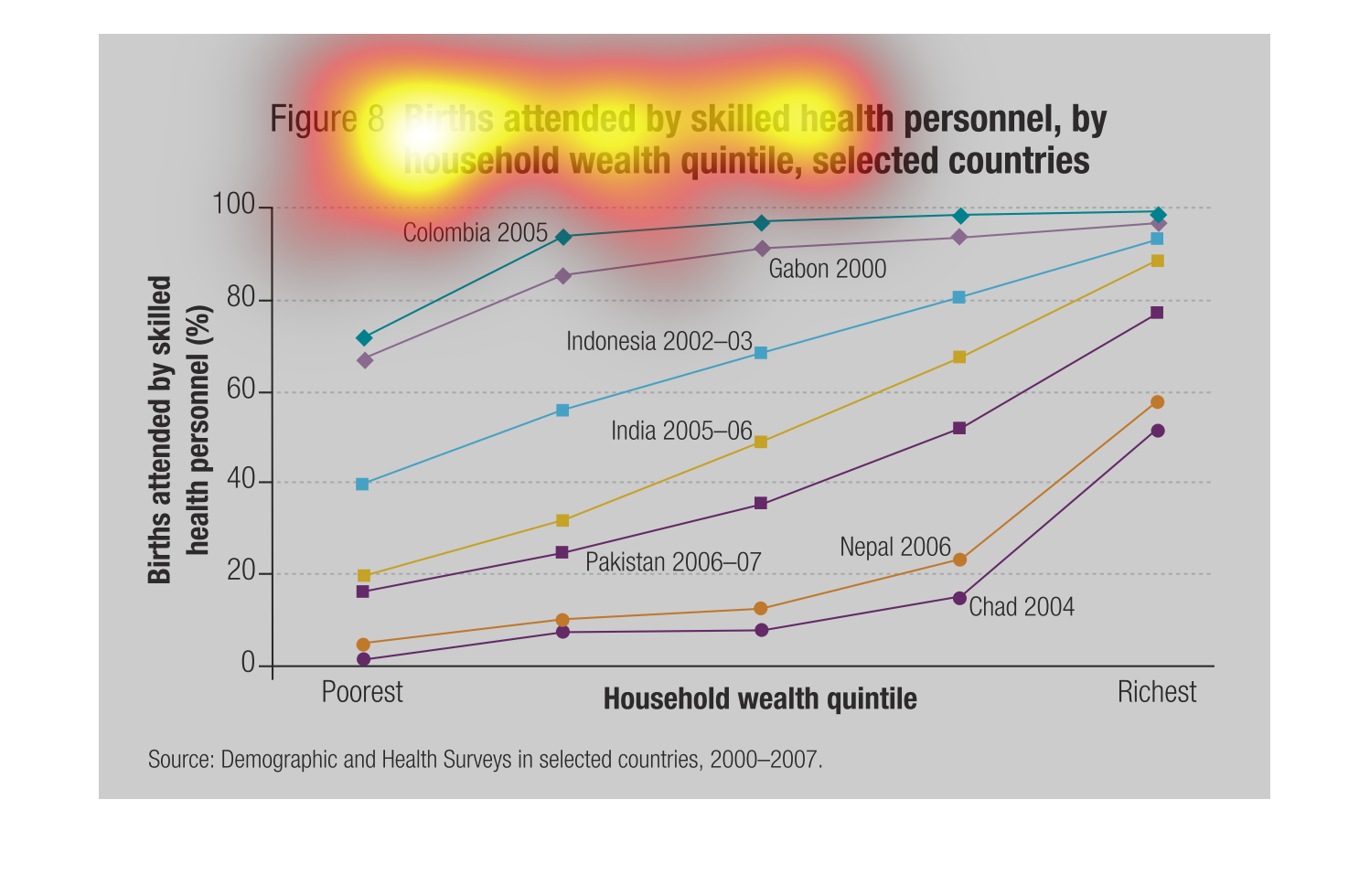
This graph shows birth attended by healthcare personnel by wealth quintile in selected countries.
 the statistics are from the years 2000 to 2007 and the lines are labeled by country.
The following chart gives information on how many skilled workers attended the birth of a
child in different countries. Also indicated how wealthy or poor the people to give birth
where.
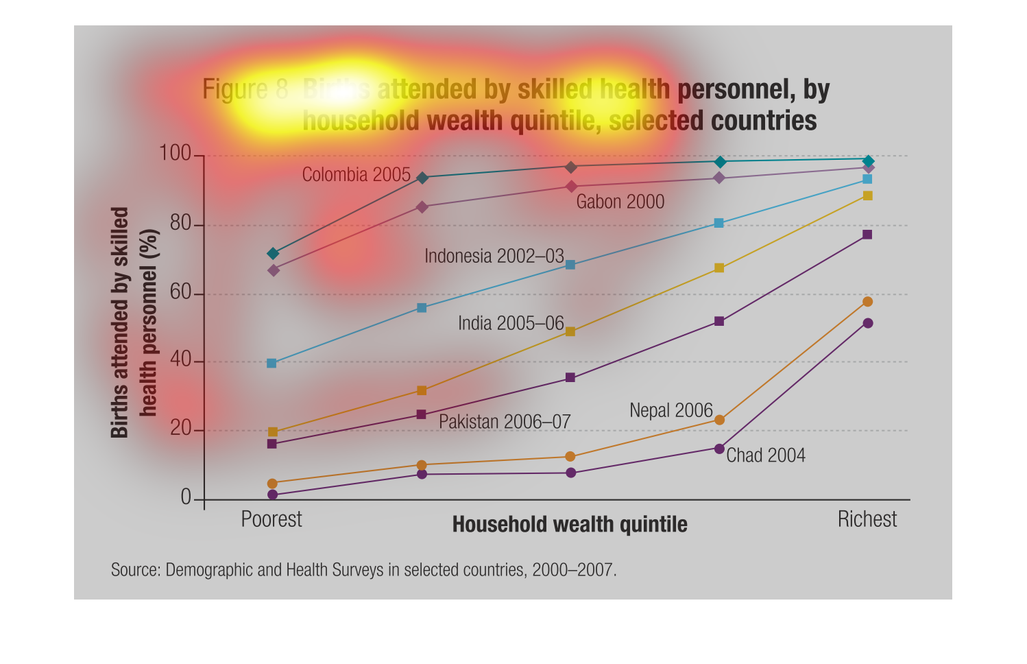
This image shows or depicts in line graph statistical format births attended by skilled  health
personnel by household wealth quintile, selected countries.
The image depicts a graph of births attended by skilled health personal by household wealth
quintile in selected countries by percentage. Poorest countries to Richest countries. Years
include 2000-2007. Source is Demographics and Health Surveys in selected countries. General
observation is that richer countries have higher skilled professionals attending births based
on household wealth.
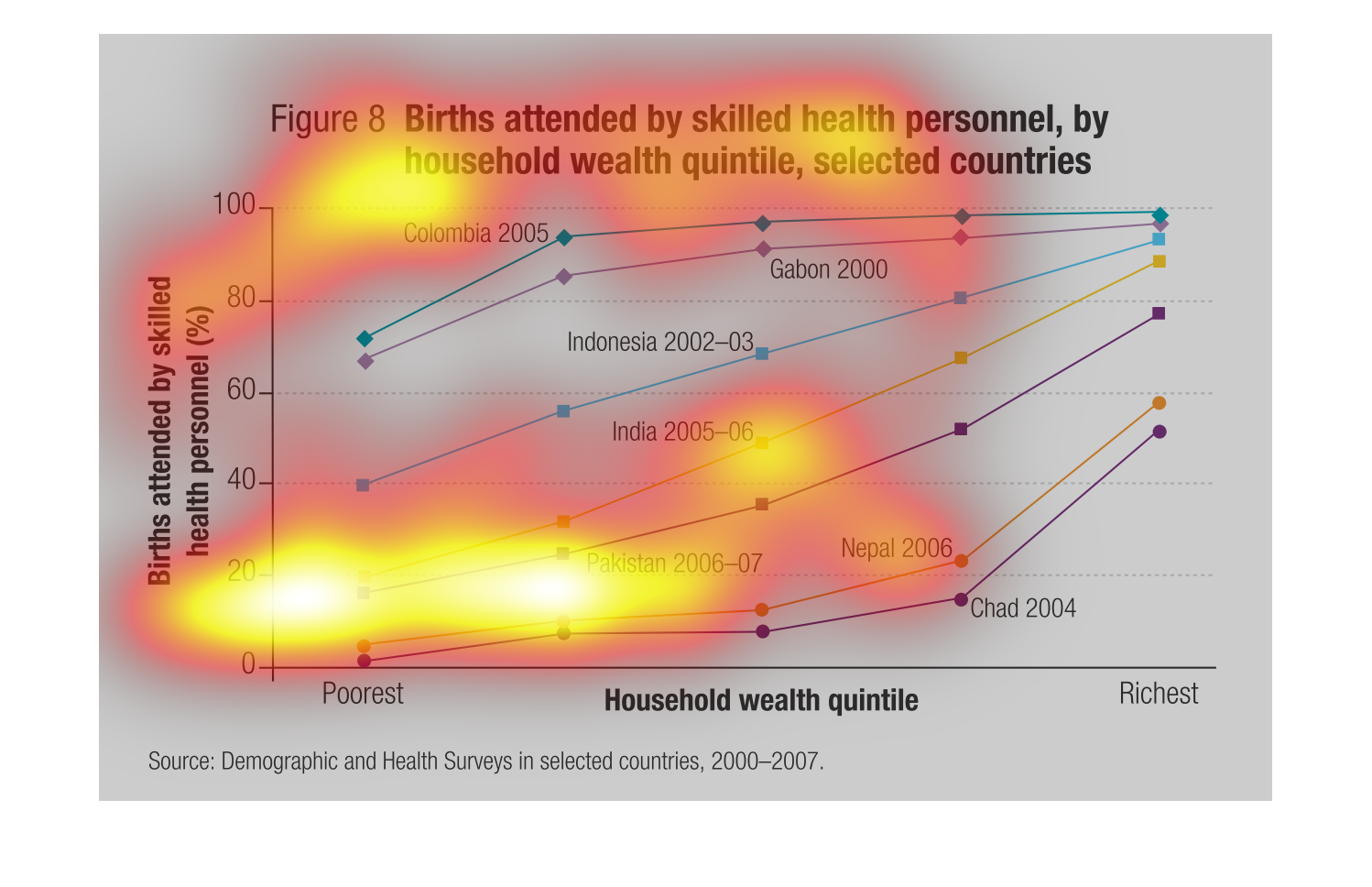
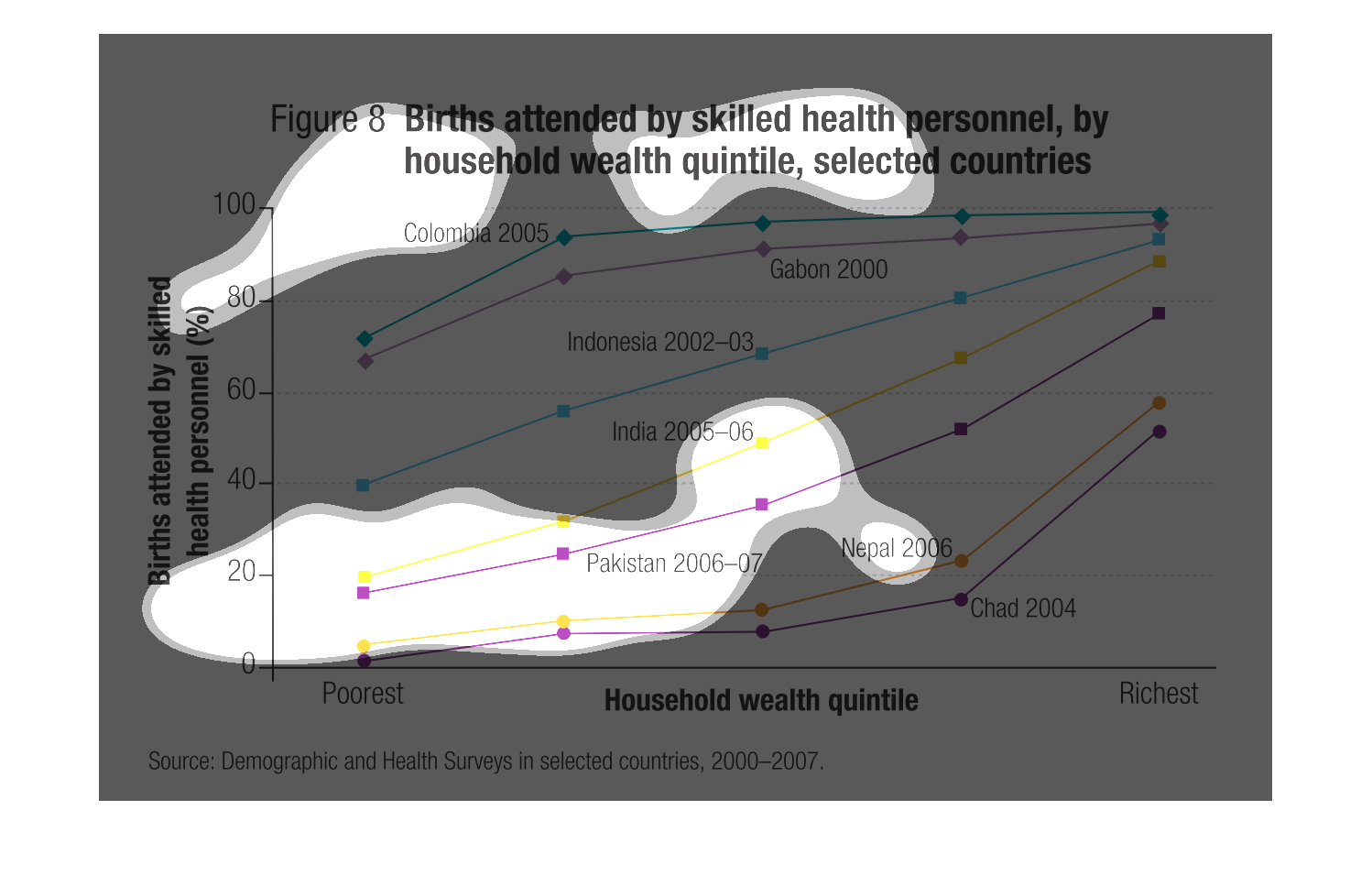
The graph shows the births attended by health personnel by household wealth quintile, selected
countries.  The graph charts the percentages of birth in poor and rich countries.
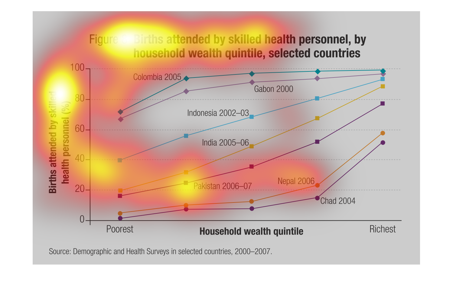
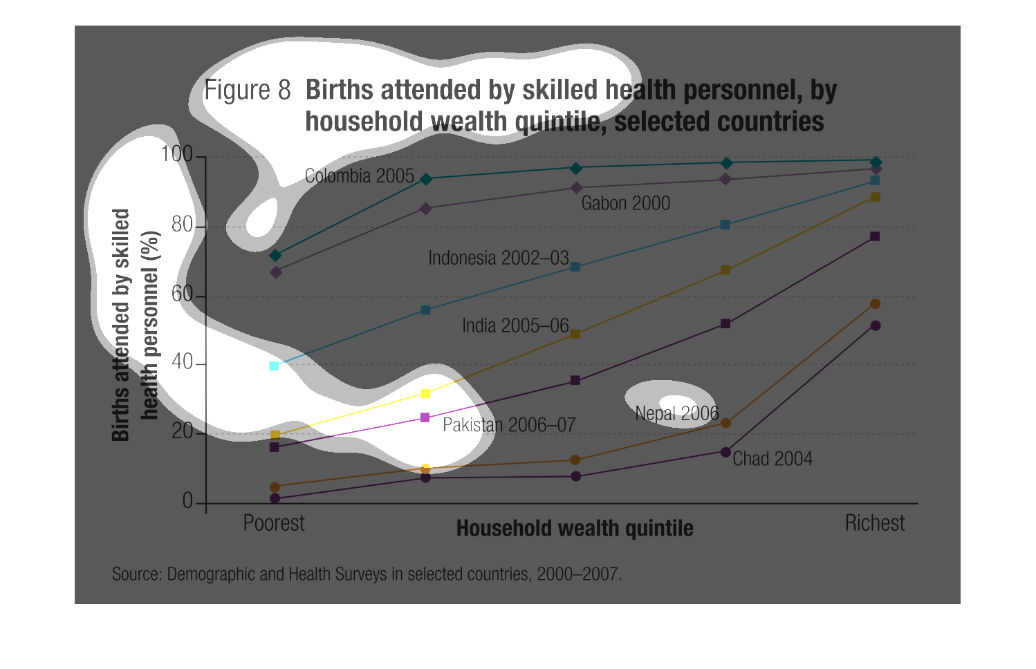
This chart describes and depicts the births attended by skilled health personnel, by household
wealth quintiles in a multitude of different countries.
In the graph to the right it is representing skilled doctor births.  On the x axis it is how
many highly educated personal assist in a birth of a child.  On the Y axis is describes the
number of births.  As one may tell from the graph individuals who are doctors with more skill
in giving births have more patients to work with as apposed to less skilled doctors.
This chart details births for the world. We are looking at which births had medical professionals
in attendance and which did not. There are lines for Colombia, Indonesia, India, Pakistan,
Nepal, and Chad.
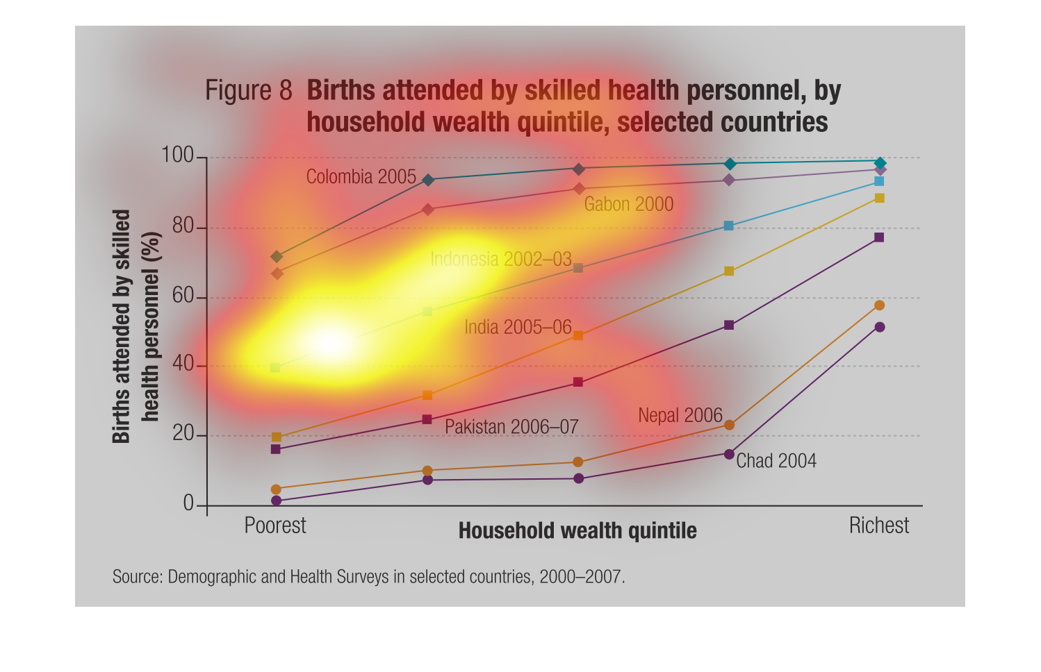
The caption for this graph is, "Births attended by skilled health personnel, by household
wealth quintile, selected countries.  There are several selected countries with data streams
reflecting on one end of the graph, poorest countries.  At the other end of the graph is listed
richest, corresponding to the richest selected countries for this graph.

This chart is about child deaths when there are no skilled medical practitioners to have in
the delivery of children. Third world countries are the most affected by these unfortunate
circumstances.
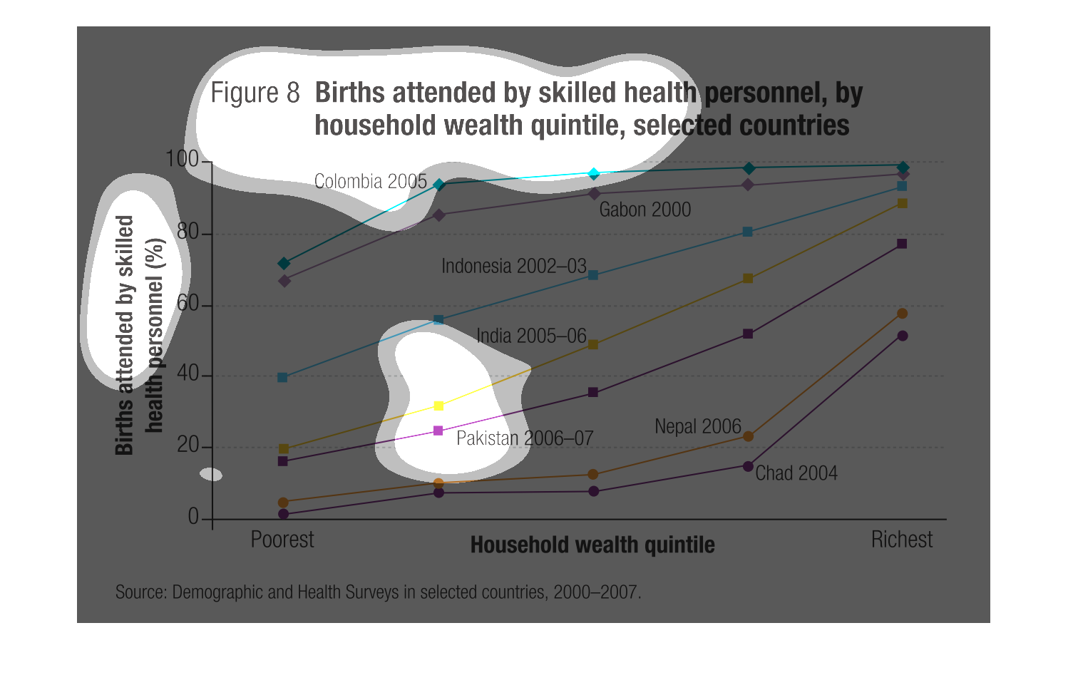
This chart shows Births attended by skilled health personnel by household health quintile,
by selected countries. The left side is labeled by % of births by health personnel, the bottom
is labeled from poorest to richest. The countries included in the graph are Columbia, Indonesia,
Pakistan, Gabon, India, Nepal, and Chad. Dates of these range from 2000 to 2007. The source
is Demographic and Health Surveys in selected countries 2000-2007