This chart shows the amount of cominocal deaseases broken down by country. The USA and other
developed countries have less while less developed countries like Africa have more
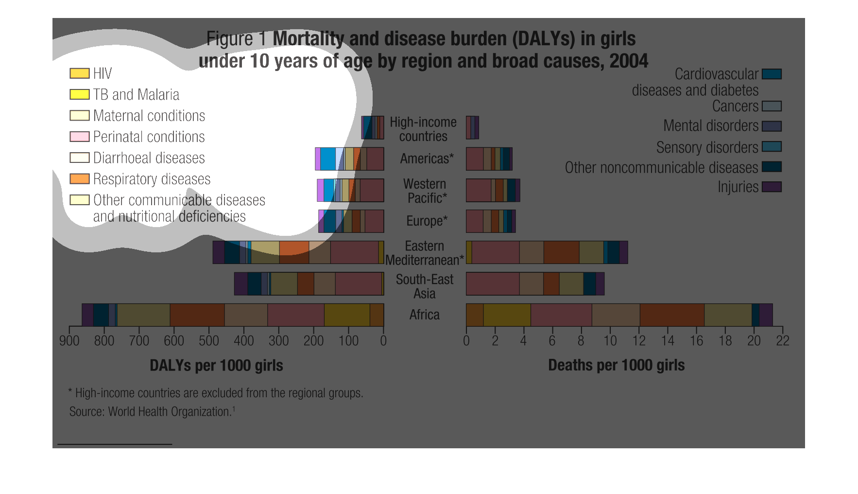
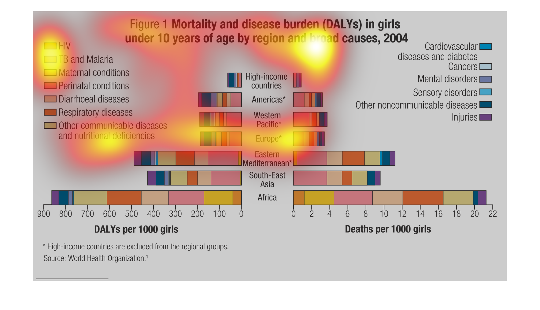
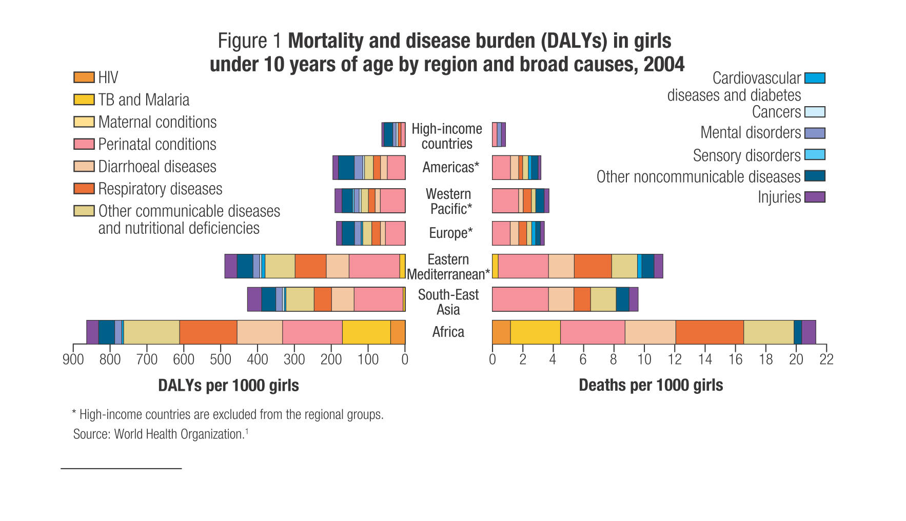
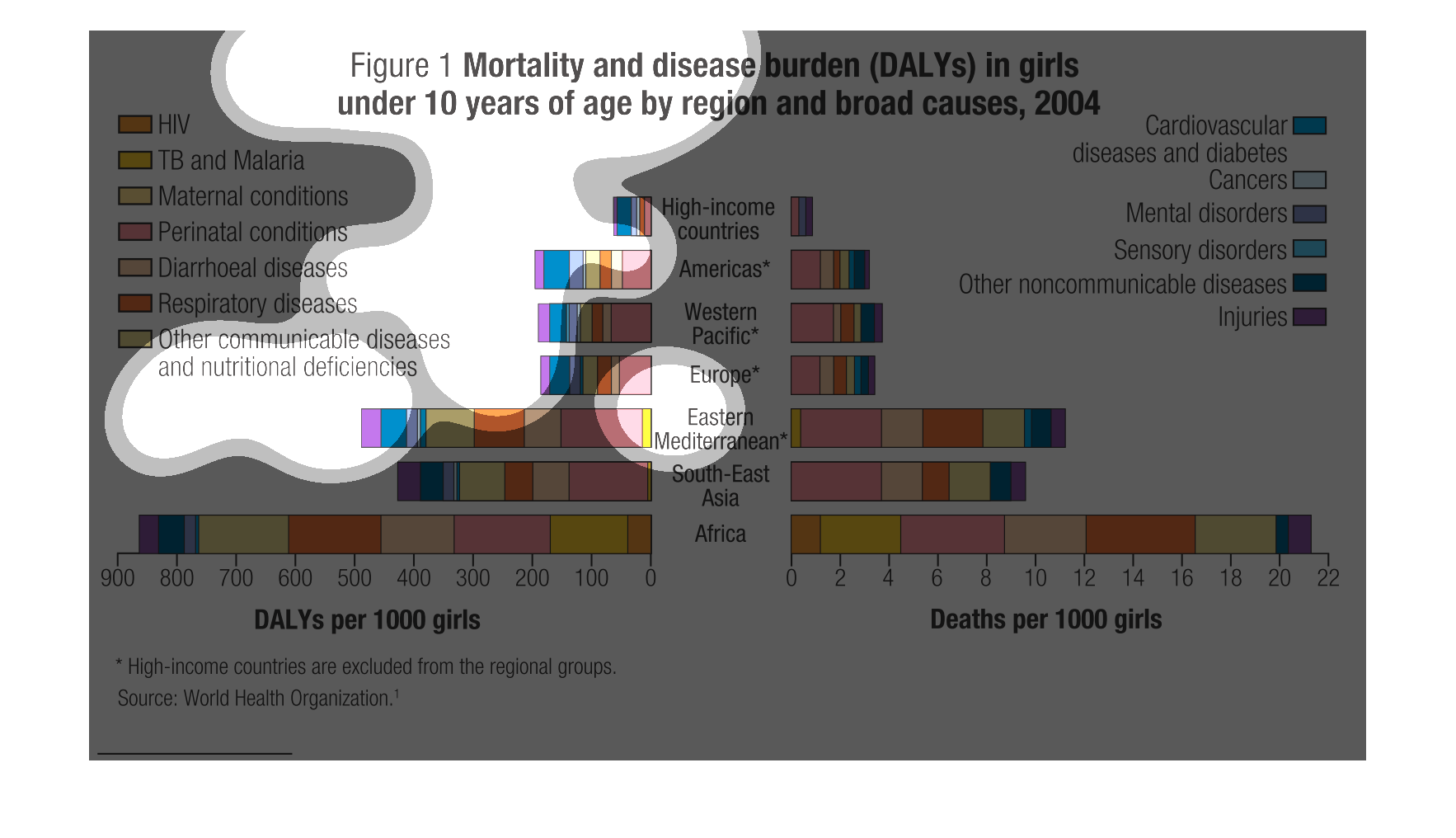
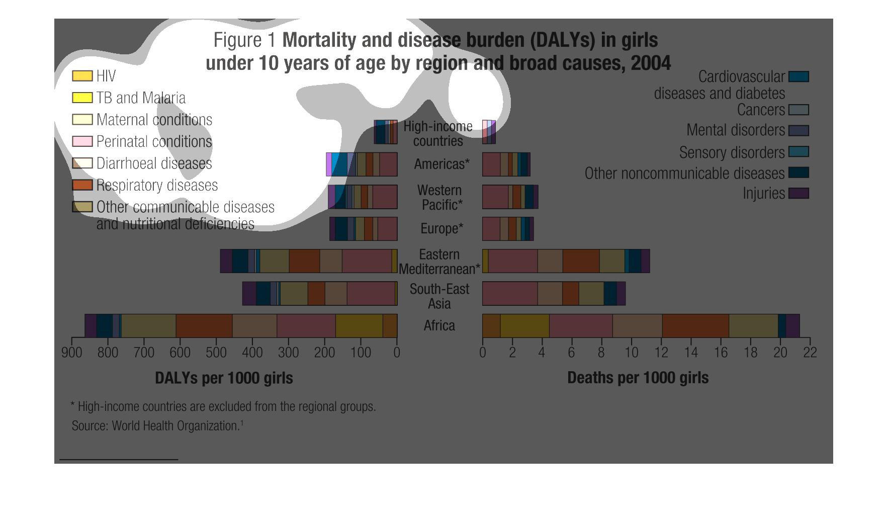
This chart shows the mortality and disease burden of girls 10 years and younger by region
in 2004. High-income countries and the Americas have the lowest rate, where Africa has the
highest.
This figure is titled Mortality and disease burden (DALYs)  in girls under 10 years of  age
by region and broad causes, 2004.  It shows different countries and their statistics.
This graph shows mortality and disease burden for women over 10 years of age in 2004.  IT
contains categories ranging from HIV to cardiovascular diseases by region.
The following chart shows the leading causes for deaths in young girls under the age of ten.
In Africa its Malaria and HIV while in the United States and the Americas its perinatal causes.
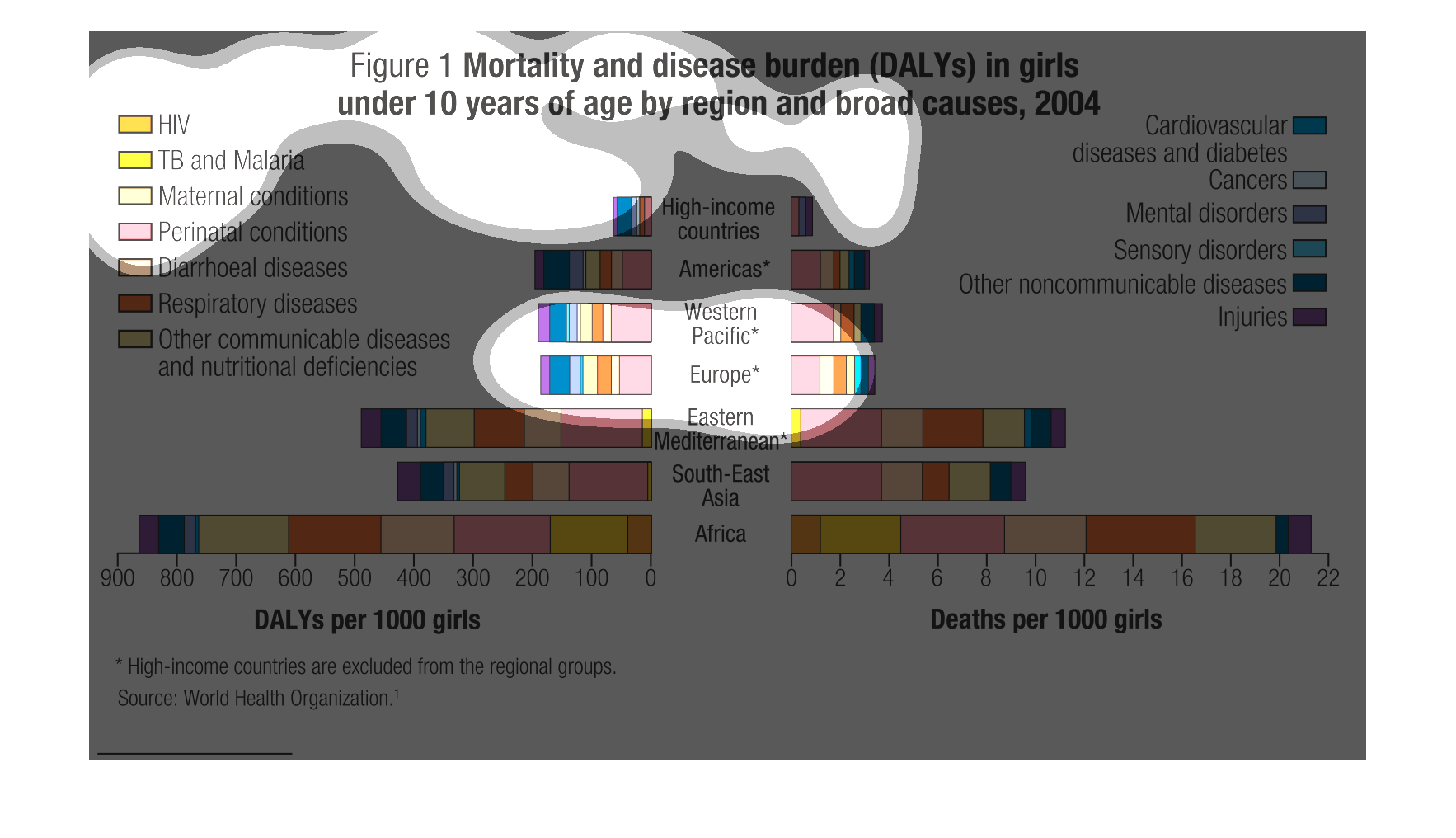
This study is trying to showcase the vast divide in mortality of young females below the age
of ten in high income nations as apposed to their lower income brethren.
A chart showing different causes of death in an area, and the amount of people each cause
has killed. All of the different causes are medical related.
This picture shows mortality and disease burden in girls aged 10 by geographic location. It
shows that in more, poorer regions, the cause is usually HIV or some other disease not as
common in more developed countries.
This shows the geographical distribution of disease burden and deaths for girls under 10 years
of age in 2004, broken down by disease type: HIV, TB, pregnancy-related problems, perinatal
problems, diarrhoeal diseases, nonTB respiratory problems, cardiovascular  plus diabetes,
cancers, injuries, mental disorders, sensory disorders, and"other". The Americas, Western
Pacific and Europe have much lower rates of both disease burden and deaths than Africa.  The
Eastern Mediterrean and Southeast Asia are in-between these extremes.
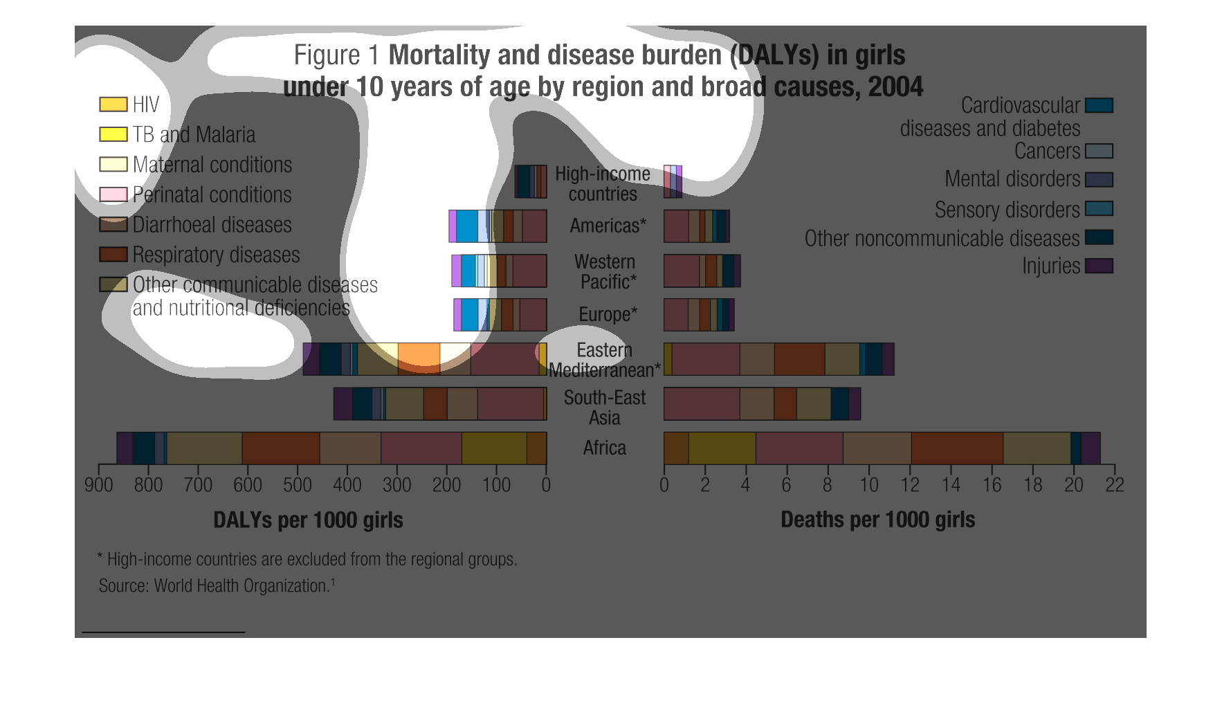
The caption for this graph is, "Mortality and disease burden (DALYs) in girls under 10 years
of age by region and broad causes, 2004'.  Down the center of this graph is a list of geographic
regions.  There are bar graphs on either side of this that extend out, reflecting the data
captured regarding the death and disease figures for girls age 10 and under.
This chart describes mortality and disease burden in girls under 10 years of age by region
and broad causes for the year 2004. Causes include HIV, TB and Malaria, and Maternal causes.
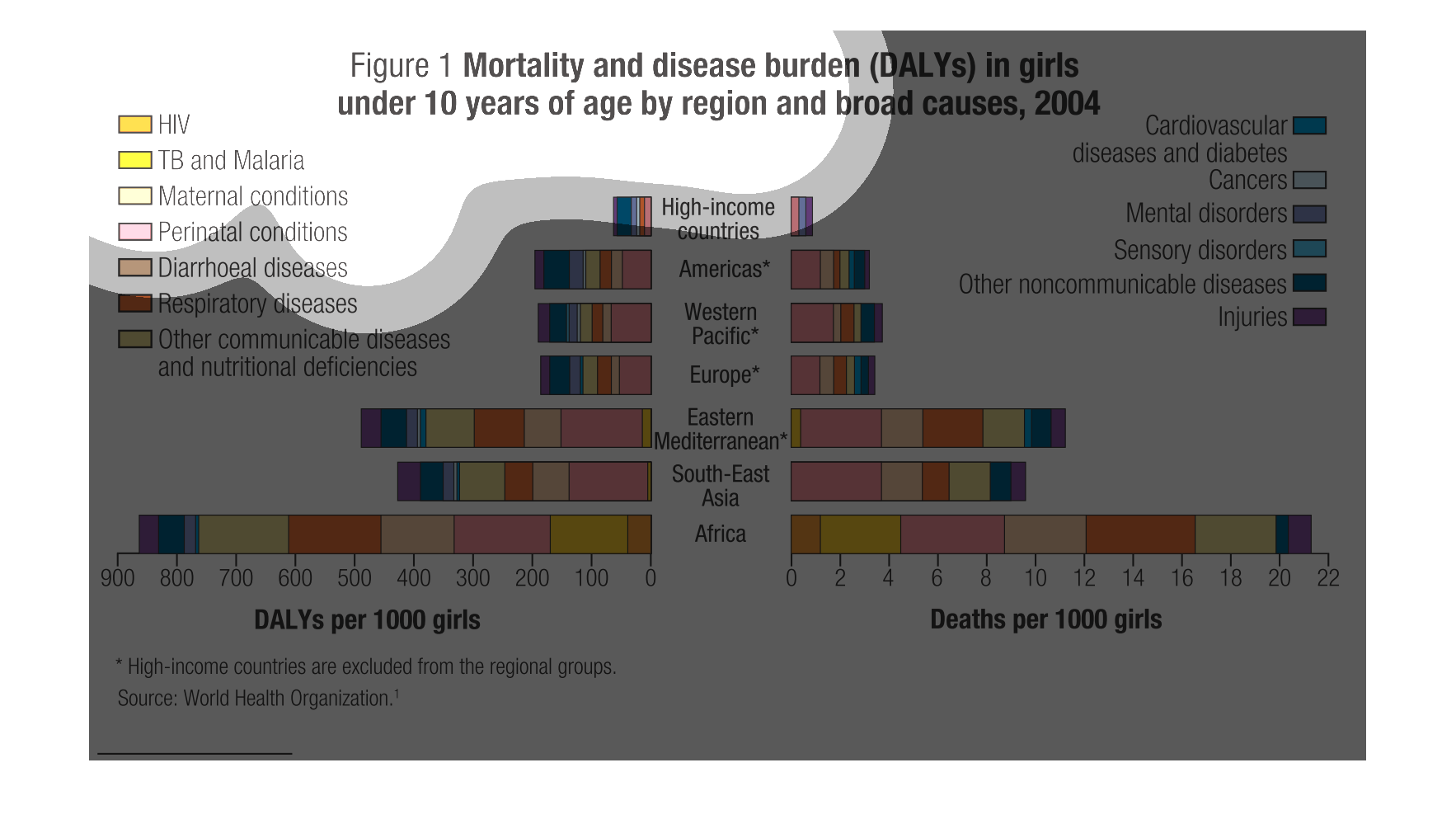
Mortality and disease burden in girls under ten years old by region and broad causes in 2004.
In African countries most of the deaths are caused by HIV or easily treatable diseases.
This composed graph (consisting of two sub-graphs) shows the mortality and disease burden
in girls under the age of 10 by regions. On the left hand side the graph- using horizontals
bars for the different diseases, shows the mortality caused by the different diseases per
1000 girls. On the right hand side, again by using horizontal bars and different color for
the different regions (divided also by income ), is shown the number of girls with a particular
disease.
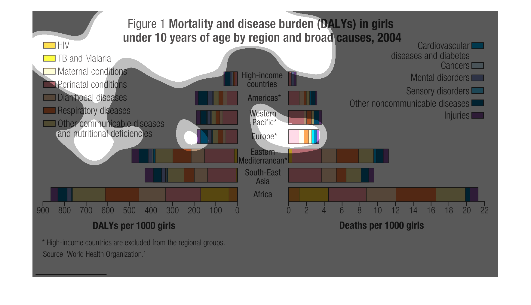
The graph shows the morality rates and disease rates in young girls ages 10 and under. it
shows that in higher income countries that the rate is lower per 1000 girls than it is in
countries such as Africa where the rate is the highest. In higher income countries the highest
disease rates are usually cardiovascular diseases and diabetes. In lower income countries
they suffer more from diseases such as HIV.