Warning: Image is too big to fit on screen; displaying at 67%
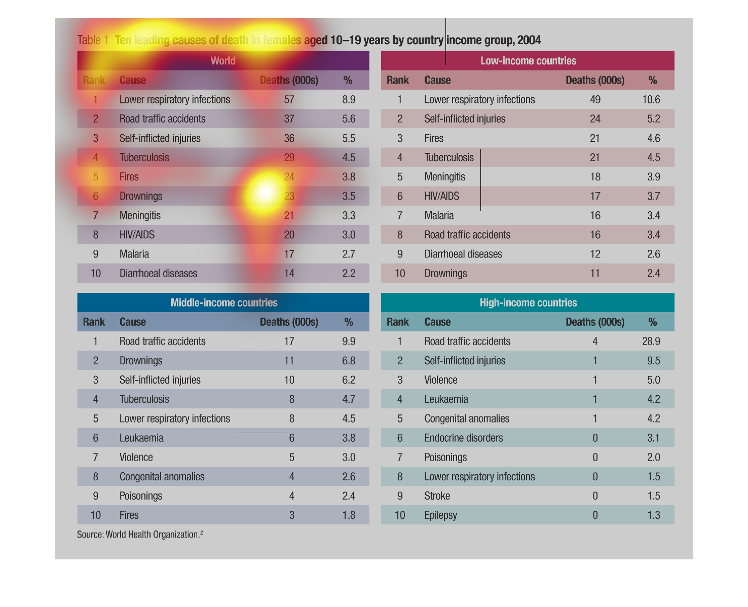
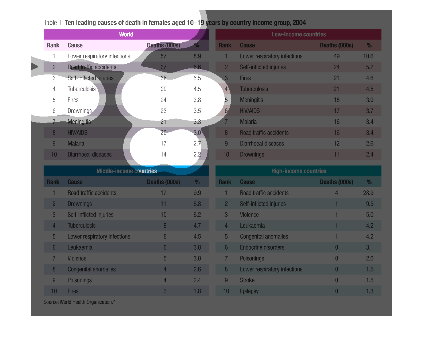
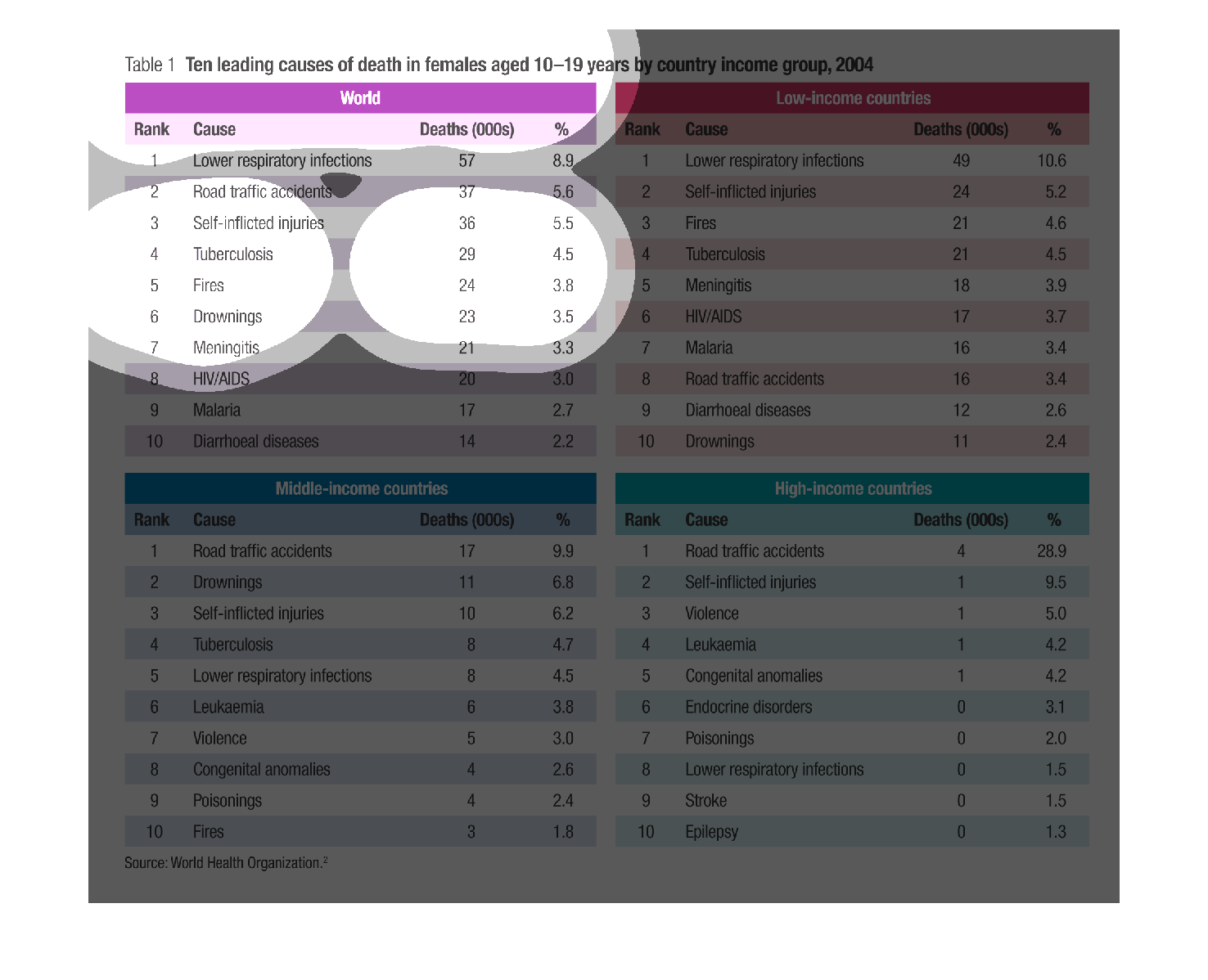
This chart has four different sections that show the common causes of death at different income
levels and also the world average for women ages 10-19. This is a interesting chart because
it shows the lower income counties die from diseases while the higher are more accident related.
Warning: Image is too big to fit on screen; displaying at 67%
Warning: Image is too big to fit on screen; displaying at 67%
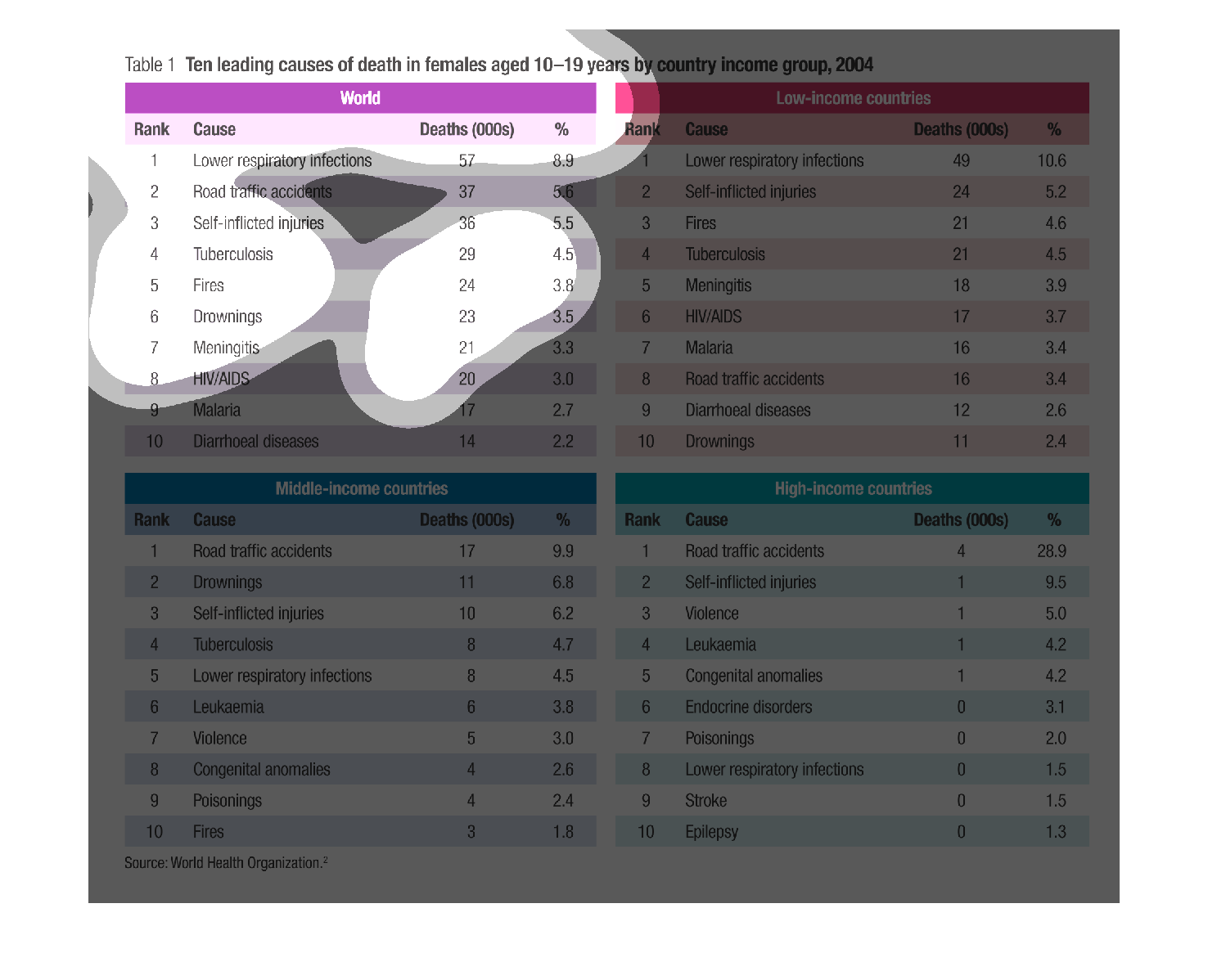
This image shows or depicts in 4 different sections the leading causes of death with  females
from ages 10-19 by country income group for the year 2004..
Warning: Image is too big to fit on screen; displaying at 67%
Warning: Image is too big to fit on screen; displaying at 67%
The first purple entry reads Leading Causes of Death in Females aged 10-19 years by Country
and Income Group, 2004.  Then it is by Rank, Cause, Death.  There are alternating purple and
white lines, each with a description of cause of death.  Then there are 3 more groupings of
different colors; red, blue and green with alternating white colors.  All the printing is
in black.
Warning: Image is too big to fit on screen; displaying at 67%
Warning: Image is too big to fit on screen; displaying at 67%
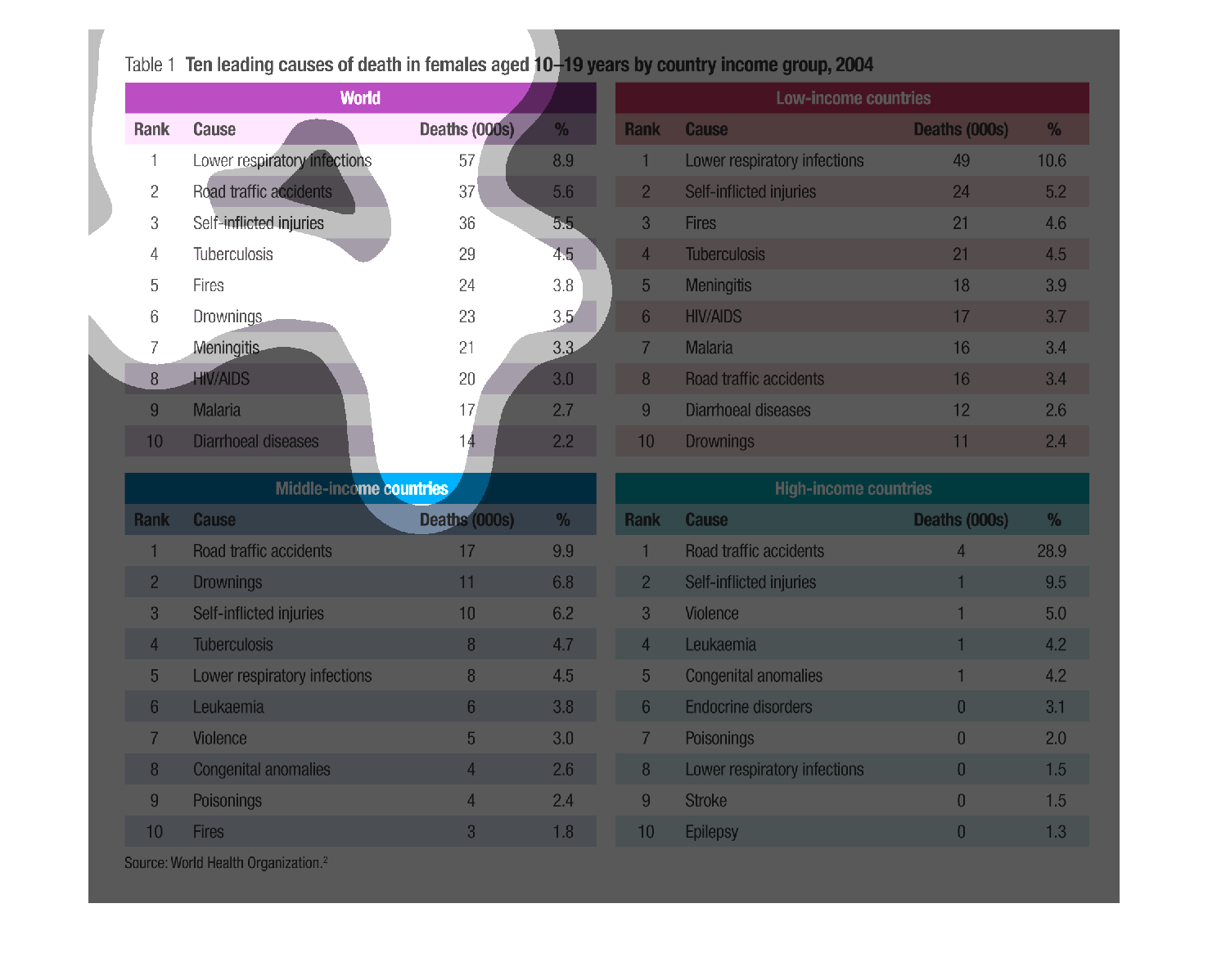
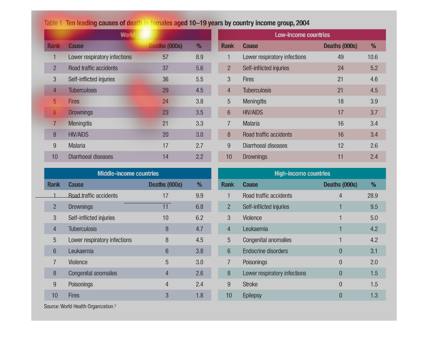
This chart describes and depicts the ten leading causes of death in women from age ten to
age nine-teen by country as well as by income group and the world.
Warning: Image is too big to fit on screen; displaying at 67%
Warning: Image is too big to fit on screen; displaying at 67%
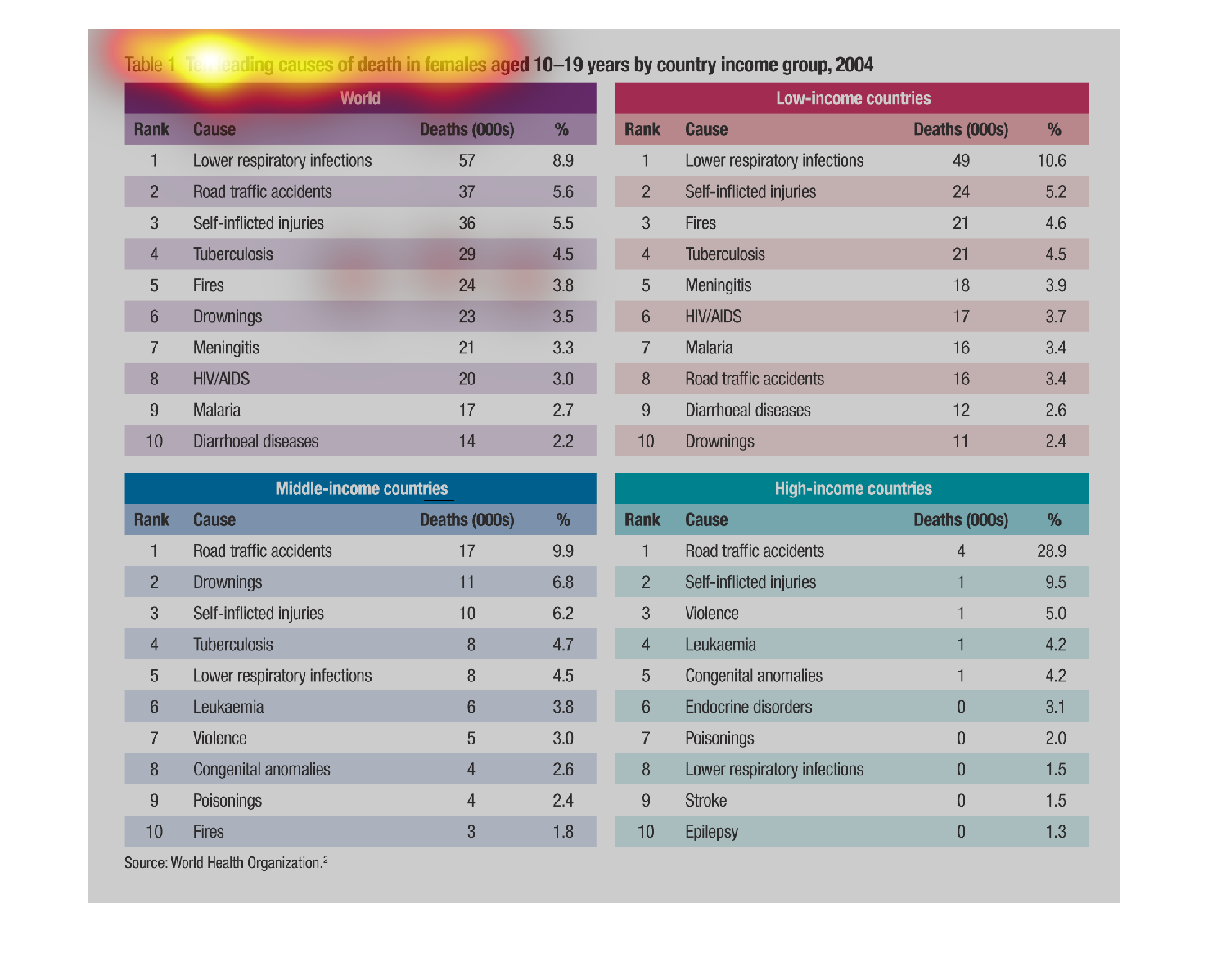
This is an image displaying data of how females aged 10-19 died in 2004 broken down by income
group. It shows that there is an impact of how wealthy a country is and how and how many of
their young women die.
Warning: Image is too big to fit on screen; displaying at 67%
Warning: Image is too big to fit on screen; displaying at 67%
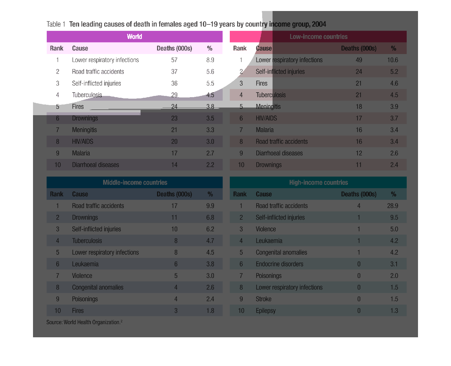
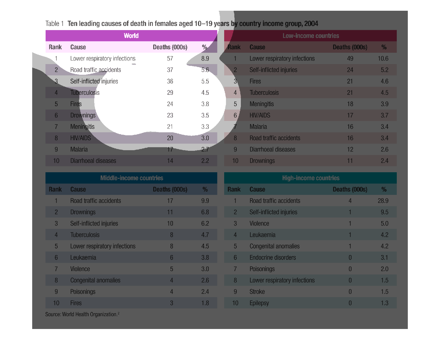
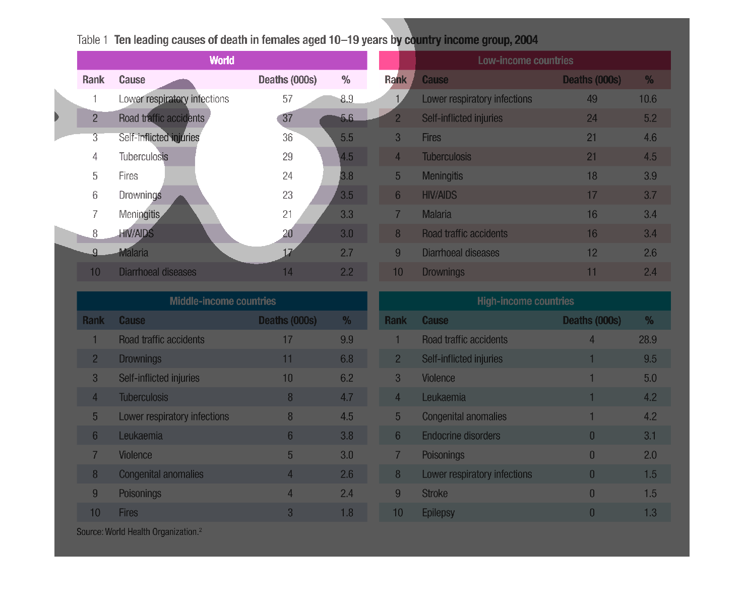
The following chart shows the top ten leading causes of death in women aged 10-19 in different
types of economies around the world.  They are Low Income Countries, Middle Income Countries
and High Income Countries.
Warning: Image is too big to fit on screen; displaying at 67%
Warning: Image is too big to fit on screen; displaying at 67%
Chart showing leading causes of death in females ages 10 - 19 broken down into, the world,
low income countries, middle income contries  and high income countries.
Warning: Image is too big to fit on screen; displaying at 67%
Warning: Image is too big to fit on screen; displaying at 67%
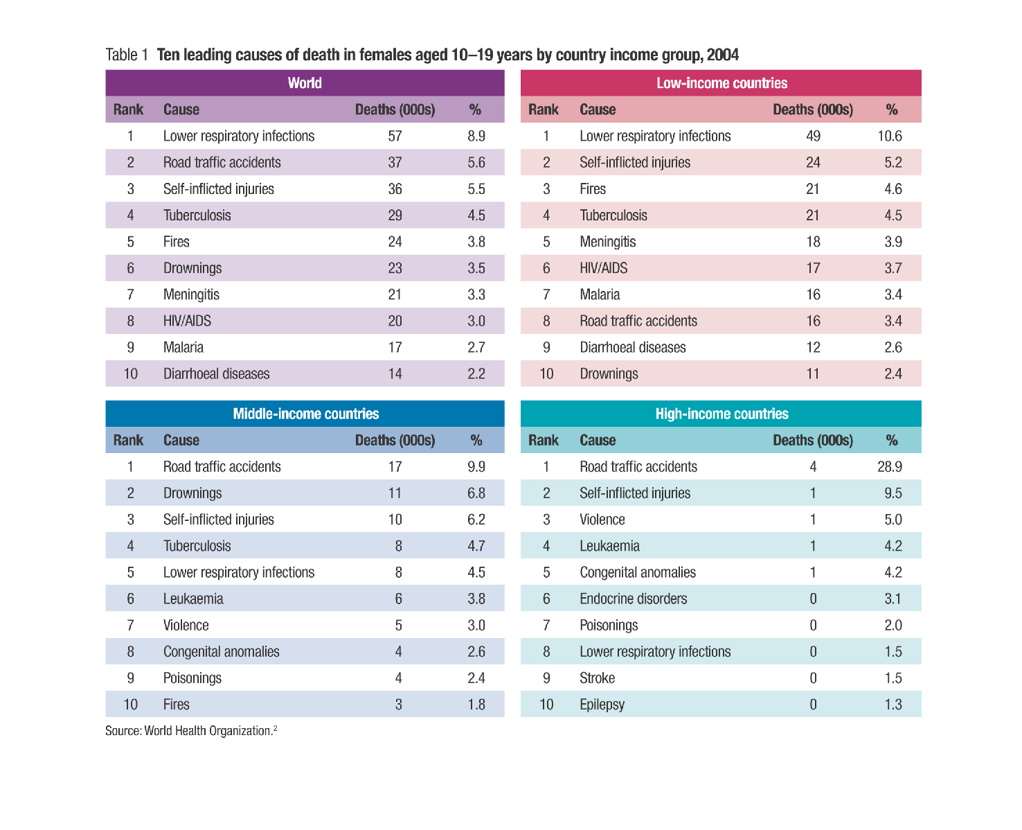
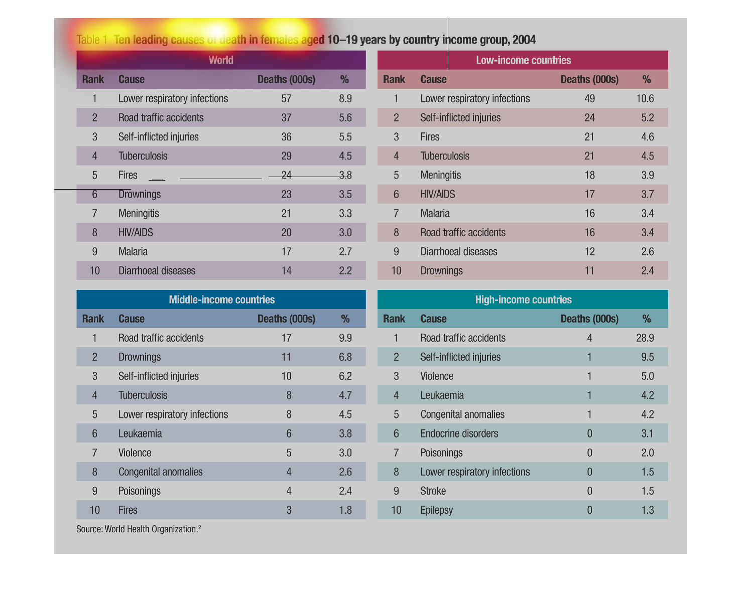
This shows the ten leading causes of females from ages 10-19 in 2004, sorted by income and
country. In low-income areas, the top killers are lower respiratory issues, fires, and suicide.
Contrary, the high-income countries have road accidents, violence and suicide as the top three.
Drownings are high up in the mid-income countries.
Warning: Image is too big to fit on screen; displaying at 67%
Warning: Image is too big to fit on screen; displaying at 67%
The image on the left hand side depicts females aged 10-19 and the most likely causes for
their deaths throughout the world.  Then, the graph goes more in-depth showing the causes
of death by socioeconomic status from low, mid, high classes in society.
Warning: Image is too big to fit on screen; displaying at 67%
Warning: Image is too big to fit on screen; displaying at 67%
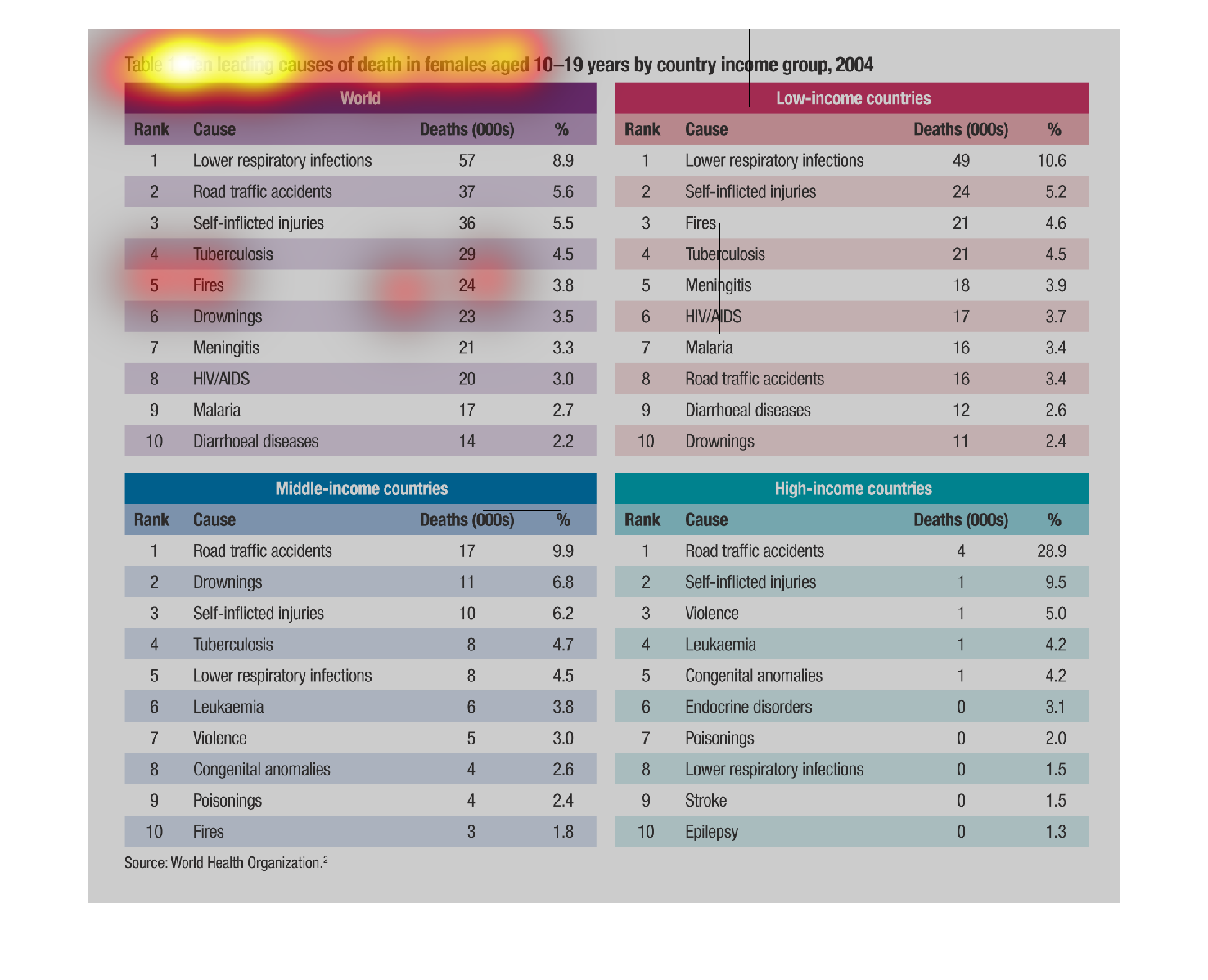
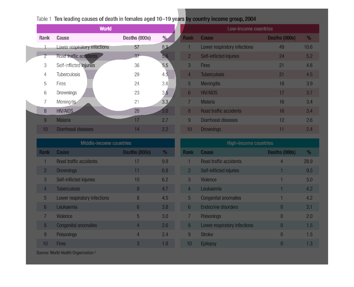
Ten leading causes of death in females aged 10- 19 years by country income group, 2004 broken
down by world, low-income, middle-income and high-income countries. Low respiratiory infections
top both world and low-income while road traffic accidents top middle and high income countries
Warning: Image is too big to fit on screen; displaying at 67%
Warning: Image is too big to fit on screen; displaying at 67%
This chart describes the ten leading causes of death in females aged 10-19 years by country
income group for the year 20004. Categories include fires.
Warning: Image is too big to fit on screen; displaying at 67%
Warning: Image is too big to fit on screen; displaying at 67%
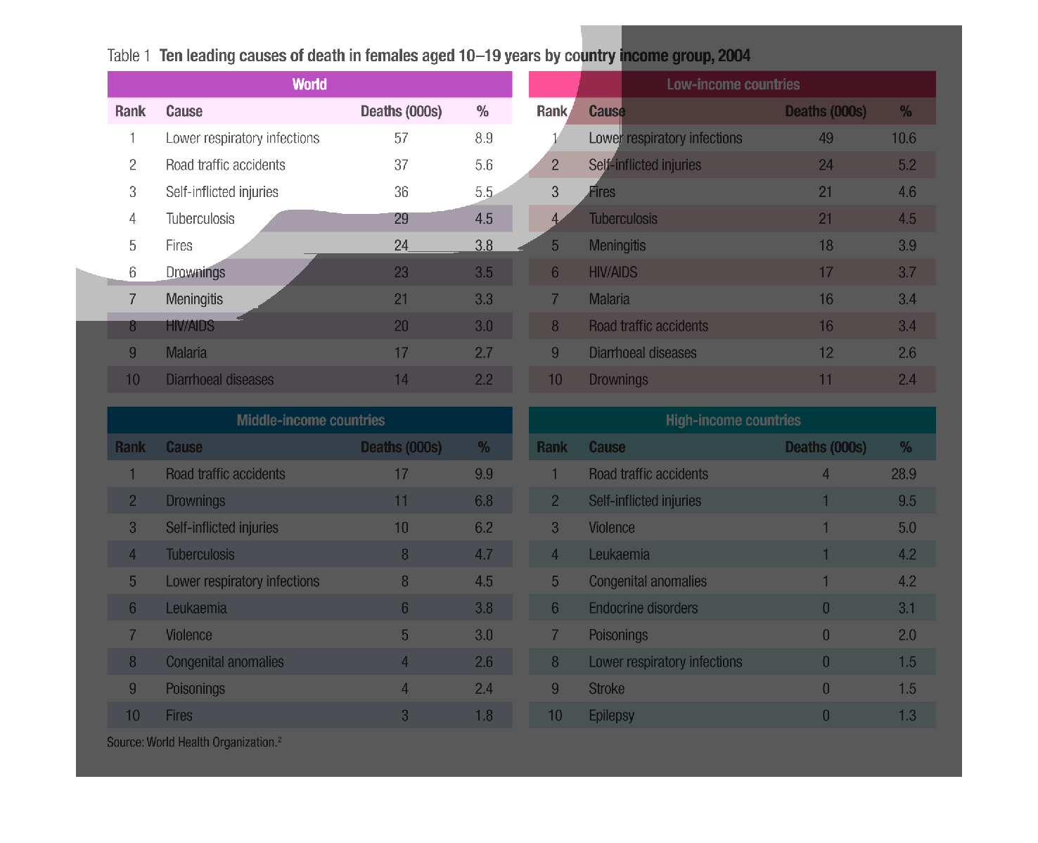
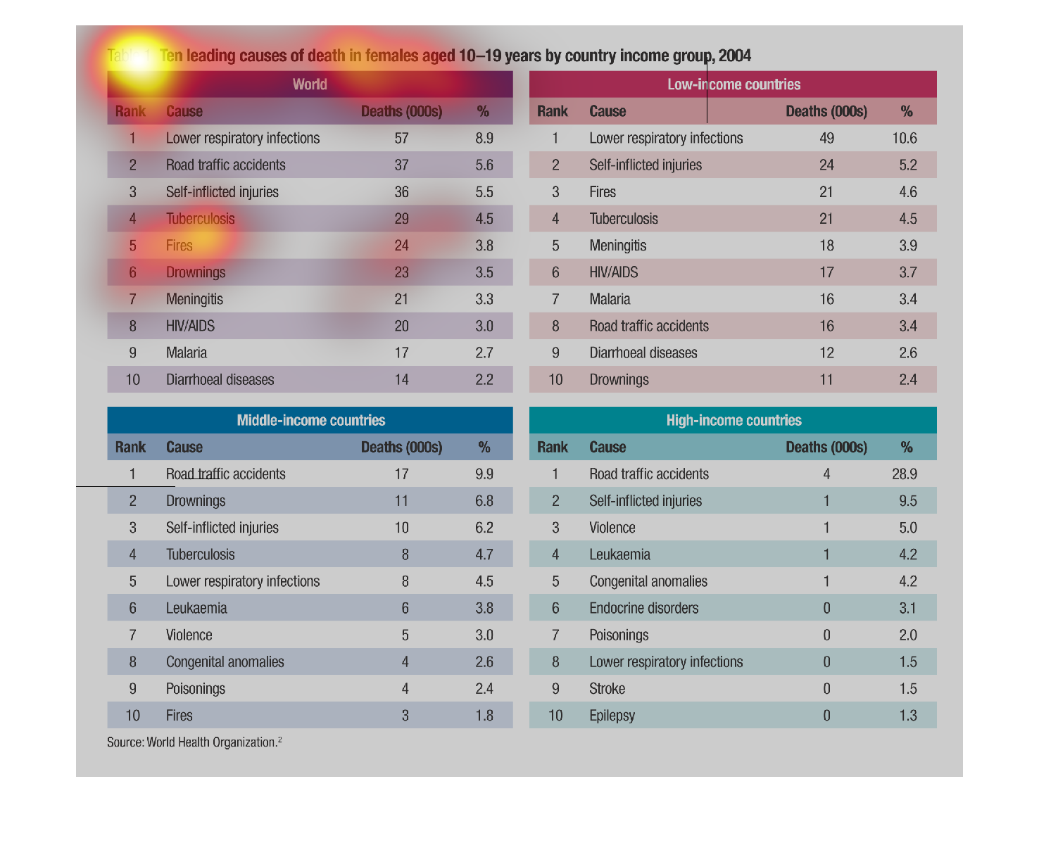
This informative picture shows a correlation of such between deaths and income. It splits
it up to low middle and high incomes and then lists the top reasons of deaths in these groups.
Warning: Image is too big to fit on screen; displaying at 67%
Warning: Image is too big to fit on screen; displaying at 67%
The caption for the displayed table is, "Ten leading causes of death in females aged 10-19
years by country income group, 2004".  The graph is comprised of four quadrants of different
colors.  One of the four boxes with the heading, world and the other three listing income
levels: low, middle, and high.  Each of the boxes then go on to list the specific causes of
death for females in the age range listed above.
Warning: Image is too big to fit on screen; displaying at 67%
Warning: Image is too big to fit on screen; displaying at 67%
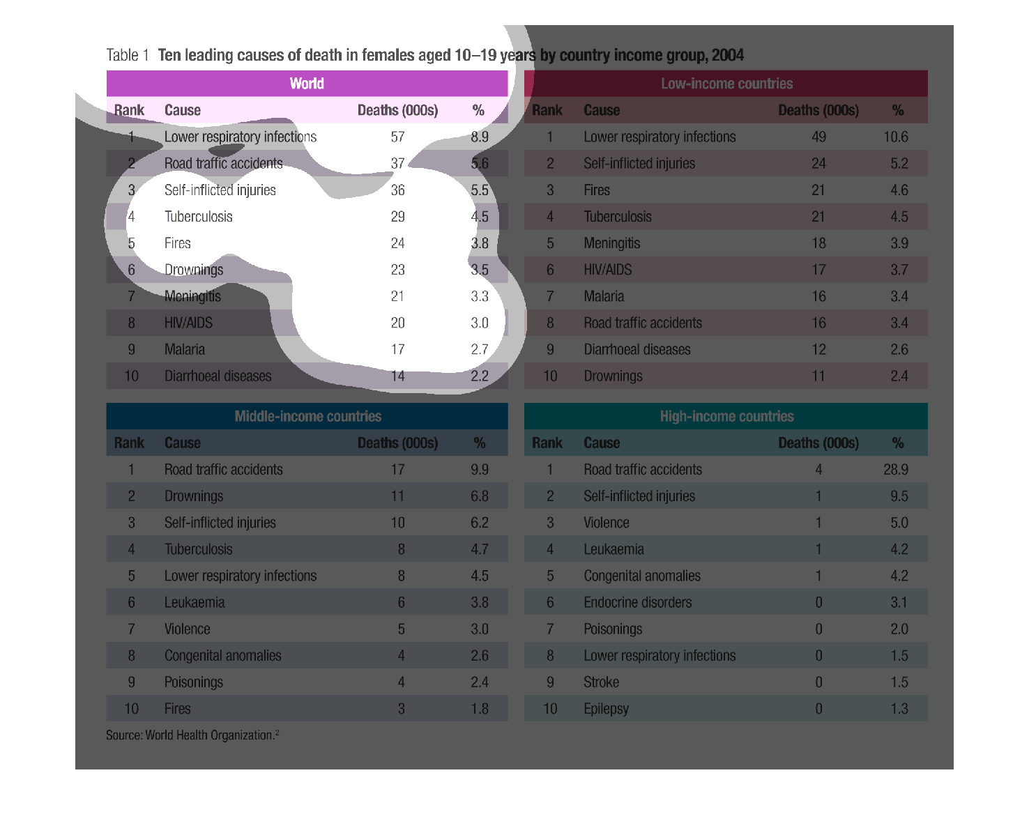
this chart shows causes of death in women between the ages of 10 and 19  in different economical
classes and statuses. lower income tends to be more of a health risk where as higher income
people tend to have a higher risk of traffic accidents
Warning: Image is too big to fit on screen; displaying at 67%
Warning: Image is too big to fit on screen; displaying at 67%