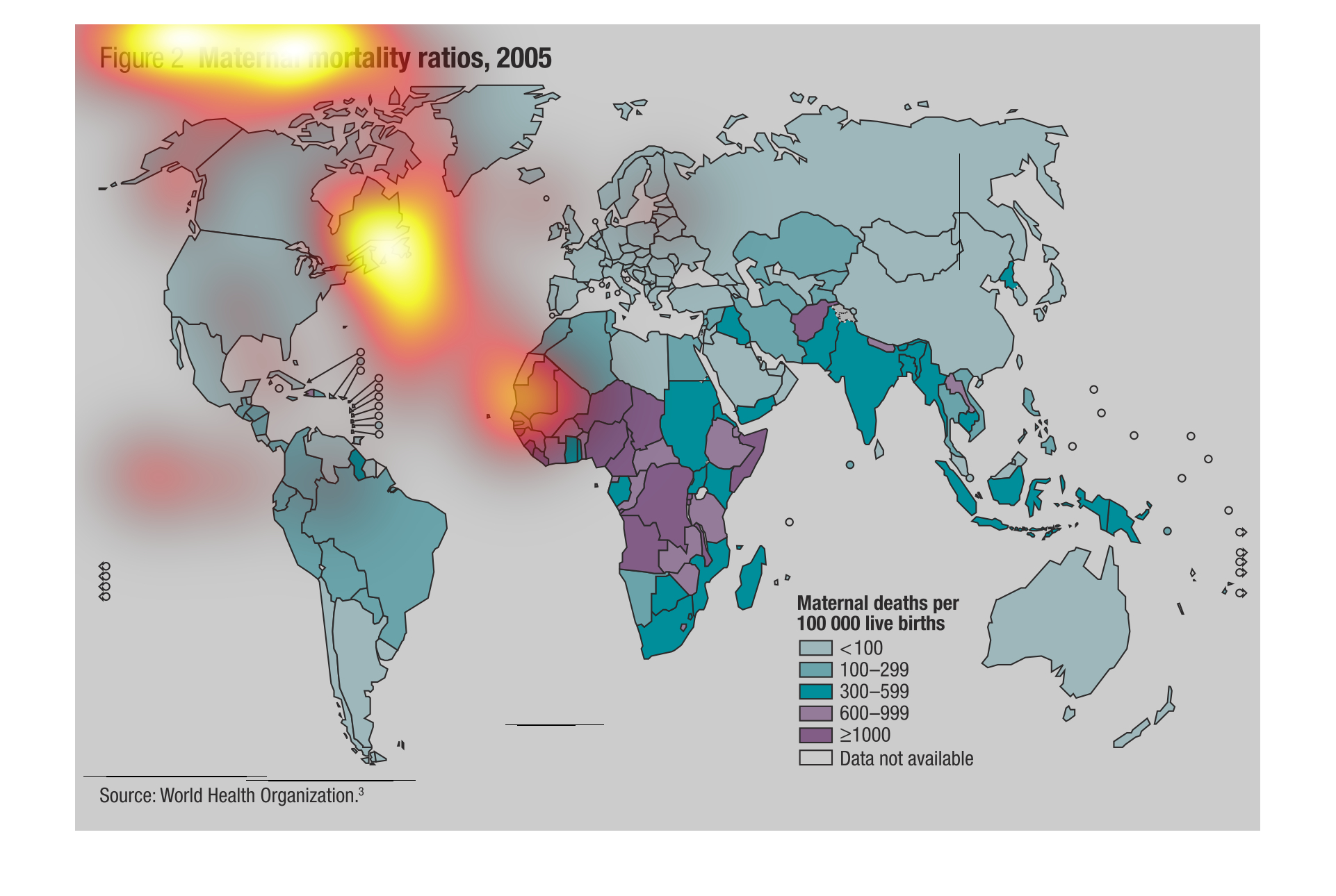
This chart shows the maternal mortality ratios in year 2005. The data is collected from WHO.
It shows the maternal death for 100000 live birth. Countries like Russia, Australia, Canada
and United states have less than 100 maternal death.

The following chart lists the Maternal Mortality ratios for the year 2005. Many of the countries
in Africa according to the chart had a very high mortality rate. While most of the developed
countries in the world had a very low rate.

This illustrations shows the disproportionate amount of maternal moralities incurred in a
lot of third world countries in Africa. While the rest of the world seems to have a handle
on things, it is out of control in that region.
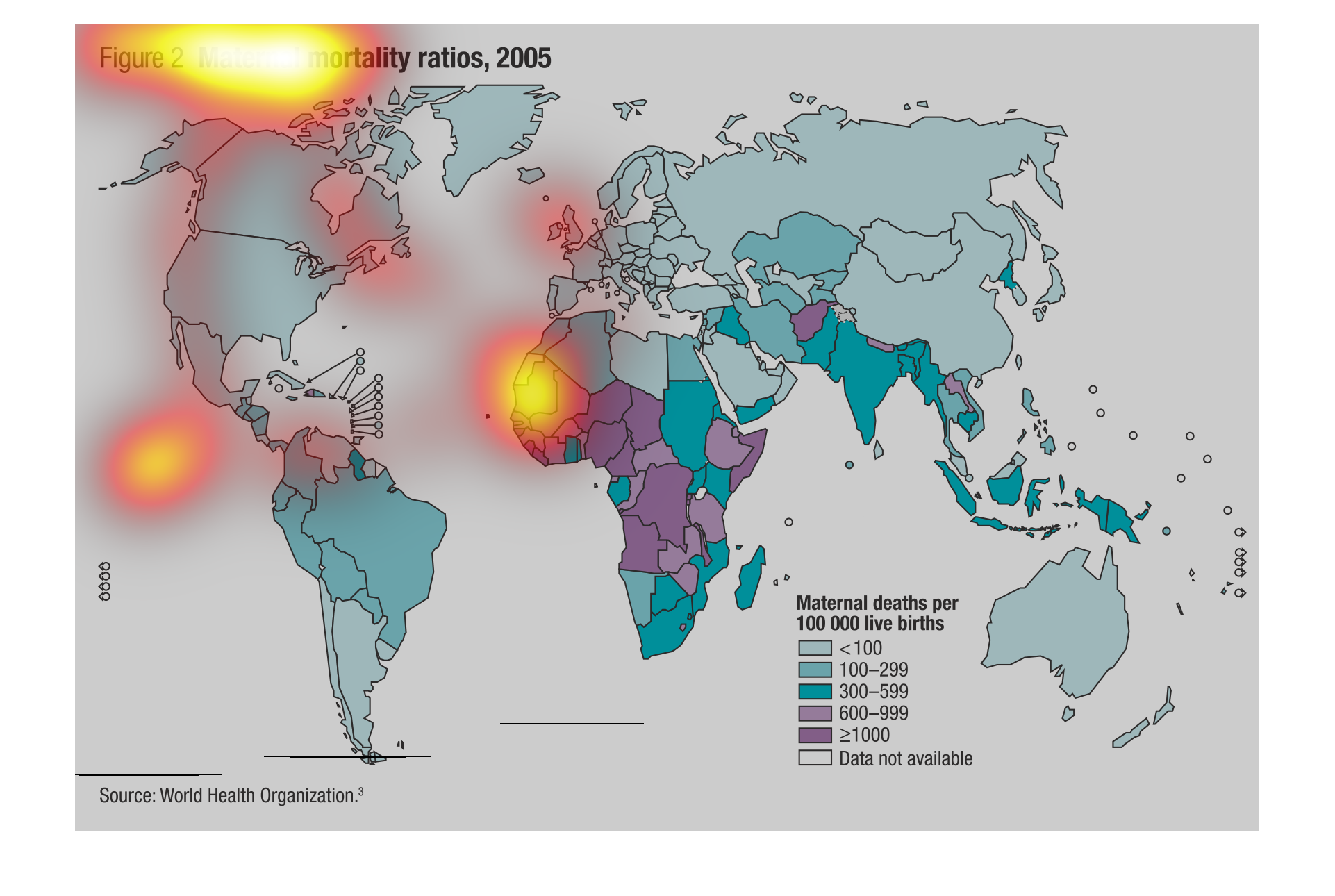
This is a color coded chart of the world that displays the number of maternal deaths per year,
per every 100,000 live births. This information comes from the World Health Organization,
and the chart is dated for 2005. According to the graph, the region with the highest number
of maternal deaths per live births are select countries in Western Africa. The regions with
the lowest numbers of deaths lie predominantly in first world countries such as in North America
and Europe.
This chart describes and depicts the number of   maternal mortality ratios as per one hundred
  thousand live births in the year two thousand and five.
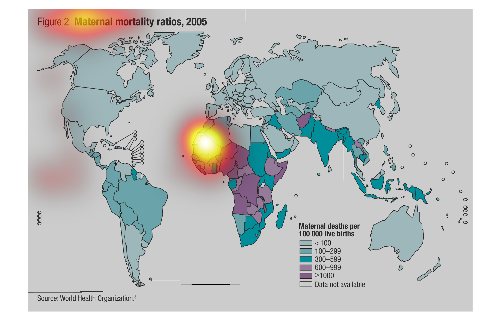
This chart is showing data for maternal mortality ratios in 2005. The data is presented showing
how many deaths occur per 100,000 live births. According to the data Africa has the highest
amount of maternal deaths per 100,000 live births.
The image on the left hand side is a picture of the world.  Within the world it has different
countries colored different colors.  These colors represent data from a 2005 study showing
the maternal deaths per 100000 live births.  From this graph it shows that Africa, specifically
Western Africa has the highest showing of maternal deaths.
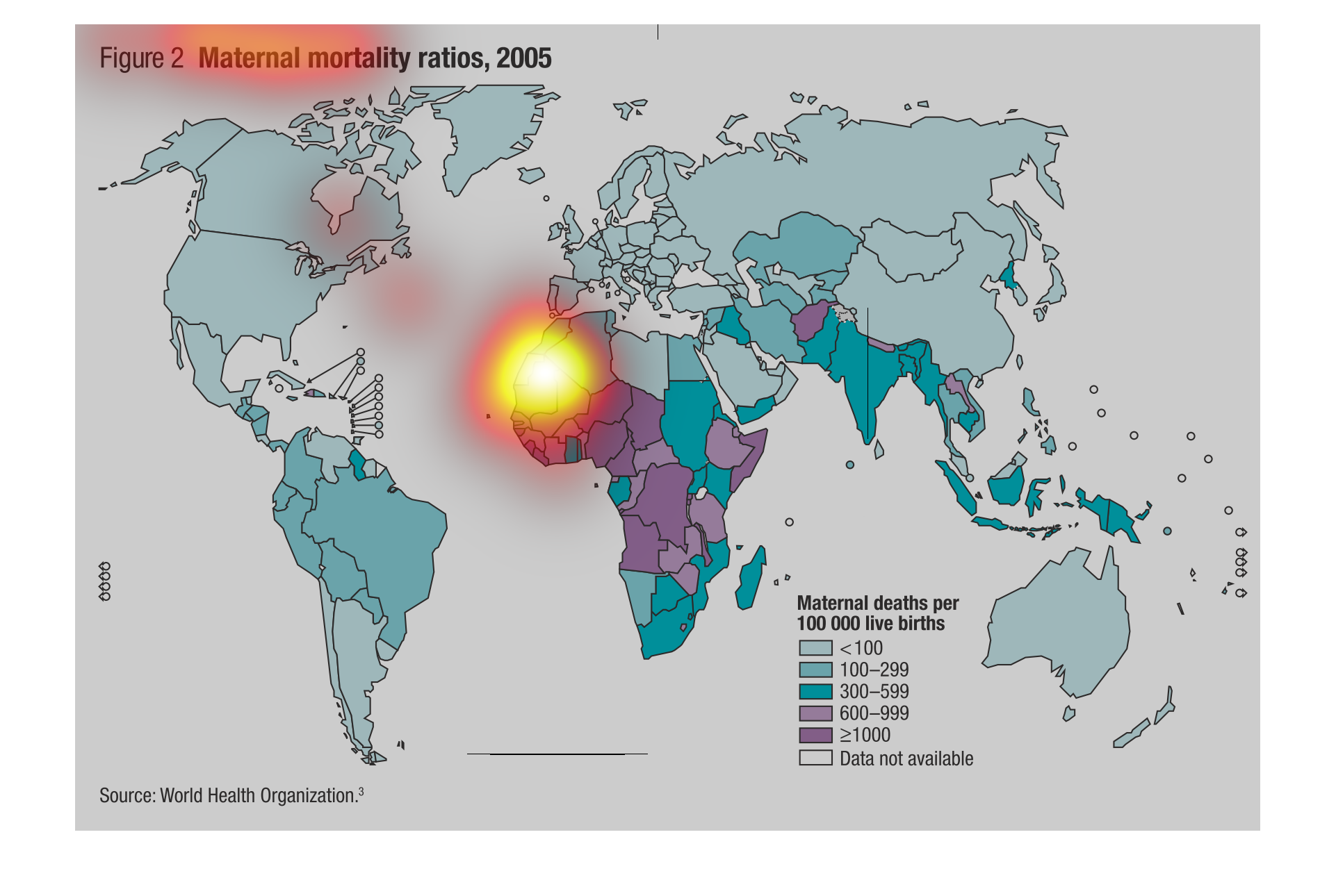
Maternal mortality ratios 2005. Maternal death rates per 100,000 live births in the northern
hemisphere from the World Heath Organization.. Highest in African countries.
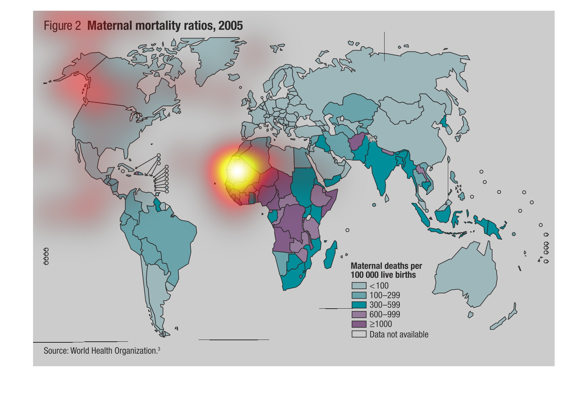
This image will display places where Maternal mortality having taken place in 2005. Another
table within the image displays a data set highlighting maternal deaths based upon live births.
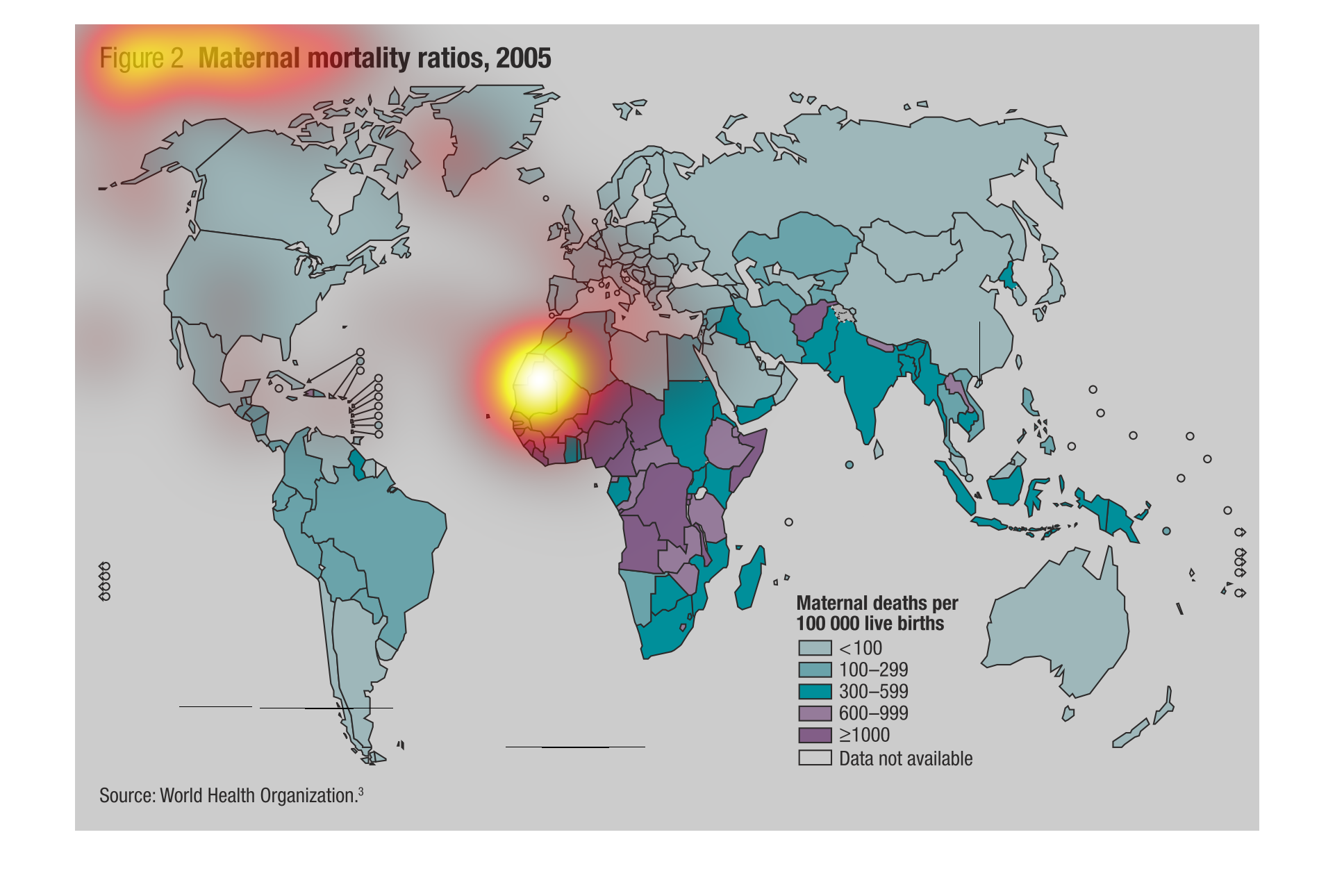
The chart shows Maternal mortality ratios in 2005. There is a key that shows "Maternal deaths
per 100000 live births" and a corresponding map of the world showing the world map with each
nation colored to represent its placement on the map. The data shows that Africa has a very
High rate of Maternal deaths
This chart is titled, and shows a world map for the maternal mortality rates.  All of the
US, and Canada have rates below 100. This probably due to being first world countries.
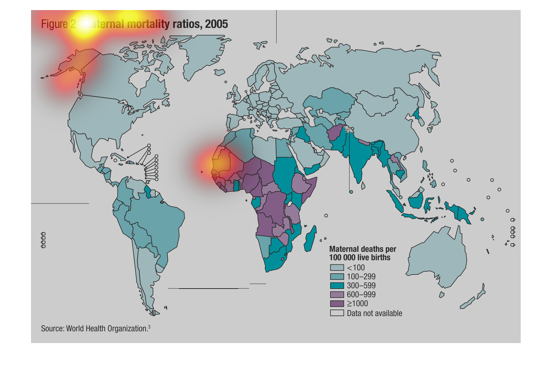
This graph shows the maternal mortality ratios for 2005.The graph shows that nations in West
Africa have one of the highest concentrations of maternal mortality deaths, whilst nations
in Western Europe and North America have some of the lowest maternal mortality rates.
This image shows or depicts in a world statistical geographical format the Maternal Mortality
ratios for the year 2005. The highest rate of these deaths seem to take place in Africa.
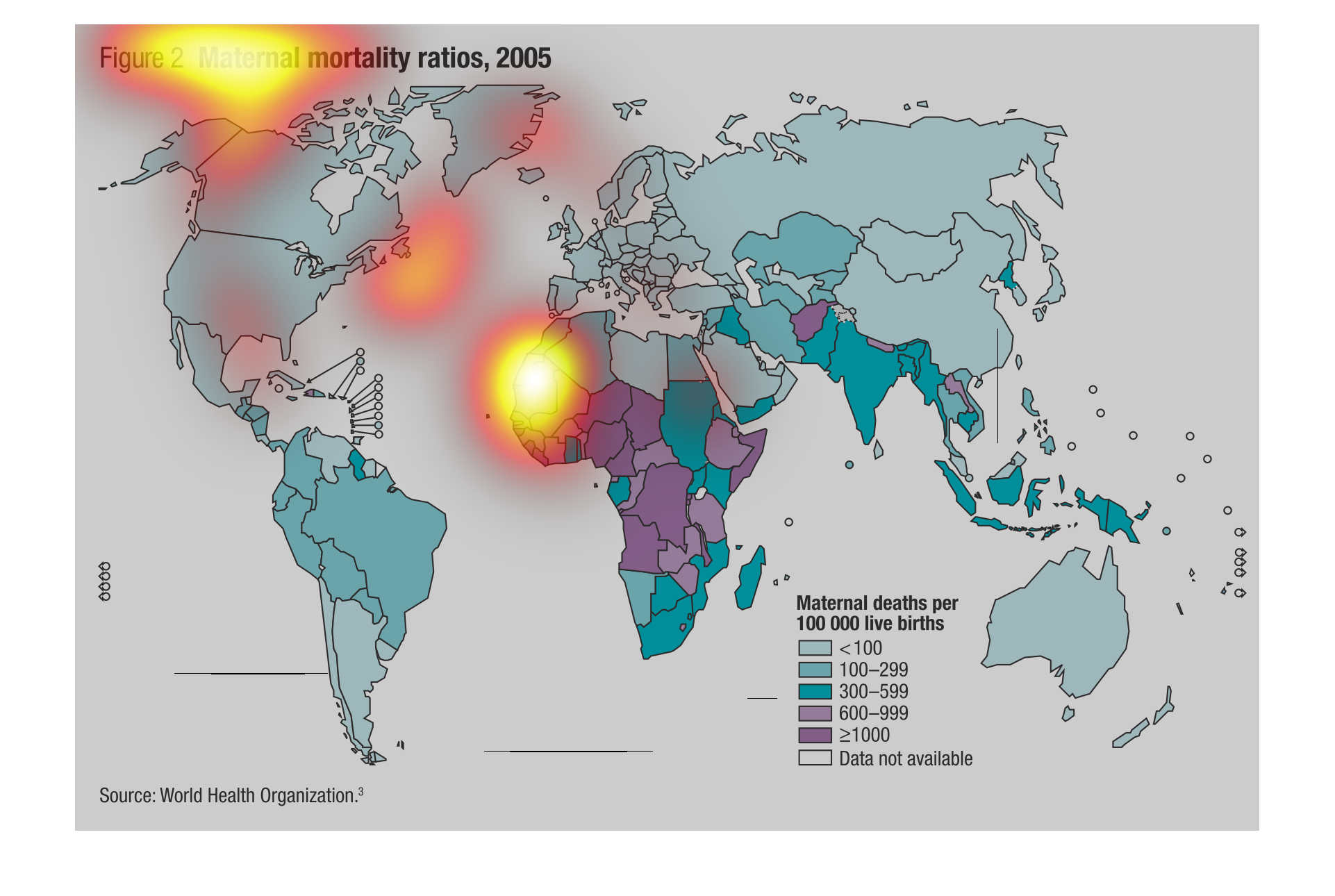
This is a world wide maternal mortality ratios from 2005 . It very clearly shows that the
mortality losses are much higher in 3rd world countries,  Some of the highest being on the
African con-tenant