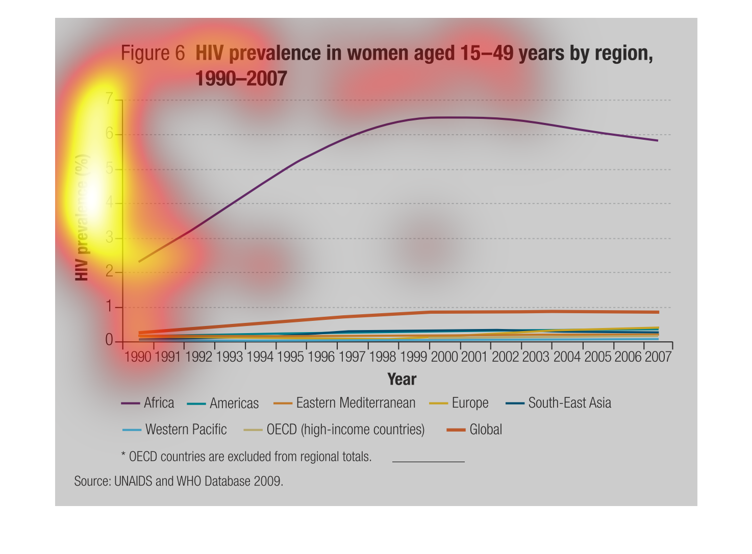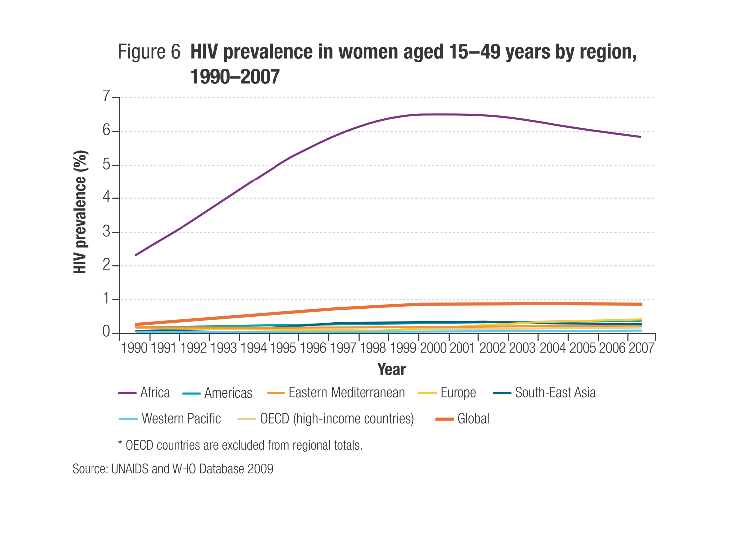
Shows the prevalence of HIV in women aged 15 to 49 years, by region, from 1990 to 2007.  Africa
has had the highest rate of all regions in the world during this time, increasing from about
2% in 1990 to as high as 6% around the year 2000.  All other regions, as well as the world
as a whole, had a rate that stayed below 1% during this time.
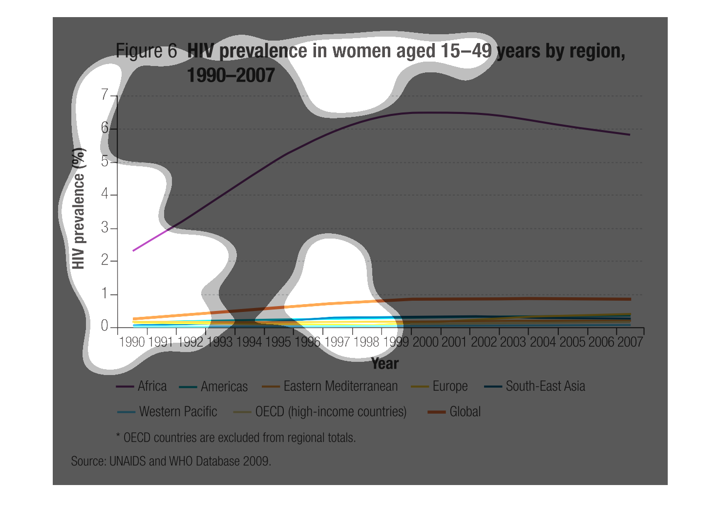
This graph is about HIV prevalence in women between the ages of 15-49 by their region. Africa
clearly has the highest percentage. While all the other regions have pretty low percentages.
This chart describes HIV prevalence in women aged 15-49 years by region for the years 1990
through 2007. Regions represented on the chart include Western Pacific.
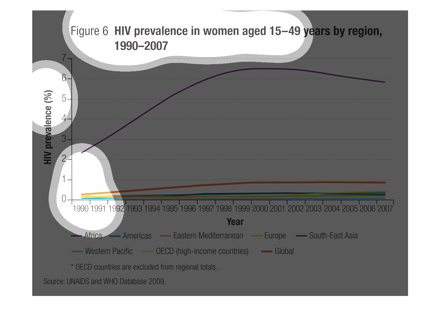
Line graph showing prevalence of HIV in women between age 15 and 49 by approximate continental
region during 1990-2007. Africa shows markedly higher HIV infections than the other regions
combined, showing a steep incline in the mid-90s, leveling off during late-90s and early 2000s,
then finally a slight decline in mid-2000s. Global rates are slightly higher than the other
regions, aside from Africa.
This graph shows the prevalence of HIV in women ages 15-49 years old during the years 1990-2007.
 The data is divided by regions.  While most of the individual regions did not notably increase
in prevalence, Africa increased rapidly in the early 90's, peaked in the late 90's early 2000's
and then decreased somewhat.
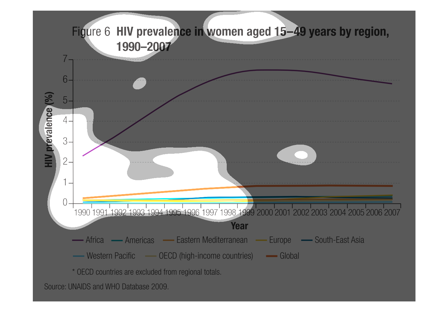
This graph shows the prevalence of HIV in women age 15 to 49 years by region from 1990 to
2007.  Africa has the highest rates by far of any region documented.
This depicts the prevalence of HIV in women between the ages of 15 and 49 by region for the
years between 1990-2007.  Based on the graph, the prevalence of HIV in this category is by
far and away higher in Africa than any other region.
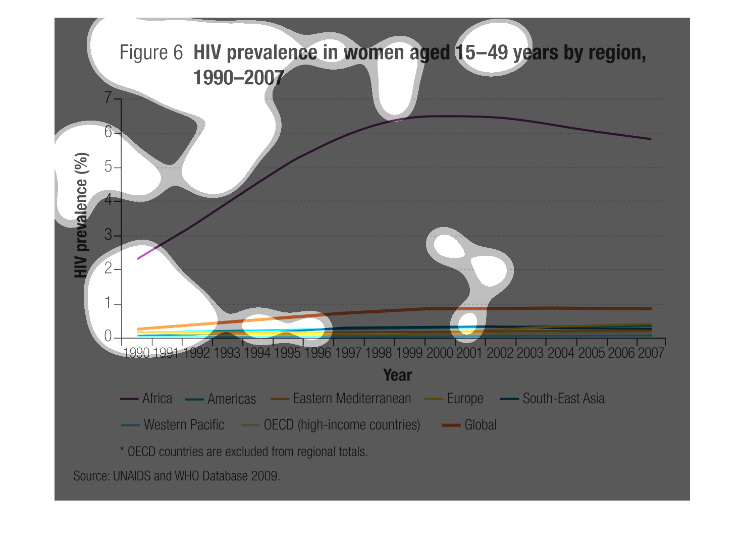
HIV prevalence in women aged 15-49 years old by region, 1990-2007. Shows the percentage of
women with HIV prevalence during 1990-207 by region. OECD countries are excluded from regional
total. The source is from UNAIDS and WHO database 2009
This graph shows the prevalence of HIV in women 15-49 years old by region from 1990-2007.
The different colored lines on the graph represent different regions of the world. Overall,
the graph shows that the vast majority of women suffering from HIV live in Africa and that
HIV rates have slightly increased for every other region throughout time, but have started
declining in African women.
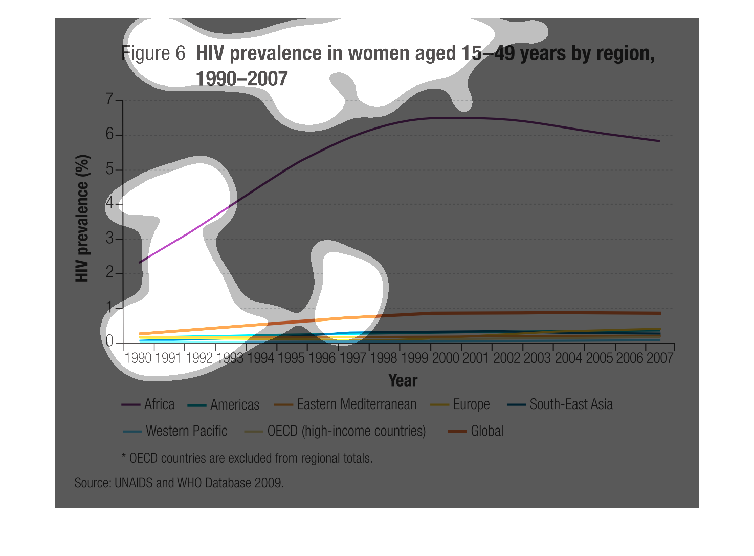
The following chart gives data for number of women affected with HIV in age range of 15-49
years of age. The rate of HIV infected people is the highest in Sub Saharan Africa.
This graph explains HIV prevalence in women aged 15-49 years by region. The Y axis represents
the % of HIV prevalence and the X axis shows the different countries represented by colored
lines.

The caption for this line graph is, "HIV prevalence in women aged 15-49 years by region, 1990-2007".
 There are several multicolored lines depicting several geographic regions.  Each line charts
the data reflecting the prevalence of HIV in woman in those regions within the age range specified
above.
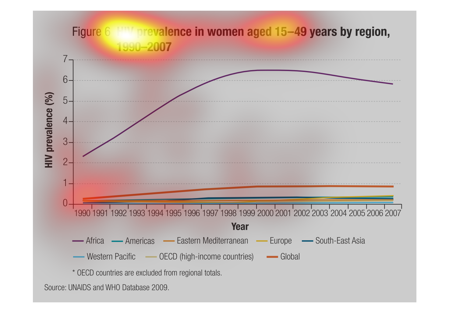
The graph shows HIV prevalence in women ages 15-49 years by region and from 1990-2007. Out
of all the regions including the Western Pacific, OECD, Eastern Mediterranean, Europe, Global,
and South-East Asia, Africa is increasing up until 1998 through 1999 and decreases slowly
from there.
This is a graph showing HIV prevalence in women aged 15-49 years by region. Overall, HIV has
remained below 1 percent over the past 50 years except for Africa where is skyrocketed to
almost 7 percent and has remained above 6 percent