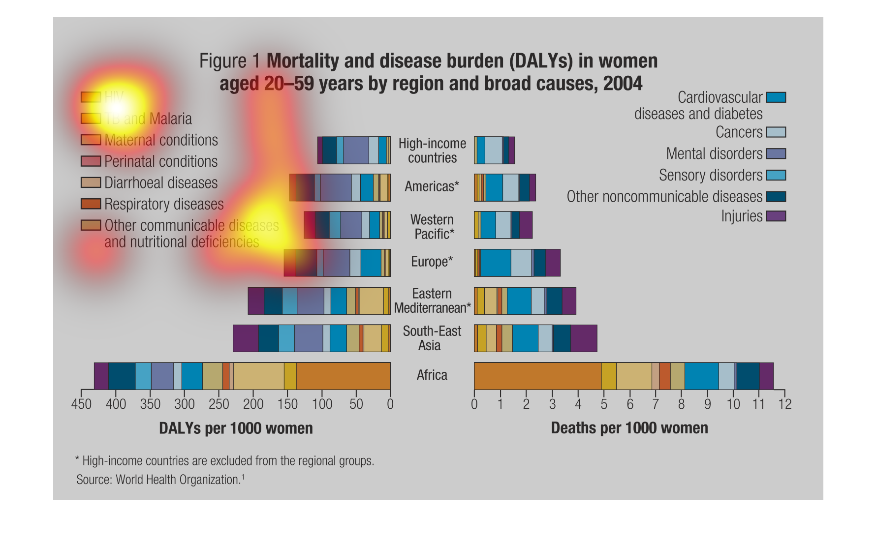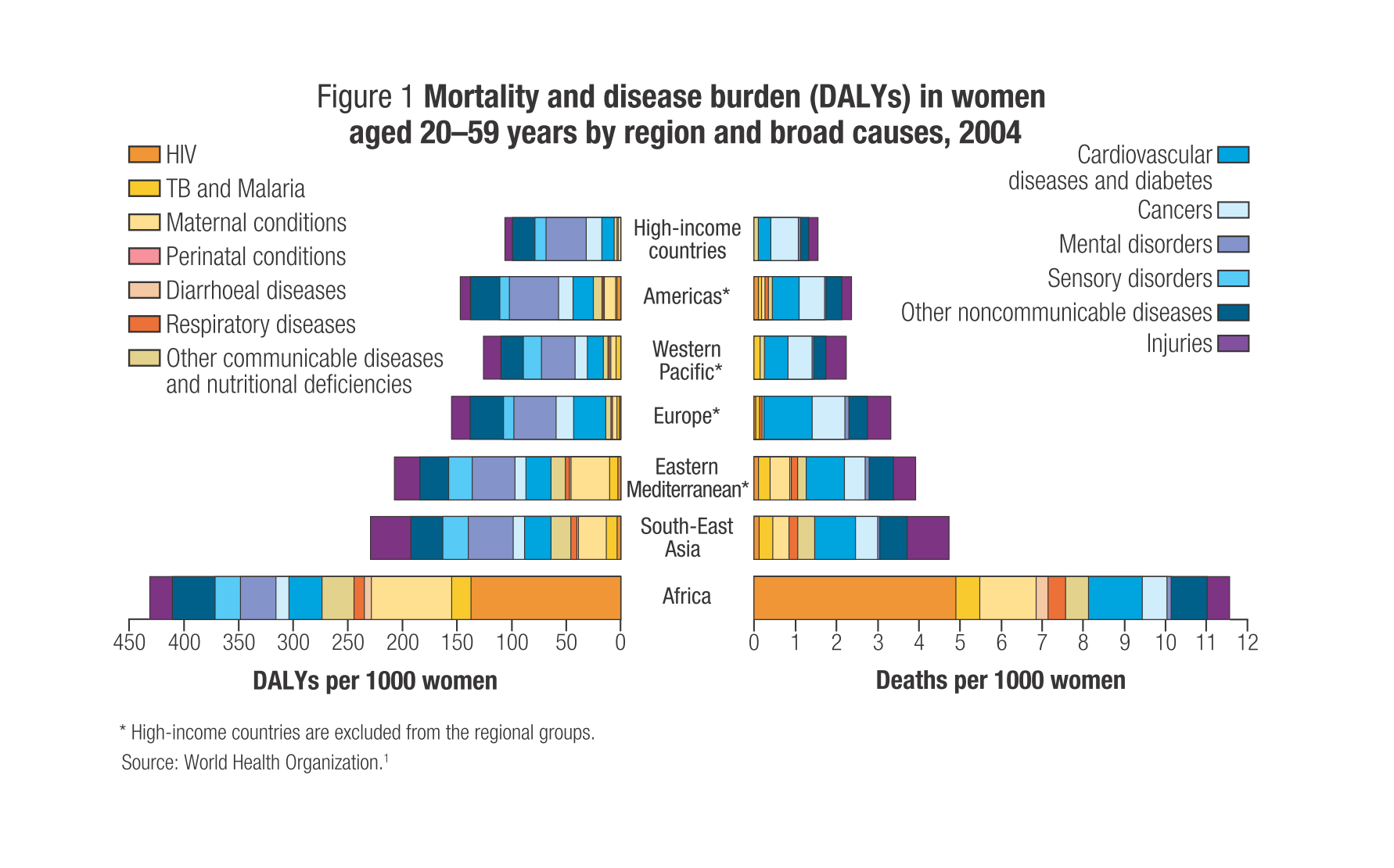
This chart describes the mortality and disease burden in women aged 20-59 by region and broad
causes. Categories include Hiv, tb and malaria, maternal conditions, paternal conditions,
diarrhoeal diseases, respiratory diseases, other communicable diseases. It then goes on to
break down diseases by region by chart.
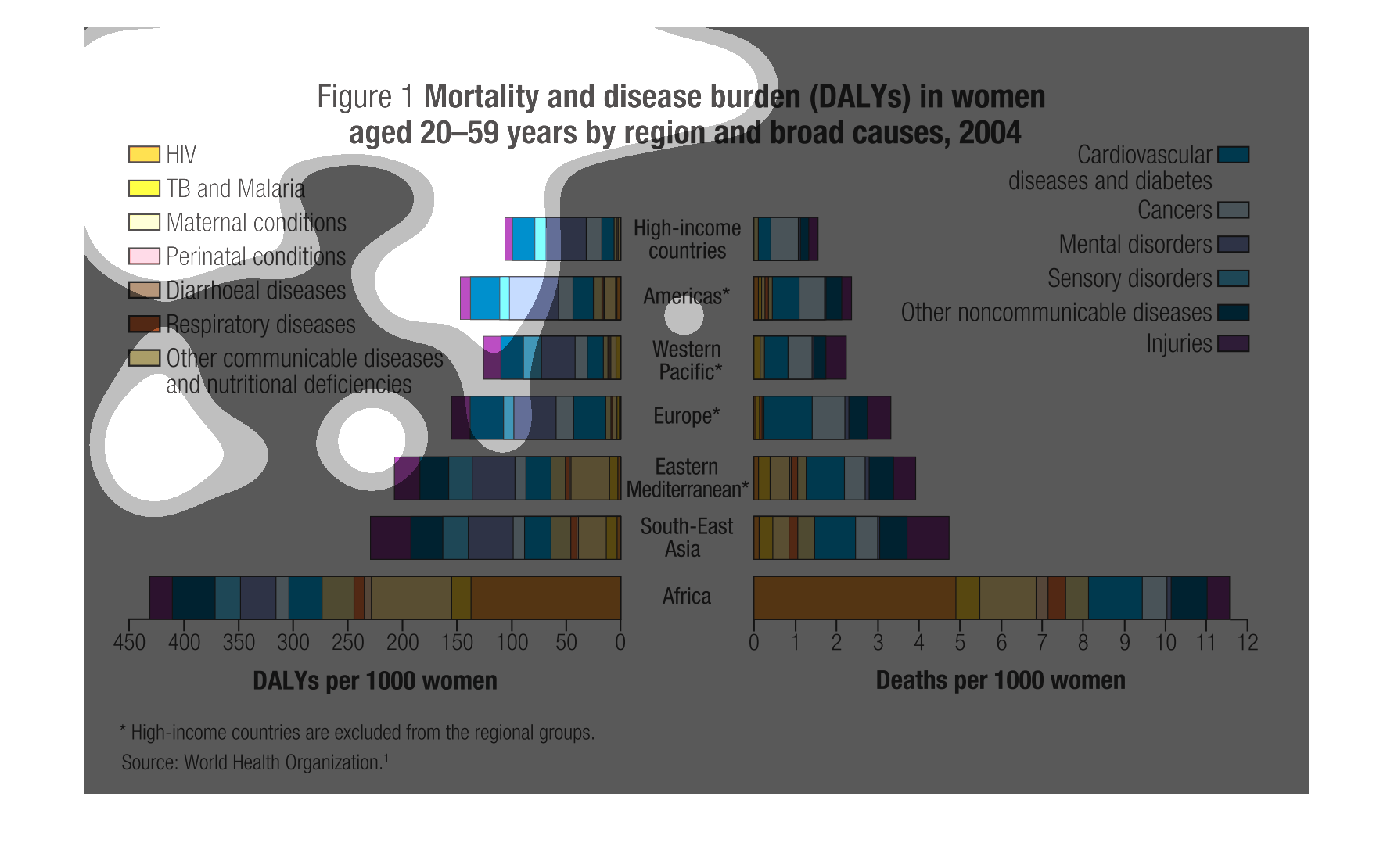
The image is a graph depicted mortality and disease burden in females aged 20-59 by region
and broad causes. Countries are listed down the middle. Diseases are color coded on the left
and right. High income countries and Americans have the lowest rates. South-east Asia and
Africa have the highest. Africa in particular is alarmingly more than all of the others. TB,
HIV, Malaria, and maternal conditions affect Africa and low income countries the most. Cardiovascular
diseases, diabetes, and cancers affect higher income countries more.

The following chart is a mortality rate in burden graph from women aged 20-59 years of age.
It is by region and by broad causes. In Africa the number one was HIV and the more developed
countries the highest cause was cancer.
This chart describes mortality and disease burden in women aged 20-59 years old by region
 and broad causes for the year 2004. Conditions on the chart include HIV and TB.
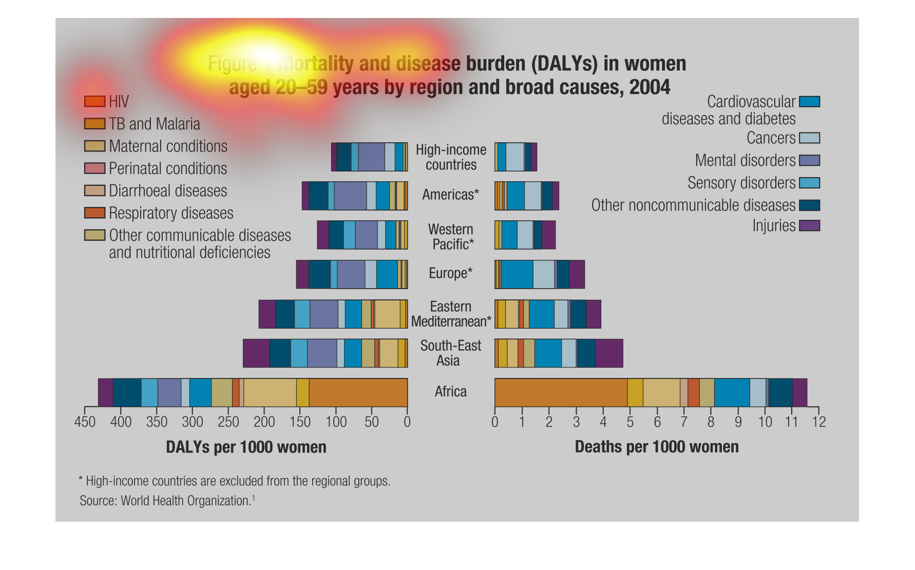
This graph depicts the disease burden on women, and the accompanying leading causes of death,
in regions around the world. High income countries have the healthiest population.
The image on the left hand side is describing the deaths and diseases that affect women aged
20-59 years of age.  They have these causes of illness and severe illness arranged by geographical
region as well as a baseline of the high income society to help see a judgement of places
like South East Asia.
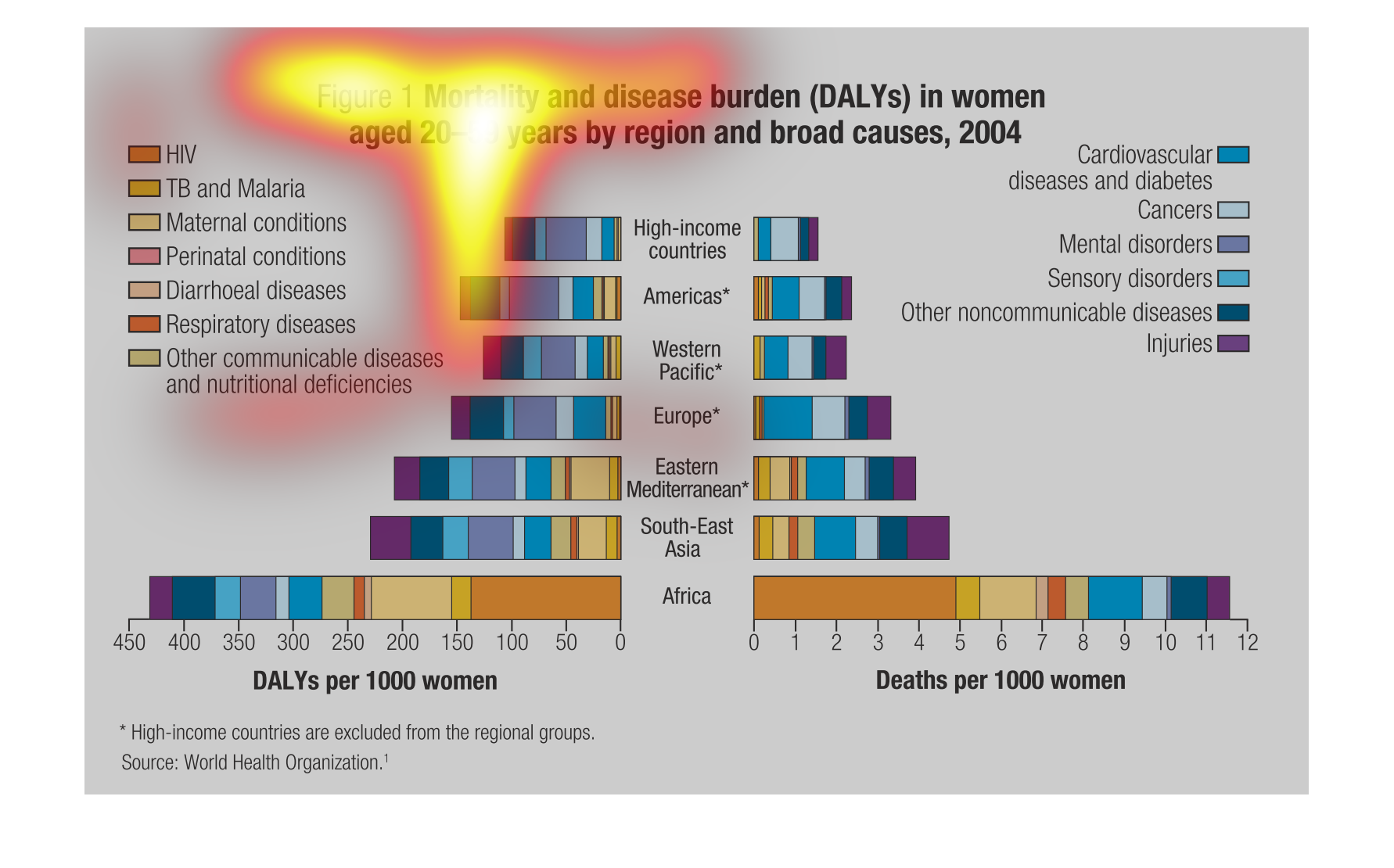
This chart displays the mortality and disease burden by region in females excluding high-income
countries. HIV is a major cause in Africa. Cardiovascular diseases and diabetes are major
factors in every region.
The image shows mortality and disease burden in women who are aged 20-59 divided into region
and by various different causes, such as diabetes, cardiovascular disease, etc.  during  the
year 2004
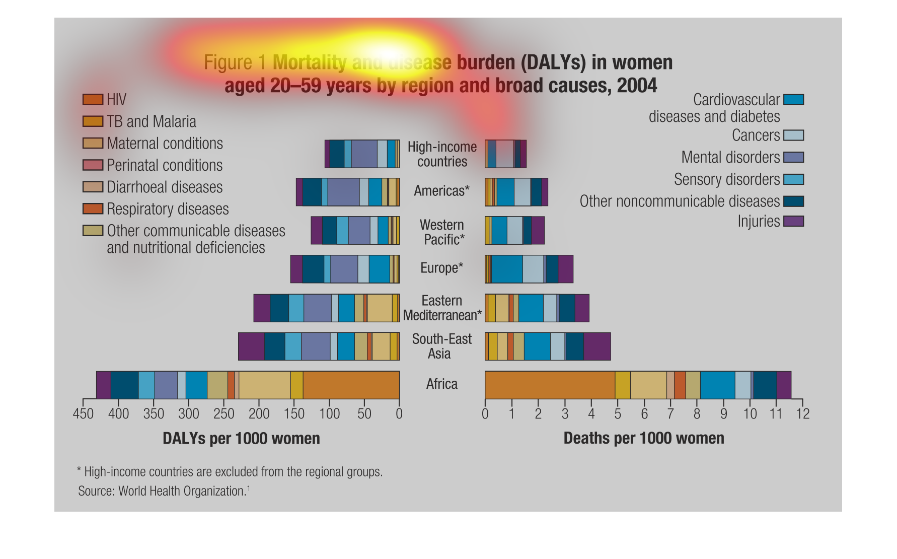
This shows all the different diseases and medical conditions that can kill a woman, and how
many woman are affected and killed by each specific medical condition.
This graph illustrates the mortality and disease burden for women aged 20 to 59 years in selected
countries in 2004.  It has various diseases from HIV/AIDS to cardiovascular disease represented.
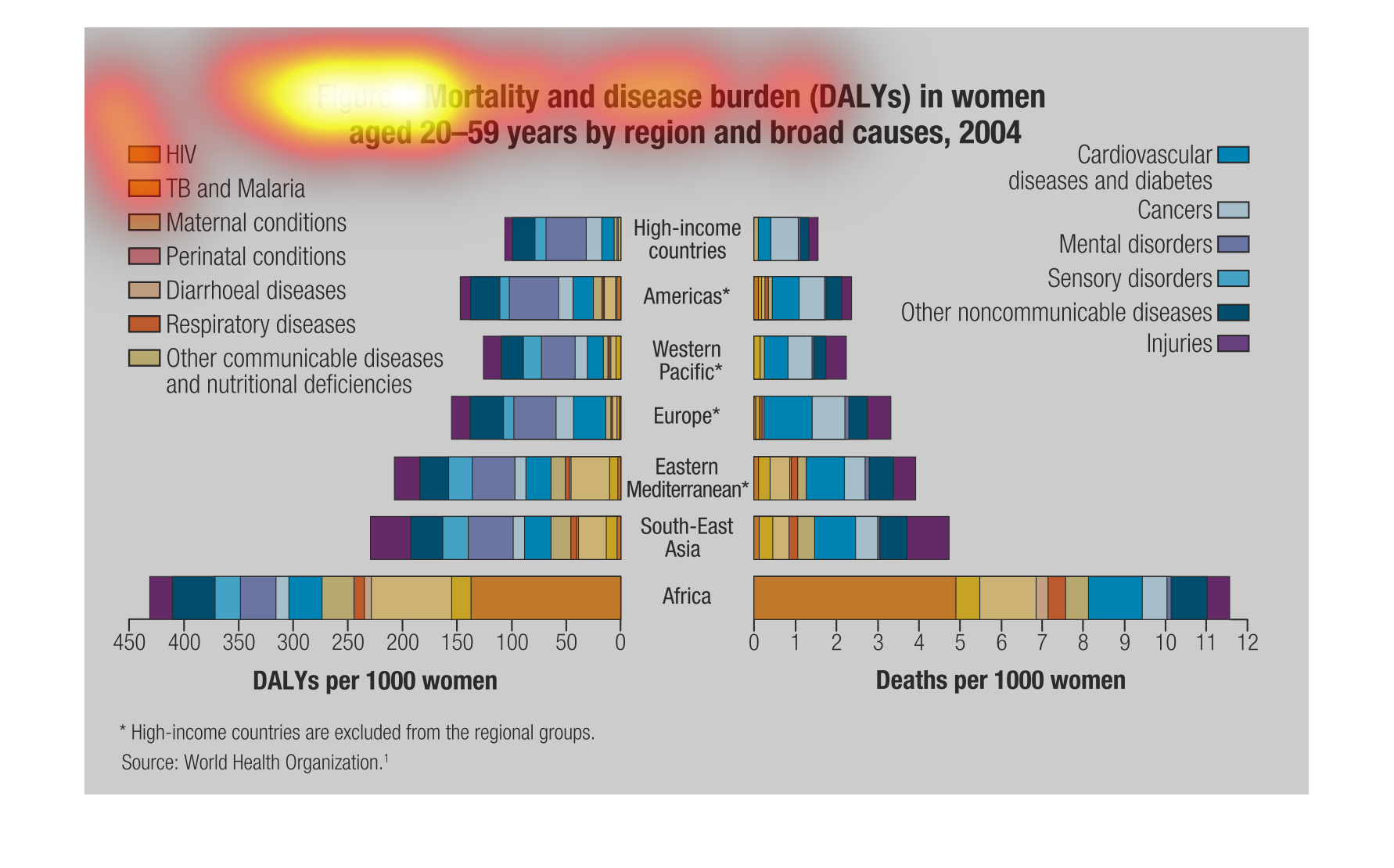
The graph illustrates mortality by disease burden of women age 20 to 59 according to country.
Dieseases inclued HIV, TB,  Perinatla conditions, maternal conditions, respiratory conditionsdiarrheal
conditioal and other nutritional causes.  Africa bore the highest incidence while  hig-income
countries were the lowest incidences.
This chart describes and depicts the mortality and disease burden in women from age twenty
to age fifty-nine by a multitude of regions and by broad causes.
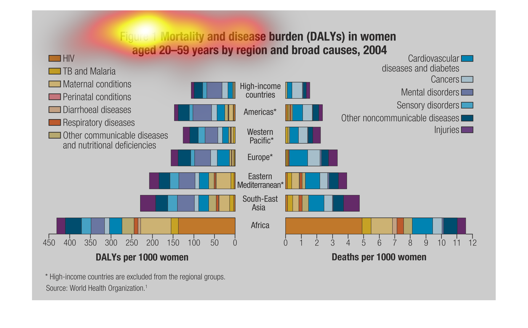
The image depicts mortality and disease burden (disability-adjusted life year, DALYs) in women
aged 20-59 years by region and broad causes, 2004. Mortality related causes include: HIV,
TB and malaria, maternal conditions, perinatal conditions, diarrhoeal diseases, respitory
diseases, and other communicable disease and nutritional diaereses. The data indicates that
in high-income countries women have less risk of dying from a plethora of diseases, infections,
etc, than women in lower-income countries.
Mortality and disease burden for woman 20-59  by global region. This highlights the regions
with the highest and lowest values.  The high income countries are left out of the regions.
 High Income America Western Pacific Europe Eastern Mediterranean Sout east Asia Africa  There
is no time information.
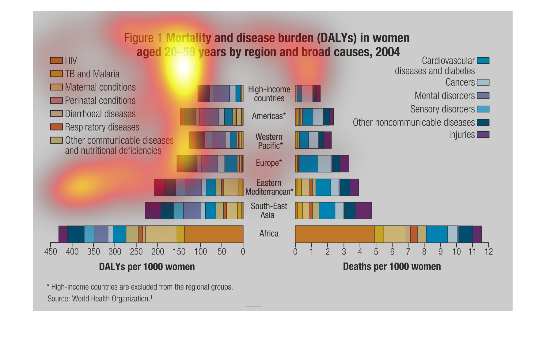
This chart shows the amount of deaseases and type of deaseases broken down by country. It
shows that the less developed countries have more deaseases wile the more developed have more