Warning: Image is too big to fit on screen; displaying at 67%
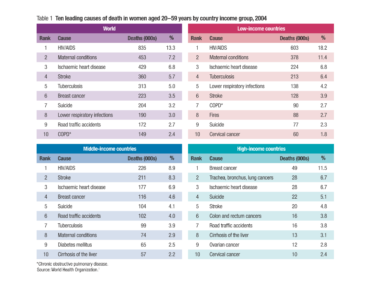
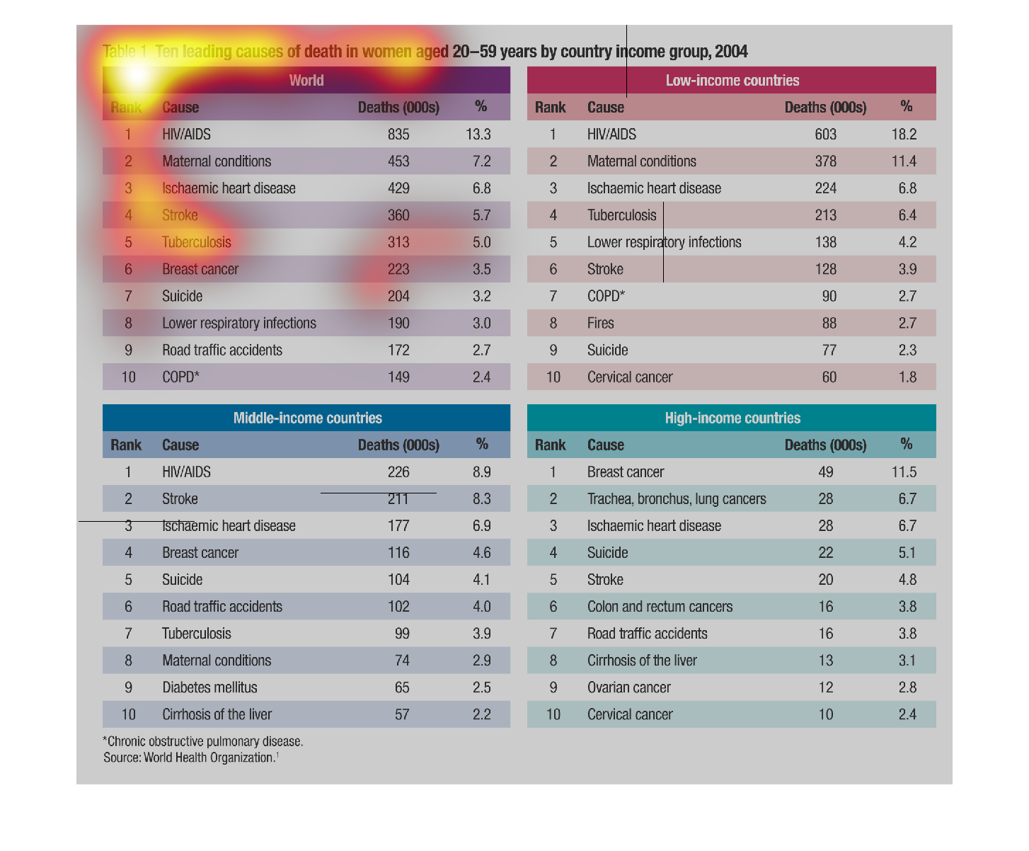
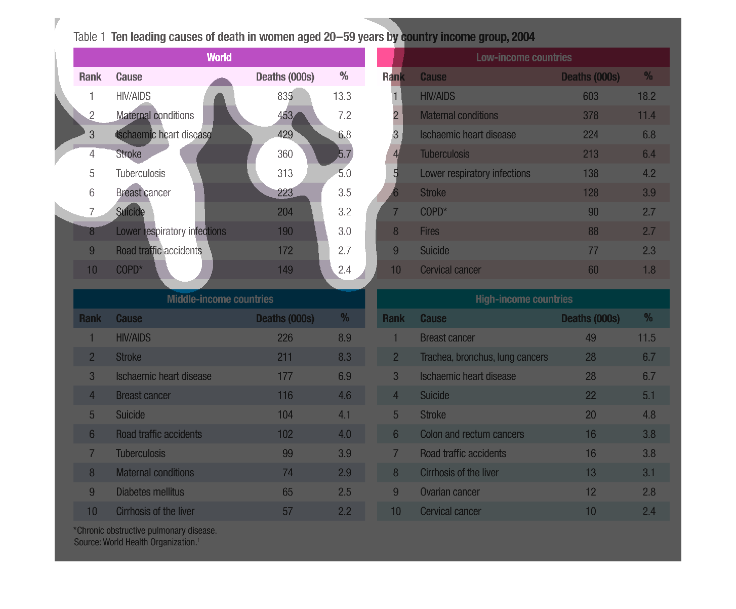
THESE TABLES SHOWS THE LEADING CAUSES OF DEATHS FOR WOMEN AGED 20-59 YEARS OLD. AT TOP LEFT
IS FOR THE ENTIRE WORLD, AND THE OTHER THREE TABLES ARE BY WEALTH OF HOME COUNTRY.
Warning: Image is too big to fit on screen; displaying at 67%
Warning: Image is too big to fit on screen; displaying at 67%
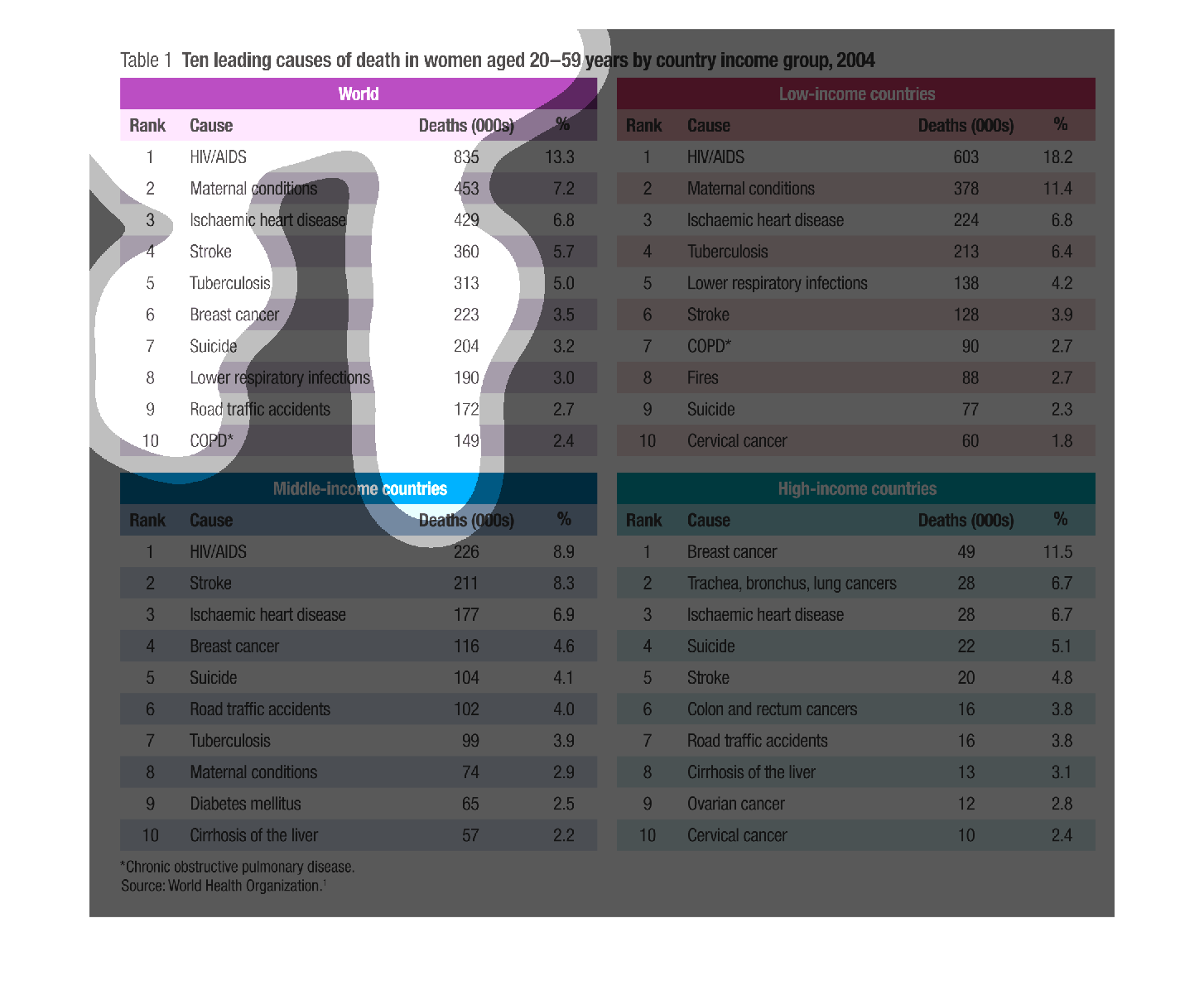
This charts shows the ten leading causes of death in women aged 20-59 years by country income
group, for the year of 2004. On the left is displayed the information for the world, and on
the right the info for low income countries.
Warning: Image is too big to fit on screen; displaying at 67%
Warning: Image is too big to fit on screen; displaying at 67%
This chart describes the ten leading causes of death in women aged 20-59 years by country
income group for the year 2004. Causes of death on the chart include HIV/Aids.
Warning: Image is too big to fit on screen; displaying at 67%
Warning: Image is too big to fit on screen; displaying at 67%
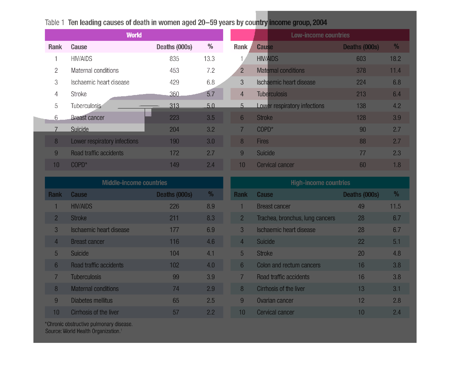
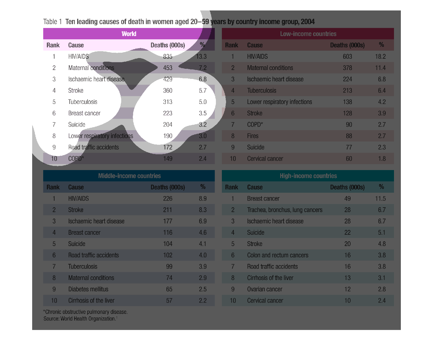
The following chart gives information on the deaths of women aged 20-59 years of age it is
broken down by low income, middle income and by wealthy nations.
Warning: Image is too big to fit on screen; displaying at 67%
Warning: Image is too big to fit on screen; displaying at 67%
This image shows or depicts in statistical numerical format lists of tables of the ten leading
causes of death in women aged 20-59 years by country income group, 2004.
Warning: Image is too big to fit on screen; displaying at 67%
Warning: Image is too big to fit on screen; displaying at 67%
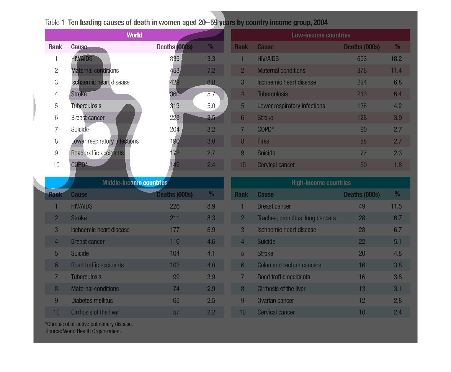
The image depicts the ten leading causes of death in women aged 20-59 years by country income
group in 2004. Country income groups include: World, Low-income countries, Middle-income countries,
and High-income countries. Rankings of common issues globally include: HIV/AIDS, Maternal
conditions, heart disease, Tuberculosis, breast cancer, suicide, lower respiratory infections,
road traffic conditions, and COPD. Source is World Health Organization.
Warning: Image is too big to fit on screen; displaying at 67%
Warning: Image is too big to fit on screen; displaying at 67%
These charts show the ten leading causes of death in women ages 20-59 years old by country
income groups for the years 2004.  The first chart shows deaths in the entire world.  The
other three charts show the deaths for low-income countries, middle-income countries, and
high-income countries respectively.  The ten leading causes of deaths decrease in the high-income
countries.
Warning: Image is too big to fit on screen; displaying at 67%
Warning: Image is too big to fit on screen; displaying at 67%
This chart describes and depicts the ten leading causes of death in women age twenty to age
fifty-nine by country as well as income group and also in the whole world.
Warning: Image is too big to fit on screen; displaying at 67%
Warning: Image is too big to fit on screen; displaying at 67%
The graph to the left is describing the breakdown of the causes of deaths in the world and
then gets more in detail about the income level of a particular group and the types of deaths
that are associated with the particular group.
Warning: Image is too big to fit on screen; displaying at 67%
Warning: Image is too big to fit on screen; displaying at 67%
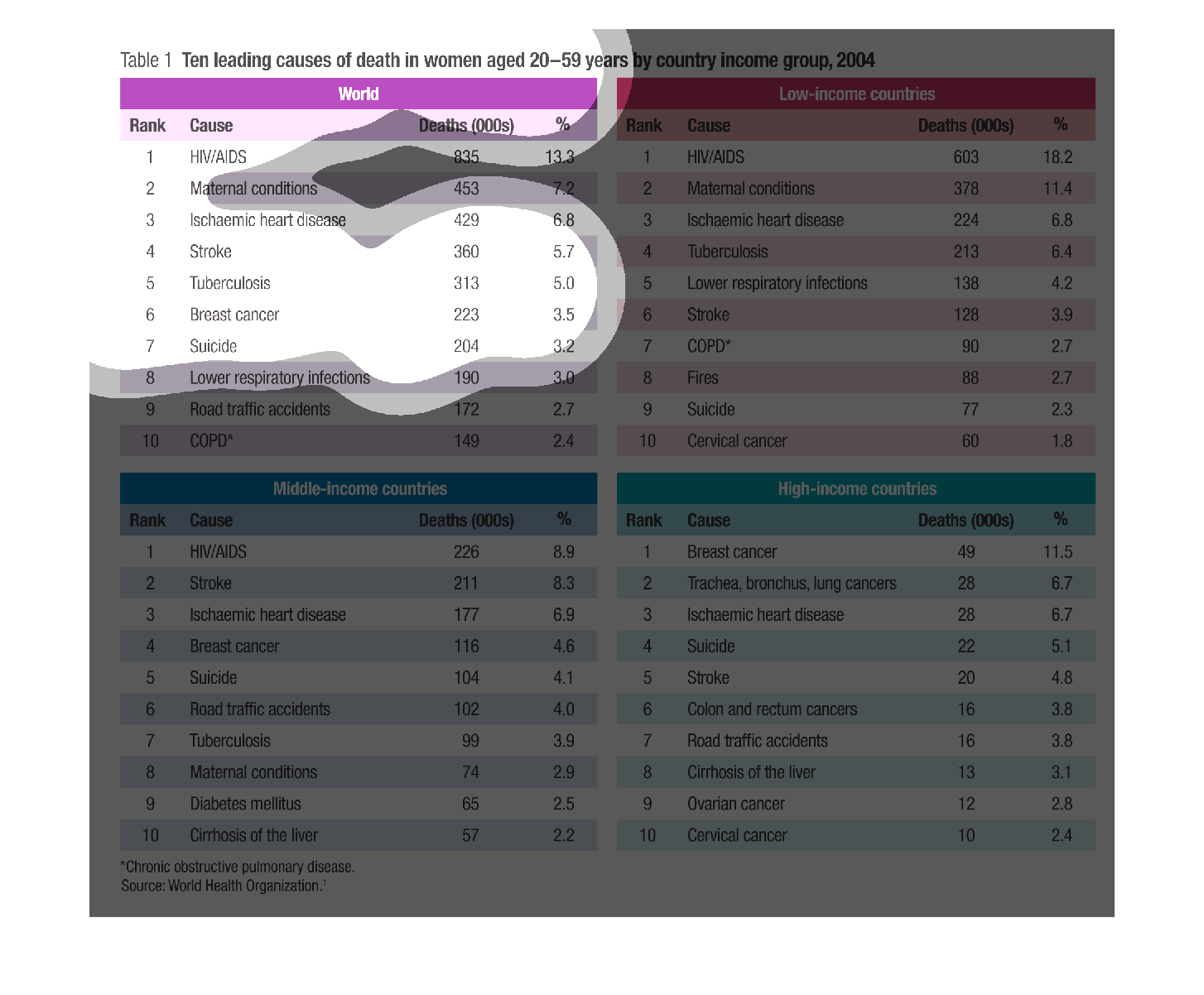
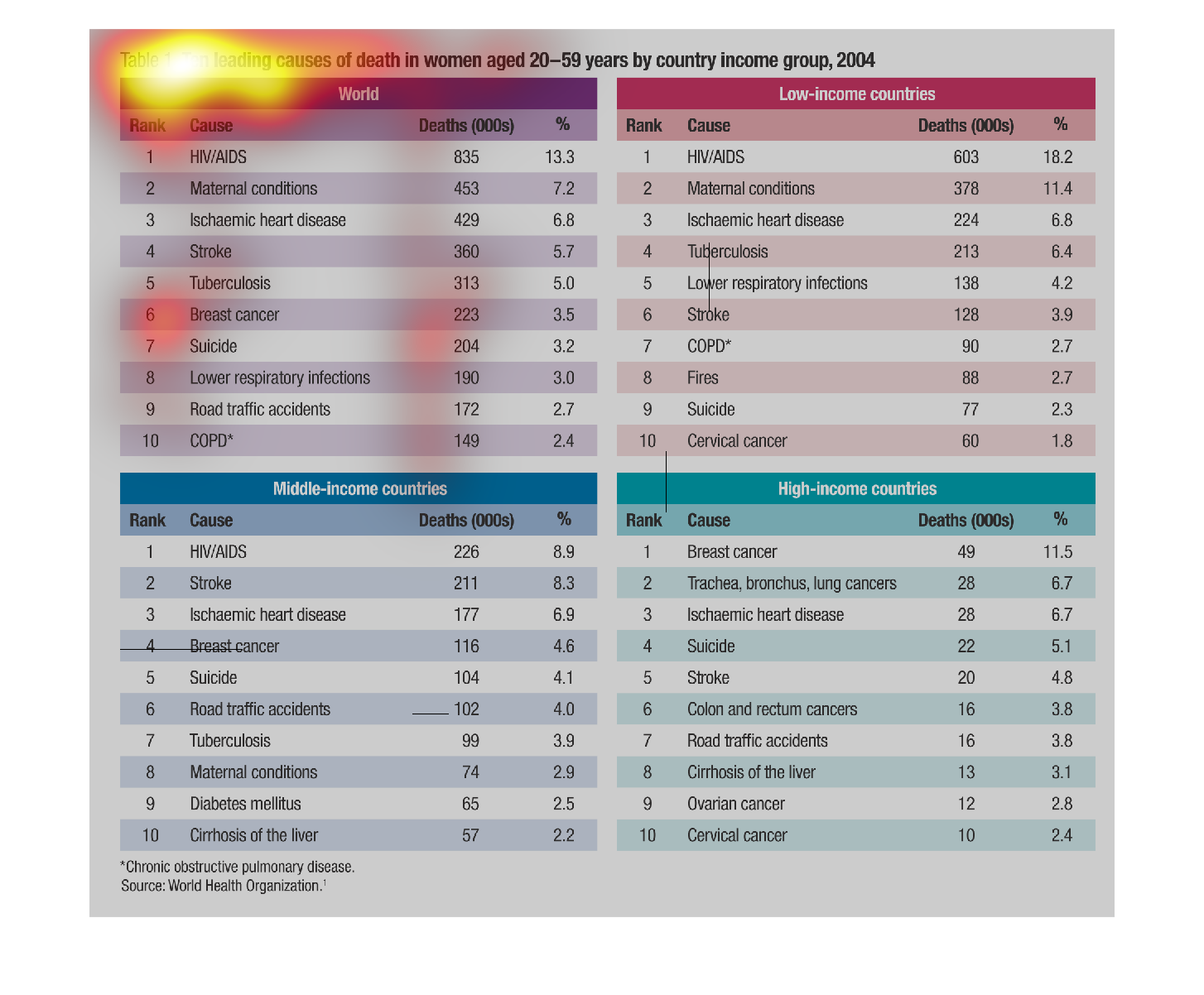
This is a four quadrant based chart that is showing how many deaths per capita low income,
medium income, High income, and World Deaths per capita based on population
Warning: Image is too big to fit on screen; displaying at 67%
Warning: Image is too big to fit on screen; displaying at 67%
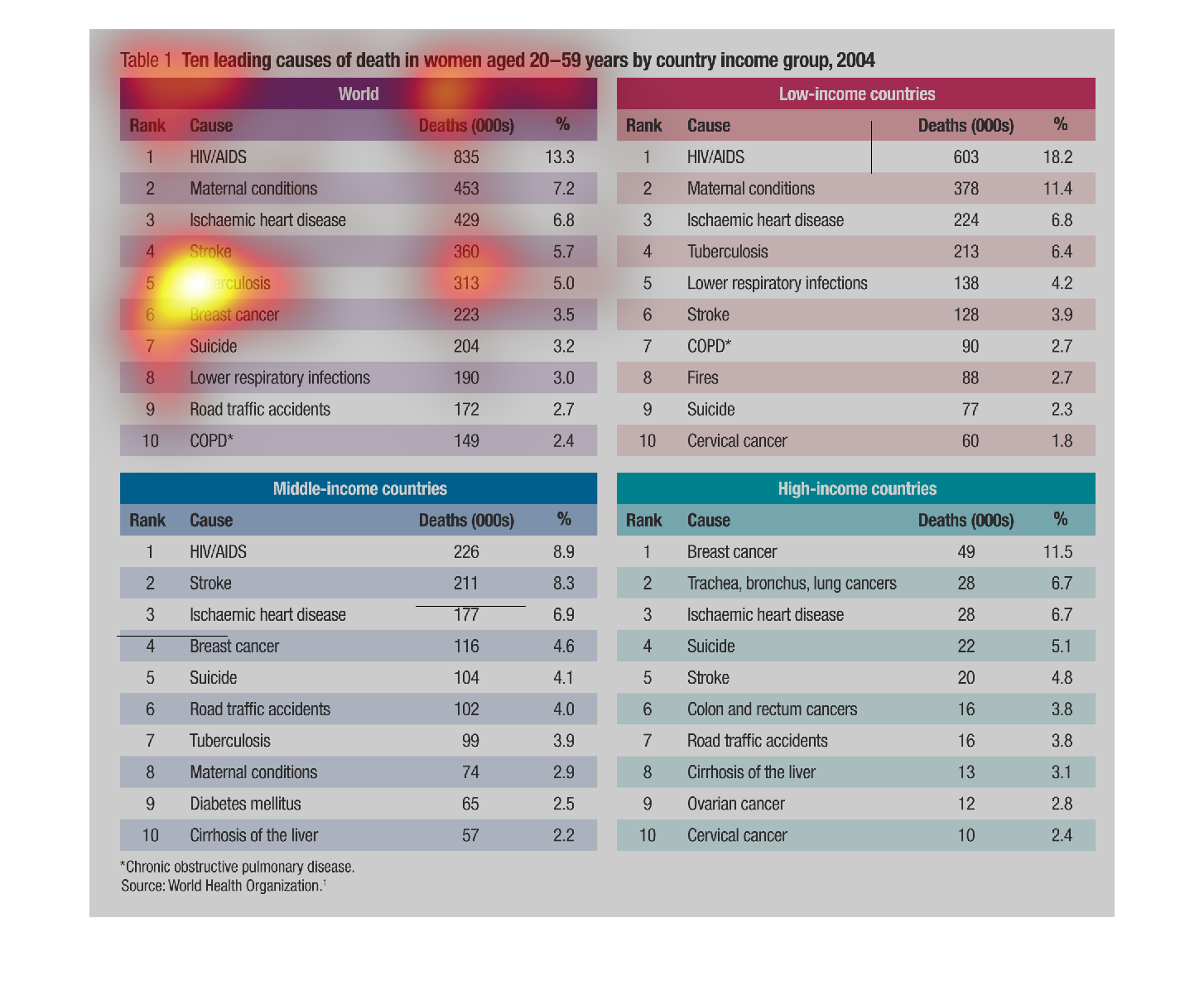
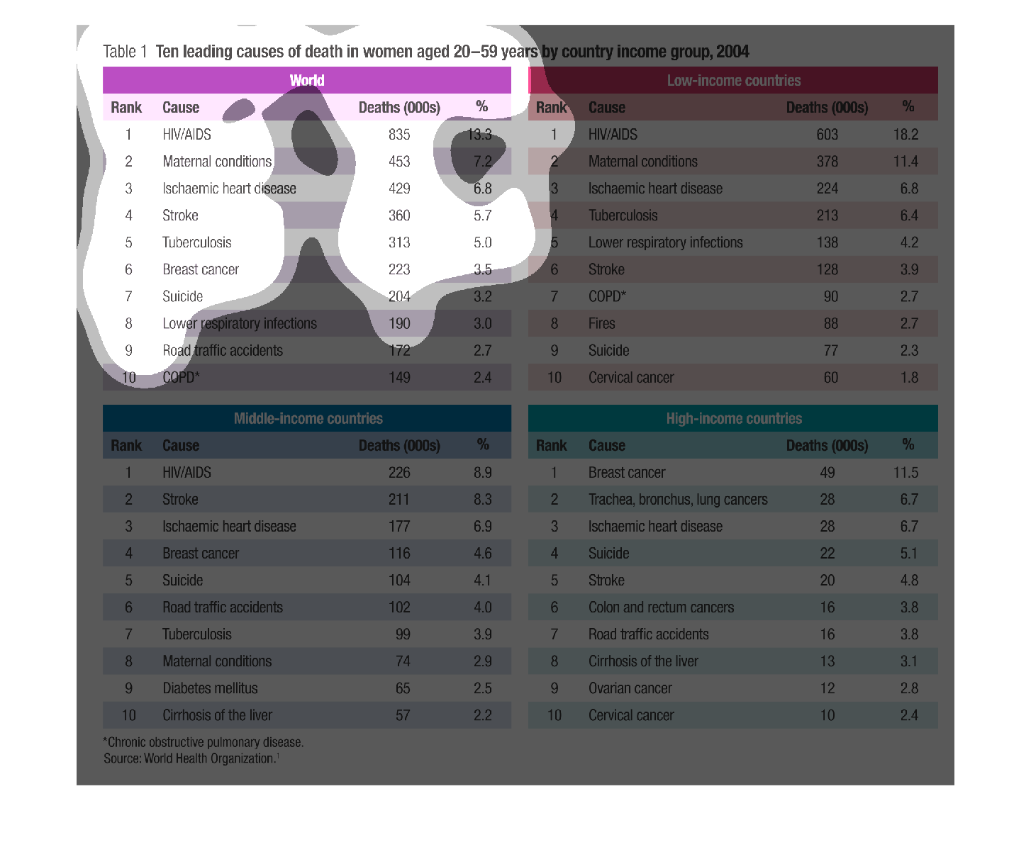
This chart details the 10 leading cause of death in women aged 20-59 years of age.  There
is one chart for women worldwide and 3 other charts for countries split up into low-, medium-,
and high-income. HIV/AIDS is the most common in every chart other than high-income.
Warning: Image is too big to fit on screen; displaying at 67%
Warning: Image is too big to fit on screen; displaying at 67%
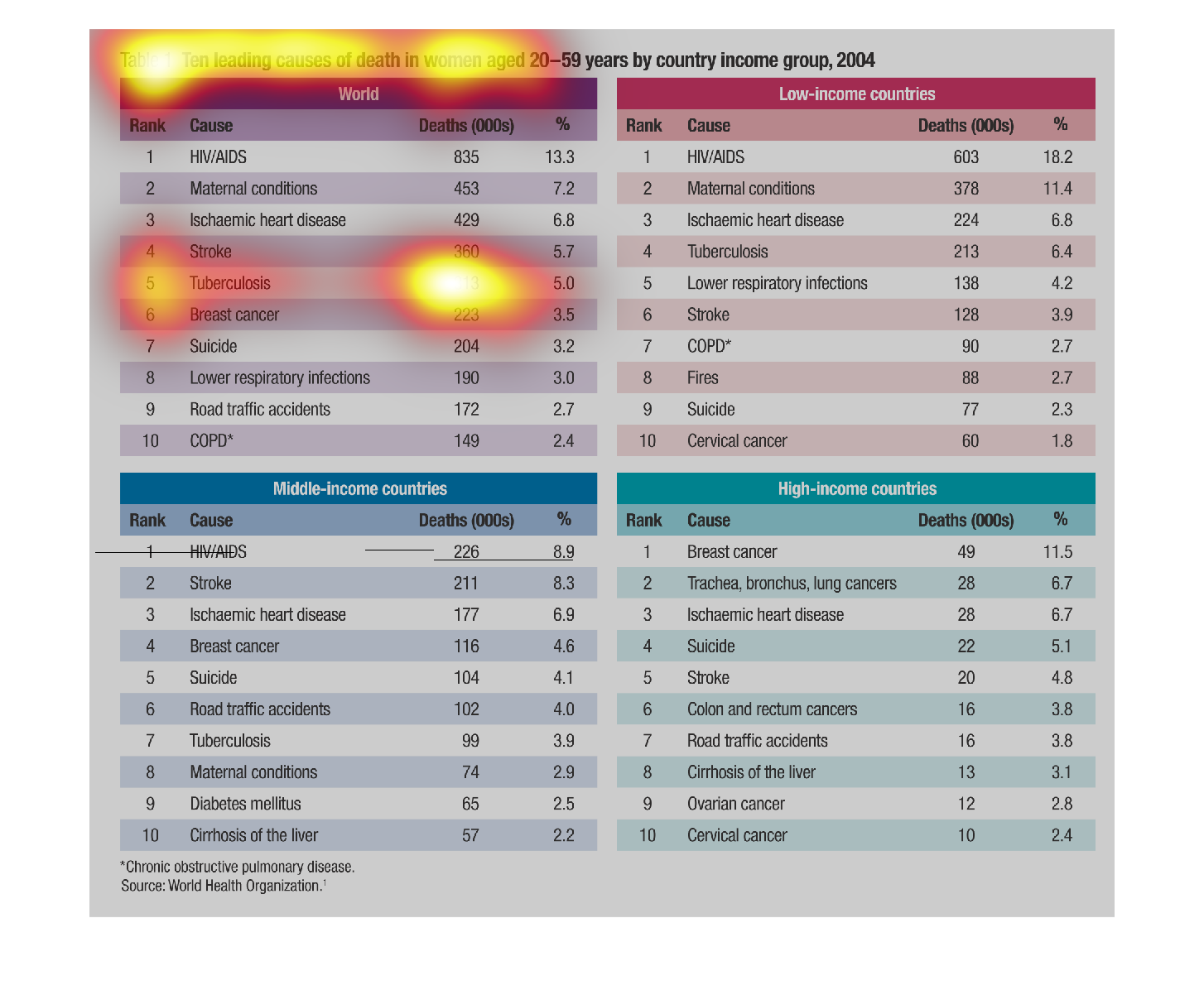
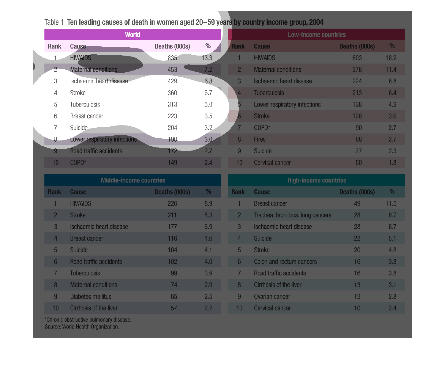
The title for this table is, "Ten leading causes of death in women aged 20-59 years by country
income group, 2004".  This graph is divided into four sections or squares.  The heading for
one of the squares is, "World".  The remaining three squares have the headings: Low income
countries, middle income countries, and high income countries.  Within each of these squares
is the break down of the ten leading causes of death in the stated demographic population
listed above.
Warning: Image is too big to fit on screen; displaying at 67%
Warning: Image is too big to fit on screen; displaying at 67%
AIDS, Malaria, Stroke, Cancer, Tuberculosis are just some of the causes of death afflicting
women from all facets of society, between the rich, middle, and poor classes. Death comes
for us all.
Warning: Image is too big to fit on screen; displaying at 67%
Warning: Image is too big to fit on screen; displaying at 67%
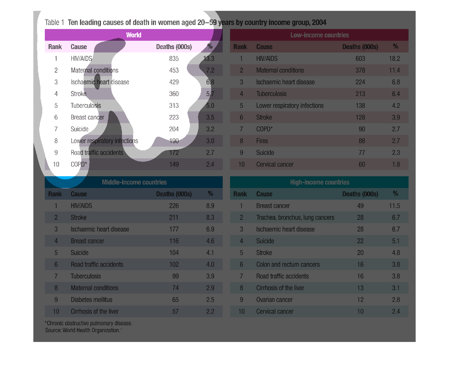
This chart shows the  top ten leading causes of death in women aged 20-59 by country income
group.  Chart 1 shows the leading causes in the world, chart 2 is low-income, chart 3 is middle-income
and chart 4 is high-income groups. Causes include HIV/AIDS, maternal conditions, ischaemic
heart disease, stroke, tuberculosis, breast cancer, suicide, lower respiratory conditions,
road traffic accidents, and COPD
Warning: Image is too big to fit on screen; displaying at 67%
Warning: Image is too big to fit on screen; displaying at 67%