This is a chart that shows the amount of deaseases broken down by country. It shows deaseases
like cancers diabetes the less developed countries have more occrances
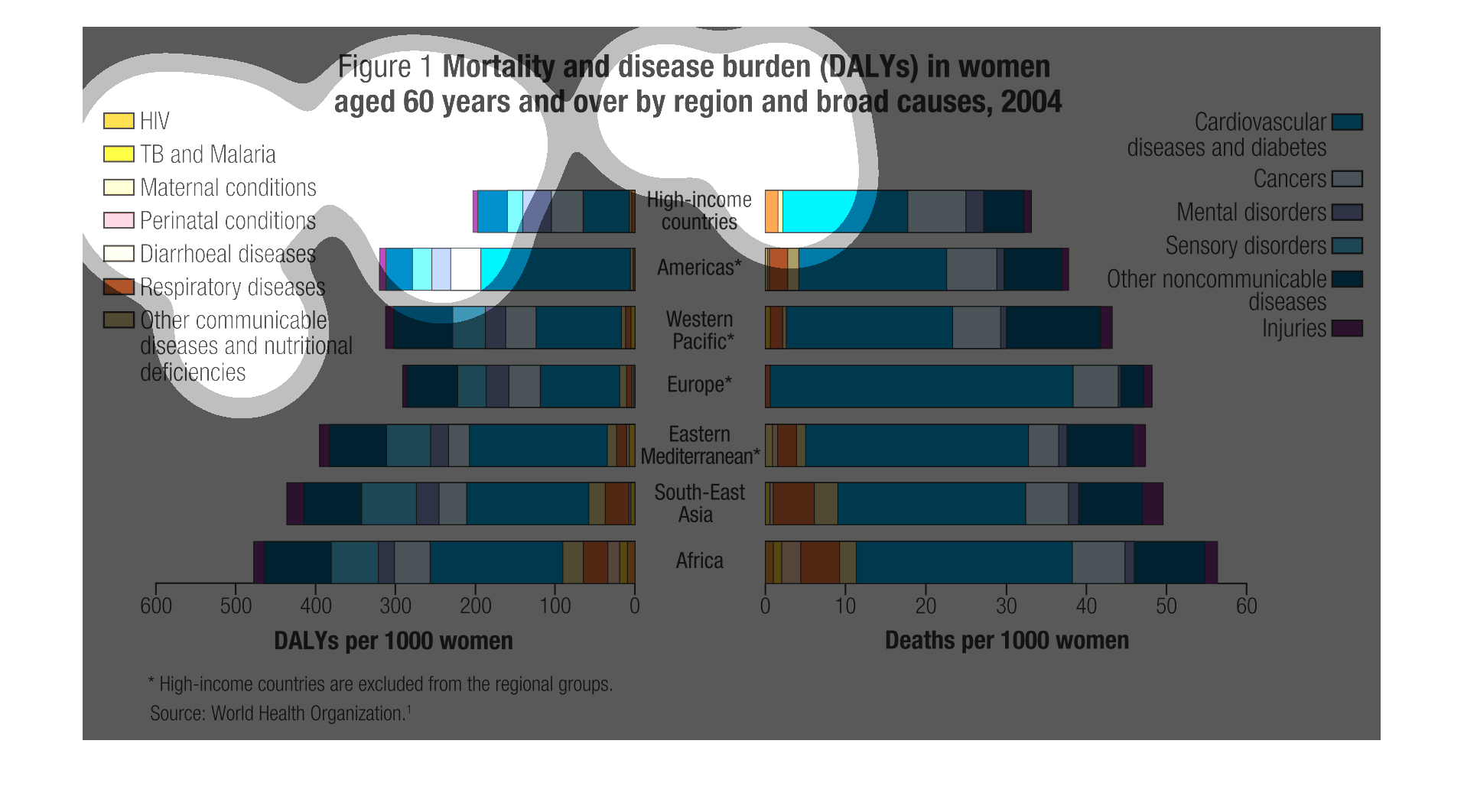
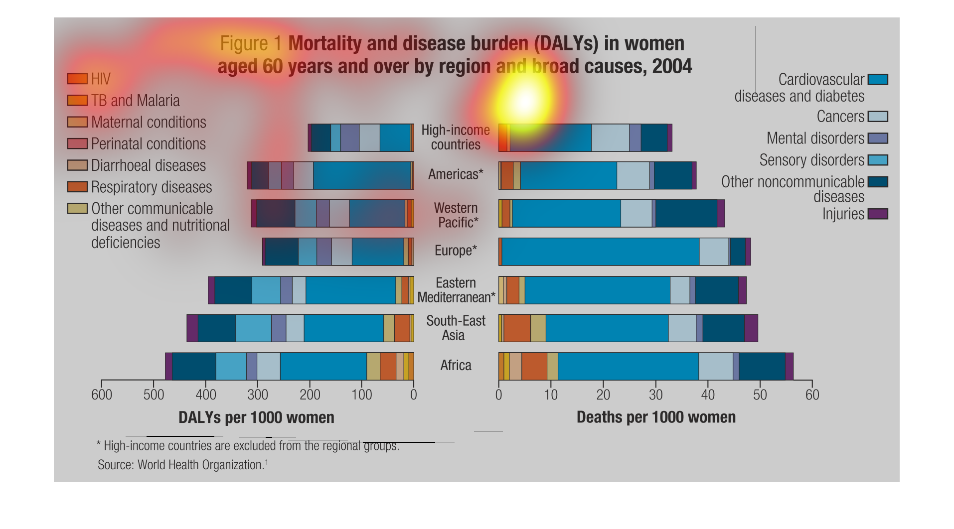
This chart shows the mortality and disease burden for women over the age of 60 in different
regions of the world. The lowest regions are high-income countries and the Americas, where
Africa has the highest burden.
This figure is titled Mortality and disease burden (DALYs) in women aged 60 years and over
by region and broad causes 2004. It shows the statistics of this for different countries.
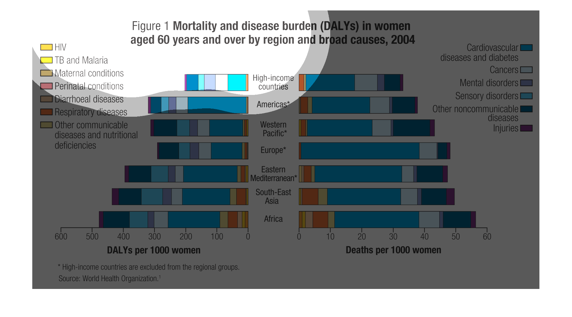
This graph shows mortality and disease burden in women aged 60 years in over in 2004.  It
shows a majority of cardiovascular diseases, communicable diseases, and hereditary disorders.
The following chart shows the leading cuases of death among women in different country. For
example the highest cause of death in Africa is HIV while in America the highest death rate
if from Cancer this is age 60 and over.
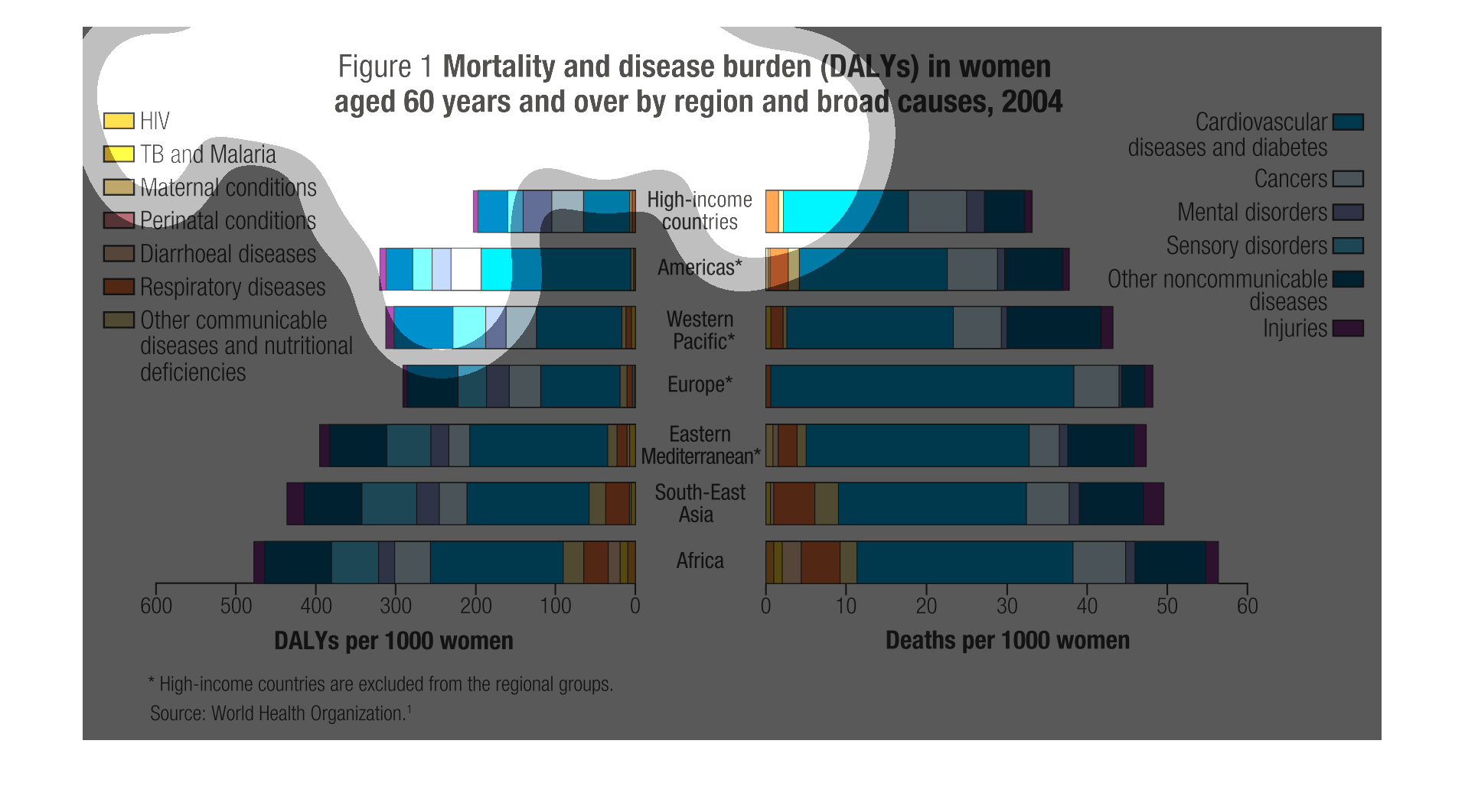
This study illustrates the higher death of disease in low income level women than higher income
ones due to a variety of issues relating to monetary availability.
This shows mortality and disease burden of older women (aged 60) by region and shows that
the cause of mortality/disease is usually HIV in poorer regions as well as cardiovascular
disease in more wealthy/developed regions.
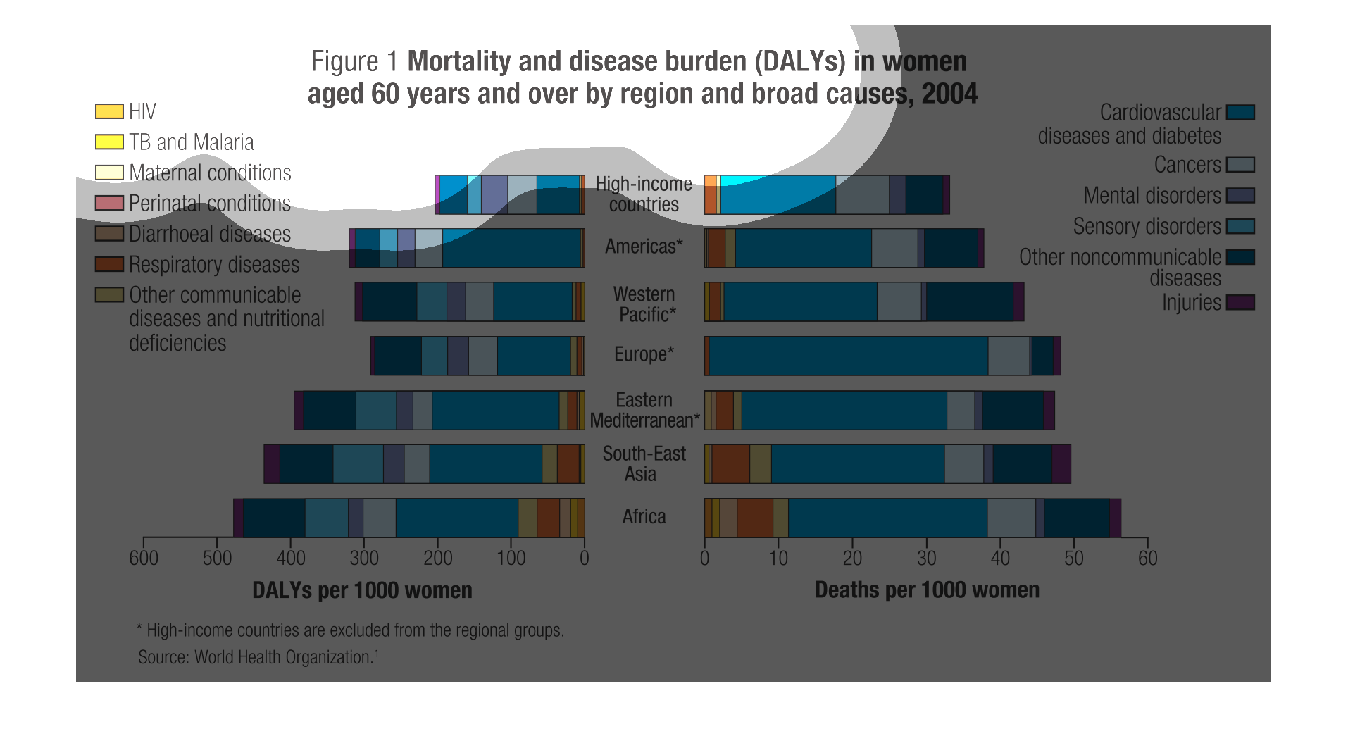
This graph shows disease burden and death rate broken down by type of disease (HIV, cancer,
TB, mental disorders, etc) and geographic region in 2004, for women age 60 and over. In all
regions, cardiovascular disease plus diabetes accounts for the greatest portion of morbidity
and mortality. HIV was responsible for many more deaths in Africa and Southeast Asia than
in the Americas, Europe and the Eastern Mediterrean. Overall morbidity and mortality were
lowest in the Americas. Suprisingly, Europe, Eastern Mediterrean and Western Pacific were
not very different. Unsurprisingly, Africa had the highest rate of both morbidity and mortality.
The caption for this graph is, "Mortality and disease burden (DALYs) in women aged 60 years
and over by region and broad causes, 2004".  Down the center of the graph is a list of geographic
regions.  On either side of this list are bar graphs that extend to reflect the data captured
about the total deaths of the woman from these different regions around the globe.
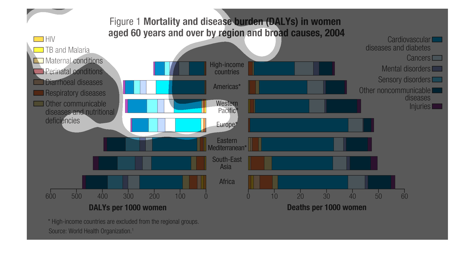
This chart describes mortality and disease burden in women aged 60 years and over by region
and broad causes. Causes include HIV, TB and Malaria, and Maternal conditions.
This chart is displaying the mortality and disease burden of women around the globe aged 60
and older. Most deaths in various regions are caused by cardiovascular disease, diabetes and
cancers.
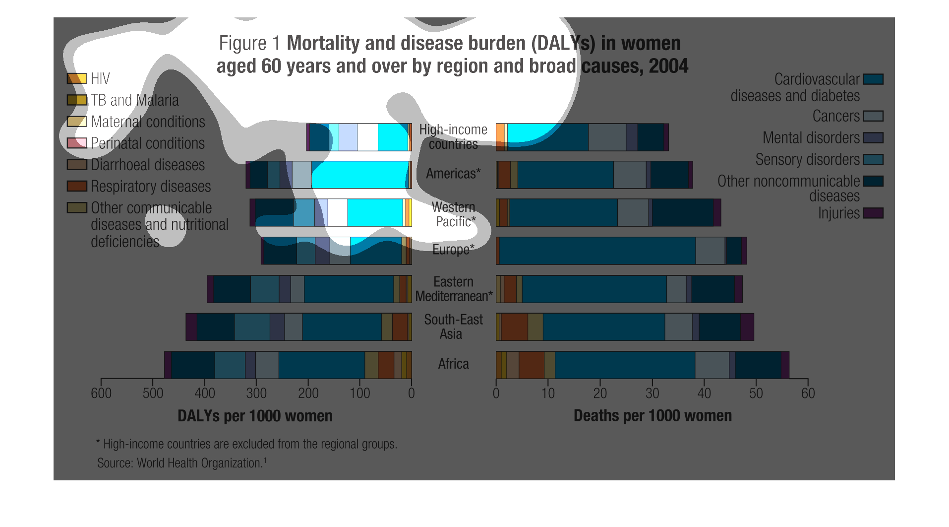
This graph is composed of two sub-graphs. It shows the mortality and disease burden in women
aged 60 and above, by region and broad causes of the mortality. On the left hand side, the
graph, using horizontal bars represents with the different colors the different kinds of diseases
and the amount of women per 1000 women that have that disease (read on the horizontal axis)
in a particular region (regions are divided by income as well). On the right hand side we
have a bar graph that shows how many women per 1000 have died as a result of a disease in
a particular region.
In this graph it shows the rates of deaths and diseases in women over 60 from around the world.
As women reach 60 the highest rate of disease in women appear to be cardiovascular and diabetic
diseases in women across many demographics. While in lower income places such as Africa there
still is a higher prevalence of HIV affecting individuals than in higher income countries.