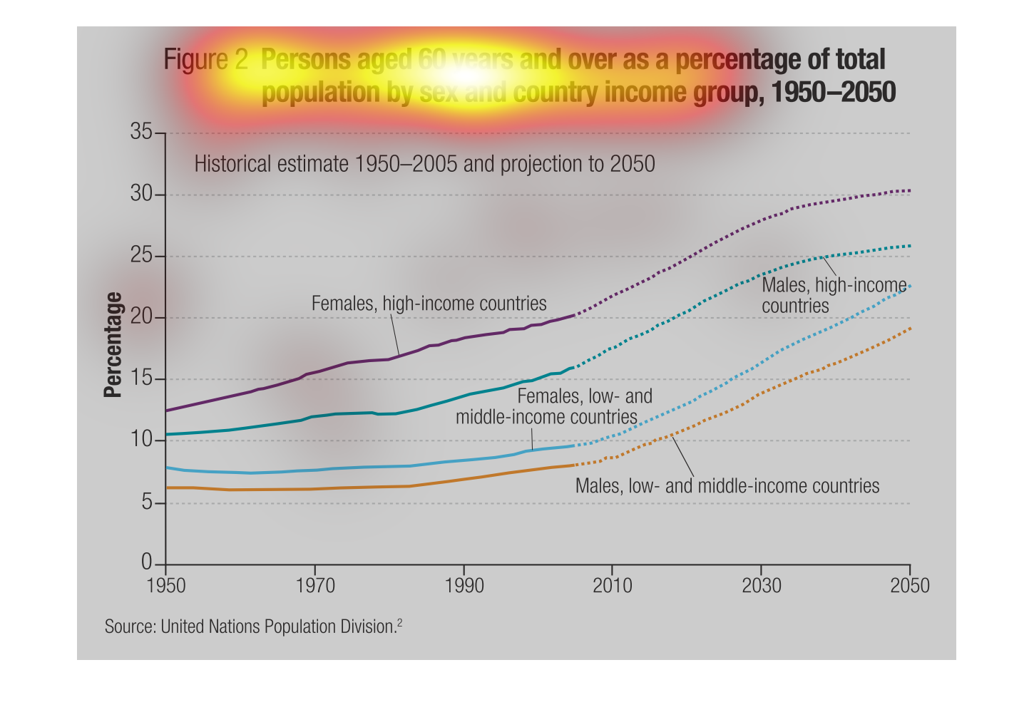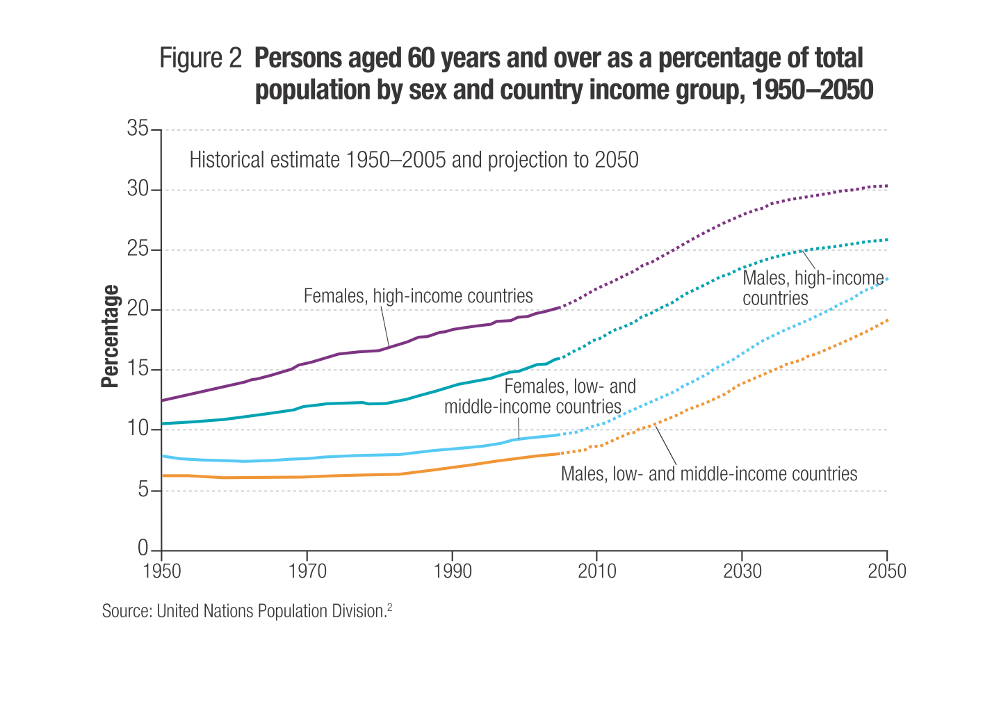
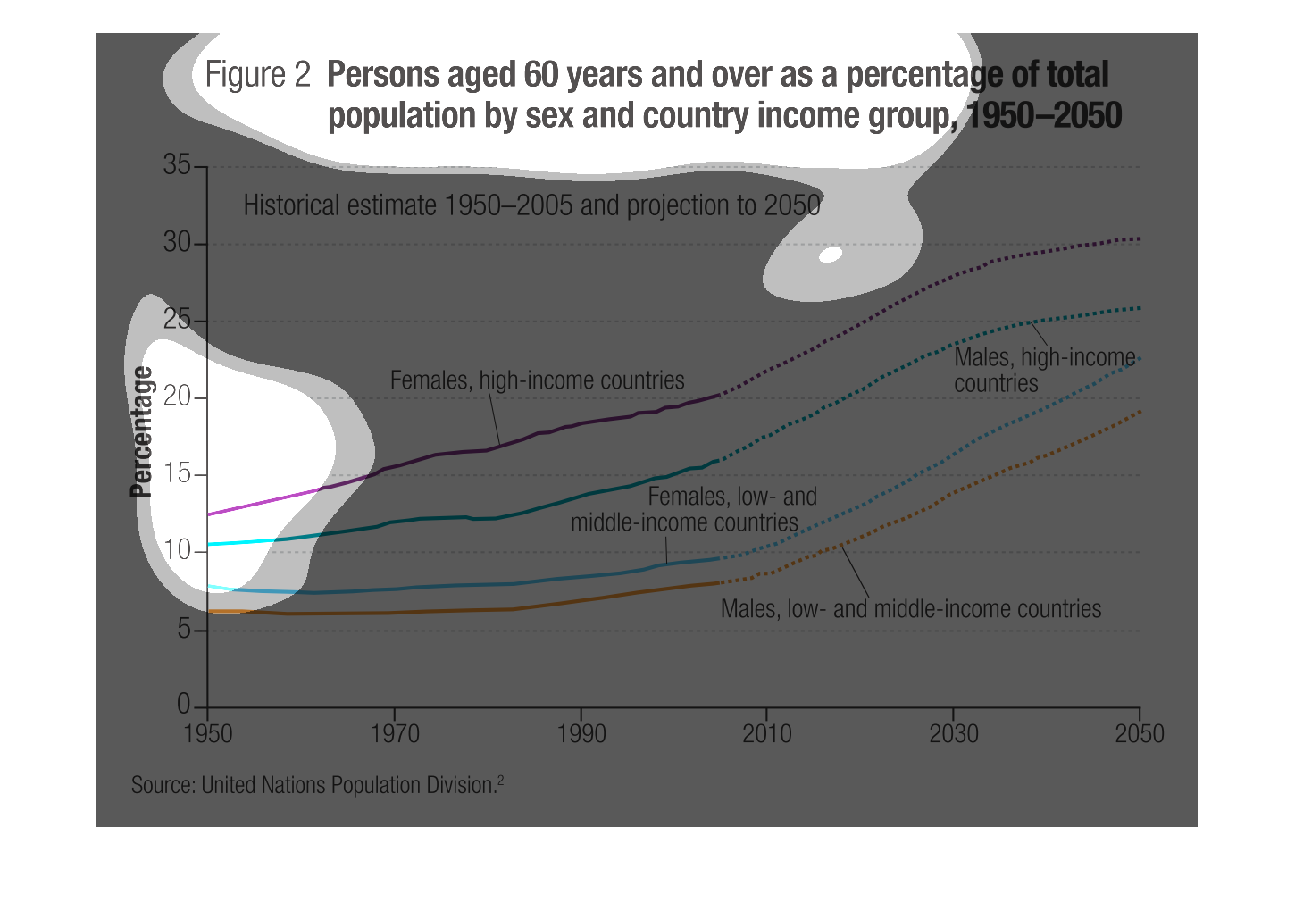
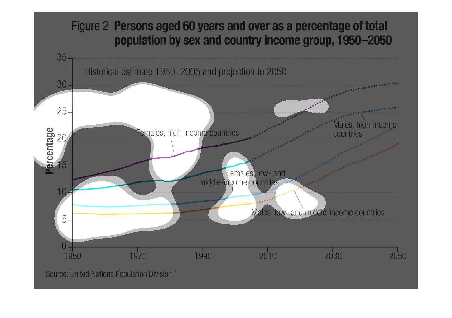
This graph shows the percentage of persons 60 years of age and older as a percentage of the
total population between the years 1950 and 2050. The persons are grouped by sex (female and
male) and income level (low-, middle-, and high-income countries). The percentage has increased
over time for all groups and is projected to continue to increase. Regardless of income level,
men make up the smallest population percentage. High-income women make up the largest percentage,
and women in low- and middle-income countries fall in between.
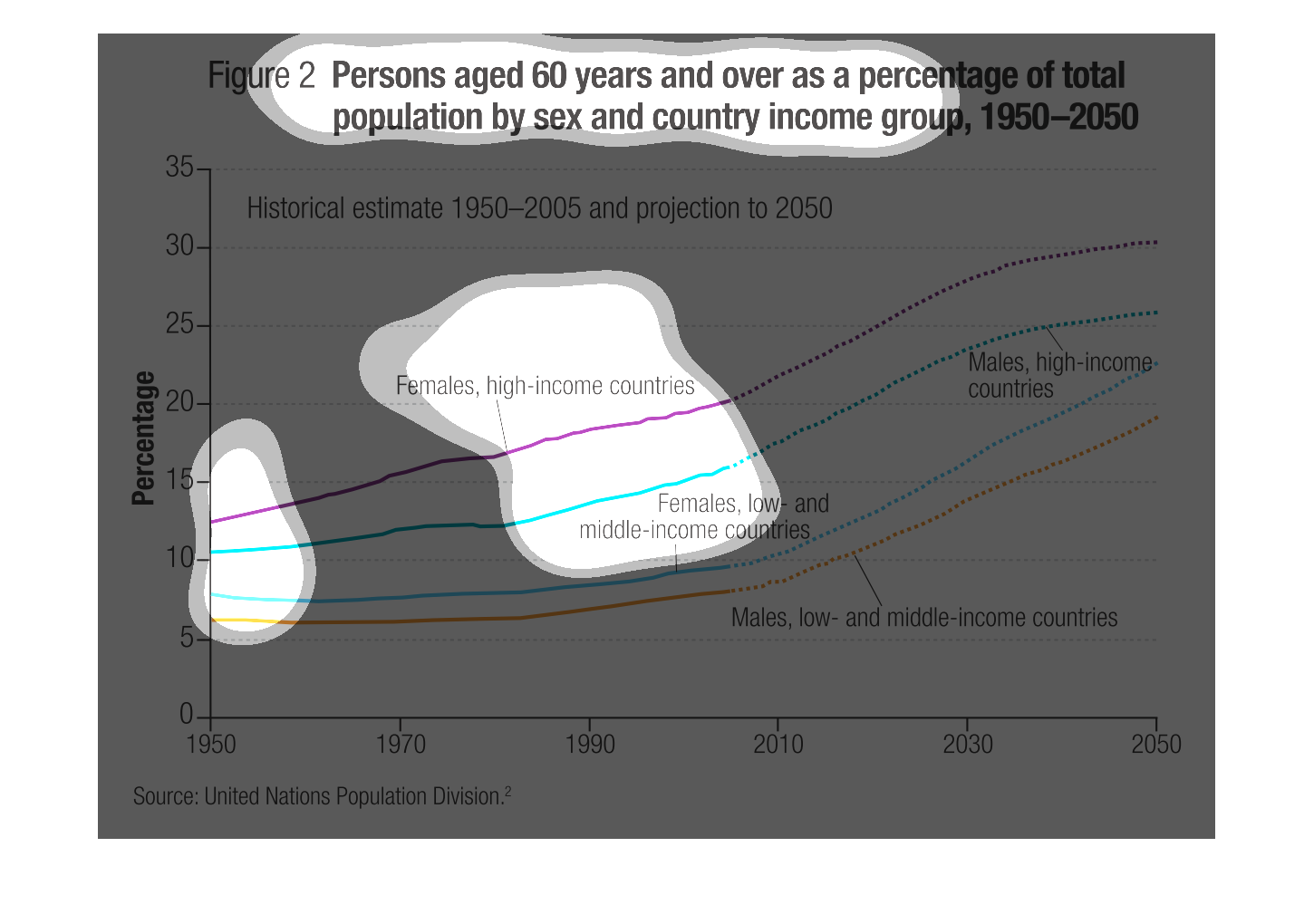
This chart shows the fraction of the population that is over 60 by country and income group,
from the years 1950-2050. Older people will make up about 30% of the populations of well-off
countries in the future, compared to 1950 when they comprised less than 10%. Women will continue
to predominate among the elderly in all countries and categories.
The chart displays the percentage of total population of persons age 60 and over by sex and
country income group between 1950 and 2050.  Females are a higher percentage than males in
both incom groups.
This is an image depicting the percentage of people over the age of 60 between the years of
1950 and 2050, separated by sex, country & income group where future dates are projected values.
I could not find a key for this graph, but each line is labeled as to what group it represents.
Females, high-income countries increase the most in percentage of the population until 2050.
There is a steep increase in all categories when the estimation begins (as indicated by a
dotted line) - which leads me to believe it's an over estimation since it's uniform across
all groups. Near 2050, both genders of high-incomes appear to taper off whereas the low-income
groups continue to increase.
This chart shows the proportion of seniors by sex and high vs low-income countries. Females
in high-income countries rank the highest, followed by males in high-income countries, then
females and males in low-income countries. Evidently females are more prevalent than males,
and all people from high-income countries are more prevalent than low-income ones.
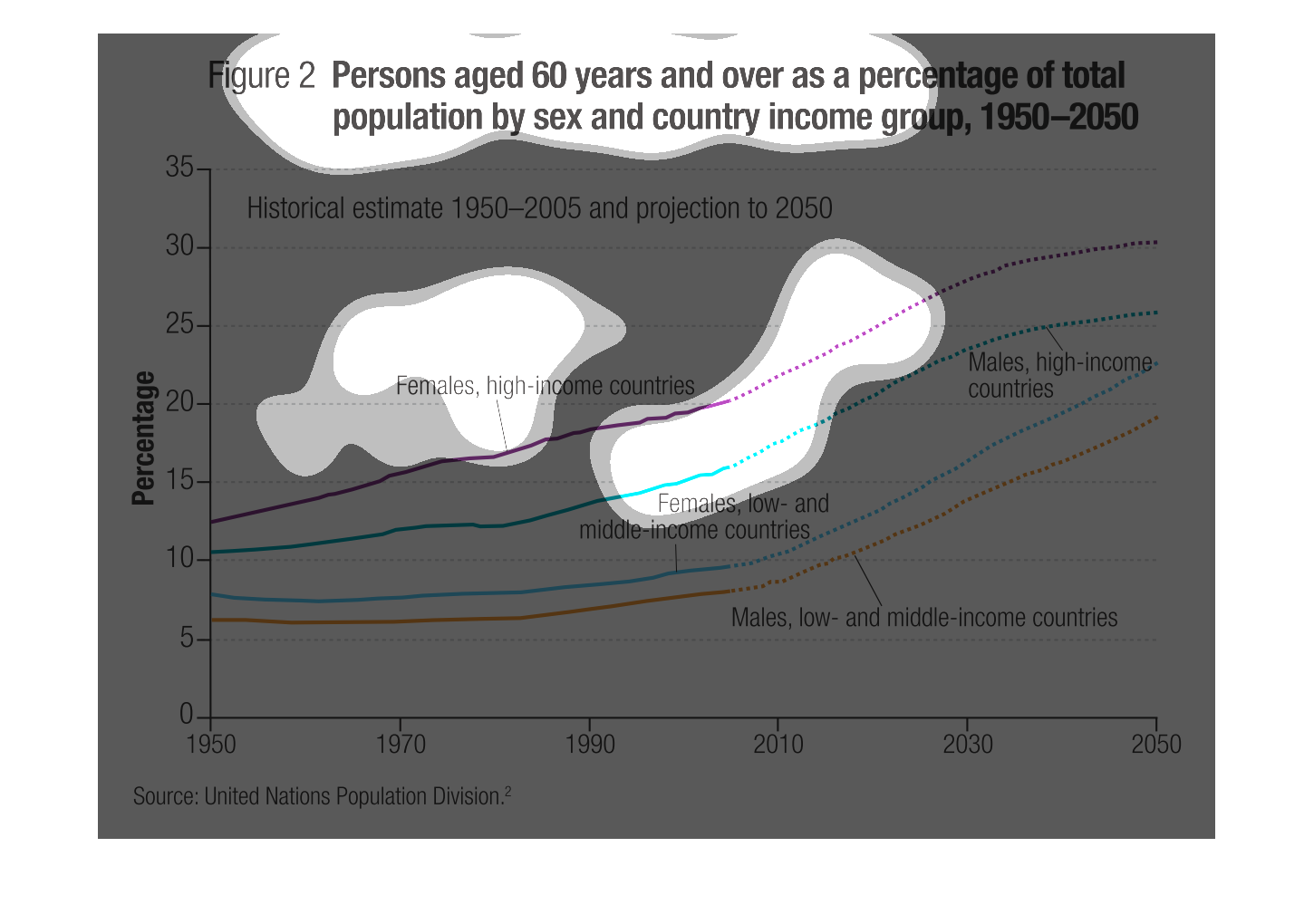
This graph illustrates persons age sixty years and over as a percent of the total population
by sex and country and income group from the years 1950 to 2050.
This handmade chart shows the total population around the world that are older than sixty
as it has changed from 1950 to 2050. Other than that the data makes no sense
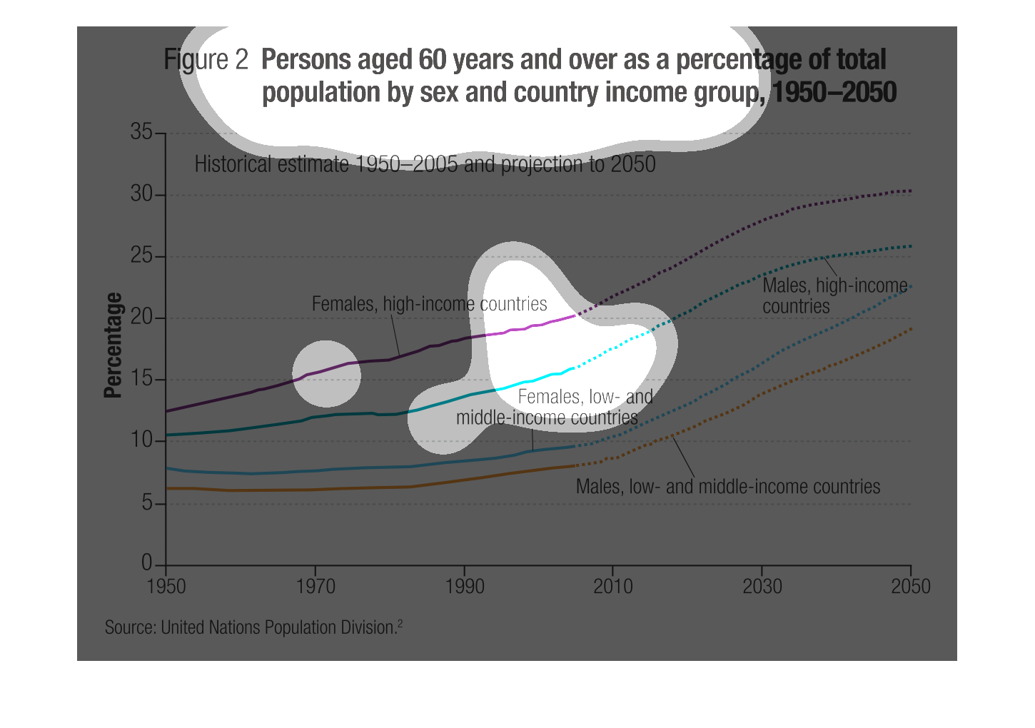
Figure 2 shows persons aged 60 years and over as a percentage of total population by sex and
country income group, 1950-2050. Populations will increase over time, much higher among the
wealthy and slower overall increase among low income.
This is a graph of people aged 60 years and over as a percentage of total population by sex
and country income group in the years of 1950-2050.  A lot of females in high income aged
60 and over
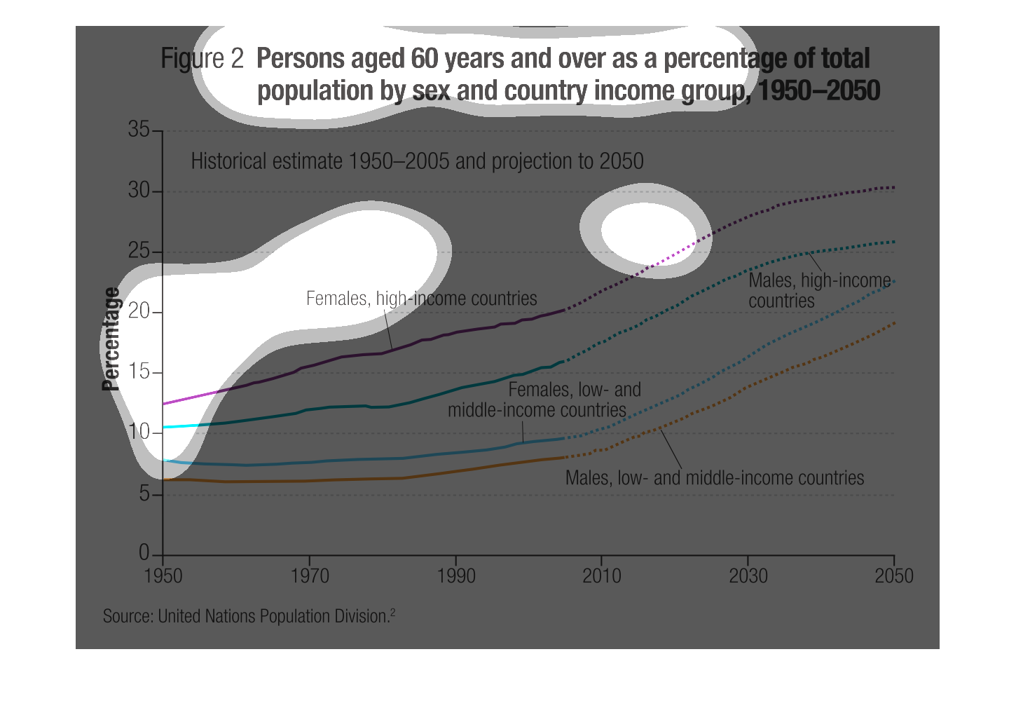
figure 2, persons aged 60 years and over as percentage of total population by sex and country
income group 1950 through 2050. Y axis shows percentage 0-35, x axis shows years. a steady
predictable increase is shown regardless of variables
This is a graph of the percent of high and low income people throught the years, going back
to 1950. It is separated by high income, low income and male and female.
This line graph shows persons aged 60 years and over as a percentage of total population by
sex and country income group from 1950- projected 2050. It is broken down into males with
high income, males with high and middle income, females with low and middle income and females
with high income.
This chart describes persons age 60 and over percentage of total population by sex and country
income groups. The years include 1950 and projection of 2050.
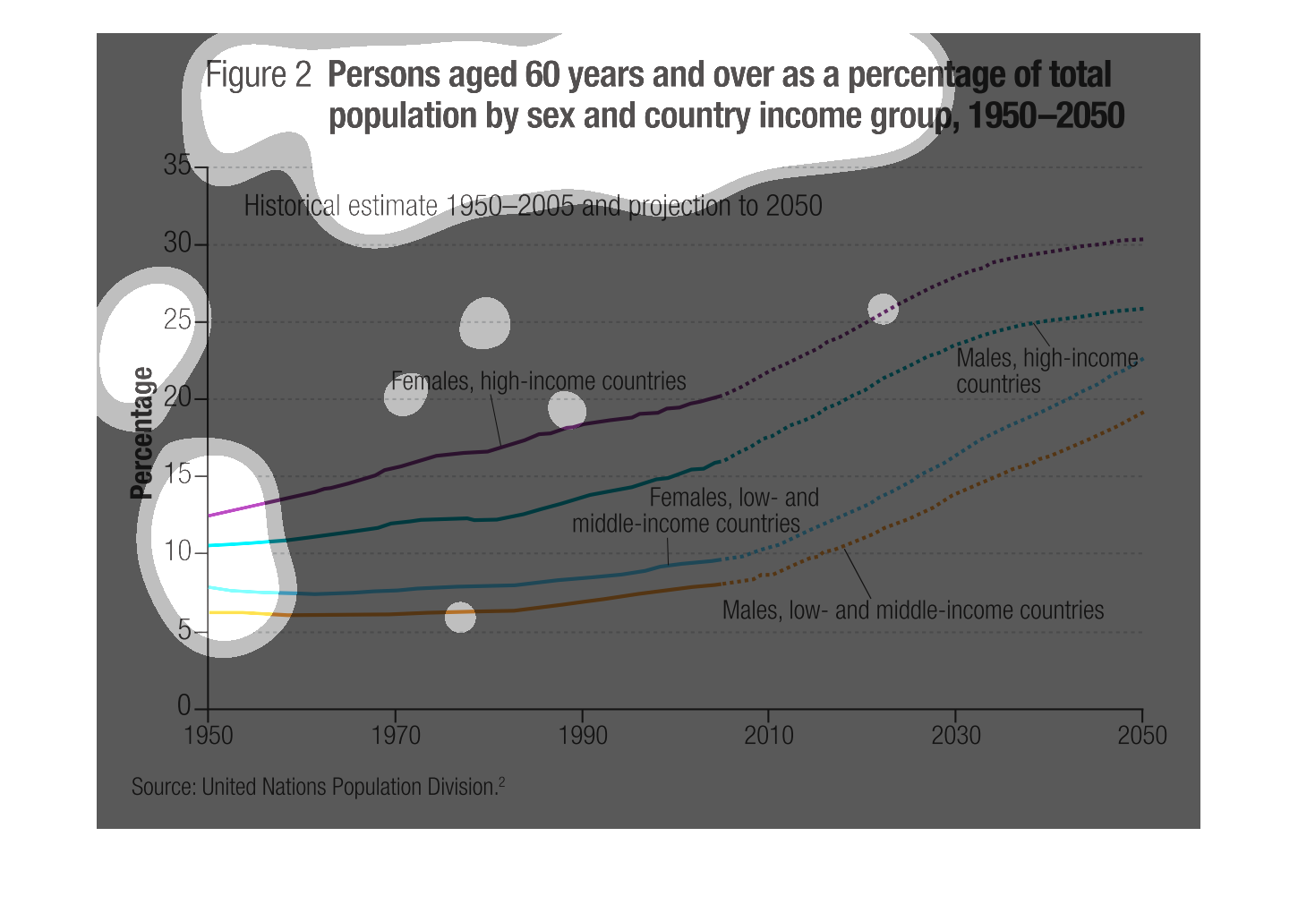
This informational image regards persons aged 60 years or older as a percentage of total population
by sex and country income group (1950-2050). The graph represents an increasing relationship.