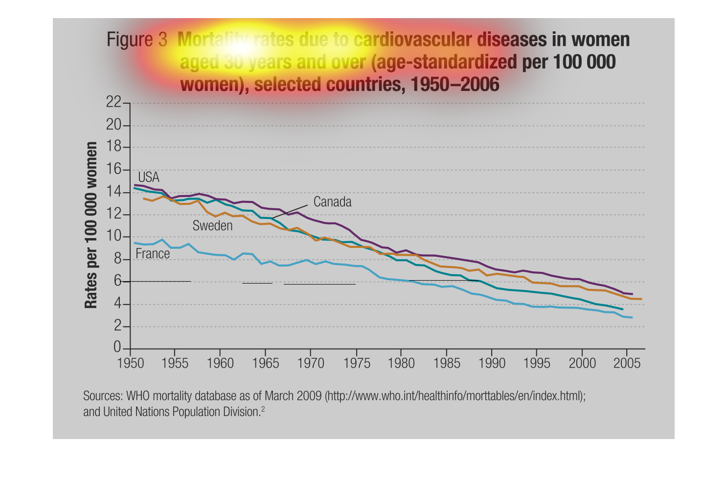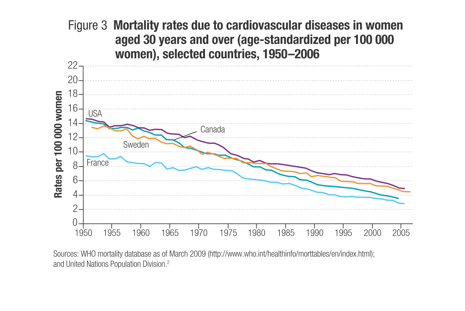
USA is a Highest mortality rate of Women due to cardiovascular disease by 1950's but they
lower by at 2005 because Americans cure by technologies and other operations
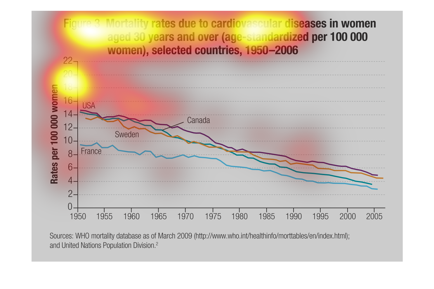
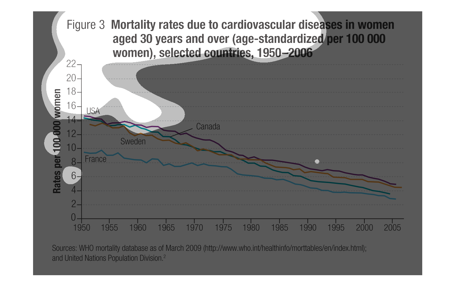
Mortality rates due to cardiovascular disease in women aged 30 years and over (age- standardized
per 100,000 women, selected countries, 1950-2006). Sources are WHO and United Nations Population
Division.
The chart depicts the decline in the amount of cardiovascular deaths in women between 1950
and 2005. There are multiple lines for countries but is too difficult to really interpret
through bubbles.
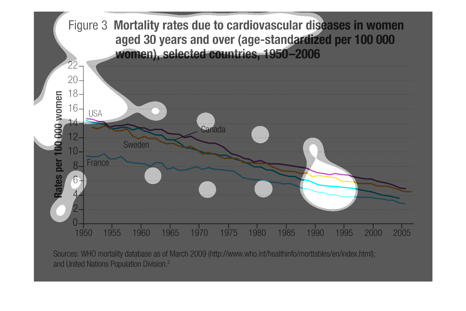
This graph shows the mortality rates of cardiovascular disease in women, aged 30 years and
older, from 1950 to 2006. The vertical axis denotes rates per 100k women, and the year scrolls
along the horizontal axis. The data is a series of color coded lines representing different
countries.
This handmade chart shows the mortality rates of women under thirty who suffer from cardiovascular
related diseases. It shows how it has dropped over time
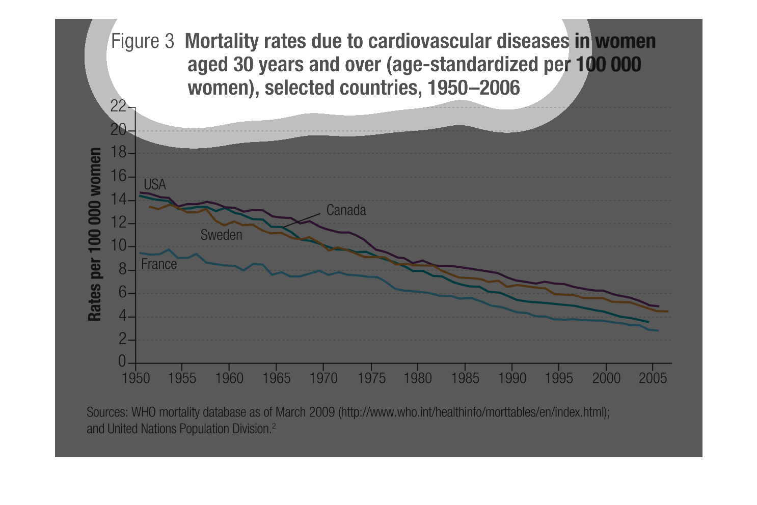
The  3 Mortality rates due to cardiovascular diseases in women aged 30 years and over( age-standardized
per 100,000 women, selected countries, 1950 - 2006.  The data is from the WHO study dated
March 2009.  On the graph we see US, Sweden, Canda, and France.  All of the countries show
a deceasion mortiality rate as the years approach 2006.  France has the lowest mortilaty rate
but the other countries get closer's to the France number, and the years progress.  The US
has the highest mortality rate of all the countries throughout the years.
The graph depicts the mortality rates pertaining to cardiovascular disease in women aged thirty
and over, from 1950-2006.  The graph does not capture global numbers only numbers from specific
countries per 100,000 women, focusing on the following countries:  United States, France,
Canada, and Sweden.
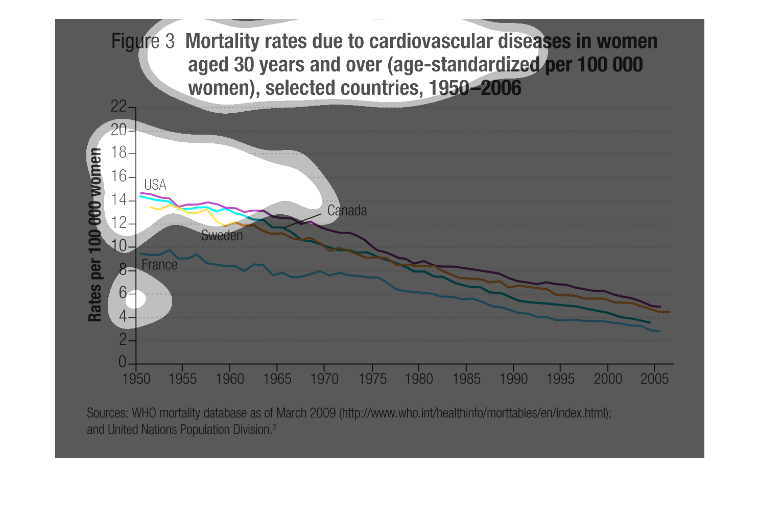
This is a chart depicting the mortality rates due to cardiovascular diseases in women aged
30 years and over in selected countries in the years 1950-2006.
The figure presented is titled Mortality rates due to cardiovascular diseases in women aged
30 and over (aged standardized per 100 000 women),  selected countries.
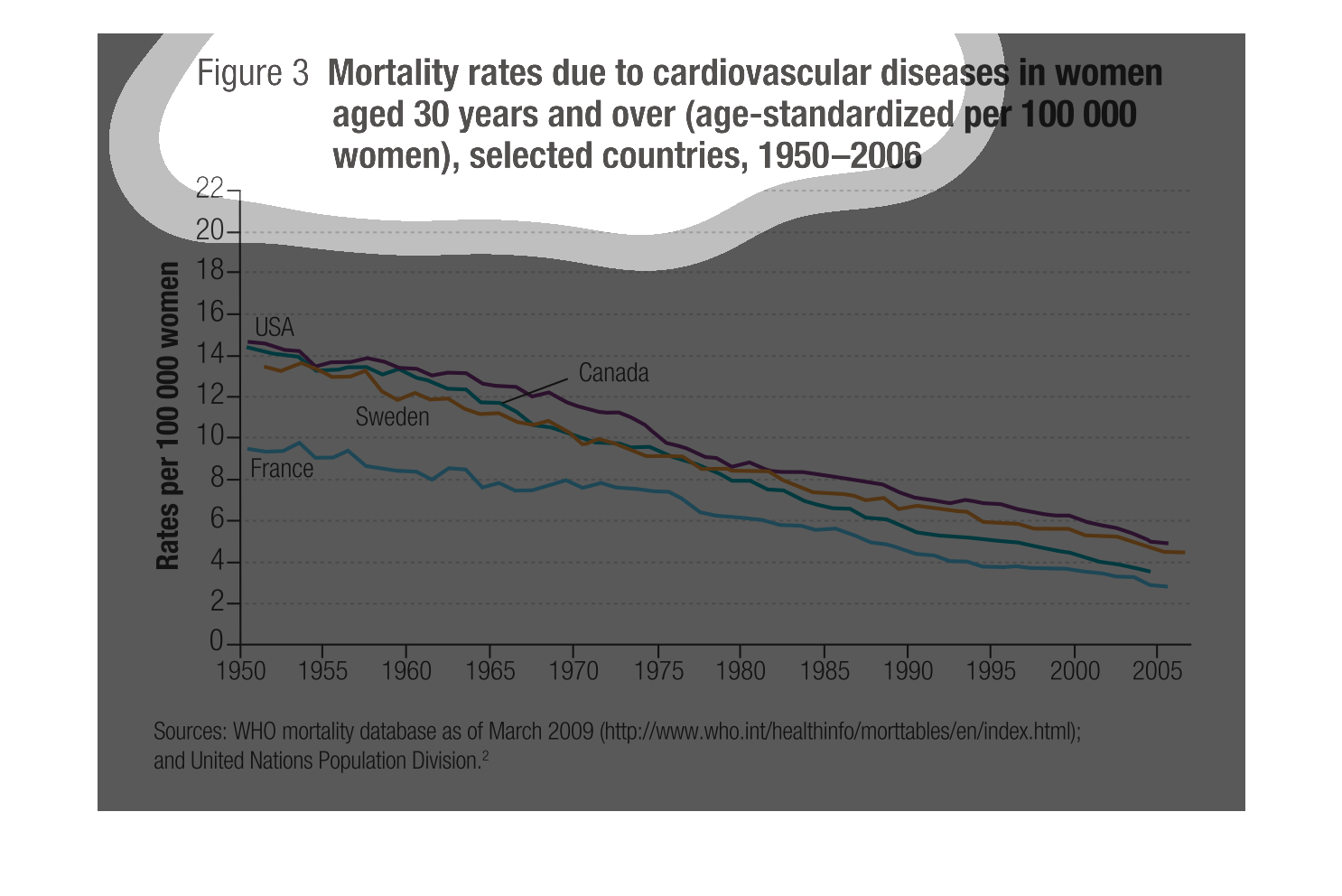
This graph details the mortality rates for women who suffer from cardiovascular disease, aged
30 or older. This graph covers the years between 1950 and 2006. The left side signifies rates
per 100,000 women and the bottom signifies the year. There are lines for France, Sweden, USA,
and Canada.
This chart shows the death rates in women due to cardiovascular diseases. It is for women
30 years and over (per 100,000) and spans form the years 1950 to 2006. It seems only 1st world
contries were included in the study.
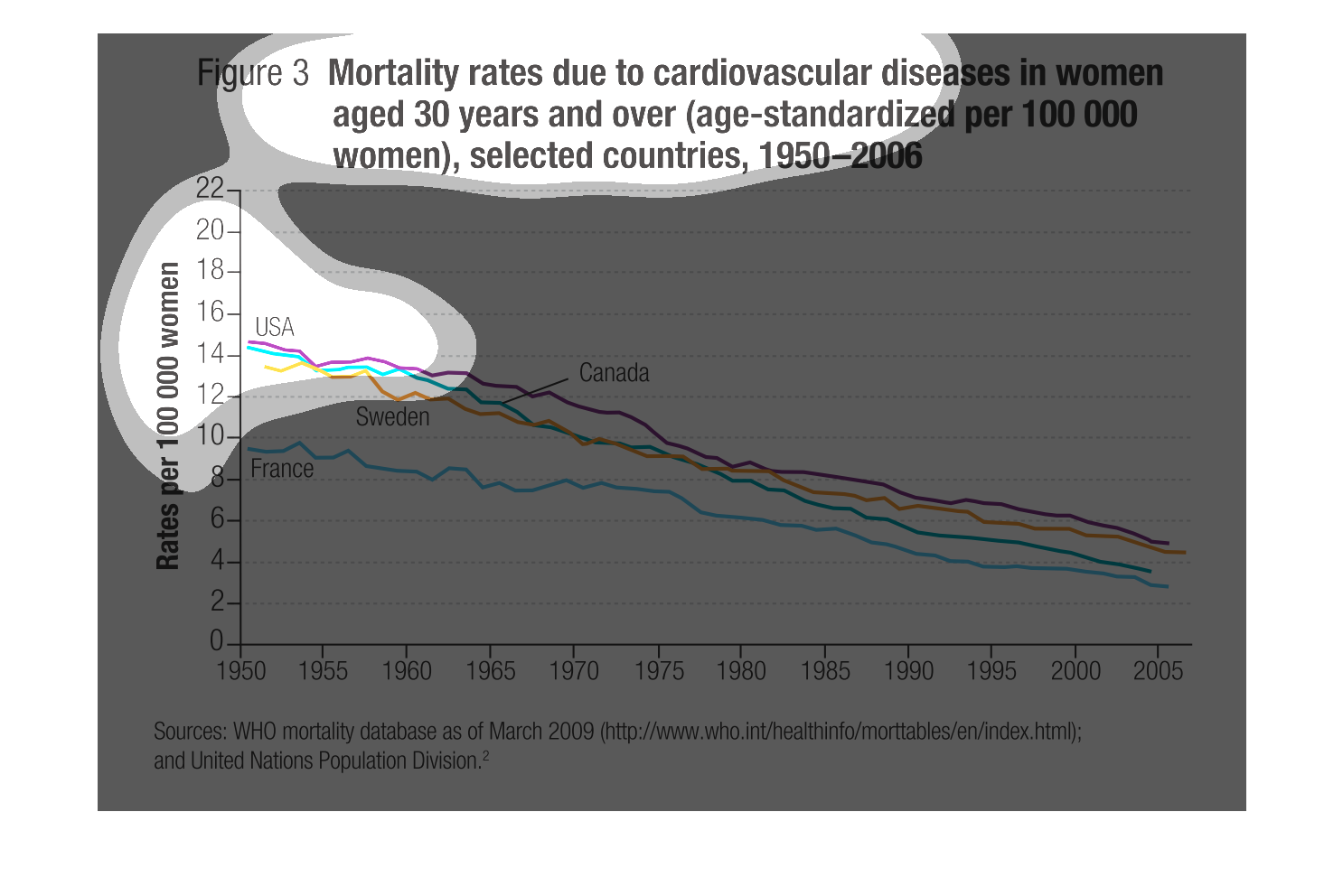
The figure presented is titled Mortality rates due to cardiovascular diseases in women aged
30 years and over (age-standardized per 100000 women), selected countries, 1950-2006.