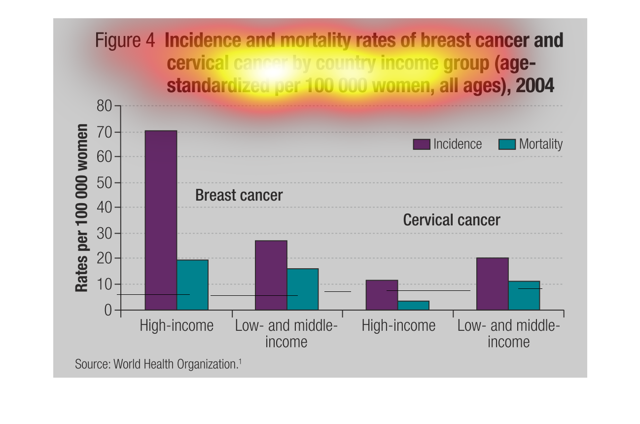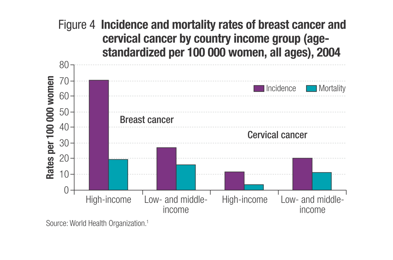
The bar graphs show incidence and mortality of breast cancer and cervical cancer by country
income group (age- standardized per 100000 women, all ages), 2004.
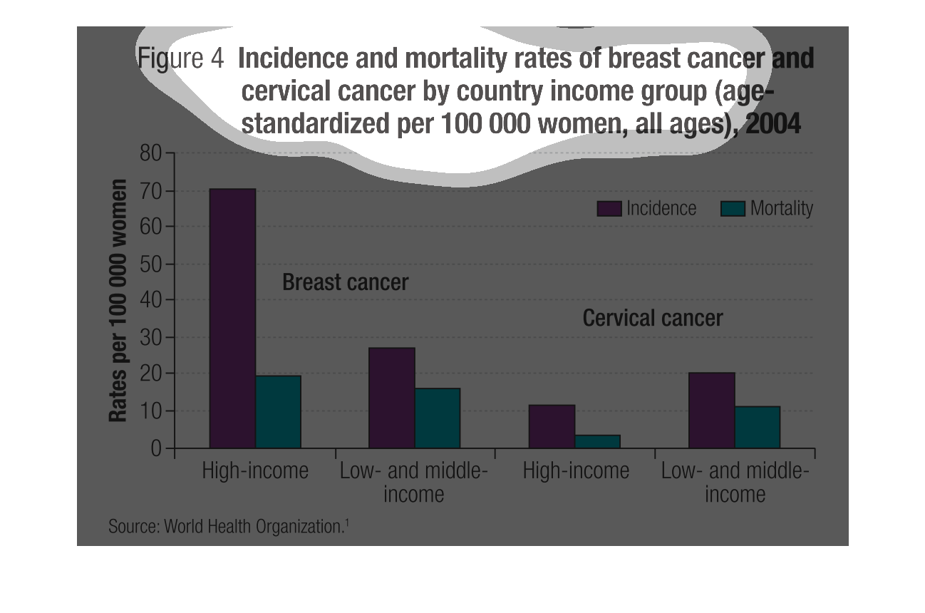
This graph illustrates the incidence of breast cancer and cervical cancer by country, income
group, and age group in 2004.  It measures both incidence and mortality for both cervical
and breast cancer.

This chart displays the incidence and mortality of breast and cervical cancer by country income
group. It shows that the incidence of breast cancer in high income countries is dramatically
higher than low income, although the mortality is only slightly higher. However, the incidence
& mortality of cervical cancer is actually higher (almost double) in low income countries.
This chart describes incidence and mortality rates of breast cancer and cervical cancer by
country income group age standardized per 100,000 women, all ages.
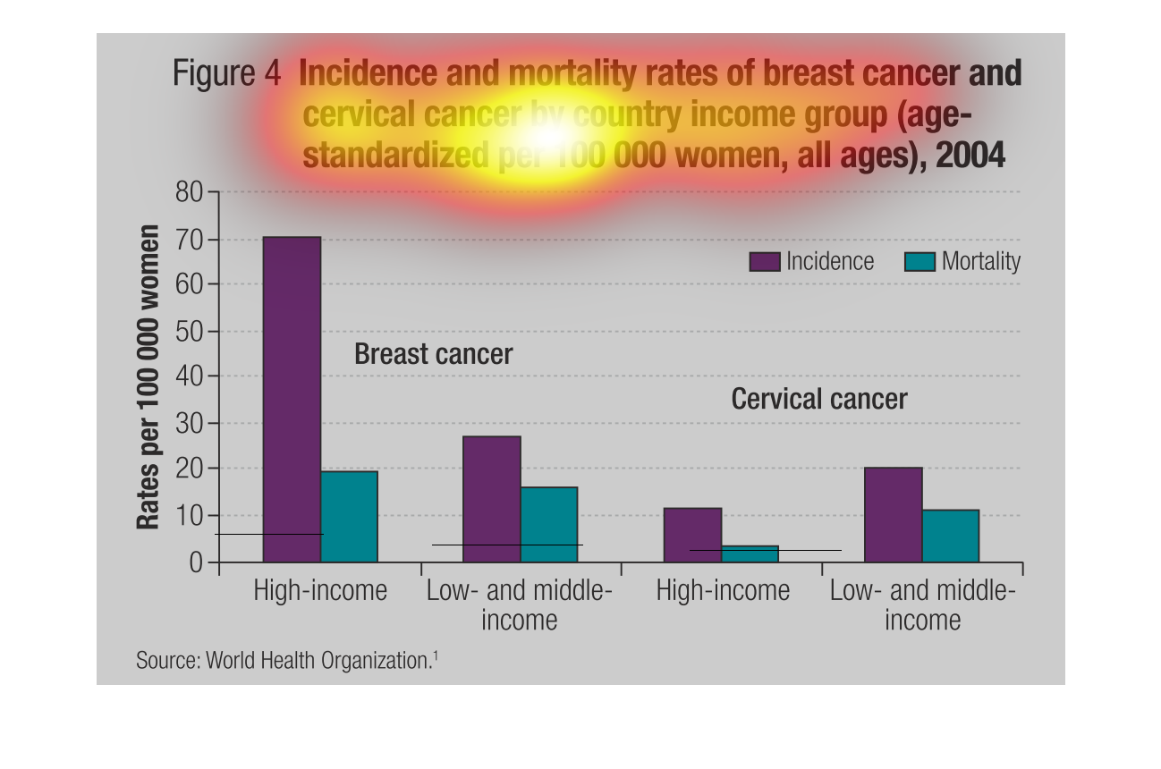
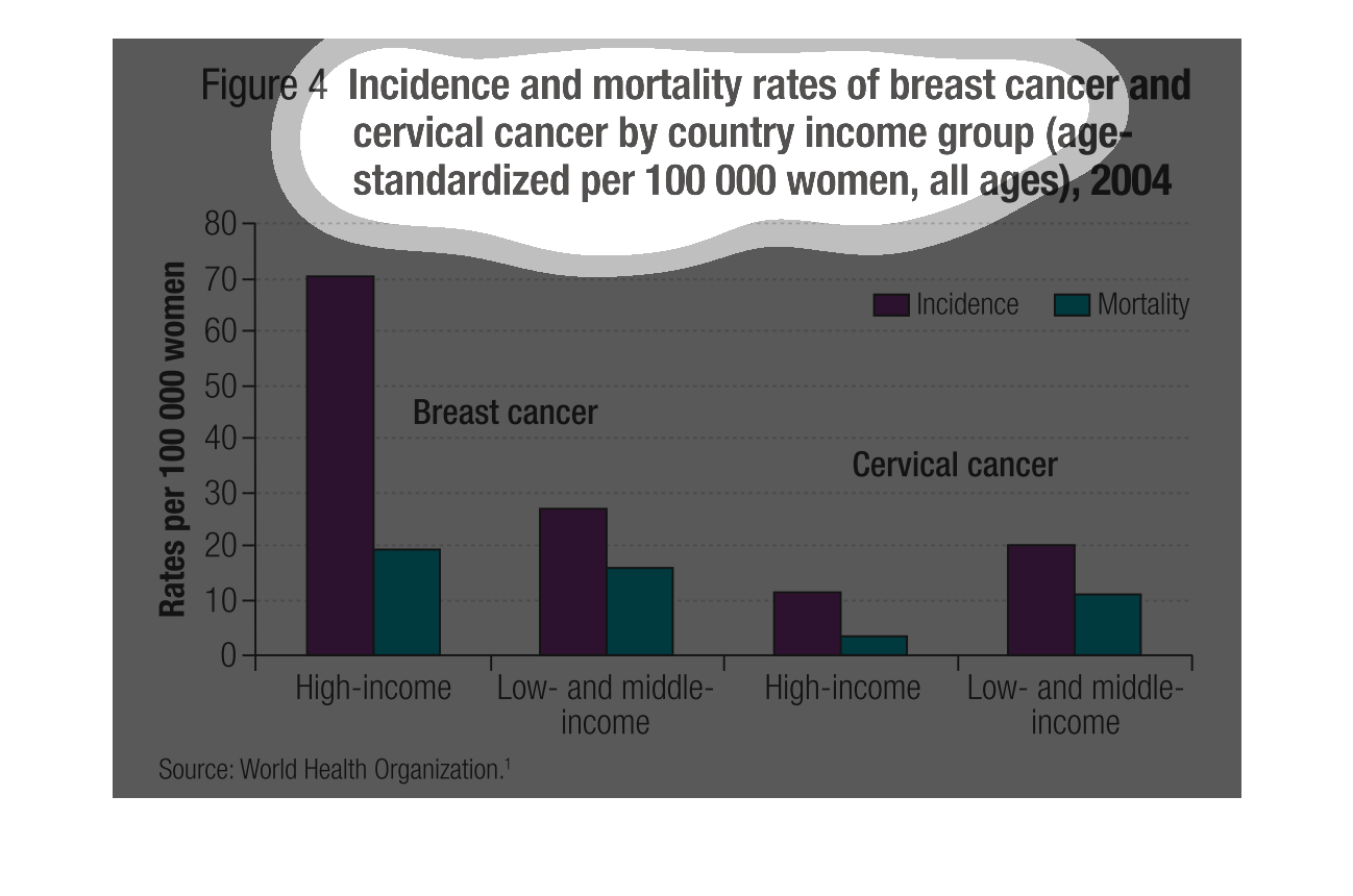
This bar graph shows incidence and mortality rates of breast cancer and cervical cancer by
country income group (age standardized per 100,000 women all ages) in 2004. High income had
the most incidence of breast cancer. Low income had a higher rate of cervical cancer.
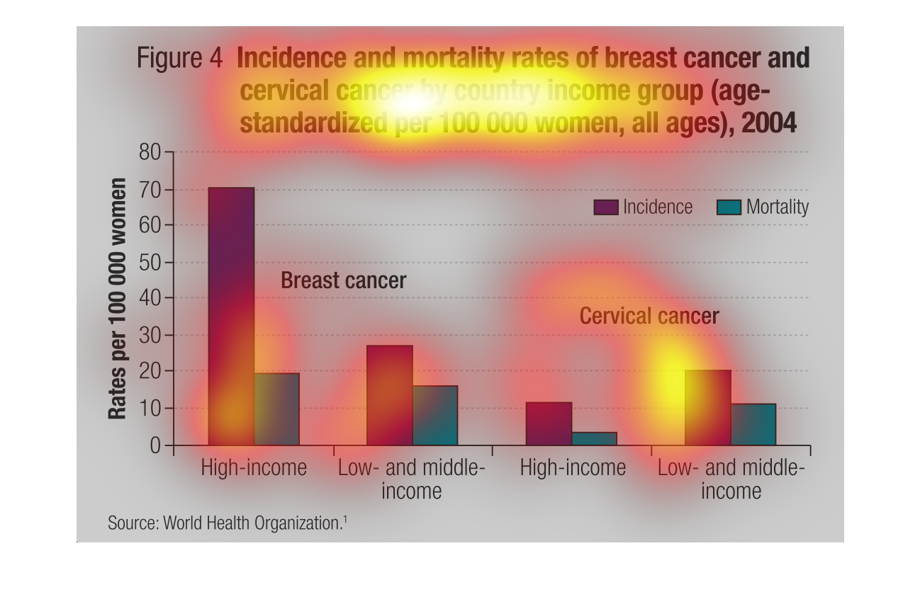
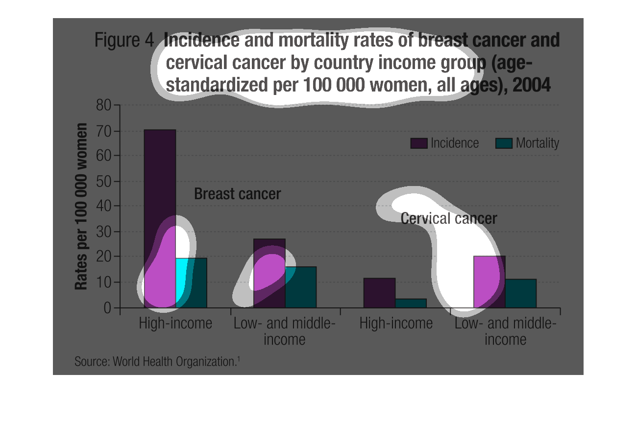
This is a graph of the mortality of incidences of breast cancer and cervical cancer by country
income group. It appears that incidences of breast cancer are much more common among women
of higher incomes.
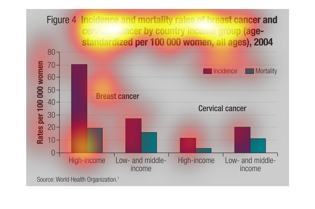
The figure presented is titled Incidence and mortality rates of breast cancer and cervical
cancer by country income group (age-standardized per 100000 women)
This graph shows the incidences of breast and cervical cancers in 2004, grouped by incomes.
For breast cancers, wealthier women had higher rates of cancer than lower income women, although
their mortality rates were similar. For cervical cancers, both the incidence and mortality
rates were higher among the lower-income women.
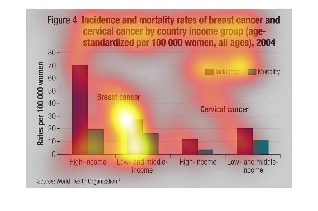
This is a fairly complicated graph that compares incident and mortality rates across women
from many different socioeconomic statuses. These classes are divided on the graph into high
income, and low and middle income.
This chart shows the death of women who suffered breast cancer or cervical cancer by country
income groups per 100,000 women, It breaks them down into low income and high income groups,
and by breast cance ror cervical cancer.
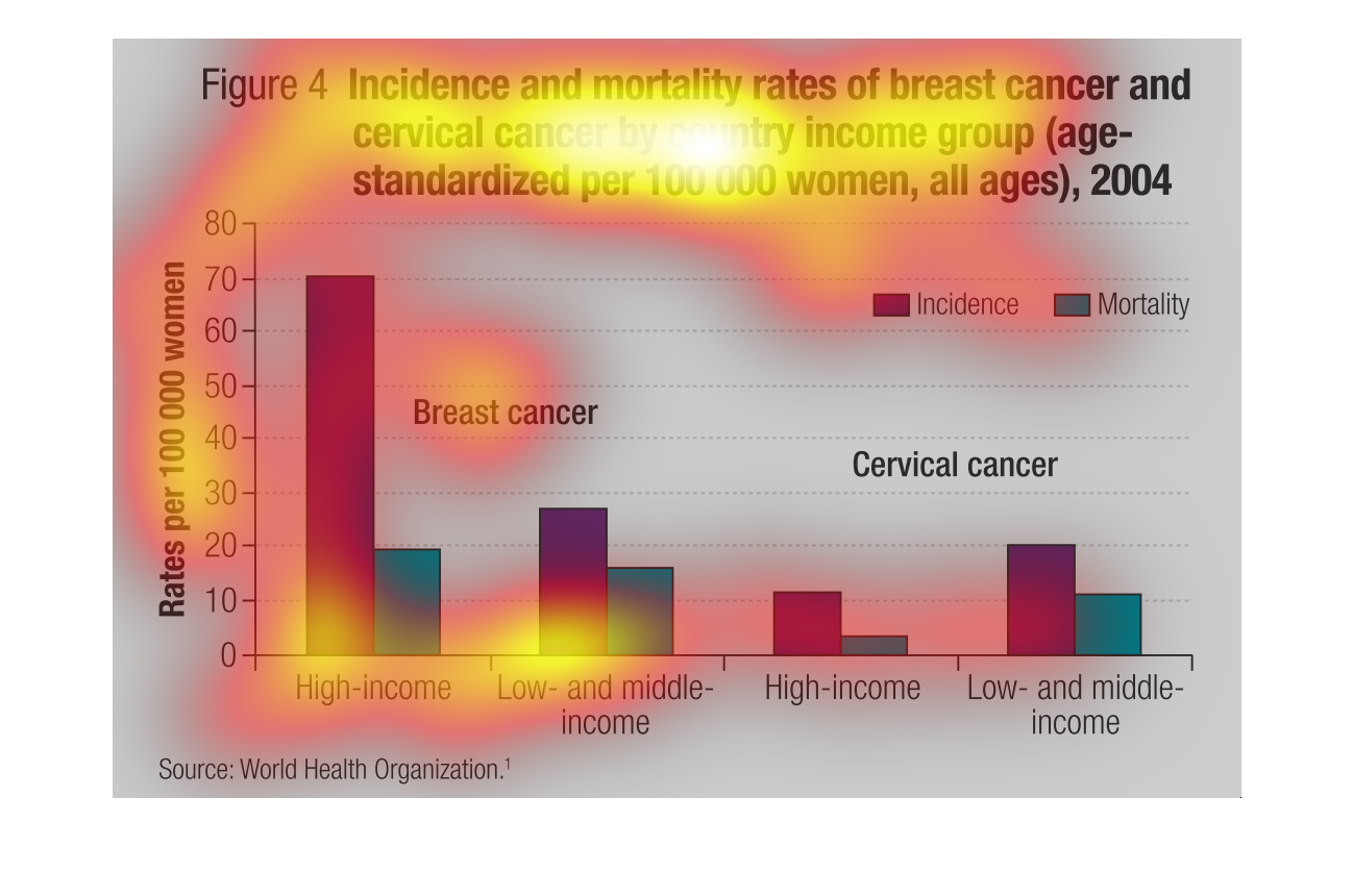
Figure 4 shows incidence and mortality rates of breast cancer and cervical cancer by country
and income group per 100,000 women all ages 2004. Breast answers incidence are highest among
the high income but cervical cancer are lower among the high income.
This chart makes no sense because there is no context and it is hard to read. It looks like
it is about the incidence of breast and cervical cancer by age group.
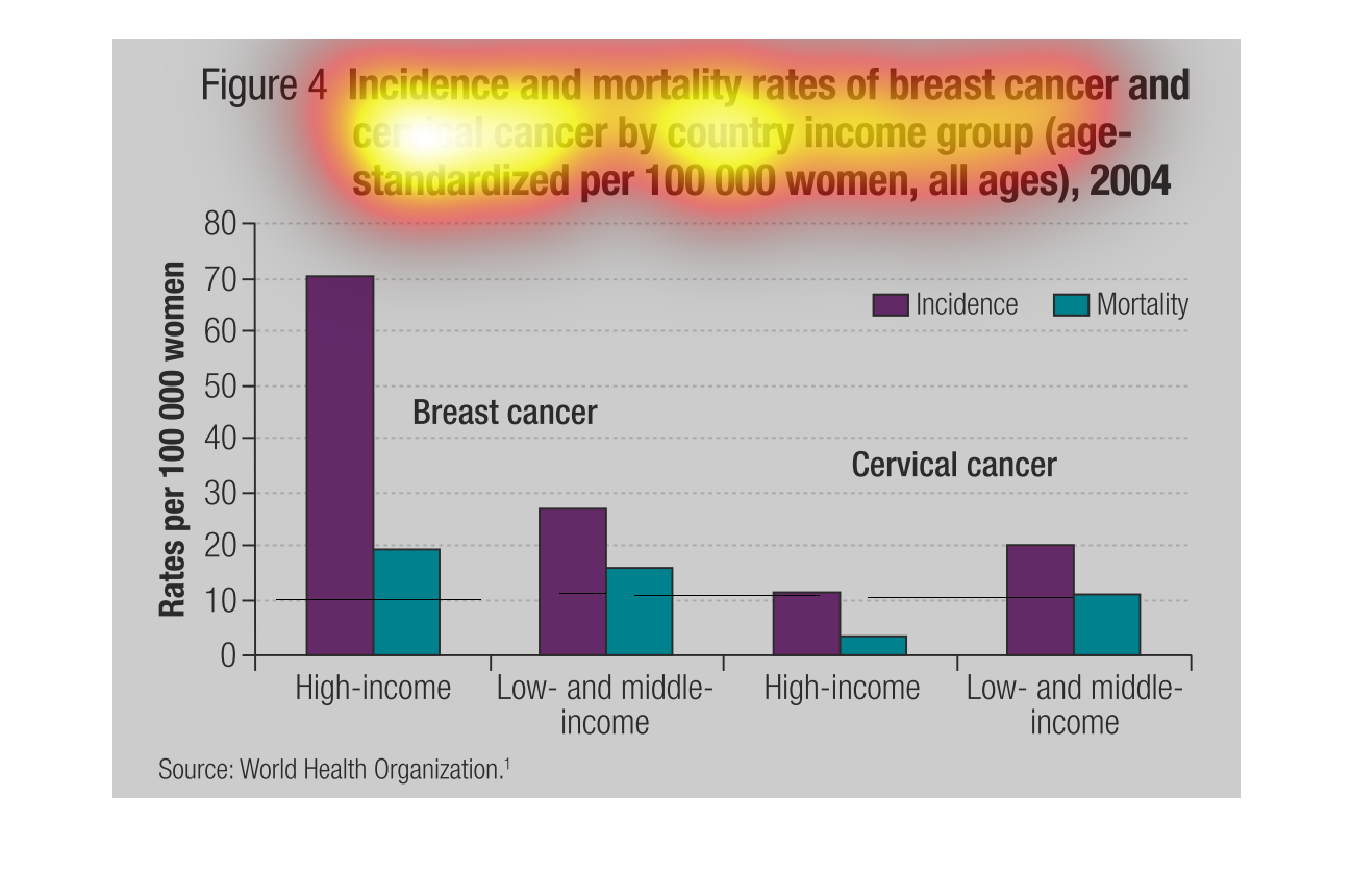
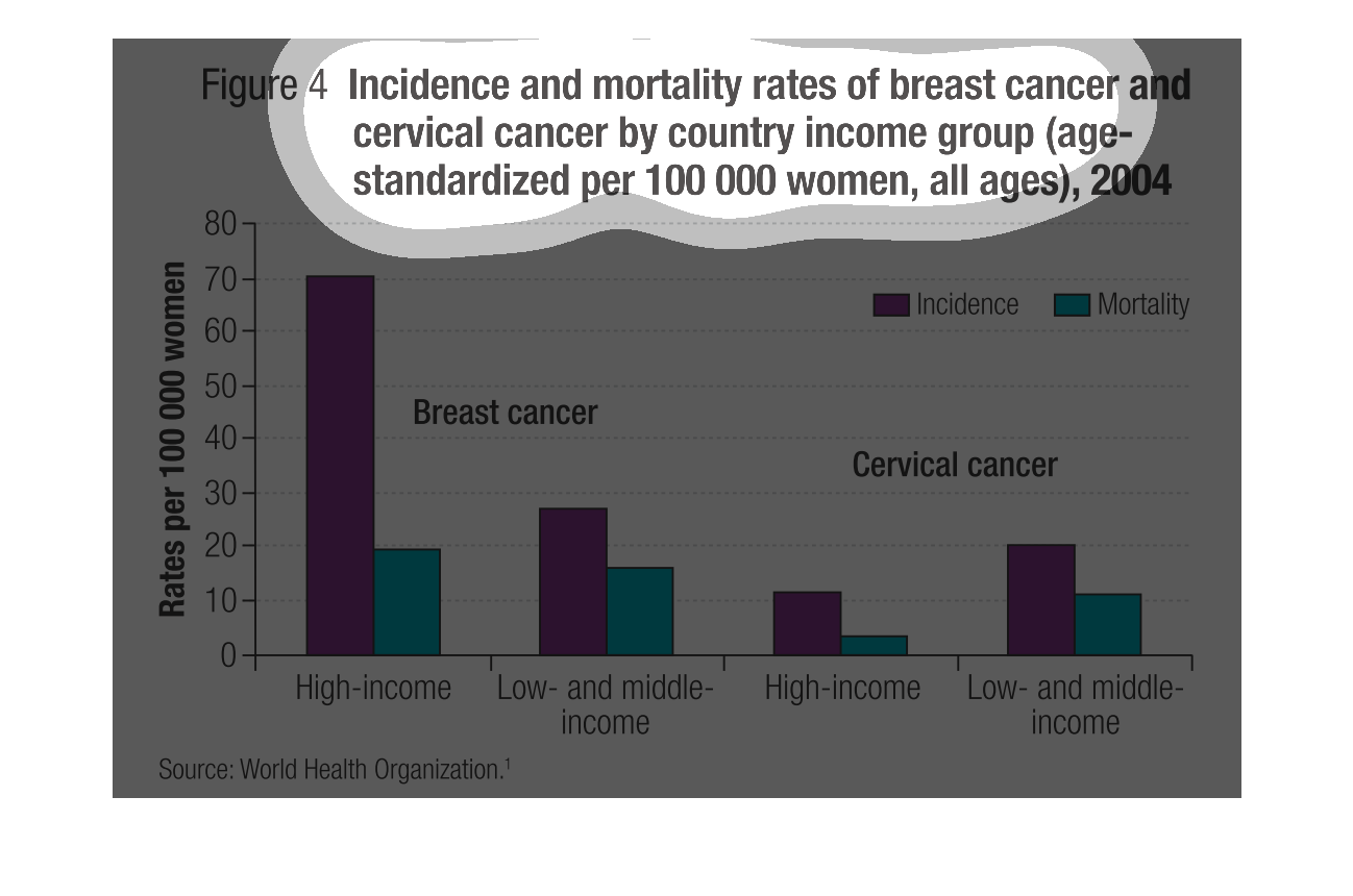
This is a graph that shows the incidents and occurrences of breast cancer and cervical cancer
by country income group. It covers the year 2004 and shows this per 100,000 women.