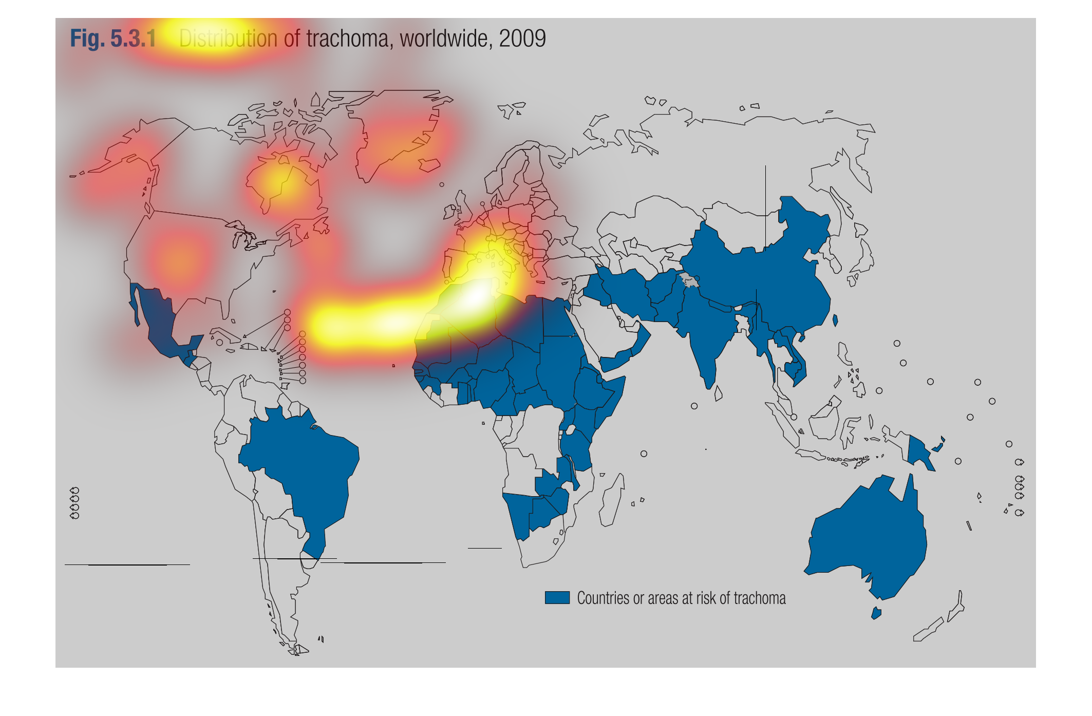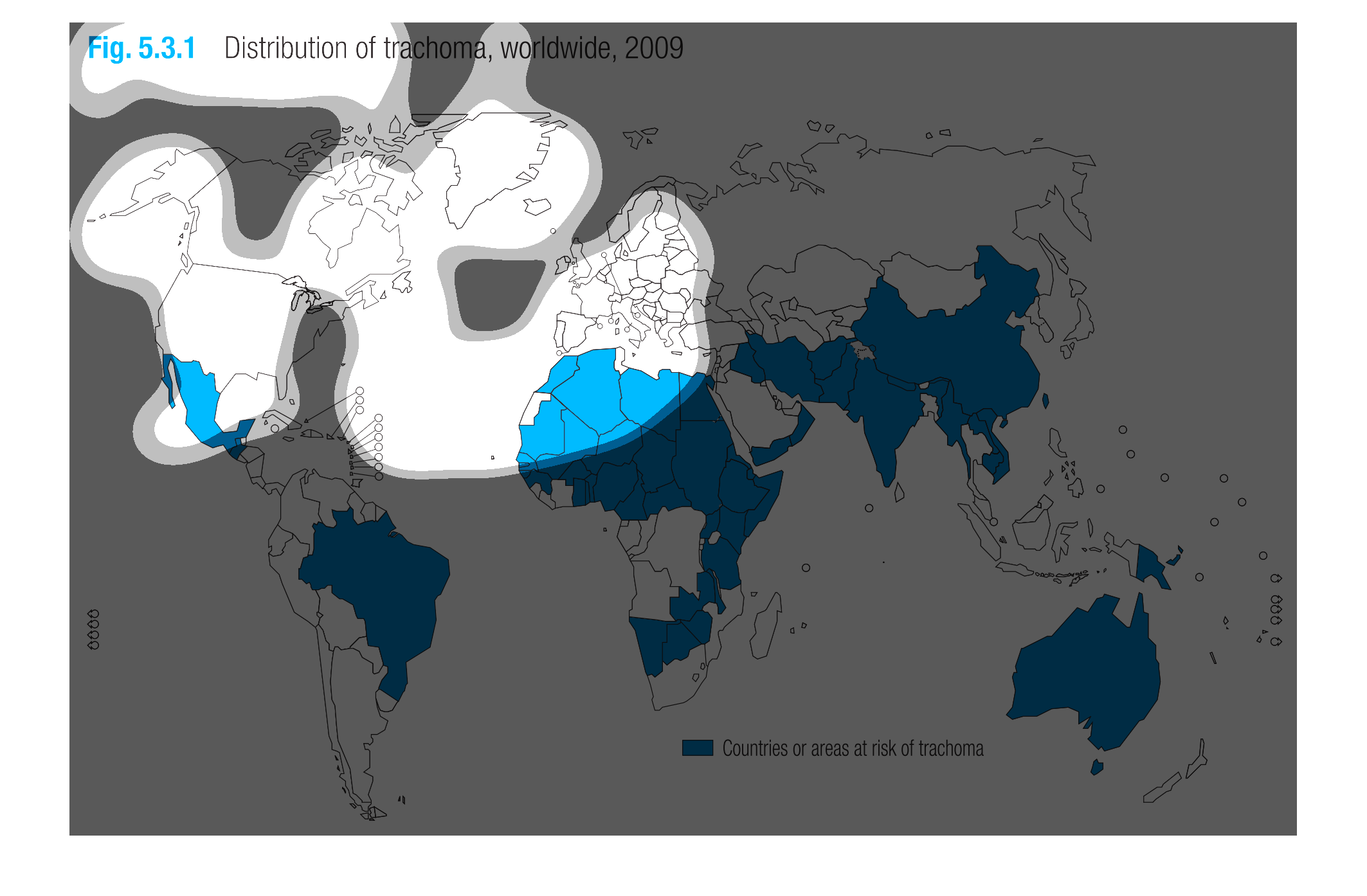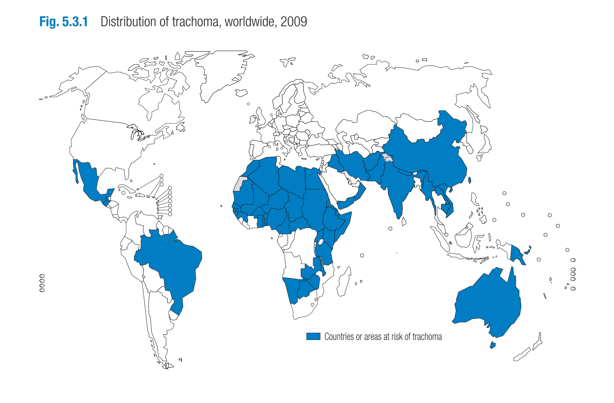
This chart describes the distribution of trachoma worldwide in the year 2009.  It shows that
Mexico, Brazil, a large portion of Africa, the middle east, India, almost all of south Asia
and Australia were all at risk.
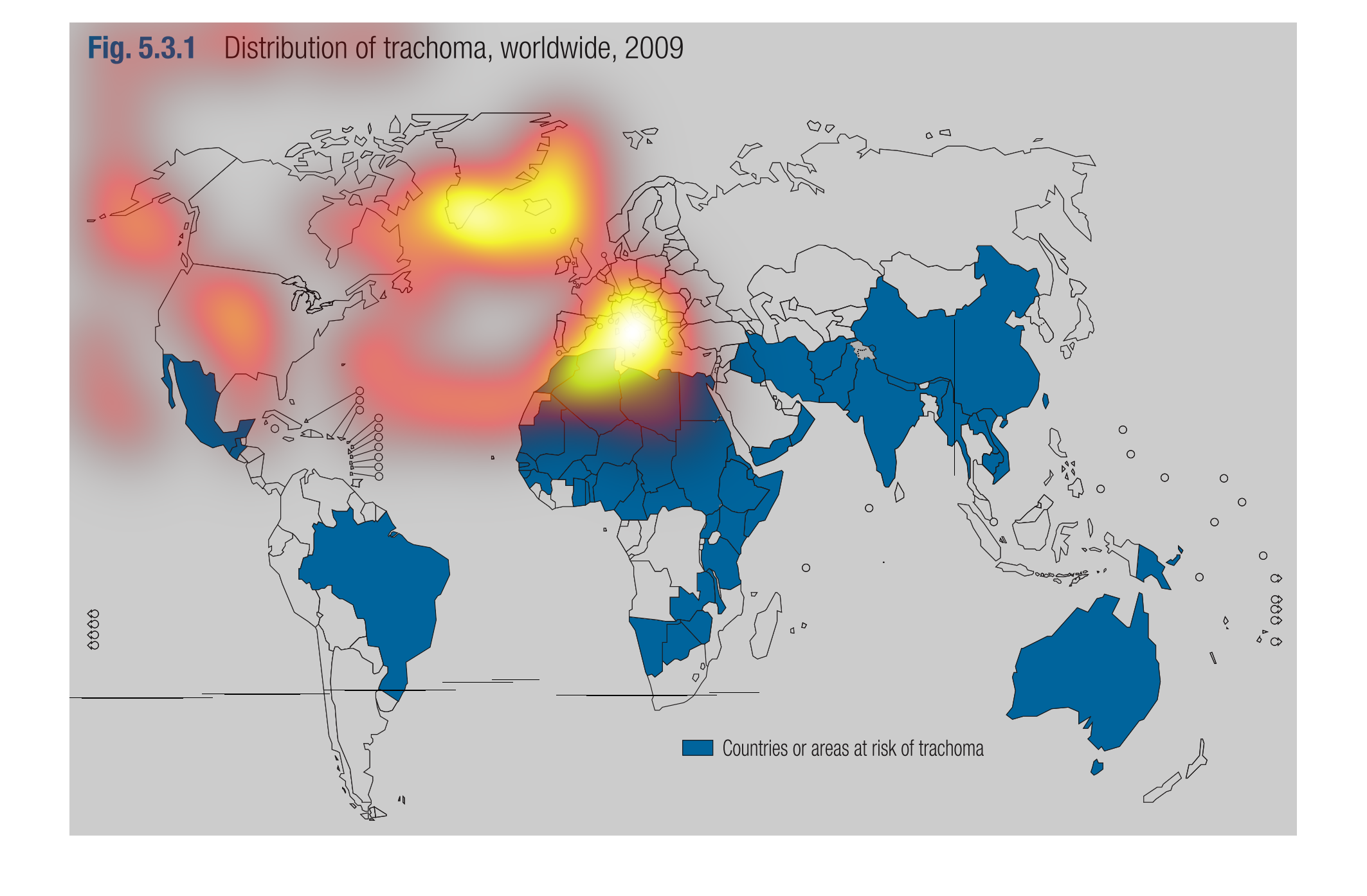
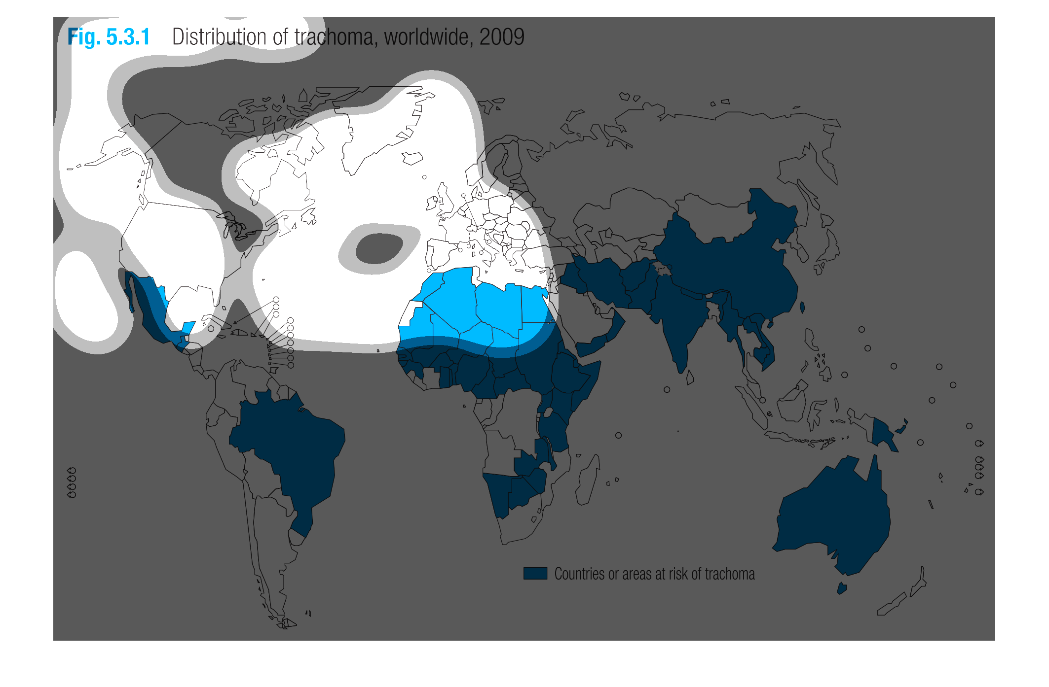
This graph displays the worldwide distribution of trachoma as of the year 2009. The regions
shaded in dark blue are the areas at risk of trachoma cases. The blue shaded regions are equatorial
regions, consisting of Mexico, much of South America, Asia, and Australia. North America,
Europe, Russia, and Antarctica do not appear shaded blue.
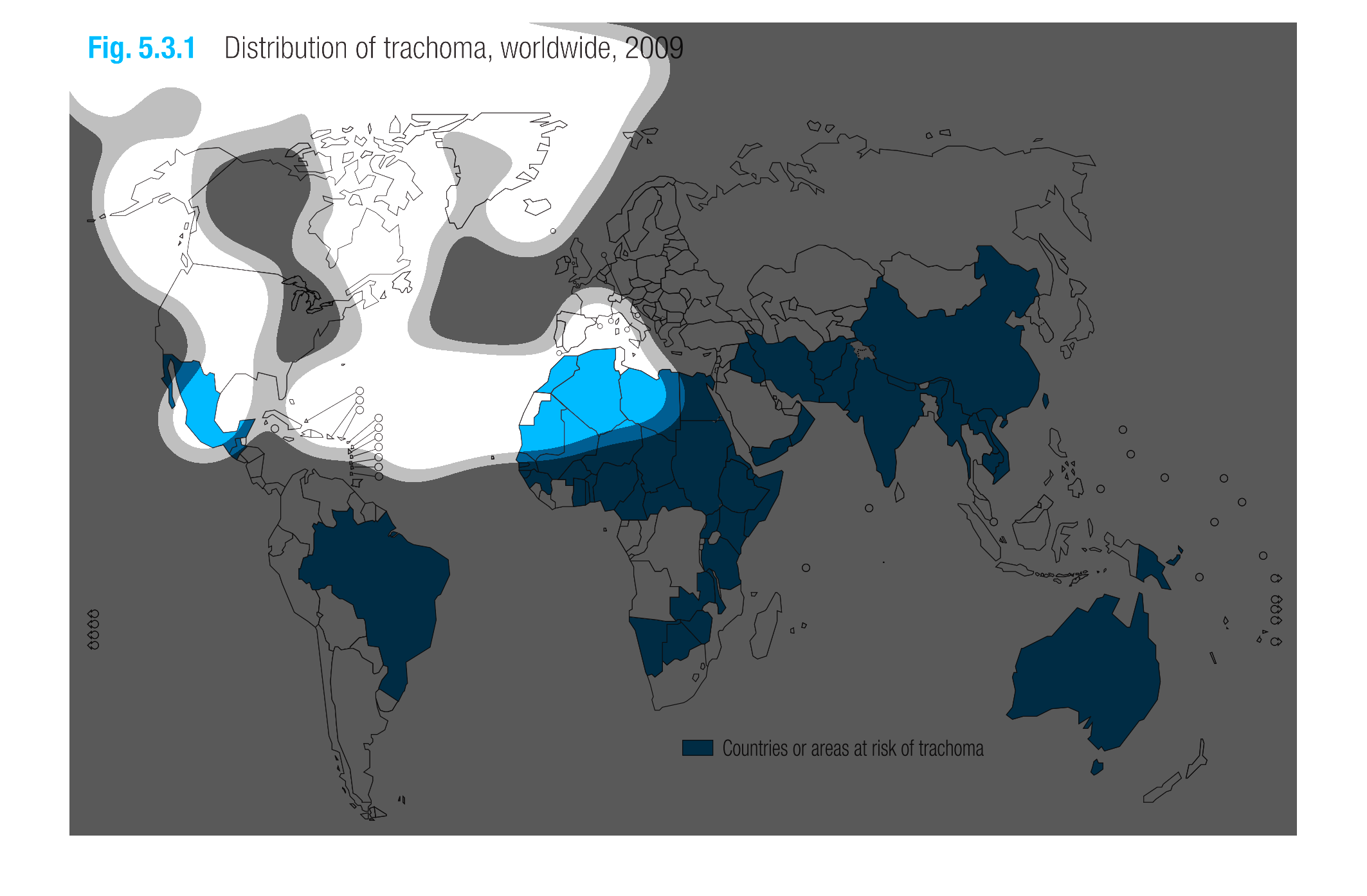
This is a graphic that shows the global distribution of trachoma disease worldwide for the
year 2009. It shows the areas in the world that are mostly affected.
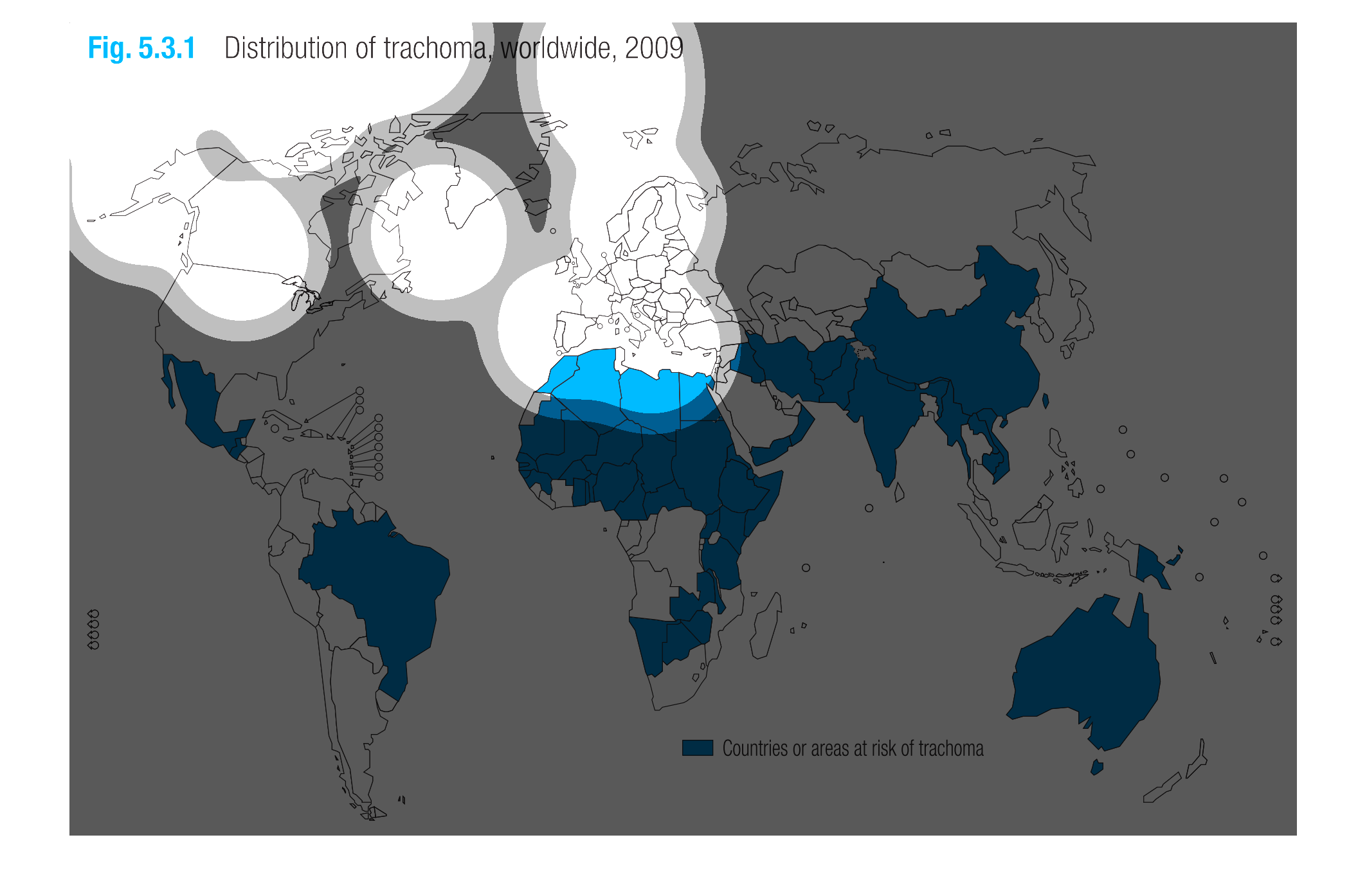
The following chart lists the distribution of trachoma worldwide in the year 2009. It shows
the distribution in Africa, South America and in South East Asia to be fairly high.
The shows areas of the world at risk of trachoma in 2009. Brazil, Mexico, most of Africa,
much of Southeast Asia and Australia are all shown to be at risk.
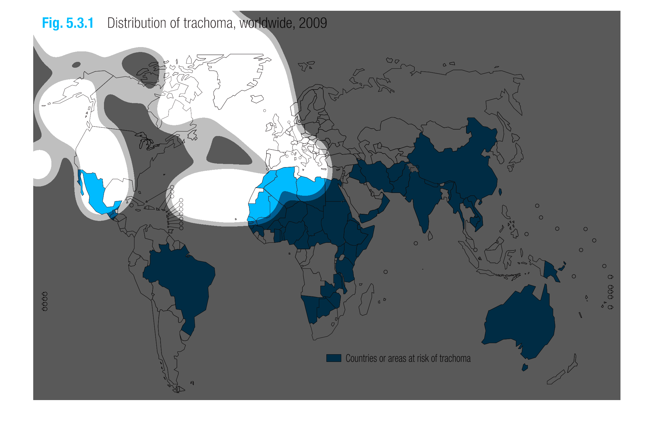
The graph shows the different countries that are at risk for trachoma.  The data was from
2009 and it seems its prevalent in many different part so the world like Australia.
This picture shows a figure out of a textbook. It is labeled figure 5.3.1 and the continents
are colored blue. The map shows the distribution of trachoma, worldwide, 2009.
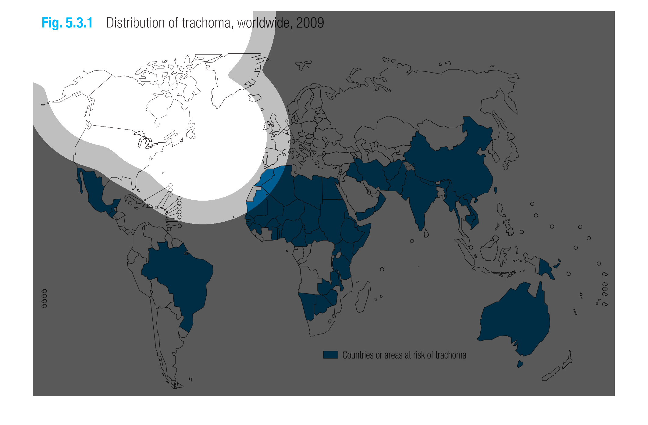
The chart shows the distribution of trachoma worldwide in 2009. Much of the world is at risk
fro contracting trachoma with the exception of the United States, Canada and the Northern
European countries
This chart describes distribution of trachoma, worldwide, for the year 2009. different regions
of the world on the chart are represented by different colors.
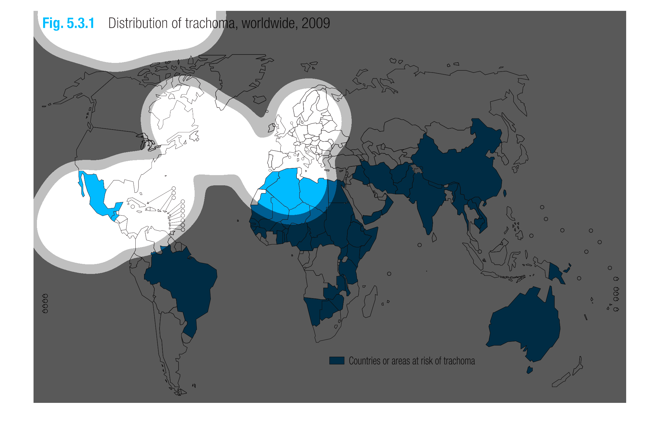
This graph shows the worldwide distribution of Trachoma in 2009. The blue areas highlight
countries that are at risk of trachoma. These areas are concentrated in the western United
States, South America, Australia, and Russia.
The image on the left hand side shows the distribution in the world of the disease trachoma.
 From the data collected in 2009, is shows that the areas that are most affected are countries
with lower socioeconomic statuses, with the majority of Africa being completely covered with
the data as per the legend in the graph.
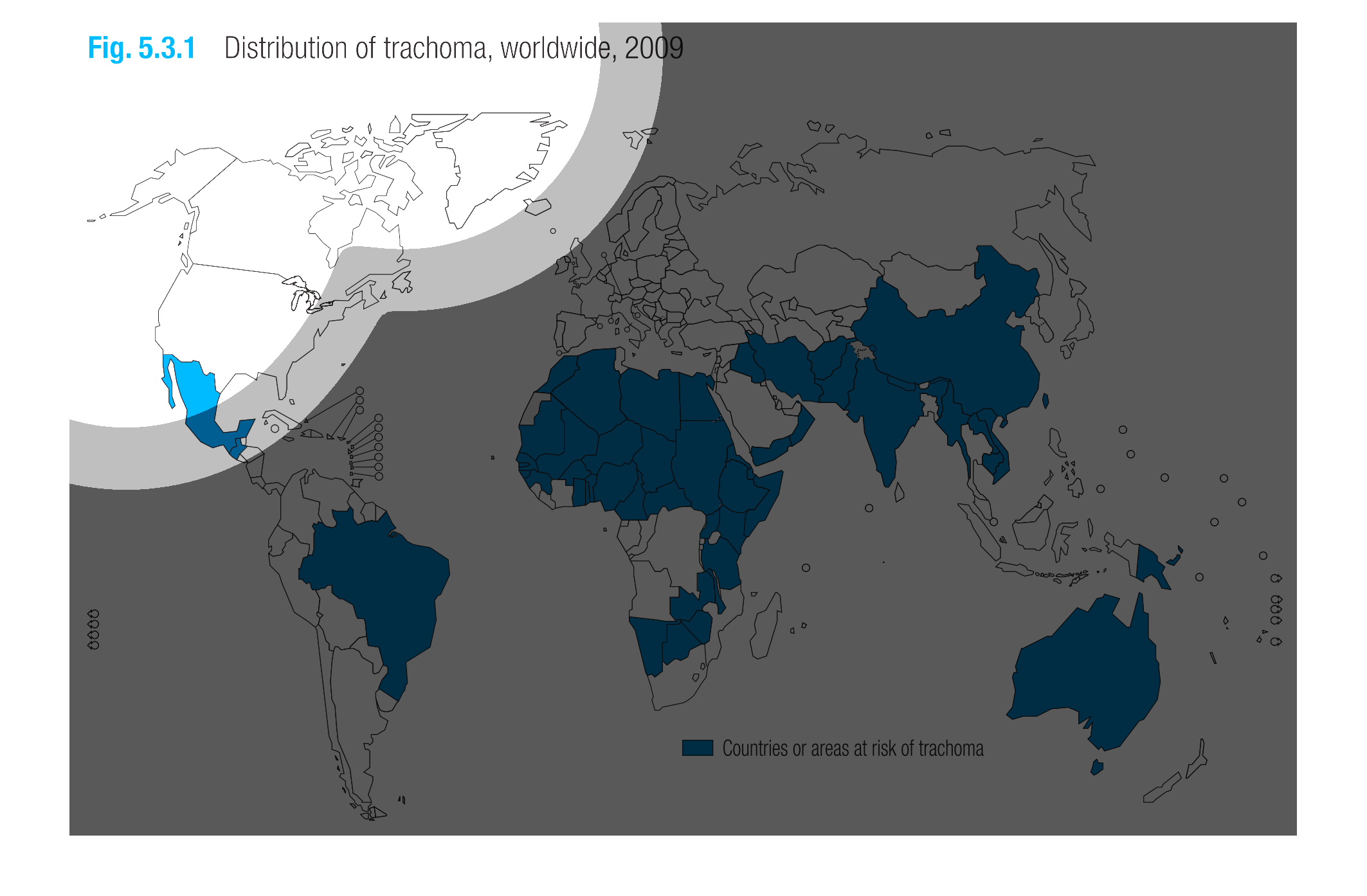
Figure 5.3.1 shows distribution of trachoma, 2009. This map graph shows countries affected
by trachoma outlined a bright blue on the map. Trachoma has a large effect on Africa.
This image represents via map, the distibution of trachoma worldwide, in 2009.  According
to the map, It appears that most of the countries at risk are in the southern hemisphere.