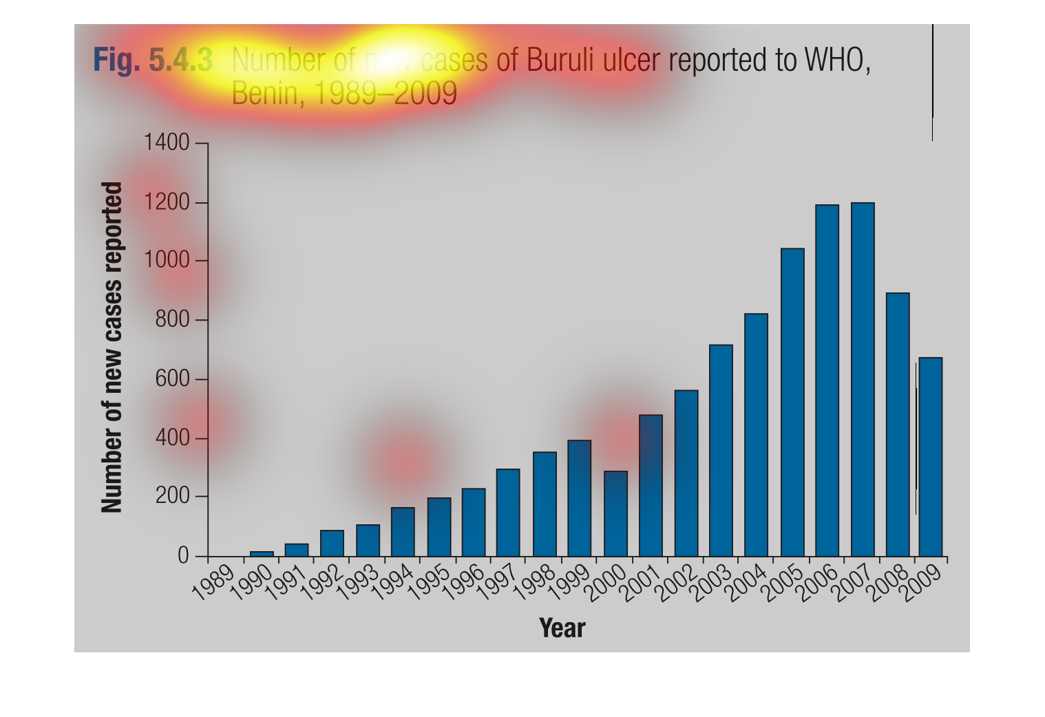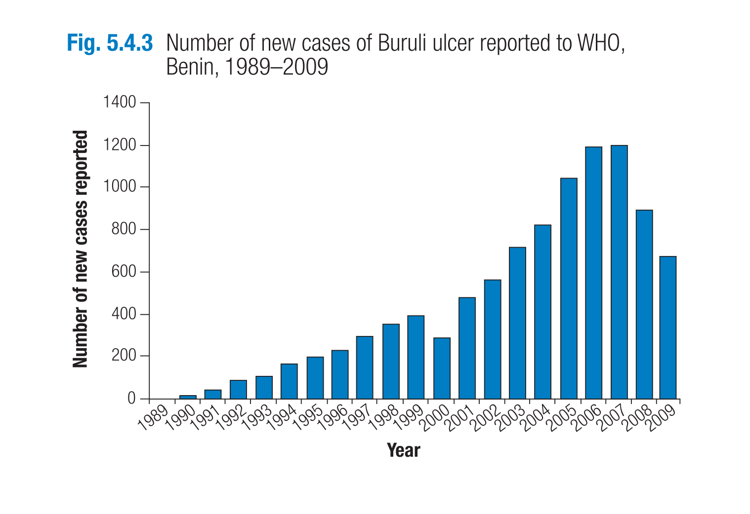
This handmade chart shows the increase in buruli ulcers as reported to the World Health Organization.
It shows how the reports of this disease have increased
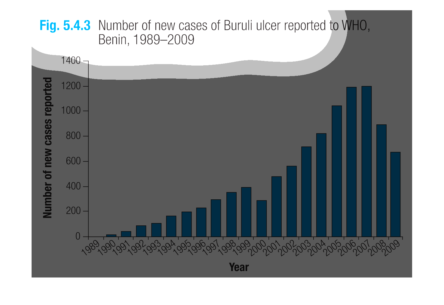
The graph contained within this image primarily deals with the total amount of buruli ulcer
instances over time. This data seems to be provided by the World Health Organization (WHO).
This chart describes the number of new cases of Buruli ulcer reported to WHO, Benin, for the
years 1989 through to 2009. The highest spike on the chart occurs in 2006.
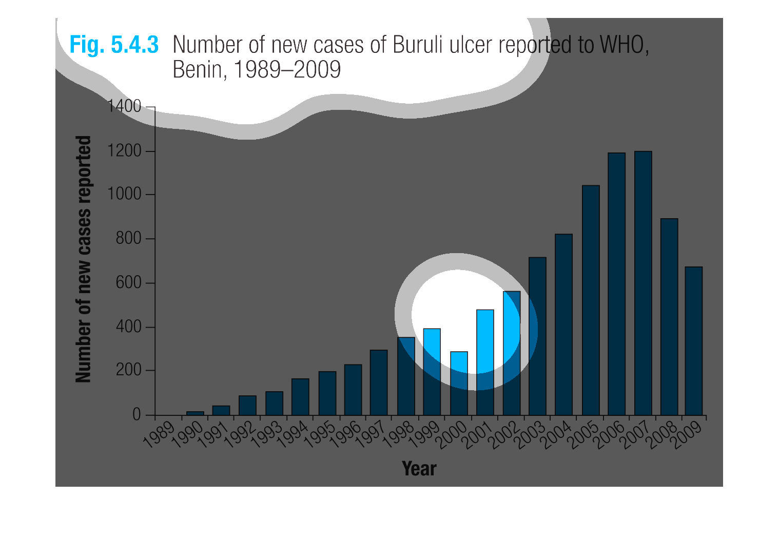
The image on the left hand side is depicting a column chart from years 1989-2009.  The columns
are representing the number of reported new cases of the disease Buruli ulcer which were reported
to the organization WHO.  From the data collected, one would infer that there was a rise from
1989 to 2007, however since then the number has been declining quite significantly over the
2008 and 2009 years.
The following chart gives the number of cases of Buruli ulcer reported to World Health Organization.
Benin from 1998-2009 it shows the number of cases increasing but peaking in 2006.
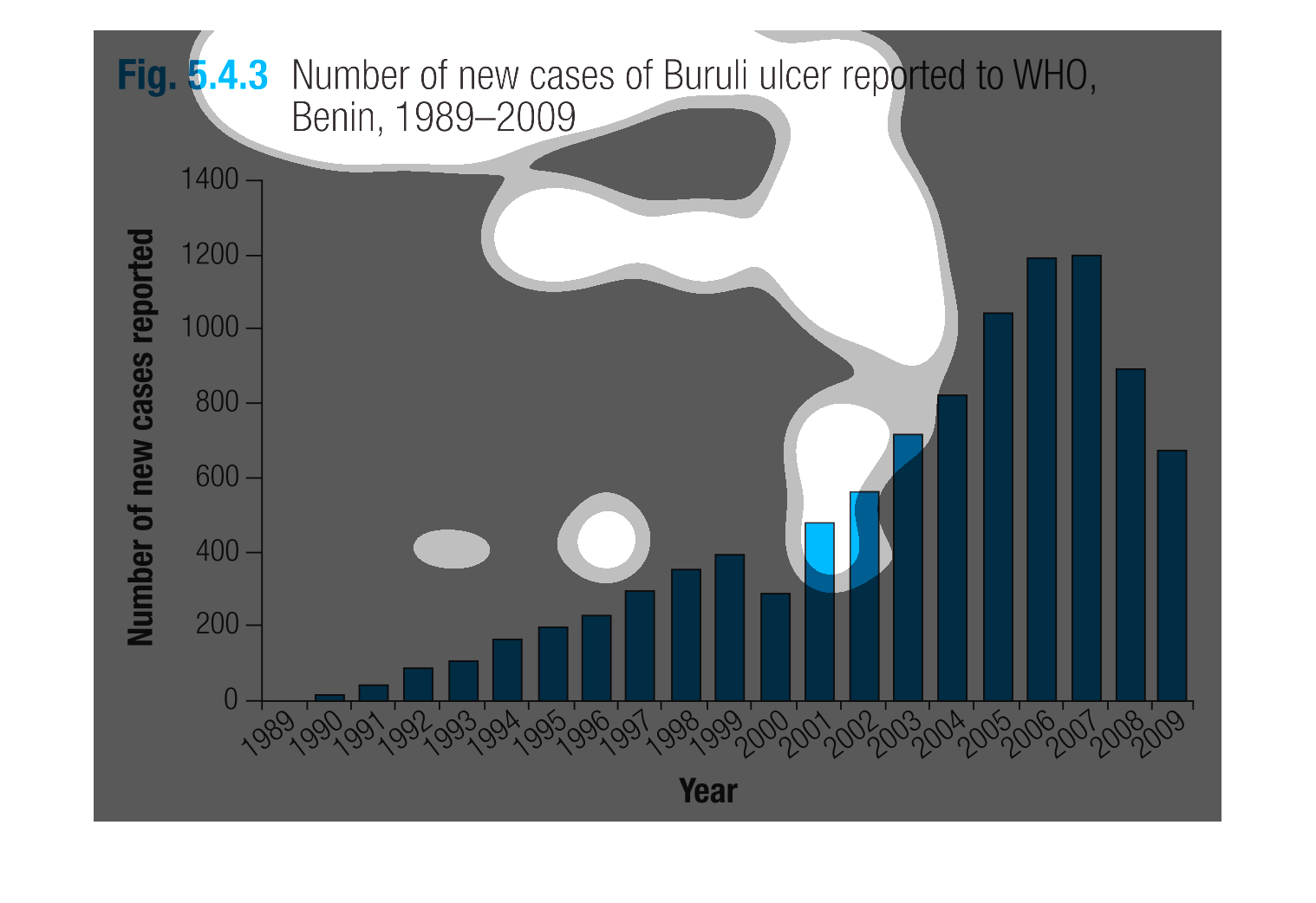
This bar graph shows the number of new cases of Buruli ulcer reported in Benin (Africa) in
the years 1989-2009. The most new cases were reported in 2007, at about 1200.
The figure presented is titled Number of new cases of Buruli ulcer reported to WHO, Benin
1989-2009.  The figure is a representation of cases of the Buruli Ulcer.
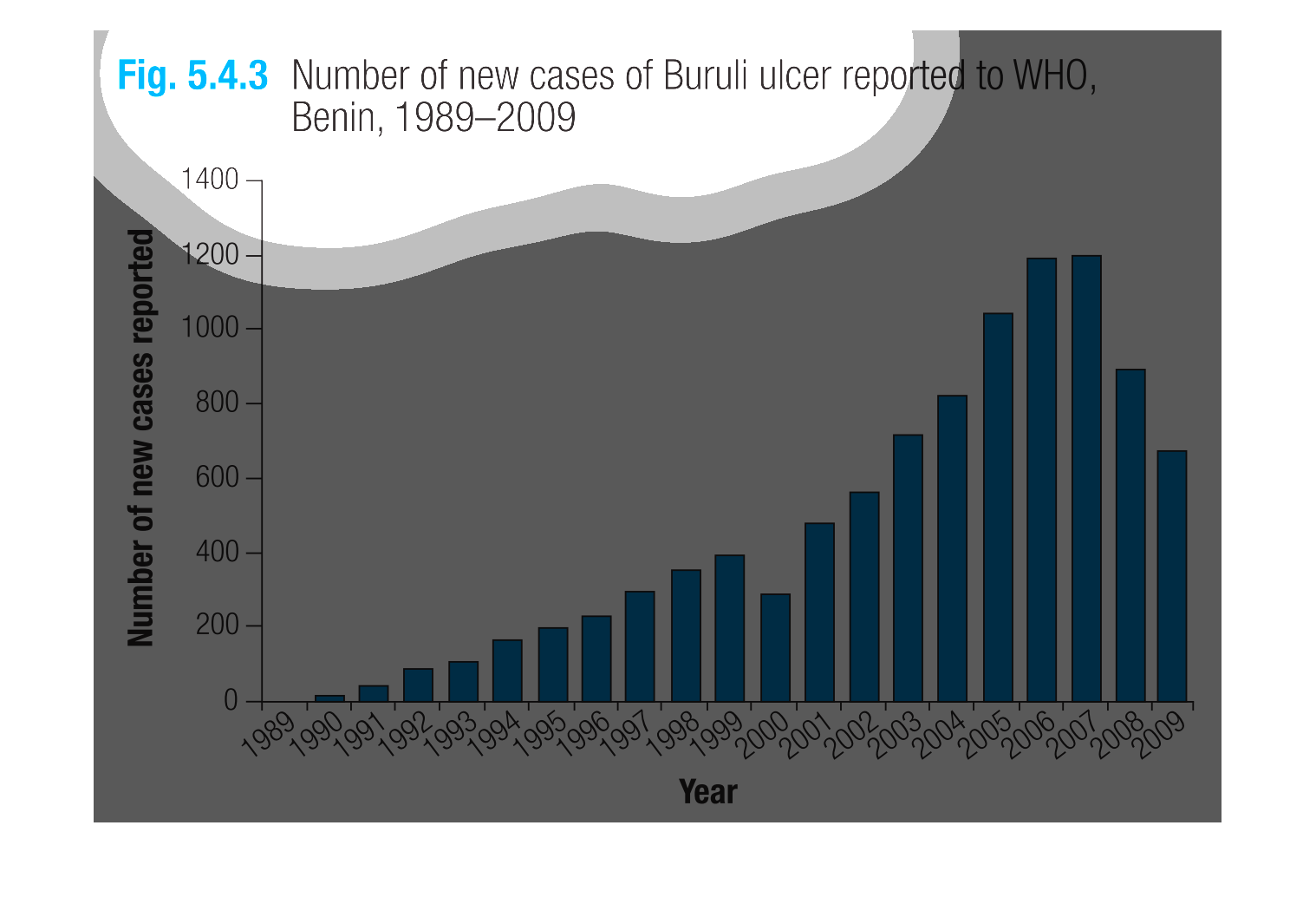
This is a graph that shows the number of reported new cases of Buruli alcer. This is as reported
to the WHO in the country of Benin between the years 1989 to 2009.
This chart describes the number of new Buruli ulcer cases from a period of 1989 to 2009, showing
a steady incline over 10 years, a slight drop, then a sharp increase and peak in 2006.
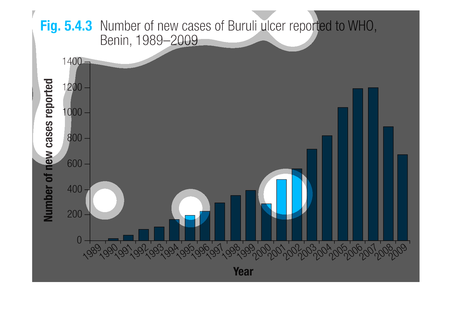
Figure 5.4.3 shows the number of new cases of Burili ulcer reported to WHO, Benin, 1989-2009.
This blue bar graph illustrates an extreme rise of new cases from 1989 to 2009. 1989 had 0
and 2007 had 1200 and moderate decrease to 800 in 2009.
This chart show the number of new cases of Buruli ulcer reported to WHO, Benin, 1989-2009.
Then the chart shows that the number of new cases reported was rising from year 1989 to 2009.
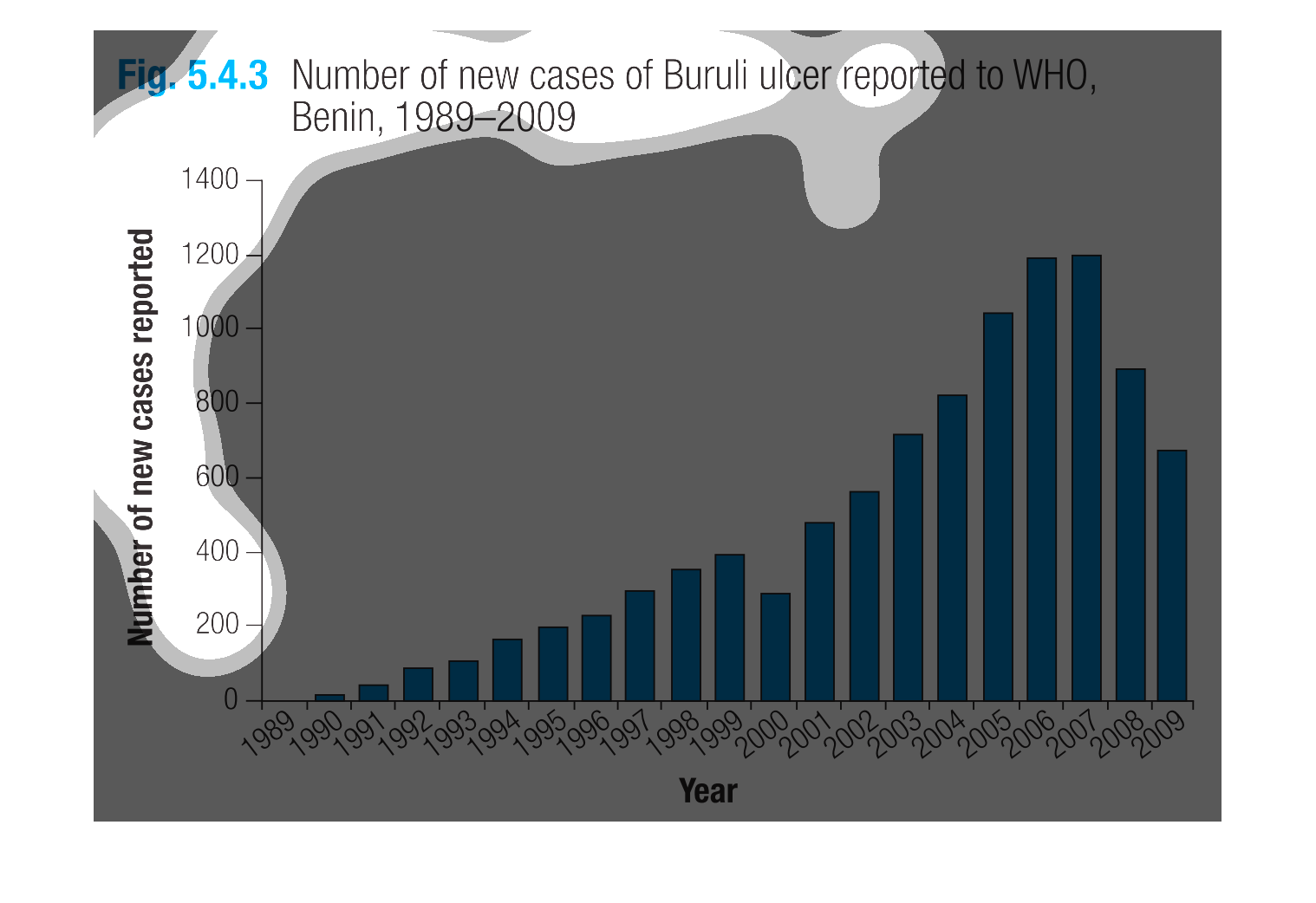
This image or figure shows or depicts in statistical bar graph format data concerning the
number of new cases of Buruli ulcer reported to WHO, Benin from 1989-2009.
This graph shows the number of new cases of Berlin ulcers reported from 1989-2009. The number
of cases reported rose until 1999, decreased slightly, then rose again until 2007 when it
reached a high and began decreasing.
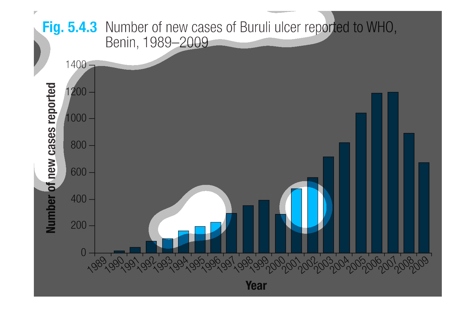
This chart describes number of new cases of Buruli ulcer reported to WHO, Benin, from the
years 1989 through to the year 2009. The highest spikes on the chart occur in 2005 and 2006.