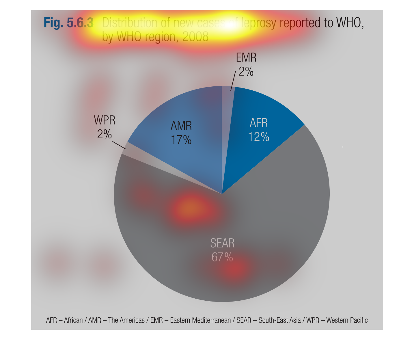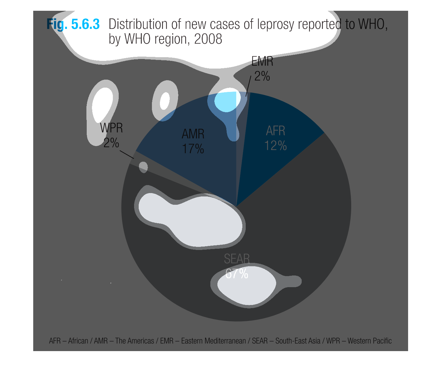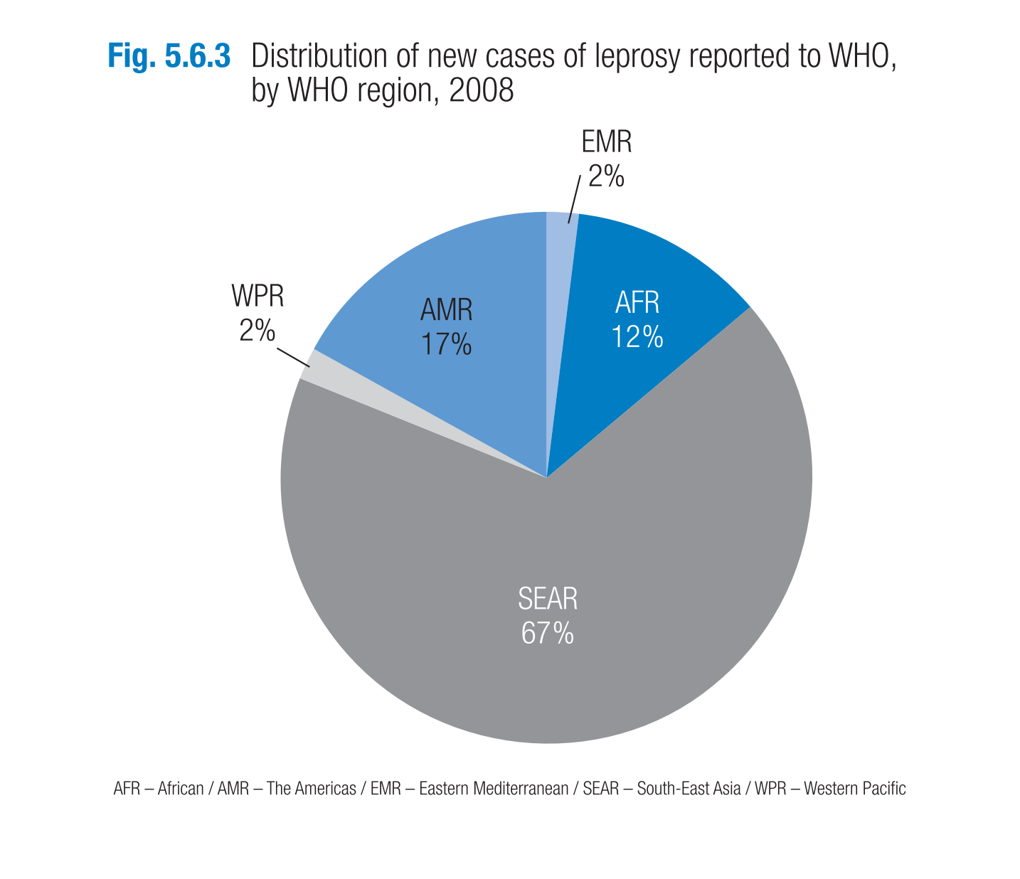
The following chart gives the number of new cases of Leprosy reported to the world health
organization in the year 2008. SEAR region by far had the highest rate of cases reported.
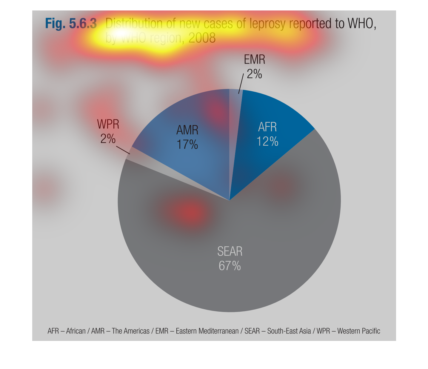
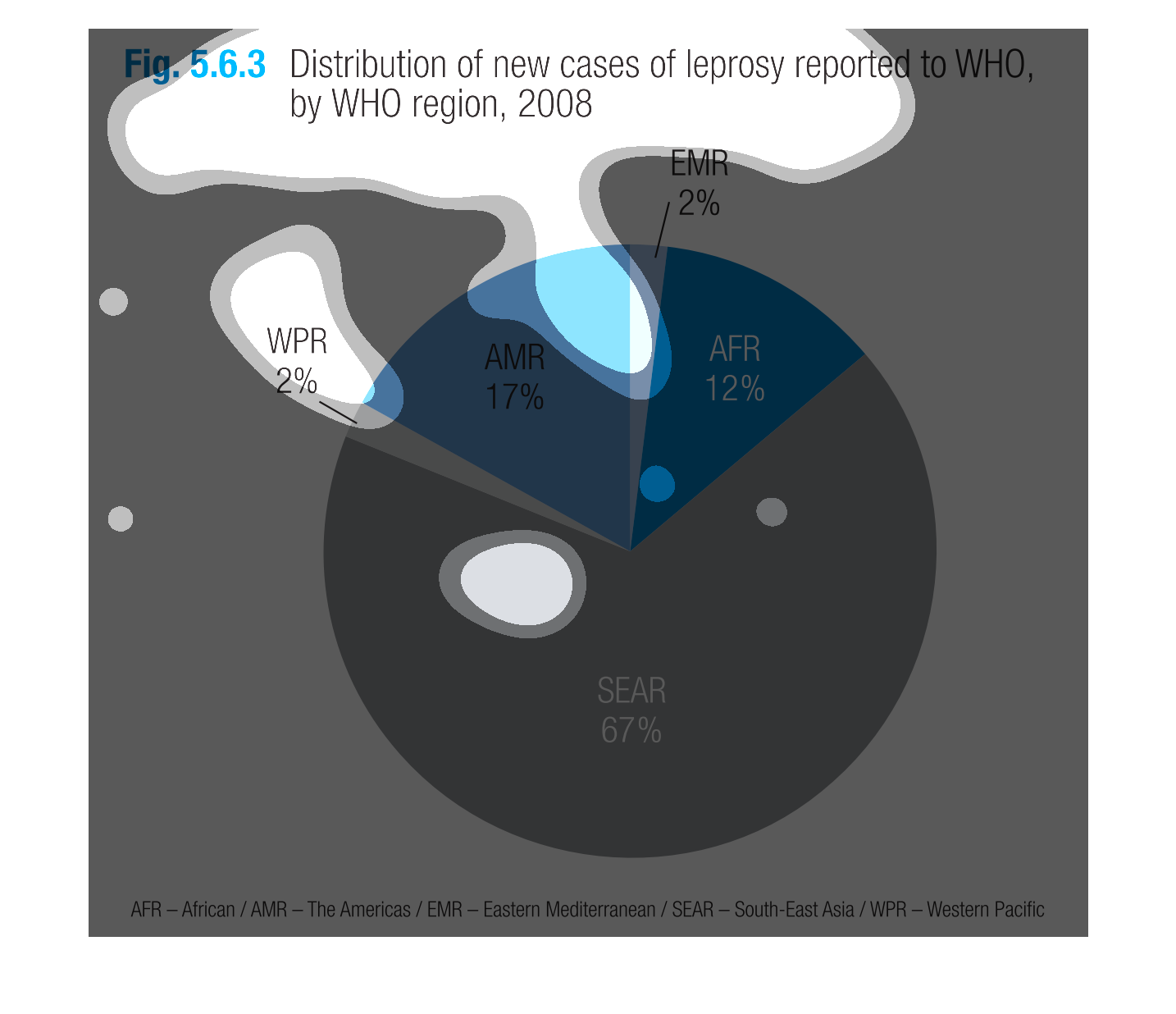
This circle graph shows the distribution of new cases of leprosy reported to WHO in 2008.
The biggest chunk is labeled as SEAR, at 67%,  while the smallest is AFR, at 12%.
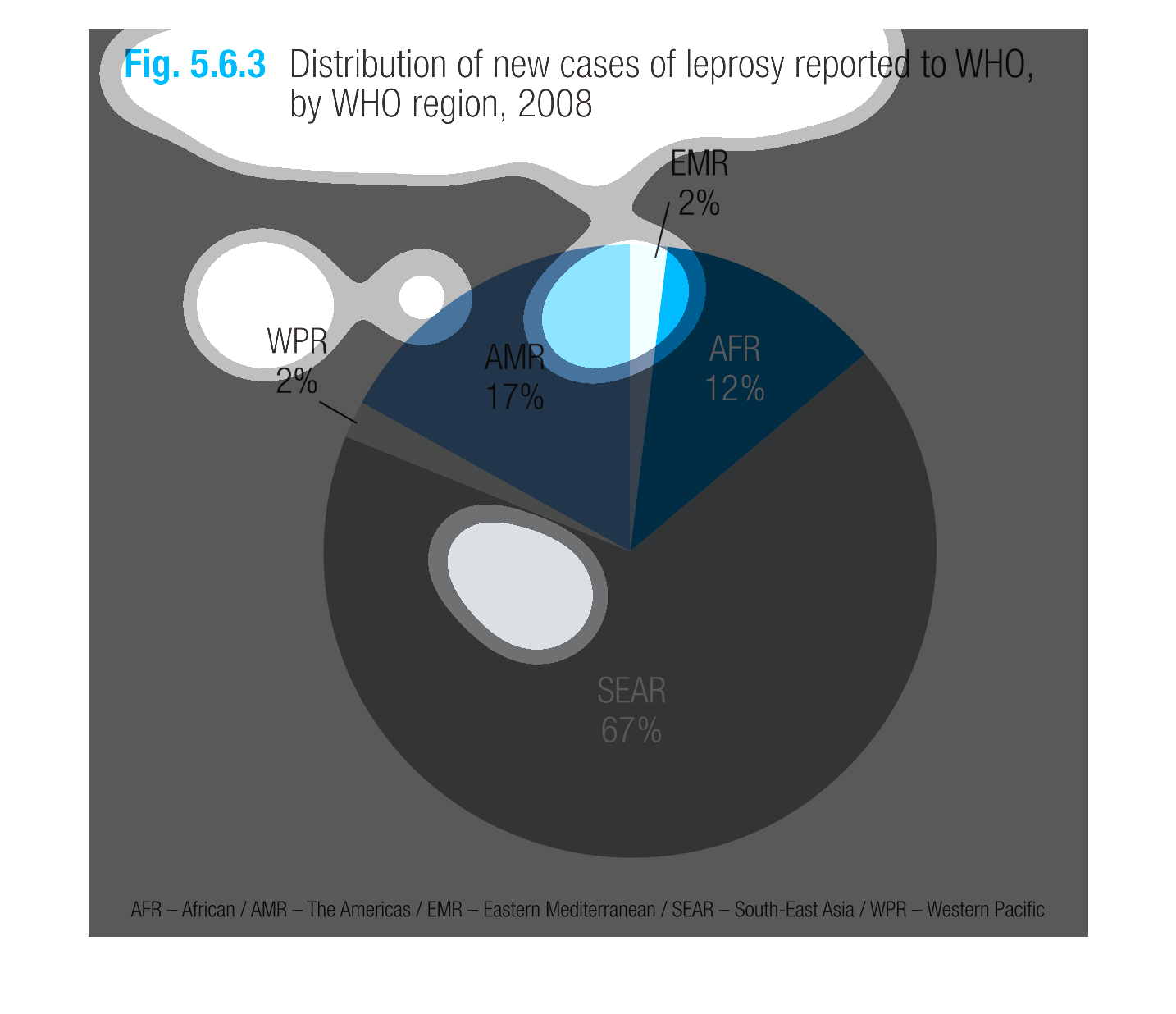
This is a graph of the distribution of new cases of leprosy reported to WHO, by WHO region.
SEAR had the most new cases of leprosy, with 67 percent. EMR and WPR had the least new cases
of leprosy, with 2 percent each.
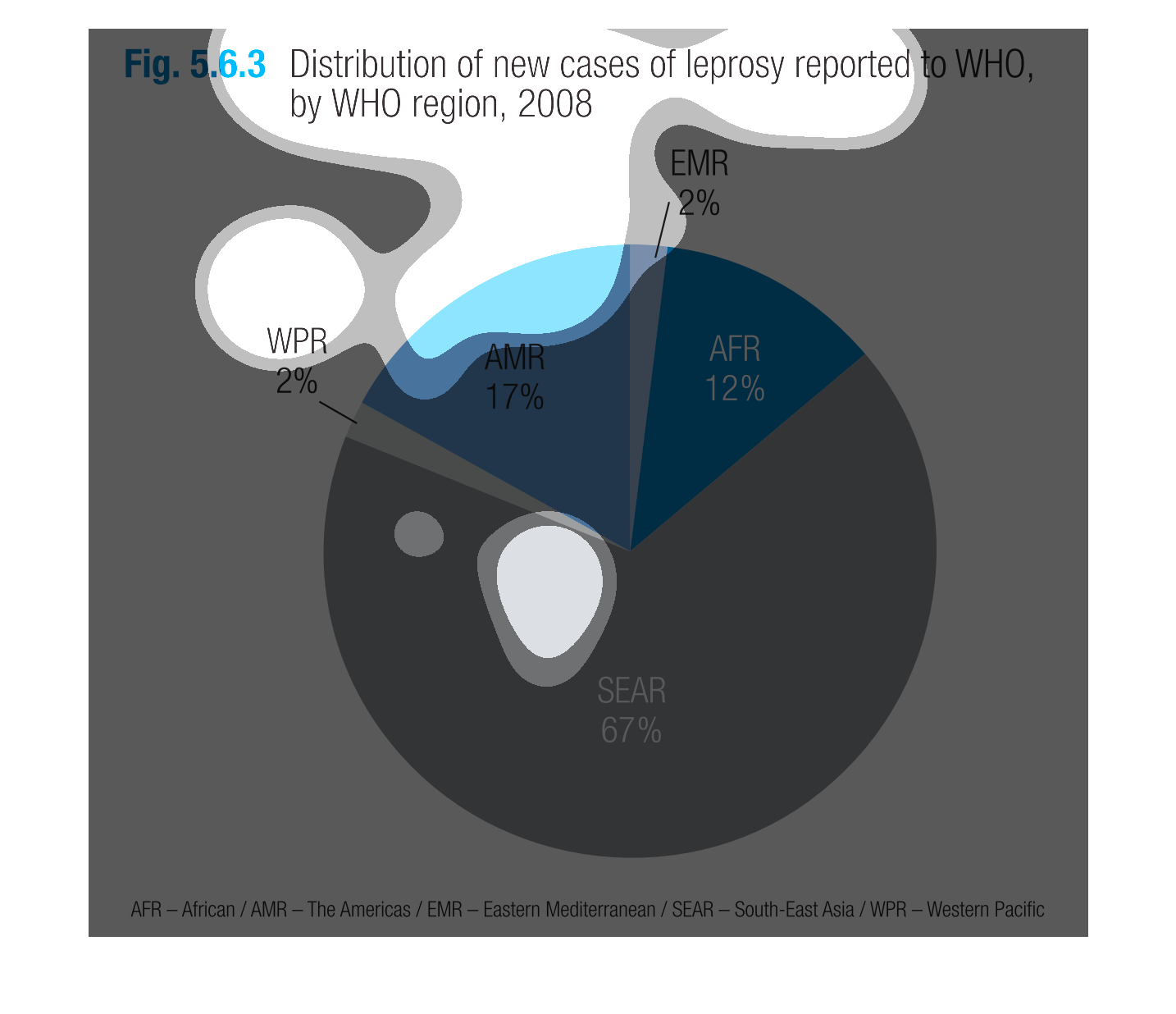
The Pie chart shows a distribution of new cases of leprosy reported to WHO, by WHO region
2008. Most reported cases have been found in Sear (67%), followed by AMR (17%), and AFR (12%).
There have been a few reported in EMR and WPR with 2%.
This chart describes distribution of new cases of leprosy reported to WHO, by WHO region for
the year 2008. The biggest section for the pie chart is 67%.
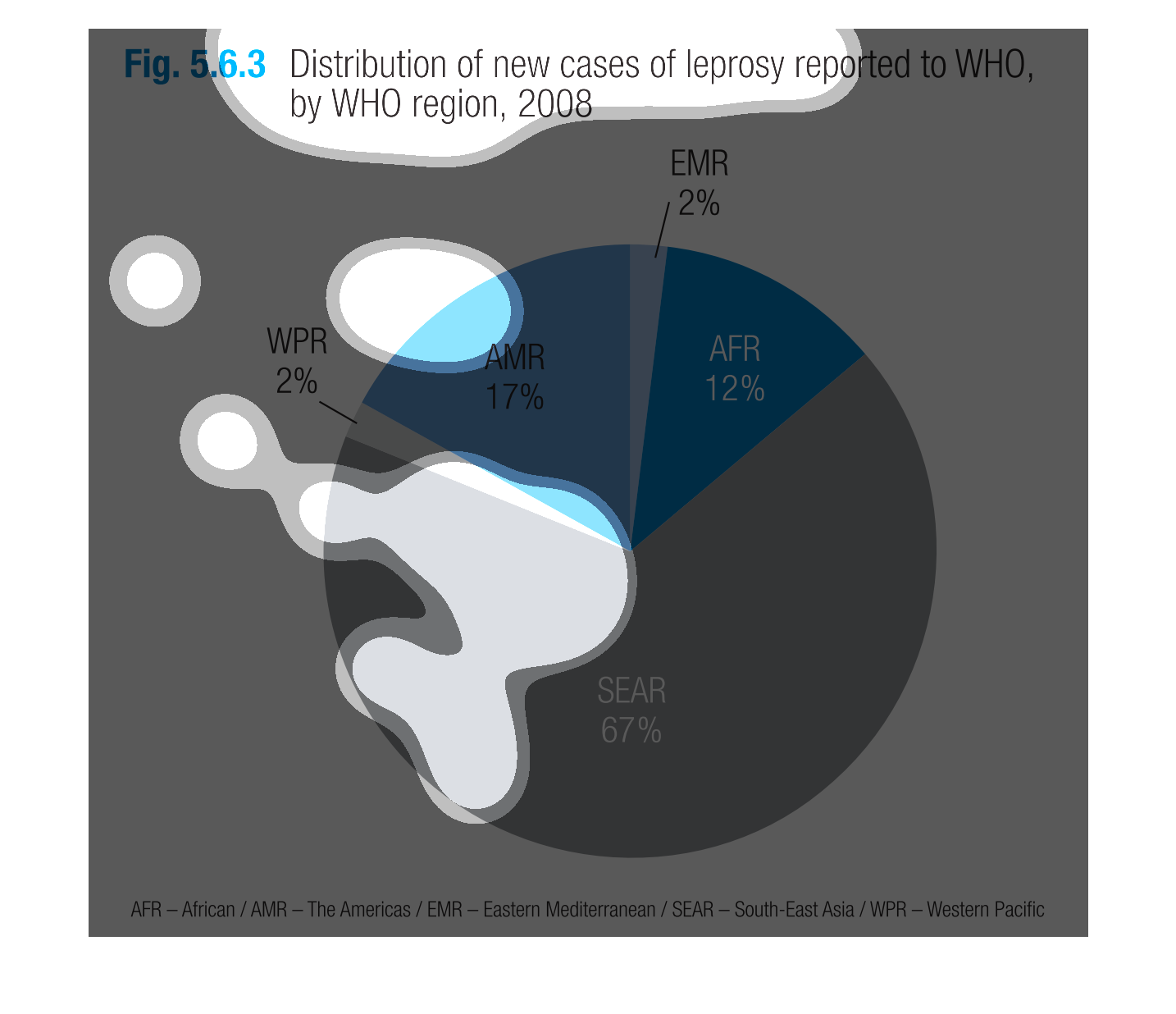
The circle graph to my left shows the distribution of new cases of leprosy reported to WHO
by WHO region, 2008. The graph then shows the five different parts where the percentages match
up together.
This handmade chart shows the new cases of leprosy as reported to the World Health Organization
in 2008 and is divided by region and country. Or so it looks like
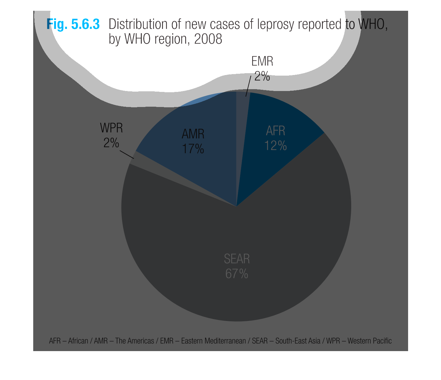
This chart shows the distribution of leprosy reported in 2008. SEAR is 67 percent, AFR is
12 percent, and AMR is 17 percent. This graph is clearly shown in colors
This image or figure shows or depicts in statistical pie chart format the distribution of
new cases of leprosy reported to WHO, by WHO region for 2008.

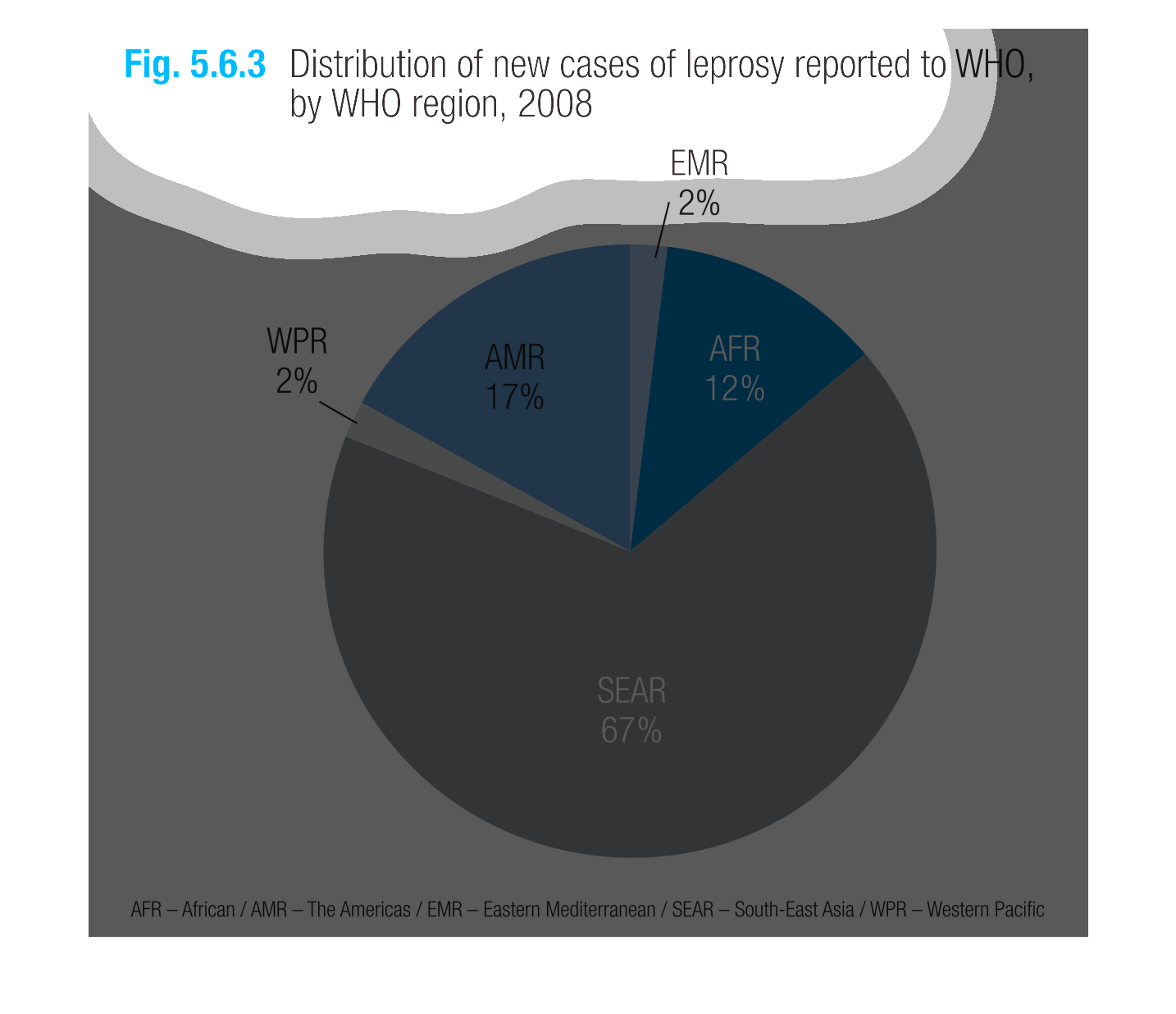
This chart describes distribution of new cases of leprosy reported to WHO, by WHO region,
for the year 2008. The largest category on the chart is SEAR with 67%.
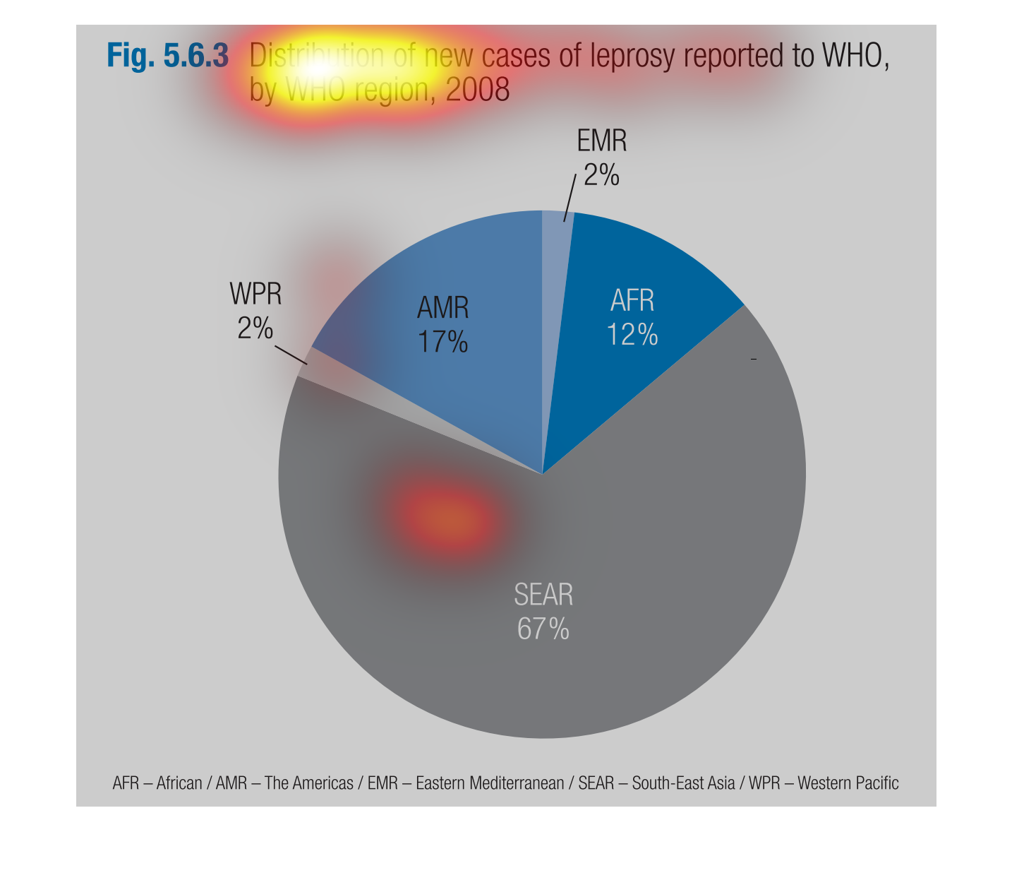
The image on the left hand side shows the breakdown of new leprosy cases throughout the world.
 From this graph one can infer that South East Asia has adopted many more new leprosy cases
than any other region.