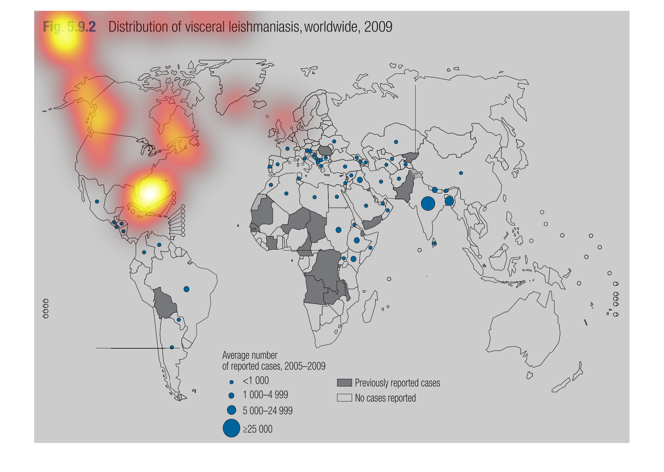
This image shows the distribution of visceral leishmaniasis worldwide in 2009.  The average
number of imported cases is separated into groups by amount and each group is given a size
of circle to denote it.  Previously reported cases are shown in gray and no reported cases
is shown in white.  All of the information is then plotted on the world map.
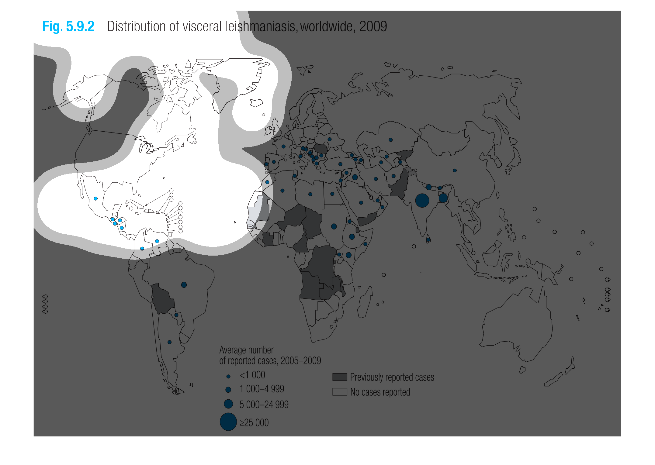
This image or figure shows or depicts in statistical World Geographic map format data concerning
distribution of visceral leishmaniasis, worldwide for 2009.
This is a graph showing the distribution of visceral leishmaniasis worldwide.  There are almost
no cases in North America, and are many cases in Africa.
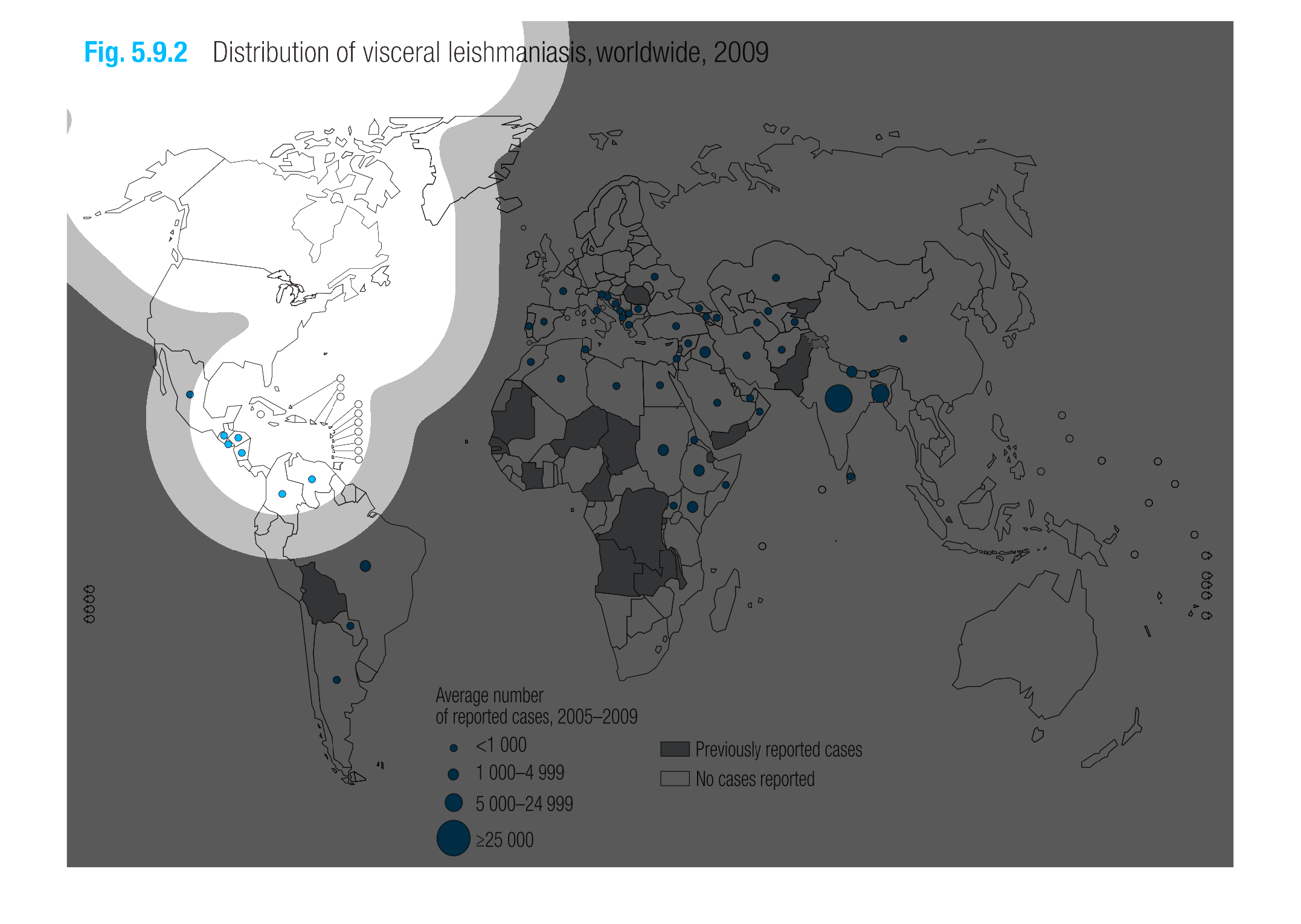
This chart shows the distribution of visceral leishmaniasis worldwide in 2009. The figure
shows that a majority of cases of visceral leishmaniasis are in hotter climates around the
equator or southern hemisphere.
This map shows the distribution of visceral leishmaniasis worldwide according to 2009 data.
Based on the map, there were no cases reported in the United States, and Africa had the most
previously reported cases. These cases were reported between 2005 and 2009.
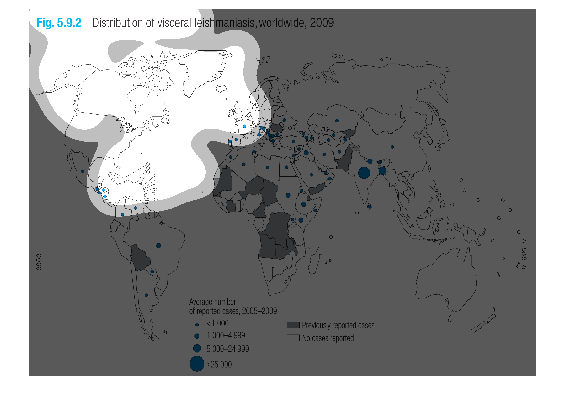
The figure presented is titled Distribution of the visceral  leishmaniasis, worldwide, 2009.
 The figure is a representation of the distribution of the visceral leishmaniasis.
the graph is a world map representing the number of outbreaks of visceral leishmaniasis worldwide
in the 2009 year. The categories are represented by different sized dots.
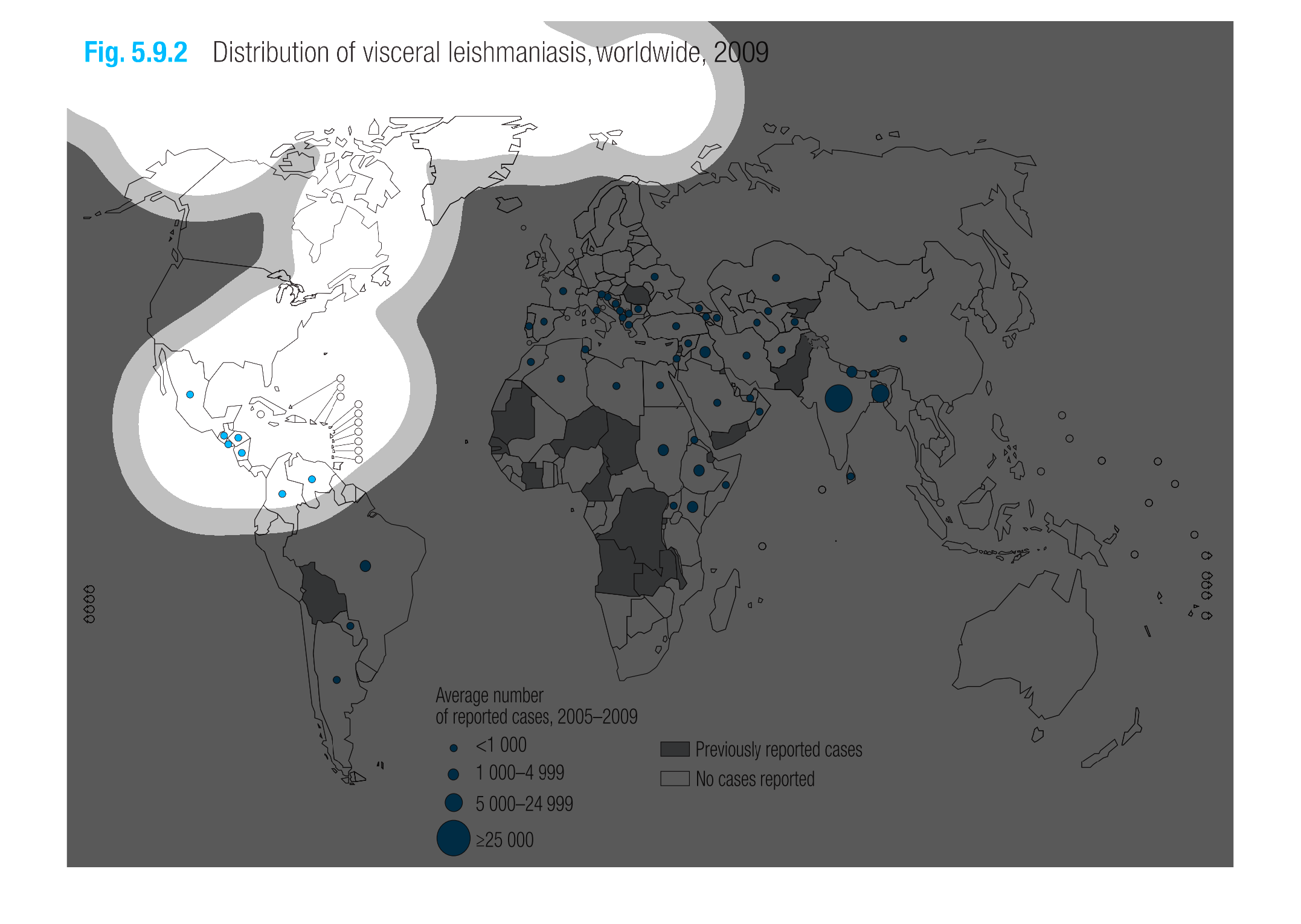
This is a graph that shows the usage and distribution of a substance on a global scale. The
usage is represented by dots. The bigger the dot, the higher the usage.
This is a graphical global map depicting the distribution of visceral leishmaniasis worldwide
in the year 2009. The area with the highest number of cases is shown to be in Asia.
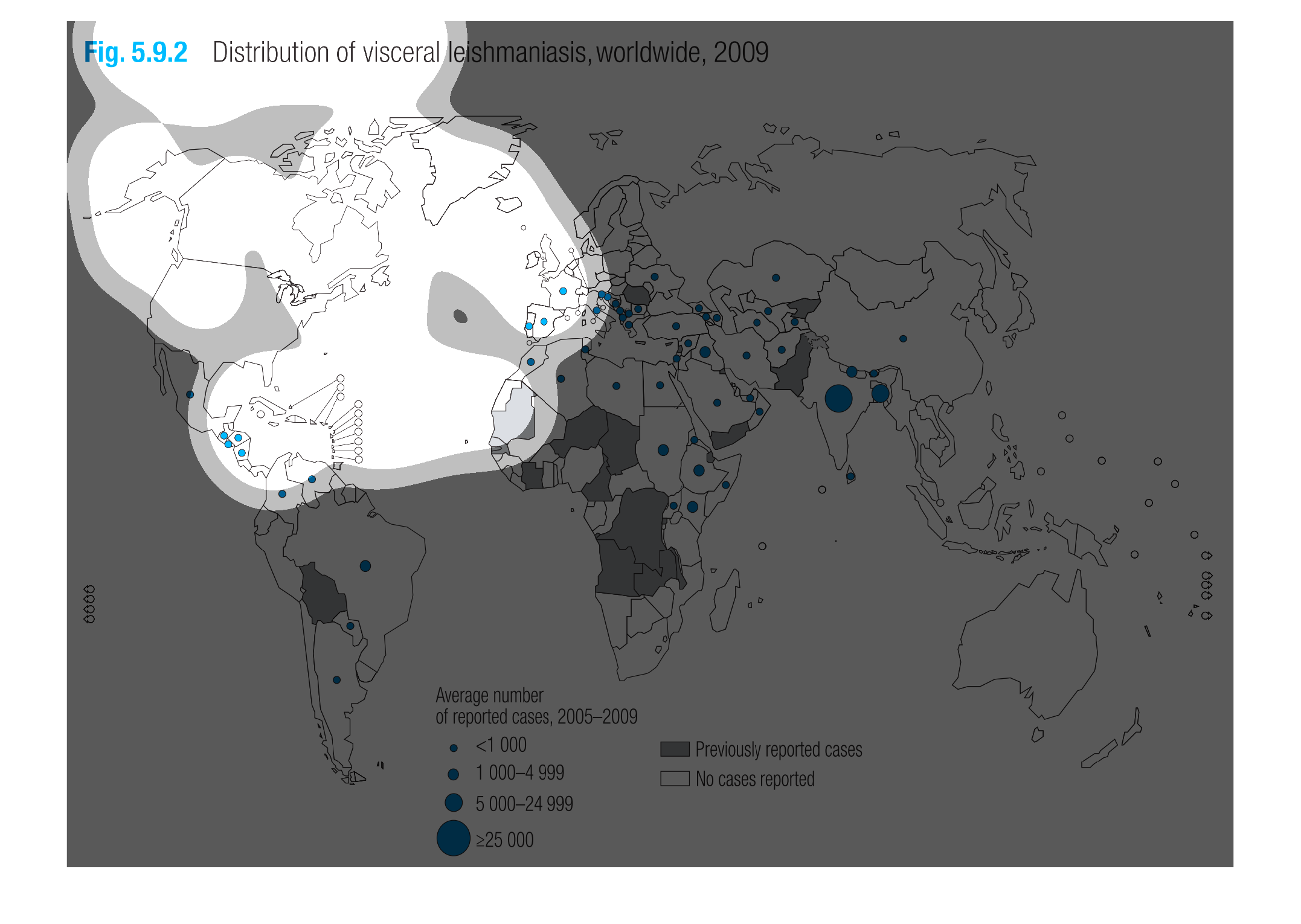
The map shows the number of cases of a disease in the world in a certain time frame.  the
blue colors indicated higher number of cases.  these seem to be located mostly in  asia and
africa