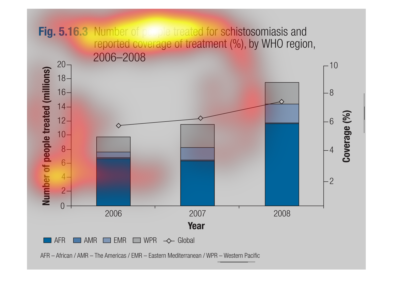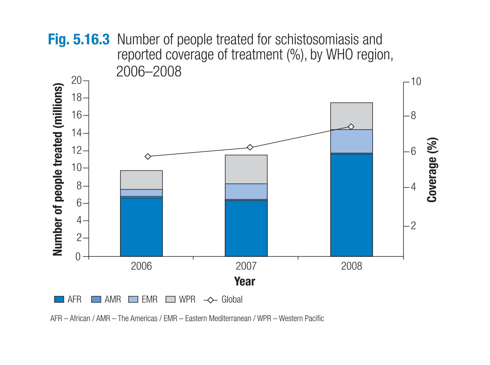
This graph shows that over time, the number of people treated for schistosomiasis has increased,
especially between 2007 and 2008. In 2007 6% of those affected were treated while in 2008
8% were treated.
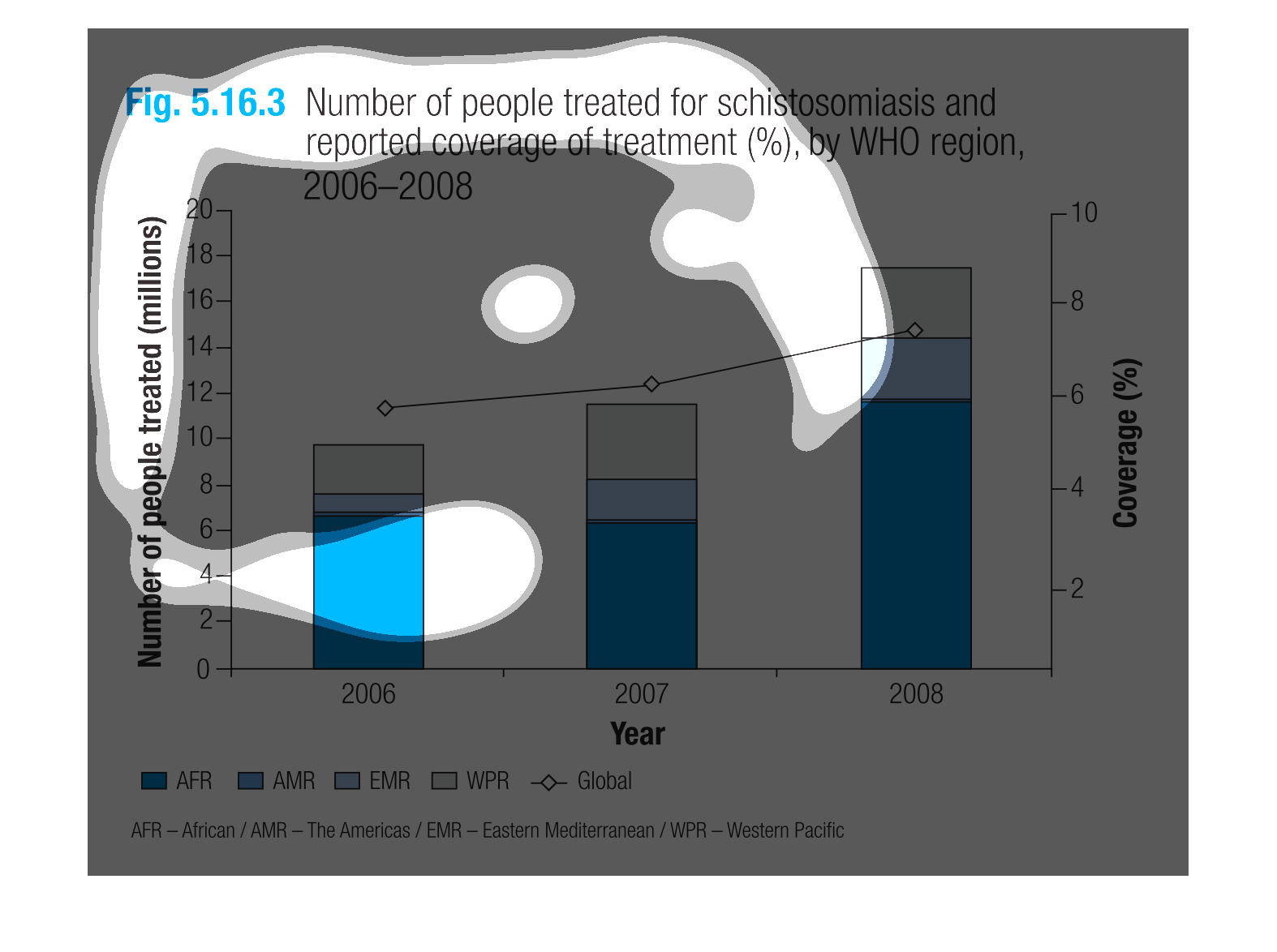
The figure presented is titled Figure 5.16.3 Number of people treated for schistomiasis and
reported coverage of treatment (%), by WHO region, worldwide.
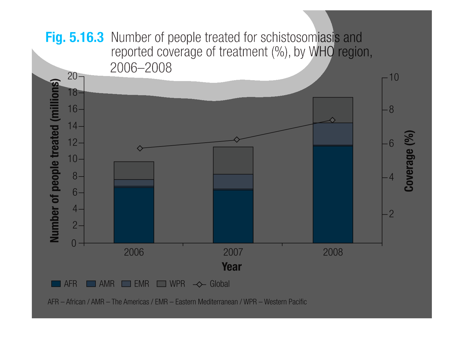
The figure presented is titled Number of people treated for schistosomiasis and reported coverage
of treatment (%), by WHO region, 2006-2008.  The data shoes the people treated for schistosomiasis.
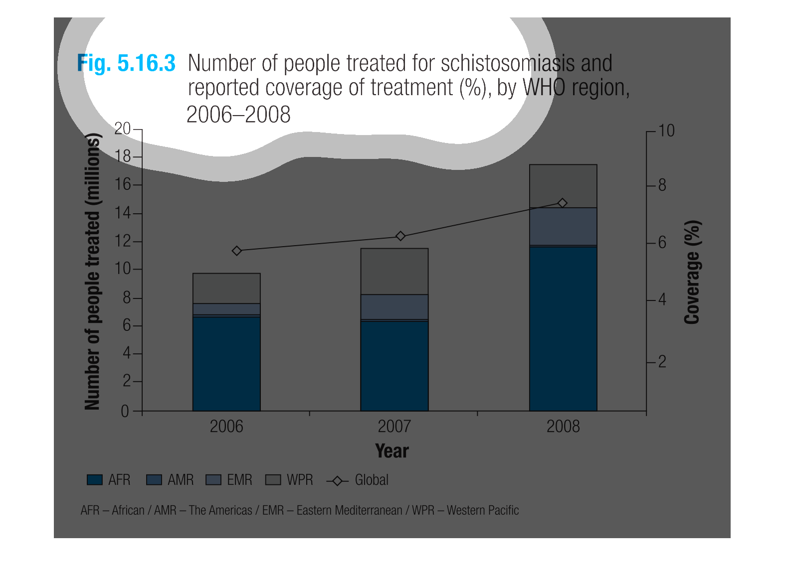
This is a graph that shows the number of people treated for schistosomiasis and reported coverage
of treatment. it is compiled by the WHO for the years ranging 2006 to 2008.
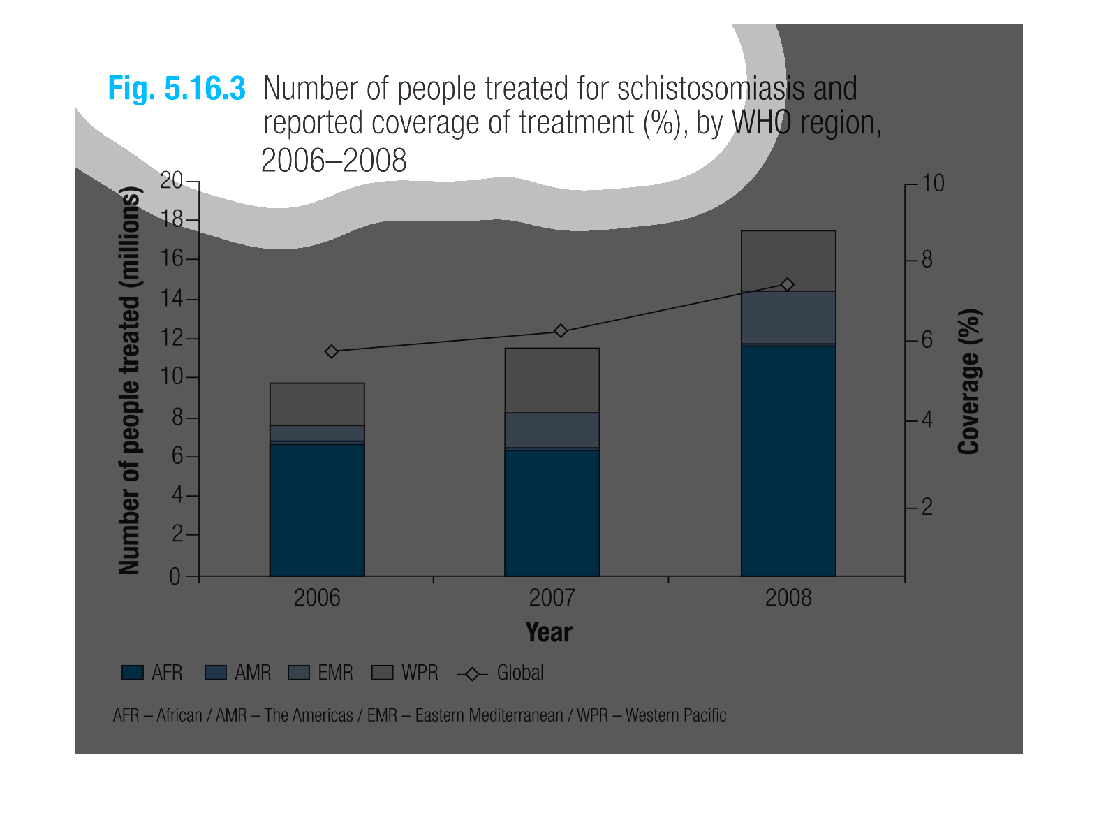
figure 5.16.3, number of people treated for schistosomiasis and reported coverage of treatment
percentage by WHO region 2006-2008. Y axis is number of people treated in millions 0-20. X
axis shows years
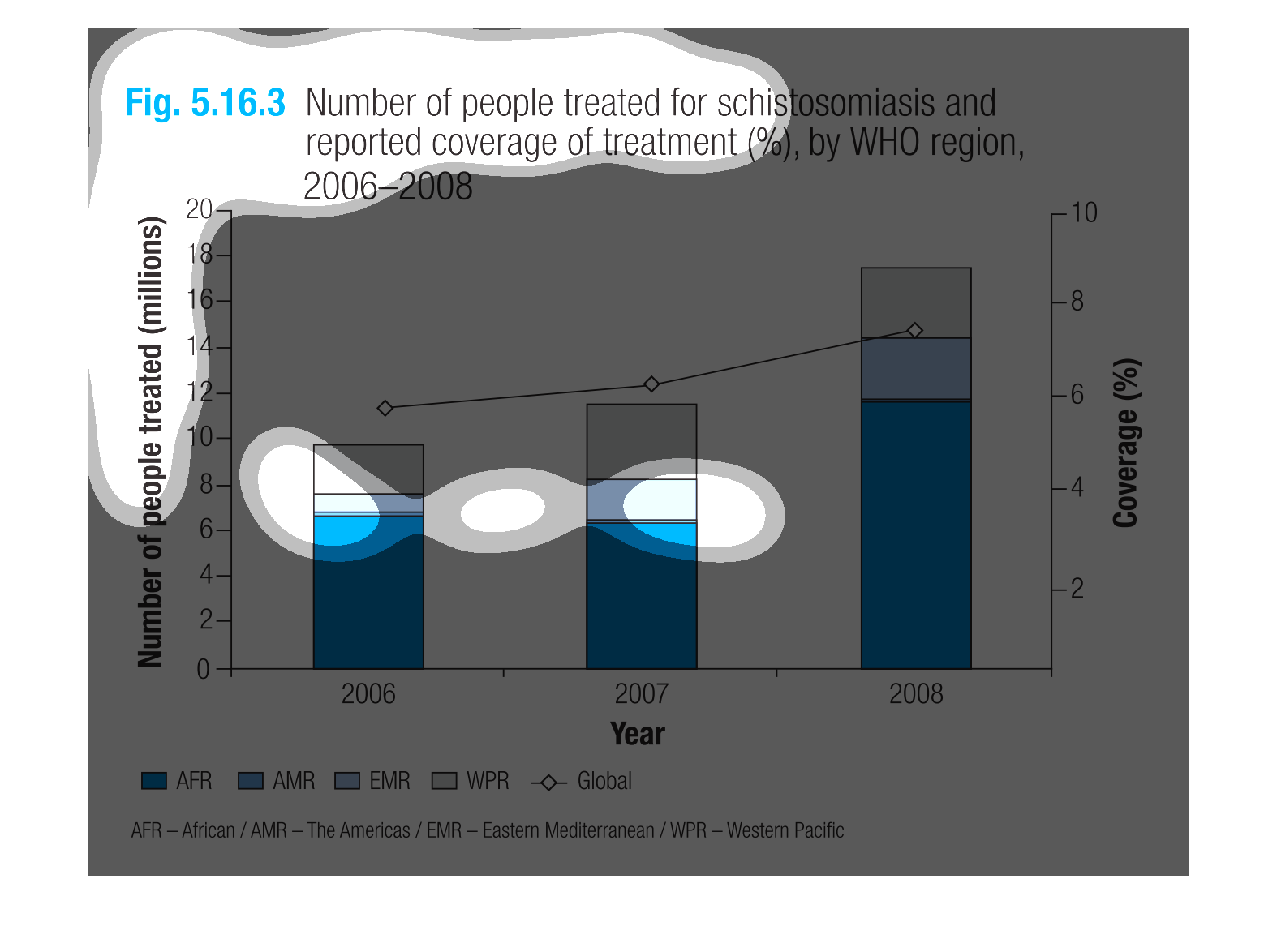
This is a series of bar graphs depicting the number of people treated for schistosomiasis
and reported coverage of treatment by WHO region from 2006-2008.
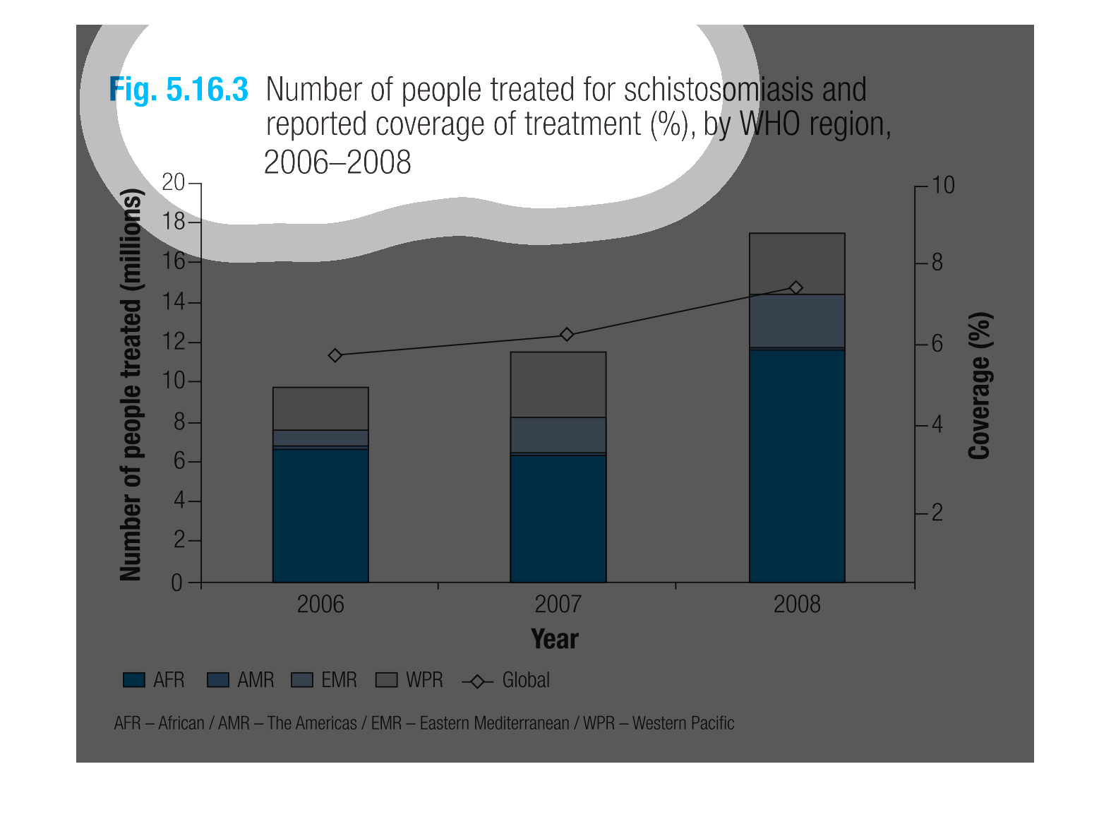
This is a chart of information from the World Health Organization, from 2006-2008, with data
on individuals who were diagnosed and treated with a specific condition and the percentage
of the individuals who had medical coverage.
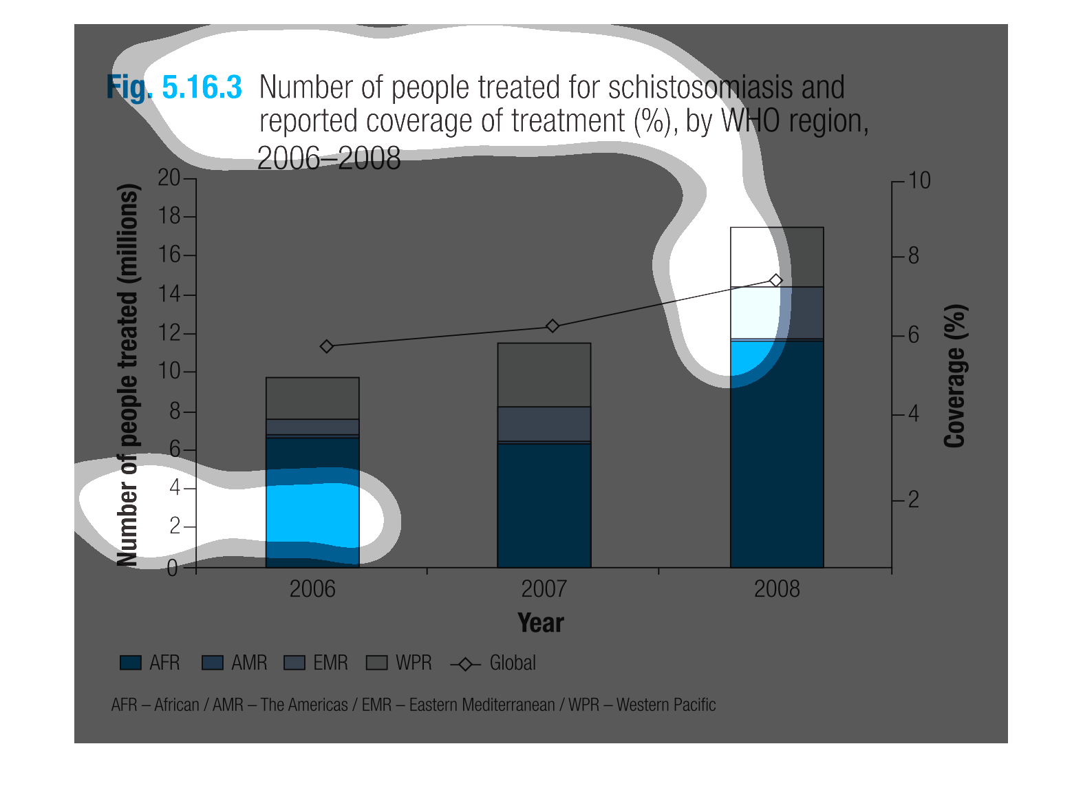
This graph depicts the number of people treated for schistosomiasis and the reported coverage
of treatment by the World Health Organization from 2006 to 2008.  The bar graph is stacked
to show the cumulative numbers segregated by region.
This chart describes numbers of people treated for schistosomiasis and reported coverage of
treatment (%), by WHO region, from the years 2006 through 2008.
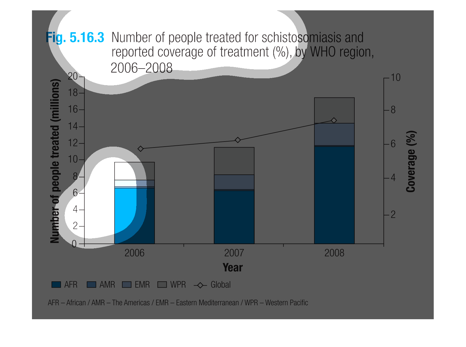
The following chart lists the total number of people treated for schistosmiasis  and reported
coverage of treatment in a percentage form reported by the world health organization in the
years 2006-2008
Figure 5.16.3 shows number of people treated for schistosomiasis and reported coverage of
treatment percent by WHO region 2006-2008. Percentages are highest among Africans.
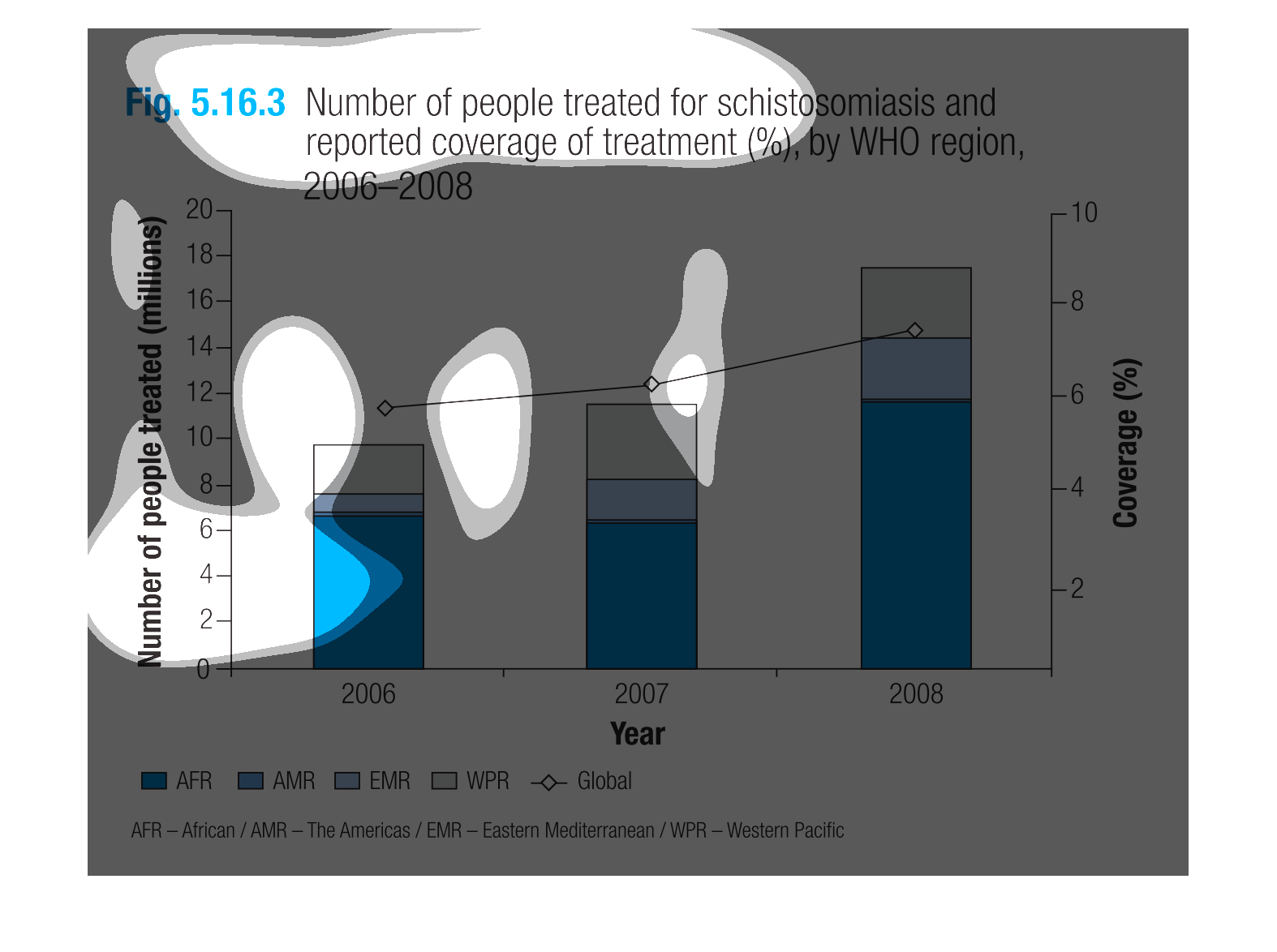
It is a bar graph that shows the amount of people who were treated for schistosomiasis and
their treatments from 2006-2008. It appears to have been a great increase in the amount of
treatment coverage per reported case in Africa by 2008.