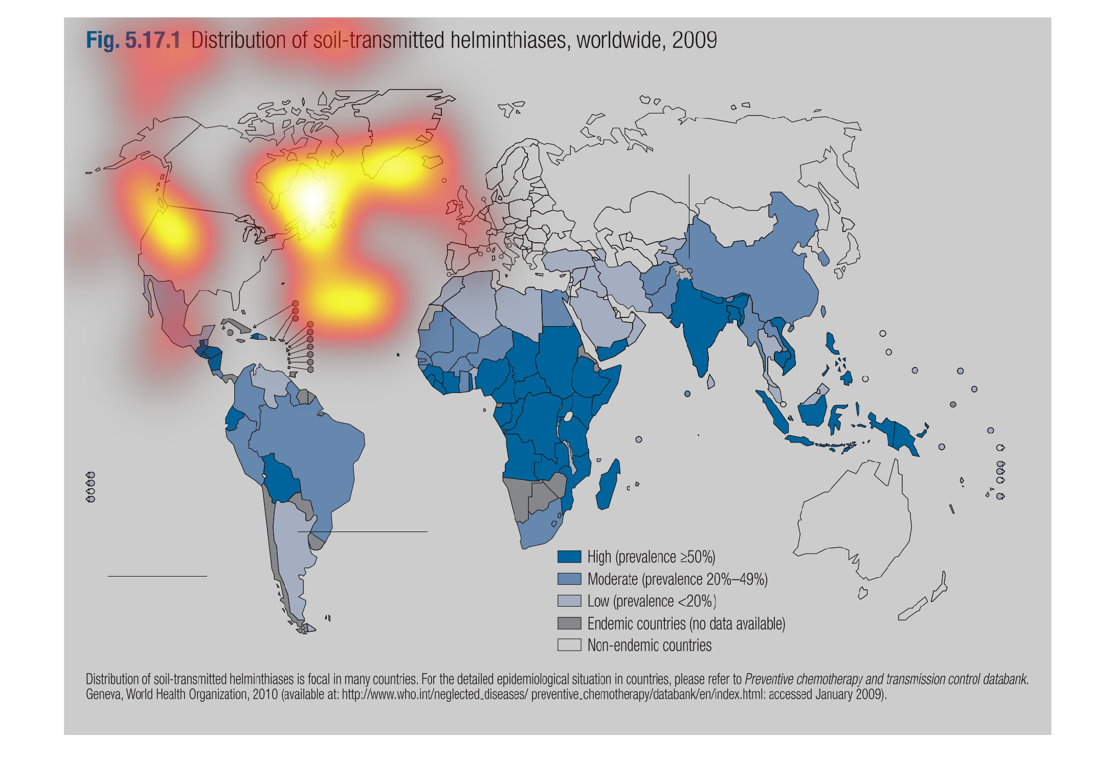
This graph is a representation of Distribution of Soil-transmitted Helminthiases (Worldwide,
2009).  It appears that the areas of higher concentration are in underdeveloped and overpopulated
countries.
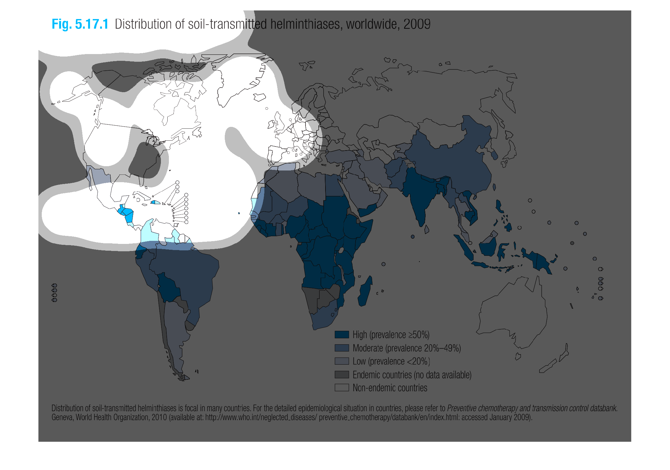
This graph illustrates a distribution of soil transmitted bacterias in 2009. It goes from
high prevalence to low prevalence range with  The southern half of the world has higher rates.
The chart shows the distribution of soil transmitted helminthiases throughout the globe in
the year 2009.  The distribution is most prevalent in the southern hemisphere, and only touches
the very southern parts of the northern hemisphere.
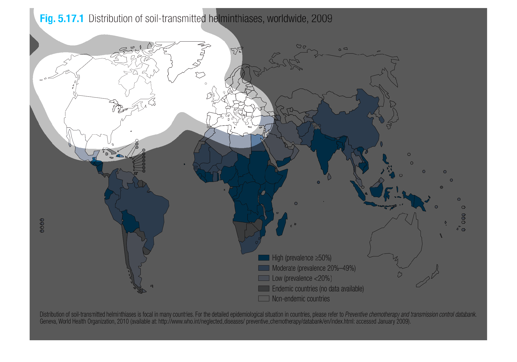
This is  a a depiction of the persistence of worm-related infections transmitted via soil
across the globe in 2009. The darker blue countries are where the infection has the highest
incident (>50%). Grey countries are endemic, no data available. White colored countries are
non-endemic. The continent of Africa has the highest number of countries that are dark blue
(>50%). Southeast Asia and India are also in the >50% range. The continent of South America
also has a high rate of 20- >50% depending on the country. European countries, Australia,
and North America have the lowest rates.
This image is a depiction of a world map, circa 2009, and the distribution of soil-transmitted
helminthiasis.Africa has the highest prevalence rate, along with parts of South America,
Asia, and the outlaying islands of Australia.
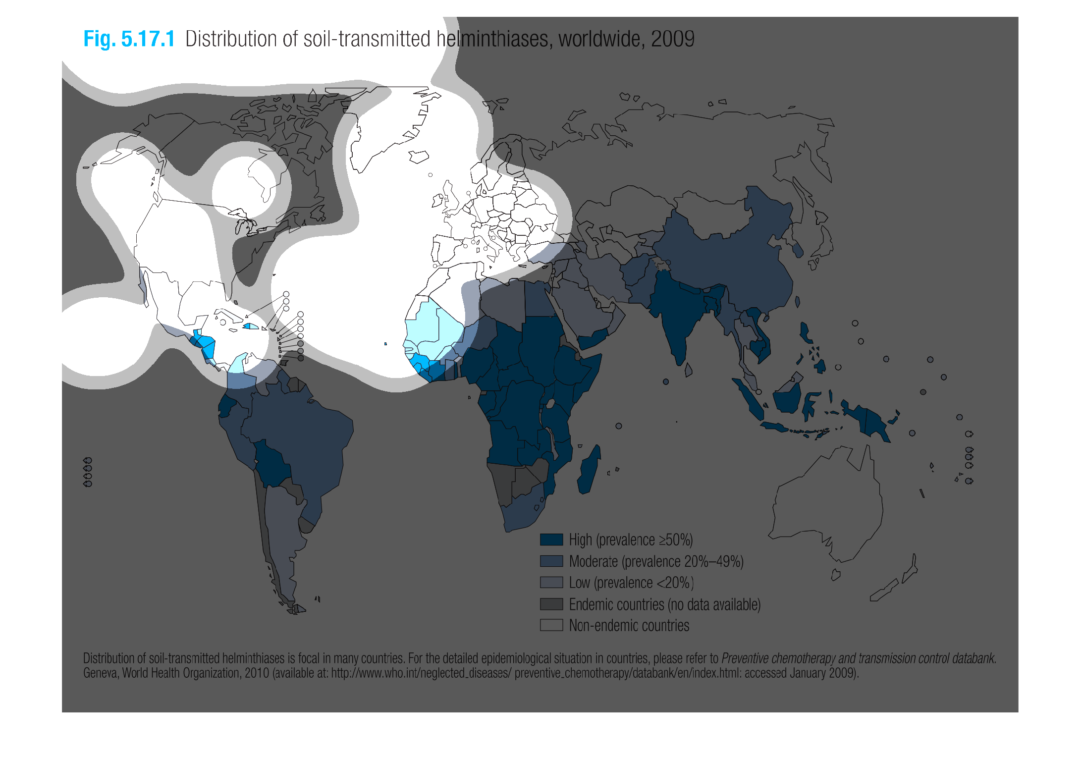
This image or figure shows or depicts in statistical World Geographical format data about
the distribution of soil-transmitted helminthiases worldwide for 2009.
The image of the graph seems to deal with the transfer and distribution of a parasitic worm
infection known as helminthiasis. The rates seem to be highest in third world countries
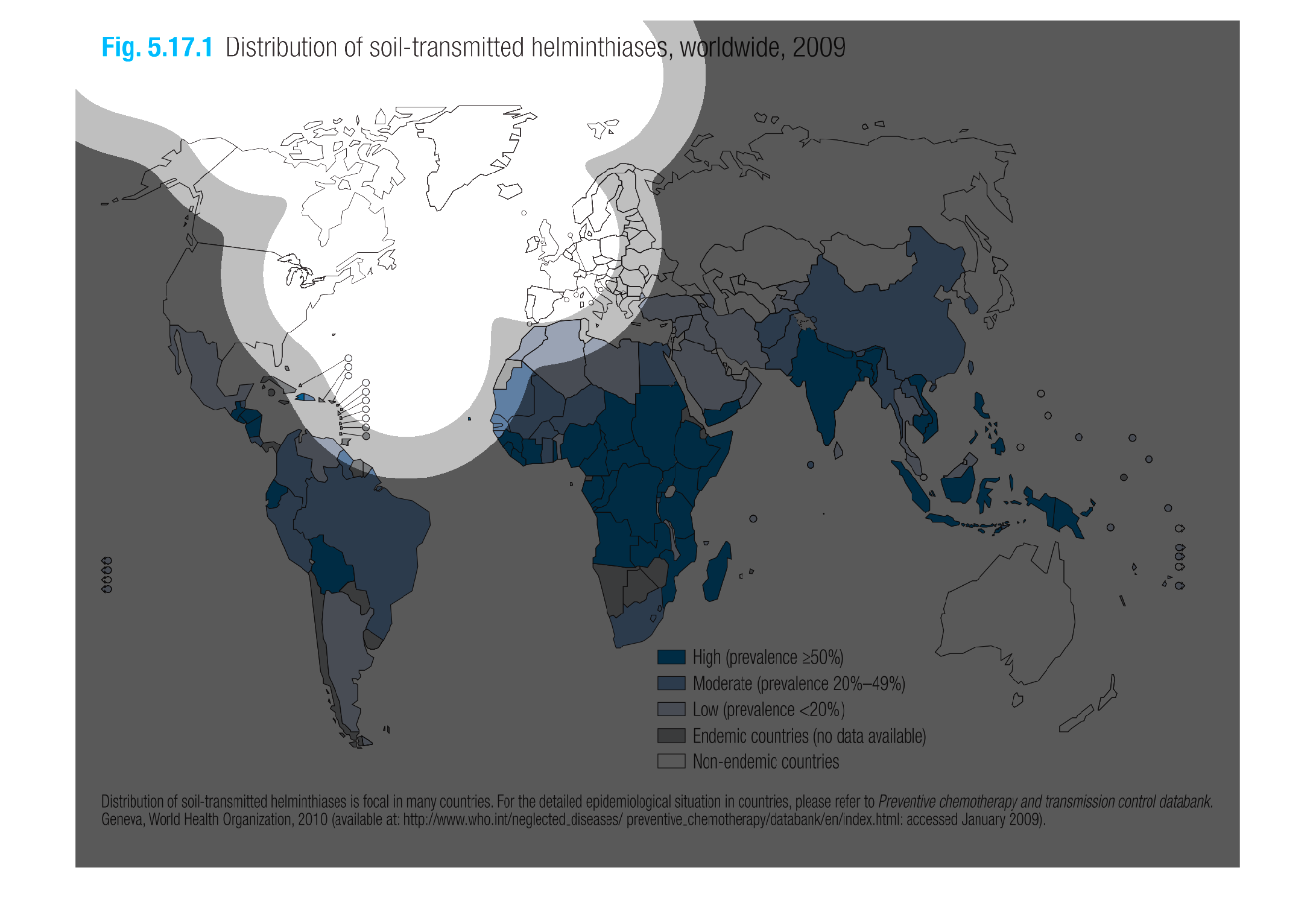
This image shows the countries around the world with a soil distribution of helmenthoasis,
and how high that distribution is. Many countries in South America, Africa and Asia have a
high distribution, while North America and Europe are non-endemic in 2010.
This image shows the distribution of soil-transmitted helminthiases, worldwide, 2009. It contains
the colors, three different types of blue,gray and white.
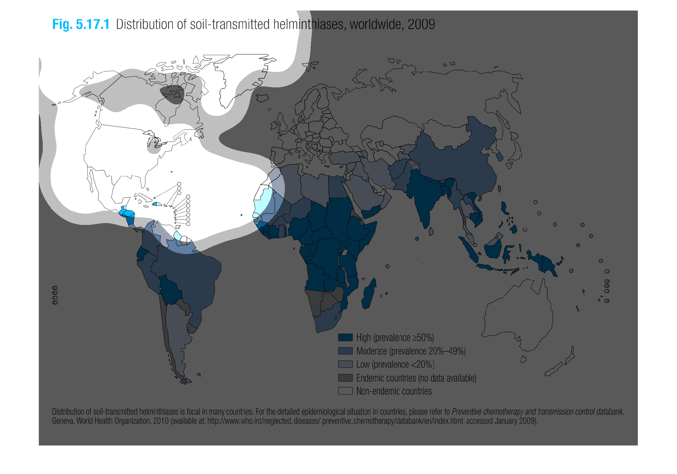
Map of the distribution of soil-transmitted heiminthiases, worldwide in 2009.  According to
the key and map, Africa and India seem to have the most out of all the countries.
This is a map of the world that shows the distribution of soil-transmitted helminthiases in
2009. It is a color coded map with levels ranging from non-endemic to high..
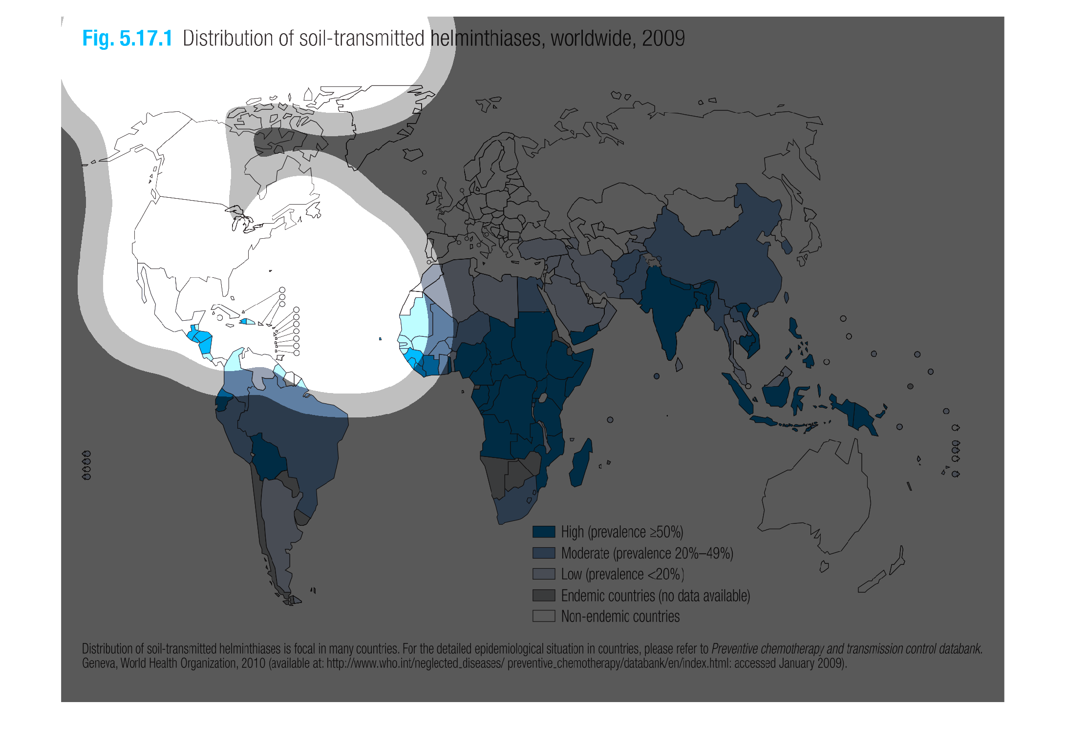
This chart describes distribution of soil-transmitted helminthiases, worldwide for the year
2009. Different categories on the chart are represented by different colors.
This chart shows the distribution of soil-transmitted helminthiases, worldwide in 2009. The
highest prevalence was in parts of Africa, parts of south America, India,