Warning: Image is too big to fit on screen; displaying at 67%
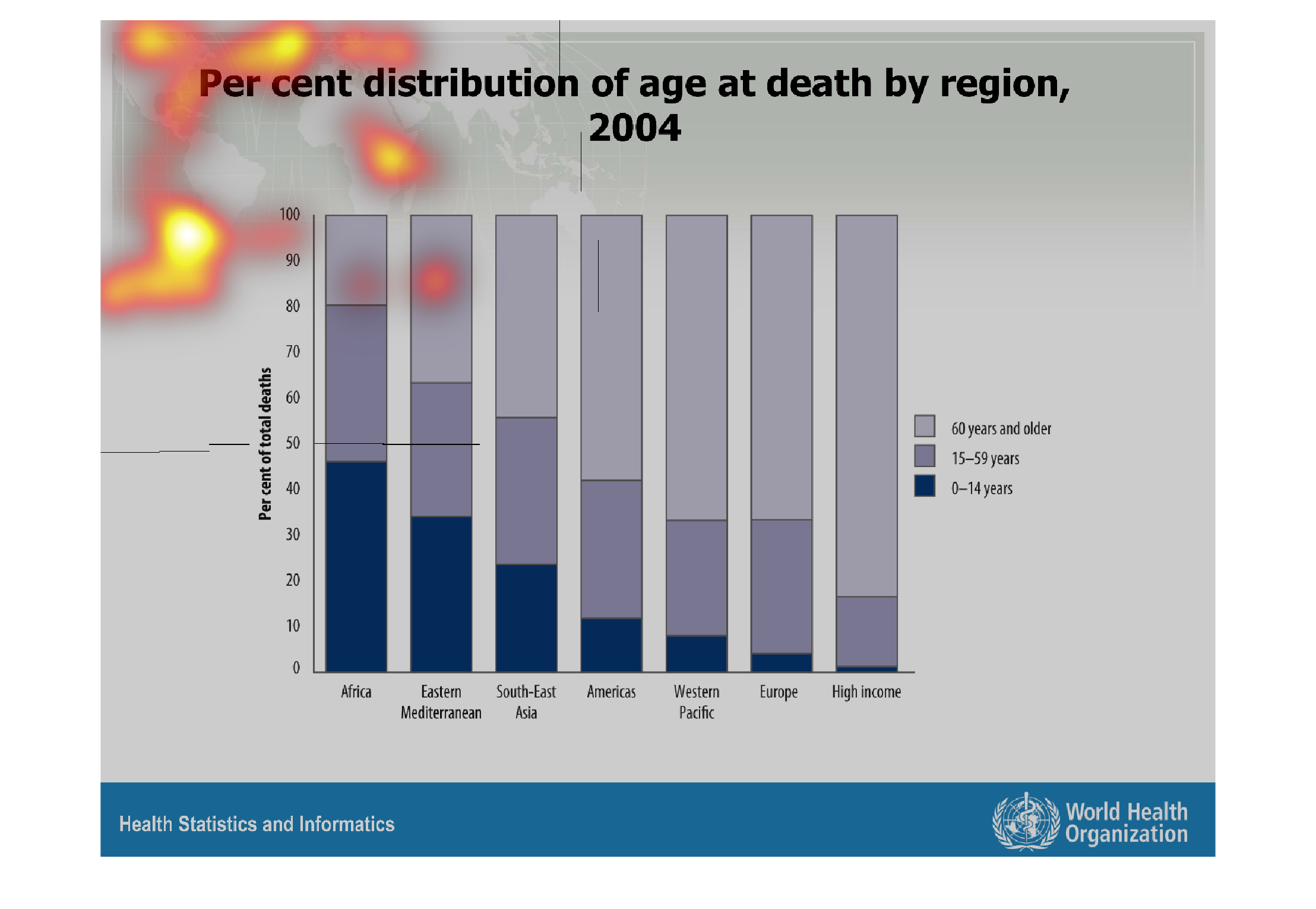
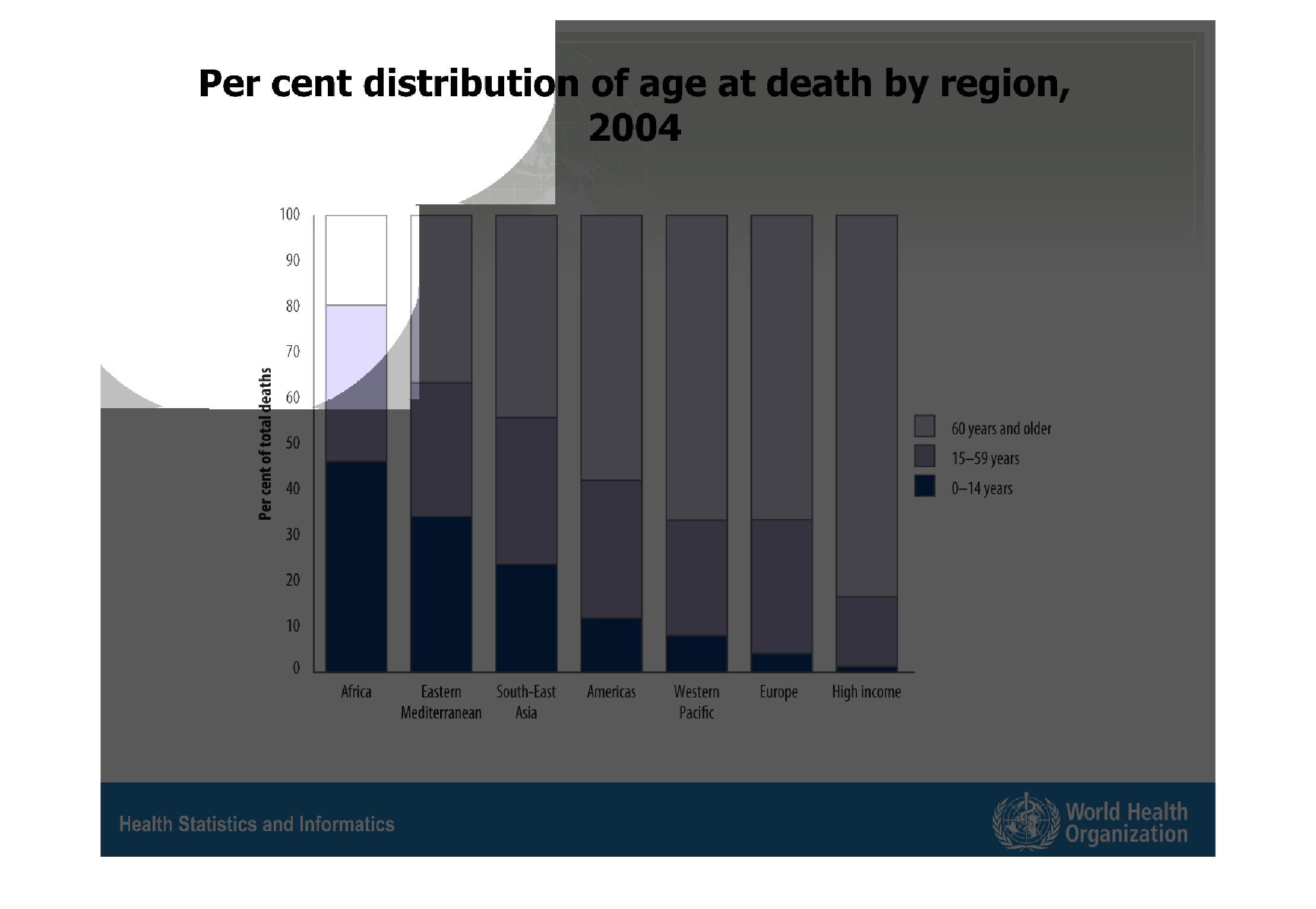
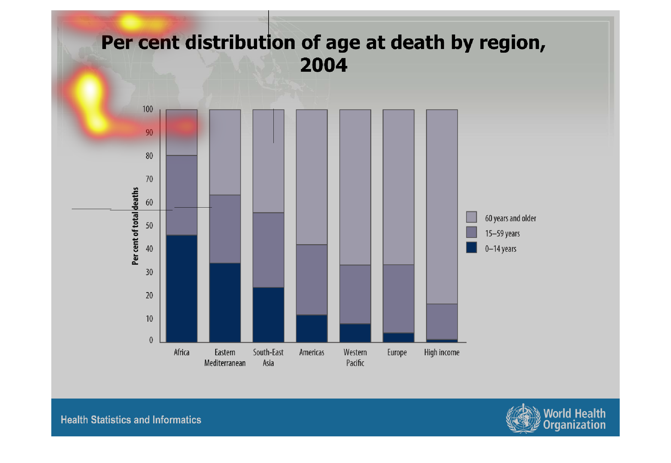
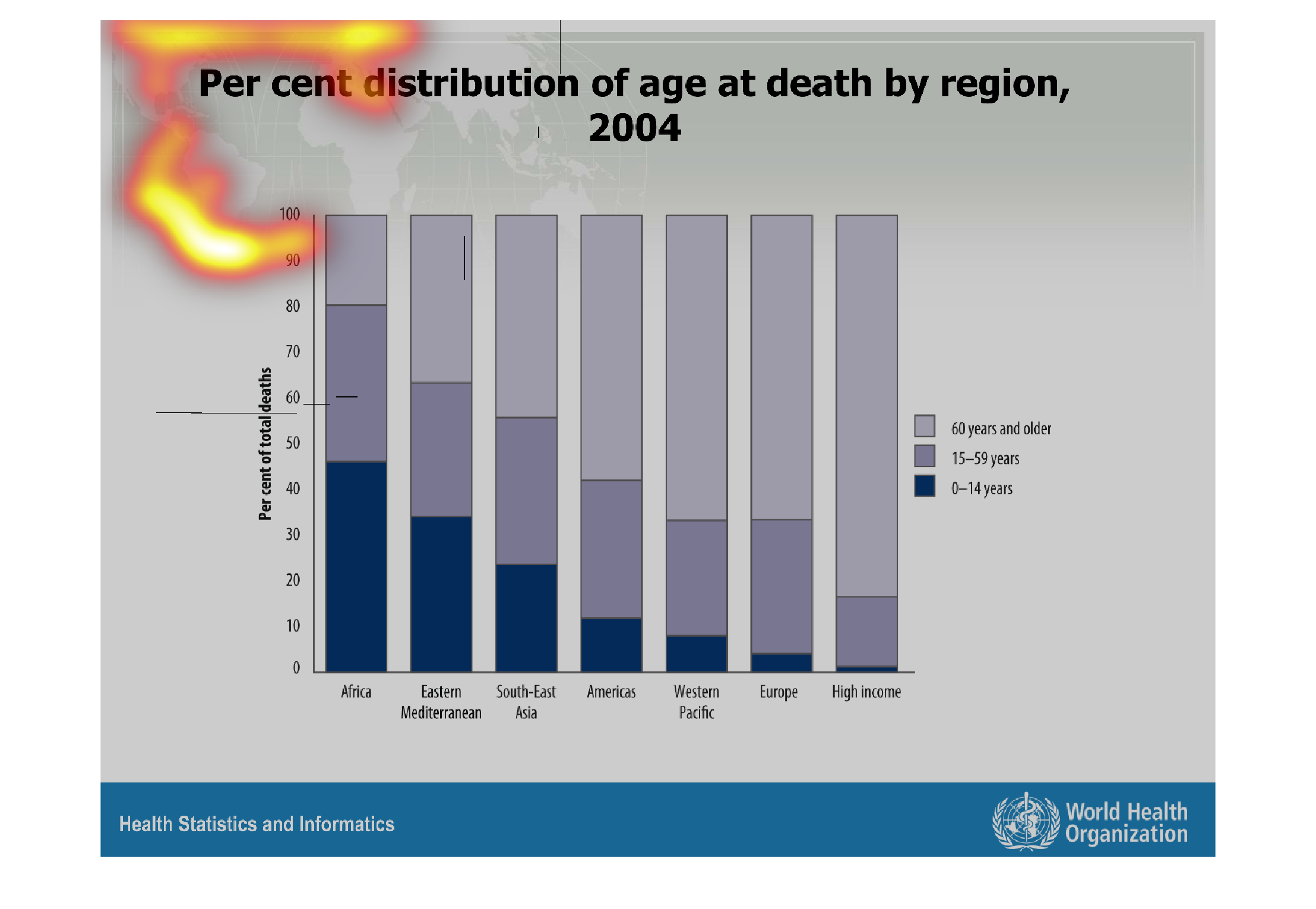
This graph shows the rises and falls of the percentage of death per age and per region of
whatever disease or issues. The ages are broken into three groups,  0-14, 15-59- 60 and older.
Warning: Image is too big to fit on screen; displaying at 67%
Warning: Image is too big to fit on screen; displaying at 67%
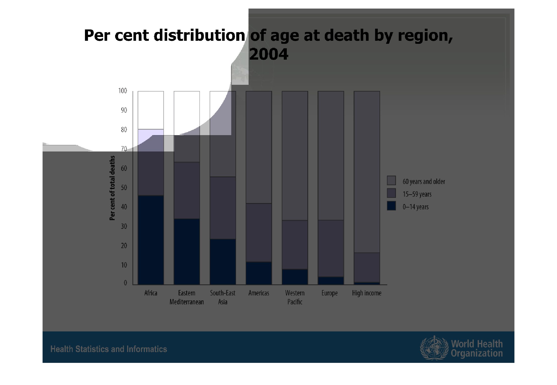
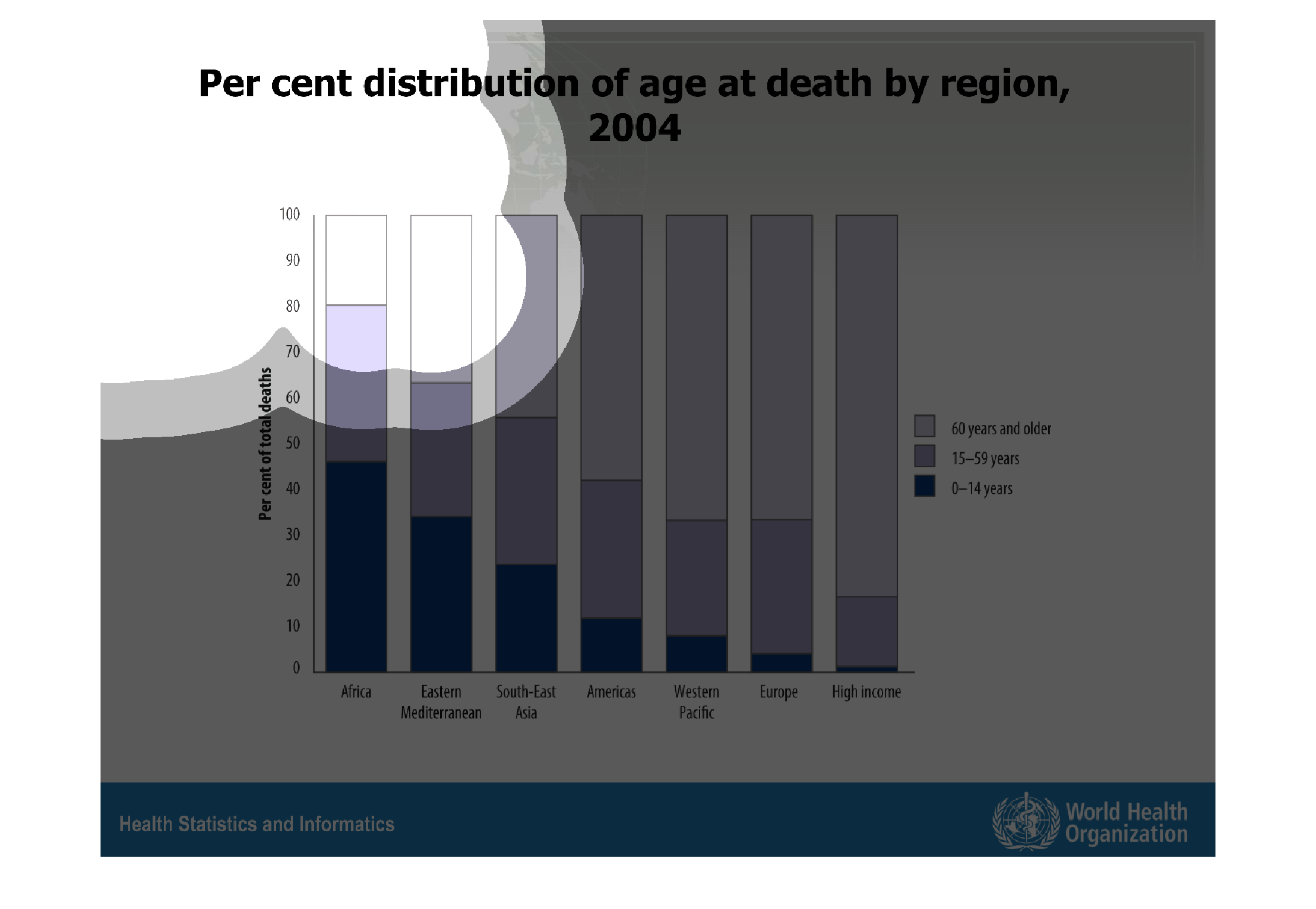
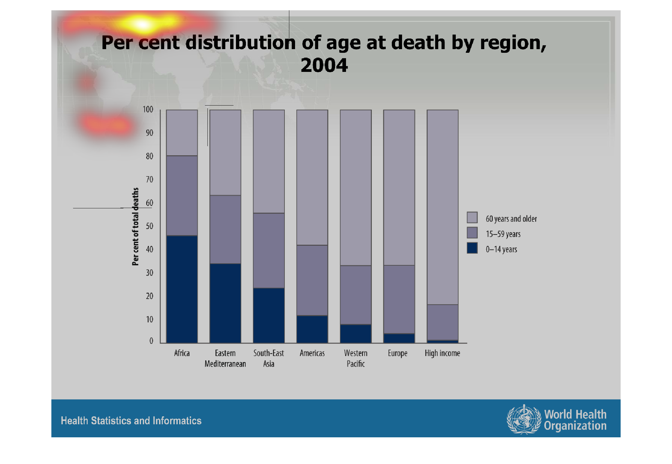
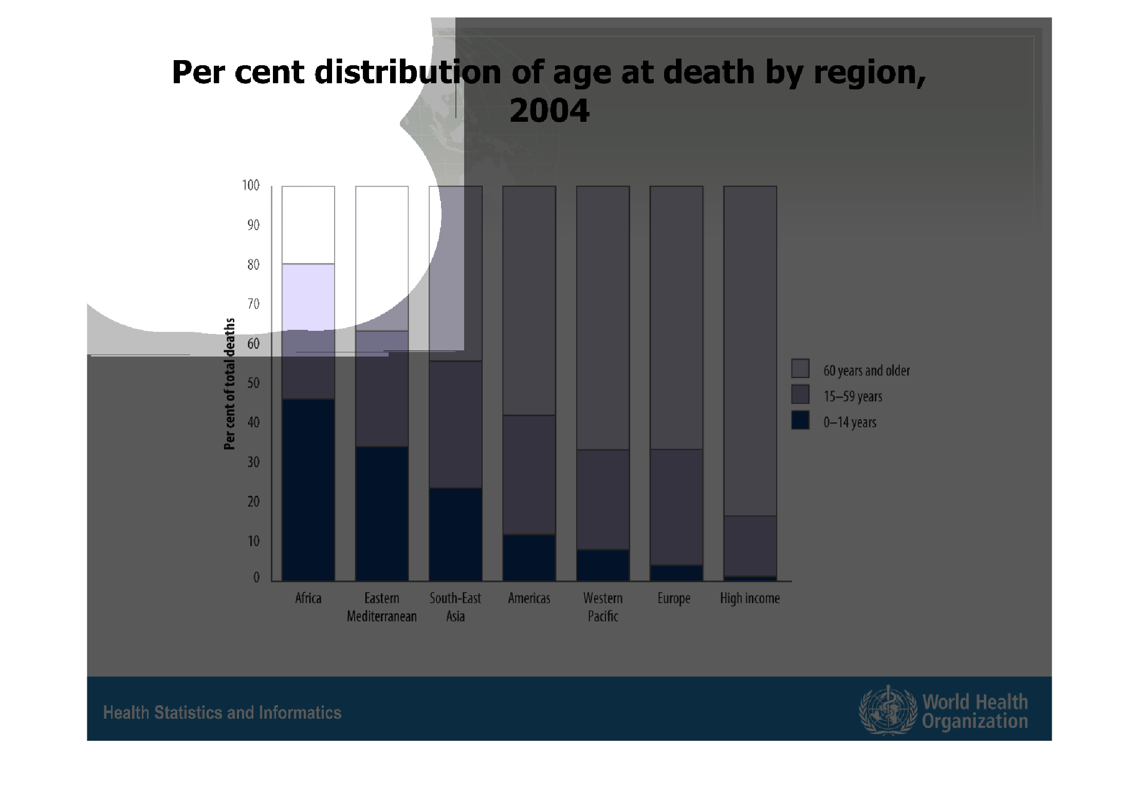
This graph represents a percent distribution of age at death by region and one by high income
people in 2004. The graph displays a distinct correlation between life expectancy and poverty
level.
Warning: Image is too big to fit on screen; displaying at 67%
Warning: Image is too big to fit on screen; displaying at 67%
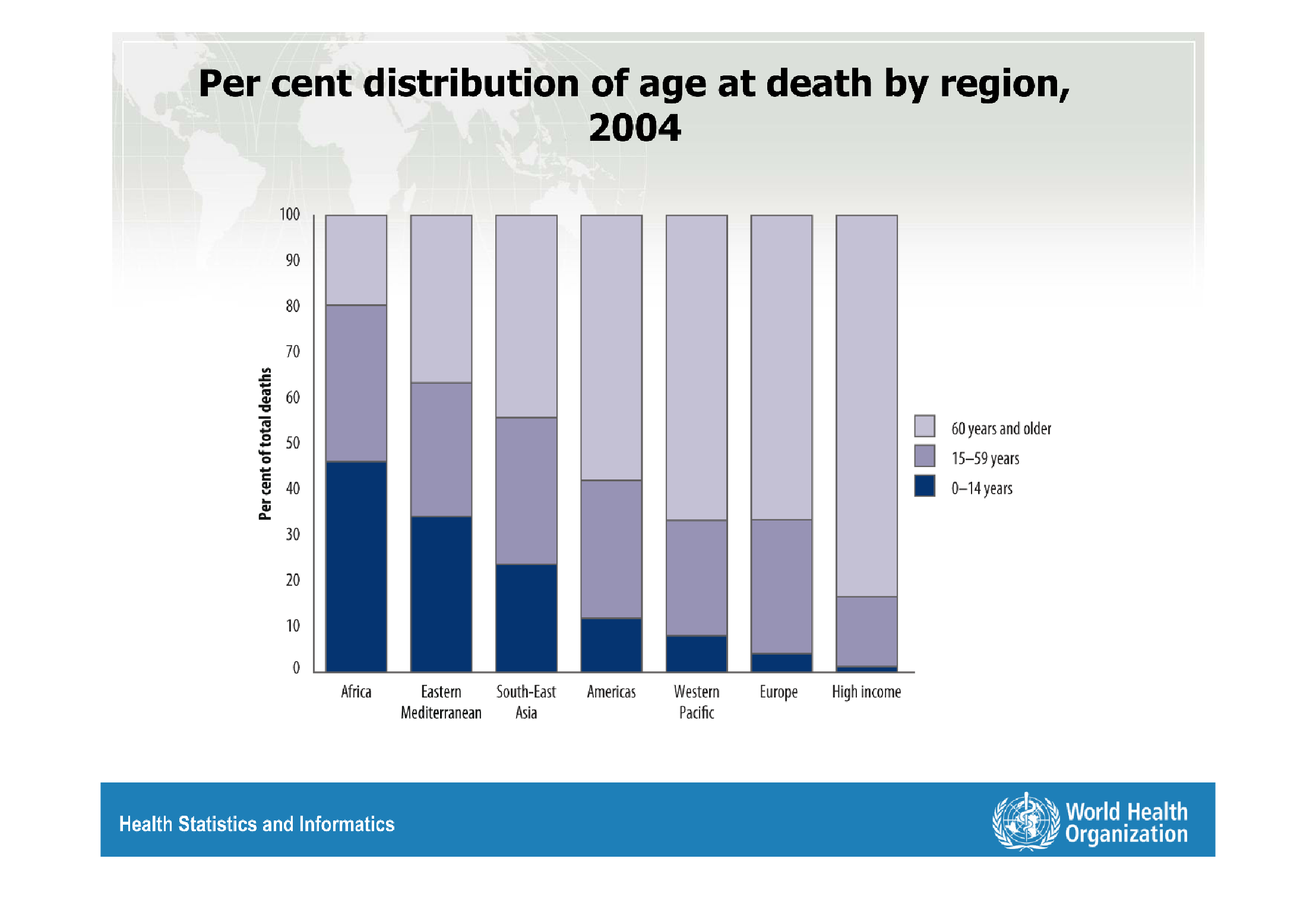
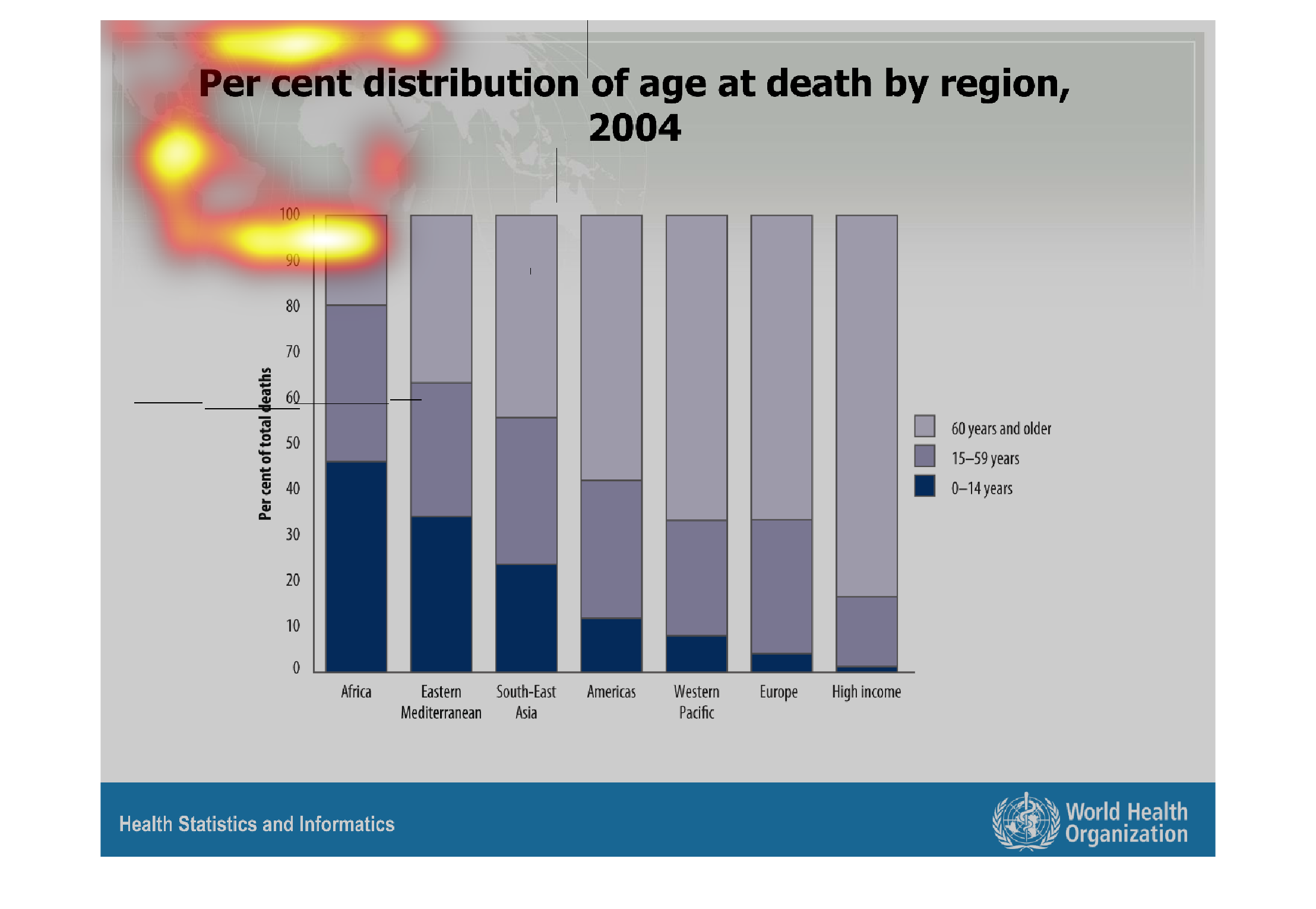
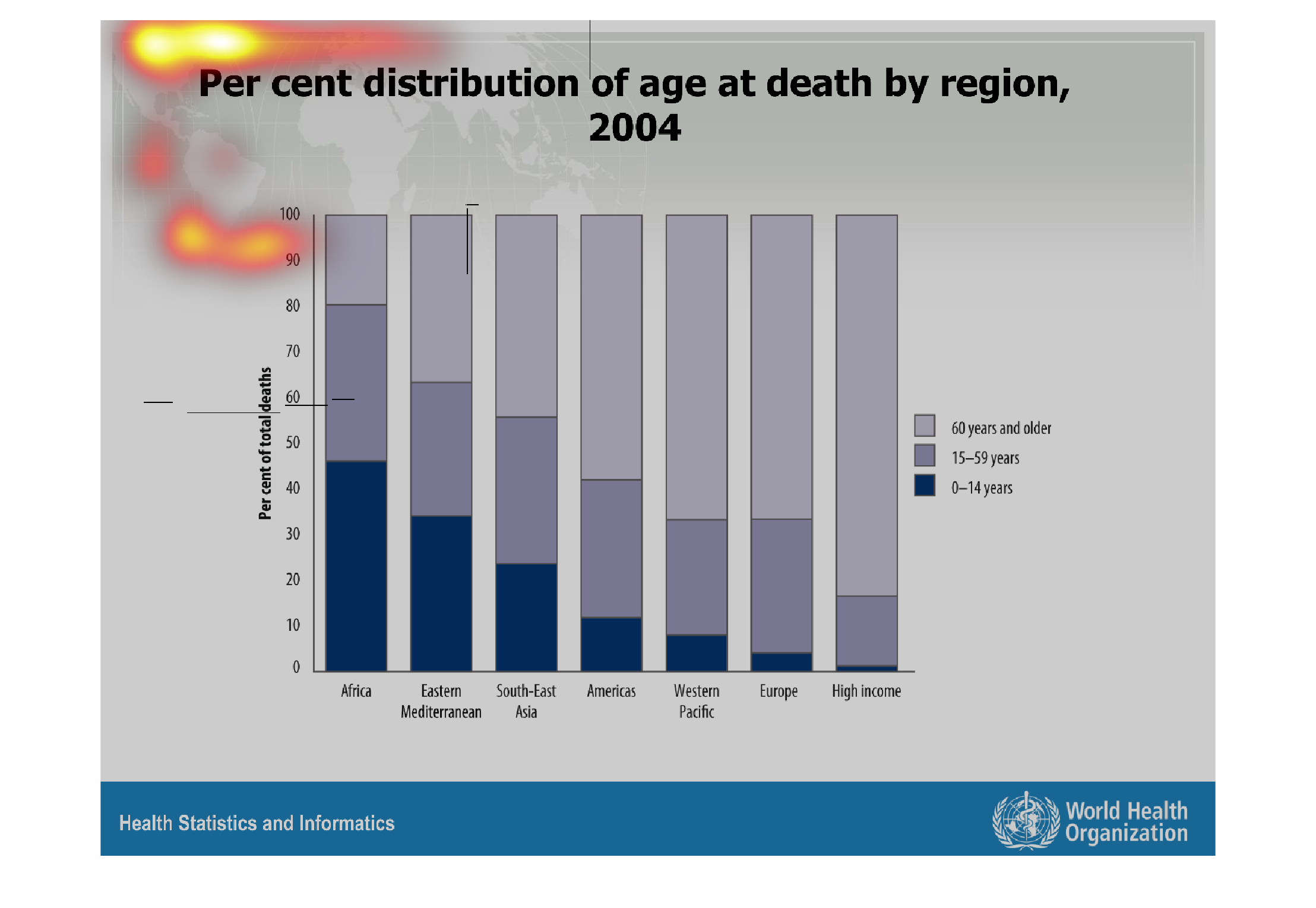
This handmade chart shows the distribution of youth deaths and how it stacks up by region.
It groups deaths into continents and major countries and regions
Warning: Image is too big to fit on screen; displaying at 67%
Warning: Image is too big to fit on screen; displaying at 67%
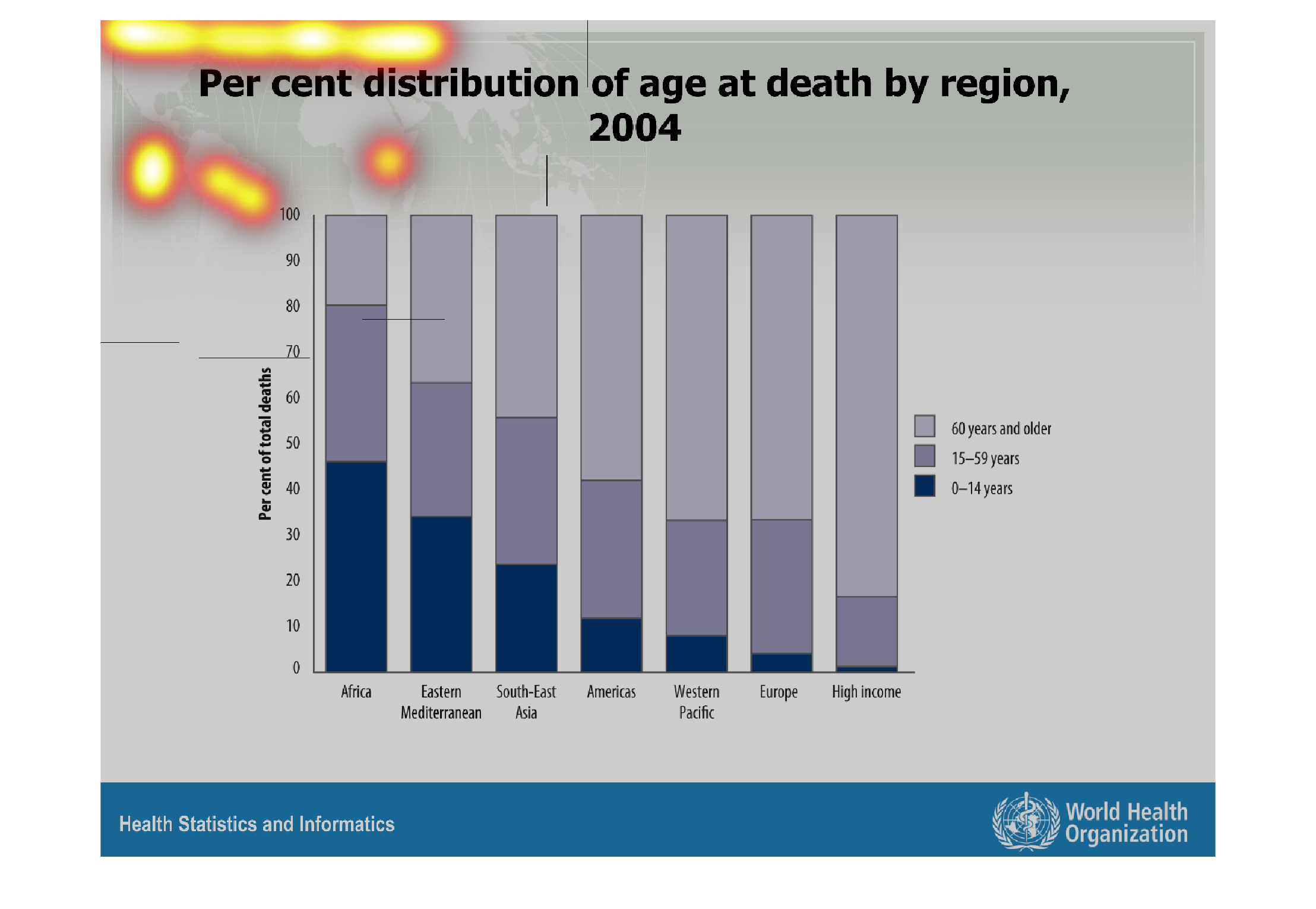
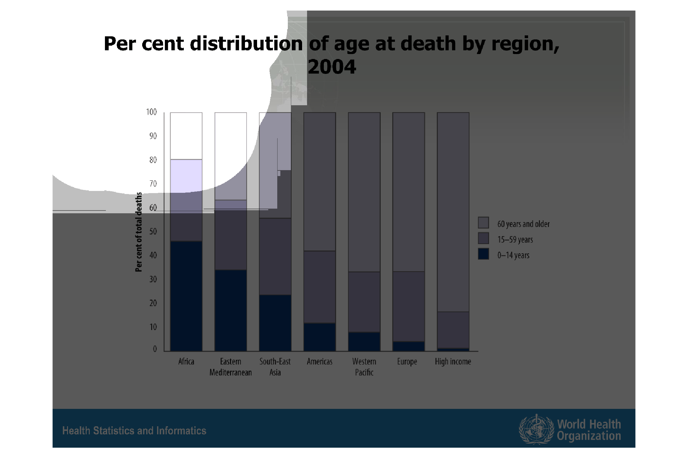
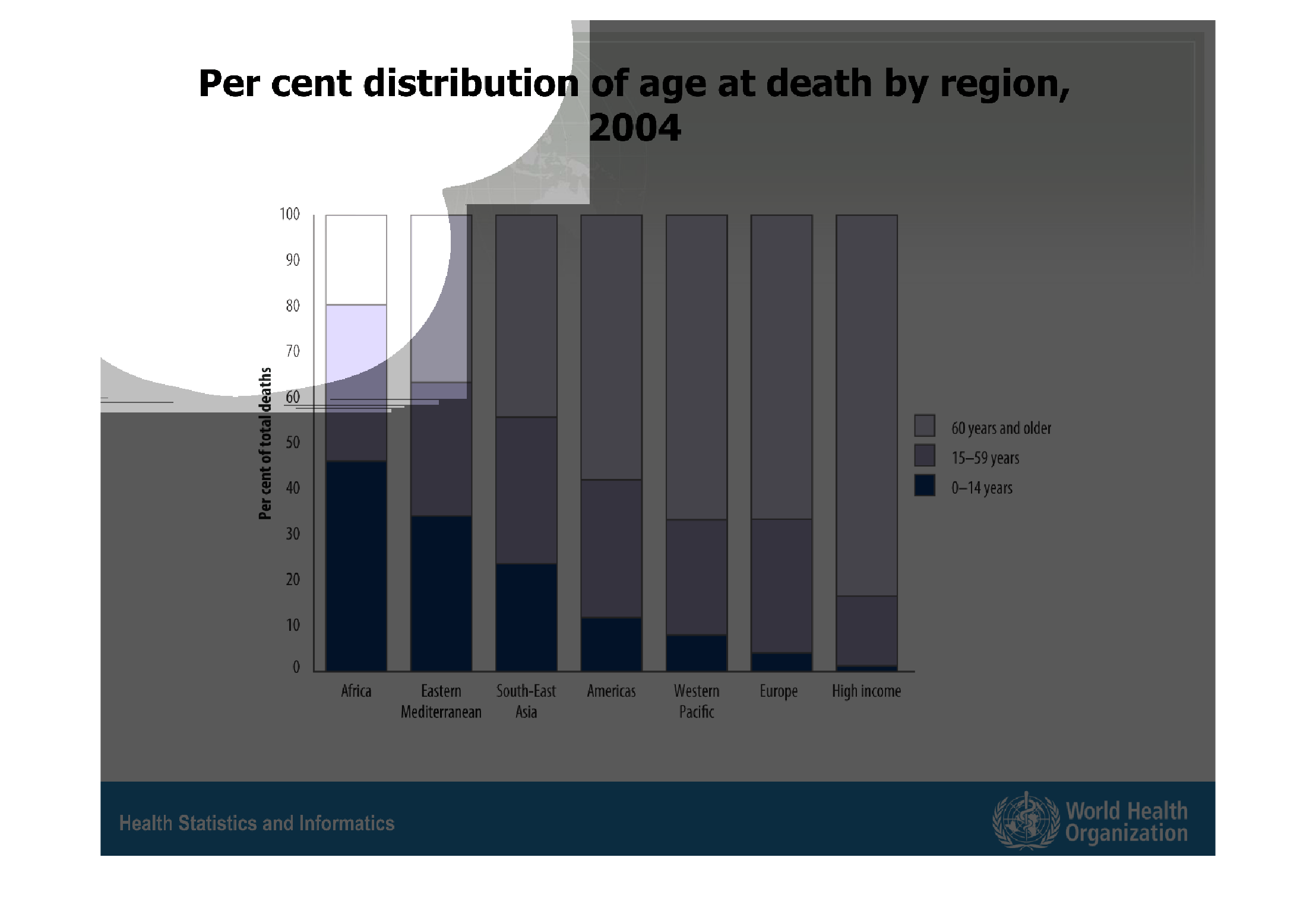
This chart describes per cent distribution of age at death by region, for the year 2004. Different
regions on the chart include Africa, and South-East Asia.
Warning: Image is too big to fit on screen; displaying at 67%
Warning: Image is too big to fit on screen; displaying at 67%

Percent distribution of age at death by region, 2004. Africa has the highest overall death
rates. America is in the middle. Europe and the high income have a very low percentage.
Warning: Image is too big to fit on screen; displaying at 67%
Warning: Image is too big to fit on screen; displaying at 67%
This chart shows the age of death by percent in 2004. Each bar represents a different continent
with the last bar showing income level. The highest percent is seen in the bar representing
africa.
Warning: Image is too big to fit on screen; displaying at 67%
Warning: Image is too big to fit on screen; displaying at 67%
This graph is representing percent of total death of death by age and by region of the world.
The regions include Africa, Eastern Mediterranean, South East Asia
Warning: Image is too big to fit on screen; displaying at 67%
Warning: Image is too big to fit on screen; displaying at 67%
This is a graph that shows how old the sample demographic was at their time of death. It compares
the age of death across many different countries in the world.
Warning: Image is too big to fit on screen; displaying at 67%
Warning: Image is too big to fit on screen; displaying at 67%
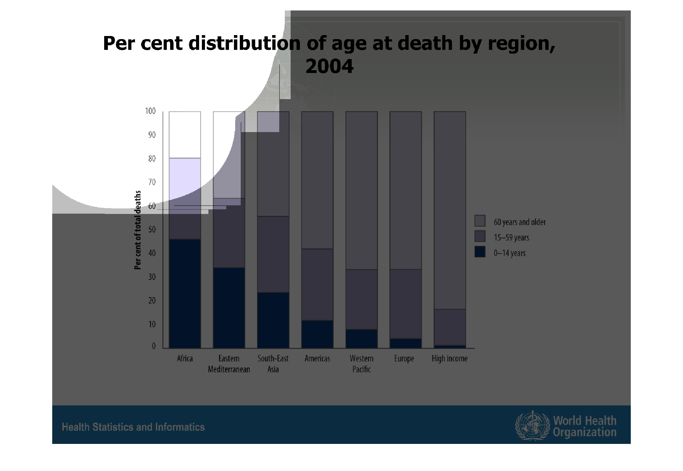
this chart describes median age at death broken up by region.  The chart is split up into
different age groups, from an early childs age to elderly adults.
Warning: Image is too big to fit on screen; displaying at 67%
Warning: Image is too big to fit on screen; displaying at 67%
This chart describes per cent distribution of age at death by region for the year 2004. Region
on the chart include Africa, and  Eastern Mediterranean.
Warning: Image is too big to fit on screen; displaying at 67%
Warning: Image is too big to fit on screen; displaying at 67%
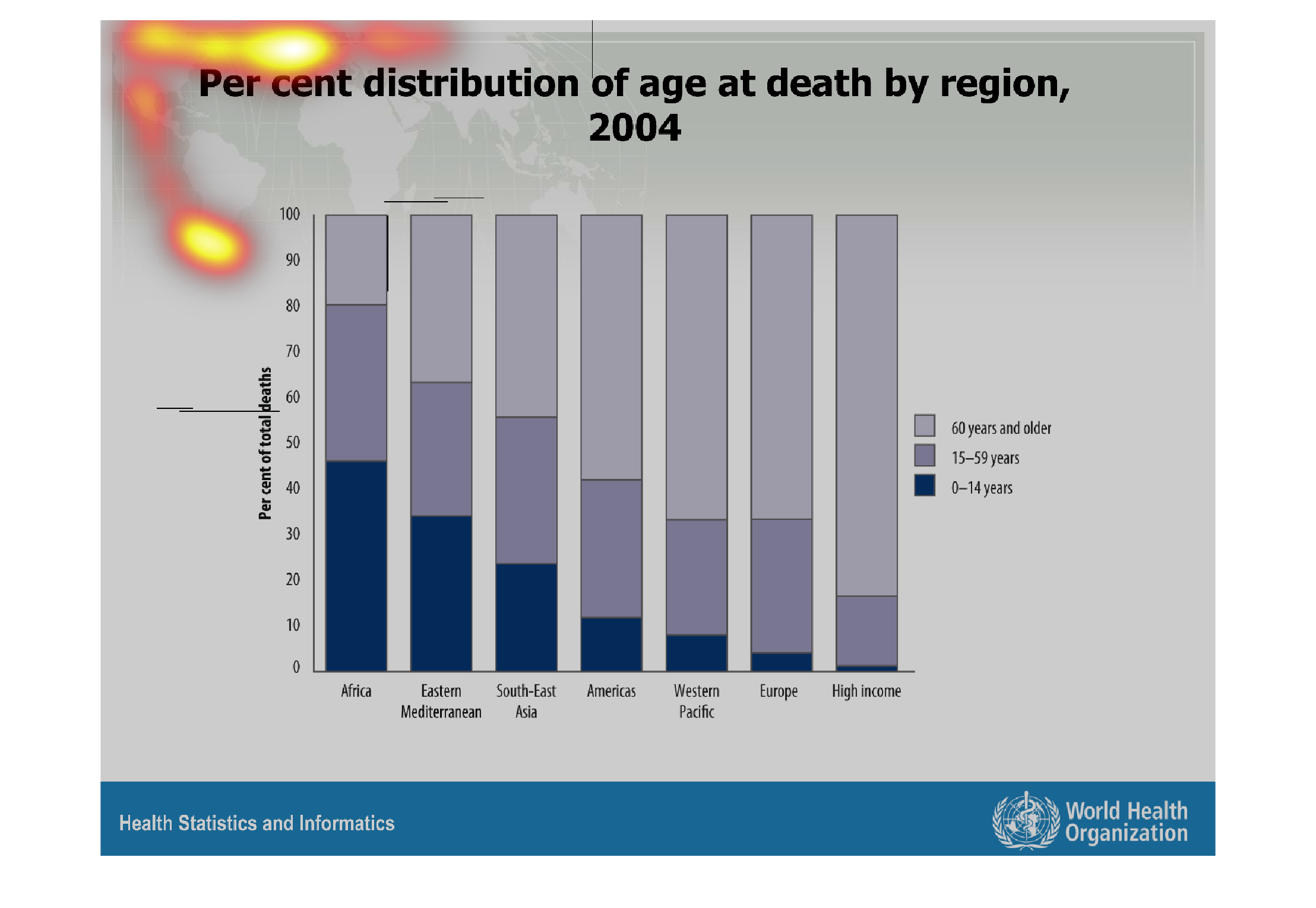
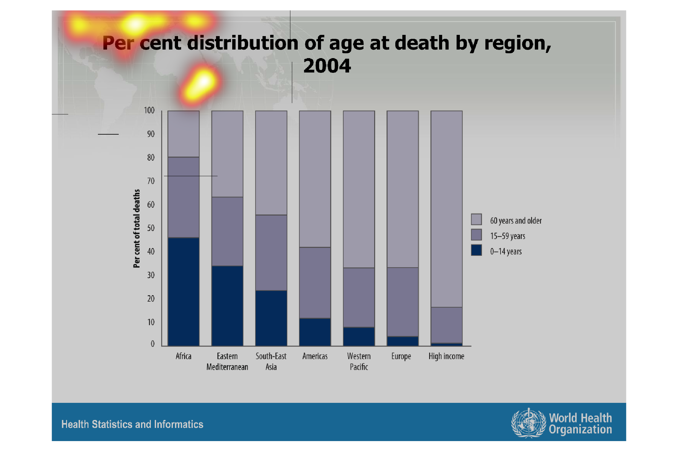
This is a graph of percent distribution of age at death by region. Africa has the greatest
death rate at lower ages, while Europe had the lowest death rate at lower ages.
Warning: Image is too big to fit on screen; displaying at 67%
Warning: Image is too big to fit on screen; displaying at 67%
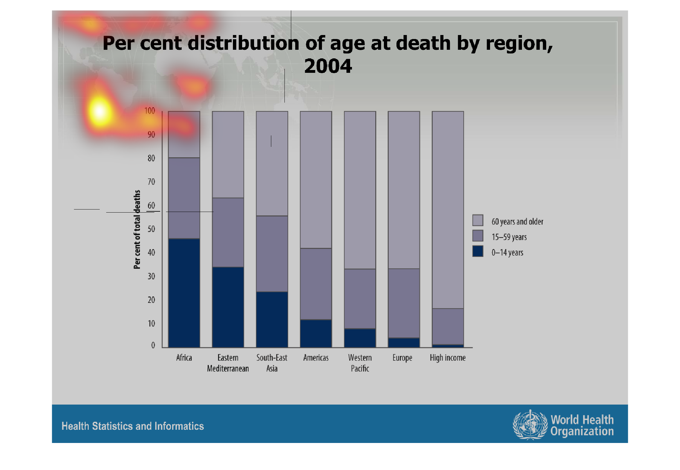
This bar graph shows the percentage of distribution of  age by death by region. Africa has
the most deaths of people 1-15 years of age, while people of high income have the lowest.
Warning: Image is too big to fit on screen; displaying at 67%
Warning: Image is too big to fit on screen; displaying at 67%


This graph shows the percent of deaths by age in each region. Africa shows the highest death
rate followed by the Eastern Mediterranean. The lowest are the Western pacific and europe.
Warning: Image is too big to fit on screen; displaying at 67%
Warning: Image is too big to fit on screen; displaying at 67%
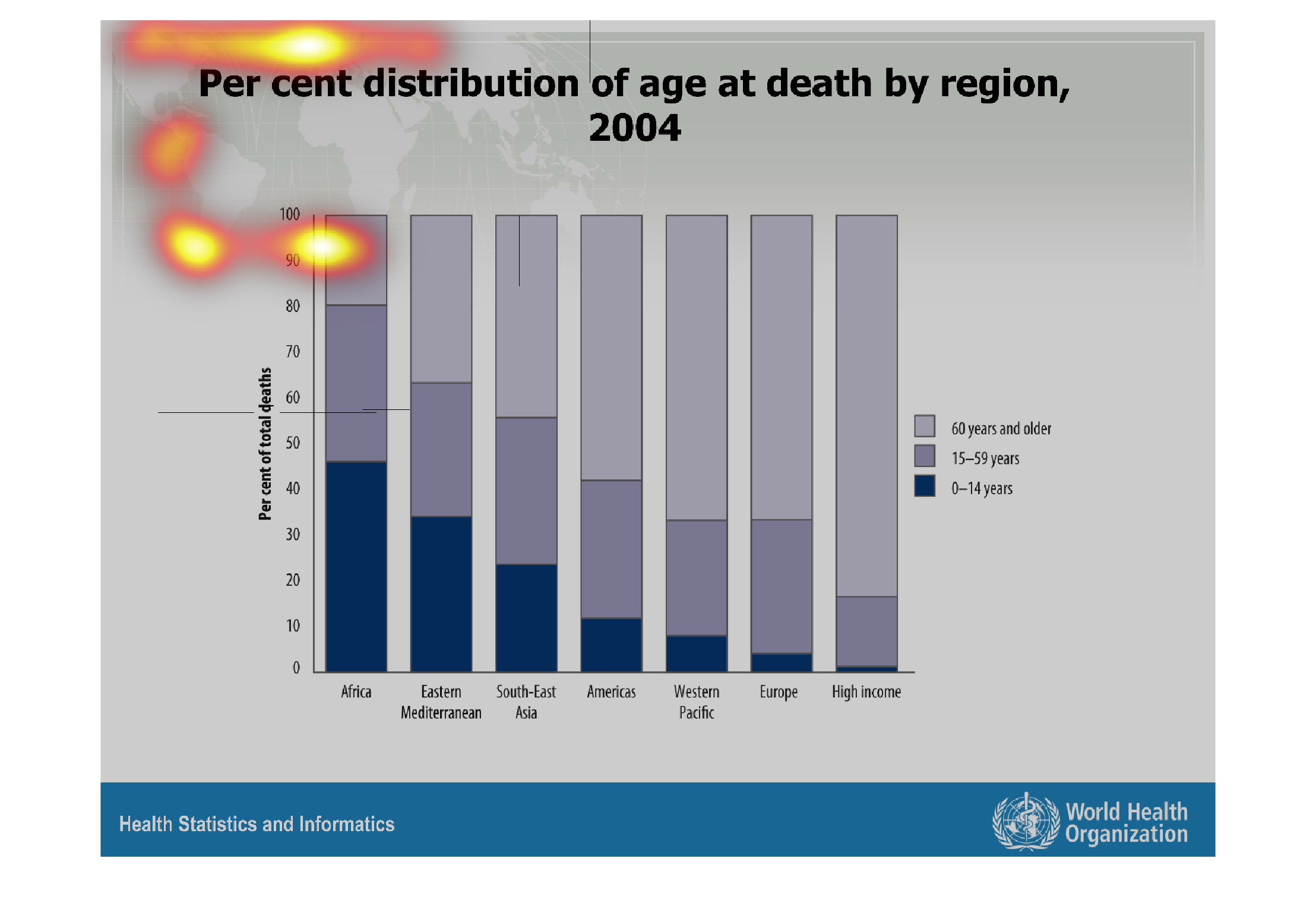
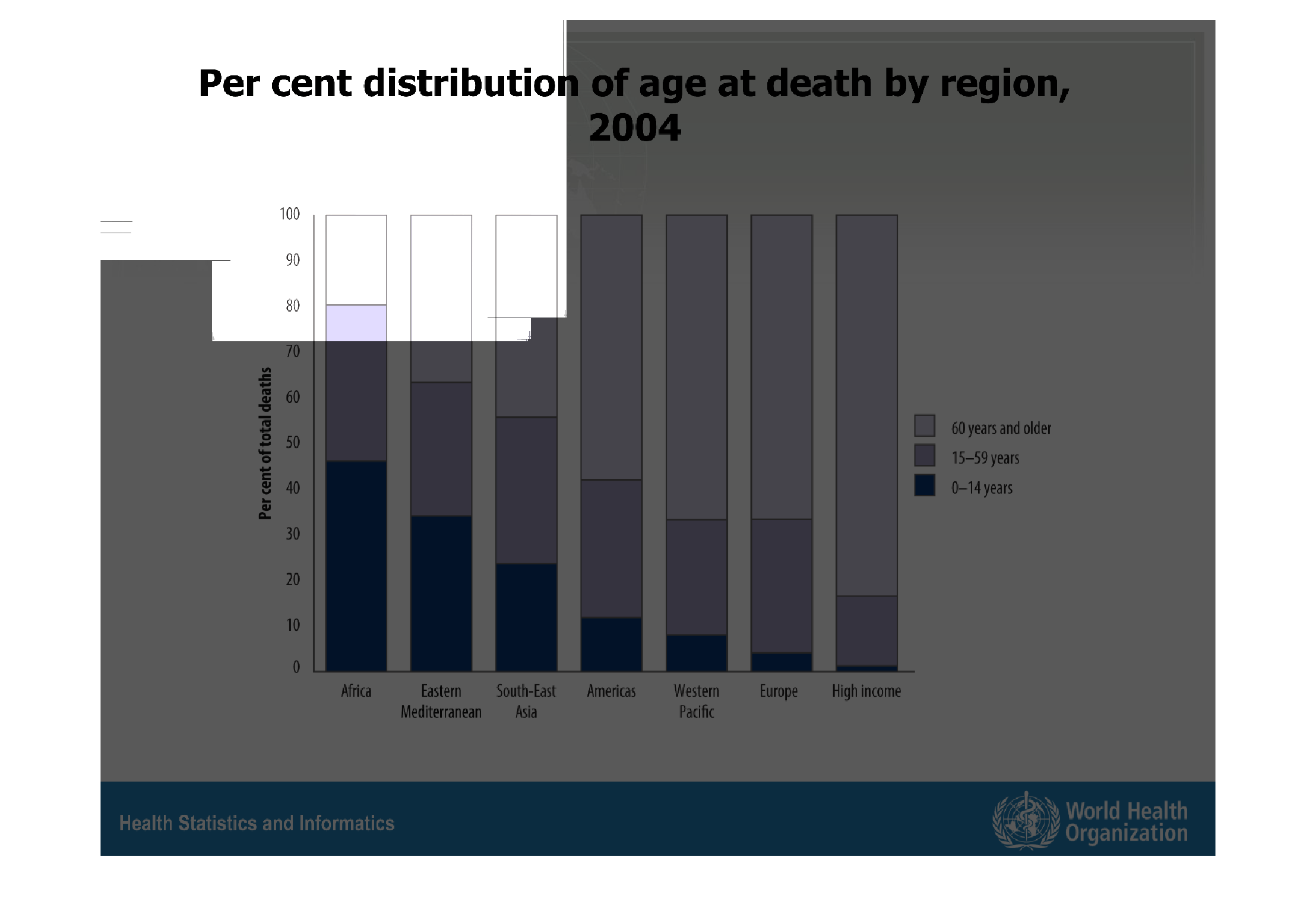
This gives you the percentage and what age brackets people die in. It then compares the difference
in age between countries. This information is given by the world health organization.
Warning: Image is too big to fit on screen; displaying at 67%
Warning: Image is too big to fit on screen; displaying at 67%