Warning: Image is too big to fit on screen; displaying at 67%
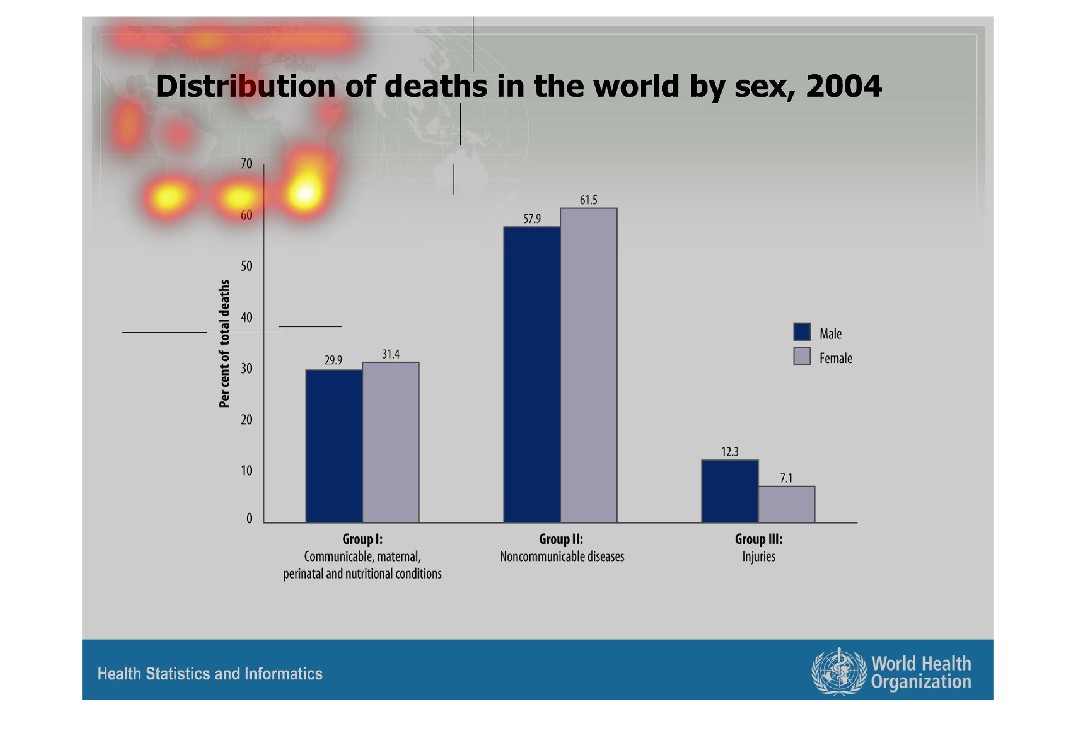
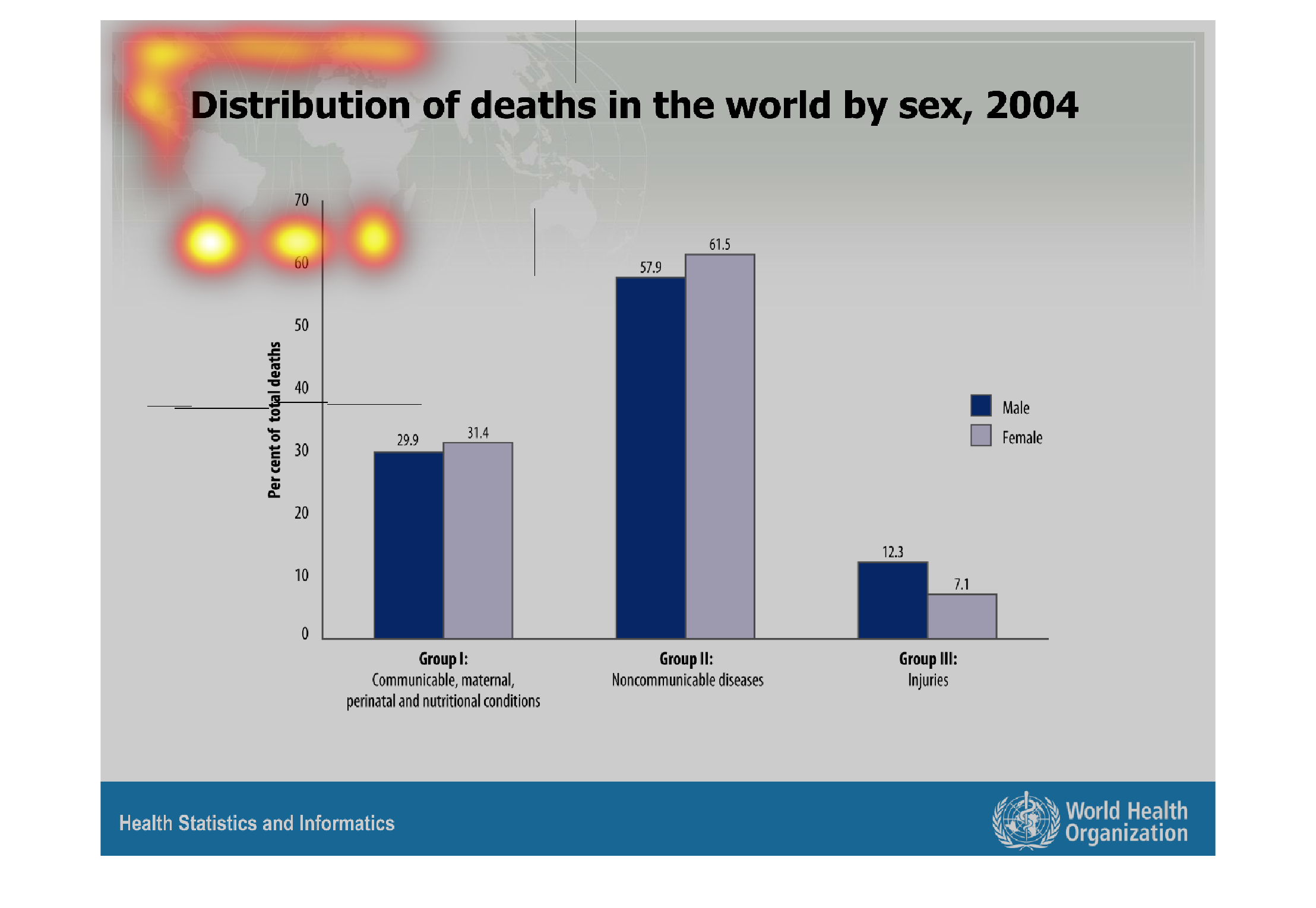
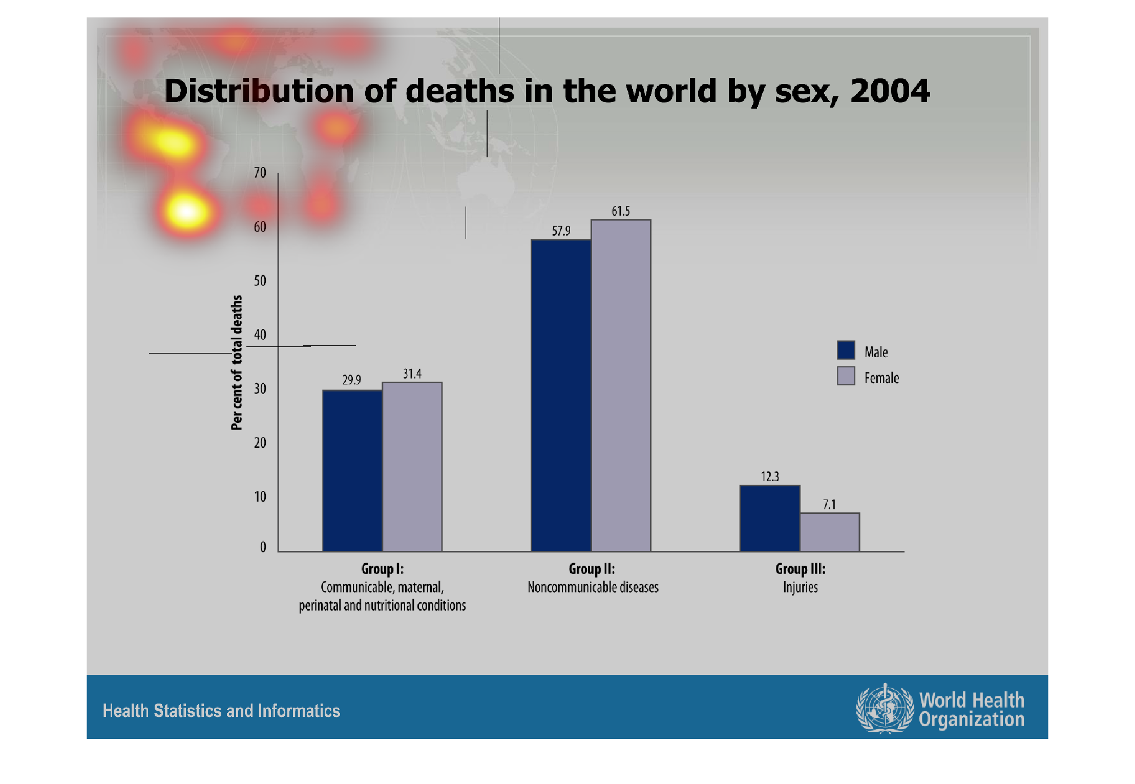
This chart describes distribution of deaths in the world by sex, for the year 2004. The chart
is divided into three groups. The second group is the highest percentage on the chart.
Warning: Image is too big to fit on screen; displaying at 67%
Warning: Image is too big to fit on screen; displaying at 67%

this is maybe about people who have unprotective sex and is giving a lot of diseases to people
thats how they are deaths among men and woman in this country
Warning: Image is too big to fit on screen; displaying at 67%
Warning: Image is too big to fit on screen; displaying at 67%
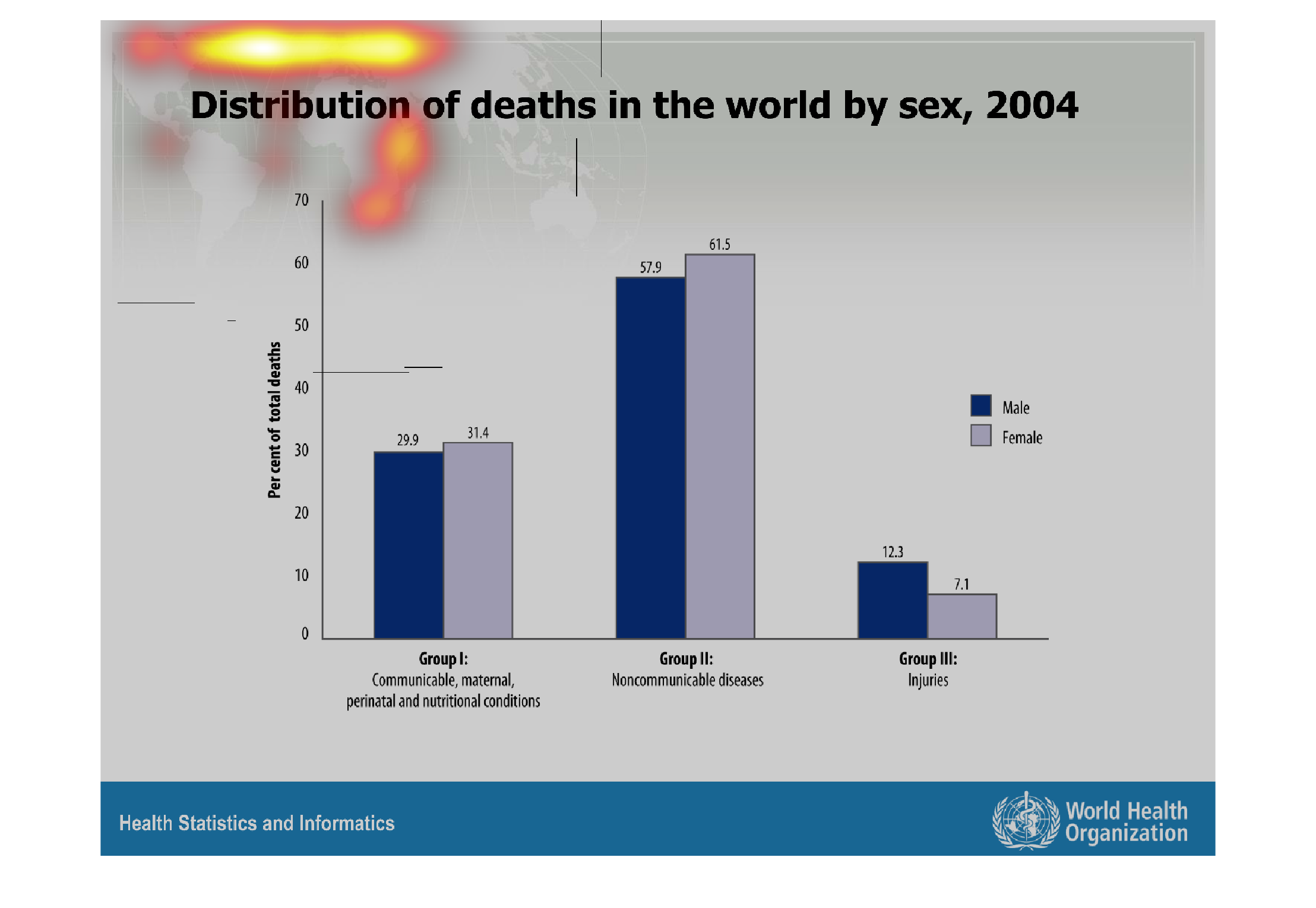
The following chart gives the distribution of deaths in the world by sex. It shows that men
are far more likely to die from injury than females are with 12.3 percent of men and  7.1
percent of women.
Warning: Image is too big to fit on screen; displaying at 67%
Warning: Image is too big to fit on screen; displaying at 67%
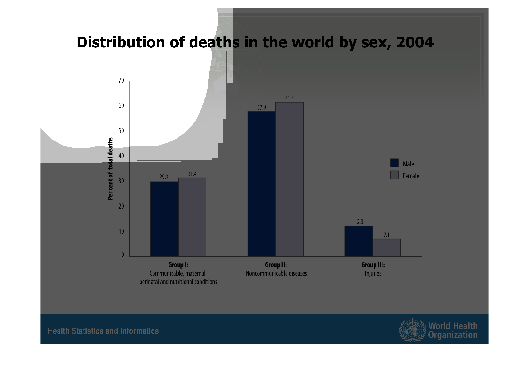
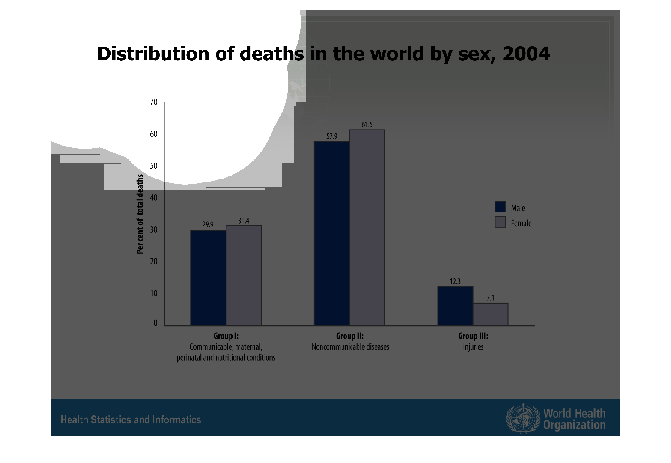
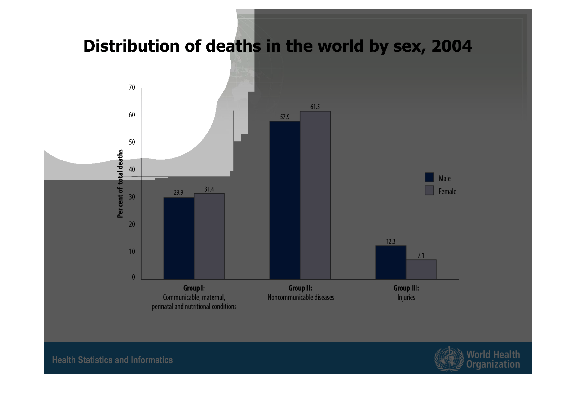
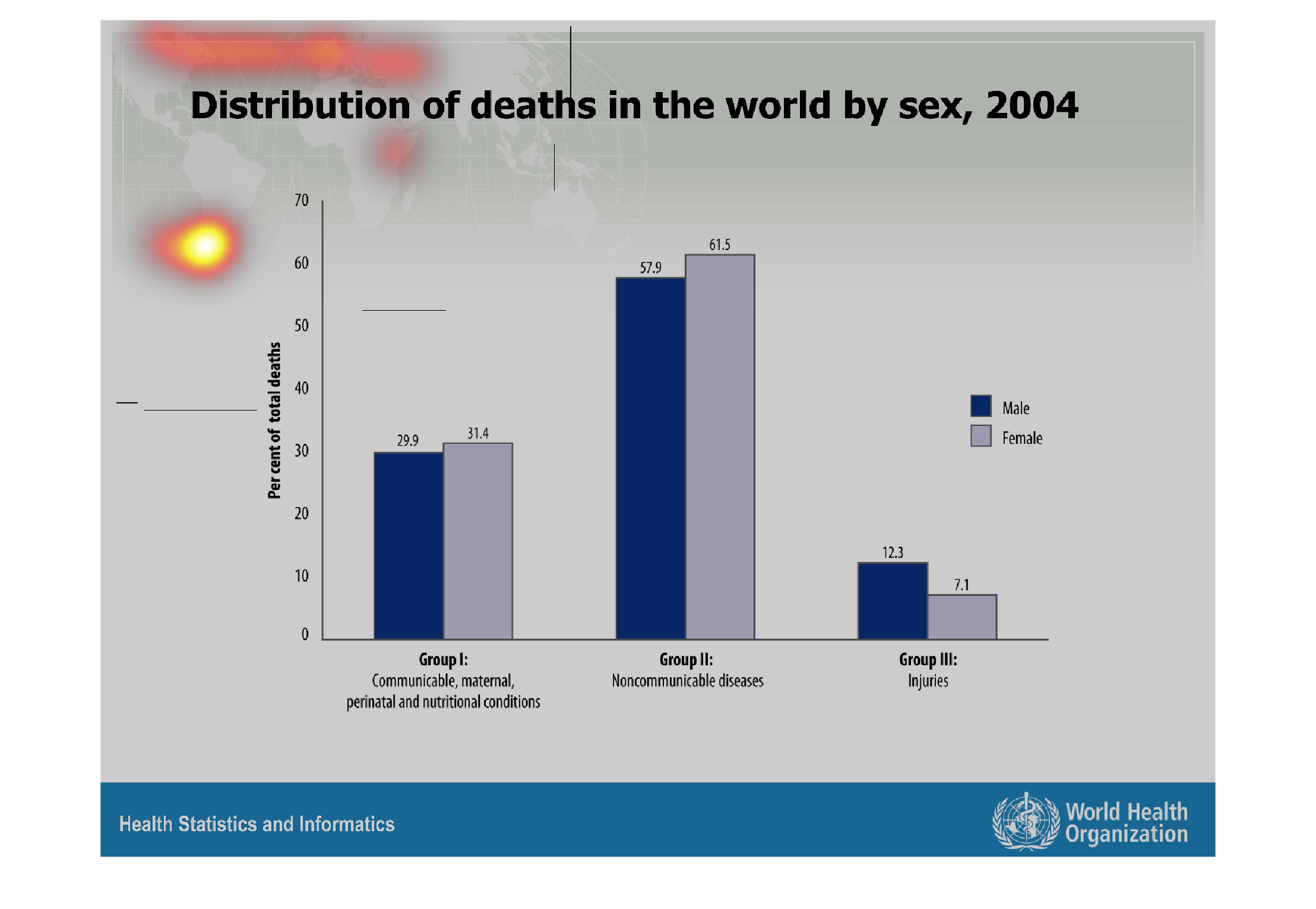
This chart shows the percentage of deaths in the world by cause and gender in 2004. There
are three categories for cause of death, of which the largest cause of deaths is noncommunicable
disease, and the smallest is injuries.
Warning: Image is too big to fit on screen; displaying at 67%
Warning: Image is too big to fit on screen; displaying at 67%

This graph show the distribution of deaths in the world by sex in 2004. Communicable diseases,
non-communicable diseases, and injuries are compared between sexes. Most people die from non-communicable
diseases.
Warning: Image is too big to fit on screen; displaying at 67%
Warning: Image is too big to fit on screen; displaying at 67%

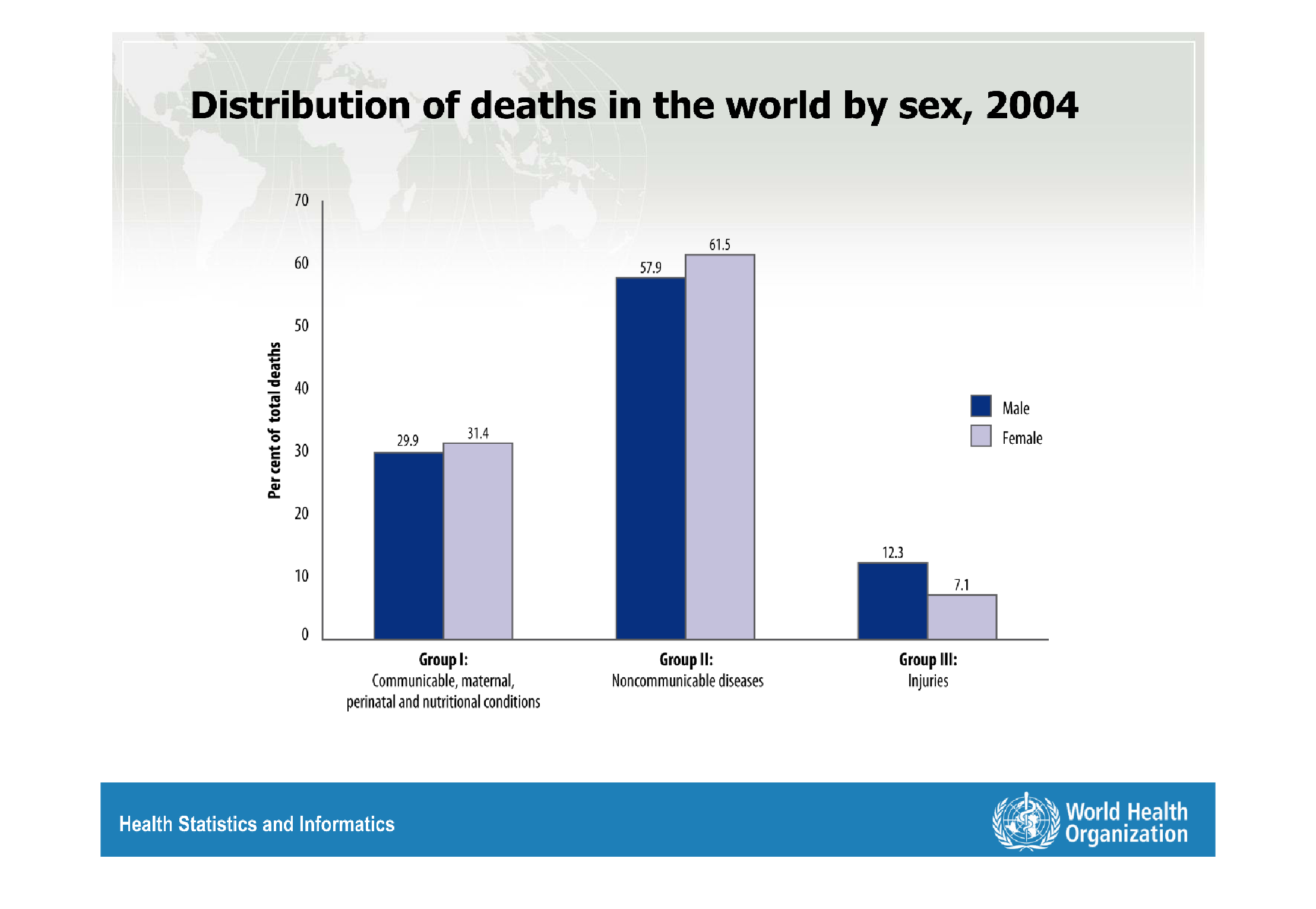
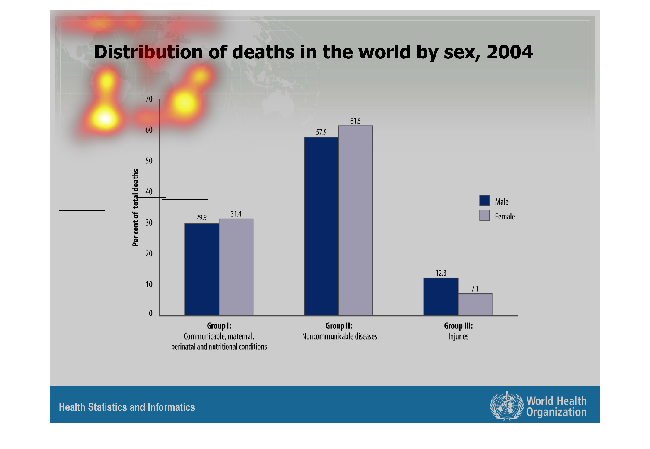
distribution of dealth in the world by sex 2004 percent of death vs male and female also defines
different groups of death causes

Warning: Image is too big to fit on screen; displaying at 67%
Warning: Image is too big to fit on screen; displaying at 67%
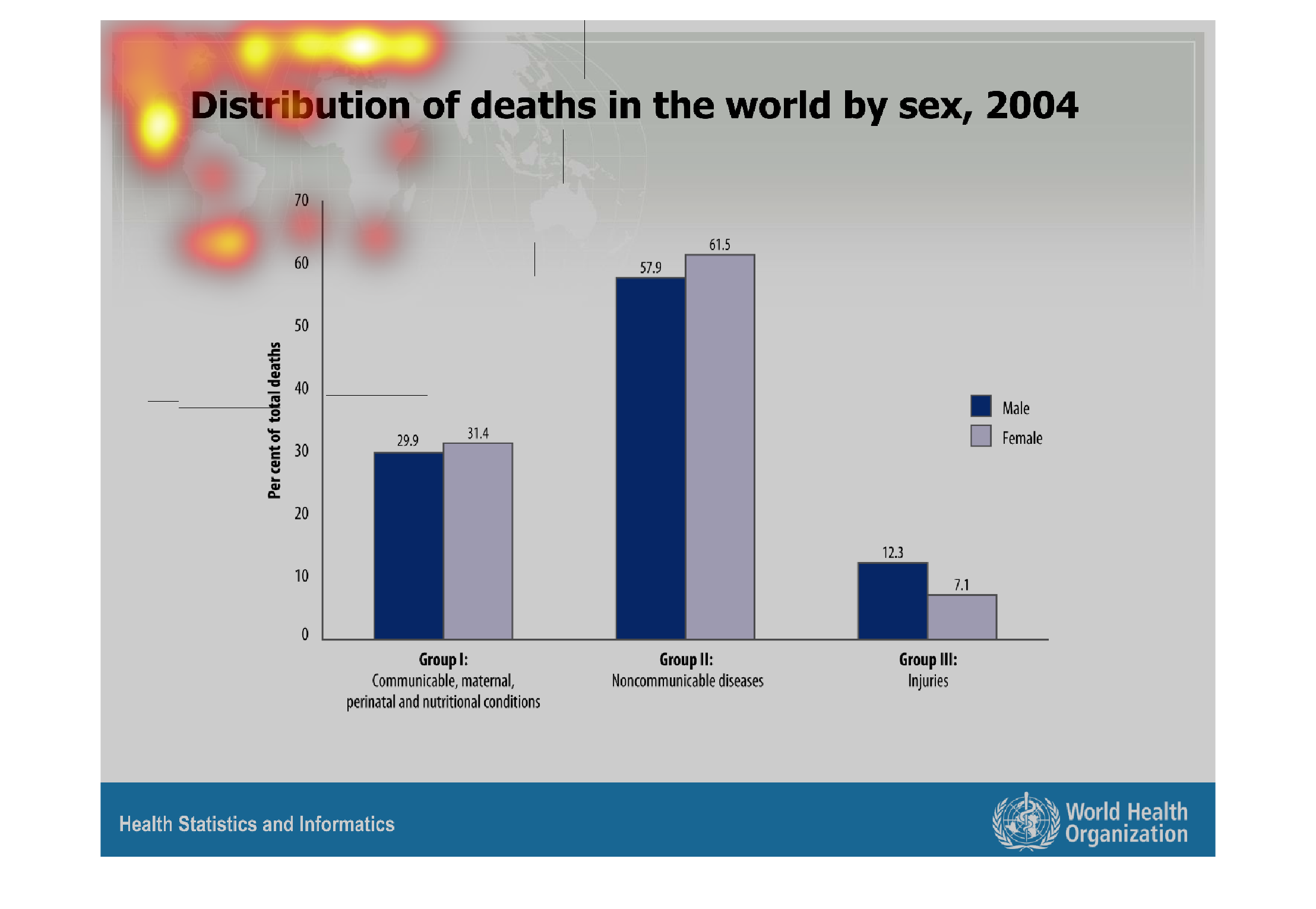
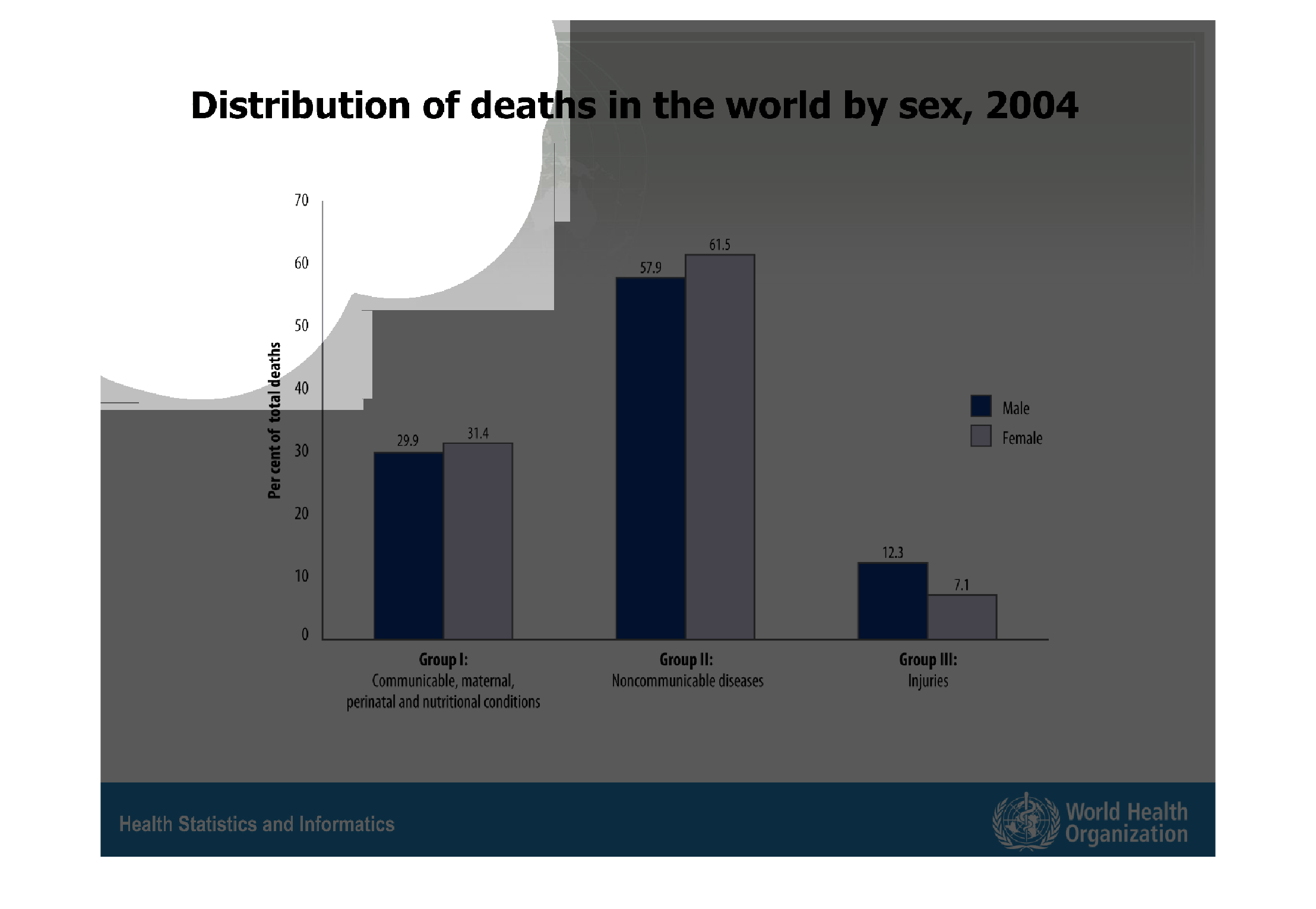
The graph is describing the distribution of deaths by gender through out the world in 2004.
Noncommunicable deaths were the highest. The smallest is by injuries. The Y axis is percent
of total deaths. The X axis is the type of death.
Warning: Image is too big to fit on screen; displaying at 67%
Warning: Image is too big to fit on screen; displaying at 67%
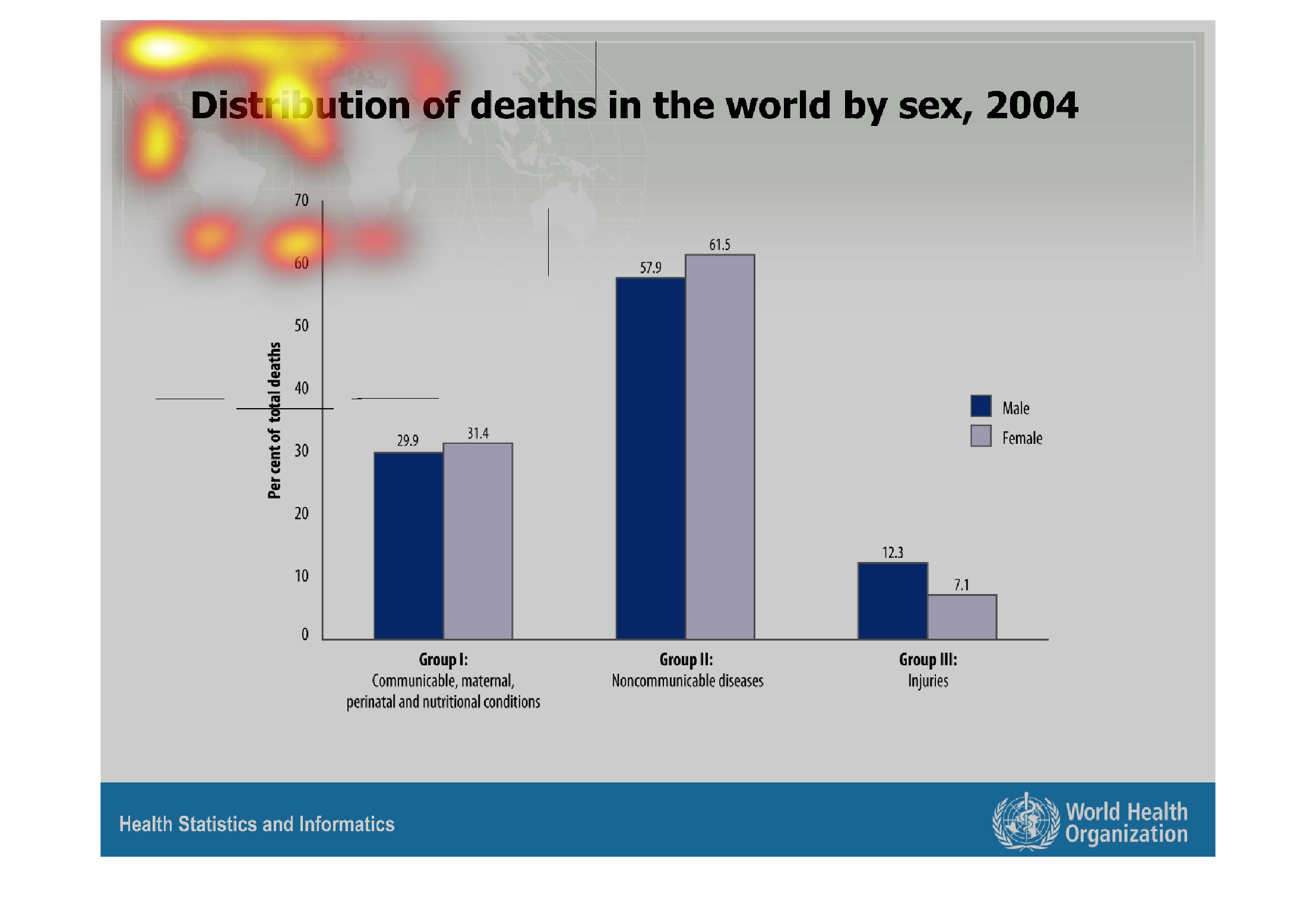

This graph shows the distribution of deaths in the world by sex in 2004. Noncommunicable diseases
were the largest percentage of death for both males and females (57.9% and 61.5% respectfully),
followed by communicable diseases, and then injuries. Only for injuries do males have a higher
percentage than females.
Warning: Image is too big to fit on screen; displaying at 67%
Warning: Image is too big to fit on screen; displaying at 67%

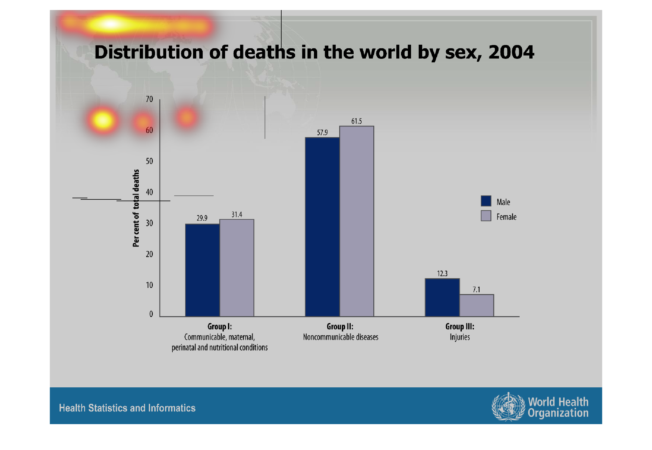
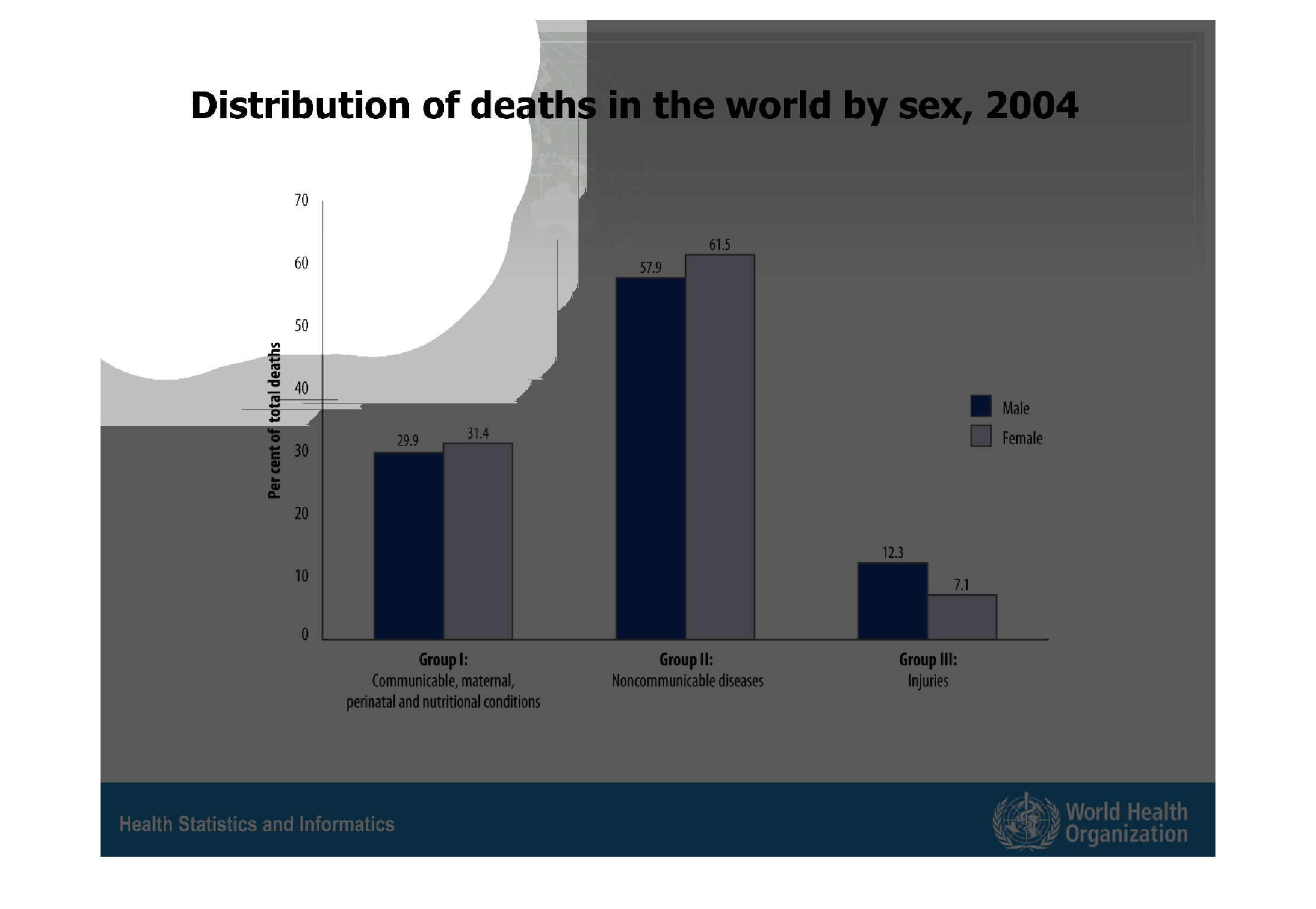
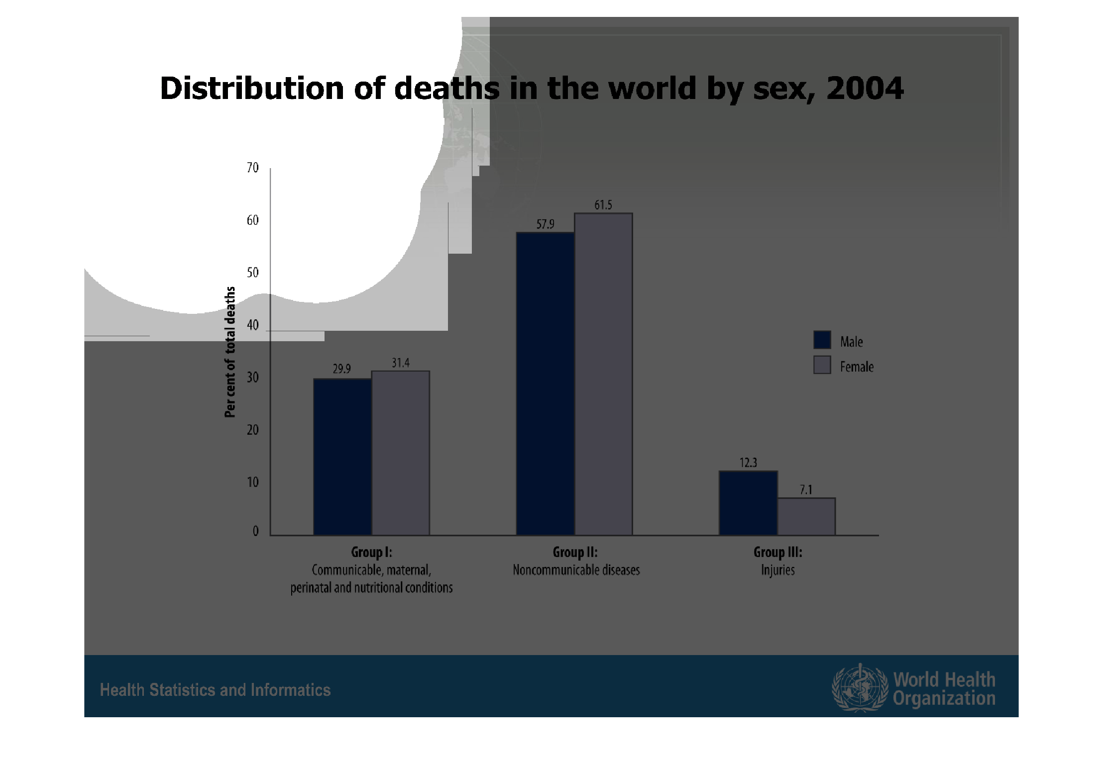
The bar graph is showing the distribution of deaths in the world by sex in 2004. In group
1 and 2, women have the higher amount of deaths. In group 3 men have the higher amount of
deaths. Group one includes communicable diseases and nutritional diseases. Group two includes
noncommunicable diseases. Group 3 includes injuries.
Warning: Image is too big to fit on screen; displaying at 67%
Warning: Image is too big to fit on screen; displaying at 67%
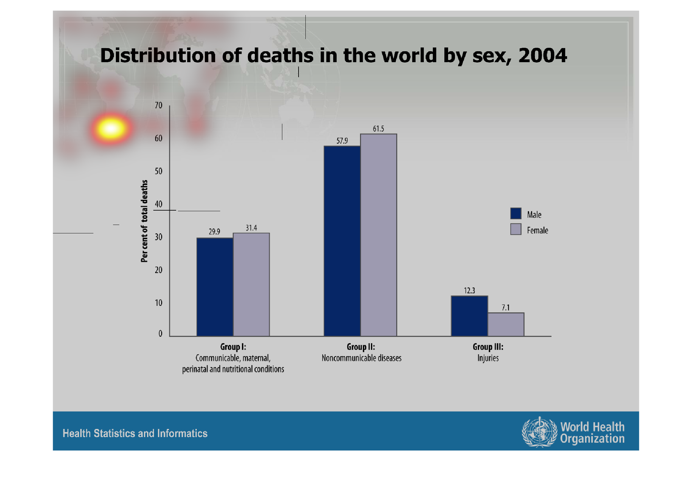
This is a bar graph showing the distribution of deaths in the world in 2004 by sex. Female
deaths from communicable, nutritional, perinatal and maternal deaths were slightly higher
for females than for males. Again, deaths caused by noncommunicable diseases were higher for
females than males. Finally, deaths caused by injury were higher in males than females.
Warning: Image is too big to fit on screen; displaying at 67%
Warning: Image is too big to fit on screen; displaying at 67%

This chart describes distribution of deaths in the world by sex, for the year 2004. The chart
is divided into two categories, which are male and female.
Warning: Image is too big to fit on screen; displaying at 67%
Warning: Image is too big to fit on screen; displaying at 67%
This simple graph of horizontal bars shows the distribution of deaths in the world by sex,
from 2004. Three bars denote groups conditions: communiicable, nutritional, and maternal conditions,
a group for noncommunicable diseases (the highest), and injuries (the lowest.) Different colors
represent men and women.
Warning: Image is too big to fit on screen; displaying at 67%
Warning: Image is too big to fit on screen; displaying at 67%
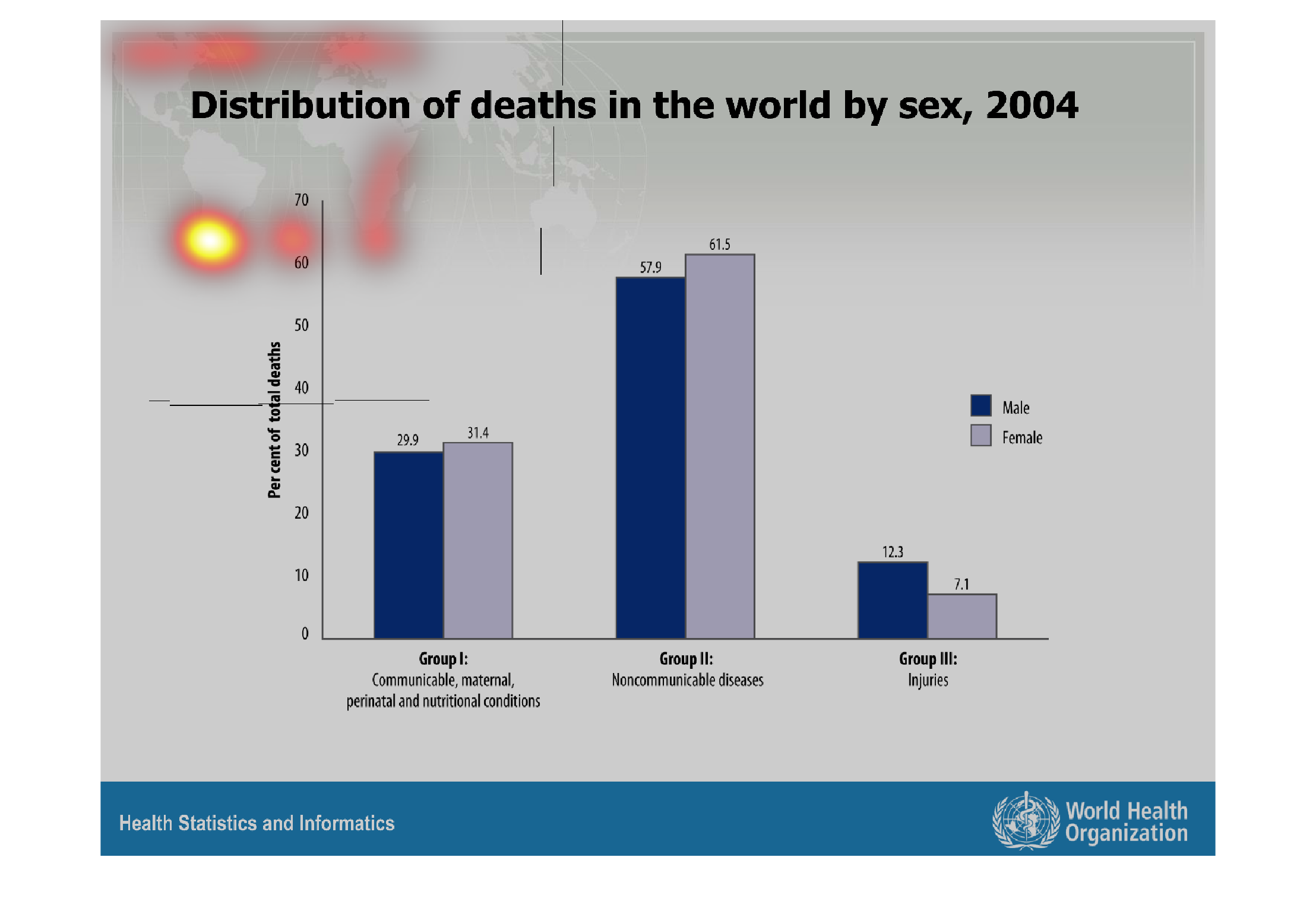
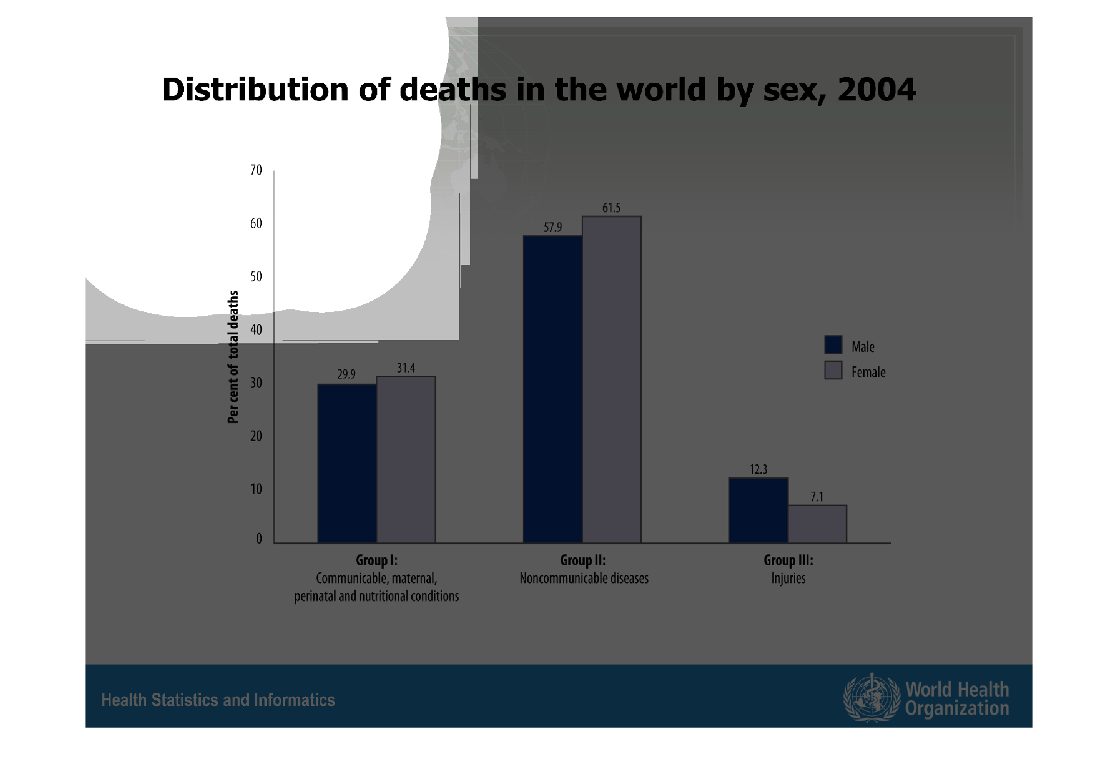
This chart shows the distribution of deaths around the world based on sex in 2004. Noncommunicable
diseases rated higher than any other group, with females rating higher than males. Injuries
was the smallest group, with males being the majority in that category.
Warning: Image is too big to fit on screen; displaying at 67%
Warning: Image is too big to fit on screen; displaying at 67%