Warning: Image is too big to fit on screen; displaying at 67%
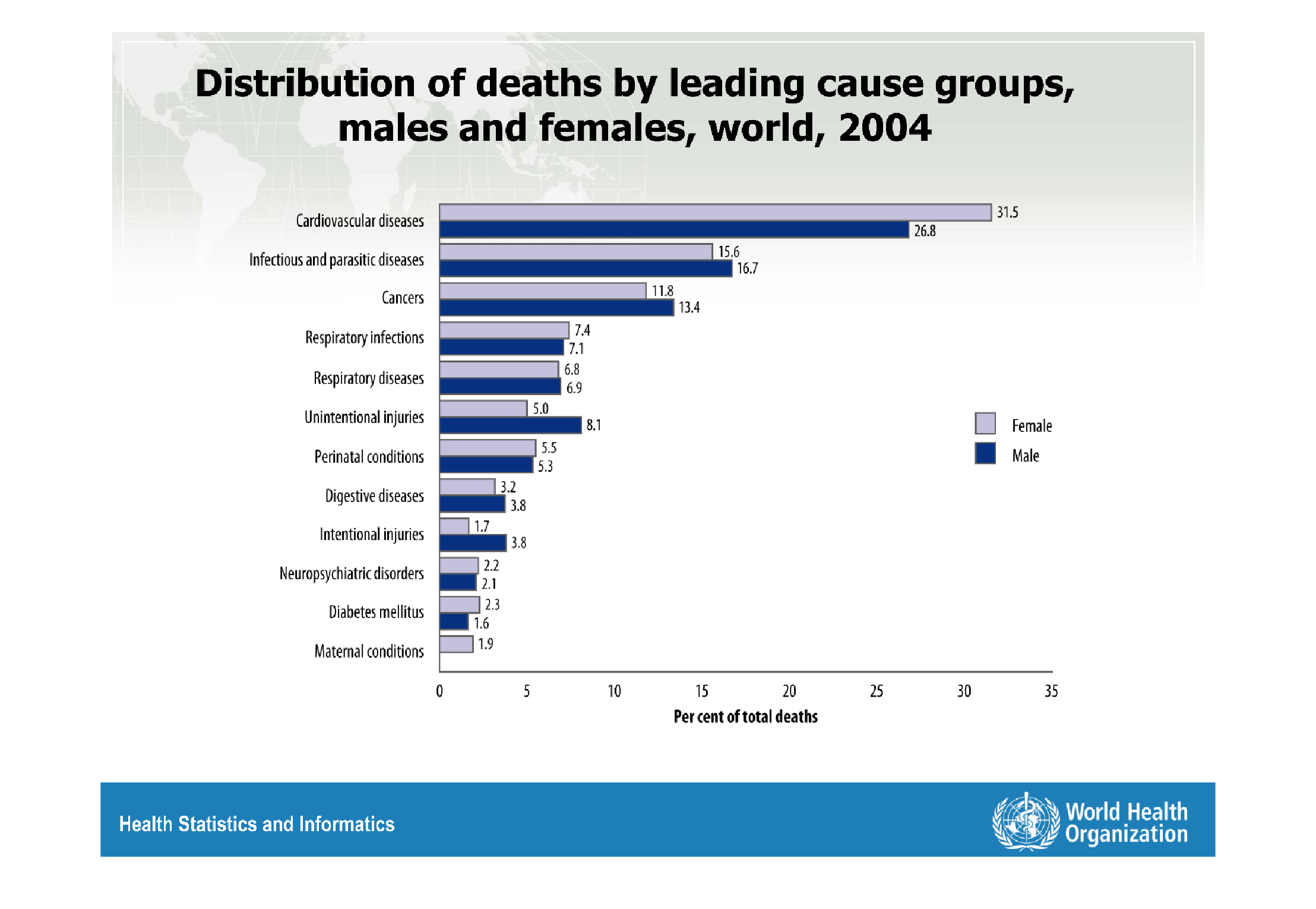
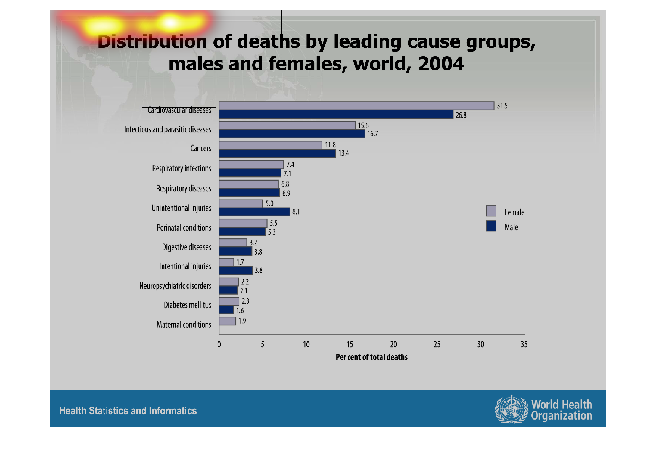
This graph shows that cardiovascular diseases were by and large the greatest cause for death
in 2004, taking up 26.8% of male deaths and 31.5% of female deaths. Compare that to the second-highest
cause of death in 2004, Infectious and Parasitic diseases, which compromised roughly 16% of
deaths for both genders.
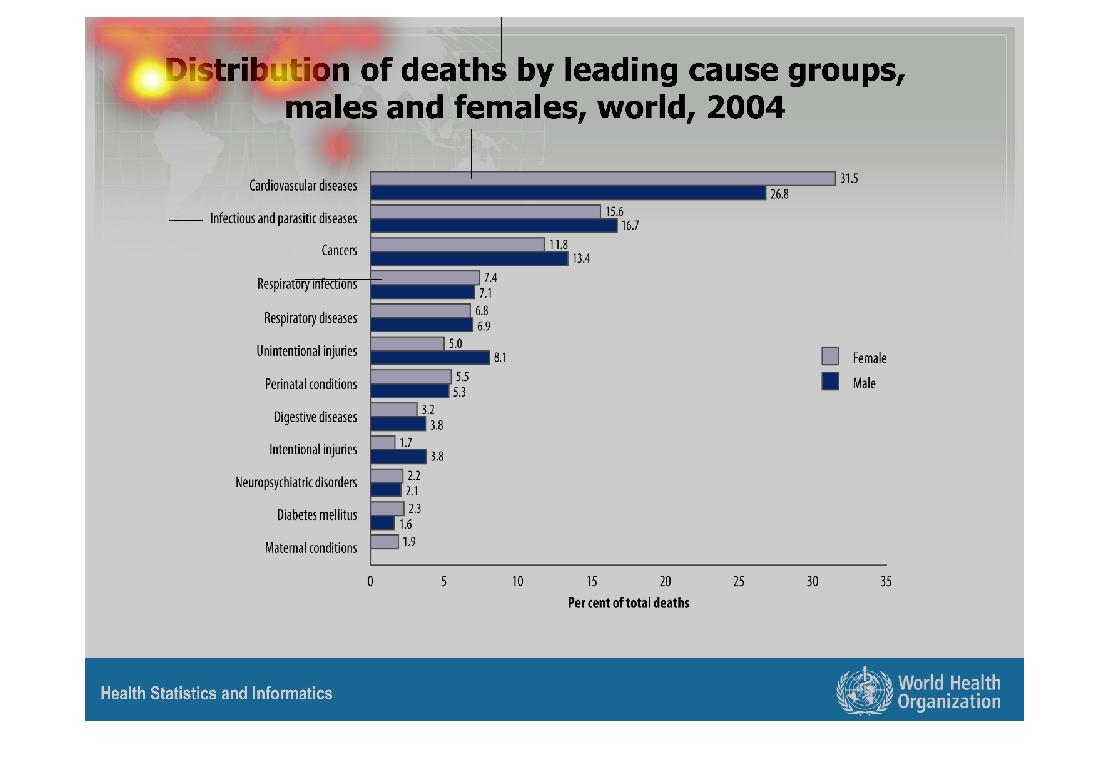
Warning: Image is too big to fit on screen; displaying at 67%
Warning: Image is too big to fit on screen; displaying at 67%
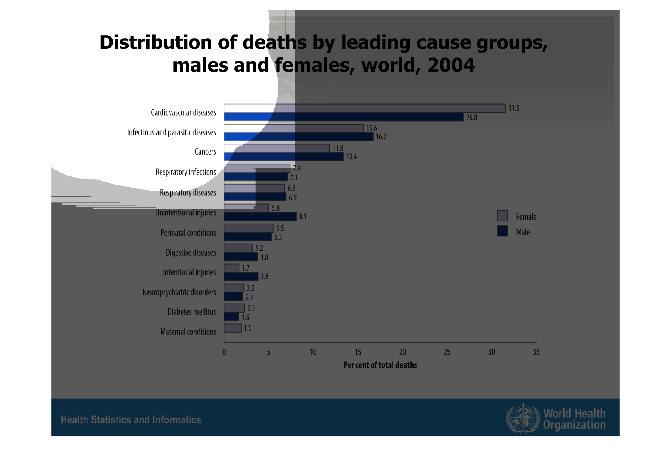
The figure presented is titled distribution of deaths by leading cause groups, males and females,
world, 2004.  The figure is a representation of death distribution.
Warning: Image is too big to fit on screen; displaying at 67%
Warning: Image is too big to fit on screen; displaying at 67%
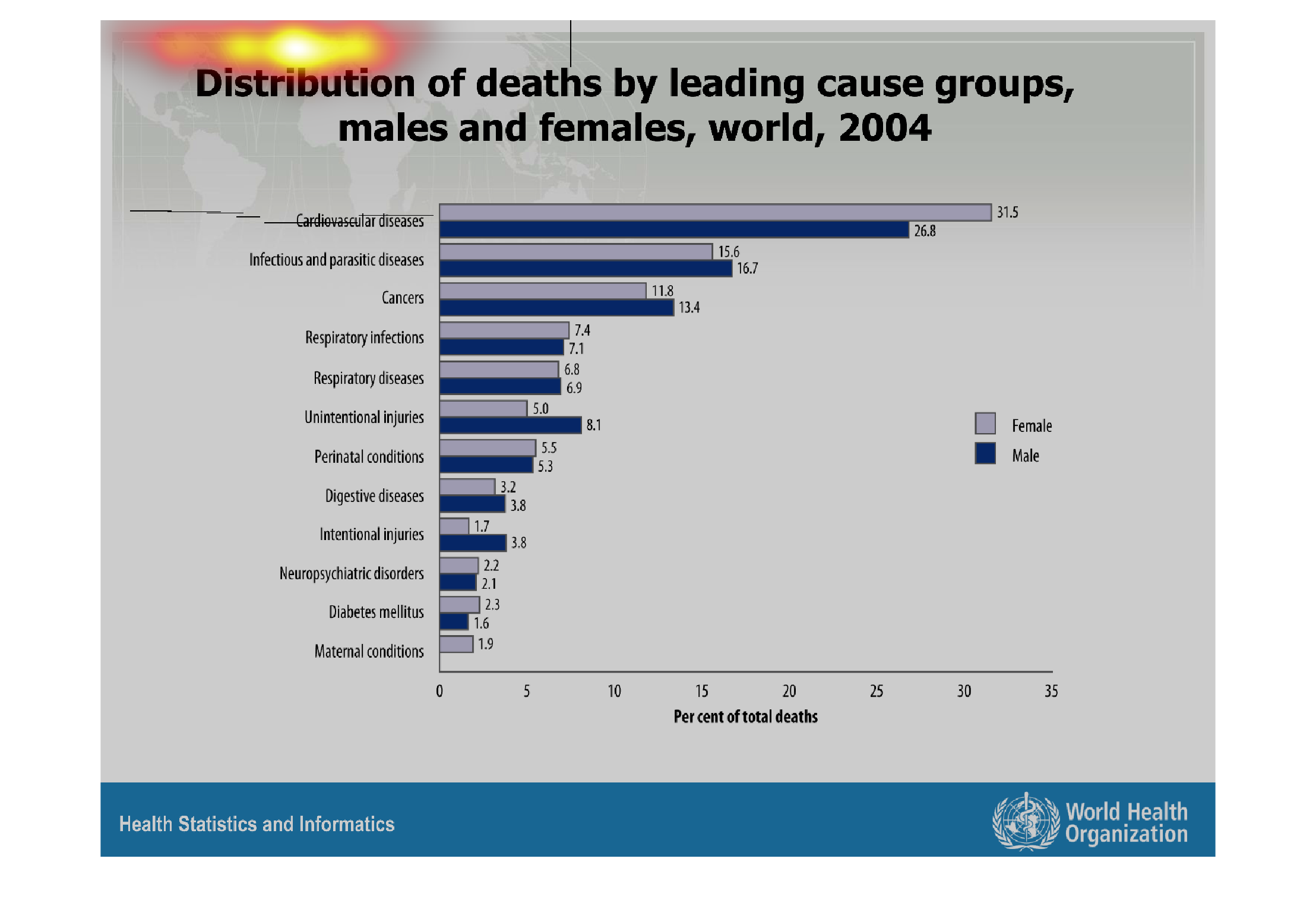
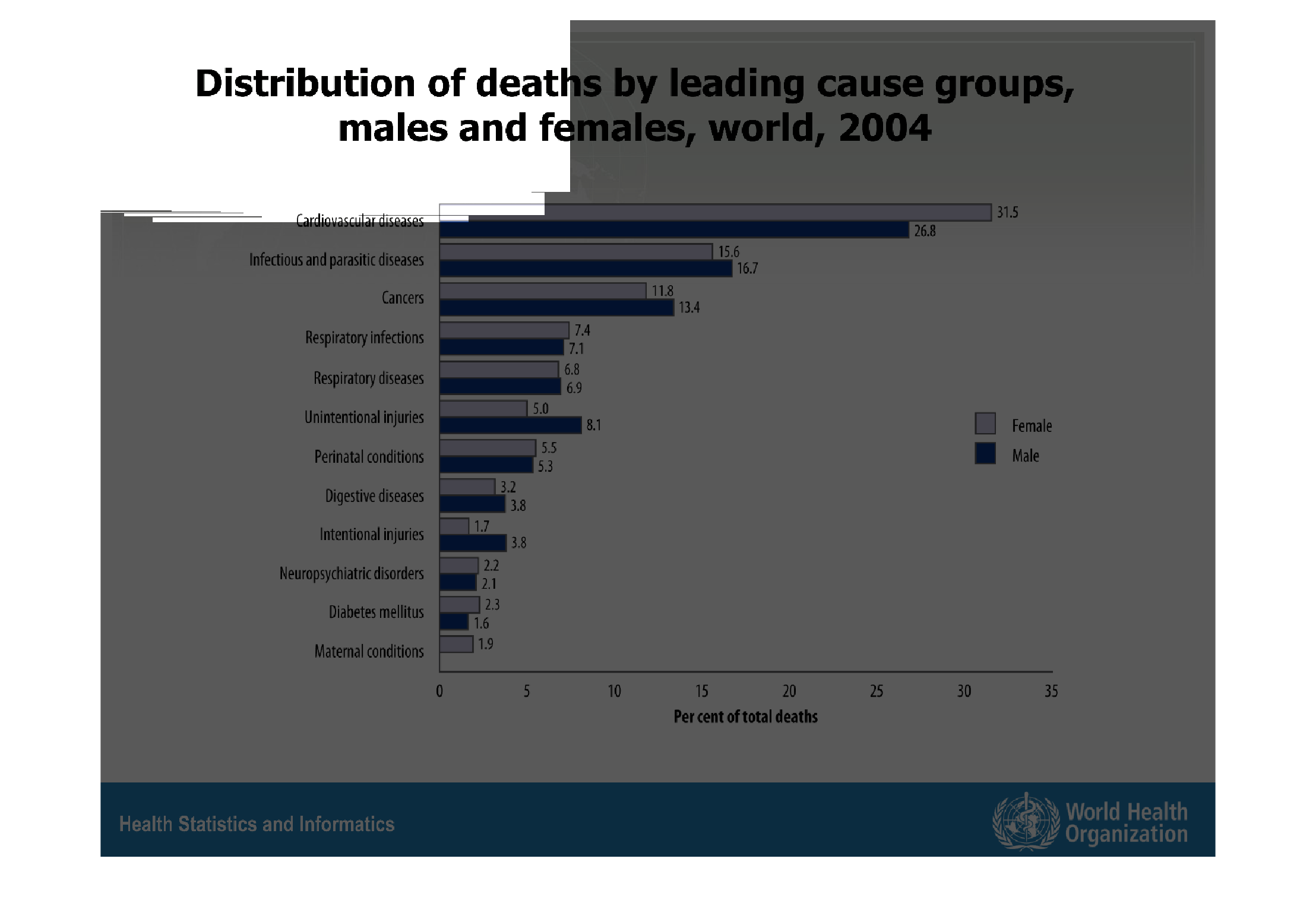
This chart describes distribution of deaths by leading cause groups, male and females, world,
for the year 2004. Categories on the chart include respiratory diseases.
Warning: Image is too big to fit on screen; displaying at 67%
Warning: Image is too big to fit on screen; displaying at 67%

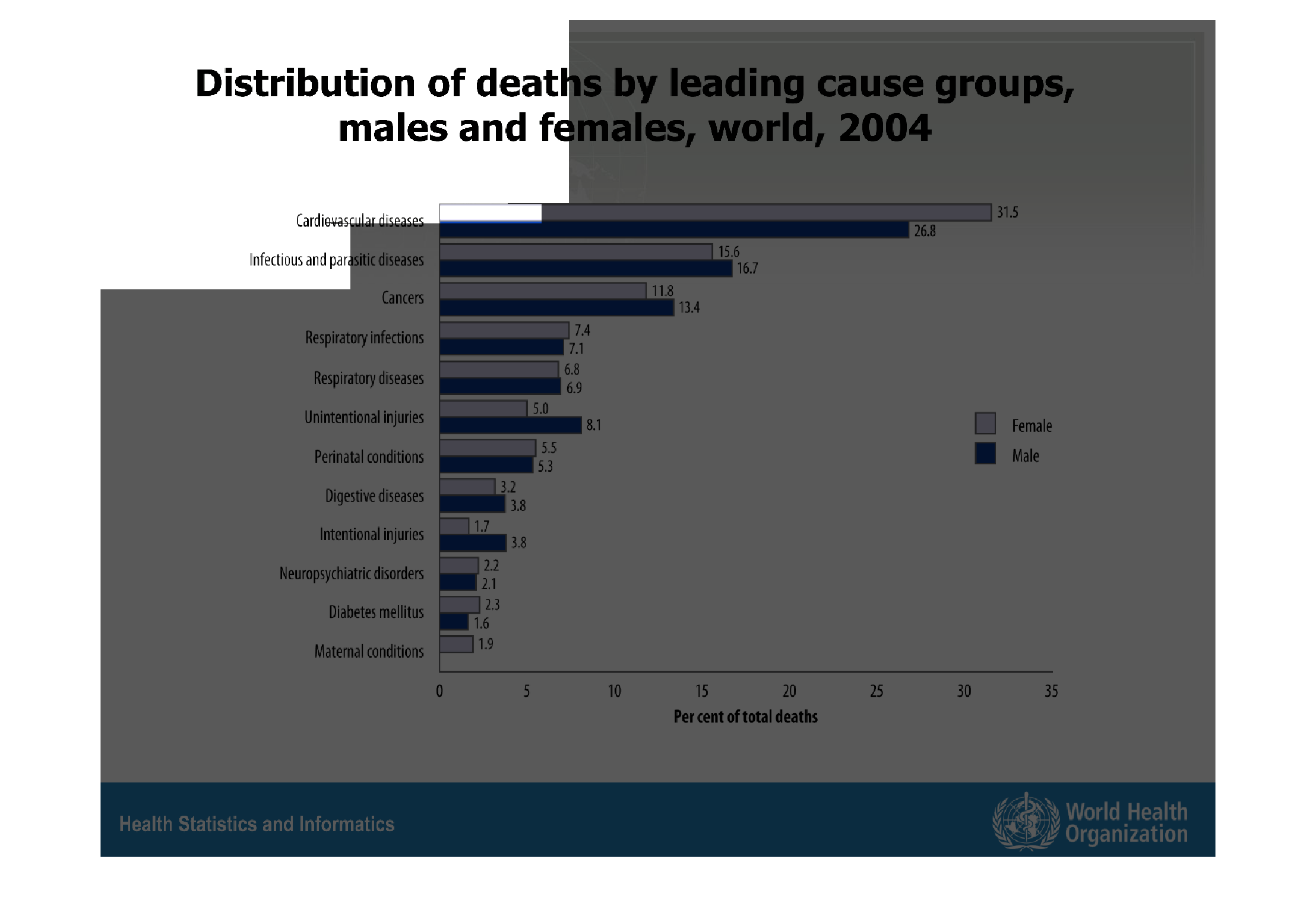
This is a graph that shows the overall distribution of deaths by the leading causes groups
for both males and females globally. It covers the year 2004.
Warning: Image is too big to fit on screen; displaying at 67%
Warning: Image is too big to fit on screen; displaying at 67%
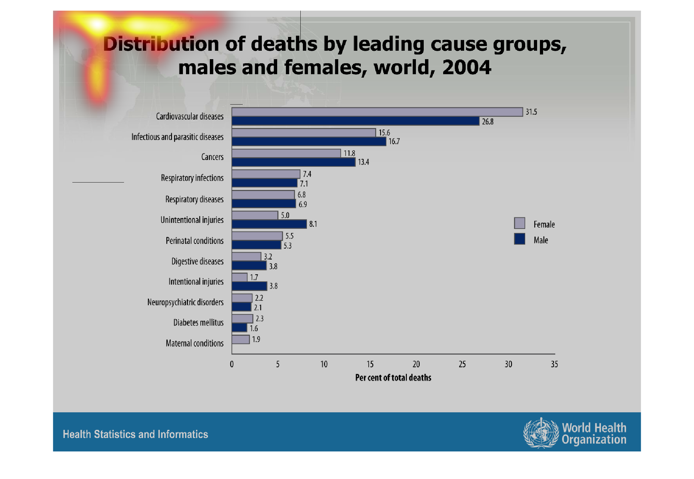
Distribution of death by leading cause groups: #1 is cardiovascular disease, highest leading
cause for both males and females. 2nd highest was infectious and parasitic deseases
Warning: Image is too big to fit on screen; displaying at 67%
Warning: Image is too big to fit on screen; displaying at 67%
distribution of deaths by leading cause groups, males and females, world, 2004. Y axis shows
different causes of deaths which I'm having a hard time reading. X axis shows bars of two
different shades, one for males and the other for females. Cardiovascular is the leading cause
followed by infections, cancers and respiratory infections.
Warning: Image is too big to fit on screen; displaying at 67%
Warning: Image is too big to fit on screen; displaying at 67%
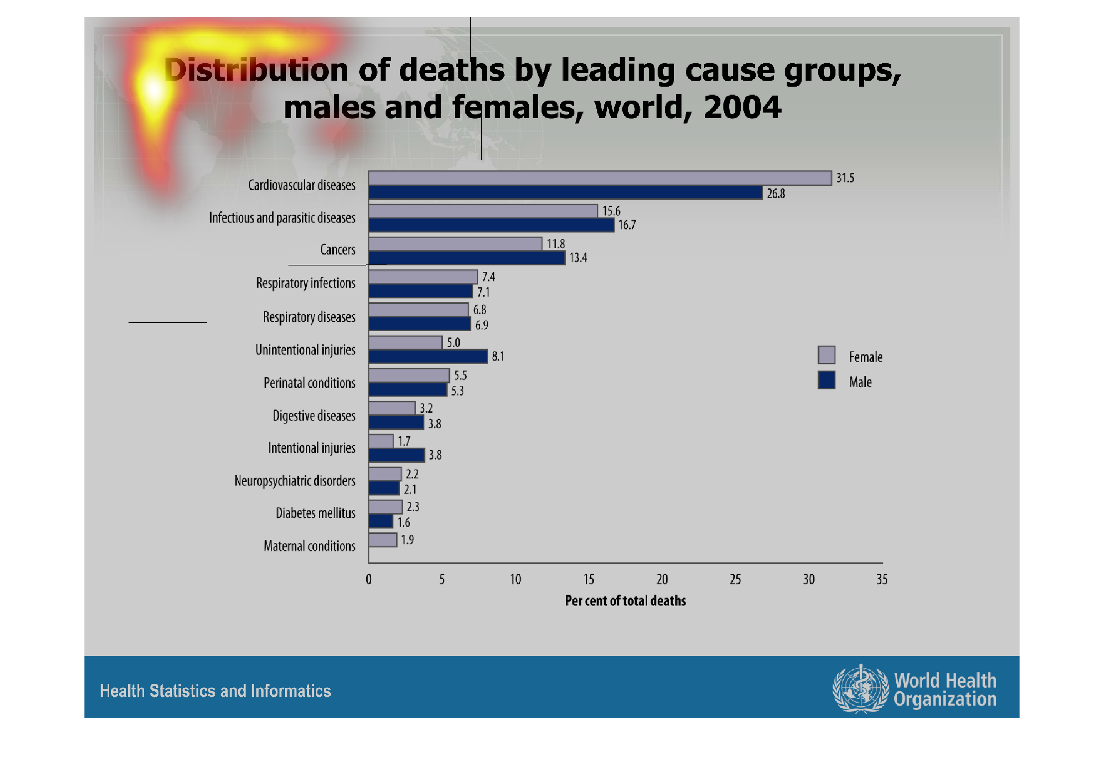
This handmade chart shows the leading causes of death in 2004 around the world as grouped
by disease category such as heart disease and cancer.
Warning: Image is too big to fit on screen; displaying at 67%
Warning: Image is too big to fit on screen; displaying at 67%
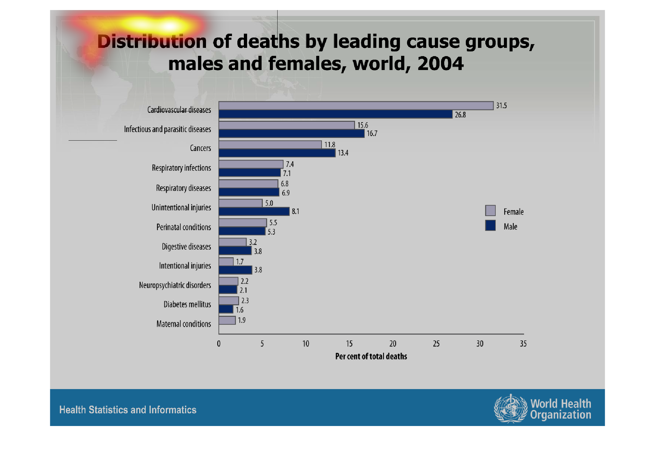
The figure presented is titled Distribution of deaths by leading causes groups, males and
females, worldwide, 2004.  The figure is a representation of deaths.
Warning: Image is too big to fit on screen; displaying at 67%
Warning: Image is too big to fit on screen; displaying at 67%

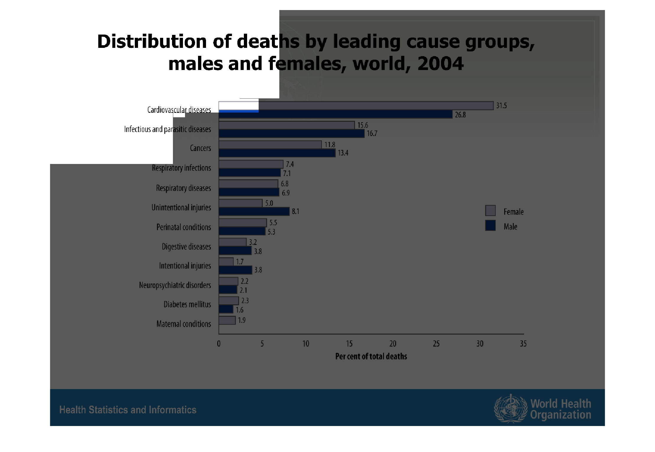
This chart shows the deaths in 2004, for both genders.  There is a bar graph showing the leading
causes, but the photo is too small to read specifically what.
Warning: Image is too big to fit on screen; displaying at 67%
Warning: Image is too big to fit on screen; displaying at 67%
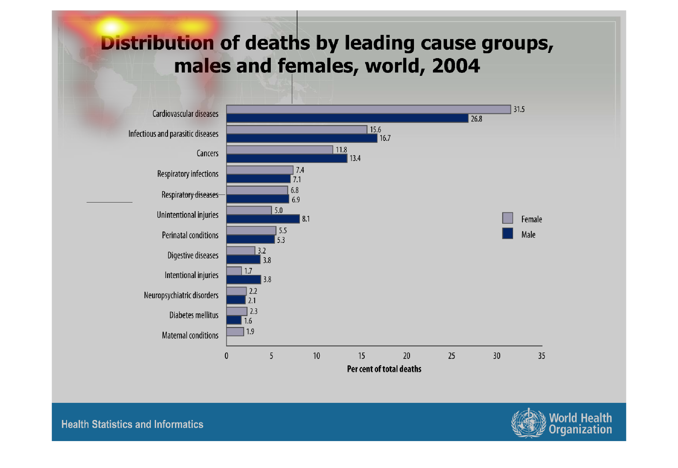
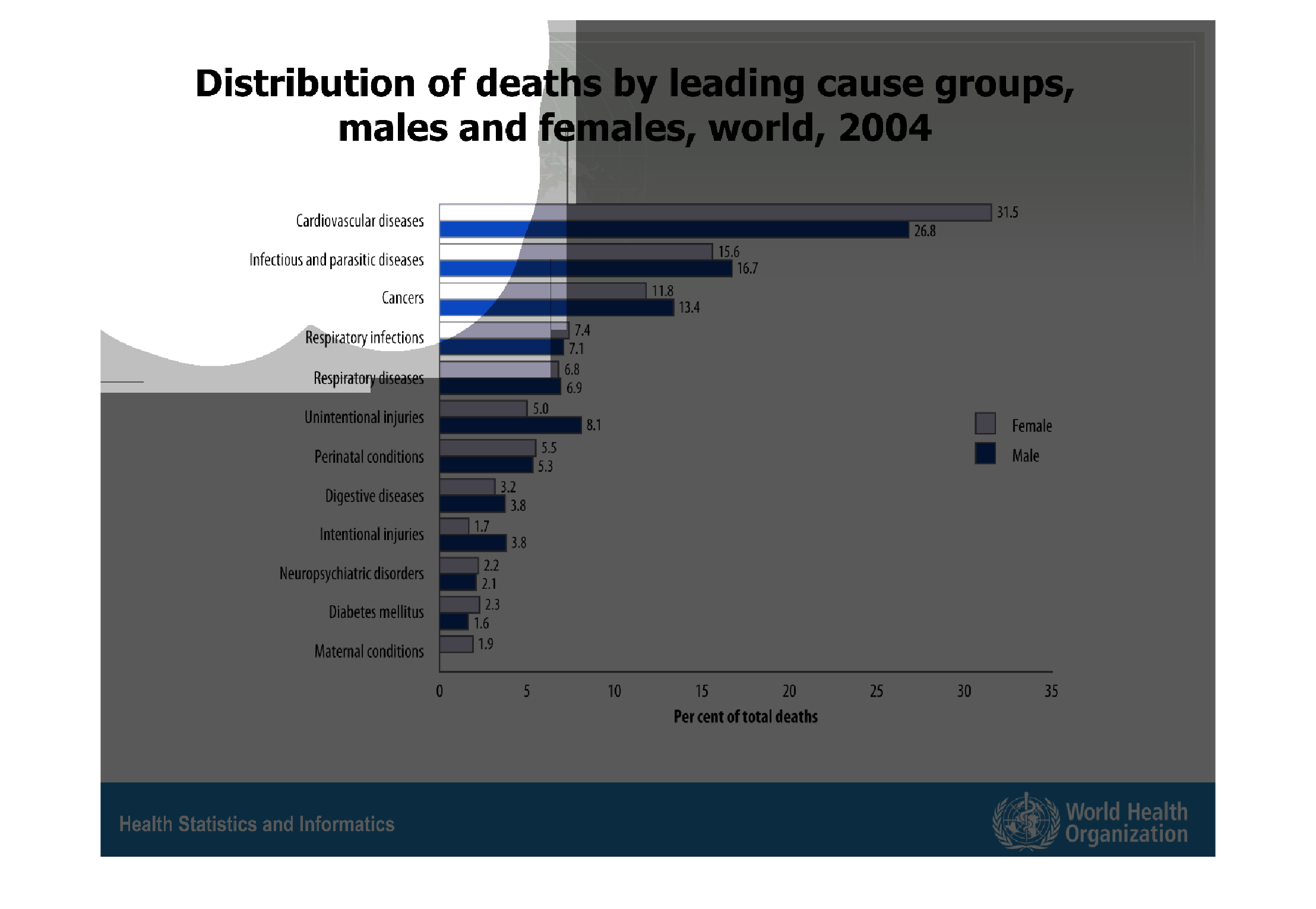
The graphic shows the leading causes of death between males and females in 2004.  As a percentage
of deaths, the only outlier is the disparity in the number of cardiovascular deaths between
men and women.
Warning: Image is too big to fit on screen; displaying at 67%
Warning: Image is too big to fit on screen; displaying at 67%
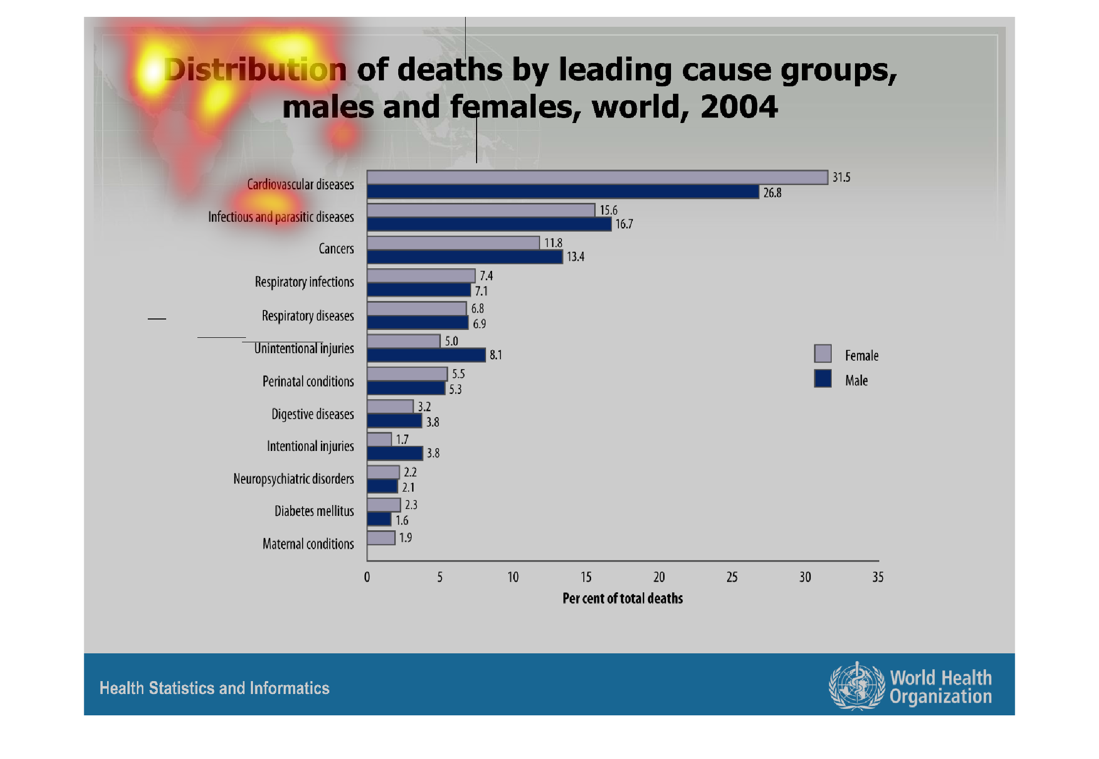
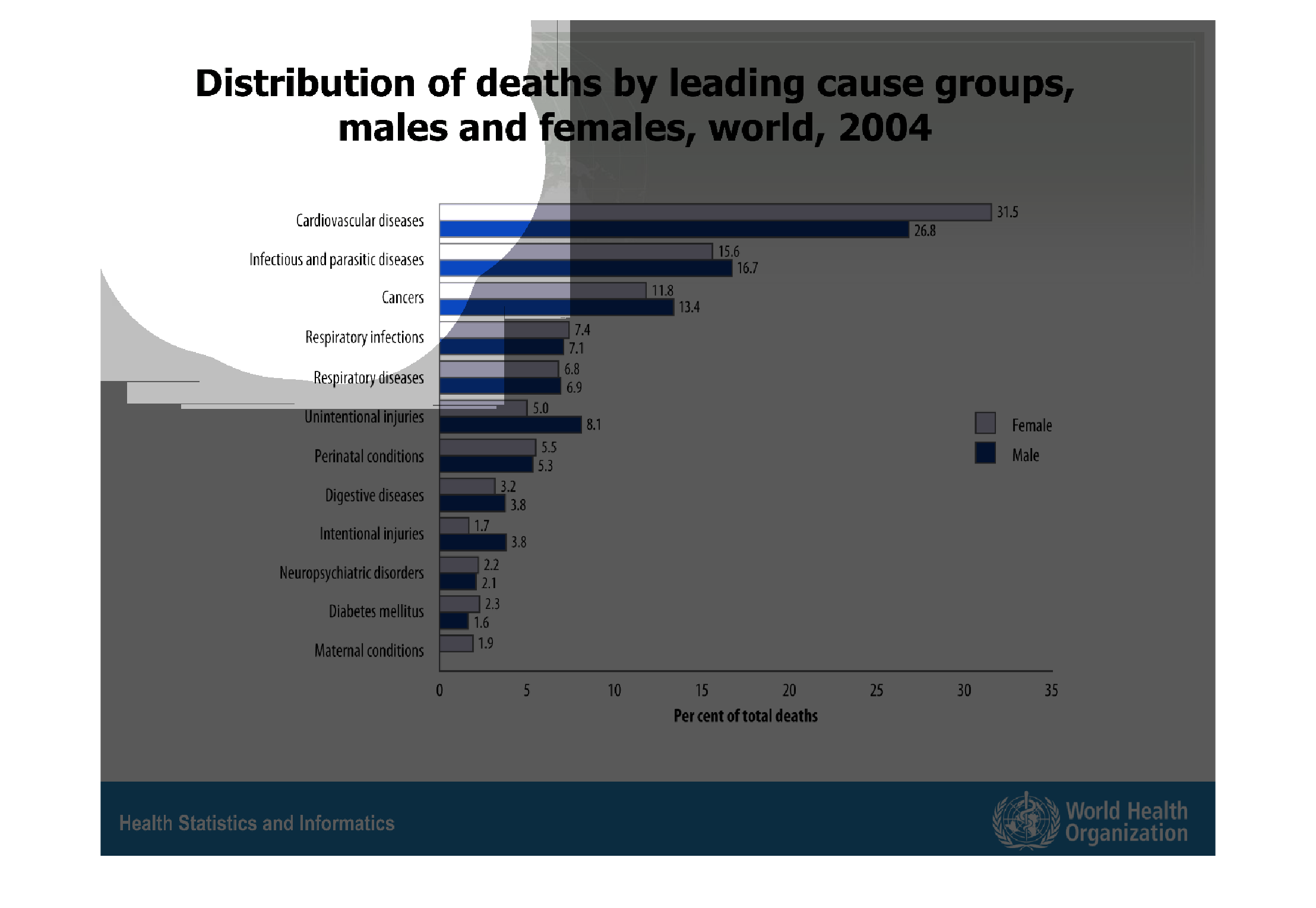
This chart describes distribution of deaths by leading cause groups, males and females, word,
for the year 2004. Categories on the chart include respiratory infections.
Warning: Image is too big to fit on screen; displaying at 67%
Warning: Image is too big to fit on screen; displaying at 67%
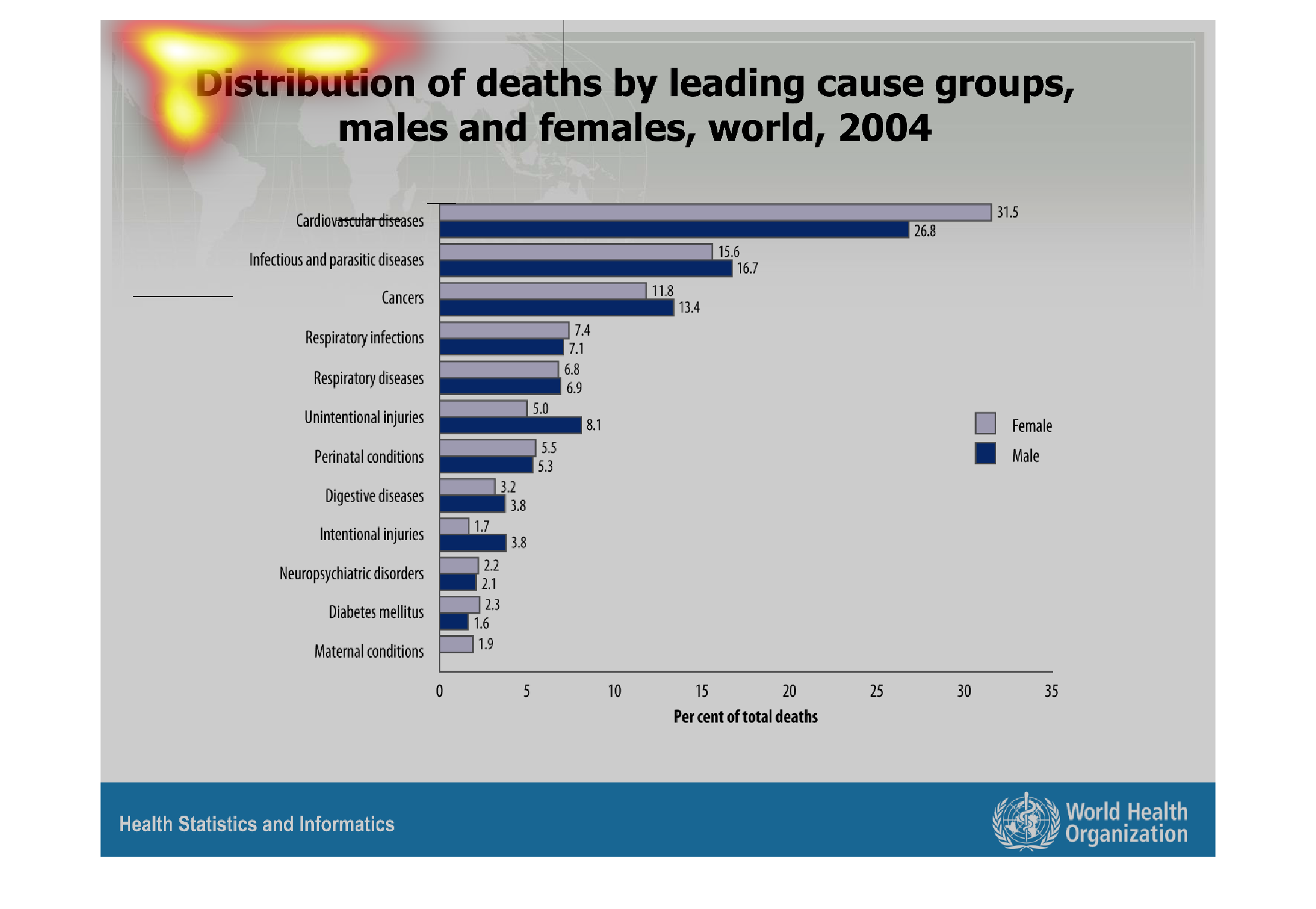
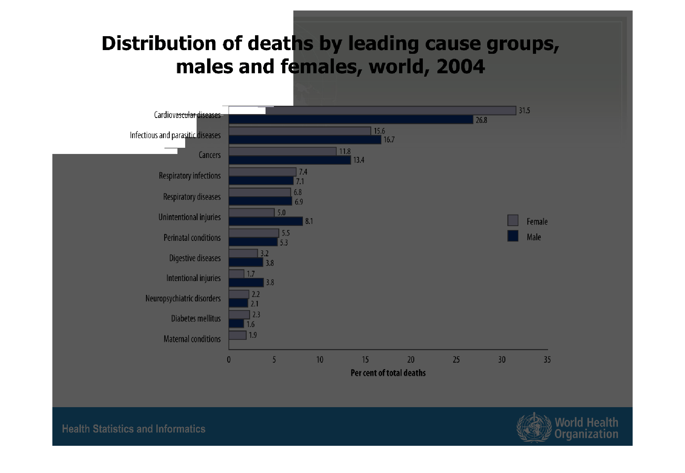
This graph compares the number of deaths by cause of death.  Cardiovascular disease is the
leading cause of death whereas maternal conditions account for the least amount of deaths.
Warning: Image is too big to fit on screen; displaying at 67%
Warning: Image is too big to fit on screen; displaying at 67%
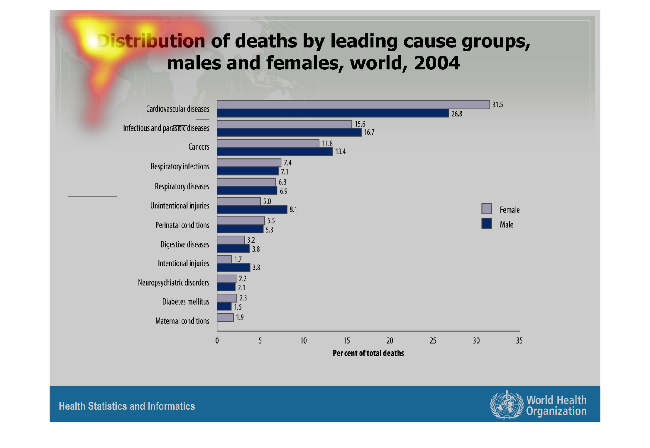
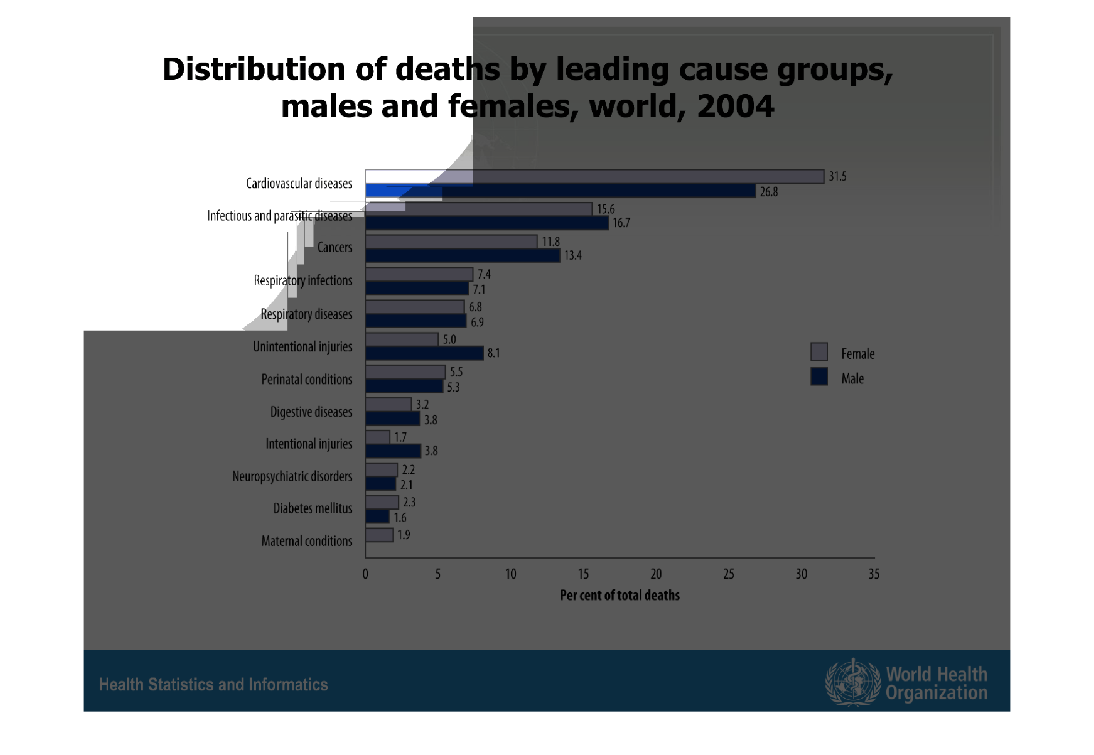
The following chart shows the distribution of death by leading cause groups, It breaks them
down into male and female and the number one killer for both man and woman around the world
according to the chart is cardiovascular disease.
Warning: Image is too big to fit on screen; displaying at 67%
Warning: Image is too big to fit on screen; displaying at 67%
This is a graph that shows the leading cause of death around the world. It shows both for
male and female. It ranks the highest cause first then goes down to the last.
Warning: Image is too big to fit on screen; displaying at 67%
Warning: Image is too big to fit on screen; displaying at 67%