Warning: Image is too big to fit on screen; displaying at 67%
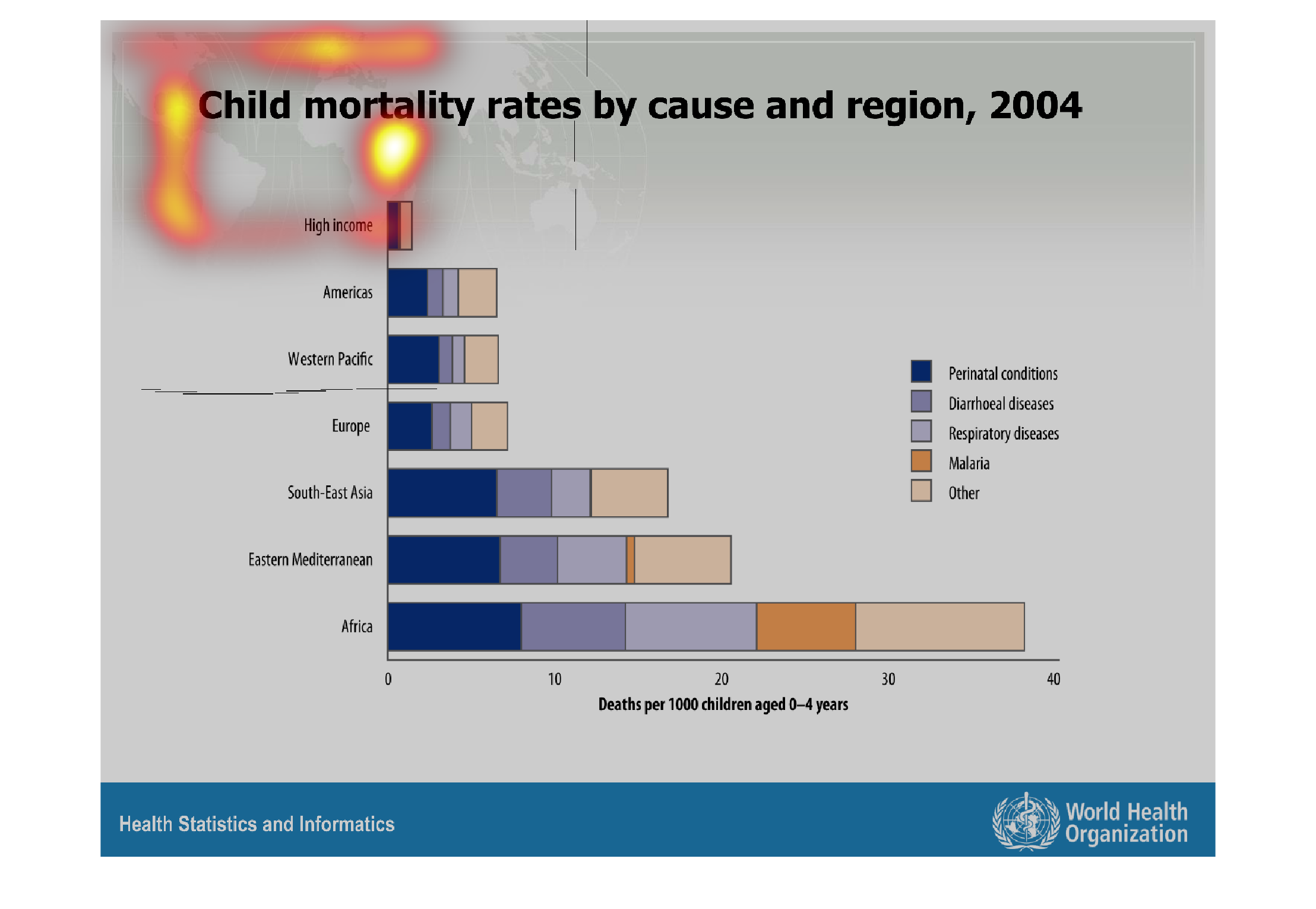
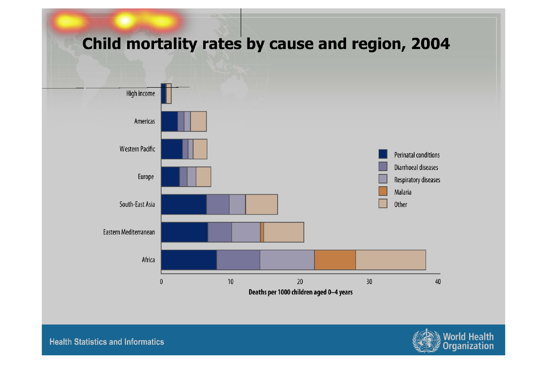
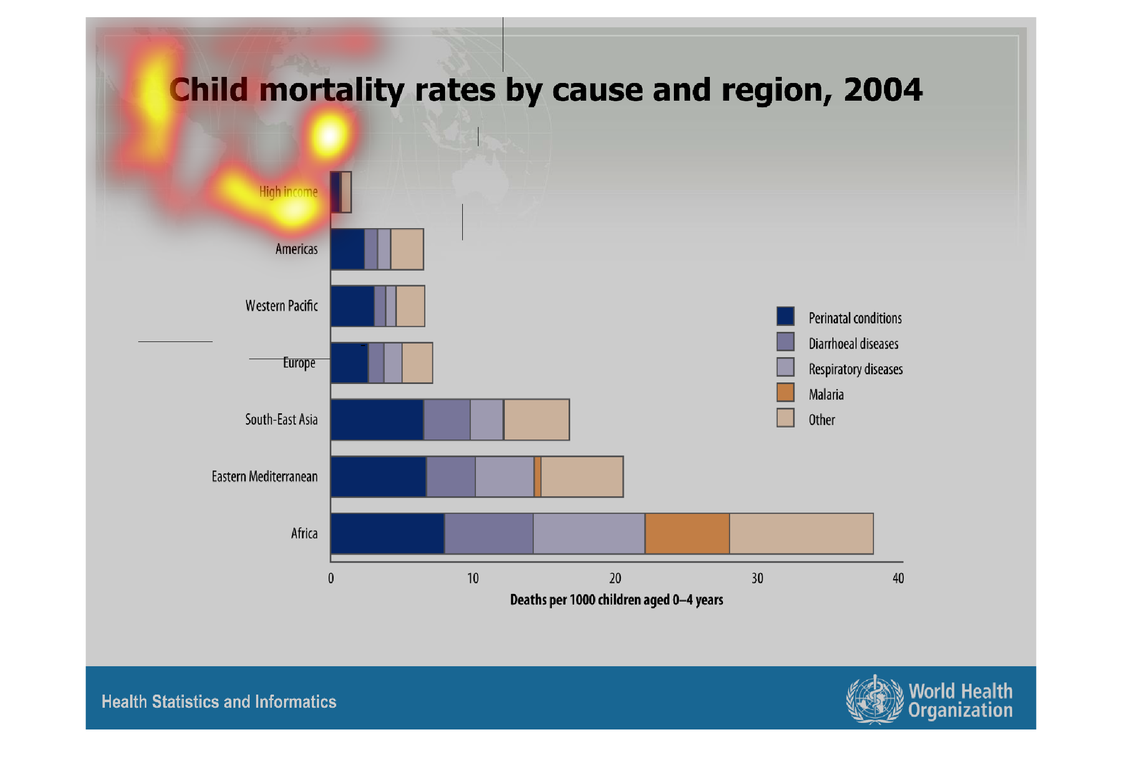
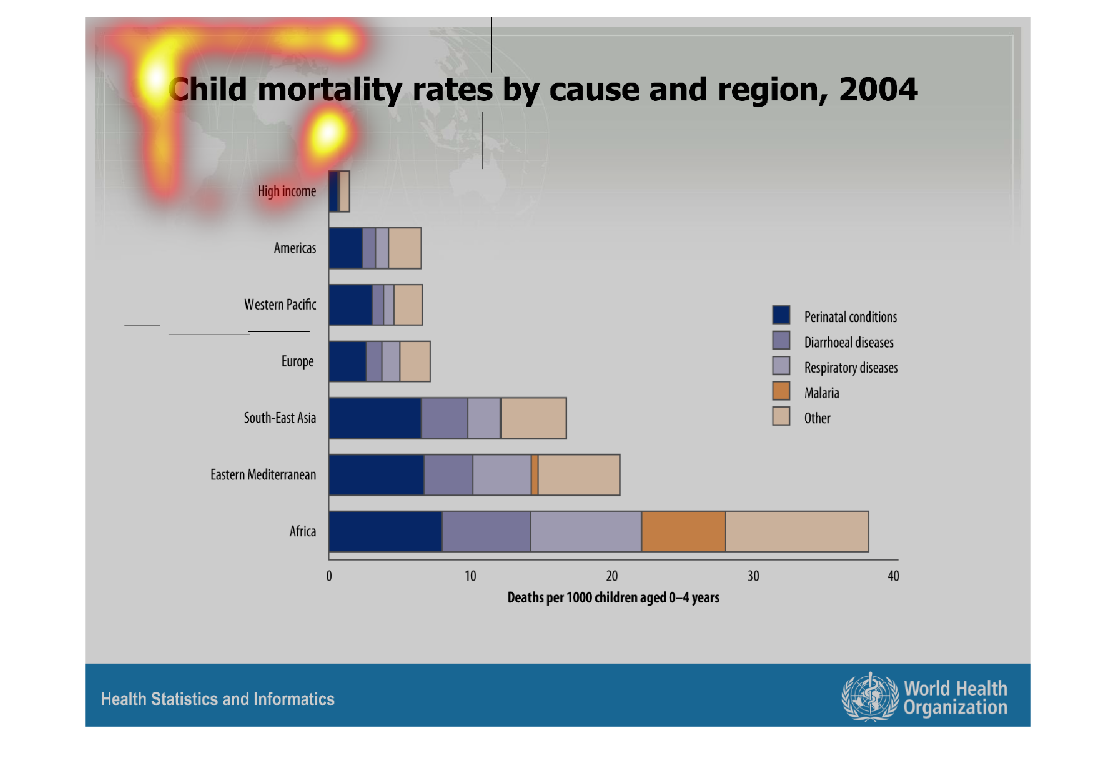
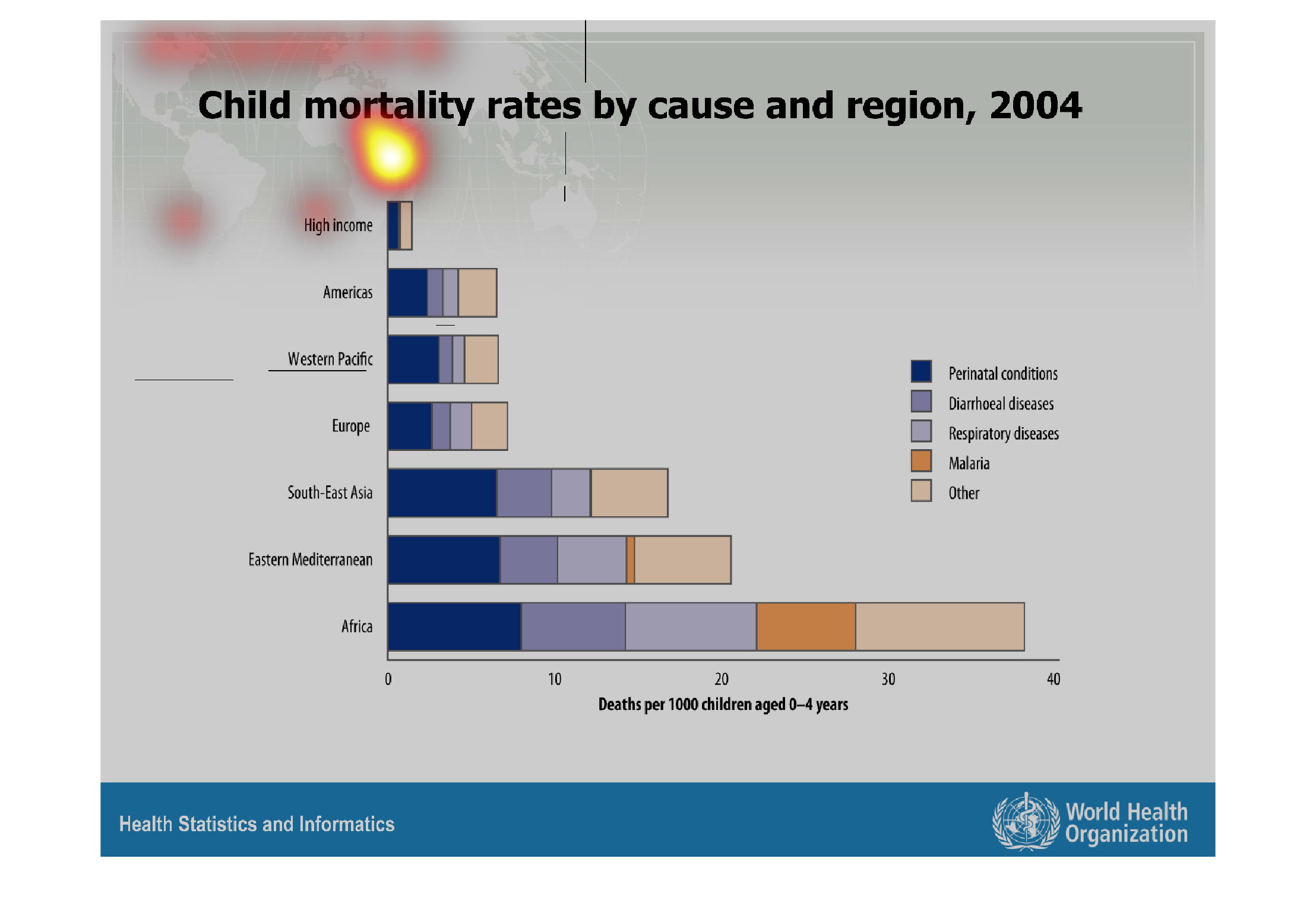
child mortality rates by cause and region, 2004. Y axis lists different regions. x axis shows
deaths of children 4 and under by the thousands. The bars are split into different colors
coded by a key, including malaria, respiratory disease, diarrheal disease, and prenatal conditions.
Warning: Image is too big to fit on screen; displaying at 67%
Warning: Image is too big to fit on screen; displaying at 67%

This image or figure shows or depicts in statistical bar graph format the child mortality
rate by cause and region for the year 2004. Africa seems to have the highest rates.
Warning: Image is too big to fit on screen; displaying at 67%
Warning: Image is too big to fit on screen; displaying at 67%
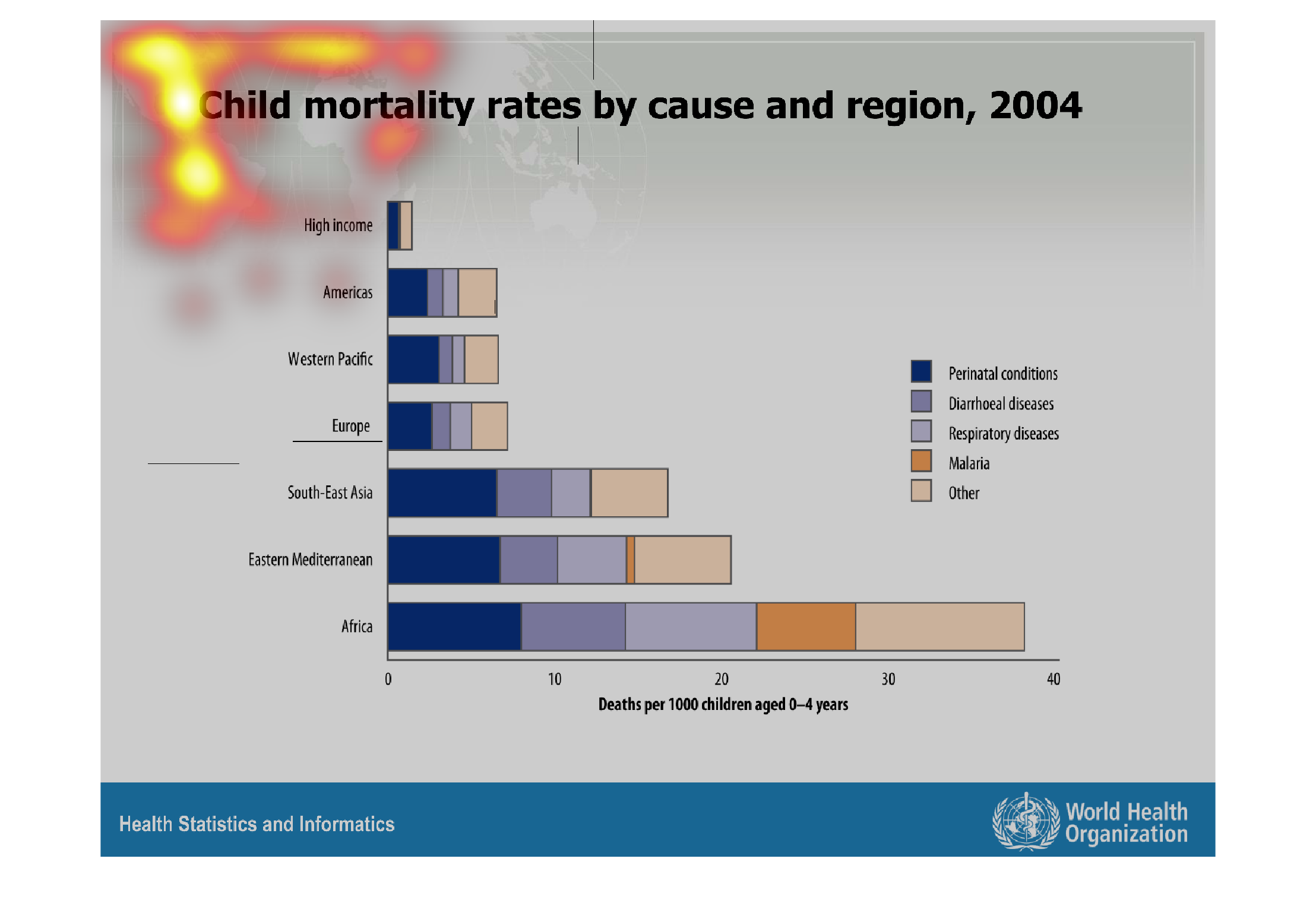
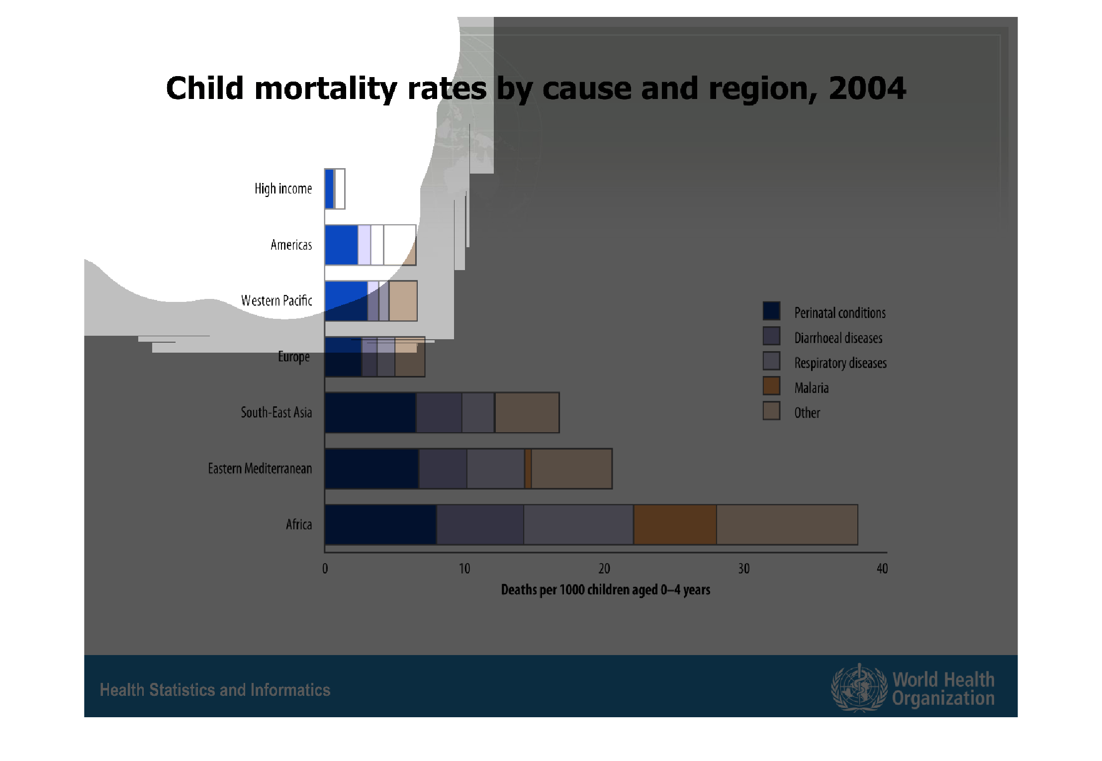
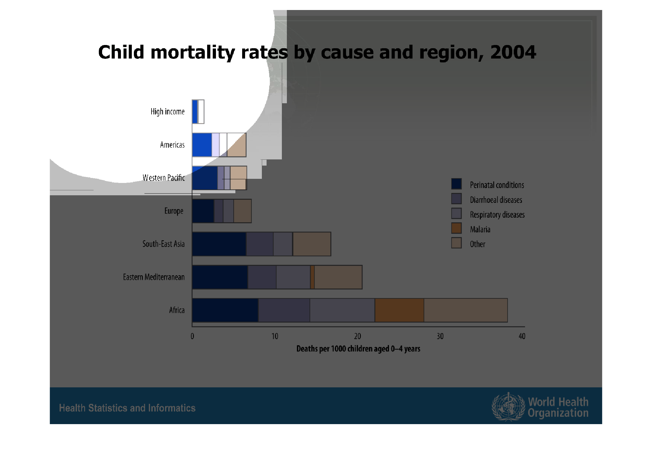
Child mortality rates by cause and rate for 2004. The areas are Africa, Western Mediterranean,
South East Asia, Europe, Western Pacific, Americas. The illnessess are Prenatal, Respitory,
Malaria, and Diahrrea.
Warning: Image is too big to fit on screen; displaying at 67%
Warning: Image is too big to fit on screen; displaying at 67%
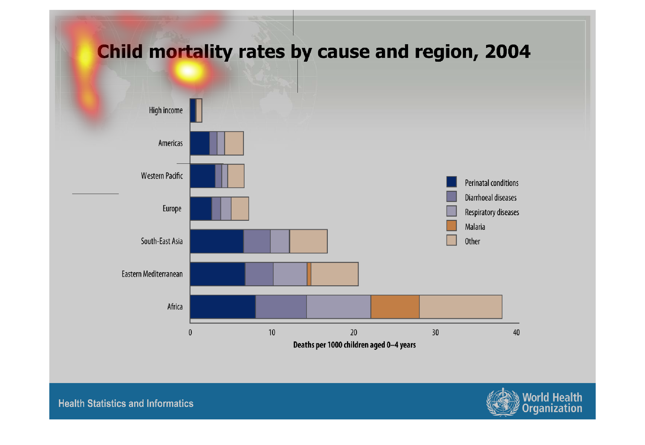
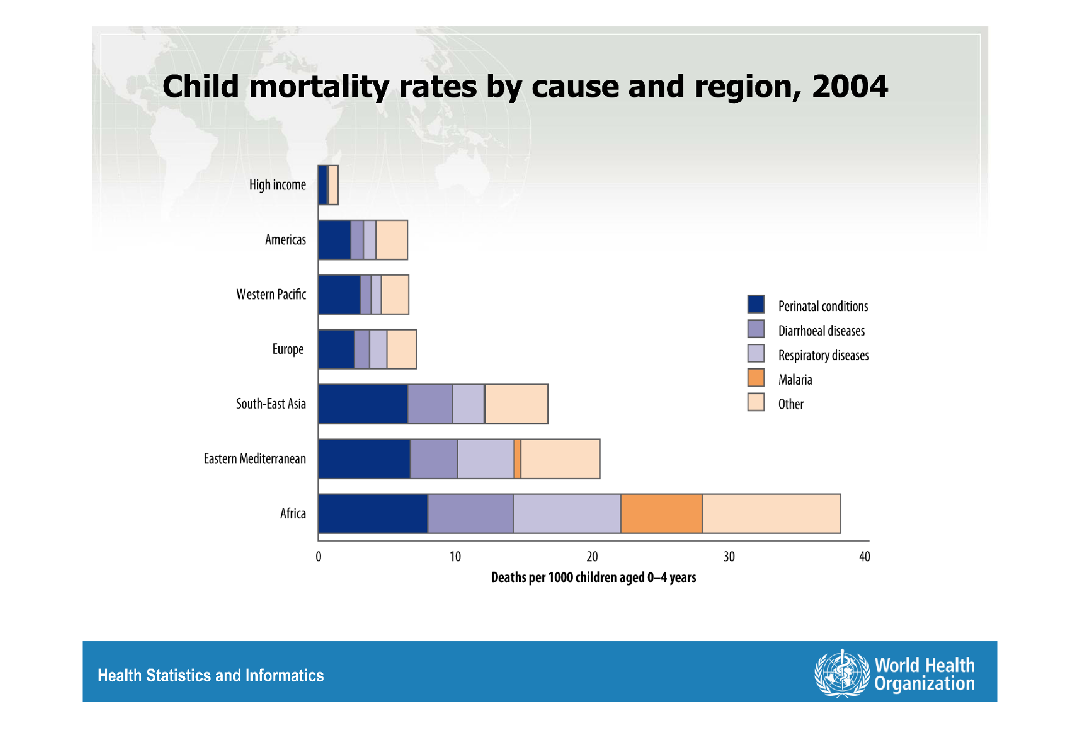
The figure presented is titled child mortality rates by cause and region, 2004.  The figure
is an intelligent representation of the child mortality rates by cause.
Warning: Image is too big to fit on screen; displaying at 67%
Warning: Image is too big to fit on screen; displaying at 67%
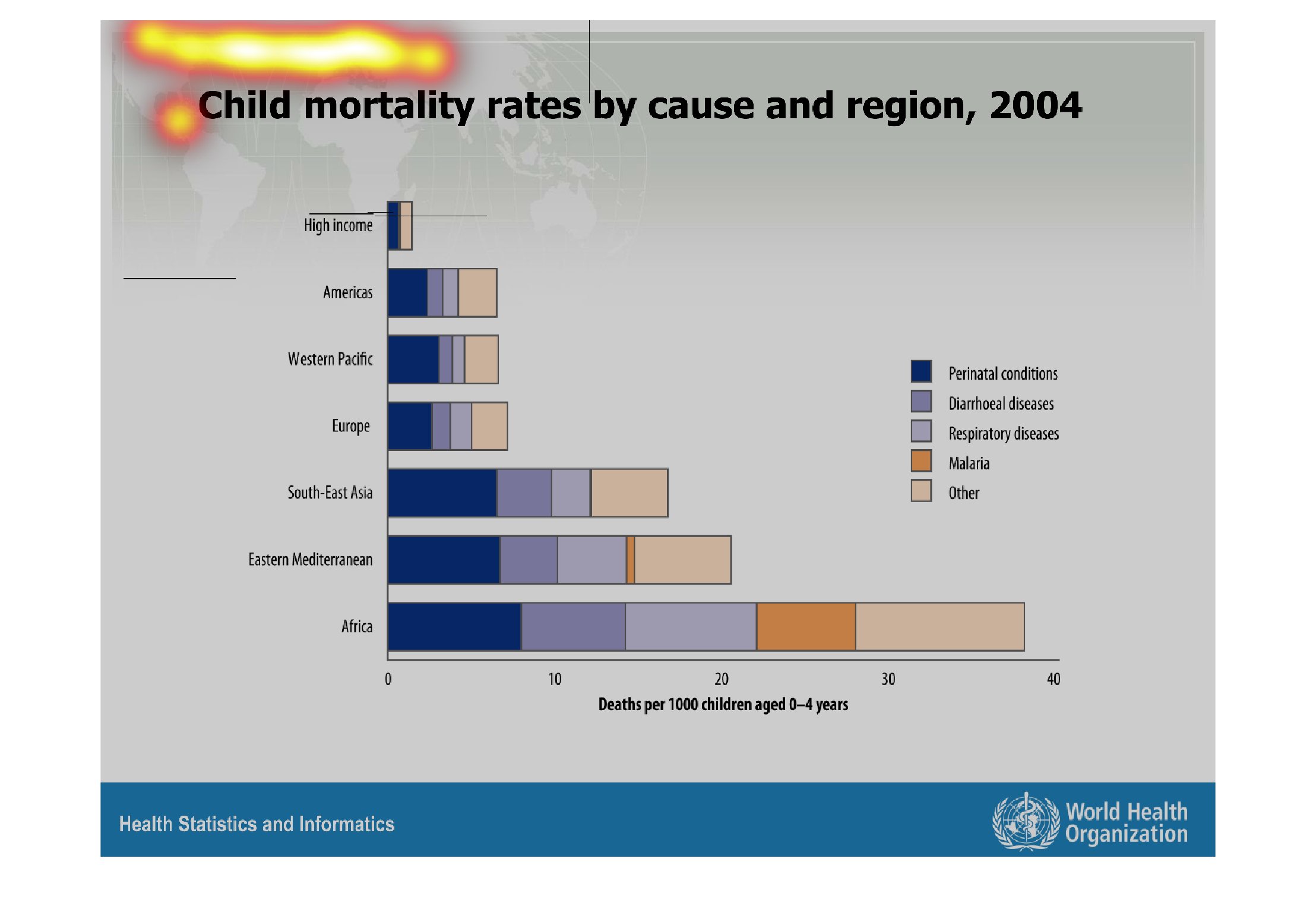
This 2004 chart shows childhood mortality rates by causes and regions. The horizontal bars
and color shaded to denote different diseases, and ranked by country, with a small bar for
'high income.'
Warning: Image is too big to fit on screen; displaying at 67%
Warning: Image is too big to fit on screen; displaying at 67%
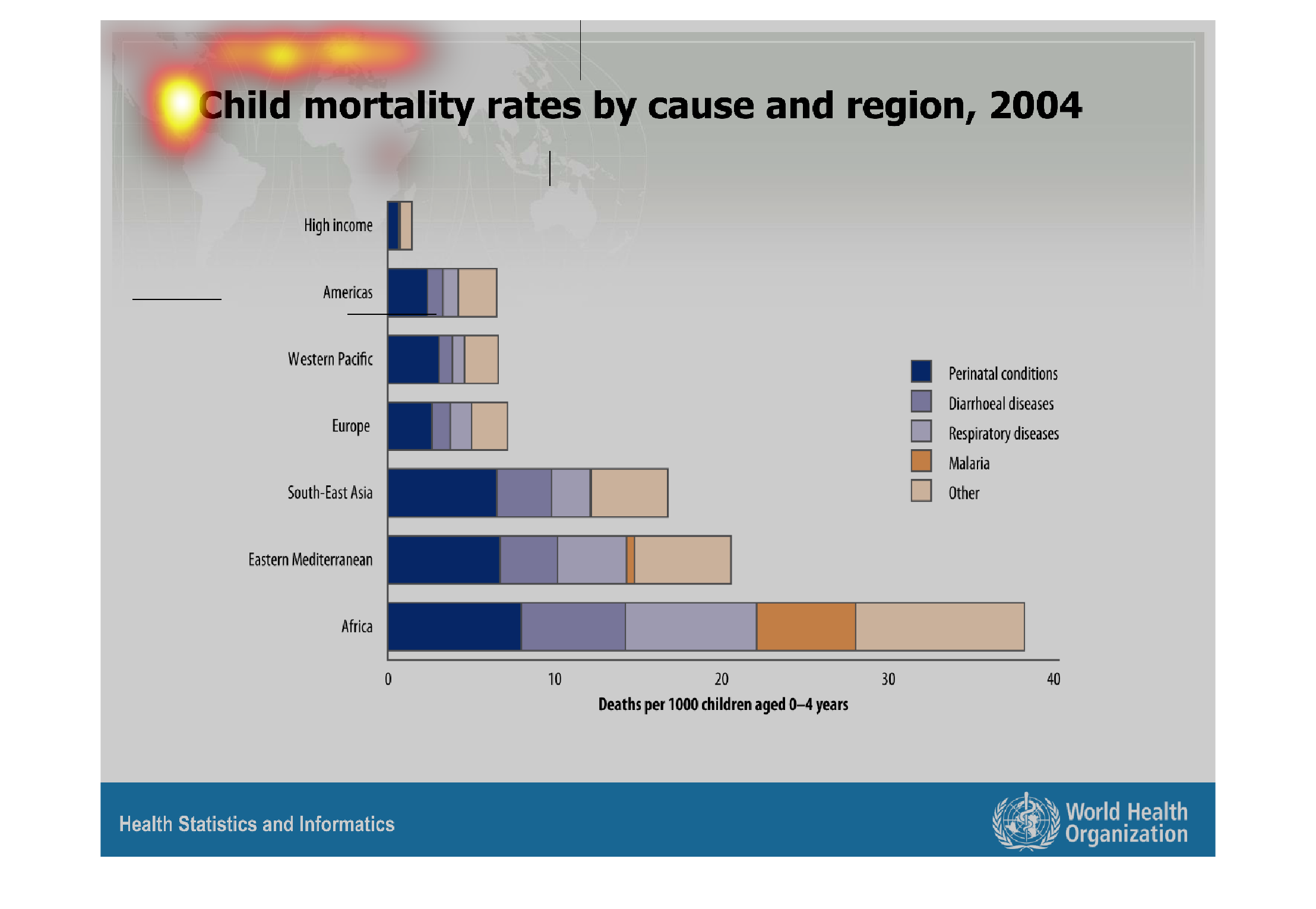
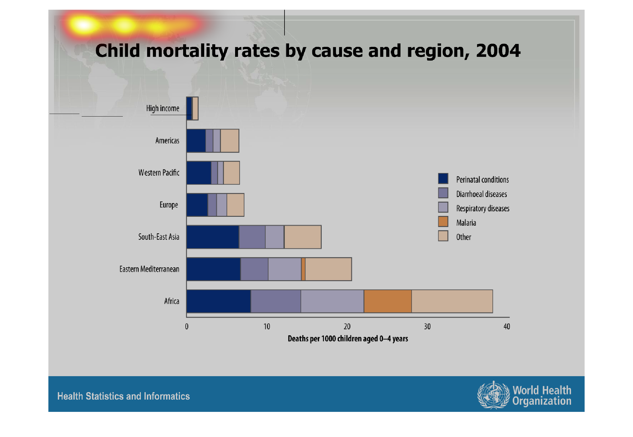
This graph shows child mortality rates by cause and region in 2004. Causes include prenatal
conditions, diarrheal disease, respiratory diseases, and malaria.
Warning: Image is too big to fit on screen; displaying at 67%
Warning: Image is too big to fit on screen; displaying at 67%
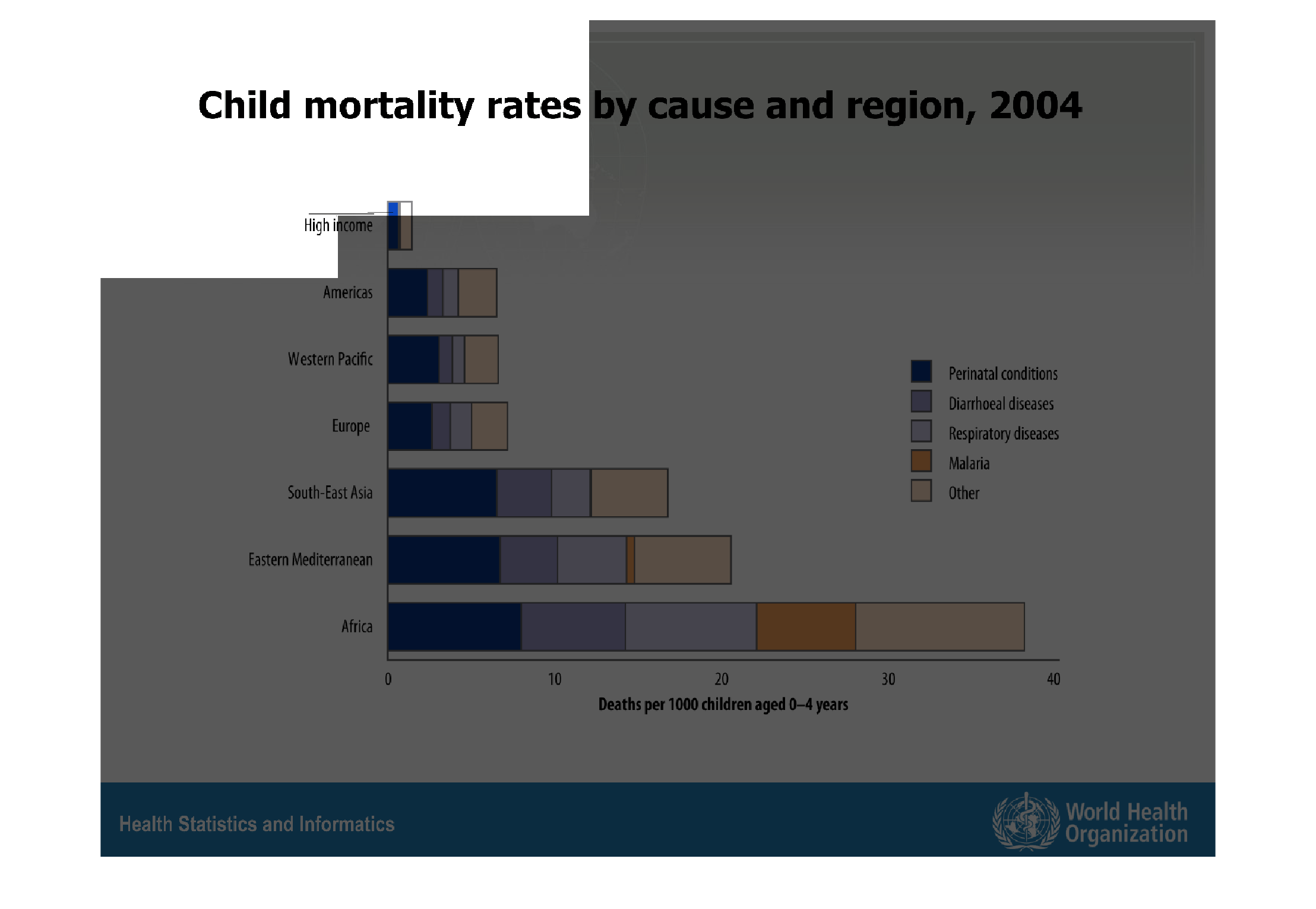
This figure is titled child mortality rates by cause and region, 2004.  The figure is a representation
of the mortality rates of children in different regions.
Warning: Image is too big to fit on screen; displaying at 67%
Warning: Image is too big to fit on screen; displaying at 67%
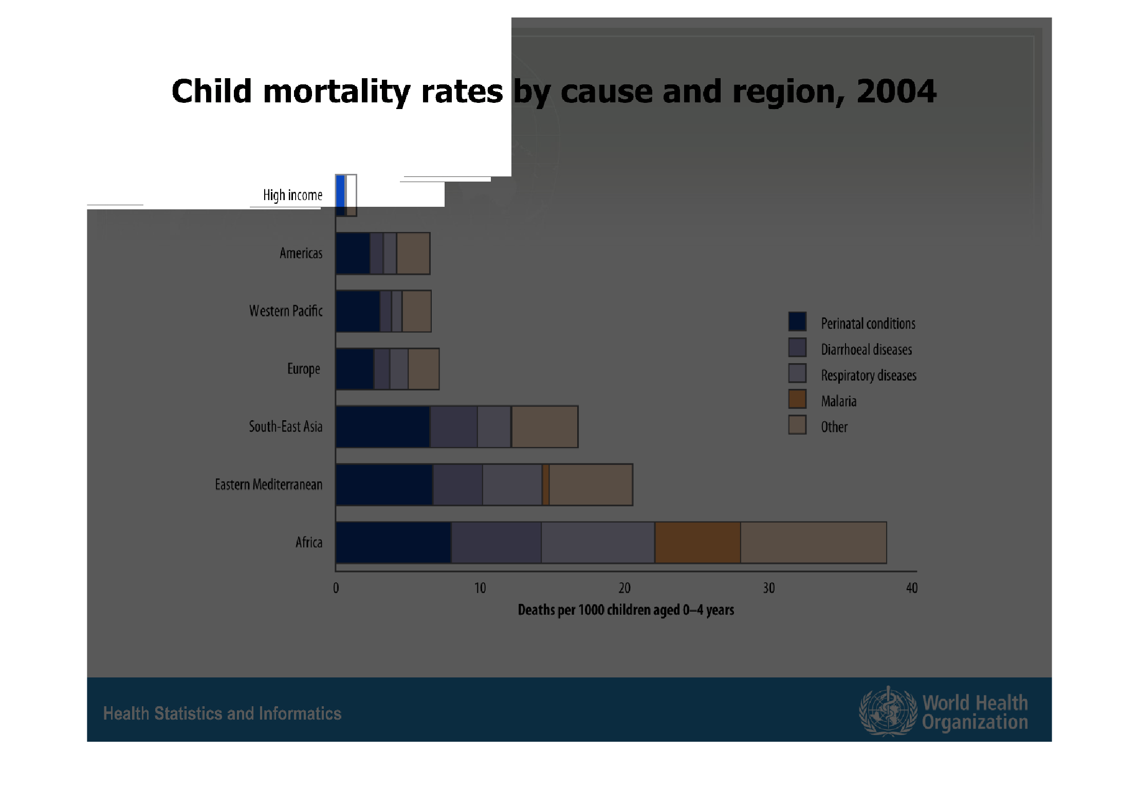
The following chart gives the mortality rate for children and the causes. It is broken down
into different regions of the world as well. It also gives a high income group.
Warning: Image is too big to fit on screen; displaying at 67%
Warning: Image is too big to fit on screen; displaying at 67%
This chart describes child mortality rates by cause and by region, for the year 2004. Regions
on the chart include the Americas and the Western Pacific.
Warning: Image is too big to fit on screen; displaying at 67%
Warning: Image is too big to fit on screen; displaying at 67%
This graph illustrates child mortality rates by cause and region in 2004.  Africa has the
highest with a combination of respiratory diseases, prenatal conditions, and malaria.
Warning: Image is too big to fit on screen; displaying at 67%
Warning: Image is too big to fit on screen; displaying at 67%
Child mortality rates by cause and region in 2004.  Africa has the most deaths, and high income
regions have the lowest. Causes are listed as prenatal conditions, diarhoeal diseases, respiratory
diseases, malaria, and other.
Warning: Image is too big to fit on screen; displaying at 67%
Warning: Image is too big to fit on screen; displaying at 67%

This chart is about the child mortality rate by cause and region. As usual and sadly, Africa
has the largest child mortality rate among the other countries mentioned.
Warning: Image is too big to fit on screen; displaying at 67%
Warning: Image is too big to fit on screen; displaying at 67%
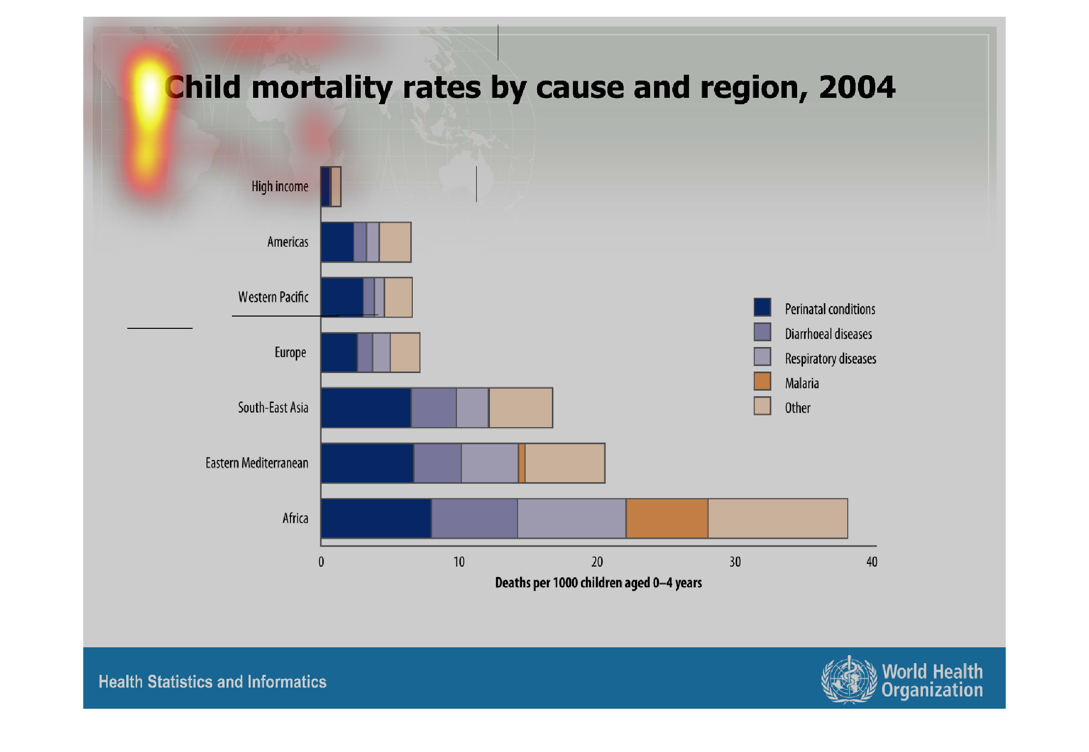
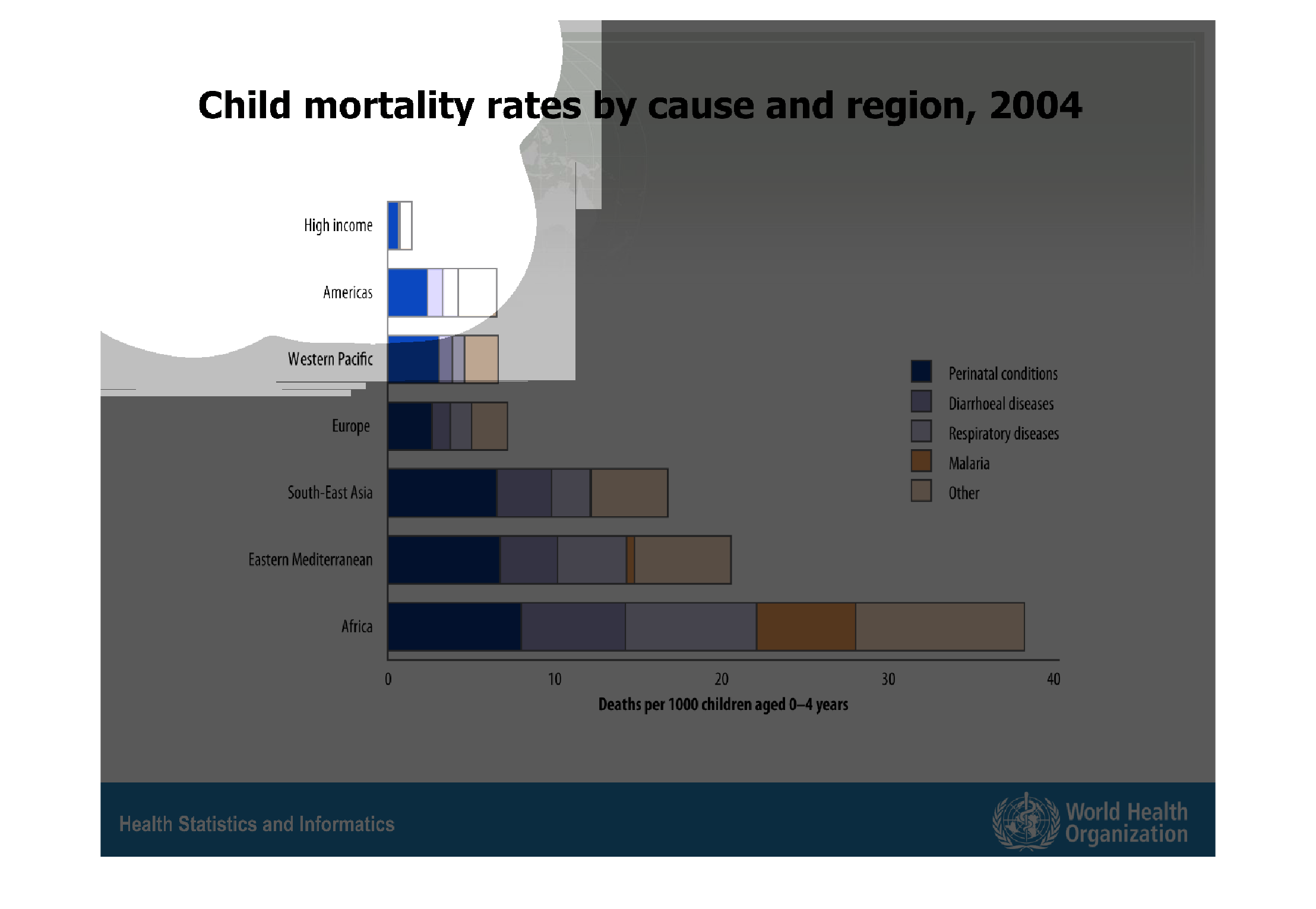
This graph describes child mortality rates by cause and region for the year 2004. It describes
perinatal conditions, diarrheal diseases, respiratory diseases, malaria, and others, amongst
major regions of the world. It also has a bracket for child mortality as related to high income.
Warning: Image is too big to fit on screen; displaying at 67%
Warning: Image is too big to fit on screen; displaying at 67%