Warning: Image is too big to fit on screen; displaying at 67%
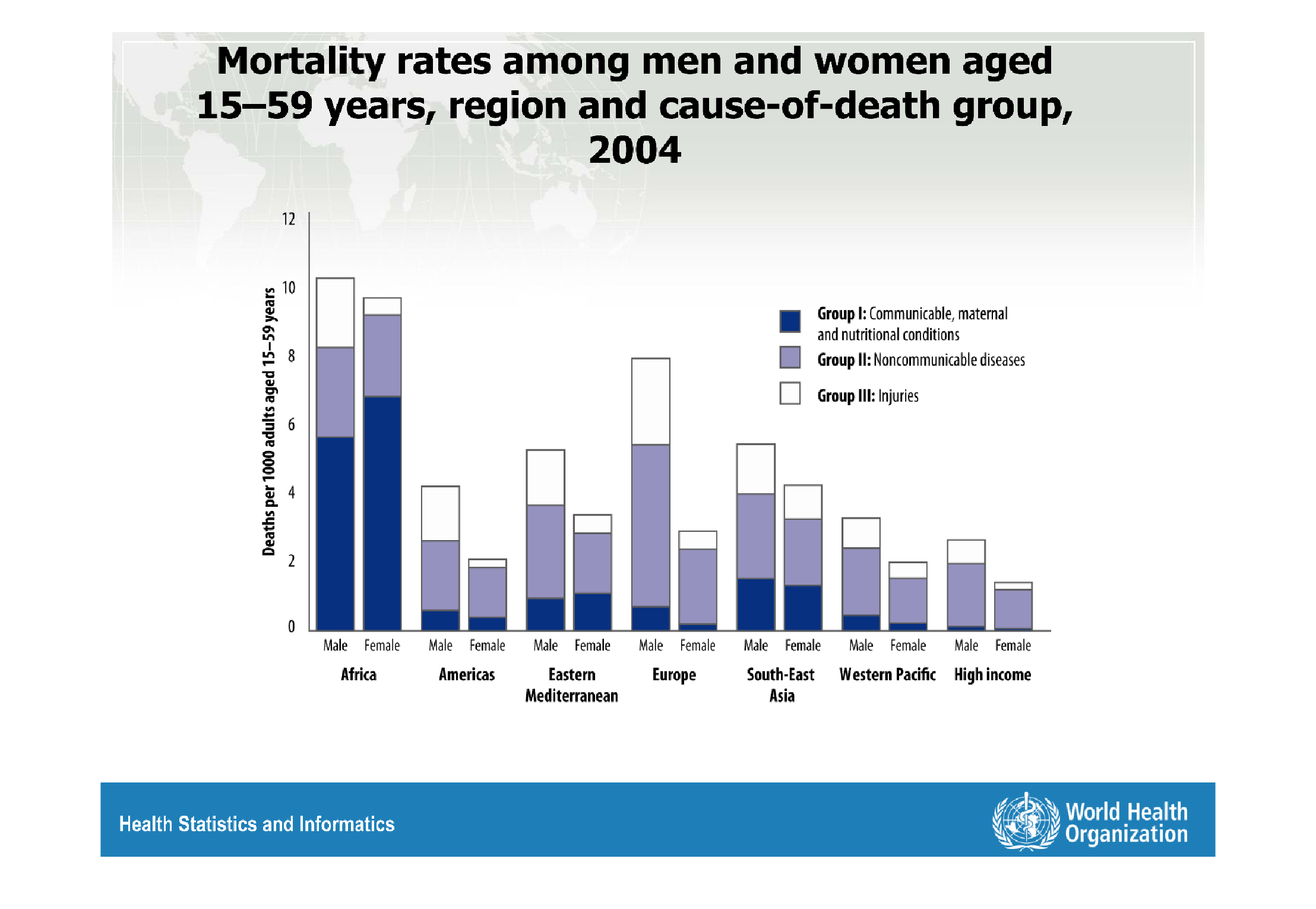
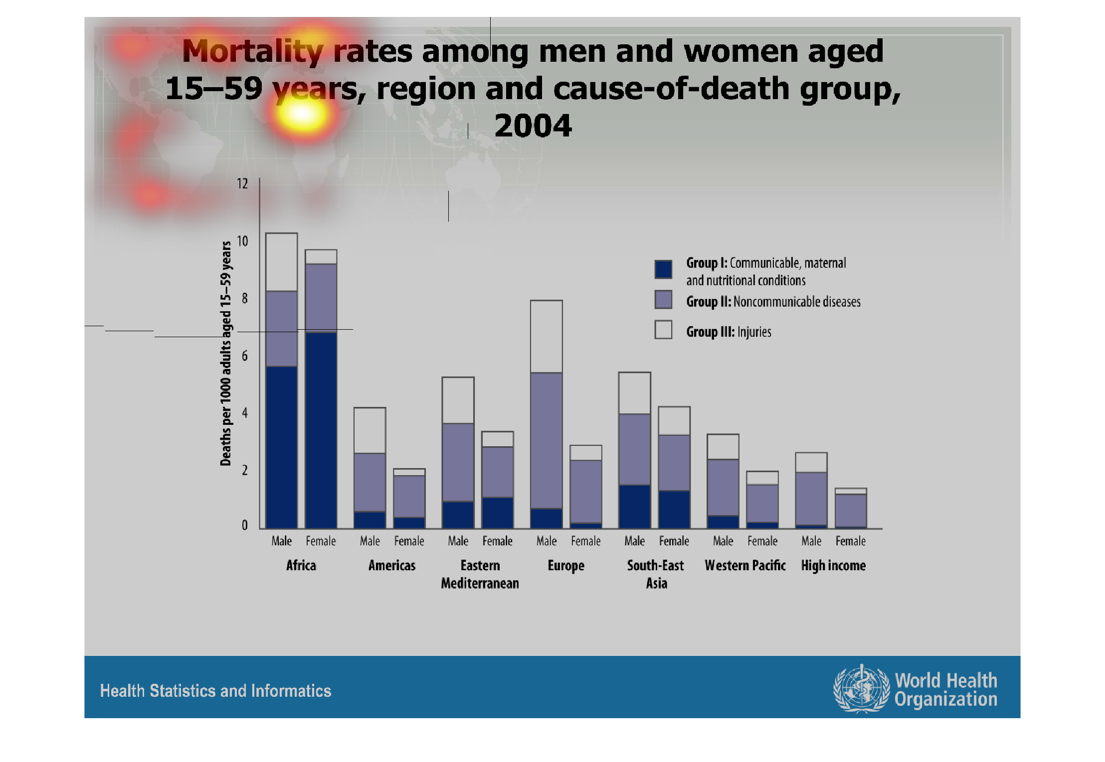
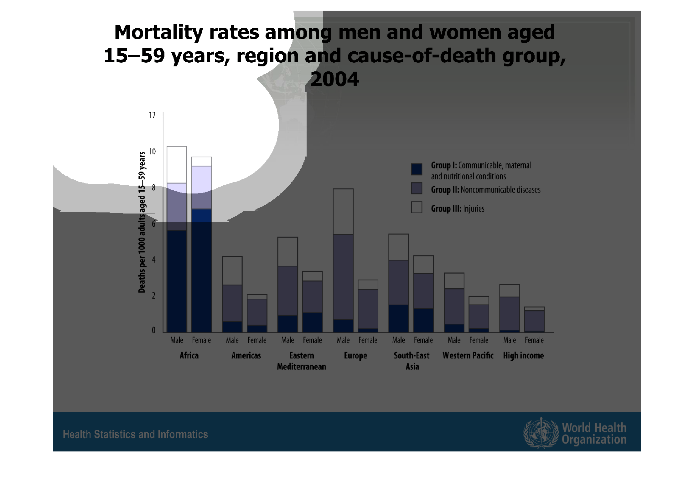
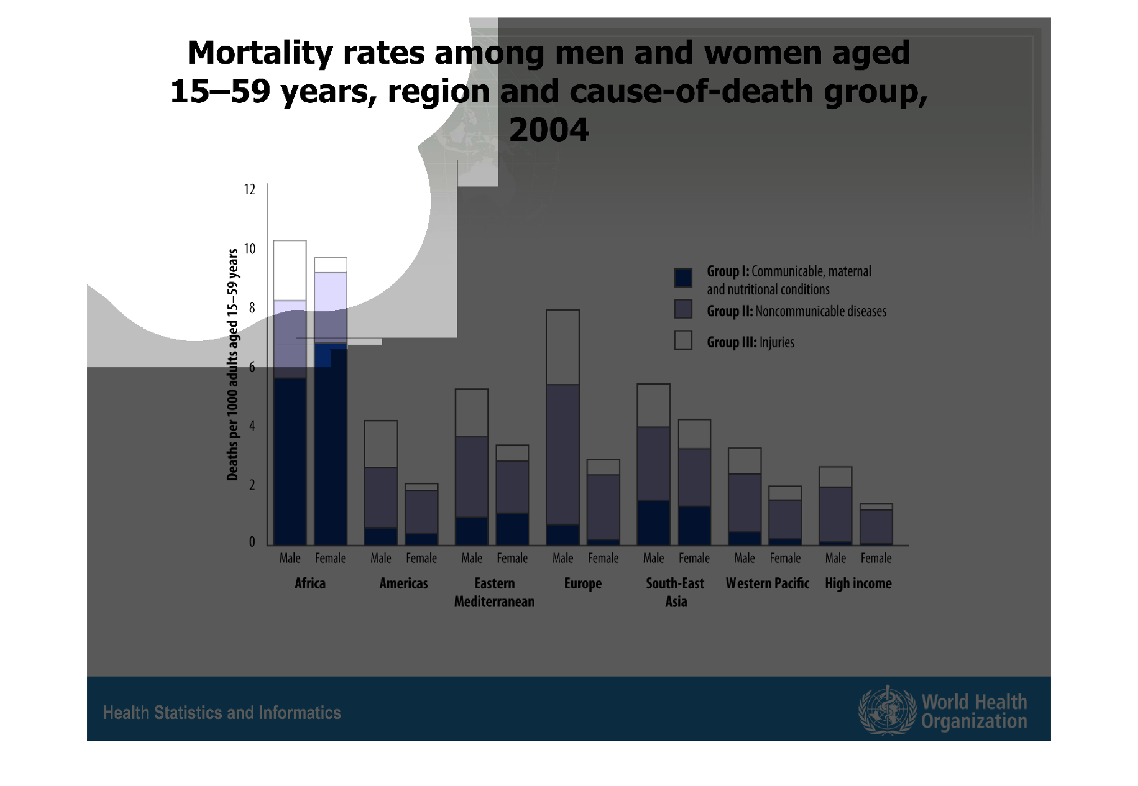
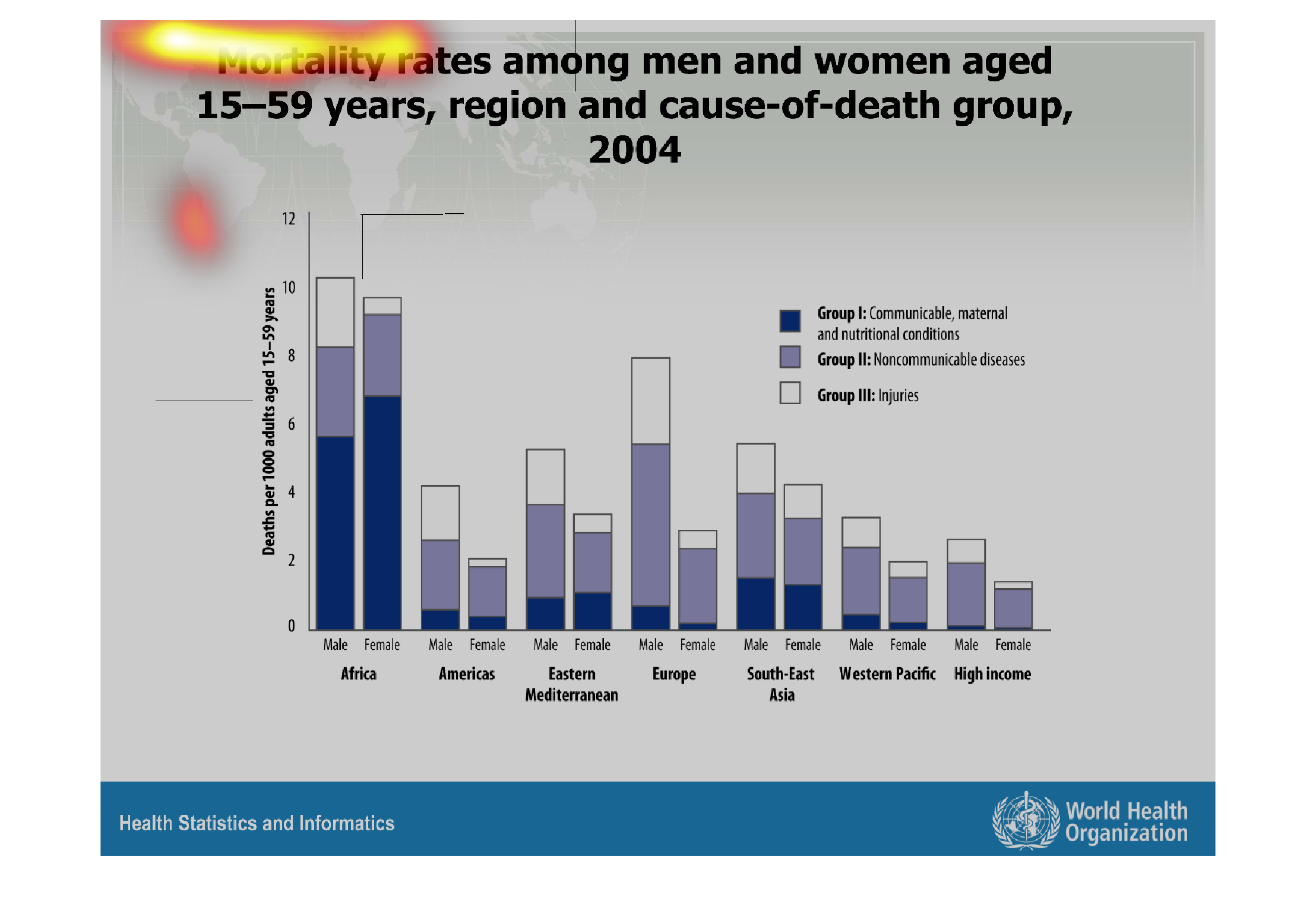
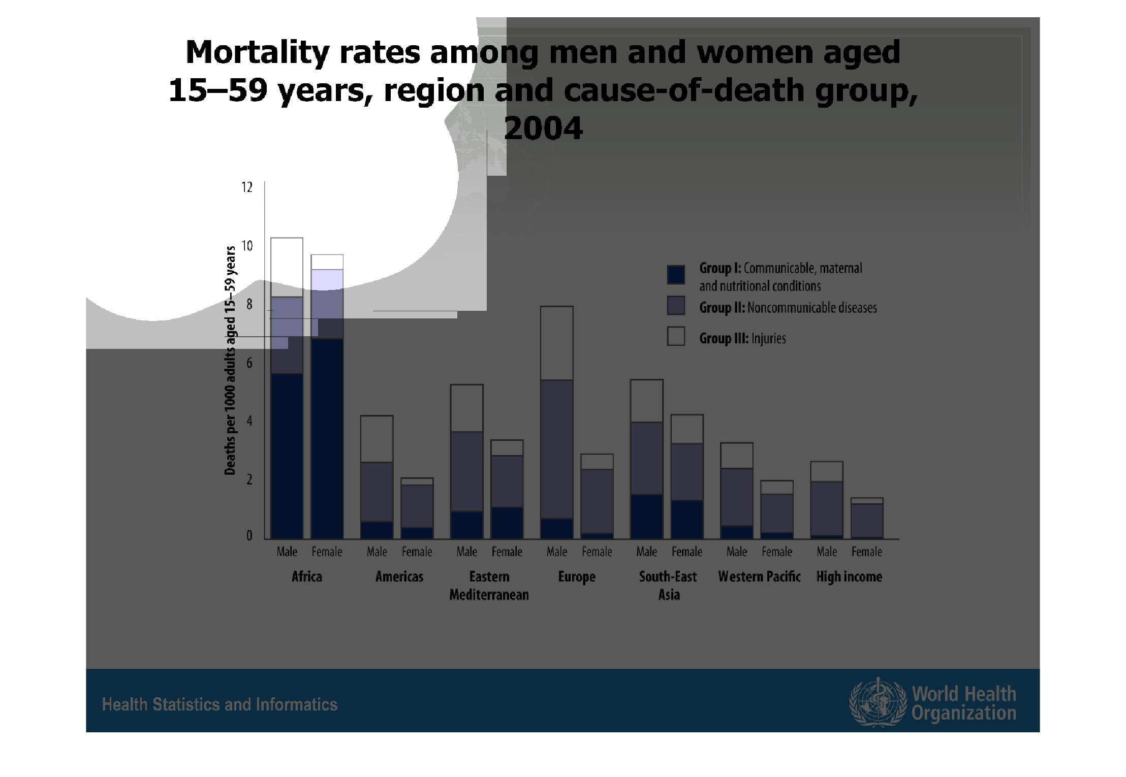
This chart describes mortality rates among men and woman aged 15-59 years.  It also shows
the reason and cause of death group.  The data is from 2004.  The mortality rate is highest
in Africa, where the leading cause of death is communicable, maternal and nutritional conditions.
 The lowest mortality rate occurs in the Americas where the cause of death is noncommunicable
diseases.
Warning: Image is too big to fit on screen; displaying at 67%
Warning: Image is too big to fit on screen; displaying at 67%

The graph displays mortality rates among both men and women aged 15-59 years, with causes
of death grouped together. The key shows three groups. Dark blue is communicable, maternal,
and nutritional causes. Purple is noncommunicable diseases. White is injuries. The y-axis
is labeled "deaths per 1000 adults" in the age group given. Each bar is broken up by color
chunks in the key. The x axis is divided by region, and each region is divided by male and
female. There is an additional group at the far right of the x axis for high income individuals.
Warning: Image is too big to fit on screen; displaying at 67%
Warning: Image is too big to fit on screen; displaying at 67%
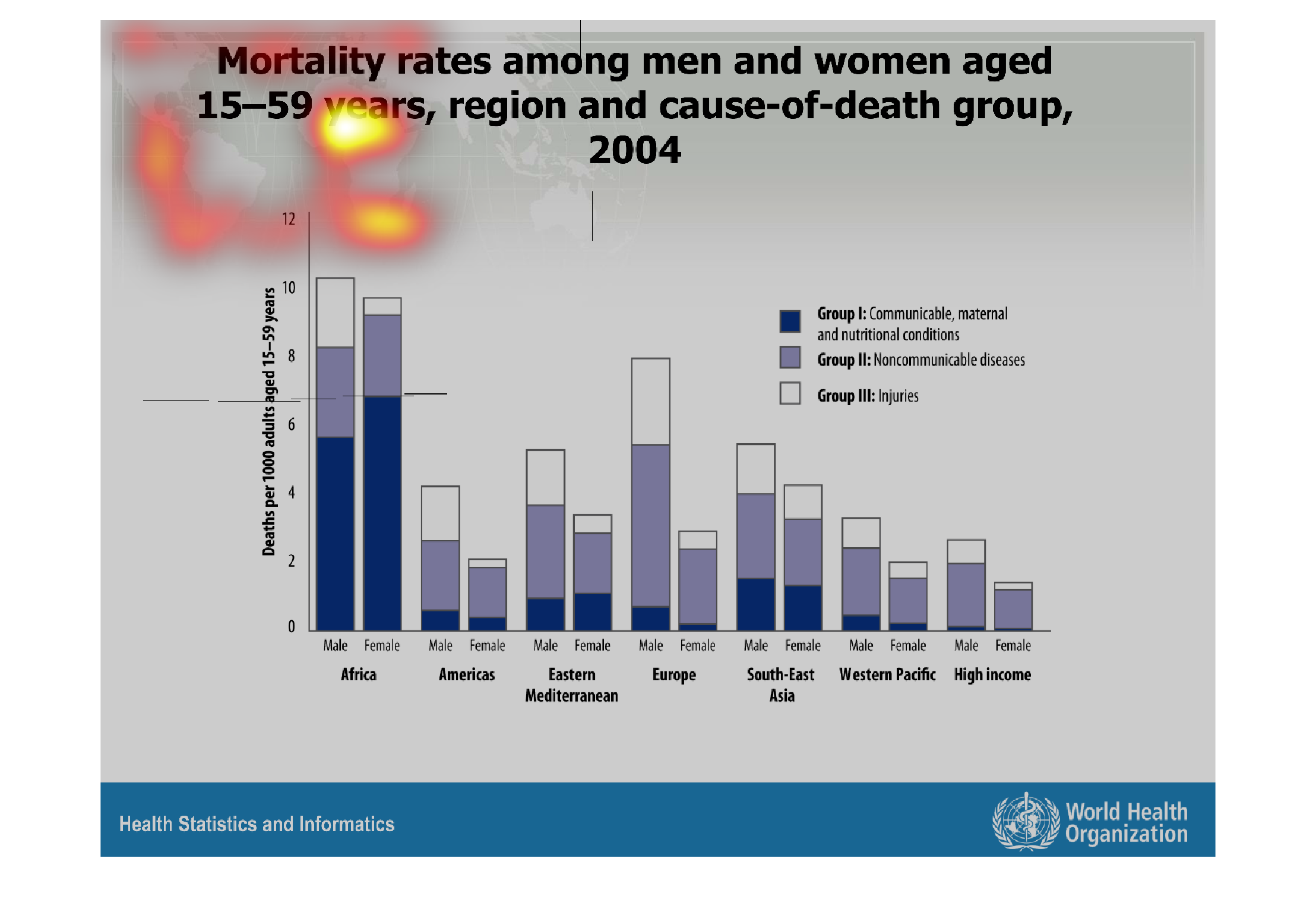
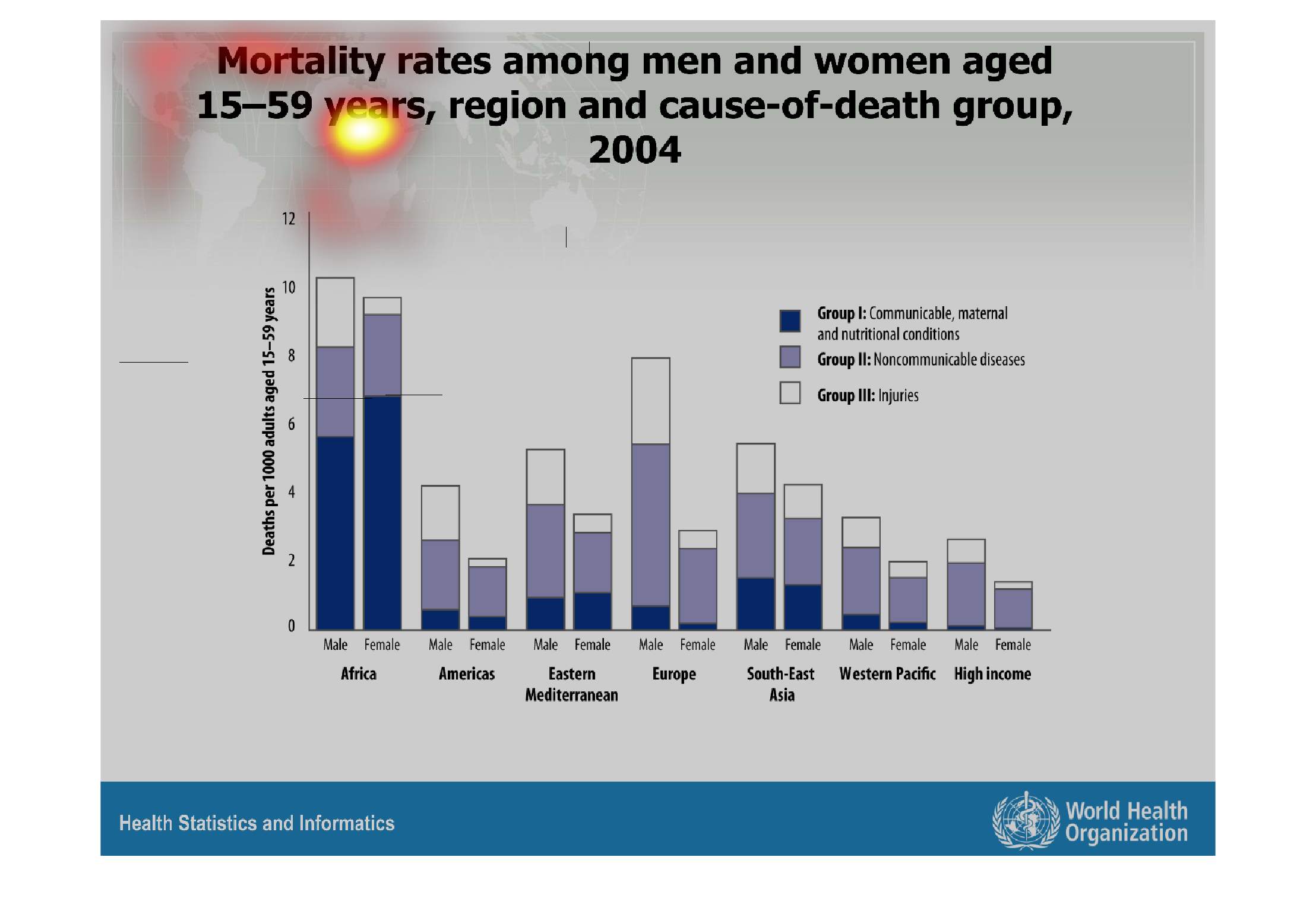
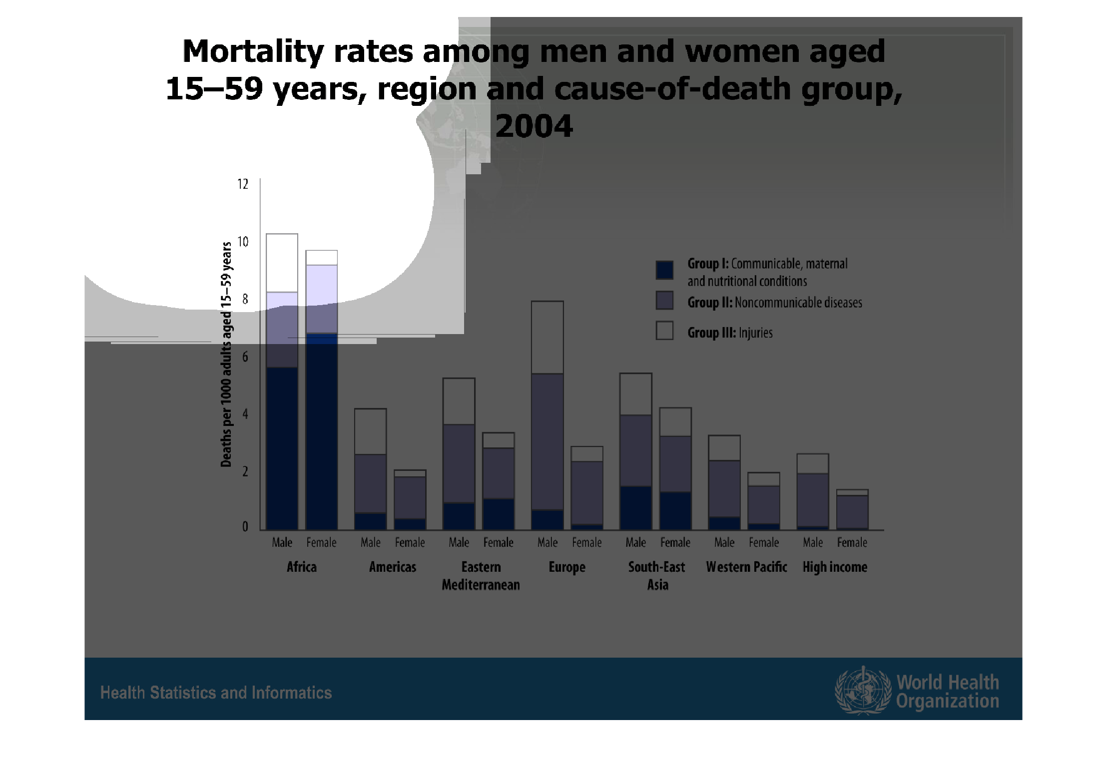
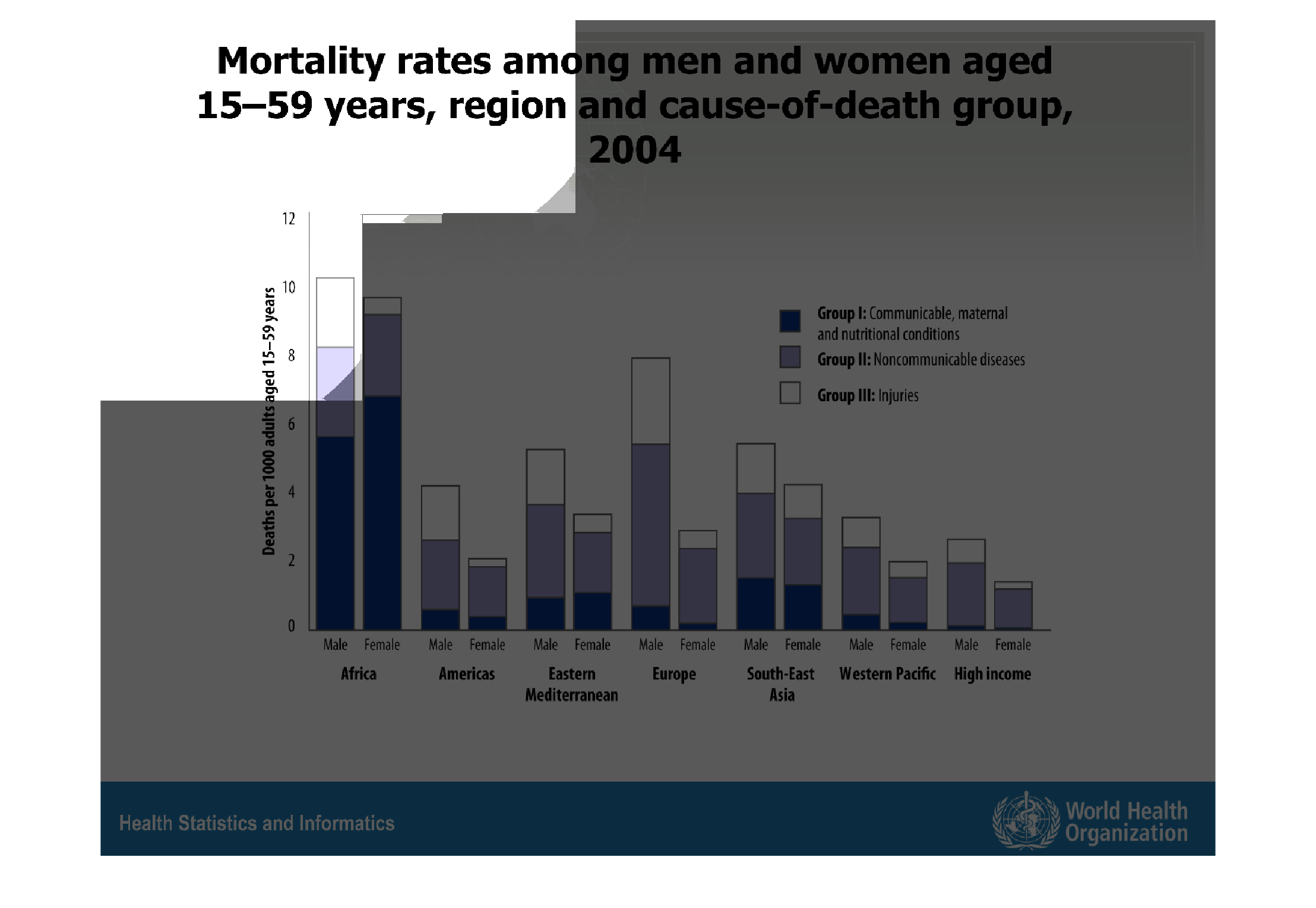
This is a graph that shows the mortality rates among men and women between the ages of 15
and 59 and it also shows the cause of death among this group.
Warning: Image is too big to fit on screen; displaying at 67%
Warning: Image is too big to fit on screen; displaying at 67%
The following chart gives the mortality rate among men and women aged 15 to 59 years of age.
It gives age and death of the person the data was given for Europe, Americas, Africa, Eastern
MED, Western pacific and also high income groups.
Warning: Image is too big to fit on screen; displaying at 67%
Warning: Image is too big to fit on screen; displaying at 67%

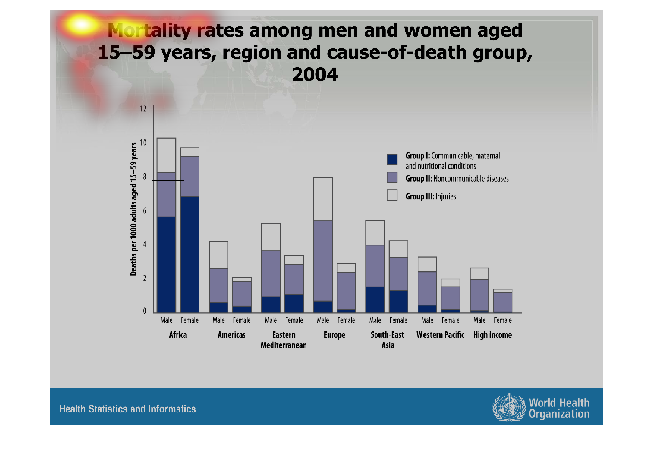
The chart shows the death rate for men and women between the ages of 15 and 59 in 2004. It
shows how many communicable, non-communicable and injuries.
Warning: Image is too big to fit on screen; displaying at 67%
Warning: Image is too big to fit on screen; displaying at 67%
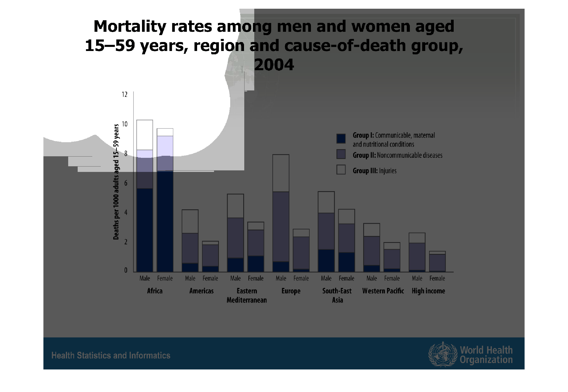
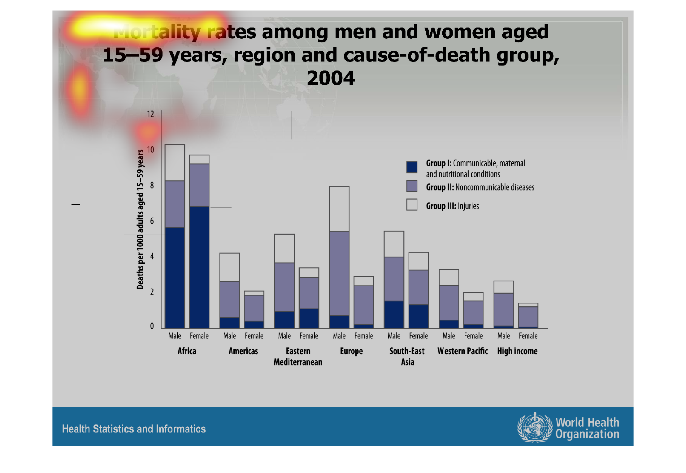
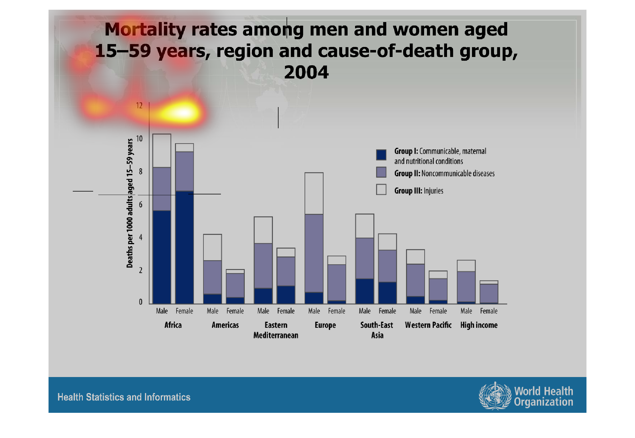
The graph shows the mortality rate for males and females in different parts of the country.
 From the graph it seems females tend to live longer than males.
Warning: Image is too big to fit on screen; displaying at 67%
Warning: Image is too big to fit on screen; displaying at 67%
this picture shows a graph that I labeled "Mortality rates among men and women aged 15-59
years, region, and cause of death group." This graph is a bar graph.
Warning: Image is too big to fit on screen; displaying at 67%
Warning: Image is too big to fit on screen; displaying at 67%

This chart shows the mortality rates for men and women between the ages of 15 -59, region
and cause of death in the year 2004. The chart show a correlation between malaria deaths and
R&D funding. As R&D funding increases in a region the number of malaria deaths decreases.

Warning: Image is too big to fit on screen; displaying at 67%
Warning: Image is too big to fit on screen; displaying at 67%
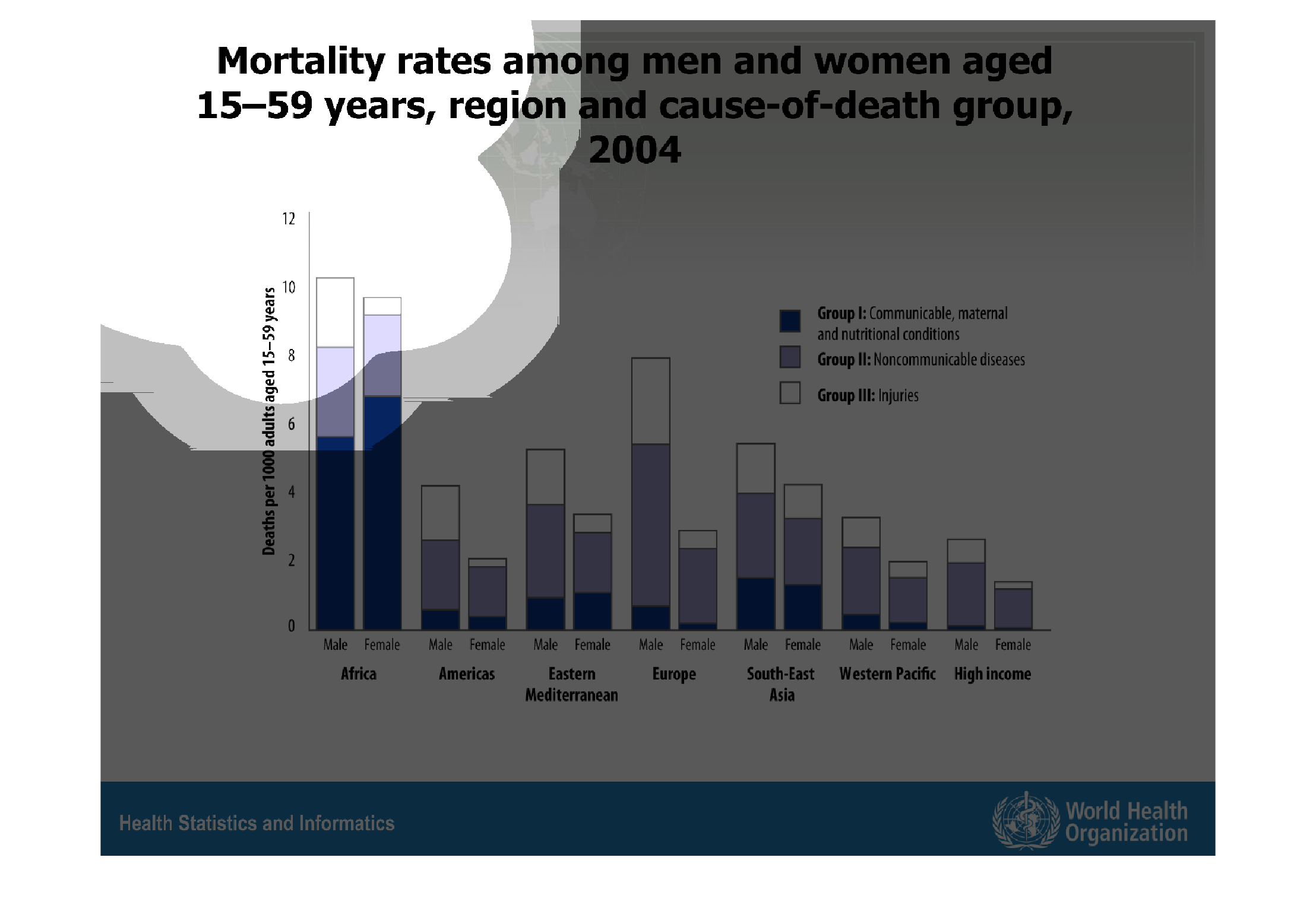
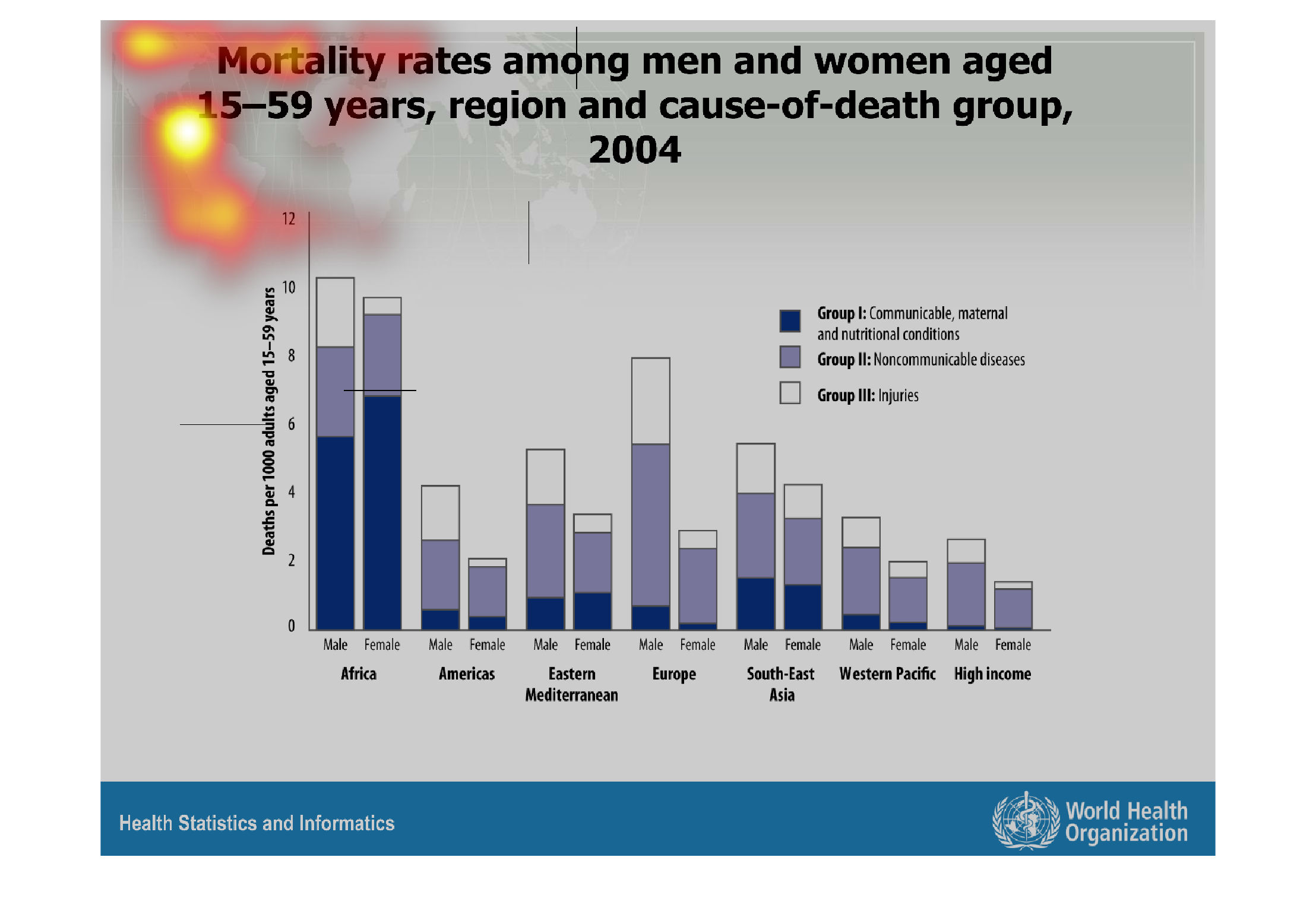
This chart describes mortality rates among men and women aged 15-59 years, region and cause
of  death group for the year 2004. Regions on the map include Africa and America.
Warning: Image is too big to fit on screen; displaying at 67%
Warning: Image is too big to fit on screen; displaying at 67%
This graph shows the mortality rates of men and women between the ages of 15-59 years, the
region they are from, and their causes of death, from 2004. The highest cause of death was
in Africa for females, followed by males. The lowest death was people around the world with
high income.
Warning: Image is too big to fit on screen; displaying at 67%
Warning: Image is too big to fit on screen; displaying at 67%

The image on the left hand side shows mortality rates by continent and subsequently the difference
between men and women in deaths causes.  From the data collected Africa, has the highest rates
of mortality for both men and women by a significant number.
Warning: Image is too big to fit on screen; displaying at 67%
Warning: Image is too big to fit on screen; displaying at 67%
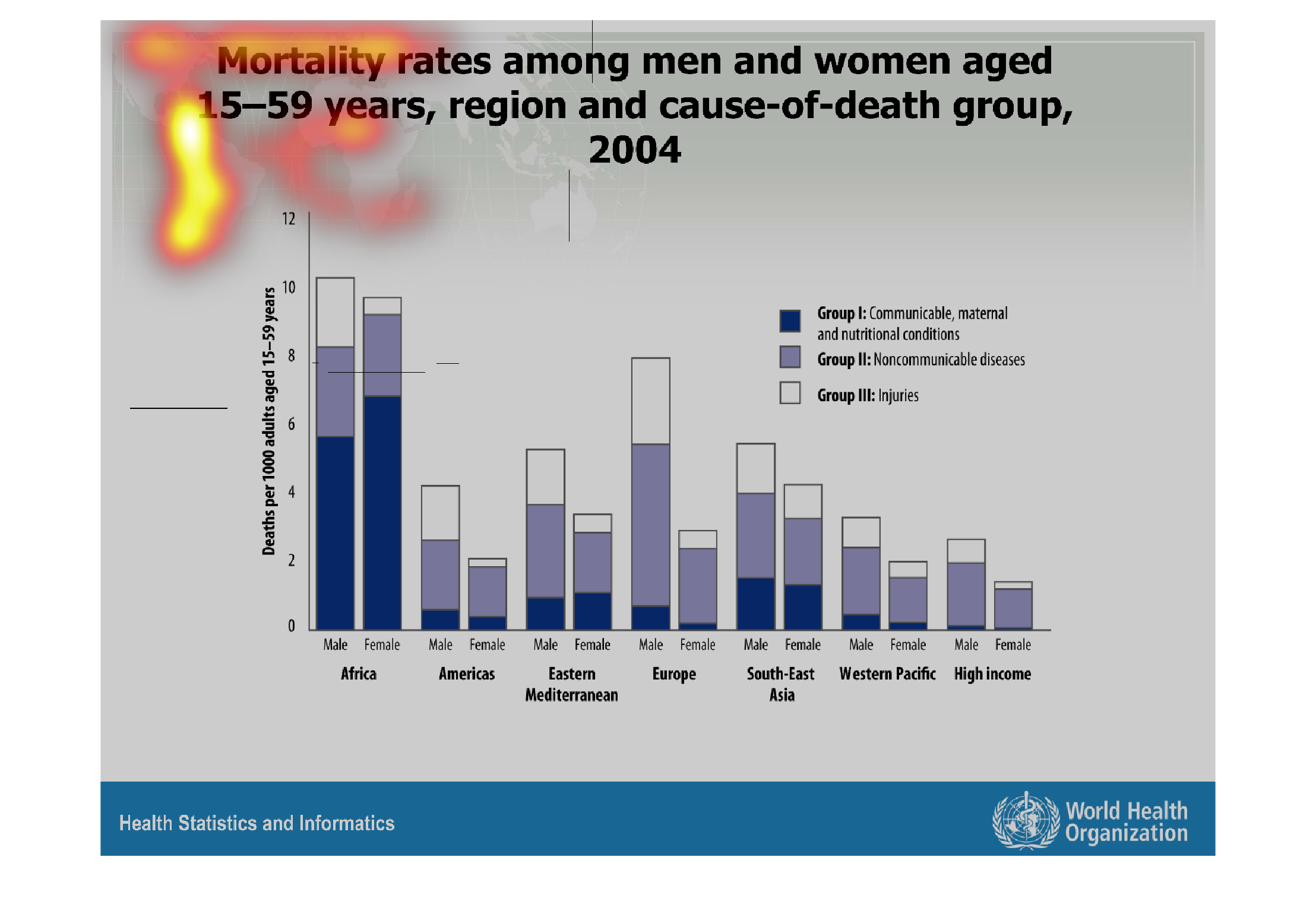
This graph shows mortality rates among men and women between the ages of 15-59 years, reason
and cause of death, 2004. This bar graph shows the results in blue and gray shades.
Warning: Image is too big to fit on screen; displaying at 67%
Warning: Image is too big to fit on screen; displaying at 67%
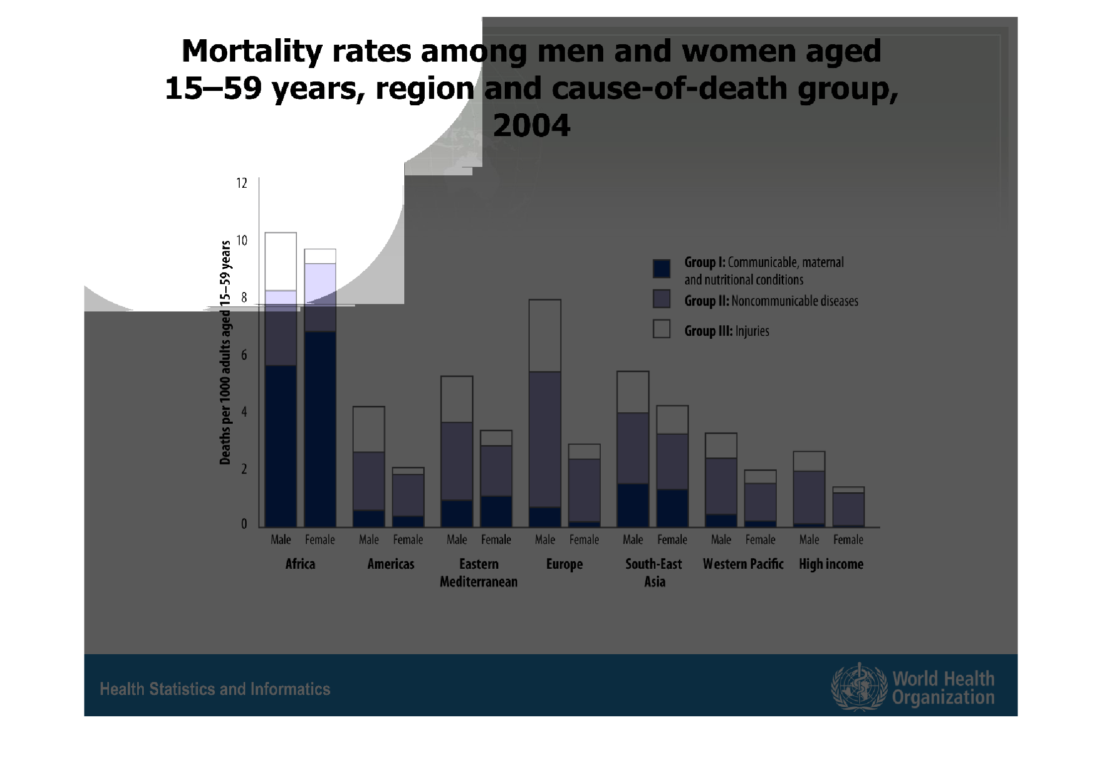
This graph depicts mortality rates among men and women ages 15-59, grouped by region and and
cause of death. Causes of death include: Group I- communicable, maternal, and nurtritional
conditions, Group II- non communical diseases, and group III Injuries.
Warning: Image is too big to fit on screen; displaying at 67%
Warning: Image is too big to fit on screen; displaying at 67%