Warning: Image is too big to fit on screen; displaying at 67%
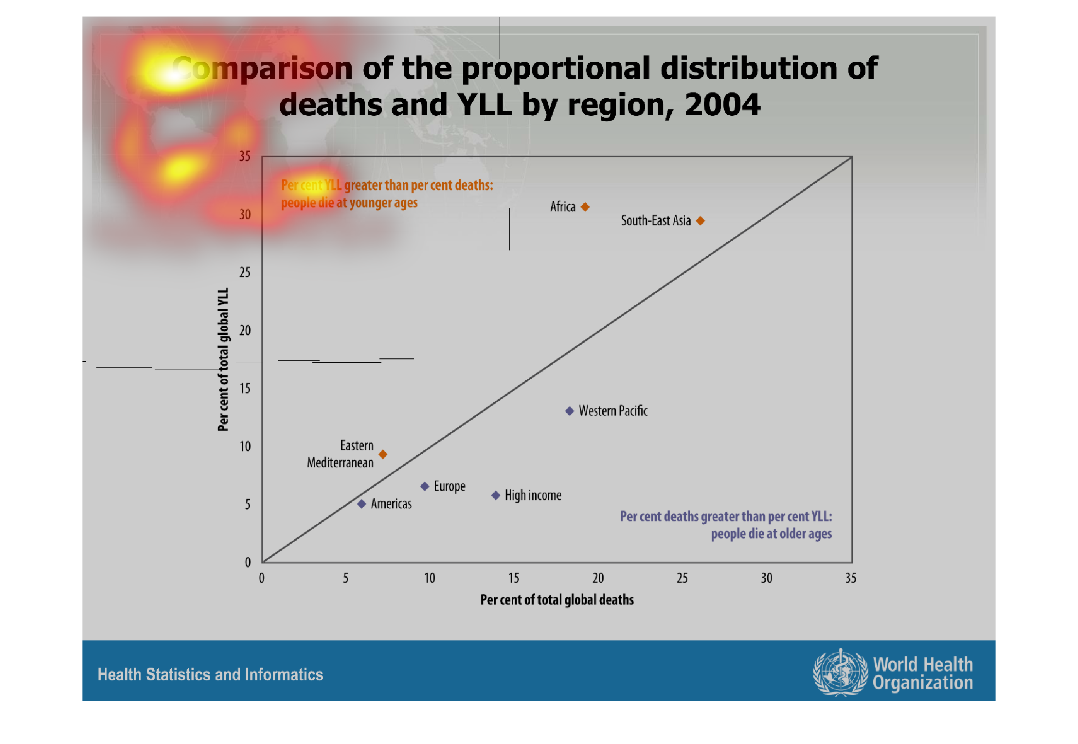
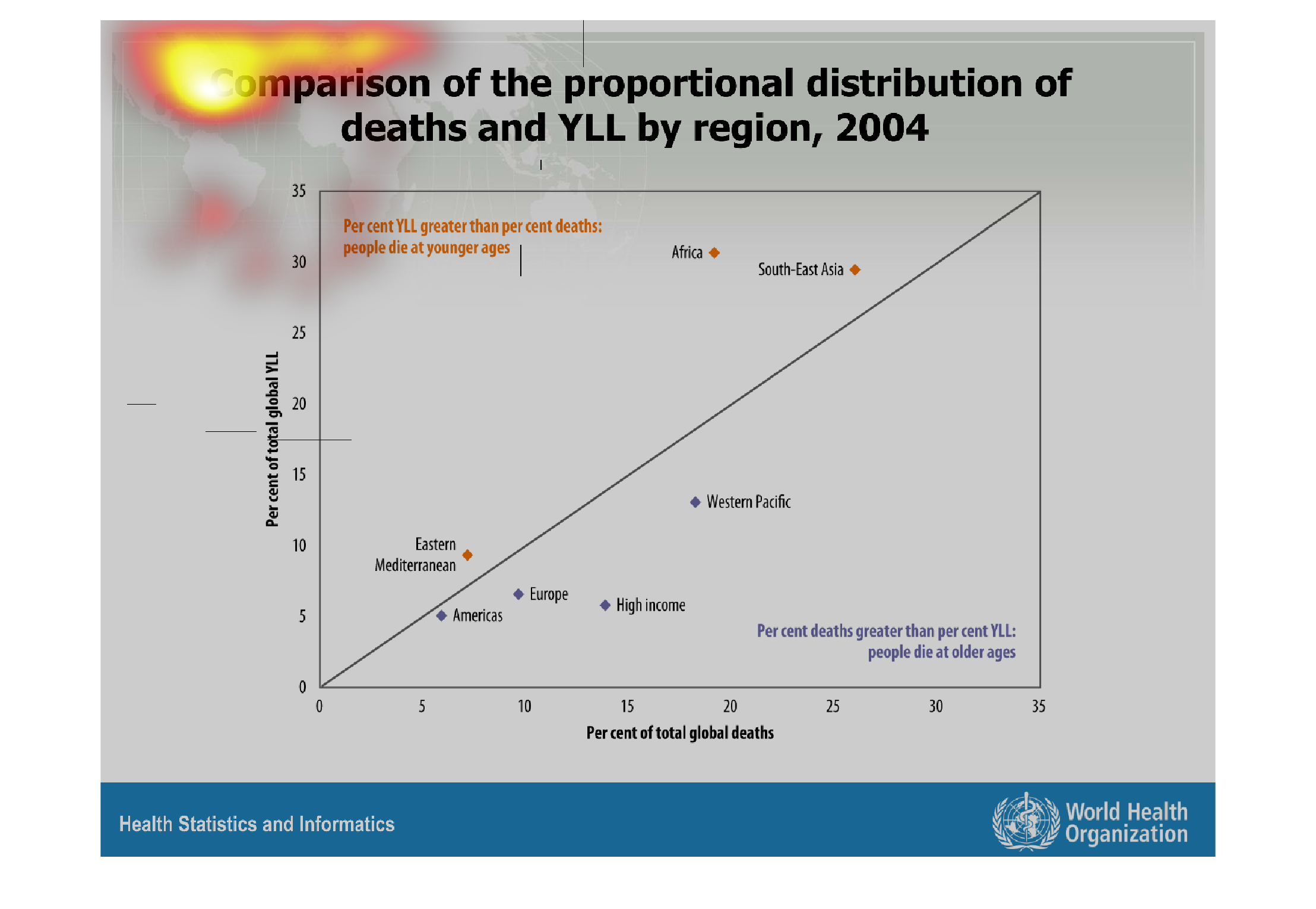
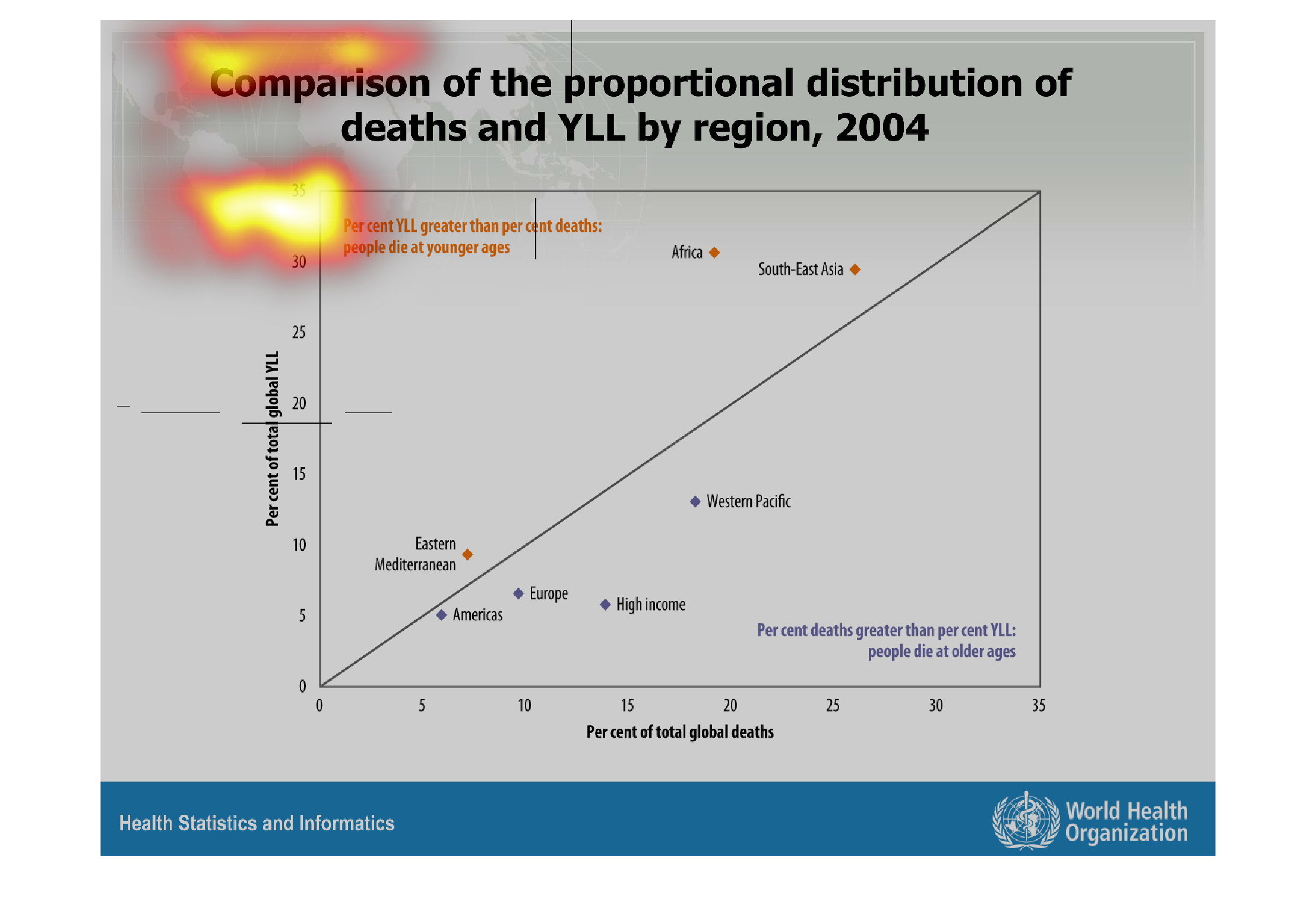
This chart describes the difference in the distribution of death and years of life lost in
2004 amongst continental regions. Generally, the highest difference in the years of life lost
lies in the less developed countries, such as Southeast Asia and Africa.
Warning: Image is too big to fit on screen; displaying at 67%
Warning: Image is too big to fit on screen; displaying at 67%
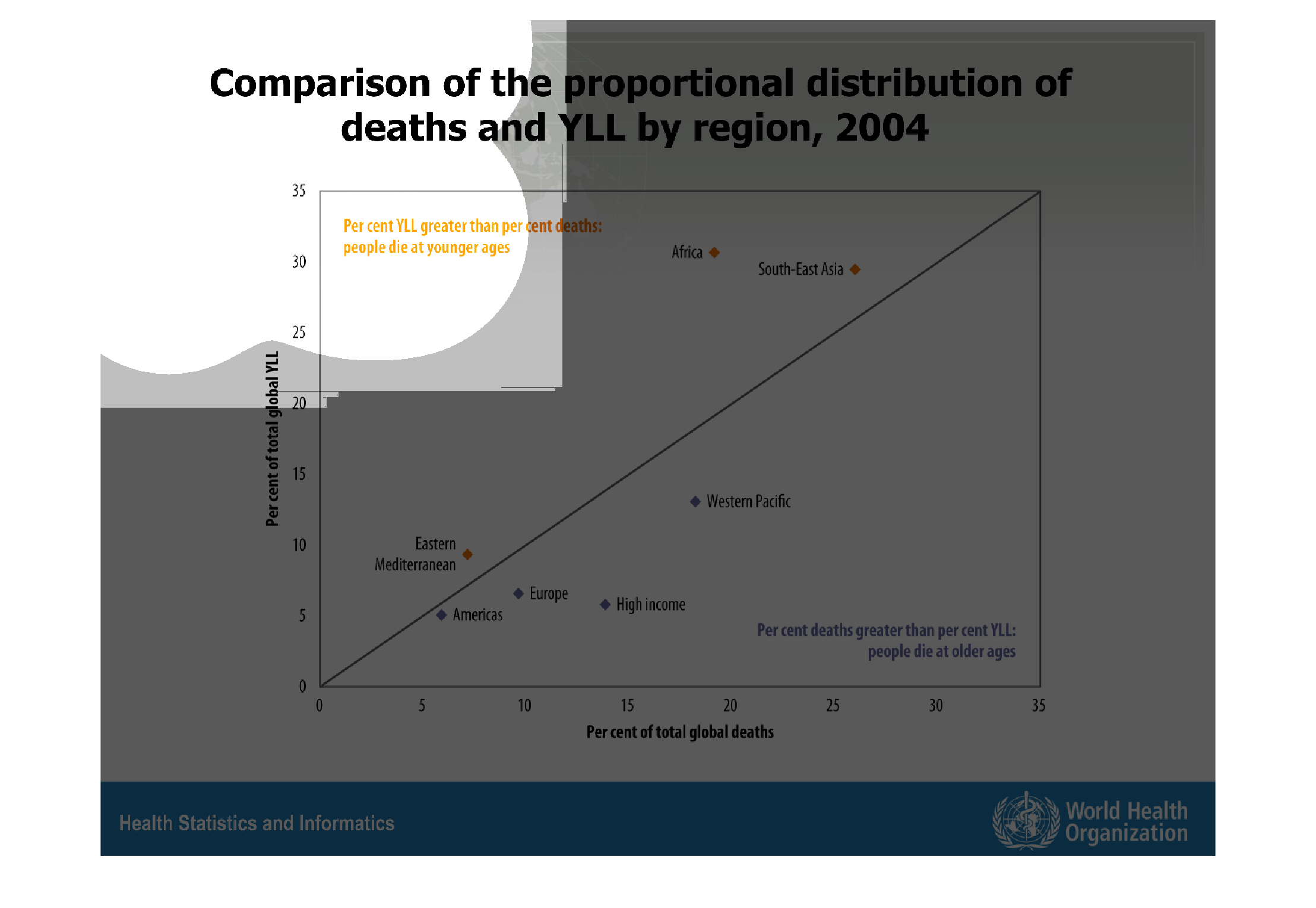
This graph compares deaths and YLL (years of life lost) by region in 2004. In the eastern
Mediterranean and in South-East Asia, this graph suggests that people die very young. This
is determined by the percent YLL being greater than the percent deaths. In contrast, people
in the Americas, Europe, and the Western Pacific die at older ages. Notably, persons with
high income also have a higher age at death.
Warning: Image is too big to fit on screen; displaying at 67%
Warning: Image is too big to fit on screen; displaying at 67%
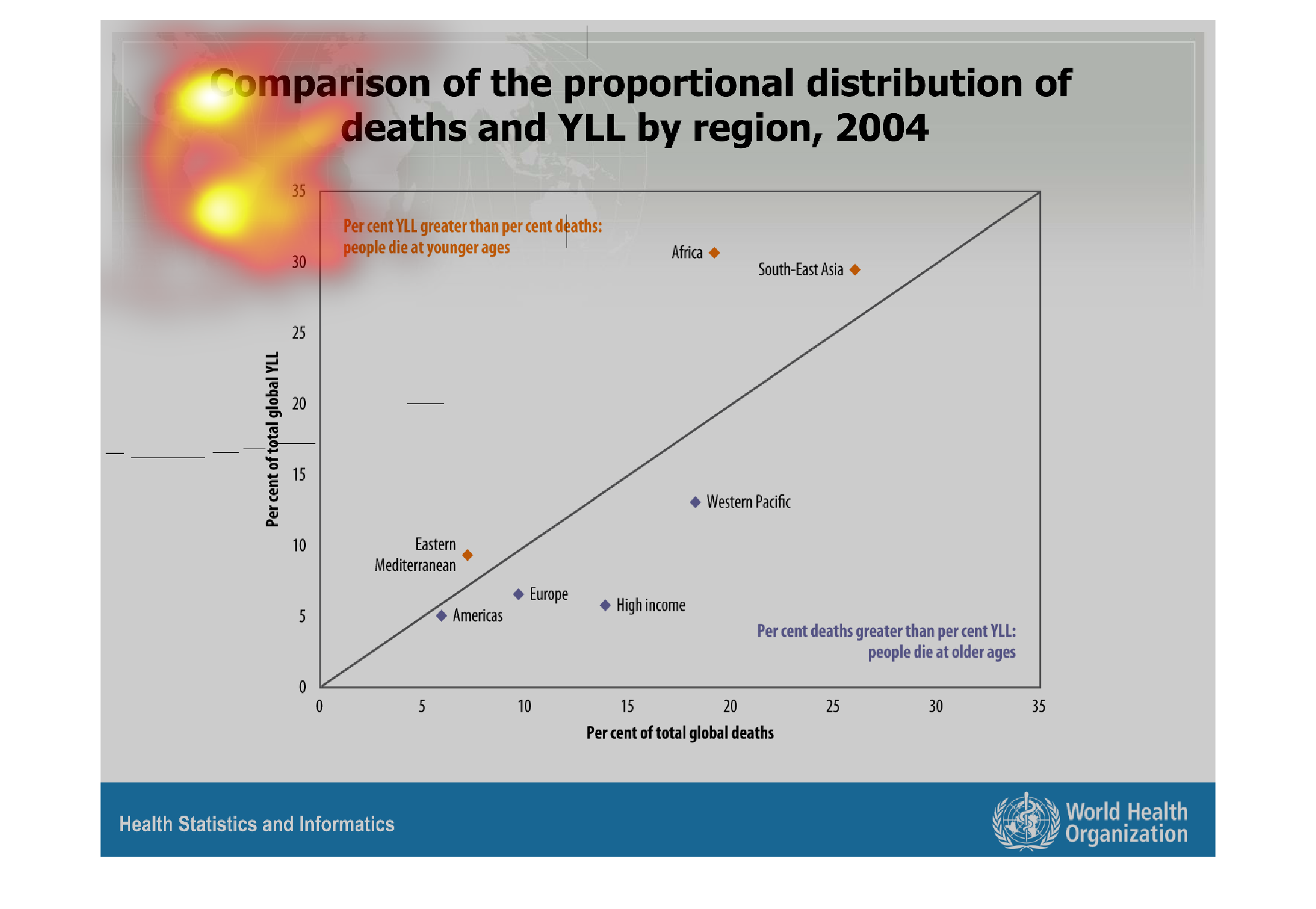
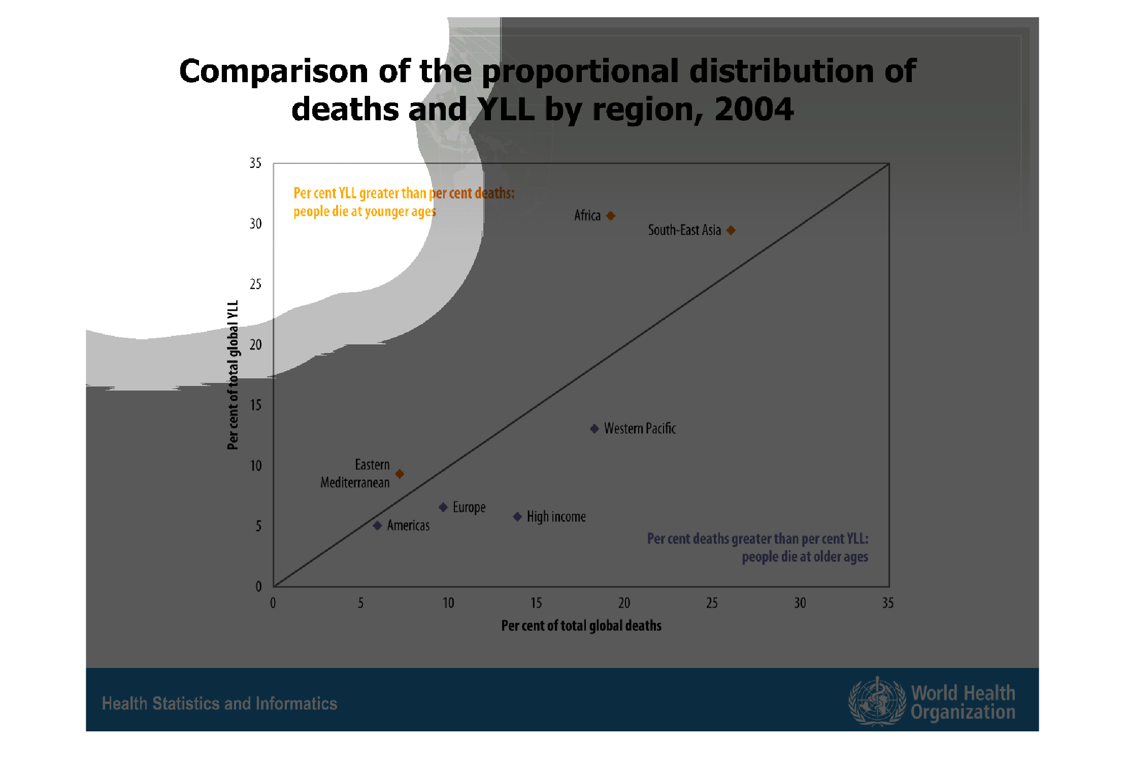
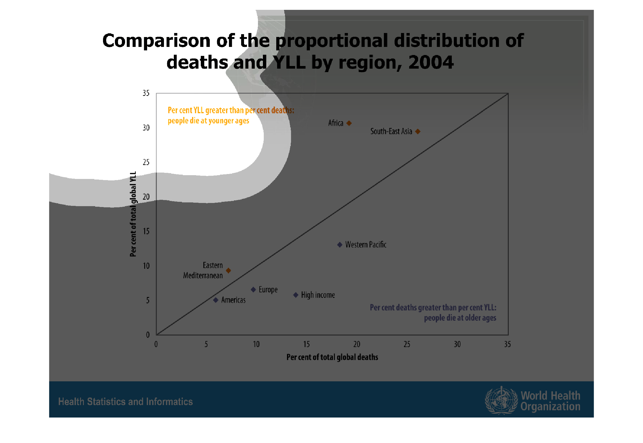
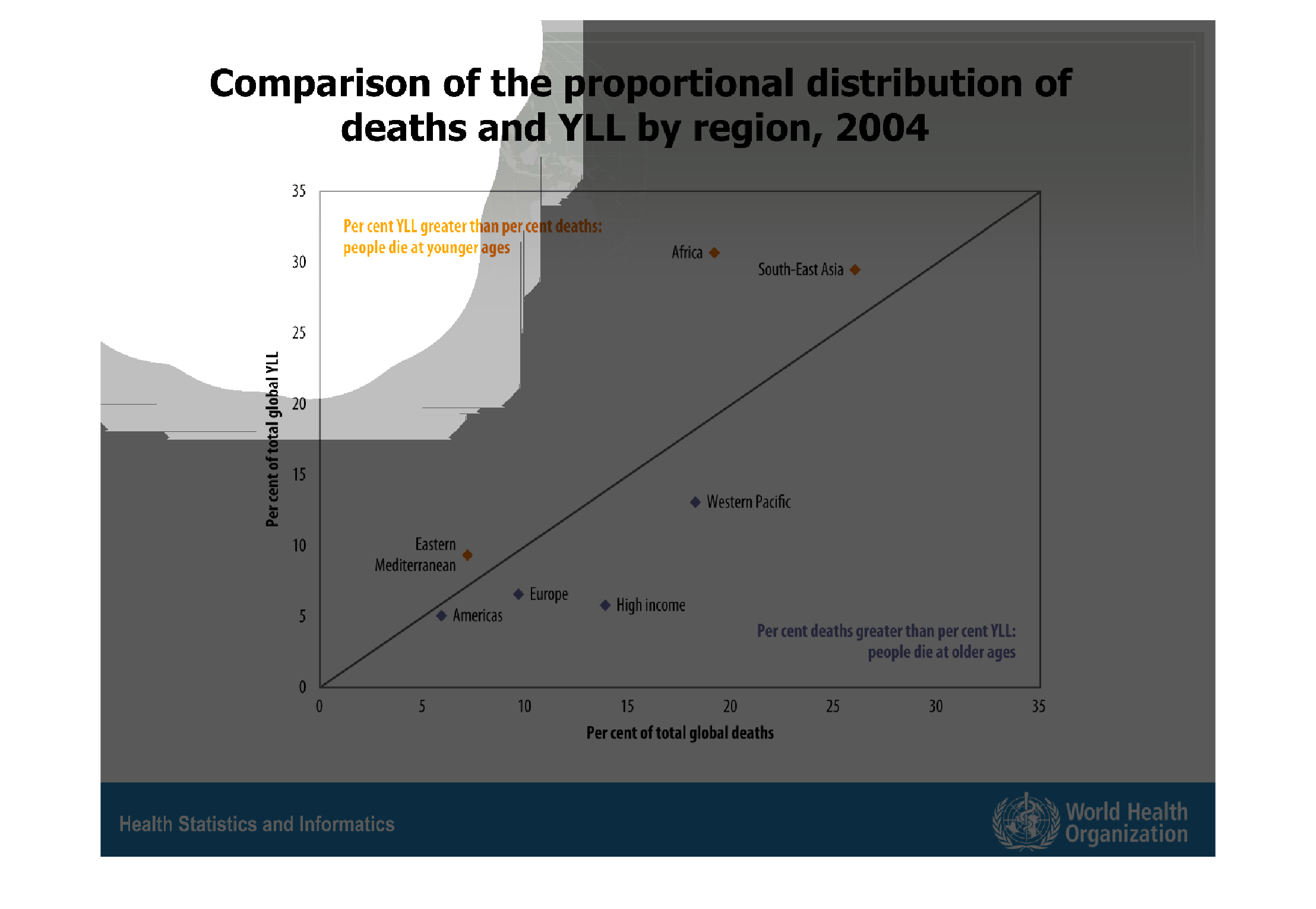
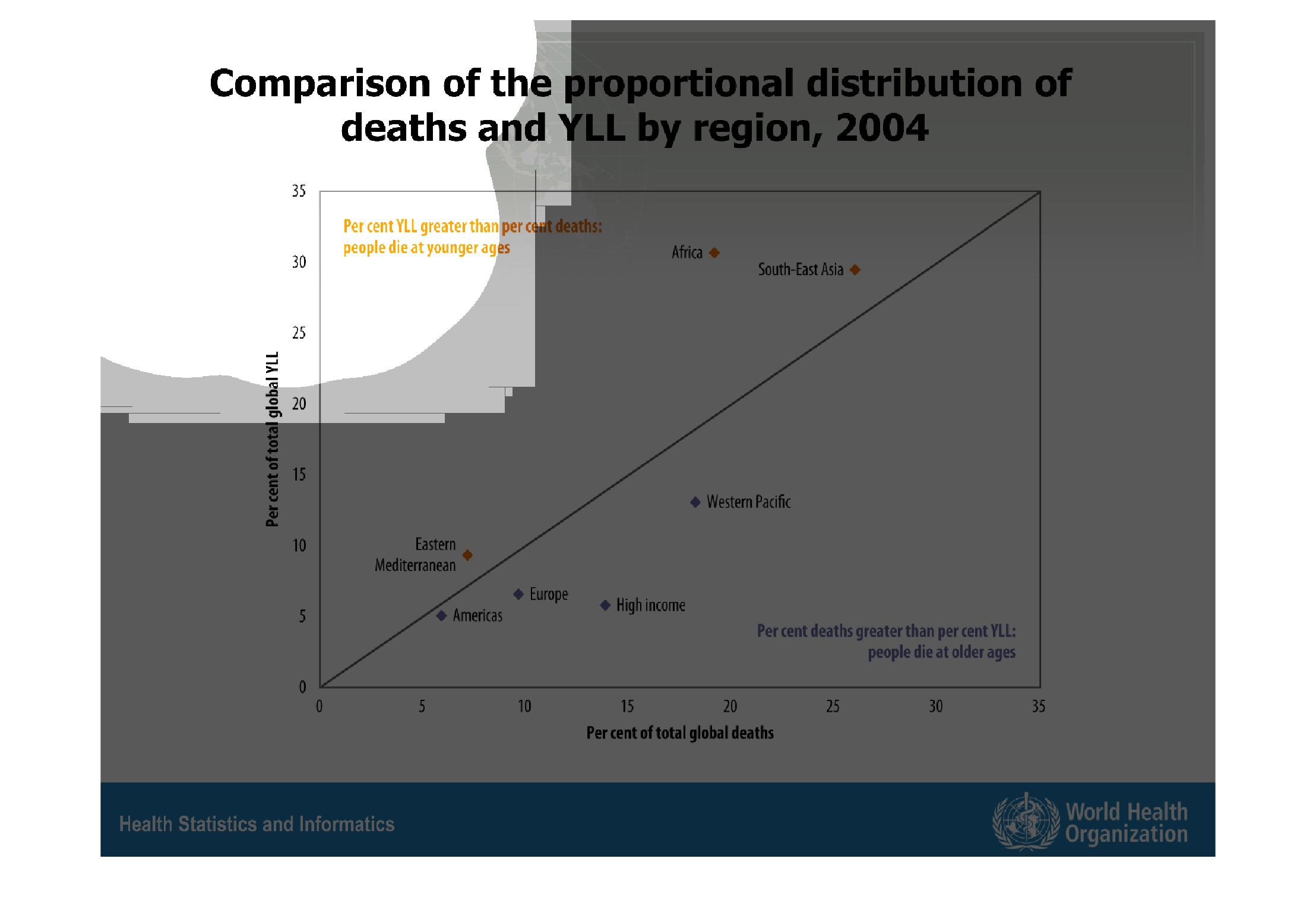
This graph from 2004 shows the comparison of the proportional distribution of deaths and YLL
by region. Americas have the lowest distribution and death rate, while Southeast Asia has
the highest.
Warning: Image is too big to fit on screen; displaying at 67%
Warning: Image is too big to fit on screen; displaying at 67%
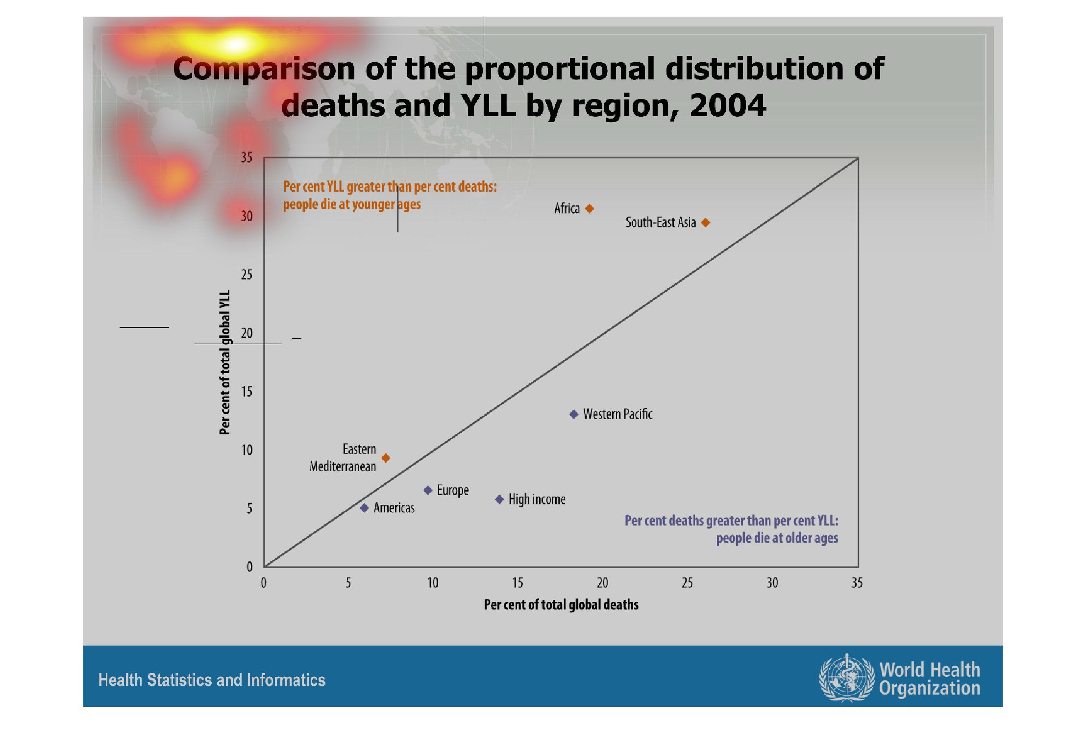

Comparison of the proportional distribution of deaths and YLL by region, 2004. At the top
of the graph is the legend, saying "Per cent YLL greater than per cent deaths; people die
at younger ages."
Warning: Image is too big to fit on screen; displaying at 67%
Warning: Image is too big to fit on screen; displaying at 67%
it is a map showing the distribution of schistosomiasis from certain time spands.it is a map
showing the distribution of schistosomiasis from certain time spands.
Warning: Image is too big to fit on screen; displaying at 67%
Warning: Image is too big to fit on screen; displaying at 67%
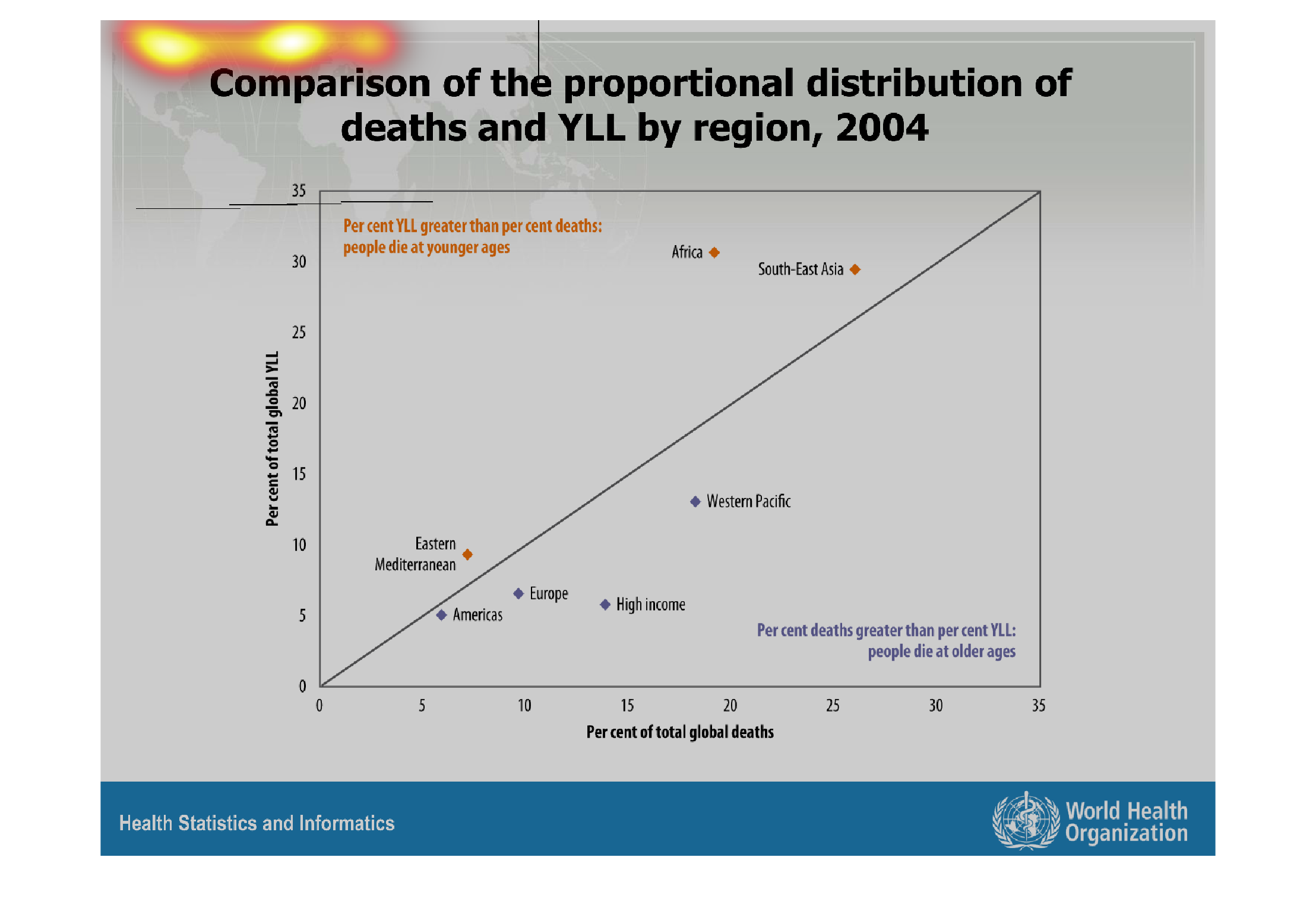
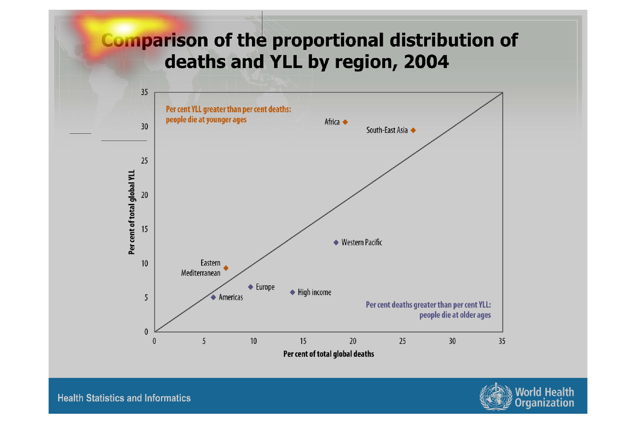
The chart depicts the relationships between deaths and amount of YLL. I could not figure out
what YLL was. It seems that the more YLL there is, the greater the death rate is. Southeast
Asia represents this correlation.
Warning: Image is too big to fit on screen; displaying at 67%
Warning: Image is too big to fit on screen; displaying at 67%
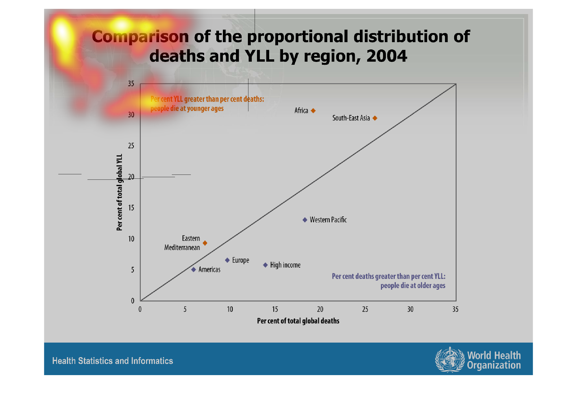
This handmade chart shows the comparison and distribution of deaths and YLL in some year.
I do not know what YLL is and cannot comment further on this chart
Warning: Image is too big to fit on screen; displaying at 67%
Warning: Image is too big to fit on screen; displaying at 67%
The charts displays a comparison of proportional distribution of death and YLL by region for
the year of 2004.  The chart focuses on the total percentages of global deaths, dividing data
into different regions: Eastern Mediterranean, Americas, Europe, Western Pacific, etc.
Warning: Image is too big to fit on screen; displaying at 67%
Warning: Image is too big to fit on screen; displaying at 67%
it is talking about something to do with the death of something in a certain year. not exactly
sure because it is all blurry. doesn't make much sense.
Warning: Image is too big to fit on screen; displaying at 67%
Warning: Image is too big to fit on screen; displaying at 67%
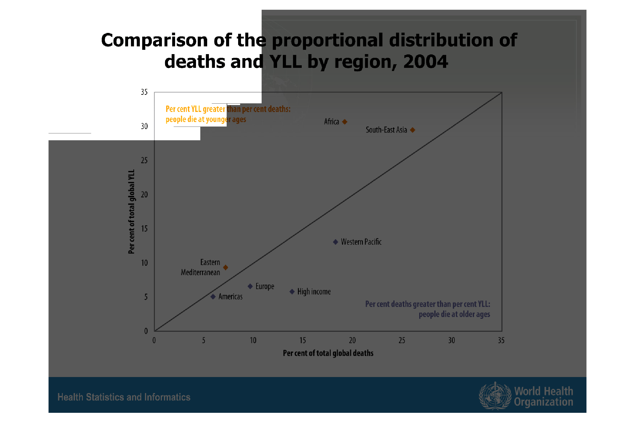
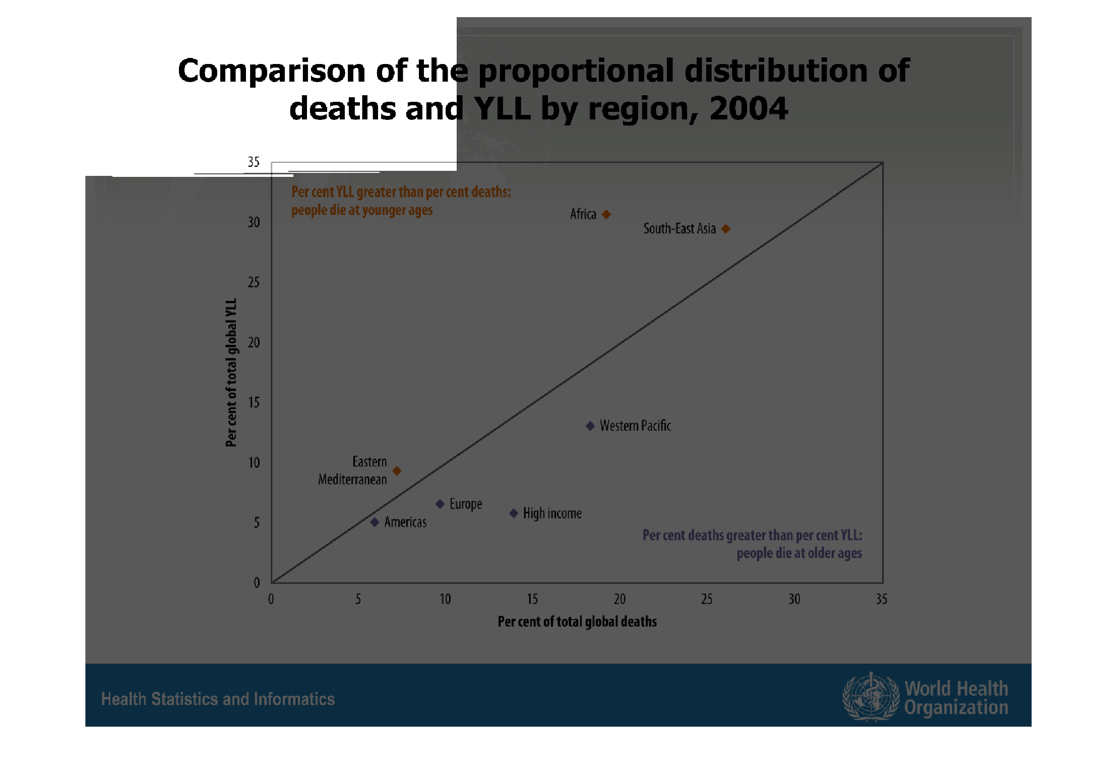
This is a chart depicting the comparison of the proportional distribution of deaths and YLL
by region in the year 2004. It shows a steadily increasing plot.
Warning: Image is too big to fit on screen; displaying at 67%
Warning: Image is too big to fit on screen; displaying at 67%
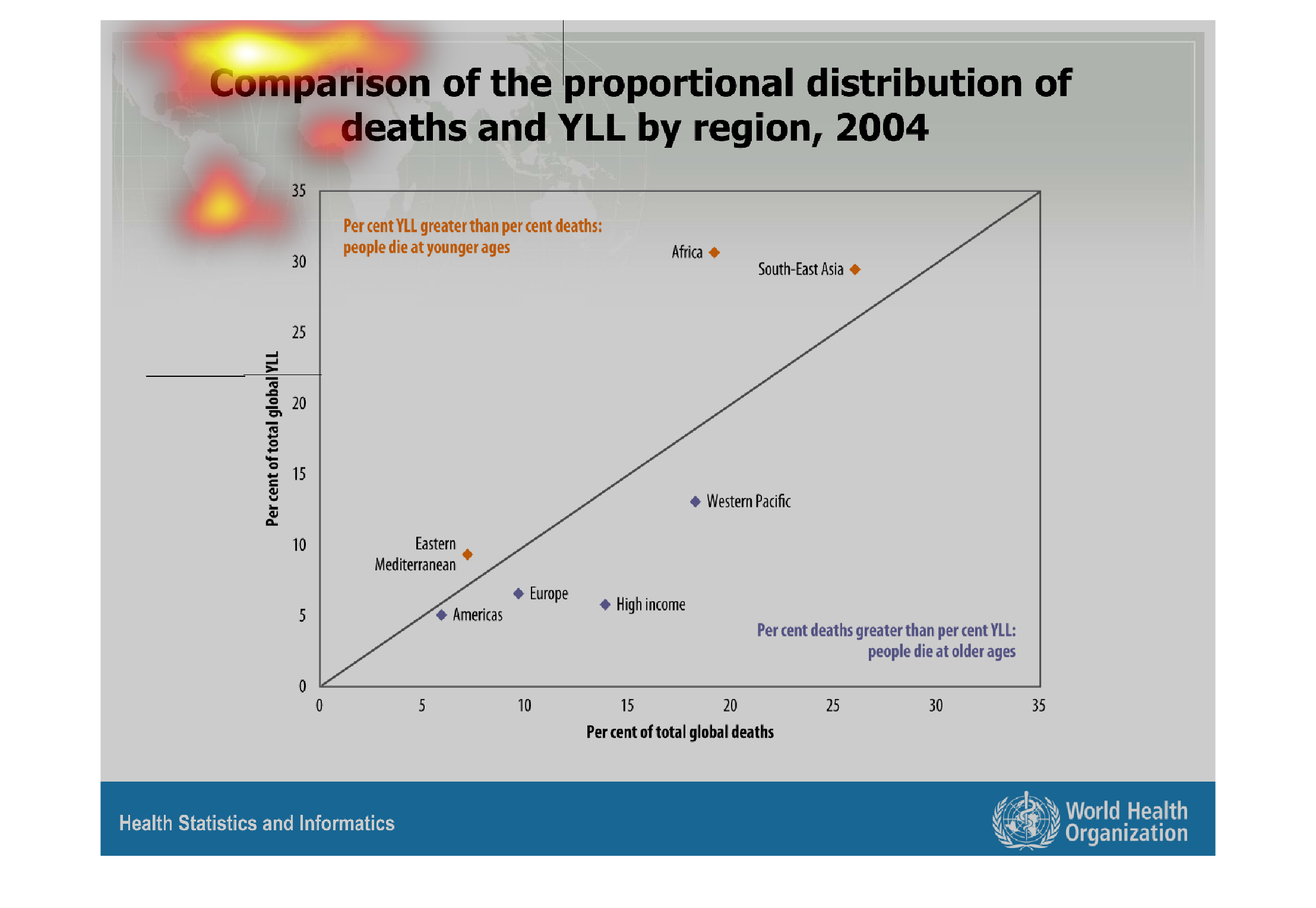
This graph details the comparison of deaths and YLL by region in the year 2004. The left side
of the graph pertains to percent of total global YLL and the bottom refers to percent of total
deaths. There are dots for the Americas, Eastern Mediterranean, Europe, High Income, Western
Pacific, and Southeast Asia.
Warning: Image is too big to fit on screen; displaying at 67%
Warning: Image is too big to fit on screen; displaying at 67%
The figure presented is titled Comparison of the proportion distribution of deaths and YLL
by region, 2004.  The figure shows the distribution of deaths in 2004.
Warning: Image is too big to fit on screen; displaying at 67%
Warning: Image is too big to fit on screen; displaying at 67%
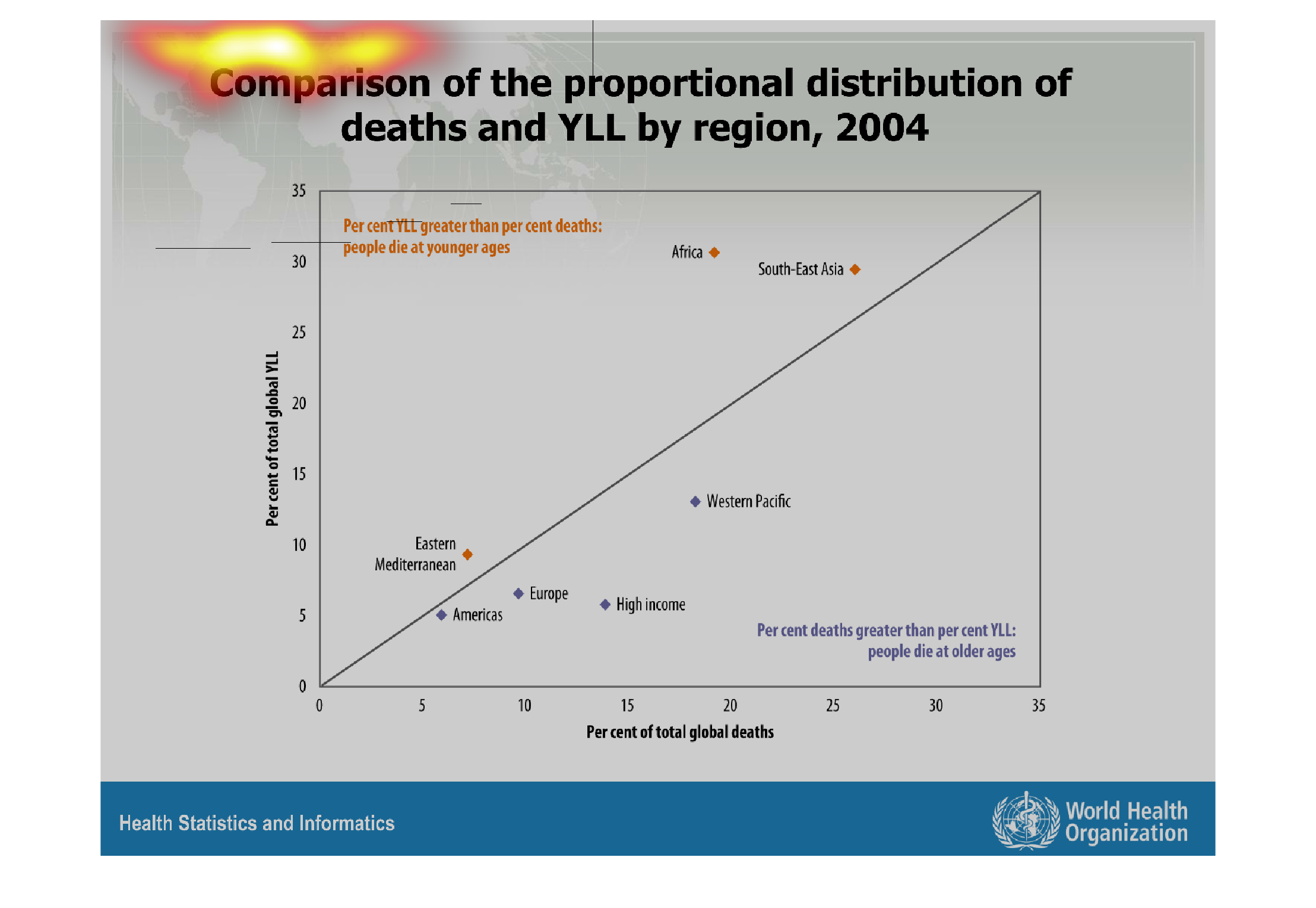
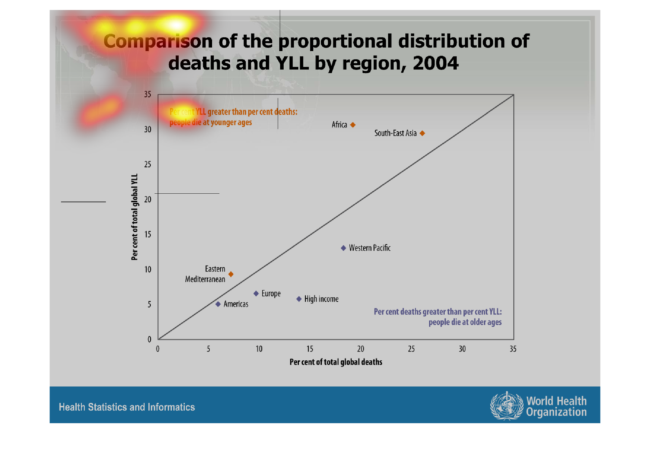
This is a chart of the relationship between deaths and YLL in different regions. In areas
where the percentage of global deaths is greater than the percentage of YLL, people tend to
die at older ages, while areas with higher percentages of YLL compared to total global deaths
have younger average ages at death.
Warning: Image is too big to fit on screen; displaying at 67%
Warning: Image is too big to fit on screen; displaying at 67%